My Account
My Slides
Search by Category
Templates
View All Templates
Download Template Slides
✦ AI Search
Feedback
Login
Logout
Get Started
Browse all Slides
Browse all Slides
Create a FREE Account
Instant access to 1,000+ real slides from top companies like McKinsey, BCG, Goldman Sachs, Google and many more!
First Name
Last Name
Email
Password
I agree to all
Terms & Privacy Policy
Thank you! Your submission has been received!
Oops! Something went wrong while submitting the form.
Have an account?
Sign in
Saved Slides
The slide shows a series of vertical stack coin icons representing the value distribution of household investments.
Financial Performance
Financial Services
The slide illustrates the distribution of household investment values, ranging from under $50K to over $1M.
Household, Investments, Value, Distribution, Wealth
Single Chart
IPSOS
Saved
Includes a line graph showing data growth over years and a smartphone interface. Visual elements are in purple and blue, with clear textual annotations.
Strategic Planning
Financial Services
Explores how Experian plans to use consumer data to enhance personalization features in its services, including new ways for consumers to share their data, impacting credit scores and financial offerings.
data growth, personalization, consumer data, credit scores, financial services
Multiple Chart
Barclays
Saved
This slide contains a complex combination of line charts and bar graphs displaying CEO confidence levels and global economic growth trends, with annotations and a key question section on the right side.
Market Analysis and Trends
Financial Services
Analyzes CEO confidence in relation to global economic growth, showing trends over several years and indicating a decline in confidence not seen since 2009.
CEO confidence, economic growth, revenue, decline, survey, 2009
Mixed Chart
PwC/Strategy&
Saved
This slide shows multiple small stacked area and column charts comparing capacity scenarios across four categories (Central, Step Change, Fast Change, Slow Change).
Market Analysis and Trends
Energy & Utilities
Compares different capacity scenarios without the HumeLink upgrade, highlighting the potential impact on energy capacity across various changes and timelines.
HumeLink, capacity, scenarios, energy, comparison, Central, Step Change, Fast Change, Slow Change
Multiple Chart
EY
Saved
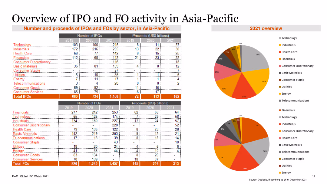
The slide contains two tables displaying the number and proceeds of IPOs and FOs by sector from 2019 to 2021. Two pie charts illustrate the sector distribution for 2021.
Market Analysis and Trends
Financial Services
This slide provides an overview of IPO and FO activities in the Asia-Pacific region, detailing the number and proceeds by sector, and highlighting key trends for 2021.
IPO, FO, Asia-Pacific, Financial Services, Market Trends
Multiple Chart
PwC/Strategy&
Saved
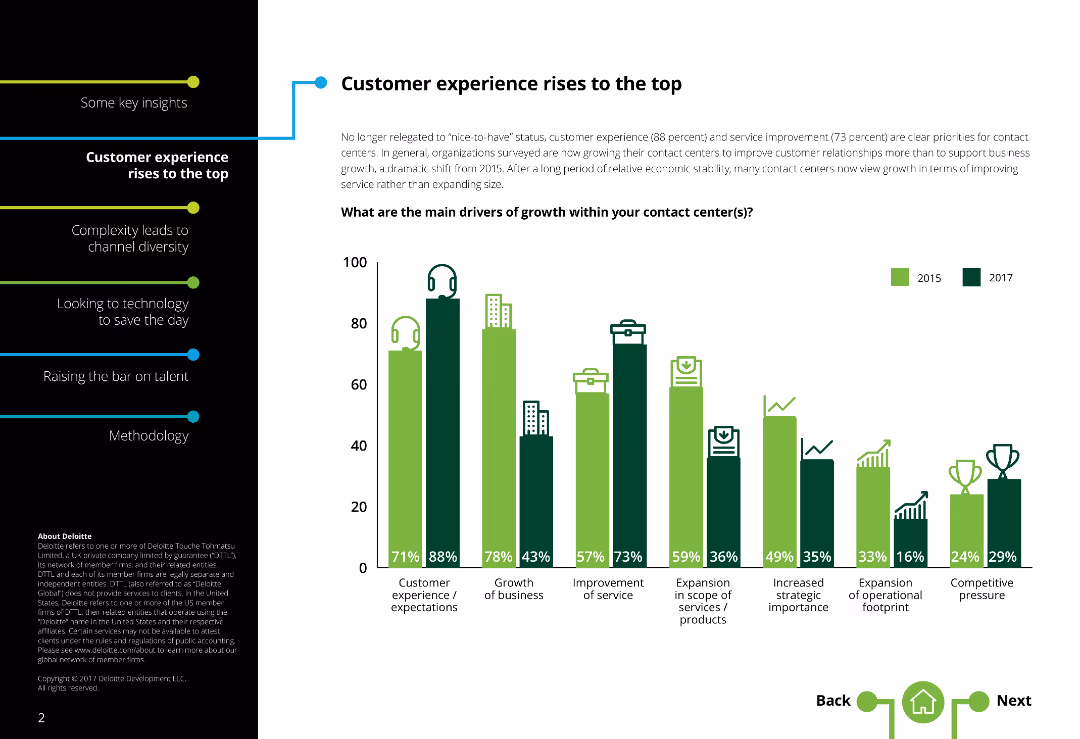
This slide includes a column chart comparing various drivers of growth in contact centers across different years, with icons representing each driver.
Market Analysis and Trends
Professional Services
The slide highlights key drivers of growth within contact centers, emphasizing customer experience and service improvement. It compares data from different years and includes insights into how companies prioritize different growth factors, such as customer expectations, business growth, and service improvement.
Customer experience, growth drivers, contact centers, column chart, service improvement
Single Chart
Deloitte
Saved
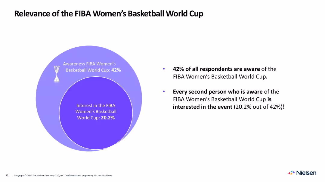
Circle diagram on left showing awareness and interest, with bulleted summary on the right
Market Analysis and Trends
Media & Entertainment
Shows that 42% are aware of the Women's World Cup, and 20.2% are interested, with half of those aware expressing engagement.
women's basketball, awareness, interest, FIBA, gender, sports engagement, fan behavior, Venn diagram, Nielsen
Mixed Chart
Nielsen
Saved
Two sets of column charts dominate the slide. The left chart, in a dark to light blue gradient, represents 'OPERATING CASH FLOW AFTER INVESTMENTS' across five quarters. The right chart shows 'CASH FLOW OF INVESTMENTS' in the same period, categorized by associated companies and plot investments. The images in the lower right corner give a glimpse into a well-lit office space and a wooden interior, possibly a café or communal area within a business premise, hinting at the corporate setting.
Financial Performance
Financial Services
Highlights a strong cash flow performance, presenting data suitable for discussions in financial strategy meetings or investor briefings on company health.
cash flow, operating cash flow, investment, financial strategy, financial health, quarterly figures, corporate finance, financial services
Multiple Chart
Goldman Sachs
Saved
This content slide includes a mix of text, a photo of a worker with wind turbines, and a column chart displaying economic, energy, and emissions trends under three scenarios. The design is moderately dense with detailed information.
Market Analysis and Trends
Environmental Services & Sustainability
The slide outlines how green climate action can decouple GDP growth from emissions and energy consumption. It compares three scenarios for global economic growth and emissions trends up to 2050, showing the potential benefits of transitioning to renewable energy sources and improving energy efficiency.
Climate, Emissions, GDP, Energy, Sustainability
Multiple Chart
EY
Saved
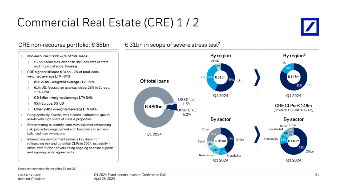
The slide features pie charts detailing CRE portfolio by region and sector, with key highlights on non-recourse and higher-risk loans.
Financial Performance
Financial Services
It provides an overview of Deutsche Bank's commercial real estate portfolio, focusing on non-recourse and higher-risk loans by region and sector.
CRE, commercial real estate, portfolio, non-recourse, higher-risk loans, region, sector, Deutsche Bank
Multiple Chart
Deutsche Bank
Saved
This slide features a bar graph and a list of action points. The graph provides a visual comparison of performance outcomes based on planning strategies, using a clear color differentiation for each category. The layout is straightforward, focusing on clarity and ease of interpretation.
Strategic Planning
Professional Services
The slide compares the effectiveness of scenario-based and dynamic planning in achieving performance targets, offering actionable insights on strategic planning processes. It's used to advocate for proactive and data-driven decision-making in business strategies.
Strategic Planning, Scenario Planning, Performance, Data-Driven, Bar Graph
Mixed Chart
PwC/Strategy&
Saved
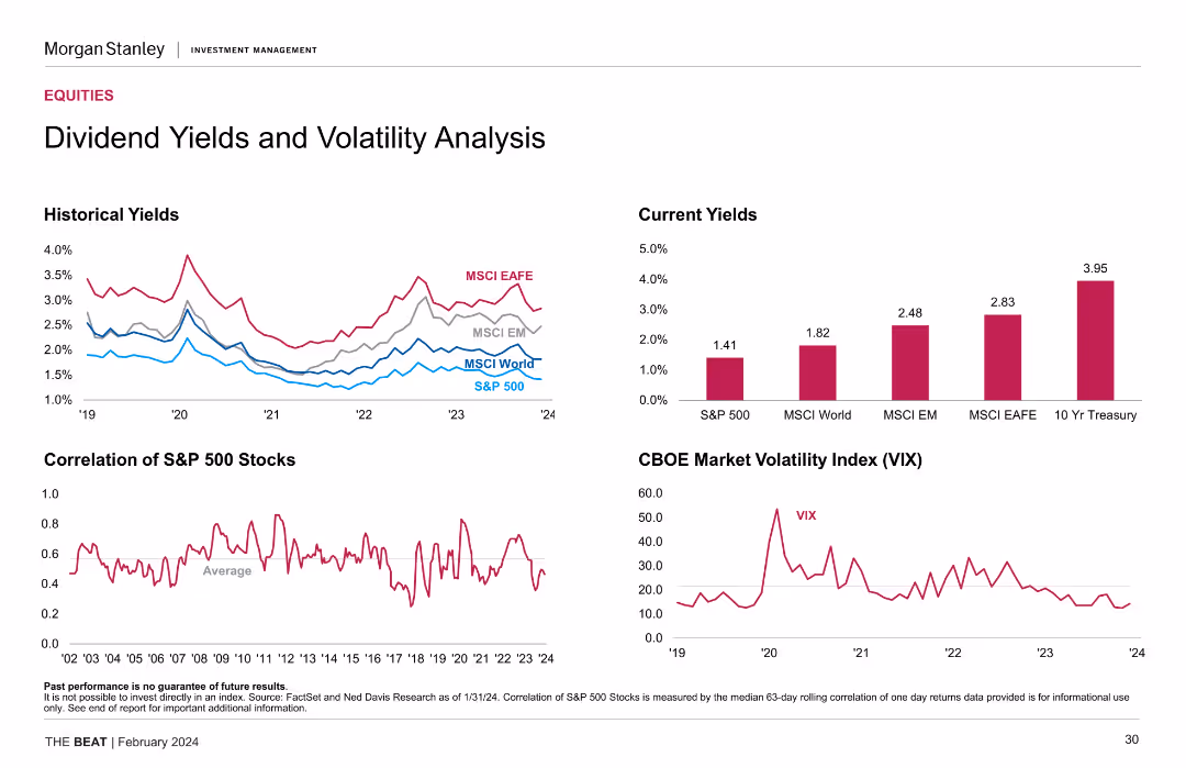
The slide features several charts: a line chart for historical yields, a bar chart for current yields, and a line chart for the CBOE Market Volatility Index.
Financial Performance
Financial Services
This slide analyzes dividend yields and volatility, comparing historical and current yields and showing the market volatility index, aiding investment decisions.
Dividend Yields, Volatility, Historical Yields, Current Yields, VIX
Multiple Chart
Morgan Stanley
Saved
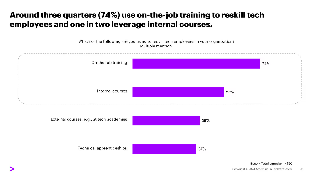
A horizontal bar chart on this slide illustrates the methods used to reskill employees, such as on-the-job training, internal courses, external courses, and technical apprenticeships.
Human Resources and Talent Management
Professional Services
The slide outlines the various methods organizations use to reskill their employees, with on-the-job training and internal courses being the most commonly used methods.
reskilling methods, training, internal courses, external courses, apprenticeships
Single Chart
Accenture
Saved
Complex display of column charts and pie charts comparing asset management growth and composition over time.
Financial Performance
Financial Services
Shows asset management growth at Deutsche Bank, with a focus on types of assets managed and yearly performance.
asset management, financial growth, performance analysis, investment strategies
Multiple Chart
Deutsche Bank
Saved
Slide showcases four segments with images and text, highlighting concepts of hyperpersonalization, ultraconvenience, community, and sustainability.
Customer and Market Segmentation
Retail & E-commerce
Discusses the evolving expectations of consumers for personalized and convenient experiences, emphasizing community and sustainability.
hyperpersonalization, ultraconvenience, community, sustainability, consumer behavior, engagement, millennials, Generation Z, demographics, ESG
Header Horizontal
BCG
Saved
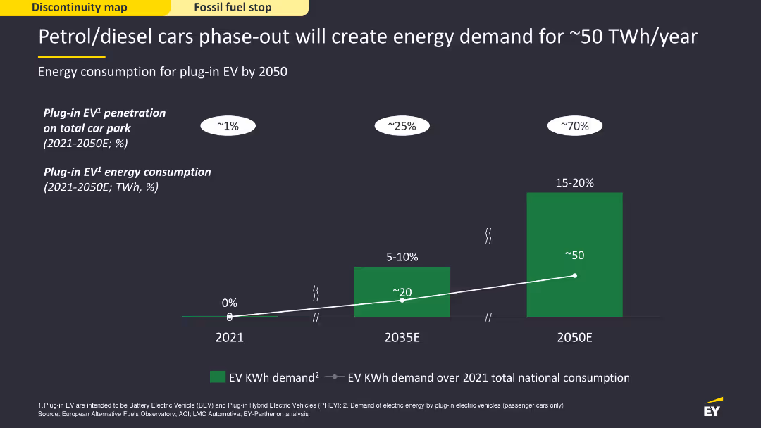
The slide features a column chart showing the projected energy consumption for plug-in electric vehicles (EV) from 2021 to 2050. The chart uses green bars and a dark background to display data clearly, with projections marked for significant future years. The layout is visually simple but informative, focusing on the energy demand increase.
Strategic Planning
Energy & Utilities
The slide forecasts the energy demand created by phasing out petrol/diesel cars, projecting the consumption for plug-in EVs up to 2050. It shows how EV penetration will grow, leading to a significant rise in energy requirements, emphasizing the need for strategic energy planning to accommodate this shift.
EV, energy demand, petrol, diesel, phase-out
Single Chart
EY
Saved
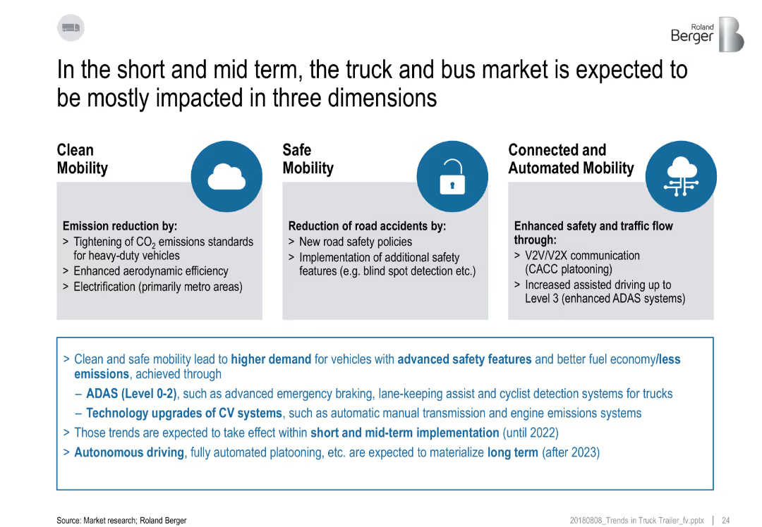
Three-column layout with icons and descriptions under each theme, text box below summarizing implications.
Technology and Digital Transformation
Transportation & Logistics
The slide outlines three key areas—Clean Mobility, Safe Mobility, and Connected/Automated Mobility—that will influence the truck and bus market. It discusses emissions, safety, and automation trends, along with implementation timelines.
clean mobility, ADAS, emissions, automation, safety, connected vehicles
Pillar
Roland Berger
Saved
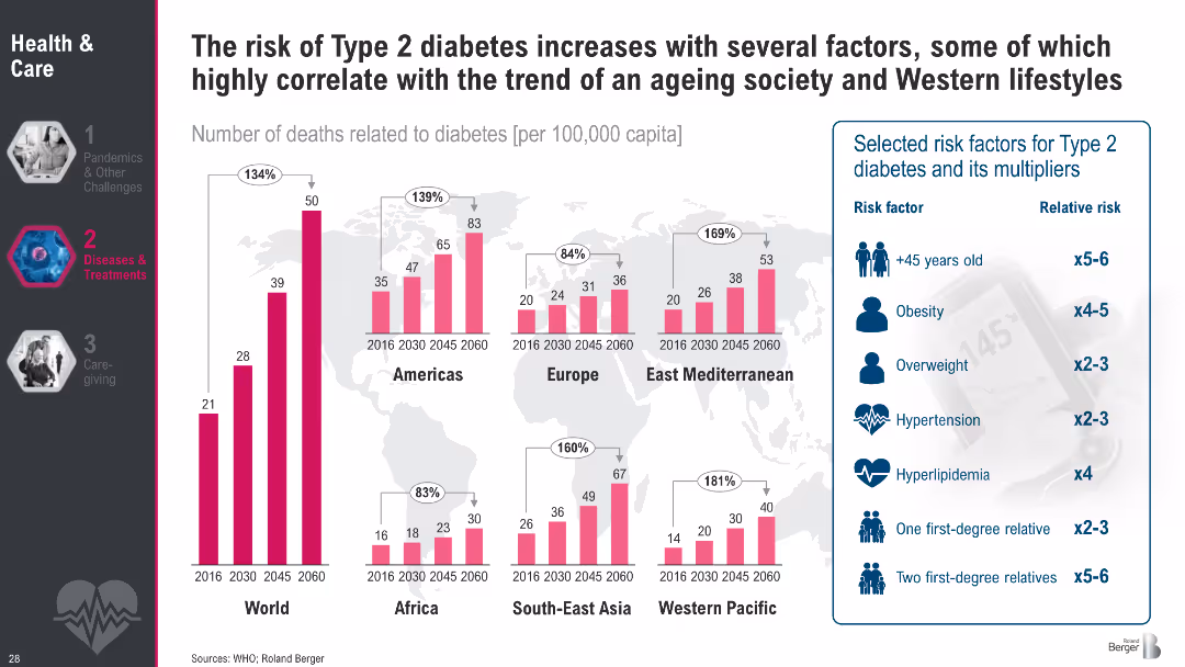
Regional bar charts showing diabetes death rates (2016–2060); sidebar lists key risk factors with relative risks
Risk Assessment and Management
Healthcare & Pharmaceuticals
This slide illustrates the correlation between Type 2 diabetes mortality and contributing risk factors such as age, obesity, and hypertension. It highlights regional trends and emphasizes how modern lifestyles amplify diabetes risk.
Type 2 diabetes, obesity, aging, risk factors, hypertension, mortality, lifestyle diseases, public health, metabolic disorders
Multiple Chart
Roland Berger
Saved
The slide features a diagram illustrating Ipsos's reputation and policy legislation intelligence platform, highlighting data sources, analytics, and actionable alerts.
Technology and Digital Transformation
Technology & Software
It details Ipsos’s AI and advanced analytics platforms, explaining how they help clients sense and respond in real time using various data sources and technologies.
AI, analytics, Ipsos, data, real-time response
Linear Flow
IPSOS
Saved
Contains icons and statistics related to Fintech, Buy Now Pay Later, and the Rental industry, with projected market values and growth rates.
Market Analysis and Trends
Financial Services
Discusses Experian's growth opportunities in various emerging sectors like Fintech and Buy Now Pay Later, highlighting the potential for innovation and market expansion.
Fintech, Buy Now Pay Later, market growth, innovation, Experian
Header Vertical
Barclays
Saved
Left side contains detailed text explaining regulation gaps; right side has a circular chart with 59% indicating AI regulation is lagging behind technology developments.
Regulatory and Compliance
Artificial Intelligence
The slide presents findings that the public believes AI regulation is lagging behind tech advancements. It emphasizes the need for stronger governance and international cooperation. While most believe the UK should lead globally in AI oversight, there's skepticism about achieving this. Public concern over risks and insufficient regulation limits acceptance and adoption of AI technologies.
regulation, AI governance, public concern, international cooperation, UK policy, tech development, compliance
Mixed Chart
IPSOS
Saved
The slide features two column charts side by side. The left chart displays year-on-year house prices for Australia, Sydney, and Melbourne, while the right chart shows auction clearance rates and house prices as a 3-month moving average. It has a moderate level of visual complexity.
Market Analysis and Trends
Real Estate & Construction
The slide analyzes trends in residential real estate prices in Australia, comparing house prices in Australia, Sydney, and Melbourne over time. It also examines auction clearance rates.
Real estate, house prices, auction rates, Australia, Sydney, Melbourne, trends, data analysis
Multiple Chart
JP Morgan
Saved
A text-focused slide that includes icons representing various product categories to show changes in consumer purchasing trends over time, particularly noting an increase in online grocery shopping.
Operational Efficiency
Retail & E-commerce
Details the evolution of first-time digital consumer purchasing patterns, with a recent uptick in online grocery shopping, reflecting the impact of digital transformation and changing consumer preferences.
Digital consumer, shopping trends, online groceries, Southeast Asia, consumer behavior
Header Horizontal
Bain
Saved
This slide features a two-column layout. The left side lists key takeaways in bullet points. The right side contains a column chart detailing economic impacts.
Regulatory and Compliance
Government & Public Sector
Covers the use of Earth Observation for security purposes, benefits of satellite data in surveillance, and economic impacts of such technology in Europe.
Earth Observation, surveillance, satellite data, economic impact, security applications
Mixed Chart
PwC/Strategy&
Saved
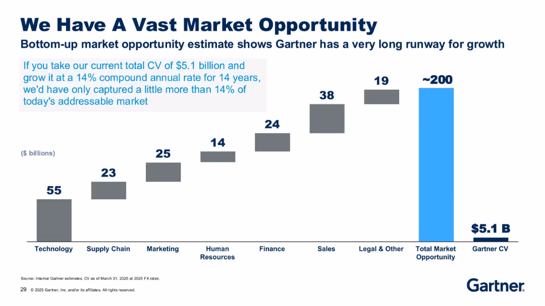
Bar chart with stepped grey bars and one bright blue bar, labeled with market size in billions.
Market Analysis and Trends
Technology & Software
The slide highlights Gartner’s potential market opportunity of ~$200B across several sectors, compared to its current $5.1B CV. It emphasizes the growth potential if Gartner continues growing at a 14% CAGR over 14 years.
market opportunity, CAGR, technology, finance, growth, Gartner, $5.1B, CV, potential, industry size
Single Chart
Gartner
Saved
Previous
Next
If nothing, comes up, please save your slides first
Create a FREE account to continue browsing
Receive Instant Access to 1,000+ slides from companies like McKinsey, Google, and Goldman Sachs
First Name
Last Name
Email
Password
I agree to all
Terms & Privacy Policy
Thank you! Your submission has been received!
Oops! Something went wrong while submitting the form.
Have an account?
Sign in
Column Chart
Heatmap
Chevron
Org Chart
Infographic
Callouts
Timeline
List
Graphic
Picture
Process Flow
Diagram
Paragraph
Map
Table
Framework
Subtitle
Takeaway Box
Icon
Other Chart
Radar Chart
Waterfall Chart
Mekko Chart
Pie Chart
Scatter Plot
Line Chart
Bar chart
Bullet points