My Account
My Slides
Search by Category
Templates
View All Templates
Download Template Slides
✦ AI Search
Feedback
Login
Logout
Get Started
Browse all Slides
Browse all Slides
Create a FREE Account
Instant access to 1,000+ real slides from top companies like McKinsey, BCG, Goldman Sachs, Google and many more!
First Name
Last Name
Email
Password
I agree to all
Terms & Privacy Policy
Thank you! Your submission has been received!
Oops! Something went wrong while submitting the form.
Have an account?
Sign in
Saved Slides
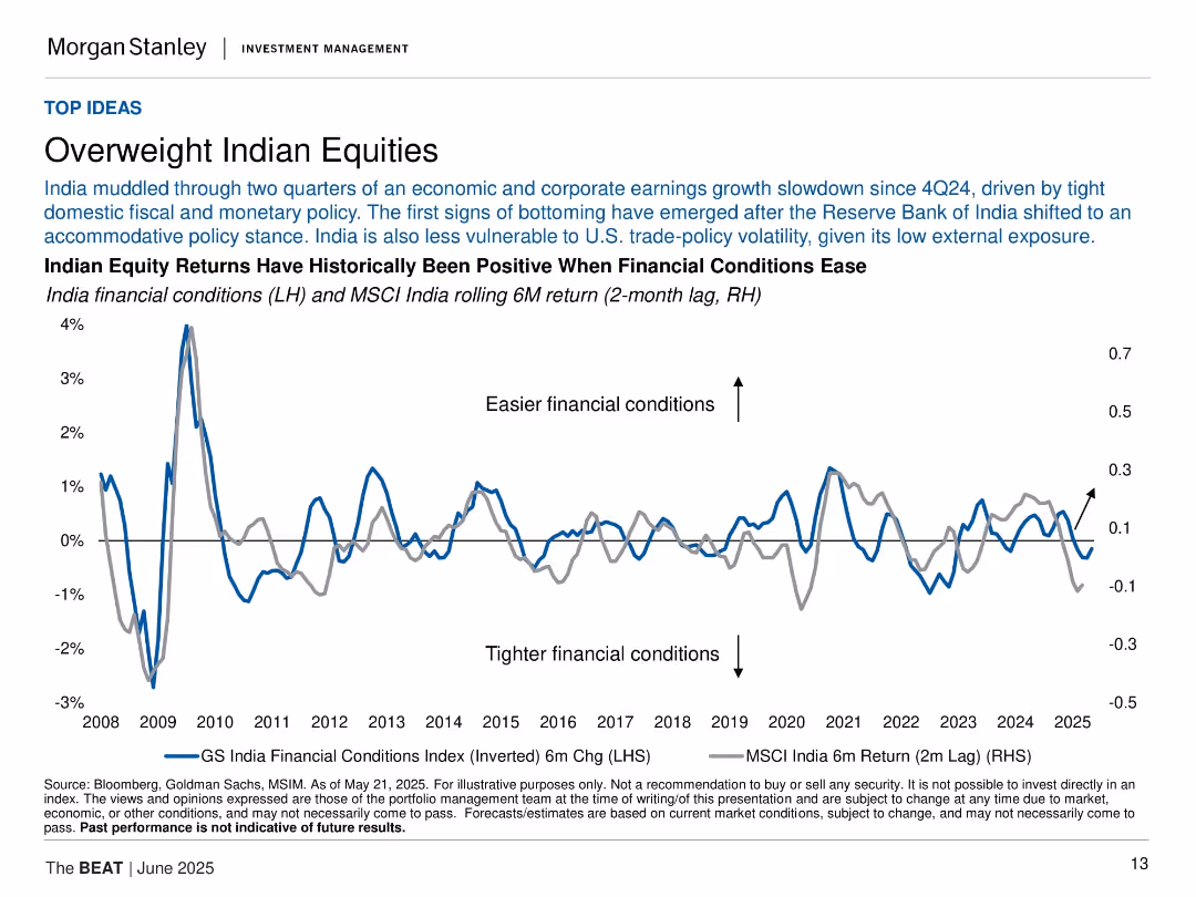
Dual-axis line chart showing India financial conditions and equity returns; minimal layout with focus on trends.
Investment Analysis
Financial Services
This slide supports overweighting Indian equities based on easing financial conditions and accommodative policy by the RBI. A dual-line chart illustrates the historical correlation between financial conditions and equity returns.
Indian equities, financial conditions, RBI, monetary policy, MSCI India, investments, easing, macroeconomic, returns
Single Chart
Morgan Stanley
Saved
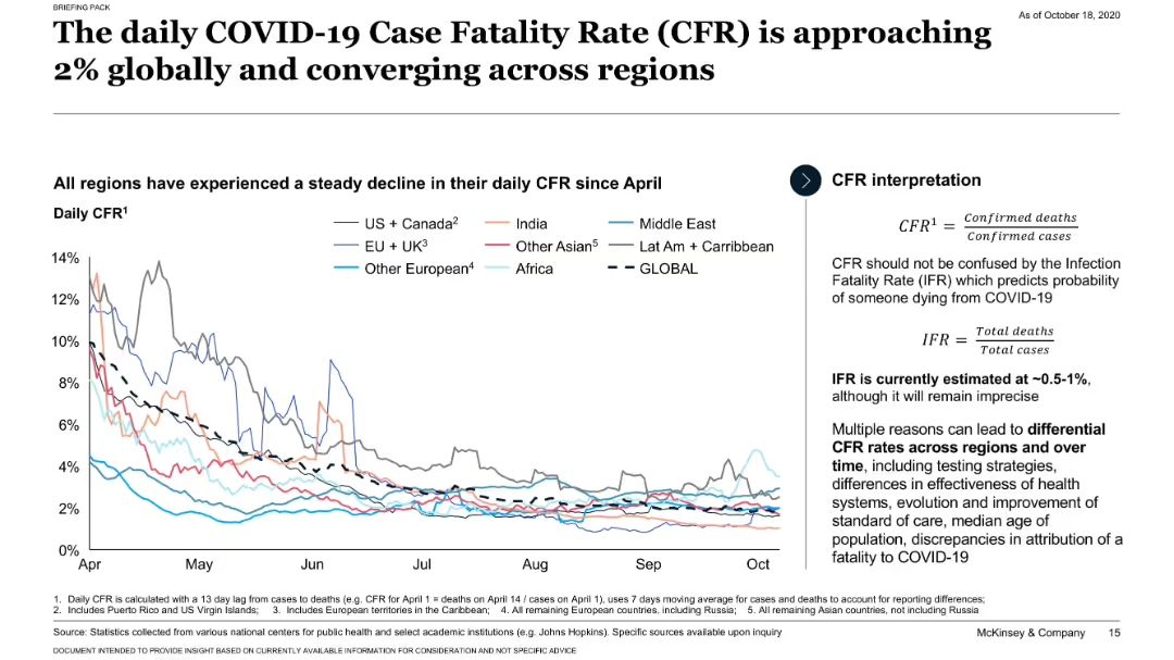
Line chart tracking daily CFR trends globally and by region since April; CFR definitions provided.
Performance Metrics and KPIs
Healthcare & Pharmaceuticals
Shows that the global daily COVID-19 CFR has declined and converged around 2% across regions. Introduces the distinction between CFR and IFR and discusses why CFR may vary.
CFR, global trends, IFR, regional comparison, COVID-19
Mixed Chart
McKinsey
Saved
The slide features a professional setting with individuals in a discussion. The text highlights the need for collaboration and the development of future risk leaders within businesses. It emphasizes the importance of aligning risk management strategies with business goals to foster organizational growth and resilience.
Strategic Planning
Professional Services
This slide discusses the strategic approach to nurturing future leaders in risk management, focusing on integrating risk considerations into broader business strategies and decision-making processes. It advocates for a proactive and integrated approach to risk management as essential for sustainable business growth and competitive advantage in a volatile business environment.
future leaders, risk management, strategic planning, collaboration, business growth, professional, discussion
Mixed Chart
Accenture
Saved
The slide shows a bar chart and tables detailing total revenue breakdown by different business units and revenue types. It presents clear numerical and graphical data.
Financial Performance
Financial Services
It reports the total revenues for the third quarter of 2022, breaking down the contributions from various business segments and revenue sources.
total revenues, financial performance, revenue breakdown, business units, 3Q22
Single Chart
UBS
Saved
This slide is visually dense with a large column chart showing expansion market revenue over time and its CAGR. The chart is complemented by statistical data points and a map outline. Textual content is minimal, focusing on numerical growth representation, making it suitable for audiences interested in financial growth patterns.
Financial Performance
Financial Services
The slide presents a financial overview of a middle market expansion strategy, highlighting the consistent growth in revenue over several years. The visual focus is a column chart depicting rising figures with a target projection, supported by data on clients, loans, and deposits, emphasizing a steady increase in business performance.
middle market, expansion, revenue, growth, clients, CAGR, bankers, financial analysis, loans, deposits
Single Chart
JP Morgan
Saved
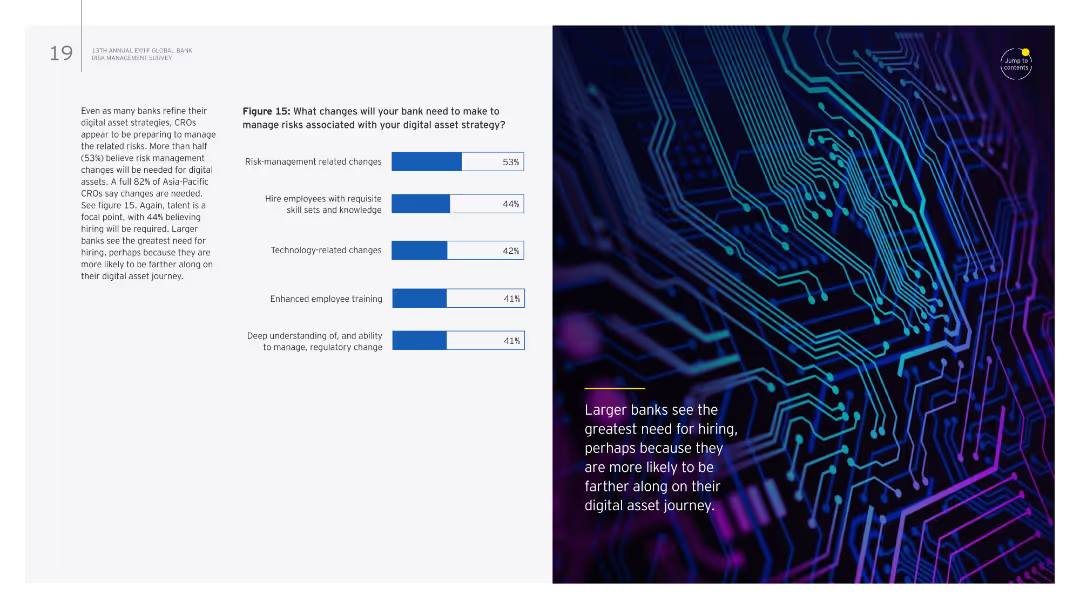
The slide combines text with a column chart on the right. The chart lists changes needed in banks to manage risks associated with digital asset strategies.
Risk Assessment and Management
Financial Services
It details necessary changes for banks to manage digital asset strategy risks, focusing on risk management, hiring, technology, training, and regulatory understanding.
Digital assets, risk management, hiring, technology, training
Mixed Chart
EY
Saved
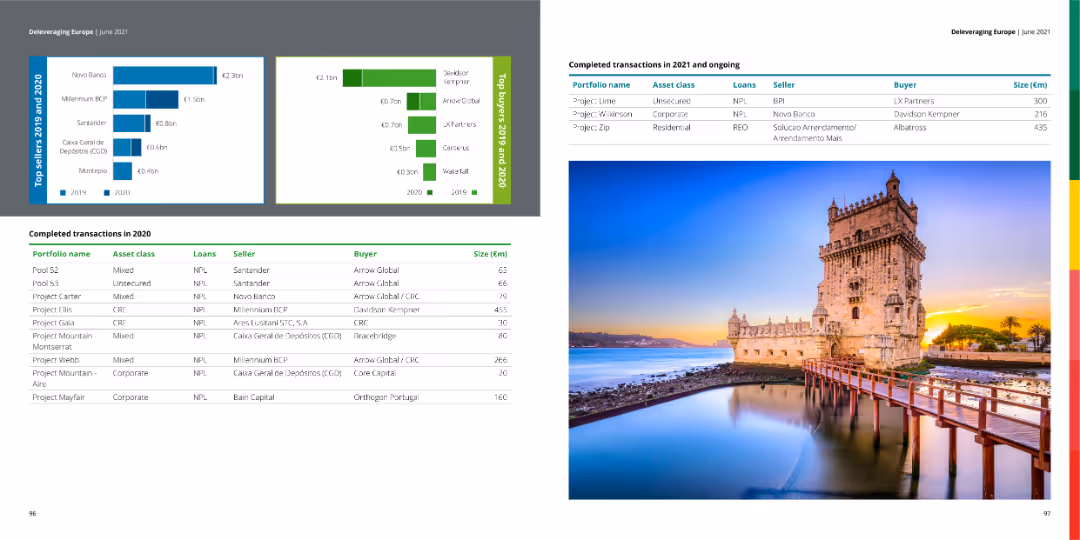
The slide features a table with completed transactions in 2020 and ongoing transactions in 2021, along with bar charts showing top sellers and buyers for 2019 and 2020. The right side contains an image of a historical building.
Market Analysis and Trends
Financial Services
The slide provides a summary of completed and ongoing financial transactions, detailing portfolio names, asset classes, loan types, sellers, buyers, and transaction sizes.
transactions, financial, market, buyers, sellers
Multiple Chart
Deloitte
Saved
Comprehensive tables and lists showing the status of PPP projects in the Philippines by status, sector, and area, with a professional and organized layout.
Operational Efficiency
Government & Public Sector
Provides an overview of public-private partnership projects in the Philippines, detailing their stages, sectors, and geographic distribution.
PPP, projects, Philippines, public-private, government, sectors, distribution
Table
Deloitte
Saved
A bar chart outlines the top macro risk factors for investors, with changes from a previous survey period marked, highlighting interest rates, geopolitical risks, and inflation.
Risk Assessment and Management
Financial Services
Evaluates major macro risk factors considered by investors, with emphasis on how perceptions have shifted over recent periods. Useful for risk management and strategic investment planning.
risks, investors, macro factors, interest rates, inflation
Single Chart
BCG
Saved
Column chart on right showing emission reduction, text with bullet points on the left
Strategic Planning
Environmental Services & Sustainability
Highlights EY's efforts to reduce CO2 emissions from air travel, outlining strategies and goals
Green mobility, CO2 reduction, travel, emissions, EY
Mixed Chart
EY
Saved
The slide features a world map showing bioenergy primary energy demand by continent for 2017 and 2040 under a stated policies scenario. Each continent's demand is displayed in terms of traditional biomass and advanced biomass.
Market Analysis and Trends
Energy & Utilities
This slide presents the primary energy demand for bioenergy by continent, comparing the data from 2017 and projections for 2040, highlighting the contributions of traditional and advanced biomass to the overall energy mix.
bioenergy demand, primary energy, continent, traditional biomass, advanced biomass, 2017, 2040, world map
Multiple Chart
Kearney
Saved
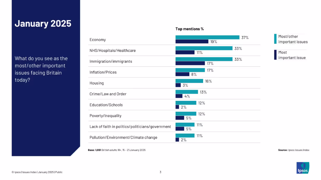
Nearly identical layout to 19473 but adds a dual-color bar split for “most important” vs. “most/other important”
Market Analysis and Trends
Government & Public Sector
This slide expands on the previous one by splitting the responses into two categories: most important and most/other important issues. It visually contrasts how concerns differ in perceived urgency.
top issues, comparison, priorities, Ipsos, public opinion, chart, UK, 2025, concern levels
Mixed Chart
IPSOS
Saved
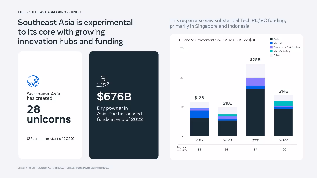
Three-panel layout showing unicorn creation stats, funding availability, and PE/VC investment trends in SEA via bar charts and infographics.
Investment Analysis
Financial Services
Presents SEA as a hub of innovation with 28 unicorns and $676B in dry powder. Highlights rising PE/VC investments (especially in 2021) across tech, medical, transport, and manufacturing sectors, emphasizing Singapore and Indonesia as key recipients.
startups, unicorns, Southeast Asia, PE/VC funding, tech investment, innovation hubs
Mixed Chart
Bain
Saved
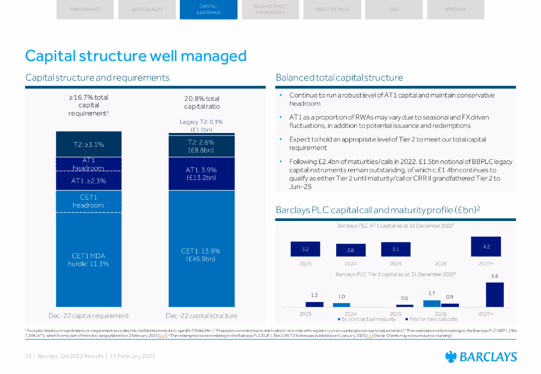
A detailed visual with column charts and text explaining capital structure and requirements, along with maturity profile.
Strategic Planning
Financial Services
Describes Barclays' capital structure, requirements, and balanced total capital structure. Includes maturity profiles and expectations for future capital requirements.
capital structure, requirements, maturity, total capital, planning
Multiple Chart
Barclays
Saved
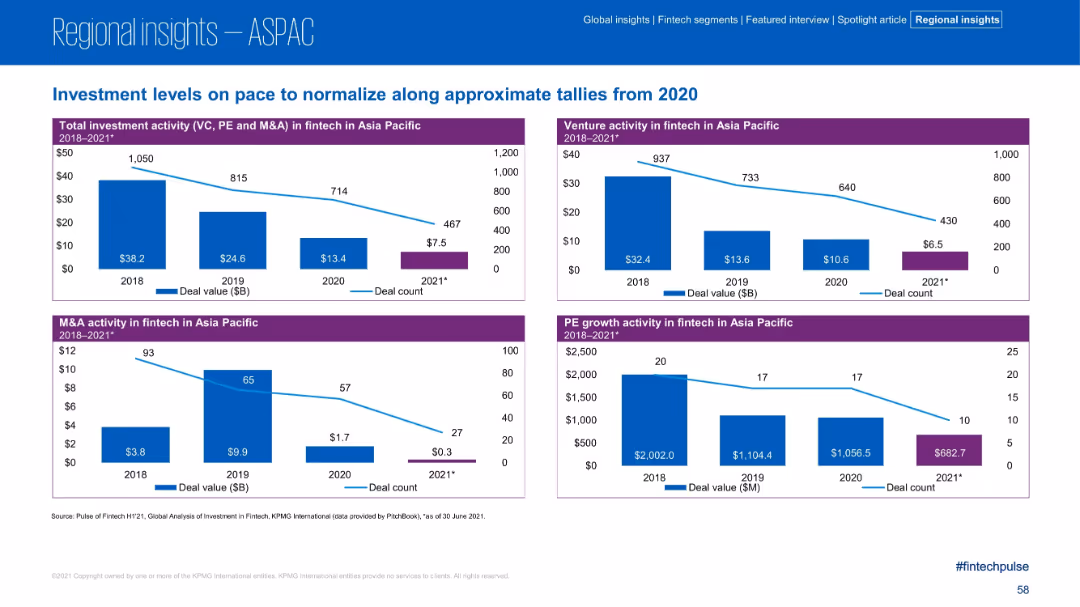
Four-panel bar and line charts comparing deal value and count for VC, PE, and M&A from 2018–2021 in ASPAC.
Market Analysis and Trends
Financial Services
This slide illustrates the decline in fintech investment activity across the Asia Pacific region from 2018 to 2021. Each panel focuses on a different segment—venture, M&A, and PE—with deal value and count both trending downward across the board.
Fintech, Asia Pacific, Investment, Deal Flow, M&A, PE, VC, Trends
Multiple Chart
KPMG
Saved
This slide uses a Venn diagram centered around "Collective action" with segments detailing the roles of "Communities", "Investors", "Governments", and "Businesses". Each segment includes an image and brief descriptive text
Industry Overview
Environmental Services & Sustainability
The slide presents the concept of a sustainable SEA (Southeast Asia), highlighting the necessary individual and collective actions across different societal sectors to achieve sustainability goals.
sustainability, SEA, collective action, governments, businesses
Framework
Bain
Saved
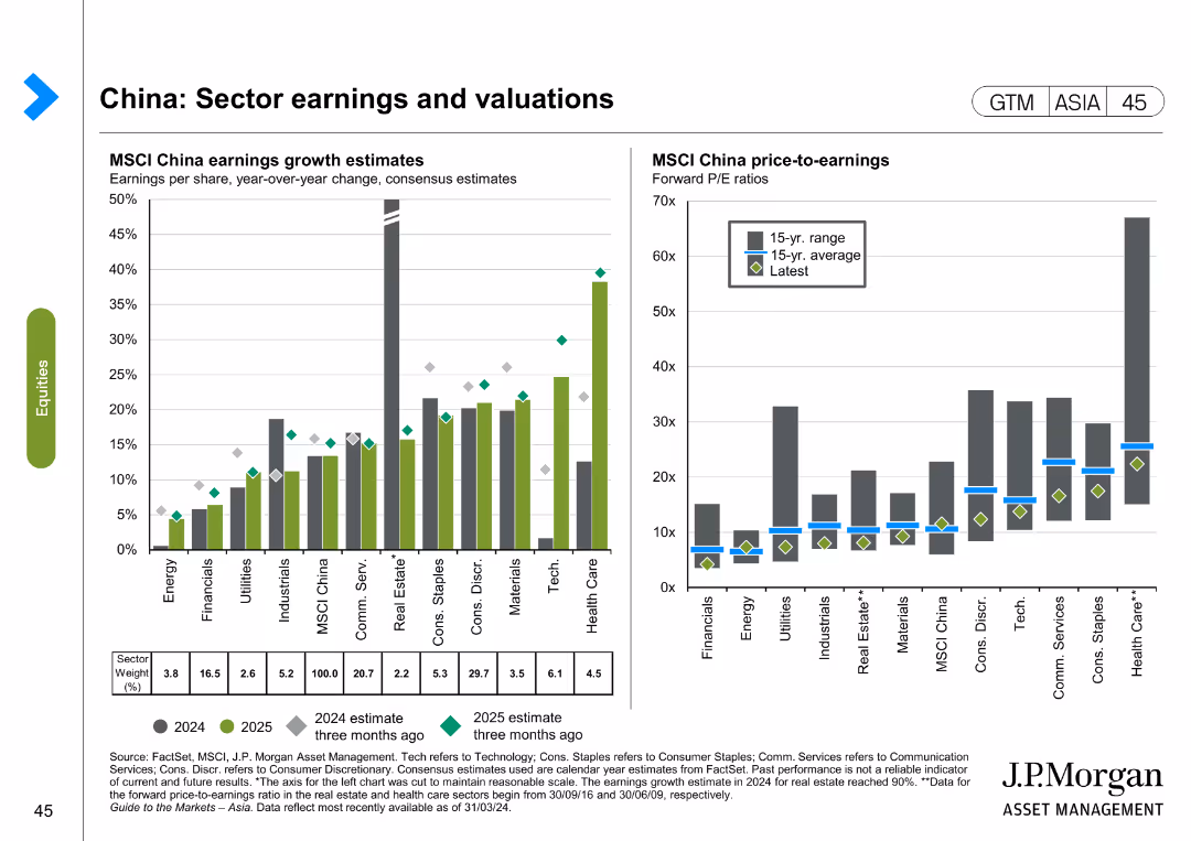
The slide contains two column charts. The left chart shows MSCI China earnings growth estimates by sector for 2024 and 2025, while the right chart shows MSCI China price-to-earnings ratios by sector.
Financial Performance
Financial Services
The slide analyzes sector earnings and valuations in China, focusing on earnings growth estimates and price-to-earnings ratios for different sectors. It is used for financial performance evaluation and investment decision-making.
China, sector earnings, valuations, MSCI, price-to-earnings, financial performance, investment
Multiple Chart
JP Morgan
Saved
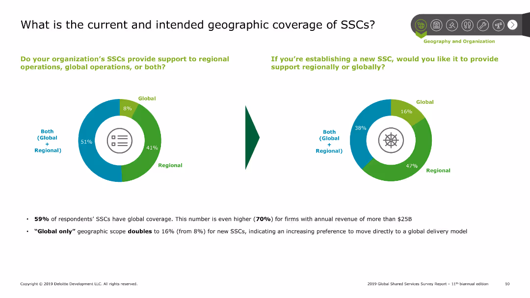
Pie charts showing current and intended geographic coverage of shared services centers (SSCs), with text explaining survey results on global and regional support.
Market Analysis and Trends
Professional Services
Explores the geographic scope of shared services centers, indicating a preference for both regional and global support among survey respondents, along with future intentions.
SSCs, geographic, coverage, global, regional
Multiple Chart
Deloitte
Saved
Column chart showing the percentage of organizations currently using API management solutions, those planning to use, and those with no plans. The majority currently use API management solutions.
Operational Efficiency
Technology & Software
The slide presents statistics on the adoption of API management solutions by organizations, indicating that over two-thirds currently use these solutions, with a smaller percentage planning to adopt them in the future.
API management, adoption, organizations, statistics
Single Chart
Gartner
Saved
This slide includes a map of Australia showing grain production regions and a list of major crops with percentages of total production.
Industry Overview
Agriculture & Food Production
The slide provides an overview of grain production in Australia, emphasizing that wheat is the predominant crop and detailing the production regions and other major crops.
Wheat, Grain, Production, Australia, Crops
Graphic
LEK
Saved
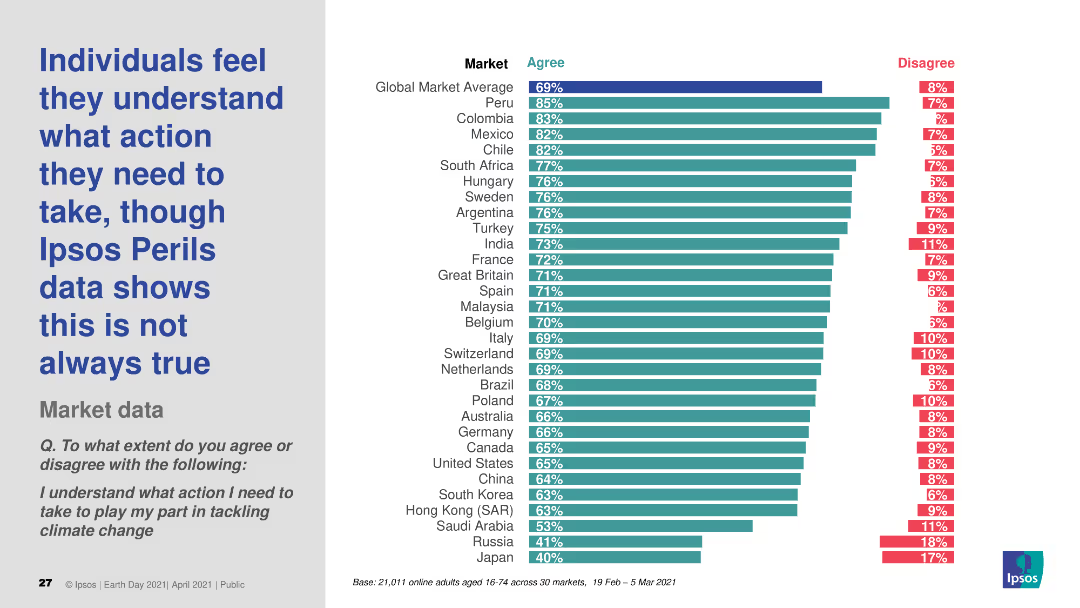
The slide presents a column chart showing the percentage of individuals who agree or disagree with the statement about understanding actions needed to tackle climate change. The chart has two colors for "Agree" and "Disagree."
Risk Assessment and Management
Environmental Services & Sustainability
The slide displays survey data on the perception of understanding actions required for tackling climate change, comparing agreement and disagreement across various global markets.
climate change, perception, understanding, survey, actions
Multiple Chart
IPSOS
Saved
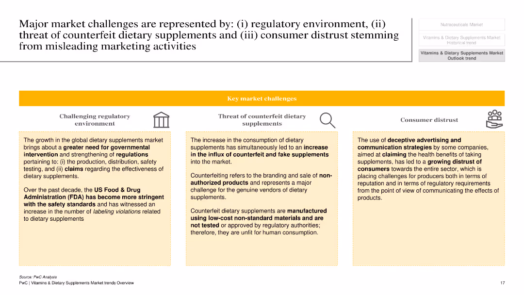
The slide is divided into three sections with icons and text blocks under each section: challenging regulatory environment, threat of counterfeit dietary supplements, and consumer distrust. Each section is highlighted with a yellow banner and corresponding icons.
Risk Assessment and Management
Healthcare & Pharmaceuticals
The slide discusses major challenges in the dietary supplements market, including regulatory hurdles, the threat of counterfeit products, and consumer distrust due to misleading marketing activities. It explains how these challenges impact the industry and emphasizes the need for better regulations and consumer protection.
regulatory challenges, counterfeit supplements, consumer distrust, dietary supplements, market risks
Pillar
PwC/Strategy&
Saved
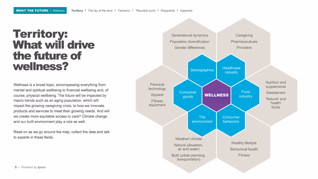
This slide contains a hexagonal diagram with 'Wellness' at the center, surrounded by key drivers such as demographics, healthcare industry, consumer goods, and the environment.
Strategic Planning
Healthcare & Pharmaceuticals
The slide outlines the various factors that will shape the future of wellness, including demographic shifts, technological advancements, and environmental factors. It sets the stage for a discussion on wellness trends.
Wellness, future trends, demographics, healthcare, environment
Diagram
IPSOS
Saved
This slide contains two column charts showing the growth of branch count and deposits per branch from 2017 to 2022, with comparative data points.
Operational Efficiency
Financial Services
Highlights the growth strategy of the branch network with data on branch counts and deposit per branch, indicating operational expansion and optimization.
branch growth, deposits, network optimization, banking, financial services, CAGR, market expansion, operational efficiency, Chase
Multiple Chart
JP Morgan
Saved
Features a stacked bar chart detailing the age of the smartphone user base over several years.
Market Analysis and Trends
Telecommunications
Reviews trends in smartphone durability and the increasing lifespan of smartphones due to less frequent upgrades.
smartphone durability, upgrade frequency, device lifespan, consumer behavior, technology trends
Mixed Chart
Deloitte
Saved
Previous
Next
If nothing, comes up, please save your slides first
Create a FREE account to continue browsing
Receive Instant Access to 1,000+ slides from companies like McKinsey, Google, and Goldman Sachs
First Name
Last Name
Email
Password
I agree to all
Terms & Privacy Policy
Thank you! Your submission has been received!
Oops! Something went wrong while submitting the form.
Have an account?
Sign in
Column Chart
Heatmap
Chevron
Org Chart
Infographic
Callouts
Timeline
List
Graphic
Picture
Process Flow
Diagram
Paragraph
Map
Table
Framework
Subtitle
Takeaway Box
Icon
Other Chart
Radar Chart
Waterfall Chart
Mekko Chart
Pie Chart
Scatter Plot
Line Chart
Bar chart
Bullet points