My Account
My Slides
Search by Category
Templates
View All Templates
Download Template Slides
✦ AI Search
Feedback
Login
Logout
Get Started
Browse all Slides
Browse all Slides
Create a FREE Account
Instant access to 1,000+ real slides from top companies like McKinsey, BCG, Goldman Sachs, Google and many more!
First Name
Last Name
Email
Password
I agree to all
Terms & Privacy Policy
Thank you! Your submission has been received!
Oops! Something went wrong while submitting the form.
Have an account?
Sign in
Saved Slides
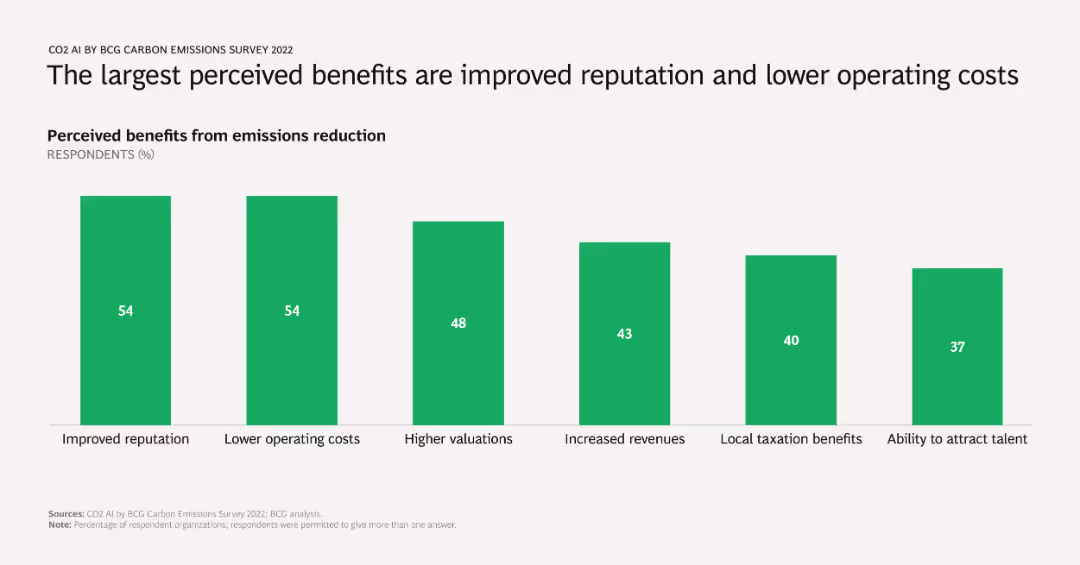
A column chart showing percentages of respondents citing various benefits from emissions reduction, including improved reputation, lower operating costs, higher valuations, increased revenues, local taxation benefits, and talent attraction.
Market Analysis and Trends
Environmental Services & Sustainability
Identifies and quantifies the primary benefits companies perceive from reducing emissions, emphasizing reputational and financial gains. Useful for advocating emissions reduction strategies to stakeholders.
benefits, emissions reduction, reputation, operating costs, survey results
Single Chart
BCG
Saved
Multiple column charts showing year-to-date (YTD) performance metrics for the S&P 500 Index, including earnings growth, P/E, ROE, market cap, beta, and dividend yield.
Financial Performance
Financial Services
This slide offers a YTD analysis of the S&P 500 Index, presenting various performance metrics to give a clear picture of financial performance over the year.
S&P 500, YTD, performance, metrics, analysis
Multiple Chart
Morgan Stanley
Saved
The slide includes several column charts comparing revenue, net income, capital, ROE, and overhead ratio from 2011 to 2021 across various banking sectors. It also features demographic data and global presence details.
Financial Performance
Financial Services
This slide showcases JP Morgan's growth in financial metrics like revenue, net income, and capital, alongside ROE and overhead ratios over ten years. It illustrates the expansion and market dominance of the CIB franchise globally, highlighting their extensive reach and efficiency in serving top global businesses.
revenue, capital, global, ROE, banking
Multiple Chart
JP Morgan
Saved
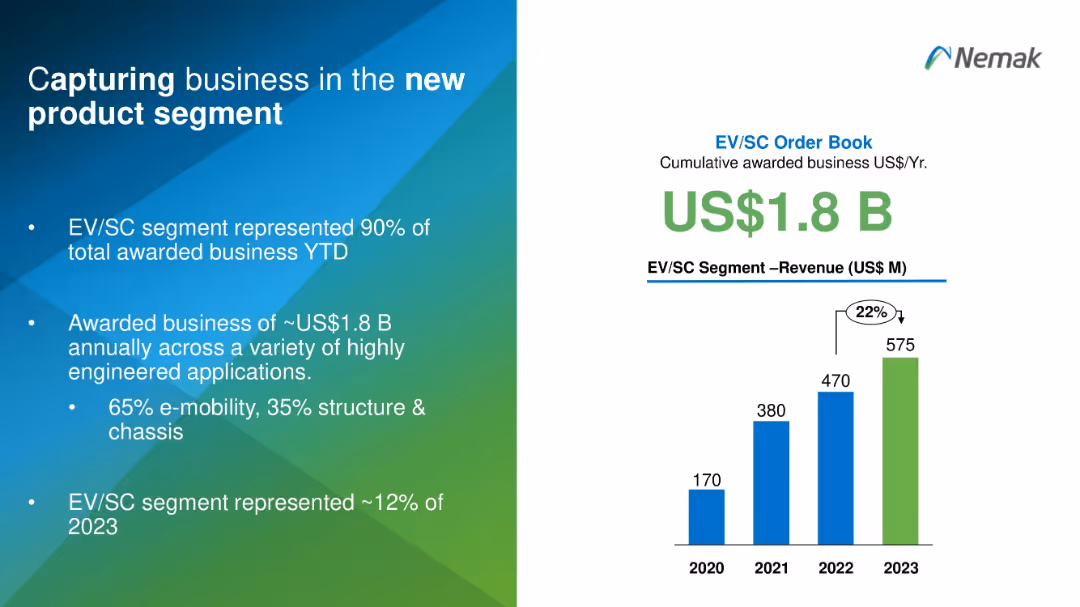
Split design with text on the left and a vertical bar chart on the right in blue and green gradients.
Sales and Business Development
Industrial & Manufacturing
This slide highlights Nemak's success in securing US$1.8B in EV/SC business, representing 90% of total awarded projects. It shows revenue growth from 2020 to 2023 and emphasizes Nemak's diversification into high-tech engineered applications, especially in e-mobility.
EV, product segment, revenue, business capture, e-mobility, engineering
Mixed Chart
Barclays
Saved
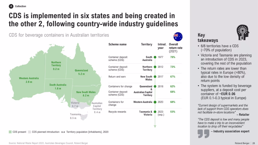
Australia map with CDS presence by state, table of schemes and return rates, and a list of key takeaways
Regulatory and Compliance
Environmental Services & Sustainability
This slide presents a national overview of CDS adoption across Australian territories, including return rates, scheme names, and timelines. It notes that Victoria and Tasmania will close remaining gaps, while explaining reasons for lower return rates vs. Europe.
CDS implementation, Australia map, recycling policy, return rates, state programs, container scheme, beverage recycling
Mixed Chart
Roland Berger
Saved
Features a line graph showing the projected levelized cost of energy for green hydrogen across three macro-zones in Chile until 2025.
Market Analysis and Trends
Energy & Utilities
Projects the decreasing costs of green hydrogen production in Chile's northern and southern zones, highlighting the competitive and uncompetitive regions.
Chile, hydrogen, cost analysis, LCOE, competitive zones, 2020-2025
Mixed Chart
McKinsey
Saved
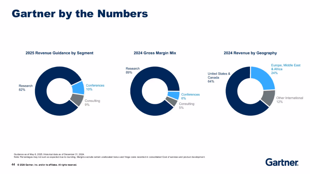
Three donut charts showing revenue by segment (2025), margin mix (2024), and revenue by geography (2024).
Strategic Planning
Technology & Software
This slide provides a high-level financial snapshot, showing the dominance of Research in revenue and margin mix, as well as U.S. and Canada as the major revenue sources. It illustrates Gartner’s business composition by segment/geography.
research, revenue mix, consulting, conferences, gross margin, geography, segment split, 2024, 2025
Single Chart
Gartner
Saved
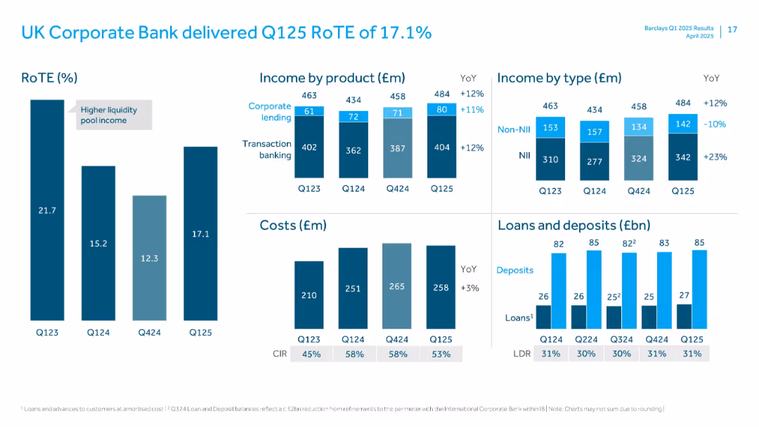
Grids of bar charts showing RoTE, income breakdown, cost structure, and loan/deposit values with LDR.
Financial Performance
Financial Services
Reviews performance of UK Corporate Bank, with RoTE of 17.1%. Includes income by product and type, cost evolution, and loans/deposits metrics. Notes YoY growth in income and marginal increase in cost base.
RoTE, Corporate Bank, Transaction Banking, Lending, Income, LDR, Deposits, NII, Q125
Multiple Chart
Barclays
Saved
Basic visual complexity, contrasting textual information with a relatable image.
Strategic Planning
Professional Services
Discusses the need for businesses to adapt to changes and disruptions, hinting at strategies for maintaining competitiveness and relevance.
business strategy, adaptability, global trends, disruptions
Mixed Chart
Bain
Saved
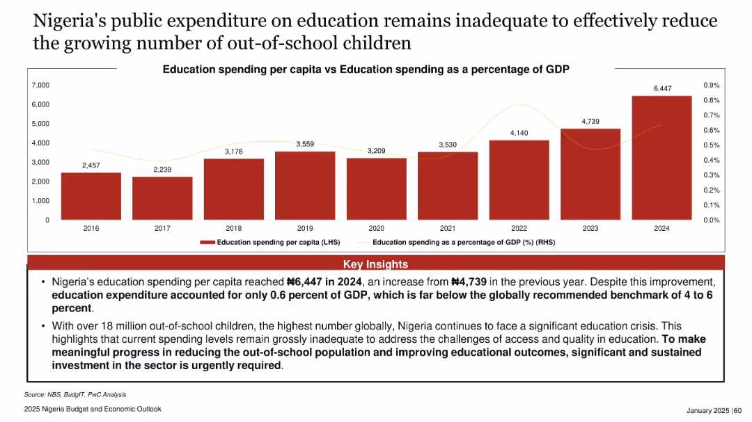
Bar chart showing education spending per capita (2016–2024) and line showing percentage of GDP. Red theme with emphasis on key insights.
Regulatory and Compliance
Education & Training
The slide criticizes Nigeria’s education funding, showing low per capita spending and GDP share. Despite increases, the current levels are far below global benchmarks. With 18 million out-of-school children, major investment is urgently needed.
education, spending, GDP, Nigeria, out-of-school children, budget, policy, 2024 data
Mixed Chart
PwC/Strategy&
Saved
Diagram with strategic business units around a central circle named 'Goldman Sachs' with dashed lines pointing to partner logos.
Investment Analysis
Technology & Software
Explores Goldman Sachs' business segments and strategic partnerships with tech companies like GitLab and Pensando.
innovation, Goldman Sachs, partnerships, business segments, tech companies, GitLab, Pensando
Framework
Goldman Sachs
Saved
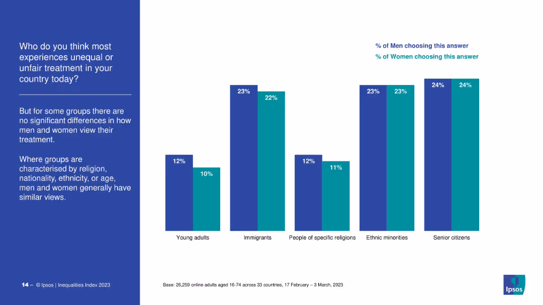
Bar chart showing percentage agreement from men and women on discrimination against different groups (e.g., young adults, immigrants, ethnic minorities), with minimal gender variation. Left-aligned text block summarizing observations.
Market Analysis and Trends
Government & Public Sector
The slide highlights that for categories related to religion, ethnicity, nationality, or age, both men and women largely agree on the presence of unfair treatment. This contrasts with earlier slides showing gender differences in perception for other marginalized groups.
ethnicity, religion, immigrants, consensus, public opinion, inequality, discrimination, survey, Ipsos
Mixed Chart
IPSOS
Saved
Contains icons and short text sections outlining strategies for future readiness.
Strategic Planning
Financial Services
Details five critical strategies for wealth management firms to stay competitive in the digital era.
wealth management, strategies, future readiness, competitive, financial services
Linear Flow
Deloitte
Saved
Features a world map highlighting the top five carbon-emitting countries, using color coding and percentages to show the proportion of emissions each country contributes.
Regulatory and Compliance
Environmental Services & Sustainability
Analyzes the carbon emission contributions of the top five countries, highlighting the significant role of major economies in global emissions. Useful for discussions on international cooperation and policy-making for emission reduction.
Carbon emissions, Countries, Global share, Climate policy
Multiple Chart
BCG
Saved
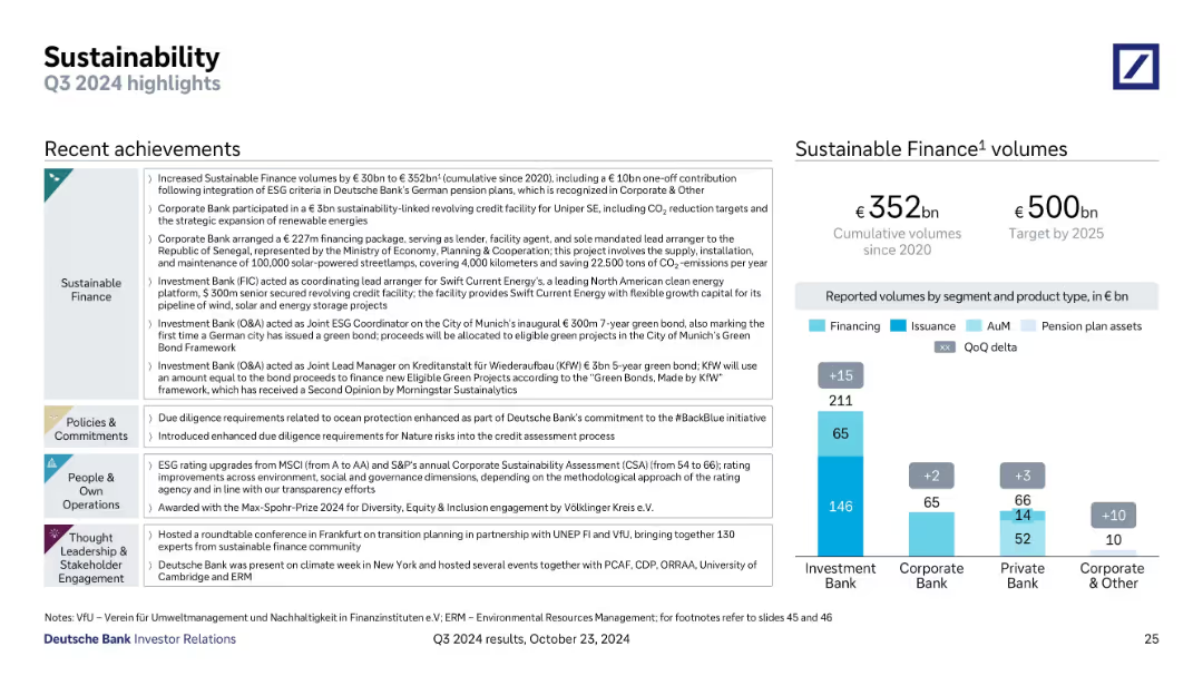
Two-part layout with bullet points of recent ESG achievements on the left and a bar chart on the right showing Sustainable Finance volumes by bank segment and type.
Regulatory and Compliance
Financial Services
Deutsche Bank reports sustainable finance progress, with €352bn cumulative volumes and a €500bn target by 2025. The slide showcases major deals, green bond arrangements, ESG ratings, and thought leadership activities. Volumes are segmented by bank division and asset type.
ESG, sustainable finance, green bond, volumes, CSR, climate, ESG ratings
Mixed Chart
Deutsche Bank
Saved
Bubble chart organized by sector activities like 'Manage' and 'Expertise' with color-coded bubbles representing different sectors and their automation potential.
Strategic Planning
Industrial & Manufacturing
Evaluates the automation potential across various sectors, identifying sectors like manufacturing and agriculture with high potential for automation based on current technology capabilities.
Sectors, Automation Potential, Technology, Manufacturing, Agriculture
Multiple Chart
McKinsey
Saved
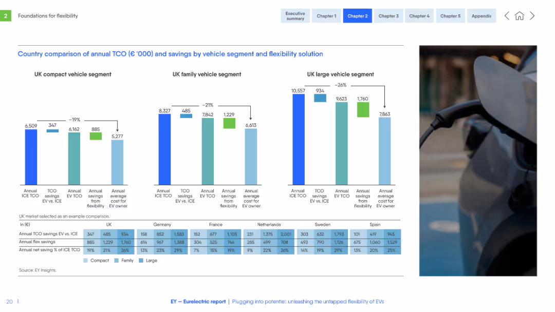
Three side-by-side bar charts for vehicle segments (compact, family, large), with data table below. Consistent color scheme and structured layout.
Financial Performance
Transportation & Logistics
Compares total cost of ownership (TCO) for EVs vs. ICE vehicles in several EU countries across vehicle segments. Shows cost savings from EV flexibility solutions and identifies where EVs are most financially advantageous.
TCO, EV vs ICE, flexibility savings, vehicle segment, Europe, cost analysis, compact, family, large
Multiple Chart
EY
Saved
Column charts detailing growth in stable financing income.
Financial Performance
Financial Services
Focuses on scaling stable financing income and includes targets for upcoming years.
Financial Stability, Income Growth, Financing, Targets, Projections
Mixed Chart
Barclays
Saved
The slide contains two column charts. The upper chart shows PE/VC exit values in US$m against the number of exits from Jan-22 to Jan-23. The lower chart breaks down PE/VC exits across asset classes within the same period. The slide uses green, orange, and blue colors to differentiate data segments.
Market Analysis and Trends
Financial Services
The slide provides a monthly breakdown of Private Equity and Venture Capital (PE/VC) exits from January 2022 to January 2023. It shows both the total value of exits and the number of exits. Additionally, it splits the PE/VC exits across different asset classes, giving a detailed view of market trends and performance.
PE/VC, exits, asset classes, monthly trends, financial data, value, number, breakdown, market trends, performance
Multiple Chart
EY
Saved
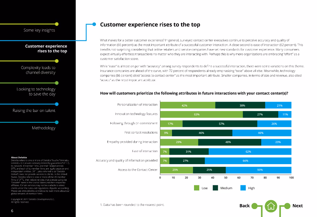
The slide has a two-column layout with text on the left and a horizontal bar chart on the right. There is moderate text density.
Market Analysis and Trends
Professional Services
The slide discusses the importance of customer experience in contact centers, highlighting attributes like ease, accuracy, and access.
Customer experience, Contact centers, Customer satisfaction, Service quality, Ease of interaction, Accuracy, Access, Personalization
Mixed Chart
Deloitte
Saved
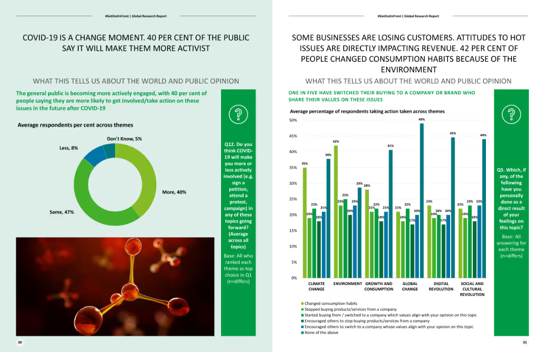
Includes a pie chart showing the distribution of expected future activism levels post-COVID-19 and a column chart on changes in consumption habits due to environmental concerns.
Risk Assessment and Management
Healthcare & Pharmaceuticals
Analyzes the impact of COVID-19 on future activism, illustrating how public sentiment towards activism has increased and affected consumer behavior.
COVID-19 impact, activism, consumer behavior, environmental concerns, future trends
Multiple Chart
Deloitte
Saved
This slide uses a scatter plot to compare various global cities on scales of density and city structure, categorizing them as monocentric or polycentric.
Risk Assessment and Management
Transportation & Logistics
Analyzes how the urban structure and density of different cities influence their vulnerability to transportation-related threats.
urban planning, transportation, city, density, threat level, global, analysis, risk management
Mixed Chart
BCG
Saved
A column chart showing the top marketing objectives for the next year, ranked by importance. The chart uses circles of varying sizes to represent different objectives like brand awareness, customer retention, and advocacy.
Market Analysis and Trends
Media & Entertainment
This slide identifies the top marketing objectives for the next year, with brand awareness being the most important. It highlights the relative importance of other objectives like customer retention and advocacy in different regions.
Objectives, Marketing, Awareness, Retention, Advocacy
Mixed Chart
Nielsen
Saved
This slide contains a column chart showing cement production and imports over time, along with bullet points summarizing key trends and statistics.
Market Analysis and Trends
Industrial & Manufacturing
Provides an analysis of the Australian cement industry's reliance on imports. Highlights trends in production and import levels, the impact of infrastructure projects, and future market growth projections.
Cement, imports, production, market trends, Australia
Mixed Chart
LEK
Saved
Column chart displaying asset and liability composition. Layout is clean, with each chart and graph clearly labeled.
Financial Performance
Financial Services
Overview of company's assets and liabilities at the end of the year, useful for financial analysis and understanding company structure.
assets, liabilities, financial stability, balance sheet, equity
Multiple Chart
Deutsche Bank
Saved
Previous
Next
If nothing, comes up, please save your slides first
Create a FREE account to continue browsing
Receive Instant Access to 1,000+ slides from companies like McKinsey, Google, and Goldman Sachs
First Name
Last Name
Email
Password
I agree to all
Terms & Privacy Policy
Thank you! Your submission has been received!
Oops! Something went wrong while submitting the form.
Have an account?
Sign in
Column Chart
Heatmap
Chevron
Org Chart
Infographic
Callouts
Timeline
List
Graphic
Picture
Process Flow
Diagram
Paragraph
Map
Table
Framework
Subtitle
Takeaway Box
Icon
Other Chart
Radar Chart
Waterfall Chart
Mekko Chart
Pie Chart
Scatter Plot
Line Chart
Bar chart
Bullet points