My Account
My Slides
Search by Category
Templates
View All Templates
Download Template Slides
✦ AI Search
Feedback
Login
Logout
Get Started
Browse all Slides
Browse all Slides
Create a FREE Account
Instant access to 1,000+ real slides from top companies like McKinsey, BCG, Goldman Sachs, Google and many more!
First Name
Last Name
Email
Password
I agree to all
Terms & Privacy Policy
Thank you! Your submission has been received!
Oops! Something went wrong while submitting the form.
Have an account?
Sign in
Saved Slides
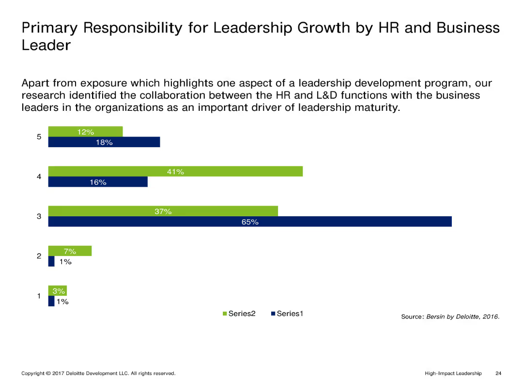
This slide features a vertical column chart with two series of data, each series represented by different colors (blue and green). The columns indicate the percentage responsibility of HR and business leaders in leadership growth.
Market Analysis and Trends
Professional Services
The slide compares the responsibility for leadership growth between HR and business leaders. The chart highlights the significant collaboration between these functions as a crucial factor for leadership maturity.
Leadership, Growth, HR, Business Leaders, Collaboration
Single Chart
Deloitte
Saved
The slide contains a timeline showing changes in ownership among major companies handling Australian grain, with different colored bars for handlers, marketers, and port operators.
Competitive Landscape
Agriculture & Food Production
This slide presents a timeline of the grain industry’s changes over ten years, highlighting consolidation among bulk handlers and new market entrants in rail and ports.
Grain, Industry, Timeline, Consolidation, Ownership
Diagram
LEK
Saved
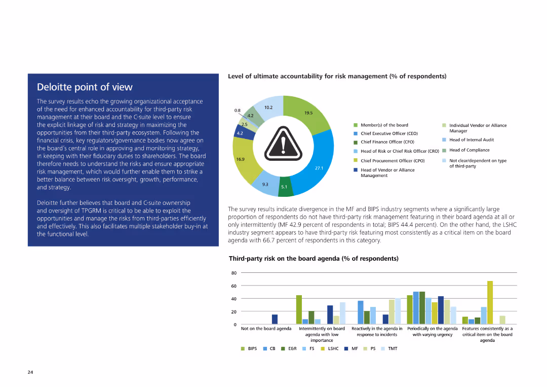
The slide includes a pie chart showing levels of ultimate accountability for risk management and a text box with Deloitte's analysis on the right.
Strategic Planning
Professional Services
The slide discusses survey results about organizational acceptance of third-party risk management accountability at the board and C-suite levels, emphasizing strategic opportunities.
Third-party risk management, accountability, Deloitte, board level, C-suite, strategic opportunities
Multiple Chart
Deloitte
Saved
Contains column charts comparing traditional and digital sales interactions among B2B decision-makers.
Technology and Digital Transformation
Technology & Software
Examines the rise in digital sales channels, highlighting consumer and business preferences for digital interactions over traditional methods during the COVID-19 pandemic.
Digital Adoption, B2B, Sales, COVID-19, Trends
Multiple Chart
McKinsey
Saved
Visualizes NYC construction permit changes with a column chart and future recovery projections with a dotted line chart, showing both immediate impacts and recovery outlook.
Market Analysis and Trends
Real Estate & Construction
Evaluates the impact of the pandemic on the construction industry, showing immediate declines in activity and projections for recovery, emphasizing the slower than average rebound.
construction, pandemic, NYC, permits, recovery projections, bar chart, line chart
Multiple Chart
BCG
Saved
The slide features a column chart comparing 'Efficiency Ratio' for 2023 YTD and 2022 YTD, alongside a comprehensive table detailing financial expenses in various categories such as compensation, transaction-based fees, and total operating expenses with percentage changes from the previous year.
Financial Performance
Financial Services
This slide analyzes financial expenses, showing year-on-year and year-to-date comparisons. It includes insights on significant changes in non-compensation expenses and the impact of taxes on earnings, aimed at providing a snapshot of financial health and operational efficiency.
Expenses, Financial Analysis, Efficiency Ratio, Depreciation, Compensation, Year-to-Year Comparison, Taxes, Operating Expenses
Mixed Chart
Goldman Sachs
Saved
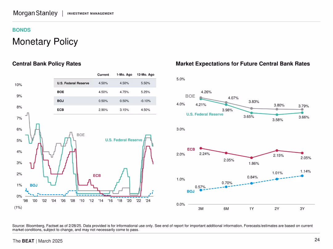
Split-screen format with two sections: left shows historical central bank policy rates (line chart), right shows market expectations for future rates (line forecast). Four banks (Fed, BOE, BOJ, ECB) tracked.
Market Analysis and Trends
Financial Services
This slide tracks and projects policy rates from major central banks. It illustrates rate cuts or pauses across the ECB, Fed, BOJ, and BOE, signaling easing monetary policy ahead. The content informs interest rate expectations impacting bond and equity valuations.
monetary policy, central banks, rate forecasts, ECB, Fed, BOE, BOJ, interest rates, macroeconomic outlook, policy changes
Multiple Chart
Morgan Stanley
Saved
This slide has a column chart showing the potential CO2 capture capacity of current announced projects compared to the IEA SDS objectives by 2030. The gap is highlighted in red for emphasis.
Market Analysis and Trends
Energy & Utilities
The slide reveals that current CCUS projects are insufficient to meet the net-zero targets, indicating that the pipeline of projects needs to increase significantly to close the gap by 2030.
CCUS, net zero, CO2 capture, project pipeline, IEA objectives
Multiple Chart
Kearney
Saved
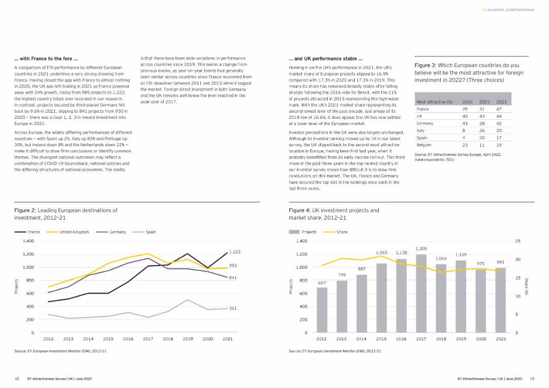
A combination of text and line graphs showing the performance of different European countries.
Market Analysis and Trends
Financial Services
The slide compares FDI performance among European countries, focusing on France's strong showing in 2021 and the UK's steady performance. It includes graphs depicting investment project numbers and market share over time.
Europe, FDI, France, UK, Market Share
Multiple Chart
EY
Saved
Includes column chart and a graph showcasing market size and growth, with a clean and structured layout that uses shades of blue and green to highlight key figures.
Market Analysis and Trends
Financial Services
The slide presents the market opportunity for Goldman Sachs' transaction banking, outlining current performance and future growth targets. It is useful for investor briefings or strategic presentations focusing on long-term market opportunities.
transaction banking, growth opportunity, Goldman Sachs, market size, clients, deposits
Mixed Chart
Goldman Sachs
Saved
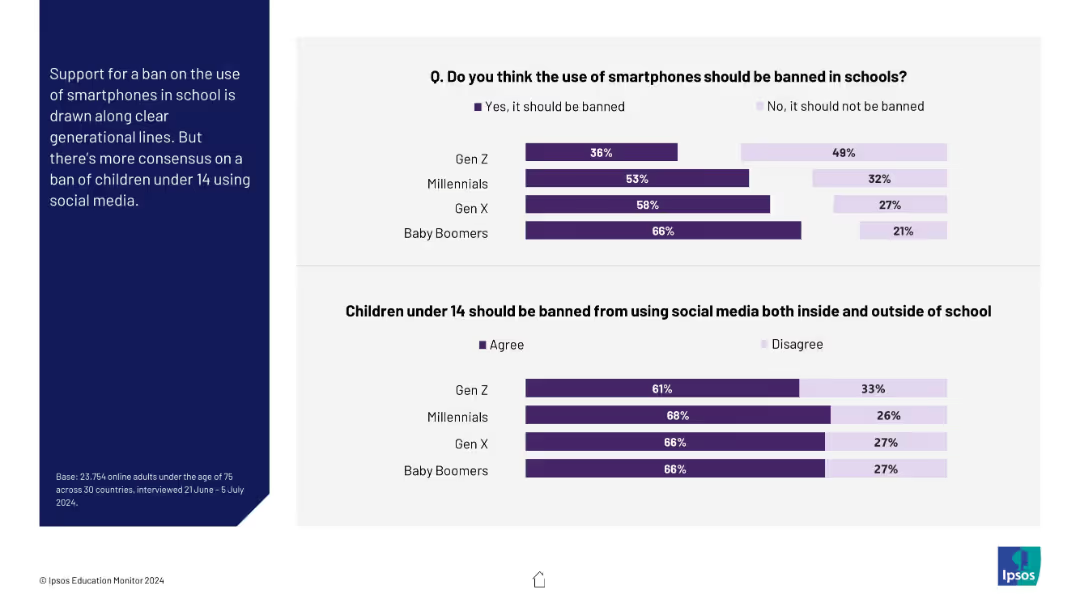
Two horizontal bar charts comparing generational views on smartphone bans and under-14 social media bans
Market Analysis and Trends
Education & Training
This slide examines generational differences in support for banning smartphones in school and children under 14 from using social media. Older generations (especially Boomers) are more supportive of restrictions.
generations, Gen Z, Baby Boomers, smartphone ban, social media, children, education
Mixed Chart
IPSOS
Saved
Slide contains column chart and data points representing financial performance metrics for FY23.
Financial Performance
Financial Services
Detailed annual financial performance review of FY23, focusing on key metrics such as RoTE, income, and costs, beneficial for financial analysis and shareholder reports.
financial, performance, RoTE, income, costs
Mixed Chart
Barclays
Saved
The slide features a column chart with five vertical bars representing different financial metrics from 4Q19 to 1Q20, showing an 8% increase overall.
Financial Performance
Financial Services
The slide shows the progression of tangible book value per share from 4Q19 to 1Q20, highlighting net profit and other contributions to the value.
tangible book value, financial metrics, net profit, OCI, quarterly data
Single Chart
UBS
Saved
This slide contains two column charts comparing the speedup of quantum and classical algorithms. The charts illustrate polynomial and exponential speedup based on problem size. Text descriptions are on the right side of the slide.
Technology and Digital Transformation
Technology & Software
The slide discusses how algorithm complexity, execution time, and problem size influence the economic value unlocked through speedup. It contrasts quantum and classical algorithms, highlighting performance differences.
Quantum, Classical, Algorithm, Complexity, Execution Time
Multiple Chart
McKinsey
Saved
The slide shows a column chart indicating the average crypto asset knowledge score and the number of correct answers participants provided on a knowledge quiz.
Technology and Digital Transformation
Financial Services
This slide measures the average knowledge score of participants regarding crypto assets, based on a series of quiz questions.
Knowledge, crypto assets, quiz, score, participants
Mixed Chart
IPSOS
Saved
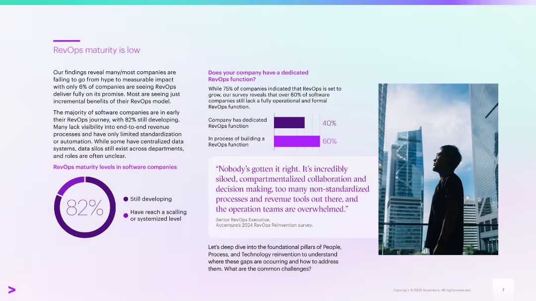
Left side text and chart; right side has quote, vertical bar chart, and person looking at skyline
Technology and Digital Transformation
Technology & Software
Emphasizes that 82% of companies are still developing RevOps capabilities. Majority lack process standardization. Notes 60% are still building a RevOps function despite the growing recognition of its importance.
RevOps maturity, software companies, business transformation, scaling, framework
Multiple Chart
Accenture
Saved
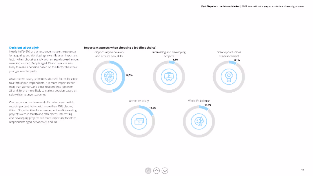
Circular diagrams showing percentages for various factors when choosing a job, including skill development and salary.
Market Analysis and Trends
Professional Services
Highlights key considerations for job selection among respondents, with a focus on skill acquisition, interesting projects, and salary.
Job Selection, Factors, Skill Development, Salary, Projects, Considerations
Multiple Chart
Deloitte
Saved
A line chart shows the CAC versus CO2 emissions from electricity generation by 2030 for various countries, comparing costs for grid, grid + wind, grid + solar, and blue hydrogen CAC setups.
Market Analysis and Trends
Energy & Utilities
The slide evaluates the cost-effectiveness of hydrogen from grid-powered electrolyzers for reducing emissions, noting the carbon footprint threshold for competitive cost.
CO2 emissions, CAC, grid, wind, solar, hydrogen, electrolyzer, cost-effectiveness
Mixed Chart
Kearney
Saved
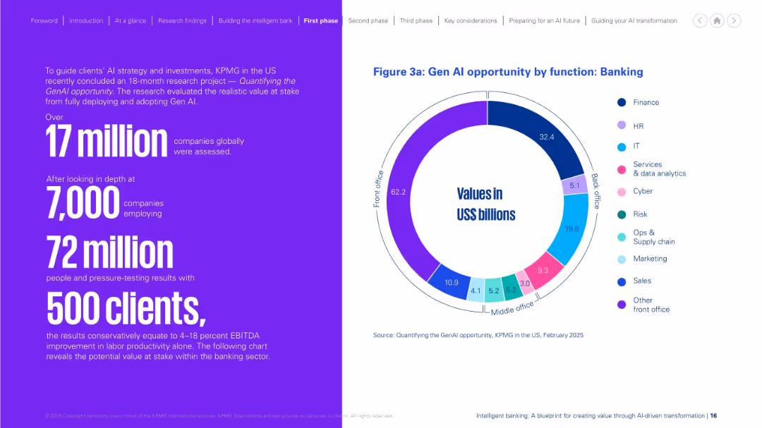
Left side presents research stats in large purple text. Right side includes a colorful circular chart showing value breakdown by banking functions. Neat bifurcation, vibrant colors.
Investment Analysis
Financial Services
This slide quantifies the opportunity of Gen AI in banking, based on KPMG research. It highlights potential value by function, with front-office roles offering the largest gains. The stats support significant productivity and financial impact, derived from analyzing over 17 million companies and thousands of clients globally.
Gen AI, opportunity, banking, productivity, front office, research, KPMG
Mixed Chart
KPMG
Saved
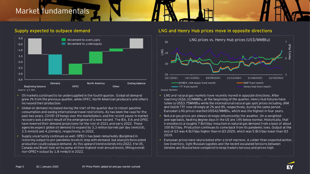
The slide contains two sections: one with a column chart showing the balance of demand and supply in the oil market and another with a line chart comparing LNG and Henry Hub prices. Each section is supported by descriptive text.
Market Analysis and Trends
Energy & Utilities
This slide provides insights into the oil and gas market fundamentals, showing the expected supply and demand dynamics and the contrasting movement of LNG and Henry Hub prices over time.
Supply, demand, oil market, LNG, Henry Hub prices
Multiple Chart
EY
Saved
The slide features a large title at the top with three proportional circle diagrams beneath, showing the increasing number of internet users from 2019 to 2022. It includes percentages and numerical data, labeled clearly to show growth over the years. The colors range from light to dark blue.
Industry Overview
Technology & Software
This slide visually demonstrates the growth in the number of internet users over a three-year span, highlighting the impact of the pandemic on digital adoption. It's useful for illustrating market growth in technology use and for identifying digital expansion trends in Southeast Asia.
internet users, SEA, pandemic, market growth, technology adoption, digital expansion, 2019-2022, circle diagrams
Multiple Chart
Bain
Saved
Contains a series of column charts and data tables presenting loan and deposit figures over several quarters, with emphasis on trends and adjustments for currency effects.
Financial Performance
Financial Services
Details recent trends in the bank's deposit and loan figures, illustrating strategic financial management and stability in the face of economic challenges, with a focus on year-over-year comparisons and foreign exchange adjustments.
Deposits, Loans, Trends, Financial Stability, Economic Challenges, Currency Adjustments
Multiple Chart
Deutsche Bank
Saved
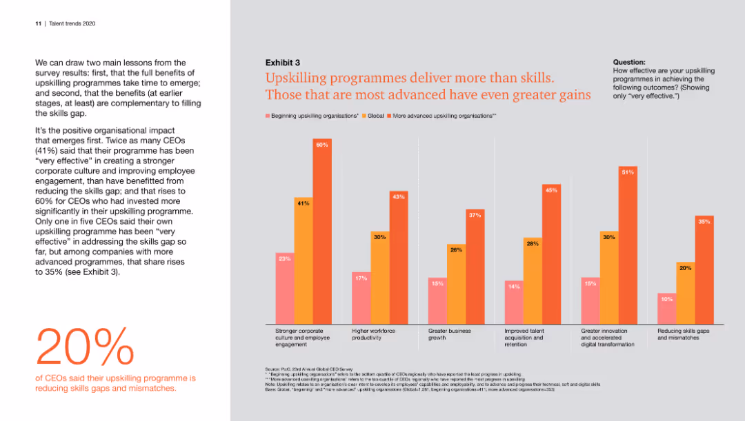
This slide features a column chart comparing the effectiveness of beginning and advanced upskilling organizations across various metrics. The chart uses three color codes for differentiation. The left side contains a text block summarizing key findings.
Human Resources and Talent Management
Professional Services
The slide compares the effectiveness of upskilling programs in achieving outcomes such as corporate culture improvement, workforce productivity, and innovation. It highlights how advanced programs yield greater gains.
Upskilling, productivity, corporate culture, innovation, skills gap, retention, business growth, digital transformation
Mixed Chart
PwC/Strategy&
Saved
The slide is an Image with Caption Slide, featuring an exploded view of a vehicle showcasing tire components, alongside a column chart and a world map. The visual elements are well-integrated and support the slide's message. The graphical data is presented clearly with contrasting colors to differentiate Michelin from competitors, and the map illustrates global presence, making for an engaging and informative layout.
Market Analysis and Trends
Transportation & Logistics
Highlighting Michelin's competitive advantage in the electric vehicle (EV) market, the slide demonstrates key tire requirements met by Michelin’s products, superior performance statistics compared to competitors, and their status as the preferred tire maker for leading EV manufacturers globally. It showcases their strategic positioning to leverage the shift towards vehicle electrification with their unique know-how.
electrification, vehicles, tires, performance, global, market, EV OEMs, competitive advantage, Michelin
Multiple Chart
Morgan Stanley
Saved
The slide presents a series of column charts comparing Morgan Stanley's net new assets (NNA) as a percentage of assets with various peers for full year 2023.
Market Analysis and Trends
Financial Services
The slide shows Morgan Stanley's market share in net new assets compared to peers, indicating continued growth and dominance in 2023.
Market Share, Net New Assets, Morgan Stanley, 2023, Peers Comparison, Column Chart, Financial Performance, Growth
Multiple Chart
Morgan Stanley
Saved
Previous
Next
If nothing, comes up, please save your slides first
Create a FREE account to continue browsing
Receive Instant Access to 1,000+ slides from companies like McKinsey, Google, and Goldman Sachs
First Name
Last Name
Email
Password
I agree to all
Terms & Privacy Policy
Thank you! Your submission has been received!
Oops! Something went wrong while submitting the form.
Have an account?
Sign in
Column Chart
Heatmap
Chevron
Org Chart
Infographic
Callouts
Timeline
List
Graphic
Picture
Process Flow
Diagram
Paragraph
Map
Table
Framework
Subtitle
Takeaway Box
Icon
Other Chart
Radar Chart
Waterfall Chart
Mekko Chart
Pie Chart
Scatter Plot
Line Chart
Bar chart
Bullet points