My Account
My Slides
Search by Category
Templates
View All Templates
Download Template Slides
✦ AI Search
Feedback
Login
Logout
Get Started
Browse all Slides
Browse all Slides
Create a FREE Account
Instant access to 1,000+ real slides from top companies like McKinsey, BCG, Goldman Sachs, Google and many more!
First Name
Last Name
Email
Password
I agree to all
Terms & Privacy Policy
Thank you! Your submission has been received!
Oops! Something went wrong while submitting the form.
Have an account?
Sign in
Saved Slides
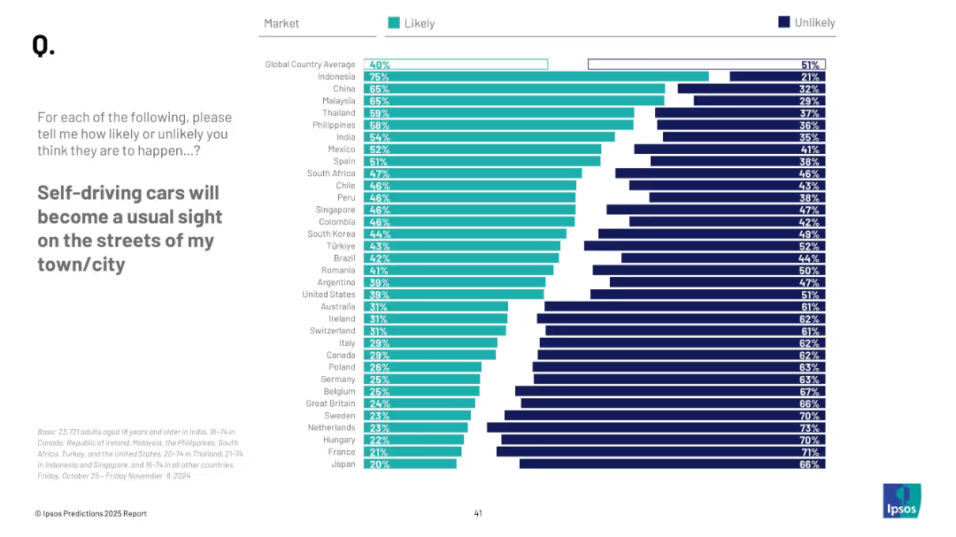
Horizontal bar chart; similar design as previous slide; country ranking with percentages, “Likely” vs “Unlikely”
Technology and Digital Transformation
Transportation & Logistics
This slide visualizes global sentiment on the mainstream emergence of self-driving cars. Indonesia, China, and Malaysia lead in optimism, with 40% global average expecting it likely.
autonomous vehicles, transportation, public opinion, technology, self-driving cars, urban planning, mobility, innovation, survey
Mixed Chart
IPSOS
Saved
Column charts comparing angel investment amounts between the US and Brazil from 2010 to 2019, highlighting growth multiples.
Investment Analysis
Financial Services
Discusses trends in angel investments in Brazil compared to the US, showcasing the significant growth and the existing investment gap.
angel investment, US, Brazil, investment trends, growth analysis
Single Chart
McKinsey
Saved
Column charts, pie chart, and various metrics displayed; text on the left
Regulatory and Compliance
Professional Services
Discusses the impact of EY Ripples initiatives in Italy, showcasing volunteer activities and their outcomes
Ripples, volunteers, Italy, impact, initiatives
Multiple Chart
EY
Saved
A column chart showing employment losses in the first six months of 2020 across various Canadian metropolitan areas, highlighting the significant impact on Metro Vancouver.
Market Analysis and Trends
Professional Services
This slide presents the economic impact of COVID-19, focusing on employment losses in Canadian metropolitan areas, with a spotlight on the severe impact on Metro Vancouver.
COVID-19 impact, employment losses, Metro Vancouver, Canada
Single Chart
Deloitte
Saved
A bar chart displays the percentage of investors' expectations for the duration of the shift from growth to value investing. Text boxes and a source citation are included.
Market Analysis and Trends
Financial Services
This slide visualizes investors' expectations for the shift from growth to value investing over various time periods. It is useful for analyzing investment trends and strategizing.
investors, expectations, growth, value, trends
Single Chart
BCG
Saved
The slide portrays two line graphs, one depicting the mean and the other the median of central bank balance sheets relative to GDP, spanning over a century. The graphs show an increasing trend, particularly in recent years. The title, subtitle, and quote from the US Federal Reserve are also present.
Regulatory and Compliance
Financial Services
The slide examines central bank balance sheet trends and discusses the innovations in quantitative easing (QE) and Flexible Average Inflation Targeting (FAIT). It can serve to explain modern monetary policy tools and strategies, especially in response to economic crises.
Central Banks, Balance Sheets, GDP, Quantitative Easing, Inflation Targeting, Monetary Policy, Trends
Single Chart
JP Morgan
Saved
This slide showcases a breakdown of revenue growth factors with accompanying column charts and annotations, including a projection for net interest income.
Financial Performance
Financial Services
Analyzes the drivers of revenue growth within the business, including deposit and loan expansion. Ideal for financial strategy and planning meetings.
revenue growth, business development, financial strategy, net interest income, deposit growth, loan expansion, strategic planning
Single Chart
JP Morgan
Saved
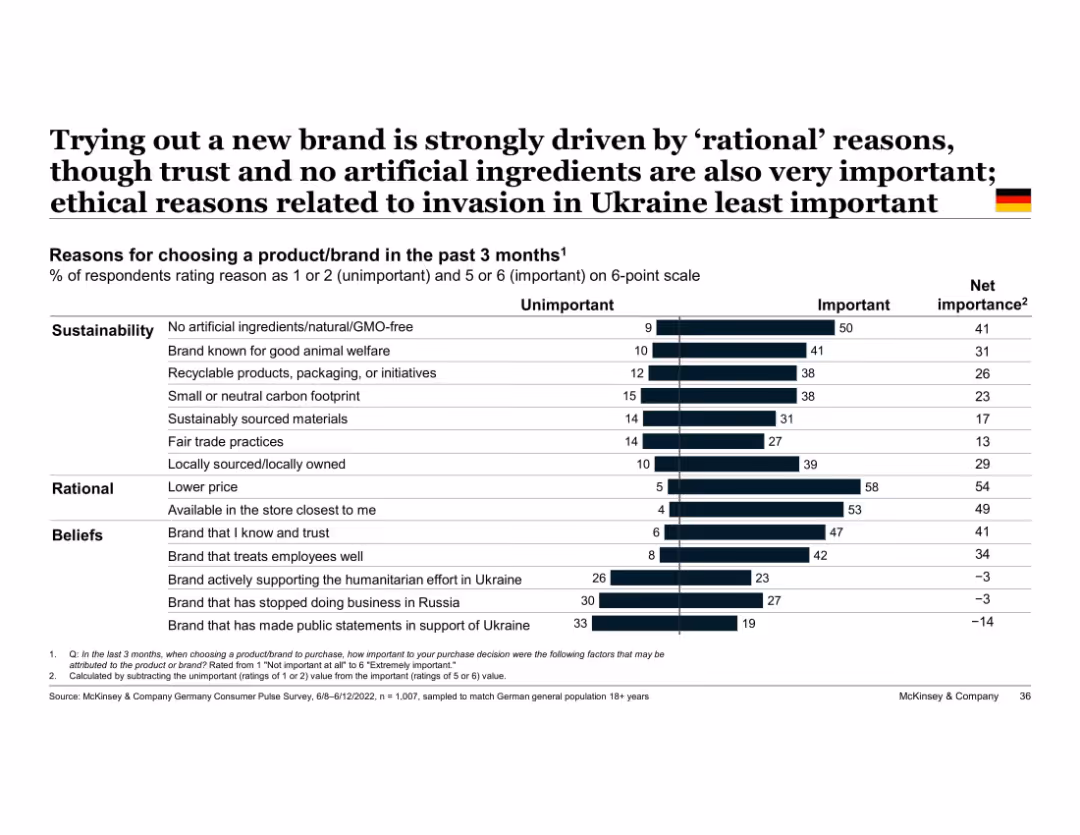
Vertical bar chart with two-part segments (unimportant vs important); grouped by theme (e.g., beliefs)
Market Analysis and Trends
Consumer Goods
Highlights top reasons German consumers tried new brands, with rational factors like price and store availability ranking highest, followed by sustainable and belief-driven factors. Ukraine war-related factors least influential.
rational decision-making, sustainability, trust, Ukraine, brand choice, Germany, ethical purchasing, consumer reasons
Single Chart
McKinsey
Saved
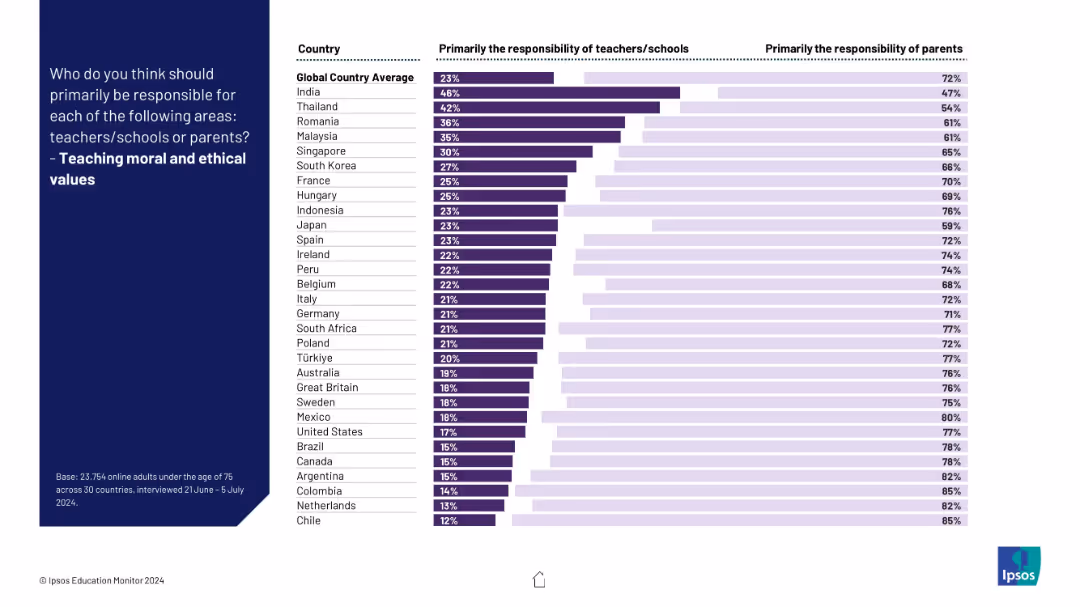
Visual ranking of countries on responsibility for instilling ethics; clear majority favor parents over schools.
Regulatory and Compliance
Education & Training
The slide illustrates global consensus that moral and ethical education should primarily fall to parents, though some variation exists.
ethics, values, morality, parenting, education, schools, culture, children, responsibility, global perspective
Mixed Chart
IPSOS
Saved
Circle chart and bar charts showing worker satisfaction levels across different SEA countries.
Market Analysis and Trends
Financial Services
This slide presents the levels of worker satisfaction in various SEA countries, indicating a significant portion of dissatisfaction.
worker satisfaction, SEA, circle chart, bar chart, survey
Multiple Chart
IPSOS
Saved
Slide features multiple column charts and textual information outlining financial targets and historical data. Layout is clear with a direct comparison of yearly data.
Financial Performance
Financial Services
This slide presents a financial overview, showing RoTE, total income, net interest income, cost:income ratio, and other financial metrics from 2021 to projections for 2026. Each financial aspect is broken down by year with targets for 2026 clearly highlighted.
financials, RoTE, income, cost, 2026 targets, banking
Multiple Chart
Barclays
Saved
Uses icons and lists to illustrate five key growth drivers, presented in a clean, structured layout.
Investment Analysis
Financial Services
Showcases JPMorgan's focus on key growth drivers such as scaling asset management and expanding global presence, providing an at-a-glance view of their strategic direction and achievements in the context of investment and market expansion.
growth drivers, asset management, global, JPMorgan, strategy
Pillar
JP Morgan
Saved
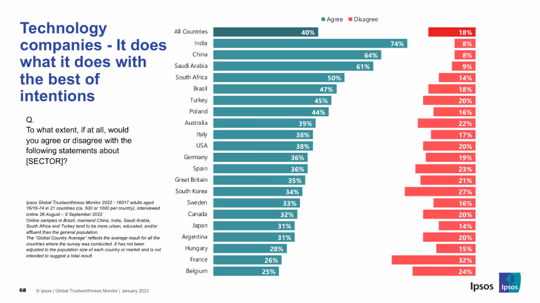
Simple bar graph on the right; large text title and survey question on the left.
Strategic Planning
Technology & Software
This slide assesses public perceptions of the intentions behind tech companies' actions, reflecting whether they are seen as operating with good intentions across countries.
intentions, technology, ethics, survey, public perception, Ipsos, global trust, corporate responsibility, transparency, sentiment
Mixed Chart
IPSOS
Saved
A slide with blue column chart bars showing Chase Travel sales volume over time, with additional details on marketplace strategies and acquisitions.
Financial Performance
Technology & Software
Projects growth in consumer travel, discussing marketplace strategies and highlighting the value of recent acquisitions.
travel sales, growth projection, marketplace strategy, acquisitions, premium customers, Chase
Mixed Chart
JP Morgan
Saved
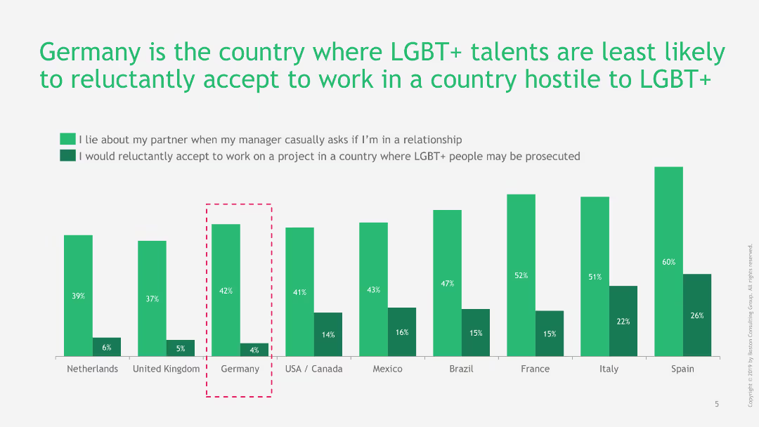
Column chart illustrating the willingness of LGBT+ talents to work in hostile countries and to lie about their partner. Green and dark green bars show different scenarios.
Regulatory and Compliance
Professional Services
The slide illustrates Germany's position where LGBT+ talents are least likely to accept work in hostile countries, and their tendency to lie about their partners when asked by managers.
LGBT+, Germany, workplace, hostile countries, diversity
Single Chart
BCG
Saved
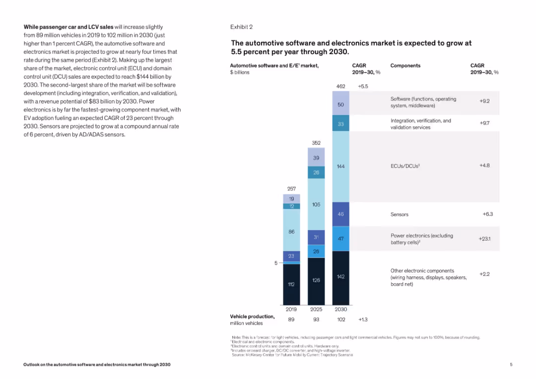
Vertical stacked bar chart by component (ECUs, software, sensors) with CAGR annotations. Right-aligned title and legend.
Technology and Digital Transformation
Industrial & Manufacturing
The slide breaks down projected growth in the automotive electronics sector, emphasizing components like ECUs, software, and power electronics. The chart highlights varying growth rates, with power electronics showing the fastest CAGR.
automotive electronics, CAGR, market growth, ECUs, sensors, power electronics, software, ADAS
Mixed Chart
McKinsey
Saved
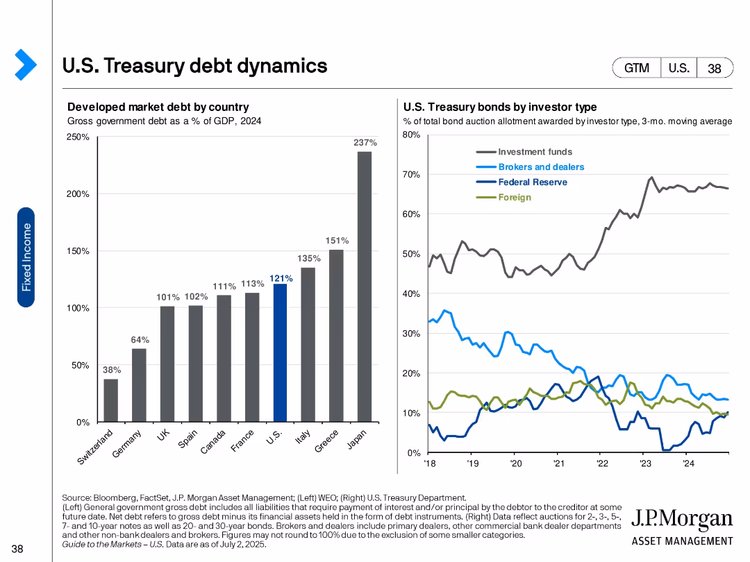
Two-panel visual: bar chart (left) of developed market debt as % of GDP and line chart (right) of bond allocations by investor type.
Market Analysis and Trends
Financial Services
The slide illustrates government debt levels across developed countries and the distribution of U.S. Treasury bond holdings by investor type. It shows the U.S. has high debt levels and investment funds dominate Treasury purchases.
U.S. debt, Treasury holdings, investor types, global debt, GDP ratio, fixed income, bond market, financial markets, government borrowing
Multiple Chart
JP Morgan
Saved
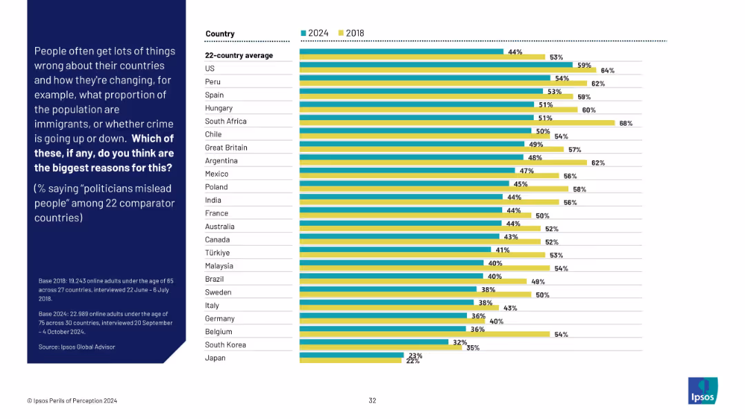
Grouped bar chart of 2024 vs 2018 showing belief that politicians mislead people. Ranked by country with noticeable shifts.
Market Analysis and Trends
Government & Public Sector
This slide tracks belief that politicians are misleading the public. While the global average decreased slightly from 2018, high distrust remains prominent in countries like the US, Peru, and Spain.
political trust, misinformation, public opinion, trend analysis, survey data, Ipsos, international governance
Mixed Chart
IPSOS
Saved
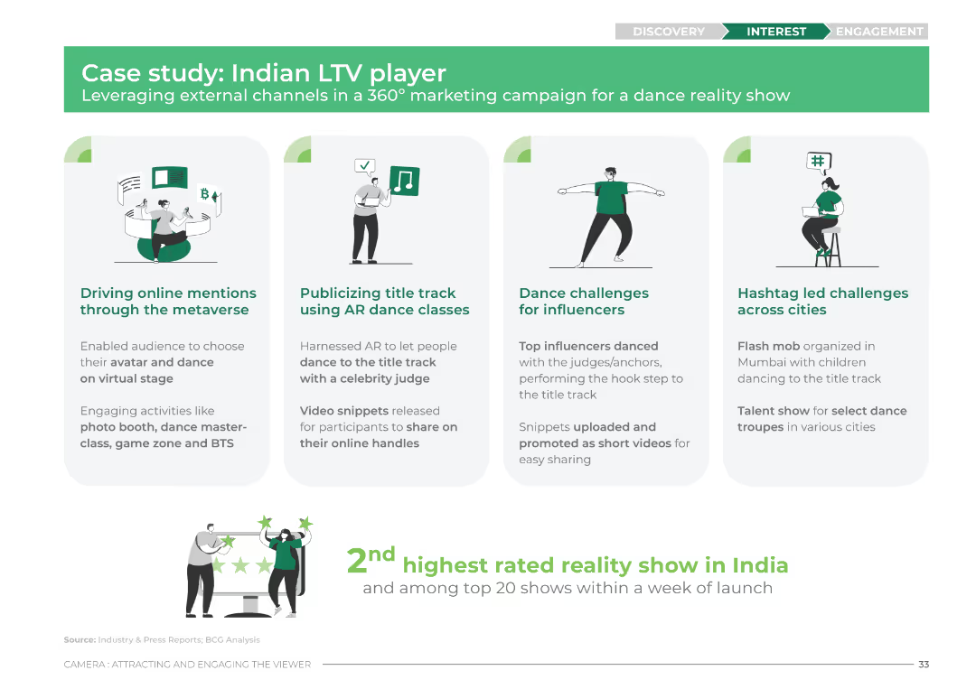
The slide features four columns with icons and brief descriptions for each aspect of the marketing campaign. The design uses green and white colors with icons representing the metaverse, AR dance classes, dance challenges, and hashtag challenges.
Client Case Studies
Media & Entertainment
This slide outlines a case study of an Indian LTV player's marketing campaign. It details the use of metaverse, AR dance classes, influencer dance challenges, and hashtag challenges to drive engagement and mentions the show's high rating and popularity.
case study, LTV, marketing campaign, metaverse, AR dance, influencers, hashtag challenges, engagement
Pillar
BCG
Saved
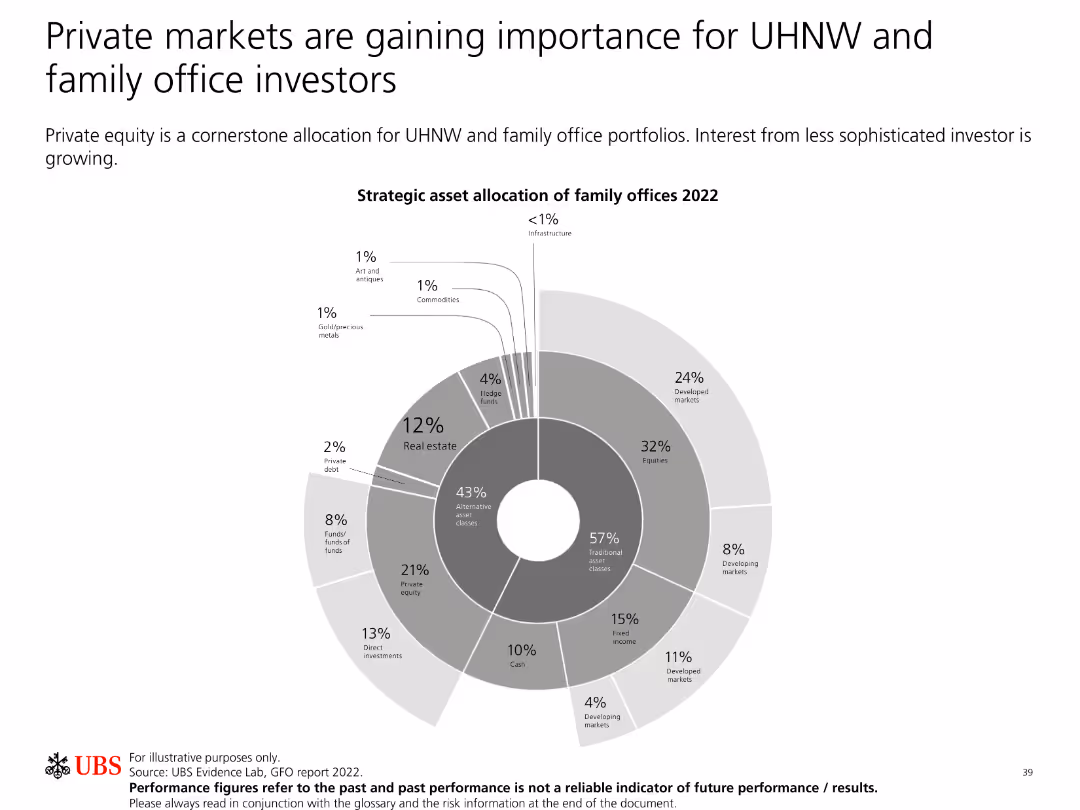
The slide features a pie chart depicting strategic asset allocation of family offices in 2022, with various segments.
Investment Analysis
Financial Services
This slide discusses the importance of private markets for ultra-high-net-worth (UHNW) and family office investors. It highlights the strategic asset allocation for 2022.
UHNW, family office, private markets, asset allocation, investment
Single Chart
UBS
Saved
This slide presents a column chart comparing the current P/E ratios to 10-year highs, lows, and averages for various regions and styles. The color coding distinguishes between the metrics, and the layout is clear with labeled axes and an accompanying legend.
Investment Analysis
Financial Services
Focused on investors and financial analysts, this slide offers a valuation analysis using price-to-earnings ratios. It contrasts current figures with historical data across different regions and styles, serving as a basis for assessing market valuation and aiding in the development of investment strategies.
Valuation, P/E Ratio, Regions, Investment Analysis, Stocks
Single Chart
Morgan Stanley
Saved
This slide features timelines and a pie chart depicting the interest in Copernicus services by sector. It’s organized clearly with separated sections for textual and visual information.
Market Analysis and Trends
Environmental Services & Sustainability
Highlights the operational phases of Copernicus services and the growing interest across various sectors. Useful for discussions on space data applications and service adoption across different industries.
Copernicus, service adoption, space data, industry sectors, operational phases
Mixed Chart
PwC/Strategy&
Saved
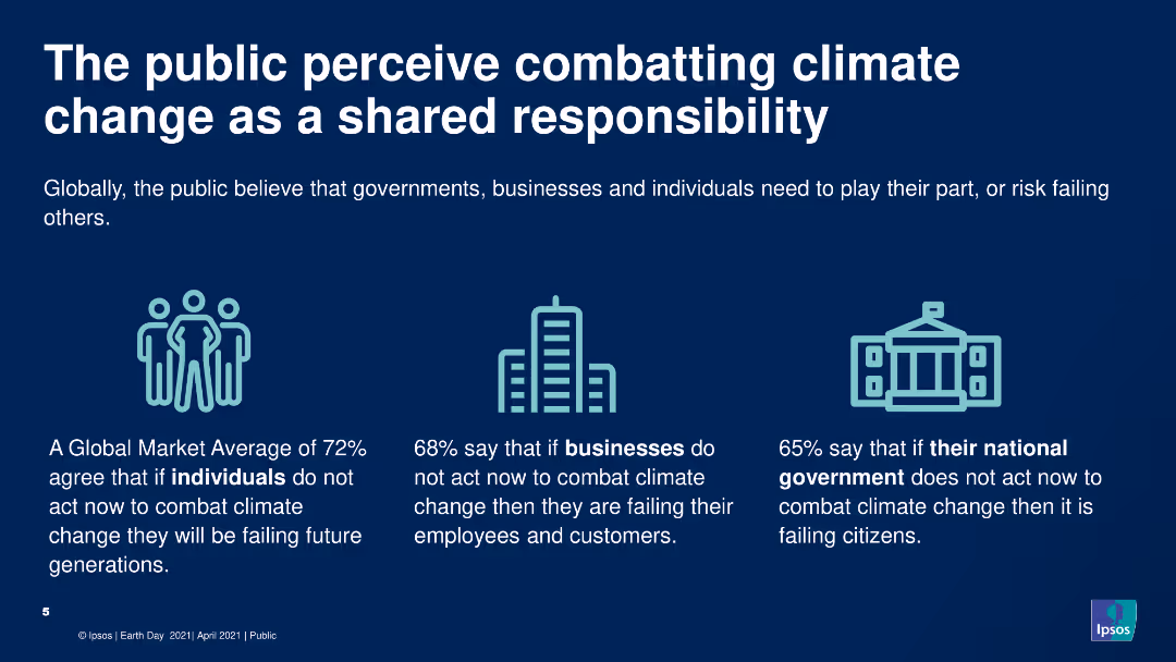
The slide includes a header, icons, and a text block summarizing survey data. The slide has a clean, simple design with three icons representing individuals, businesses, and governments, each accompanied by a key statistic from the survey about their perceived responsibility in combating climate change.
Market Analysis and Trends
Environmental Services & Sustainability
Highlights public opinion on shared responsibility for combating climate change among individuals, businesses, and governments. The slide uses icons and text to present survey data showing high agreement that all parties need to take action to address climate change.
Climate change, responsibility, public opinion, survey, environment
Pillar
IPSOS
Saved
Slide includes a column chart and table with data showing interest levels in vehicle subscription services by age, and key characteristics valued in such services.
Product and Service Analysis
Transportation & Logistics
Explores consumer interest in vehicle subscription models, highlighting the importance of cost control, convenience, and flexibility.
Vehicle subscription, consumer interest, cost control, convenience, flexibility
Mixed Chart
Deloitte
Saved
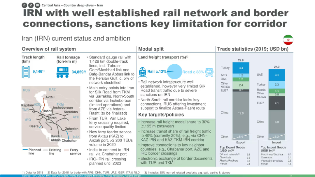
Structured with maps, transport data, and rail policies; emphasizes sanctions as a major limiting factor.
Industry Overview
Transportation & Logistics
Iran’s established rail system is highlighted, especially its border links and long track network. However, international sanctions restrict corridor utilization. Future goals include modernization, improved connections, and increased modal share.
Iran, sanctions, rail network, modal share, trade, Silk Road, freight corridors
Multiple Chart
Roland Berger
Saved
Previous
Next
If nothing, comes up, please save your slides first
Create a FREE account to continue browsing
Receive Instant Access to 1,000+ slides from companies like McKinsey, Google, and Goldman Sachs
First Name
Last Name
Email
Password
I agree to all
Terms & Privacy Policy
Thank you! Your submission has been received!
Oops! Something went wrong while submitting the form.
Have an account?
Sign in
Column Chart
Heatmap
Chevron
Org Chart
Infographic
Callouts
Timeline
List
Graphic
Picture
Process Flow
Diagram
Paragraph
Map
Table
Framework
Subtitle
Takeaway Box
Icon
Other Chart
Radar Chart
Waterfall Chart
Mekko Chart
Pie Chart
Scatter Plot
Line Chart
Bar chart
Bullet points