My Account
My Slides
Search by Category
Templates
View All Templates
Download Template Slides
✦ AI Search
Feedback
Login
Logout
Get Started
Browse all Slides
Browse all Slides
Create a FREE Account
Instant access to 1,000+ real slides from top companies like McKinsey, BCG, Goldman Sachs, Google and many more!
First Name
Last Name
Email
Password
I agree to all
Terms & Privacy Policy
Thank you! Your submission has been received!
Oops! Something went wrong while submitting the form.
Have an account?
Sign in
Saved Slides
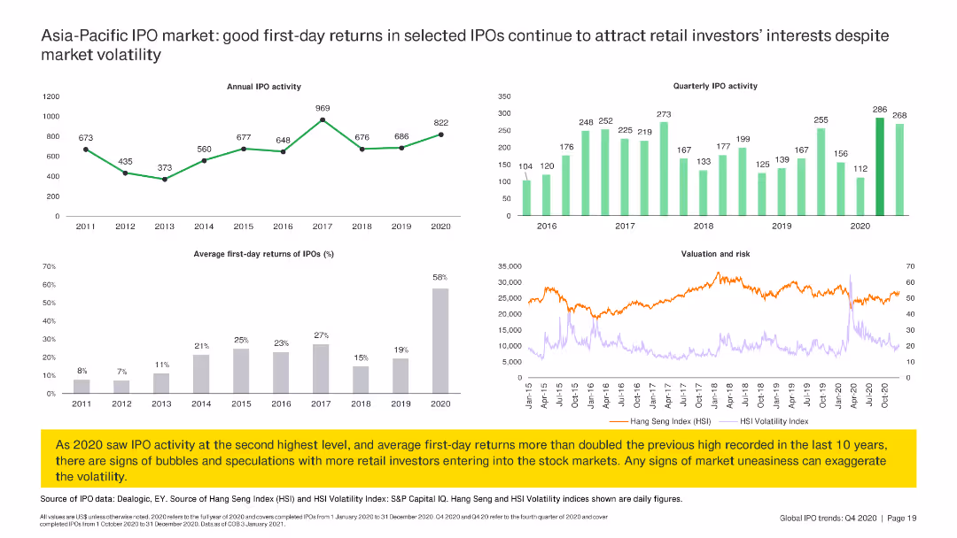
The slide includes line charts and column charts summarizing annual IPO activity, first-day returns, and quarterly IPO activity in the Asia-Pacific region.
Market Analysis and Trends
Financial Services
The slide reviews IPO activity in the Asia-Pacific region, focusing on good first-day returns and quarterly IPO trends, despite market volatility.
IPO, Asia-Pacific, returns, trends, volatility
Multiple Chart
EY
Saved
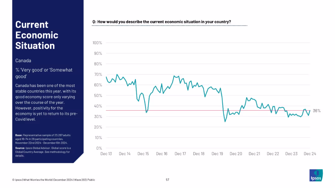
Time series chart with sidebar commentary; single line representing economic sentiment in Canada.
Market Analysis and Trends
Financial Services
Canada’s economic sentiment has remained stable throughout 2024, with current perception at 36%. However, sentiment remains below pre-COVID levels.
Canada, economic stability, Ipsos survey, long-term data, post-COVID comparison, macro sentiment, consistent trend
Mixed Chart
IPSOS
Saved
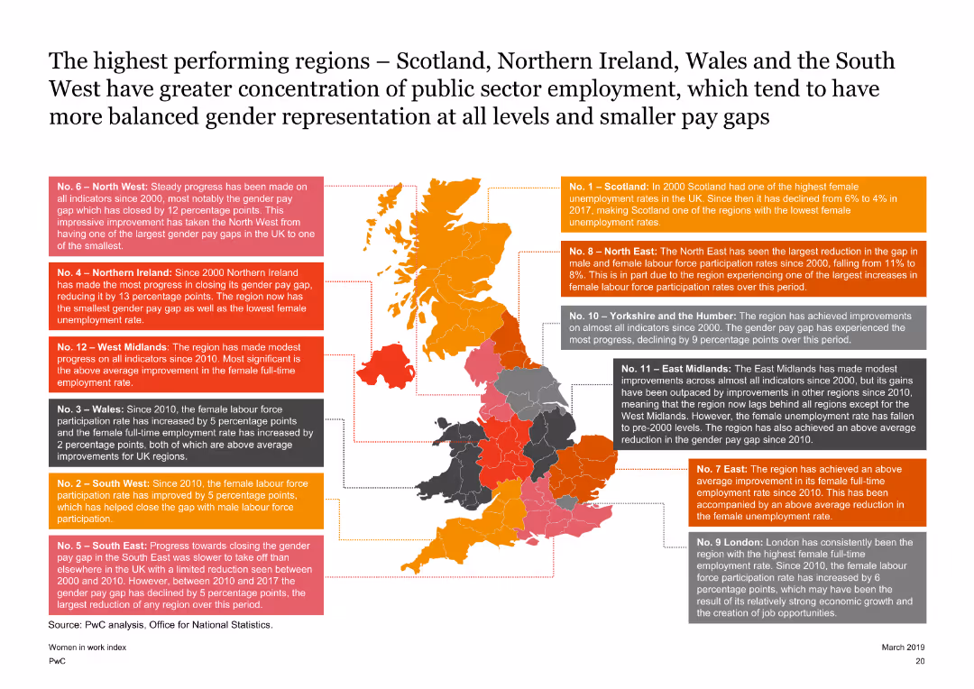
Features a map of the UK with highlighted regions and text boxes explaining the performance of each region on the Women in Work Index. The slide is detailed with a clear visual representation of regional data.
Market Analysis and Trends
Government & Public Sector
Highlights the top-performing regions in the UK on the Women in Work Index, such as Scotland and Northern Ireland, discussing their progress in female labor force participation and gender pay gap reduction since 2000.
UK map, regional performance, gender pay gap, female labor force participation
Graphic
PwC/Strategy&
Saved
The slide contains two column charts comparing country performance and new orders index for India, China, Japan, and Australia. There is a commentary section with three bullet points on the right.
Market Analysis and Trends
Financial Services
The slide shows India's strong growth momentum within Asia-Pacific, China's stable growth, and Australia's contraction.
Asia-Pacific, performance, growth, India, China, Japan, Australia, new orders, PMI
Multiple Chart
Accenture
Saved
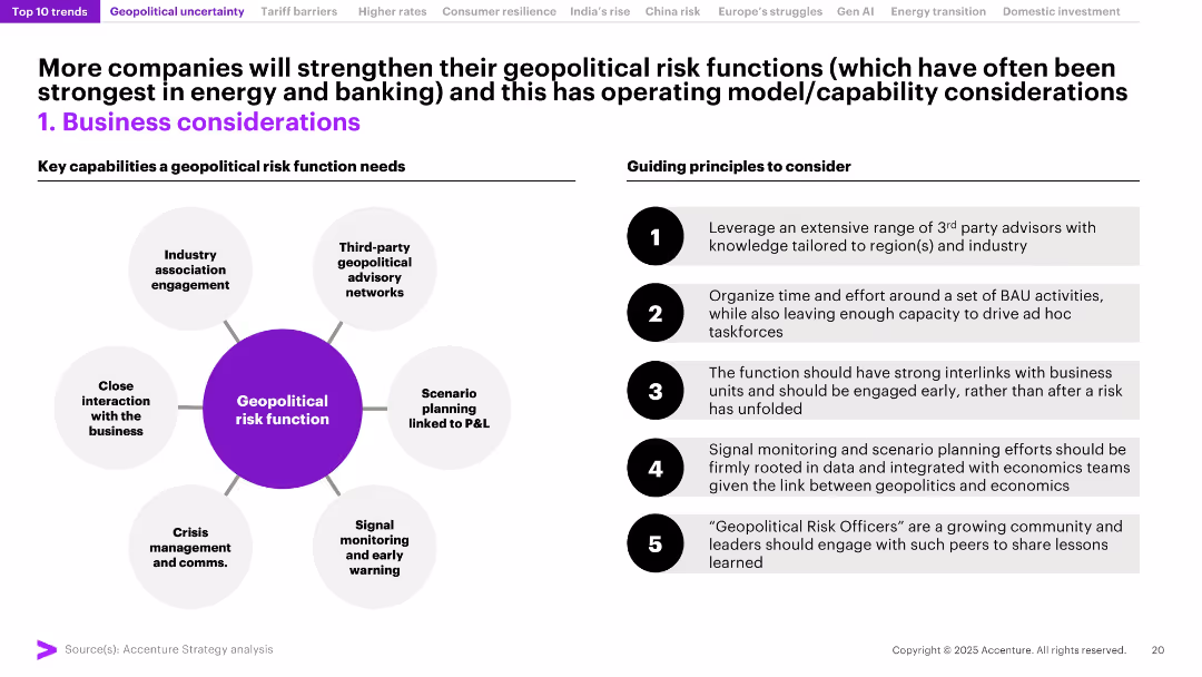
Split into two columns: left shows a circular diagram of risk function capabilities; right lists guiding principles in numbered blocks. Clean, process-oriented layout.
Risk Assessment and Management
Professional Services
The slide outlines the structure and best practices for building robust geopolitical risk functions in organizations. Emphasizes proactive scenario planning, crisis communication, and business integration, particularly relevant for banking and energy sectors.
Risk Management, Geopolitics, Scenario Planning, P&L, Crisis Comms, Business Strategy, Functions, Advisory Networks
Header Horizontal
Accenture
Saved
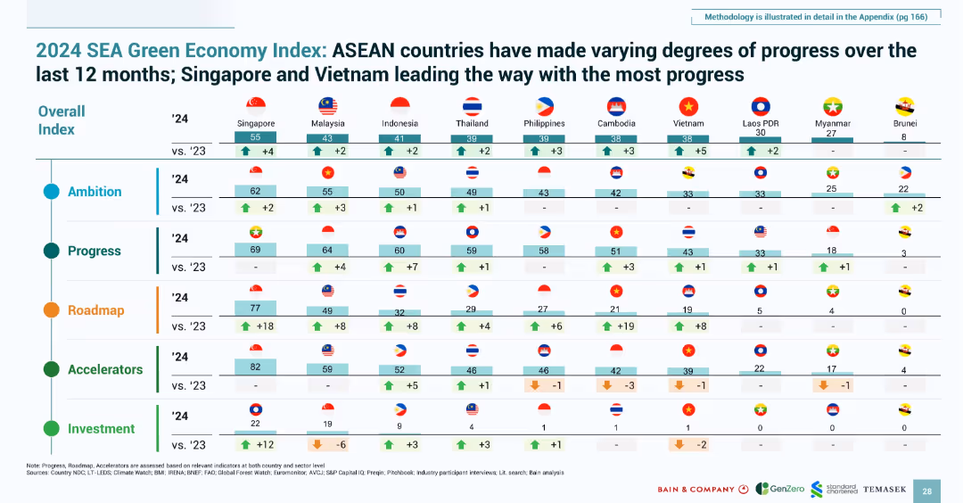
Matrix layout with country flags and numeric indicators across five pillars; structured, colorful table
Performance Metrics and KPIs
Environmental Services & Sustainability
This slide presents a comparative index of ASEAN countries’ progress across five dimensions: ambition, progress, roadmap, accelerators, and investment. Singapore and Vietnam are highlighted as leaders in green progress, based on recent gains in planning, infrastructure, and investments.
green economy, SEA index, sustainability, KPIs, ambition, investment, roadmap, ASEAN, climate
Single Chart
Bain
Saved
Vertical stacked bar chart visualizing 2020 GHG emissions in Southeast Asia by category and sub-sources; minimal text.
Market Analysis and Trends
Environmental Services & Sustainability
Visual representation of emission sources in Southeast Asia in 2020. Major contributors include land use change, power, cement, and livestock. Aims to inform investment decisions by showing emission-heavy sectors.
SEA, emissions, land use, cement, power, livestock, GHG, chart
Single Chart
Bain
Saved
Horizontal bar chart comparing public agreement and disagreement on corporate versus government action on climate change across different markets.
Market Analysis and Trends
Government & Public Sector
Shows that the public believes both corporate and government actions are crucial in combating climate change, with high levels of agreement across many countries.
climate change, corporate action, government action, public mandate, survey
Multiple Chart
IPSOS
Saved
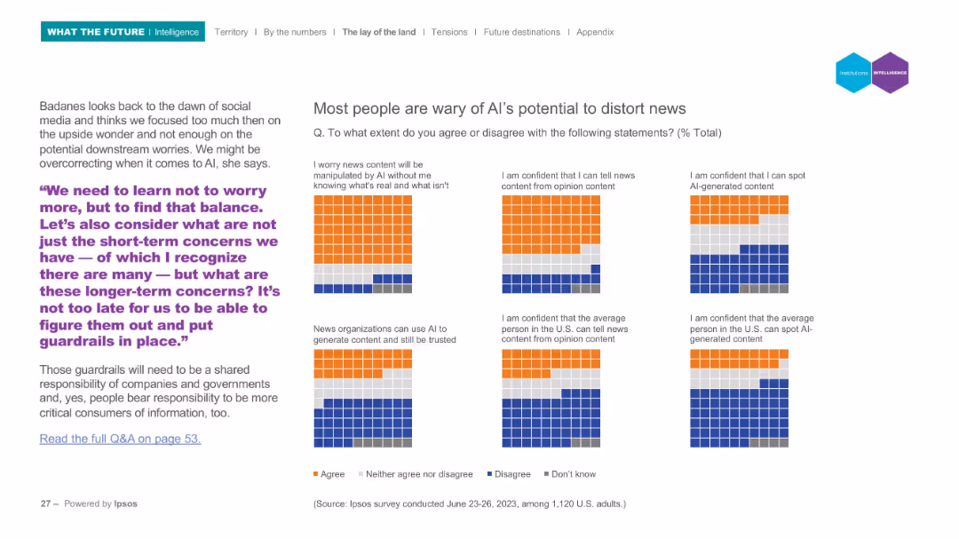
Grid-based infographic with colored blocks representing survey responses to 6 statements. Left-aligned text with quote.
Risk Assessment and Management
Media & Entertainment
This slide presents survey results on AI and news credibility, showing significant concern over manipulation and trust in AI-generated news. The quote calls for long-term thinking and placing guardrails around AI technologies.
AI, news, misinformation, trust, survey, risk
Mixed Chart
IPSOS
Saved
The slide features two column charts comparing data from 2018 and 2019 with annotations, along with a text block providing additional context.
Operational Efficiency
Financial Services
Showcases the impact of digital account openings on customer acquisition and the resultant decrease in marketing costs, underlining the effectiveness of digital strategies in finance.
Digital Acquisition, Marketing Costs, Finance, Account Openings, Cost Efficiency
Multiple Chart
JP Morgan
Saved
Features a set of horizontal bar graphs displaying GDP forecast levels for multiple countries (US, Europe, China, Japan, India) from 2019 to 2021. Each country's forecast is color-coded, and the slide uses a minimalist design to focus on the comparison of economic projections.
Strategic Planning
Financial Services
Predicts the GDP levels for several large economies, comparing projected recoveries to 2019 levels. It highlights the economic resilience and expected recovery timeline, providing a visual comparison of pre and post-COVID economic forecasts.
GDP, economic recovery, 2021, forecast, COVID-19, countries, comparison
Single Chart
BCG
Saved
This slide illustrates a circular diagram with six sectors, each representing a factor critical to successful digital marketing strategies.
Strategic Planning
Professional Services
Describes six key factors, both technical and organizational, essential for success in digital marketing.
digital marketing, success factors, technical, organizational, strategy, key factors
Diagram
BCG
Saved
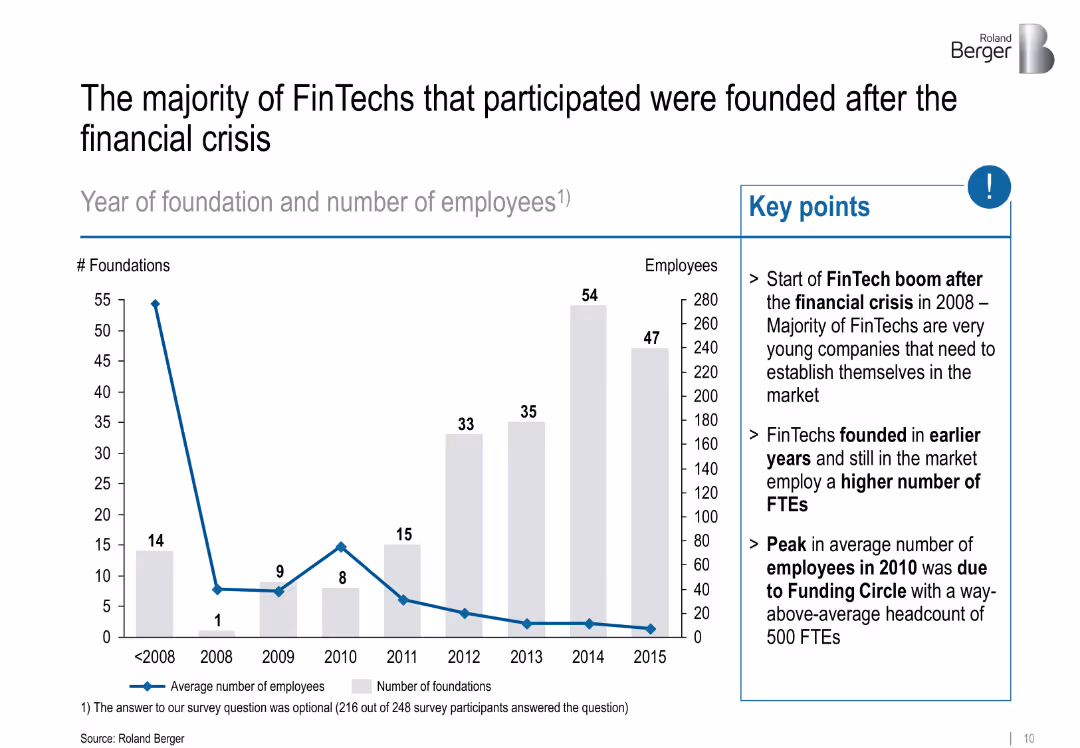
Left: bar chart showing foundations/year; Right: key insights in bullet form; uses grey and blue for emphasis
Industry Overview
Financial Services
Tracks the foundation years of FinTech companies, revealing a boom post-2008 financial crisis. Notes that older firms have more employees and highlights a peak due to a major player.
FinTech origins, post-crisis, startup growth, employment, Funding Circle
Mixed Chart
Roland Berger
Saved
The slide features a column chart showing world bioenergy consumption by sector (energy, transport, industry, buildings) from 2018 to 2040 under a stated policies scenario. It includes detailed data on the growth of bioenergy use in power, heat, car, truck, shipping, aviation, industry, and residential sectors.
Market Analysis and Trends
Energy & Utilities
This slide projects the growth of world bioenergy consumption across various sectors until 2040, with a focus on the significant contributions from the power and transport sectors to the overall increase in bioenergy demand.
world bioenergy consumption, sector, 2018-2040, power, heat, transport, industry, buildings, growth forecast
Single Chart
Kearney
Saved
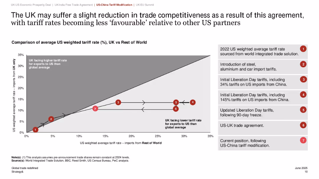
Line graph with arrows and numbered labels showing shifts in tariff positioning; side legend explains stages of tariff policy; grey-white shaded chart background.
Market Analysis and Trends
Government & Public Sector
This slide explains how recent changes to US-China tariffs may reduce UK trade competitiveness with the US. It compares the US weighted average tariff rates on UK vs. rest of world imports over time, with reference points detailing key policy changes. The UK is shown to be facing a relatively higher tariff rate under the current policy setup.
tariffs, trade competitiveness, UK-US trade, China, policy shift, weighted average, imports, global trade, protectionism, economic agreement
Single Chart
PwC/Strategy&
Saved
Line charts and points showing yearly shareholder returns across various sectors, highlighting performance disparities.
Competitive Landscape
Financial Services
Analyzes the impact of COVID-19 on shareholder returns across different sectors, distinguishing between those that have managed to mitigate impacts effectively.
shareholder returns, COVID-19 impact, sector performance, performance disparities, financial resilience, market analysis
Single Chart
BCG
Saved
Column charts displaying the composition of non-core and legacy assets by type and source, along with textual explanations.
Strategic Planning
Financial Services
This slide details the exit strategy for non-core and legacy assets, including governance, risk management, and reduction targets.
non-core, legacy, assets, UBS, Credit Suisse
Multiple Chart
UBS
Saved
Multiple percentages in sections detailing actions and adaptations by companies. Clean layout with green and blue colors.
Regulatory and Compliance
Environmental Services & Sustainability
Evaluates current sustainability efforts, the difficulty in implementing impactful actions, and the corporate focus on sustainability.
Sustainability, corporate efforts, impact, actions
Header Vertical
Deloitte
Saved
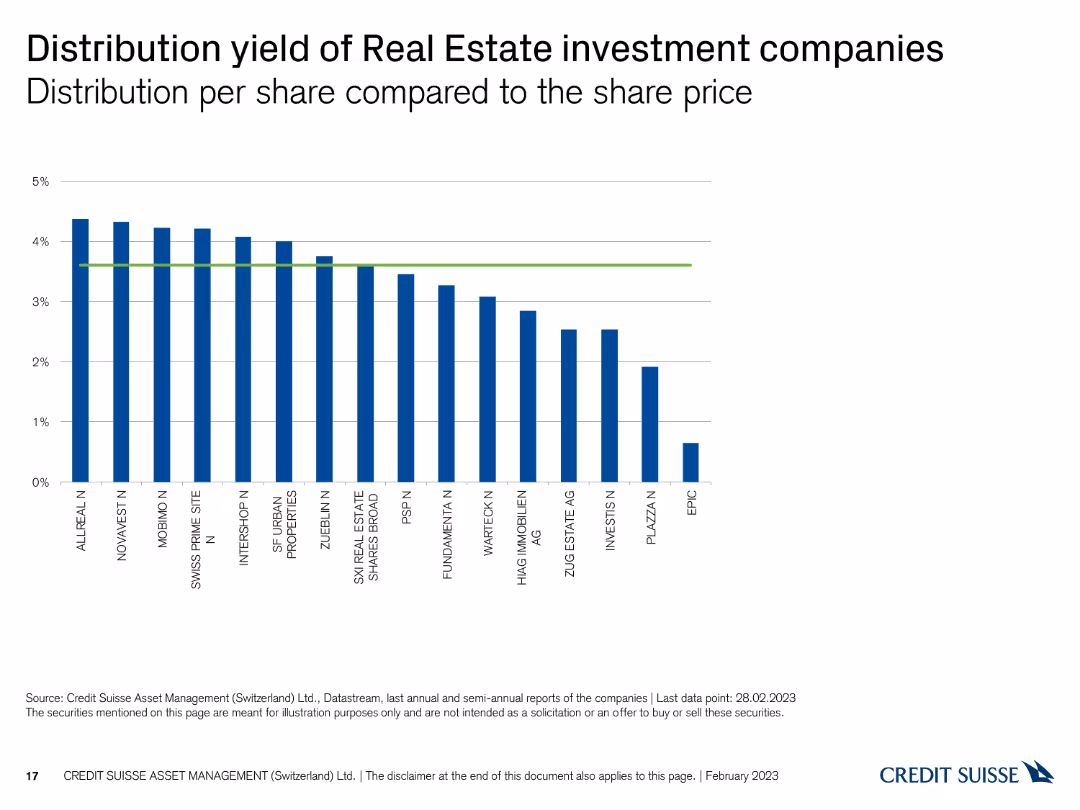
This slide displays a column chart showing the distribution yield per share for Swiss real estate investment companies, with vertical bars representing yield percentages and a green reference line.
Financial Performance
Real Estate & Construction
The slide presents the distribution yields of real estate investment companies, comparing their returns. It is used for evaluating income potential and investment performance.
Real estate, distribution yield, investment companies, returns, comparison
Single Chart
Credit Suisse
Saved
Showcases column charts for digital application starts and loan engagement, and a large light blue bar indicating the growth of visitors on the MyHome platform. Annotations provide additional context for the data.
Operational Efficiency
Financial Services
Highlights the growth of digital adoption in the home lending process, with an increase in applications started digitally, customer engagement with digital loan capabilities, and MyHome platform traffic, leading to improved customer outcomes.
Digital Adoption, Home Lending, Customer Engagement, Platform Growth, Efficiency
Multiple Chart
JP Morgan
Saved
The slide contains four column charts comparing MSCI World and Net IRR across different investment types: Corporate Equity, Corporate Credit, Real Estate, and Open Architecture Private Assets. Each chart has two vertical bars with percentages, against a white and blue background.
Financial Performance
Financial Services
The slide presents a performance comparison of various investment types, highlighting their long-term track record and returns. This can be used for illustrating investment opportunities and analyzing alternative asset management strategies.
MSCI, IRR, Corporate Equity, Real Estate, Performance
Multiple Chart
Goldman Sachs
Saved
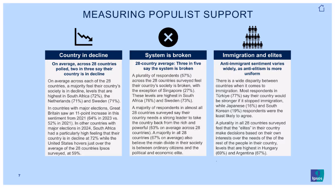
Three-column text slide with icons and bold subheadings over light blue background.
Market Analysis and Trends
Government & Public Sector
This slide outlines findings related to populist sentiment. It categorizes beliefs into three pillars: country in decline, broken systems, and views on immigration and elites. Key figures from 28-country averages support insights on political unrest.
populism, elite distrust, societal decline, Ipsos data, global opinion, political perception, immigration sentiment, broken system
Pillar
IPSOS
Saved
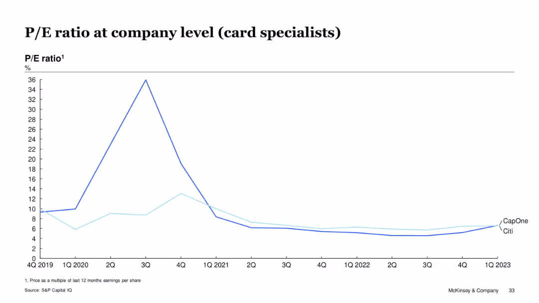
Line graph showing P/E ratio trends for CapOne and Citi from Q4 2019 to Q1 2023
Investment Analysis
Financial Services
This slide focuses on P/E ratio trends for Capital One and Citibank, both considered card specialists. After a peak in mid-2020, their P/E ratios declined and remained stable below 10x through 2023. The data reflects muted investor sentiment and earnings performance in the segment.
P/E, card specialists, Citi, Capital One, investor sentiment, valuation trends
Single Chart
McKinsey
Saved
Pie chart showing the current and planned usage of third-party APIs, alongside a word cloud highlighting popular API providers such as Salesforce, Oracle, and Microsoft.
Market Analysis and Trends
Technology & Software
The slide identifies the most commonly used third-party APIs and the intent to use them, supported by a word cloud of specific providers, emphasizing Salesforce as the leading provider.
third-party APIs, Salesforce, Oracle, providers
Mixed Chart
Gartner
Saved
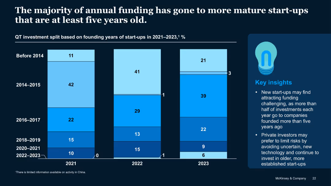
Stacked vertical bar chart showing funding split by start-up founding year across 2021–2023
Investment Analysis
Artificial Intelligence
Most QT investments go to start-ups older than five years, with declining shares for younger firms. The trend suggests investor caution toward early-stage or recently founded start-ups, particularly those formed post-2020.
Start-up Age, Founding Year, Funding Trends, QT Investment, Investor Bias
Mixed Chart
McKinsey
Saved
Previous
Next
If nothing, comes up, please save your slides first
Create a FREE account to continue browsing
Receive Instant Access to 1,000+ slides from companies like McKinsey, Google, and Goldman Sachs
First Name
Last Name
Email
Password
I agree to all
Terms & Privacy Policy
Thank you! Your submission has been received!
Oops! Something went wrong while submitting the form.
Have an account?
Sign in
Column Chart
Heatmap
Chevron
Org Chart
Infographic
Callouts
Timeline
List
Graphic
Picture
Process Flow
Diagram
Paragraph
Map
Table
Framework
Subtitle
Takeaway Box
Icon
Other Chart
Radar Chart
Waterfall Chart
Mekko Chart
Pie Chart
Scatter Plot
Line Chart
Bar chart
Bullet points


![Backup] Investable Ideas Assessment: Nature and Agriculture, Power, Transport, Buildings, and Industrial and Waste are the major sources of emissions for SEA](https://cdn.prod.website-files.com/654e70fb59937215cac87b19/6899953ad33fac82f2cba73e_mmbgON3bQK6pWFTjrUO0vLt6dHvW1rEcz_-rQsJtocs.avif)