Create a FREE Account
Instant access to 1,000+ real slides from top companies like McKinsey, BCG, Goldman Sachs, Google and many more!
First Name
Last Name
Email
Password
I agree to all
Terms & Privacy Policy
Thank you! Your submission has been received!
Oops! Something went wrong while submitting the form.
Have an account?
Sign in
Library
Templates
Courses
Pricing
My Account
My Slides
My Templates
✦ AI
AI Prompt Library
AI Search
Sign in
Start Here
Logout
My Saved Slides
The slide discusses mega-trends impacting the Greek T&T sector, highlighting shifts in consumer preferences towards less crowded destinations, wellness tourism, and workcations. It includes bullet points and a summary of sector preparedness.
Strategic Planning
Hospitality & Tourism
Describes the impact of COVID-19 on consumer preferences in the T&T sector, with a focus on wellness tourism and workcations. It outlines key trends such as remote work, less crowded destinations, and the importance of health and safety measures.
Wellness, Workcations, Tourism, COVID-19, Trends
Mixed Chart
EY
Saved
Horizontal phase timeline with four sections marked by year ranges, showing evolution of Morgan Stanley's business. Each phase includes a brief descriptor and financial figures. Predominant use of blue and white color scheme.
Strategic Planning
Financial Services
Shows the strategic transformation of Morgan Stanley's wealth management over different phases marked by key milestones.
Business transformation, wealth management, strategic phases, Morgan Stanley, growth, technology integration
Linear Flow
Goldman Sachs
Saved
A column chart displaying priorities in operational strategies using yellow to color up its bars.
Strategic Planning
Financial Services
This slide outlines CEOs' strategies for revenue growth, focusing on operational efficiencies and organic growth. Suitable for strategic planning and operational management discussions.
Revenue Growth, CEOs, Strategy, Operational Efficiency, Organic Growth, Planning
Mixed Chart
PwC/Strategy&
Saved
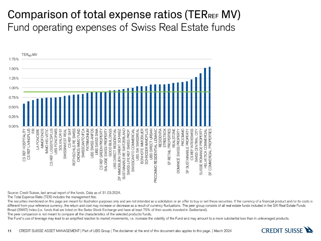
The slide features a column chart comparing the total expense ratios (TER) of Swiss Real Estate funds based on market value (MV), with a green line indicating the average TER.
Financial Performance
Real Estate & Construction
This slide examines the total expense ratios (TER) of Swiss Real Estate funds, focusing on market value (MV) as the basis for comparison, showing variations in fund expenses.
expense ratio, TER, market value, real estate, funds
Single Chart
Credit Suisse
Saved
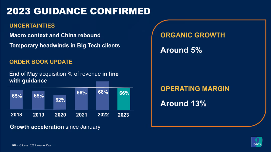
The slide contains a column chart showing percentage of revenue over years from 2018 to 2023, and a section with growth and operating margin percentages. The layout is structured and uses clear data visualizations.
Strategic Planning
Financial Services
The slide confirms Ipsos' 2023 guidance, highlighting uncertainties, organic growth, and operating margin targets, providing an update on order book and revenue projections, indicating stability and future growth prospects.
guidance, revenue, growth, operating margin, projections
Mixed Chart
IPSOS
Saved
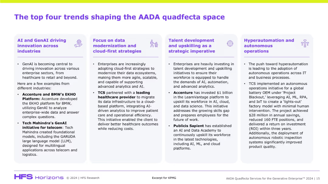
Four-column layout with bold headings and icons per trend. Purple and white color palette with bullet point explanations and industry use cases.
Technology and Digital Transformation
Artificial Intelligence
The slide outlines key trends influencing AADA (Analytics, Automation, Data, AI), including GenAI innovation, cloud modernization, talent upskilling, and hyperautomation. Examples like BMW, TCS, and Accenture support each trend’s relevance across sectors.
AADA, GenAI, cloud, talent, automation, TCS, Accenture, data strategies, transformation, AI initiatives
Pillar
KPMG
Saved
Complex bar chart showing EV battery cost breakdown by component (e.g., raw material, CAM, cell production) with cost percentages and annotations.
Product and Service Analysis
Energy & Utilities
The slide breaks down the total cost structure of a lithium-ion EV battery pack (NCM 811) as of July 2021, attributing costs to materials, processing, and production. It highlights how semiconductor shortages increased costs by $2–3/kWh.
EV battery, cost breakdown, lithium-ion, NCM 811, material costs, CAM, cell production
Single Chart
Roland Berger
Saved
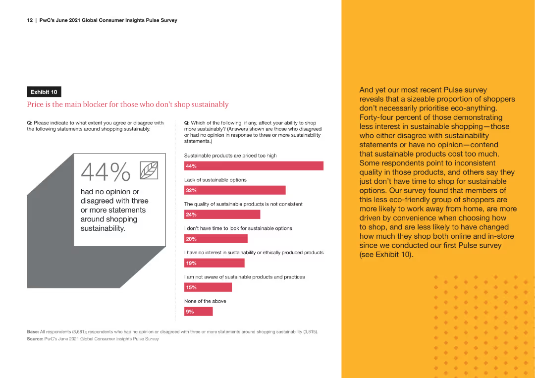
A line chart comparing the percentage of remote workers versus those working away from home who engage in sustainable shopping behaviors, such as buying eco-friendly products and checking for sustainability certifications.
Market Analysis and Trends
Consumer Goods
The slide analyzes the sustainable shopping behaviors of remote workers compared to those who work away from home, showing trends in eco-friendly purchasing and awareness of product sustainability.
sustainable behaviors, remote workers, eco-friendly, shopping habits, sustainability awareness
Mixed Chart
PwC/Strategy&
Saved
Features a multi-line chart showing percentages of talent retention strategies across industries. Icons represent different strategies at the top. Each line represents a sector with clear color coding.
Strategic Planning
Retail & E-commerce
Focuses on how retail industry's talent retention strategies align with other sectors, including CGS, Auto/IE, LS/Pharma/Biotech, and Travel/Hospitality, in foundational, programmatic, strategic, and integrated categories.
Retail, Talent Retention, Consistency, Industries, Strategies, Foundational, Programmatic, Strategic, Integrated
Mixed Chart
Accenture
Saved
Presents a line graph tracking the increase in social media hashtags for home hobbies, supported by a prominent quote.
Market Analysis and Trends
Retail & E-commerce
Analyzes the stabilization of market interests in home-based hobbies, indicating a sustained engagement in these activities beyond the immediate reaction to global events.
Home hobbies, Market stabilization, Social media trends, Hashtags increase, Engagement continuity, Line graph, Market interests
Multiple Chart
Accenture
Saved
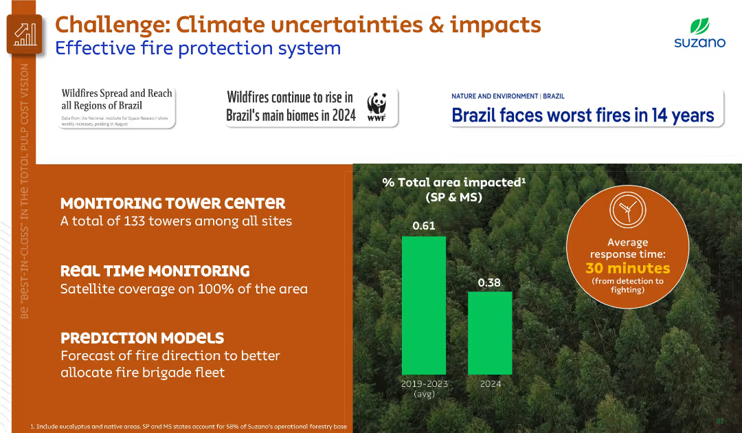
Left-aligned text sections and infographic visuals on right. Orange and green theme. Includes area impact bar chart and average response time icon.
Risk Assessment and Management
Environmental Services & Sustainability
Discusses wildfire risks and outlines Suzano’s fire protection system, including monitoring towers, real-time satellite coverage, and predictive models. Compares fire-impacted area and emphasizes rapid response.
wildfire, fire protection, monitoring, climate risk, Suzano, environment, prediction
Mixed Chart
Goldman Sachs
Saved
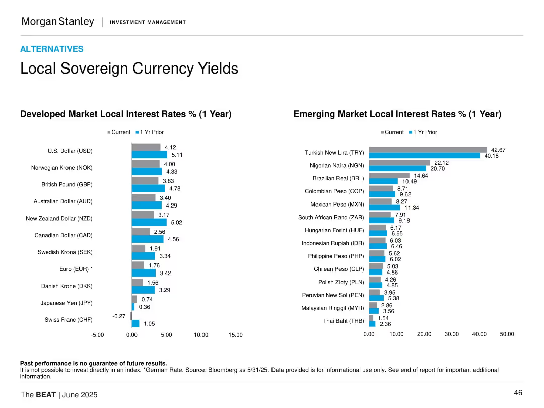
Side-by-side bar charts showing 1-year interest rates now vs. 1 year prior for developed and emerging markets.
Risk Assessment and Management
Financial Services
This slide compares current and past 1-year local interest rates for various developed and emerging market currencies. It provides insight into interest rate trends and inflation responses, highlighting shifts in monetary policy globally.
local yields, sovereign debt, interest rates, developed markets, emerging markets, monetary policy
Multiple Chart
Morgan Stanley
Saved
The slide presents a series of column charts comparing the average hours spent online per day for personal use in six Southeast Asian countries, across three time phases labeled before, during, and after.
Market Analysis and Trends
Technology & Software
This slide shows the trends in internet usage in Southeast Asia, highlighting an increase with the Philippines showing the most significant rise. It's useful for analyzing digital engagement and behavior changes.
internet usage, Southeast Asia, Philippines, column chart, before, during, after, personal use, trend
Single Chart
Bain
Saved
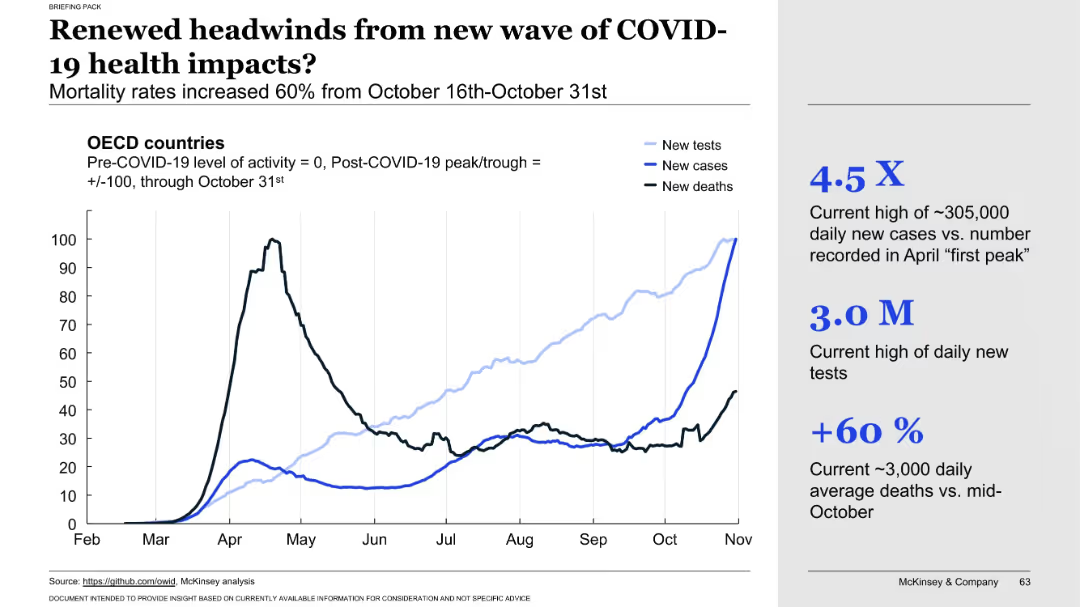
Line chart showing OECD country data (tests, cases, deaths) through October 31. Annotated metrics on the right highlight testing volume, case surge, and death rate increase.
Risk Assessment and Management
Healthcare & Pharmaceuticals
Warns of a resurgence in COVID-19 health impacts as data from late October shows significant increases in new cases, tests, and deaths. The chart visually confirms the renewed health risks and underscores the pandemic’s continued volatility.
second wave, health impact, mortality surge, new infections, testing volume, COVID-19 resurgence, OECD trends, death rate, late October data, public health threat
Mixed Chart
McKinsey
Saved
Detailed column charts illustrating assets under management by business unit and product group over time.
Financial Performance
Financial Services
Displays the trend of assets under management within Deutsche Bank's Private Bank, highlighting changes and net flows.
assets management, private banking, financial trends, investment products
Multiple Chart
Deutsche Bank
Saved
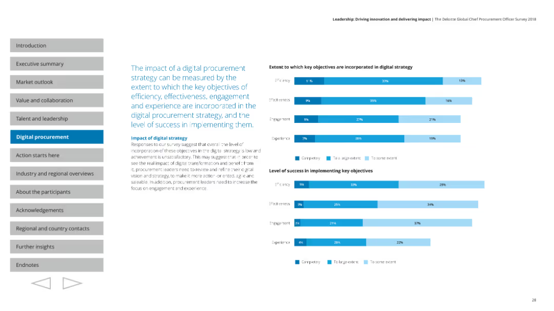
Features multiple column charts showing the extent to which key objectives are incorporated into digital strategy and the success level of implementation.
Technology and Digital Transformation
Professional Services
Measures the impact of digital procurement strategy, covering efficiency, effectiveness, engagement, and experience in implementation success.
Digital strategy, impact, objectives, efficiency, success
Multiple Chart
Deloitte
Saved
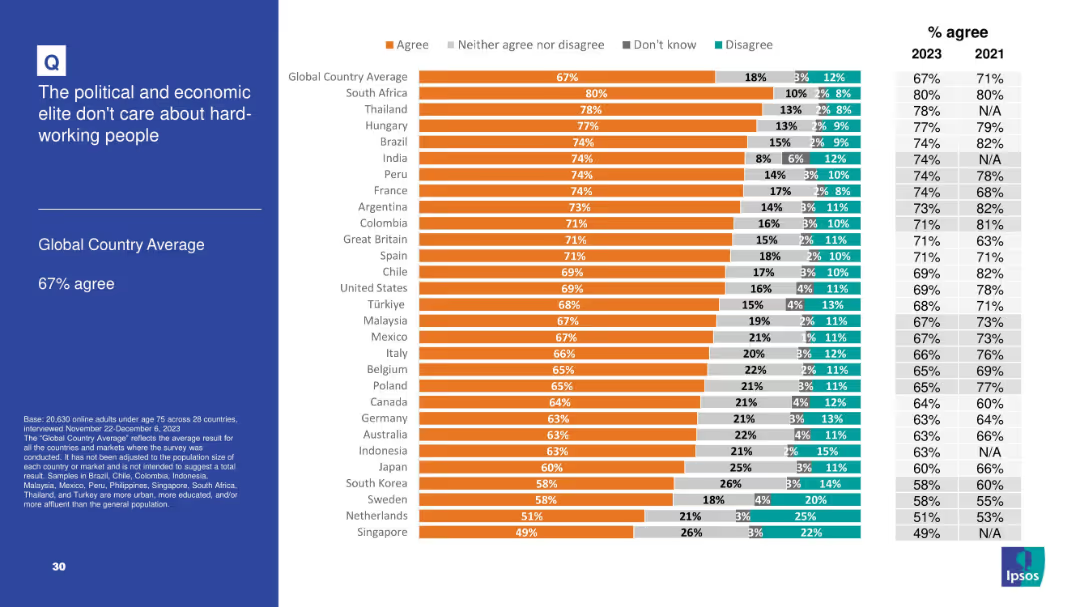
Follows same format as prior slides: bar chart, segmented by country; includes historical agreement percentage for 2021 for comparison.
Market Analysis and Trends
Government & Public Sector
This slide, with a 67% global agreement rate, emphasizes public disillusionment with elites and their perceived disconnect from the working population. South Africa and Thailand top the chart with over 75% agreement, reflecting global perceptions of injustice or imbalance in socio-economic influence and care.
political elite, economic elite, labor, perception, class divide, Ipsos, fairness, disconnect
Mixed Chart
IPSOS
Saved
A slide with two column charts depicting 'Total Revenues' and 'Adjusted EBITDA' over a six-year period. Blue bars are used to show growth over time, with key figures and annotations providing additional information.
Financial Performance
Financial Services
Discusses the company's strong cash flow generation, using historical data to highlight financial robustness and operational consistency. This slide serves as a basis for discussions on financial strategy and investor relations.
cash flow, financial strategy, operational consistency, investor relations
Multiple Chart
Goldman Sachs
Saved
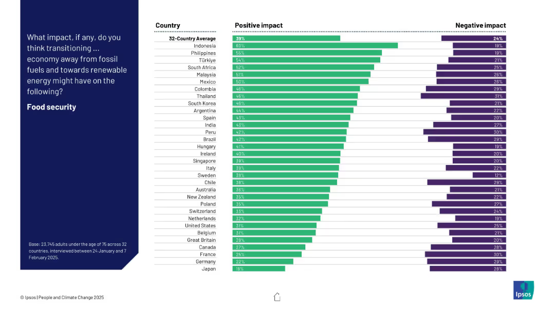
Bar chart of 32 countries ranking positive and negative expectations about the energy transition’s effect on food security.
Technology and Digital Transformation
Environmental Services & Sustainability
This slide captures global attitudes toward how moving to renewable energy affects food security. Indonesia, the Philippines, and Türkiye are most optimistic, while Japan and Germany rank lowest. Net positive views dominate across most countries.
food security, renewables, perception, climate, energy transition, bar chart, Ipsos, global opinion
Mixed Chart
IPSOS
Saved
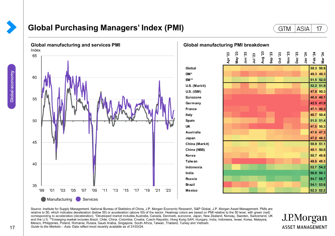
The slide includes a line chart and a heatmap. The line chart depicts the global manufacturing and services PMI over time. The heatmap provides a breakdown of global manufacturing PMIs by country, using colors to indicate performance levels.
Market Analysis and Trends
Financial Services
The slide analyzes the global Purchasing Managers' Index (PMI) for manufacturing and services, providing insights into economic activity and performance across various countries. It is used to assess economic health and trends.
PMI, global manufacturing, services, heatmap, economic performance, market analysis, country comparison, global economy
Mixed Chart
JP Morgan
Saved
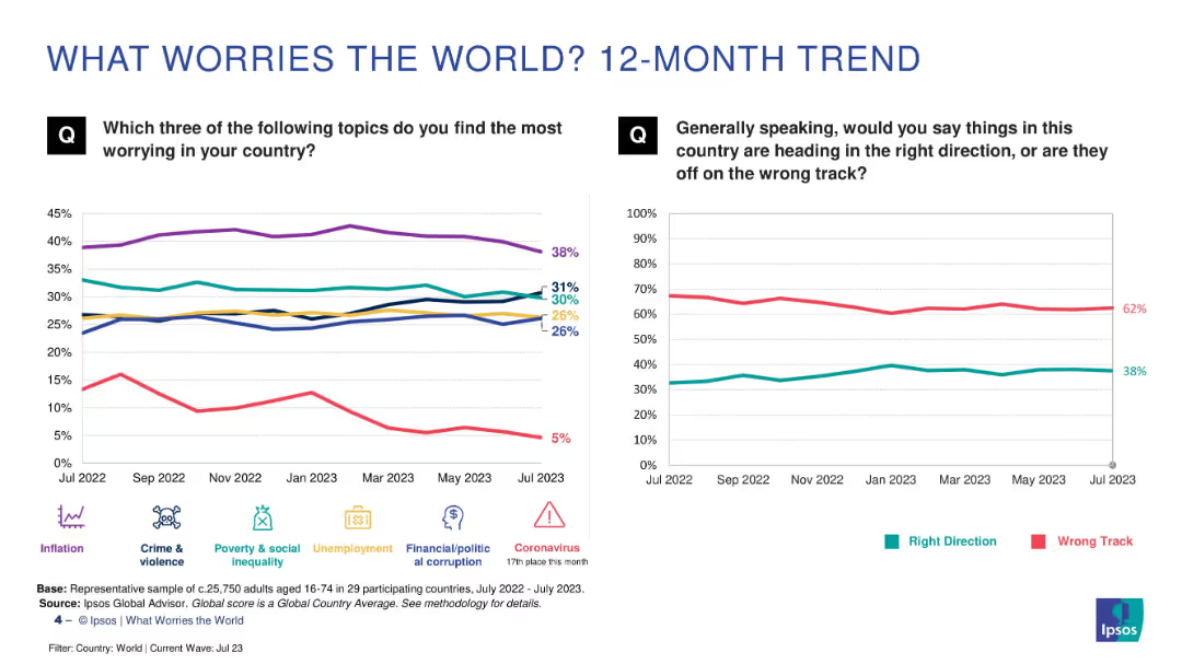
Two line charts comparing trends over time: left shows issues like inflation, crime, etc.; right shows global sentiment (right vs. wrong track). Clean, comparative layout.
Market Analysis and Trends
Professional Services
This slide tracks worry trends over 12 months, showing persistent concern over inflation and crime. The "wrong track" sentiment remains dominant, with minor fluctuations. It provides a temporal view of public priorities and dissatisfaction.
trends, inflation, global concerns, sentiment analysis, public opinion, Ipsos, 12-month trend
Multiple Chart
IPSOS
Saved
Radar charts for various industries, uses a clean layout with green and blue tones.
Customer and Market Segmentation
Telecommunications
Evaluates priority strategies for customer service across different industries and regions.
customer service, industry priorities, strategy
Multiple Chart
Deloitte
Saved
The slide includes a pie chart and a heatmap to present data on payment prediction using machine learning algorithms. It shows invoice status distribution and customer rating distribution, using various colors to highlight different data points.
Financial Performance
Energy & Utilities
The slide demonstrates the use of machine learning algorithms for predicting payment outcomes, showing data input analysis and correlation heatmap, helping in financial performance forecasting and decision-making.
Payment Prediction, Machine Learning, Algorithm, Invoice Status, Customer Rating
Multiple Chart
EY
Saved
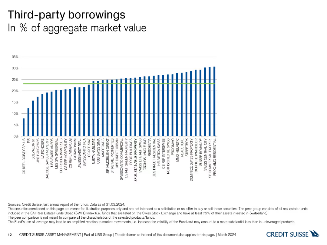
The slide shows a column chart representing the percentage of third-party borrowings relative to the aggregate market value for various Swiss Real Estate funds, with bars in blue.
Financial Performance
Real Estate & Construction
This slide illustrates the extent of third-party borrowings across different Swiss Real Estate funds, offering insights into leverage levels and financial risk.
borrowings, third-party, leverage, market value, real estate
Single Chart
Credit Suisse
Saved
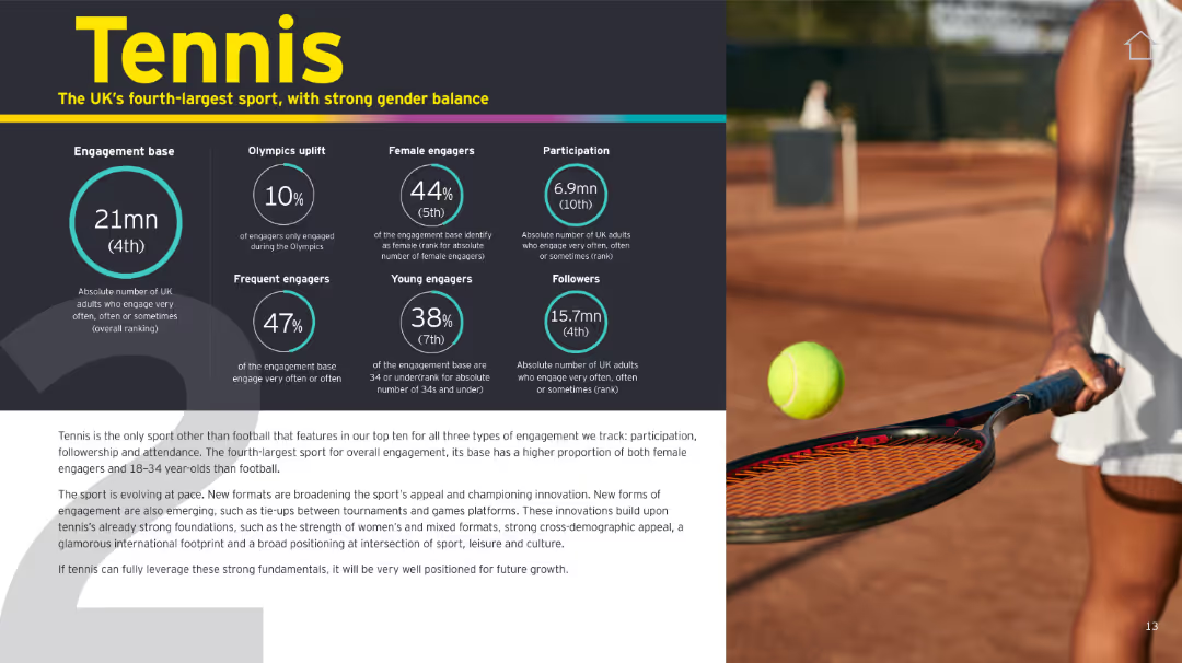
Similar format to slide 16166. Infographic panel on left, tennis photo on right. Yellow, black, and teal color scheme.
Customer and Market Segmentation
Media & Entertainment
Tennis ranks fourth in overall UK engagement and stands out for gender balance and younger audience appeal. Innovations in format and global positioning support its continued growth.
tennis, engagement, UK sport, gender balance, innovation, youth, participation
Mixed Chart
EY
Saved
Previous
Next
If nothing, comes up, please save your slides first
Create a FREE account to continue browsing
Receive Instant Access to 1,000+ slides from companies like McKinsey, Google, and Goldman Sachs
First Name
Last Name
Email
Password
I agree to all
Terms & Privacy Policy
Thank you! Your submission has been received!
Oops! Something went wrong while submitting the form.
Have an account?
Sign in
Column Chart
Heatmap
Chevron
Org Chart
Infographic
Callouts
Timeline
List
Graphic
Picture
Process Flow
Diagram
Paragraph
Map
Table
Framework
Subtitle
Takeaway Box
Icon
Other Chart
Radar Chart
Waterfall Chart
Mekko Chart
Pie Chart
Scatter Plot
Line Chart
Bar chart
Bullet points