My Account
My Slides
Search by Category
Templates
View All Templates
Download Template Slides
✦ AI Search
Feedback
Login
Logout
Get Started
Browse all Slides
Browse all Slides
Create a FREE Account
Instant access to 1,000+ real slides from top companies like McKinsey, BCG, Goldman Sachs, Google and many more!
First Name
Last Name
Email
Password
I agree to all
Terms & Privacy Policy
Thank you! Your submission has been received!
Oops! Something went wrong while submitting the form.
Have an account?
Sign in
Saved Slides
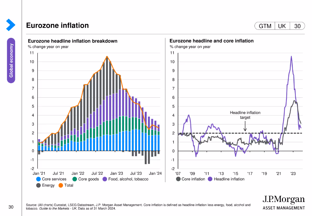
The slide features two column charts. The left chart shows a breakdown of eurozone headline inflation by different components. The right chart presents headline and core inflation trends. The charts are color-coded and include annotations for clarity.
Market Analysis and Trends
Financial Services
This slide analyzes eurozone inflation trends, breaking down the components of headline inflation and comparing headline and core inflation, important for inflation analysis.
eurozone, inflation, headline inflation, core inflation, economic trends
Multiple Chart
JP Morgan
Saved
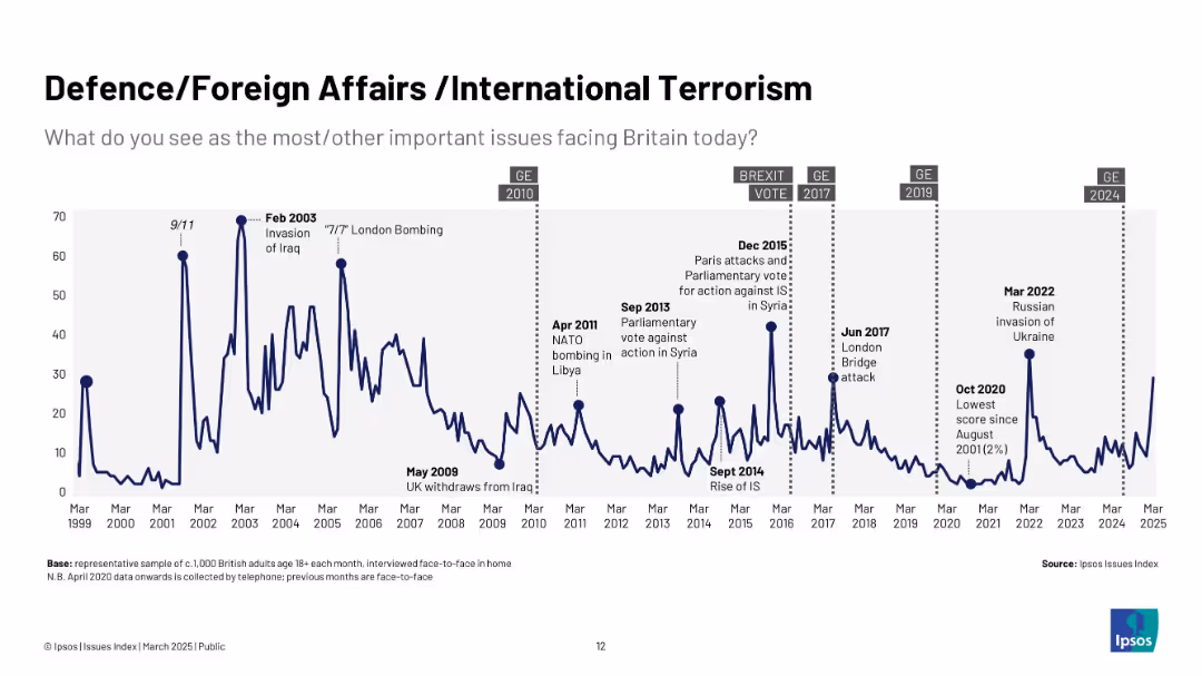
Navy blue line chart (1999–2025) with event markers for terrorism, wars, and global crises (e.g., Ukraine invasion); fluctuating concern levels.
Market Analysis and Trends
Government & Public Sector
Examines public concern over foreign threats and defence. Peaks align with global crises such as wars, terrorist attacks, and geopolitical instability, with notable fluctuations in urgency over the years.
defence, terrorism, foreign affairs, Ipsos, Ukraine, Iraq, Syria, war, UK
Single Chart
IPSOS
Saved
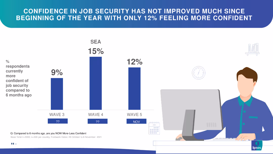
Bar chart showing changes in confidence in job security over three waves in SEA.
Market Analysis and Trends
Financial Services
The slide highlights respondents' confidence in job security over time, showing slight improvements.
job security, confidence, SEA, bar chart, trends
Single Chart
IPSOS
Saved
Three column charts, showing projected use of coal, oil, and gas from 2015 to 2050 under different climate policy scenarios.
Market Analysis and Trends
Energy & Utilities
Analysis of future fossil fuel usage under various global warming scenarios, highlighting potential declines or growth in coal, oil, and gas usage depending on environmental policies.
fossil fuels, coal, oil, gas, climate policies
Multiple Chart
BCG
Saved
The slide uses a line chart to show the relationship between CAC vs. CO₂ emissions from electricity generation in 2030 across various countries. Detailed and focused.
Regulatory and Compliance
Energy & Utilities
Discusses the challenges for top natural gas consumers in reducing carbon emissions when coupling electrolyzers with the grid, using future projections and compliance.
natural gas, carbon emissions, electrolyzer, grid coupling, CAC, CO₂ emissions, 2030, regulatory challenges
Mixed Chart
Kearney
Saved
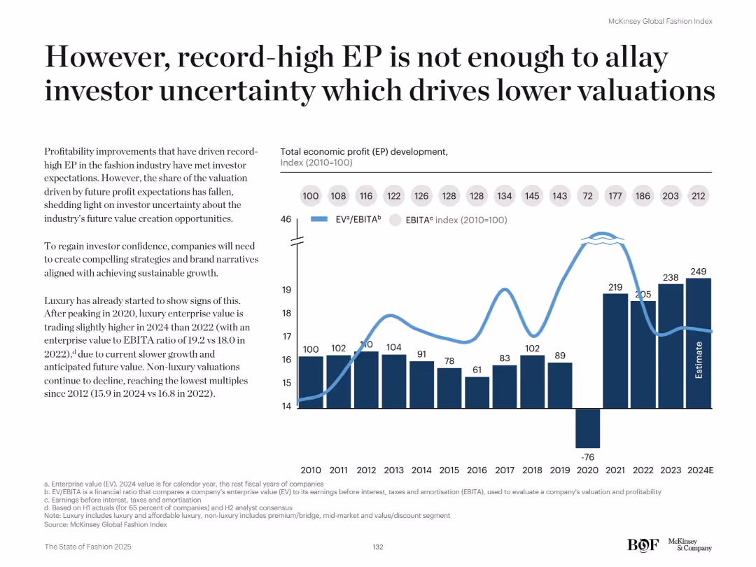
Dual-axis line and bar chart shows EP vs. EBITA index. Text discusses investor sentiment and valuation pressures.
Investment Analysis
Retail & E-commerce
Despite strong EP performance, the fashion industry faces declining valuations due to investor concerns about future growth. The chart compares EP trends with EBITA ratios, revealing a drop in valuation multiples since 2020.
Valuation, investor sentiment, EBITA, economic profit, fashion finance, capital markets, growth outlook, luxury, profitability, EV/EBITA
Mixed Chart
McKinsey
Saved
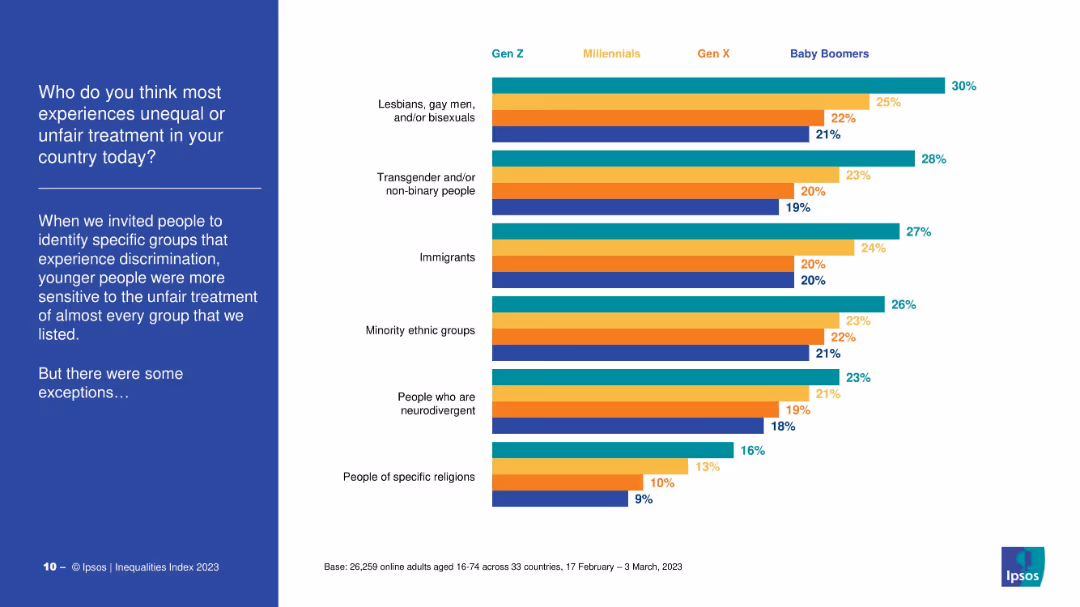
Horizontal bar chart grouped by generation, each group color-coded. Lists six demographics believed to face unfairness.
Market Analysis and Trends
Government & Public Sector
The slide illustrates which groups are seen as facing the most discrimination by different generations. Gen Z is most sensitive to unfairness, ranking LGBTQ+, immigrants, and minorities highest.
discrimination, social groups, sensitivity, Gen Z, survey, bias awareness
Mixed Chart
IPSOS
Saved
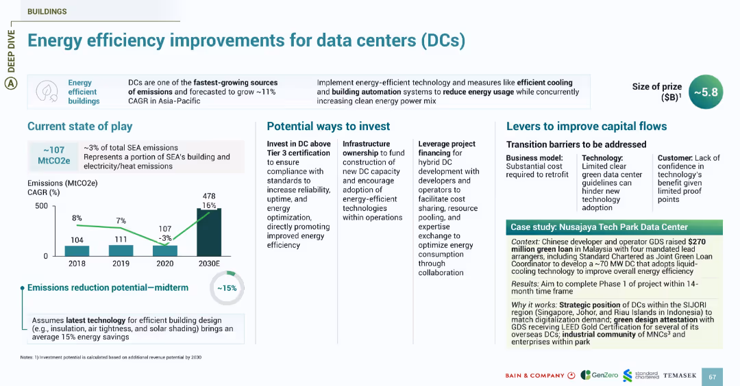
Follows the energy slide design with sections for emissions, investment, challenges, and a green-shaded case study. Focus on energy-efficient buildings.
Investment Analysis
Technology & Software
Focuses on energy consumption by data centers, one of SEA’s fastest-growing sources of emissions. Shows 15% midterm reduction potential with efficient cooling, automation, and green design. Investment opportunities include infrastructure ownership and Tier 3+ certification. Case study highlights GDS’s $270M green loan to develop a Malaysia-based DC using liquid cooling and green certification strategies.
data centers, energy efficiency, emissions, GDS, Malaysia, DCs, cooling, green loans
Multiple Chart
Bain
Saved
The slide contains a mix of icons, text, and colored boxes to represent various sectors and their growth or decline due to COVID-19. The layout is organized and color-coded.
Market Analysis and Trends
Technology & Software
Analyzes the differential impact of COVID-19 on sectors, identifying those that have been set back versus those that have seen growth or acceleration, such as e-commerce.
COVID-19, sectors, e-commerce, online travel, food delivery, growth, setback
Table
Bain
Saved
Features column charts showing Mexico's export growth to the U.S. and a map highlighting key investment regions, emphasizing Mexico's trade advantages and sectors like automotive.
Market Analysis and Trends
Financial Services
Highlights Mexico's competitive position in international trade and investment, particularly in relation to the U.S., with a focus on nearshoring opportunities and sectoral growth.
Mexico, trade, investment, nearshoring, automotive
Mixed Chart
Barclays
Saved
A descriptive list with icons. Blue and white color scheme, with a clear layout.
Technology and Digital Transformation
Healthcare & Pharmaceuticals
Discusses the influence of bioengineering across different industries.
Bioengineering, Industry Influence, Comparative Analysis
Header Vertical
McKinsey
Saved
The slide has a dark background with a yellow-highlighted quote on the left and a comparative bar chart on the right, displaying top consumer preferences with percentages.
Customer and Market Segmentation
Healthcare & Pharmaceuticals
The slide highlights what English consumers value most in the healthcare system, such as access to care, relief from pain and anxiety, and a healthier society.
Consumer values, healthcare, access to care, pain relief, England
Mixed Chart
EY
Saved
Featuring a vertical bar graph, this slide depicts the timeline of COVID-19's impact on the US economy. Accompanying text boxes provide additional insights into investors' perspectives.
Market Analysis and Trends
Financial Services
Presents investors' beliefs on the diminishing economic impact of COVID-19, relevant for assessing market risks and investment approaches.
COVID-19 Impact, Economic Analysis, Investor Beliefs, Risk Assessment, Market Sentiment, Investment Decisions, Economic Recovery, Pandemic Effects, Health Crisis, Investment Strategies
Single Chart
BCG
Saved
The slide features a two-column layout with bullet points. On the left, text is accompanied by a header "Take payments from virtually anywhere – Merchant Services". On the right, four smaller headers "Optimize contactless payments", "Reimagine the checkout experience", "Drive loyalty through your app", and "Meet your customers where they are" each followed by bullet points with benefits for customers and providers. The slide's background is white with a slight texture.
Market Analysis and Trends
Financial Services
This slide presents various strategies for enhancing merchant services, such as optimizing contactless payments, reimagining the checkout experience, and driving app loyalty. It is used to propose business solutions for improving customer interactions and operational efficiency.
merchant services, contactless payments, checkout experience, customer loyalty, business solutions
Header Horizontal
JP Morgan
Saved
This slide features comparative column charts for litigation provisions and contingent liabilities over several quarters.
Regulatory and Compliance
Financial Services
Focuses on the bank’s financial provisions for litigation and contingent liabilities, indicating trends and changes over recent quarters.
litigation, financial, provisions, liabilities, risk management, trends, banking, compliance
Multiple Chart
Deutsche Bank
Saved
A column chart comparing the approximate values lost by users during incidents such as hacking, fraud, or scams in 2023 and 2022.
Risk Assessment and Management
Financial Services
This slide displays the reported financial losses during incidents involving hacking or fraud on crypto trading platforms, comparing 2023 and 2022.
Value, loss, incident, hacking, fraud, 2023, 2022
Mixed Chart
IPSOS
Saved
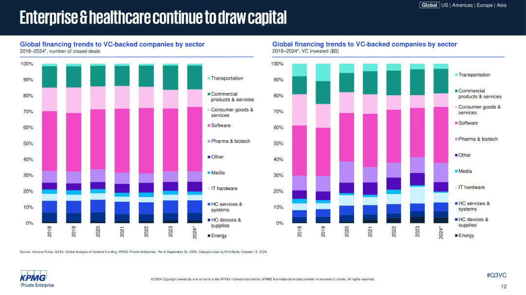
Dual stacked bar charts showing sector-wise deal and investment share, 2018–2024; sectors color-coded; consistent design with prior slides; right chart shows VC $ volume.
Market Analysis and Trends
Healthcare & Pharmaceuticals
This slide breaks down VC deal and investment volume share by industry sectors globally. Enterprise software and healthcare (pharma, biotech, HC services) remain top draws, while sectors like consumer goods and media have more modest shares. The data highlights consistent sector strength.
sector analysis, VC sectors, software, healthcare, biotech, venture funding, investment trends, 2024, sector allocation, KPMG
Multiple Chart
KPMG
Saved
This slide presents a pie chart analysis comparing the distribution of digital transformation leaders within the automotive sector to other industries.
Competitive Landscape
Transportation & Logistics
Evaluates the success of automotive companies in scaling digital innovations, categorizing them into champions, contenders, and cadets, and comparing these categories to cross-industry averages.
automotive, digital transformation, industry comparison, scaling success, competitive analysis
Multiple Chart
Accenture
Saved
Features text blocks explaining the concept, alongside images and diagrams of satellites and data processing.
Market Analysis and Trends
Technology & Software
Provides an introduction to Earth Observation, describing technologies used and their applications in monitoring Earth.
Earth observation, satellites, data processing, technology introduction
Vertical Flow
PwC/Strategy&
Saved
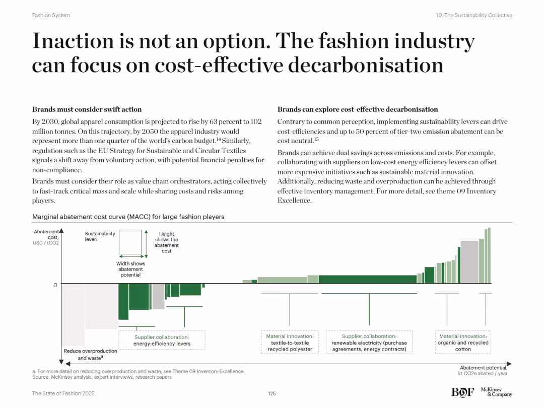
Two-column layout: left focuses on urgency and collective action, right promotes cost-efficient abatement strategies. Bottom shows a marginal abatement cost curve (MACC) chart.
Risk Assessment and Management
Retail & E-commerce
This slide promotes cost-effective approaches to decarbonization in the fashion industry. It underscores the financial and regulatory risks of inaction and showcases how low-cost measures like energy efficiency and inventory optimization can deliver high sustainability impact.
Carbon reduction, decarbonisation, energy efficiency, inventory waste, cost abatement, ESG, sustainability levers, supply chain emissions, MACC, fashion regulation
Mixed Chart
McKinsey
Saved
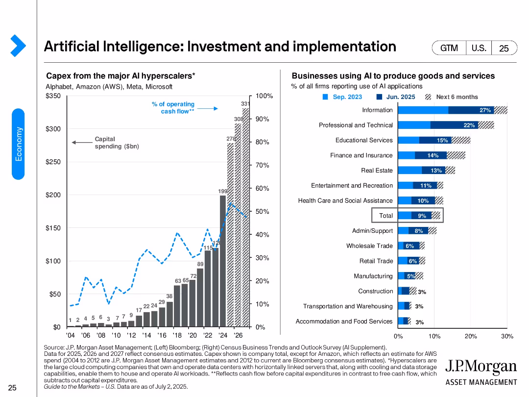
Split design. Left: bar and line chart showing capex by major AI hyperscalers from 2004 to projected 2026. Right: bar chart ranking industry AI adoption rates as of June 2025 and future intent.
Technology and Digital Transformation
Artificial Intelligence
Shows the surge in AI investment by major hyperscalers like AWS, Microsoft, and Alphabet. It also identifies sectors with highest AI adoption—led by Information and Professional Services—and expectations for broader deployment in the next 6 months.
AI investment, hyperscalers, technology adoption, AI implementation, industry adoption, digital transformation, capex, cloud
Multiple Chart
JP Morgan
Saved
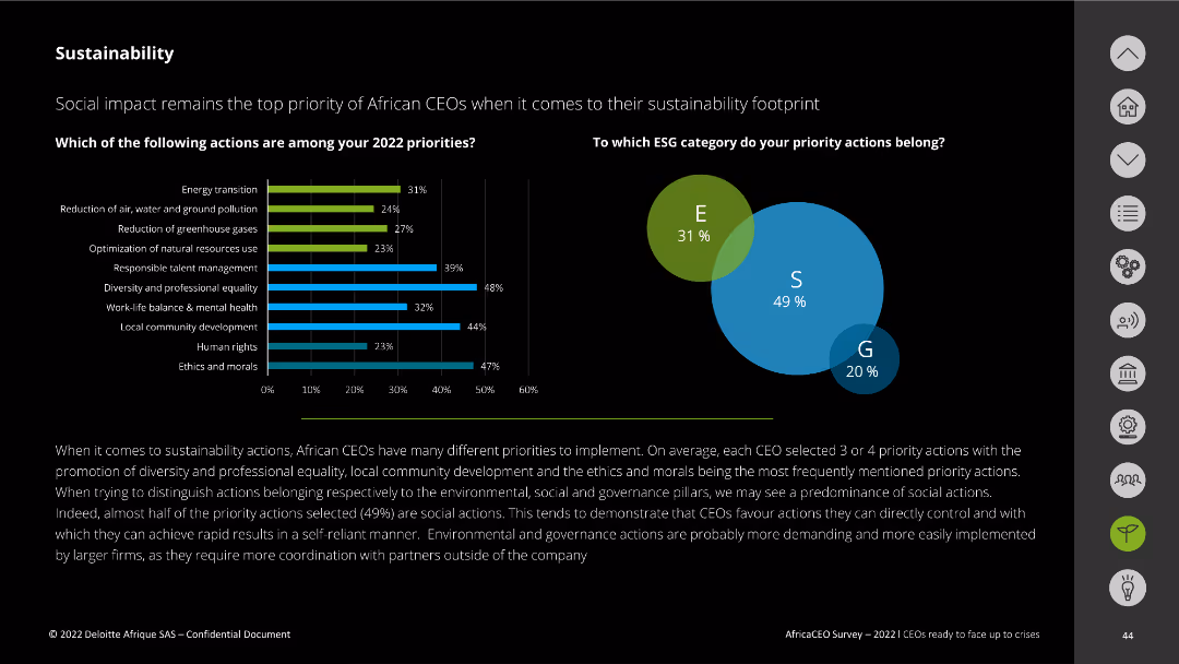
This slide includes vertical bar charts and a Venn diagram. It lists 2022 sustainability priorities and categorizes actions by ESG pillars.
Market Analysis and Trends
Environmental Services & Sustainability
The slide details the top sustainability priorities for African CEOs in 2022 and categorizes these actions into environmental, social, and governance pillars.
sustainability priorities, ESG, African CEOs, social actions, environmental impact
Multiple Chart
Deloitte
Saved
Three sets of column charts displaying agreement percentages by age group on trusting business leaders, career fulfillment, and wealth disparity.
Market Analysis and Trends
Government & Public Sector
It examines how younger people compare to older cohorts regarding trust in business leaders, career goals, and views on income inequality.
youth, trust, career focus, wealth disparity, business leaders, column chart, age groups
Multiple Chart
IPSOS
Saved
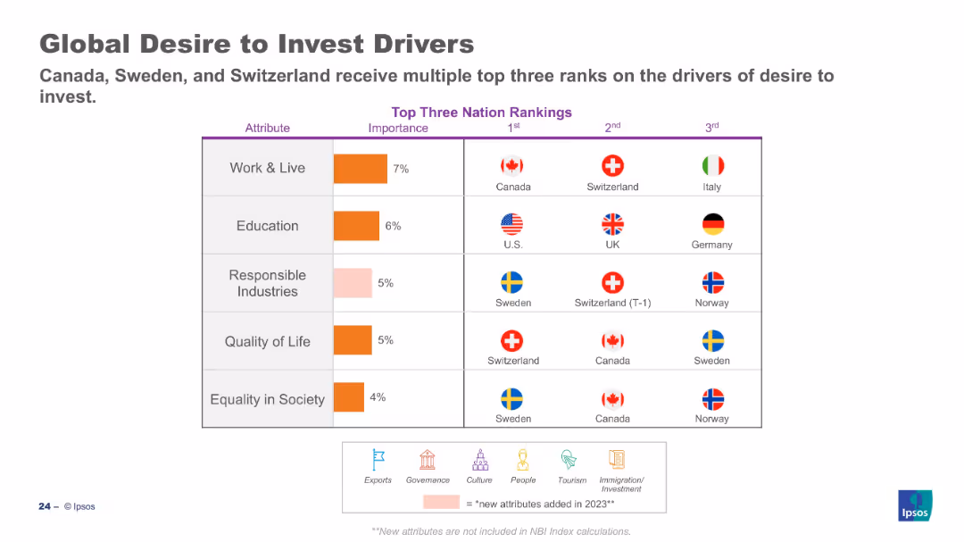
Table ranks top countries for each investment driver; importance column on left.
Customer and Market Segmentation
Professional Services
This slide showcases which countries are perceived most favorably for investment attributes like work & live, education, and quality of life. Canada, Sweden, and Switzerland rank highly across multiple categories, highlighting their strong international appeal.
investment, perception, countries, Ipsos, drivers, ranking, global sentiment, attributes
Mixed Chart
IPSOS
Saved
Column charts showing total revenues and profit before tax for different regions, with additional text explanations.
Financial Performance
Financial Services
Details the financial performance by region for Q3 2022, highlighting revenues and profits across various geographies.
Group results, regions, financial performance, UBS, 3Q22, revenues, profit, cost/income ratio
Multiple Chart
UBS
Saved
Previous
Next
If nothing, comes up, please save your slides first
Create a FREE account to continue browsing
Receive Instant Access to 1,000+ slides from companies like McKinsey, Google, and Goldman Sachs
First Name
Last Name
Email
Password
I agree to all
Terms & Privacy Policy
Thank you! Your submission has been received!
Oops! Something went wrong while submitting the form.
Have an account?
Sign in
Column Chart
Heatmap
Chevron
Org Chart
Infographic
Callouts
Timeline
List
Graphic
Picture
Process Flow
Diagram
Paragraph
Map
Table
Framework
Subtitle
Takeaway Box
Icon
Other Chart
Radar Chart
Waterfall Chart
Mekko Chart
Pie Chart
Scatter Plot
Line Chart
Bar chart
Bullet points