Create a FREE Account
Instant access to 1,000+ real slides from top companies like McKinsey, BCG, Goldman Sachs, Google and many more!
First Name
Last Name
Email
Password
I agree to all
Terms & Privacy Policy
Thank you! Your submission has been received!
Oops! Something went wrong while submitting the form.
Have an account?
Sign in
Library
Templates
Courses
Pricing
My Account
My Slides
✦ AI
AI Prompt Library
AI Search
Sign in
Start Here
Logout
My Saved Slides
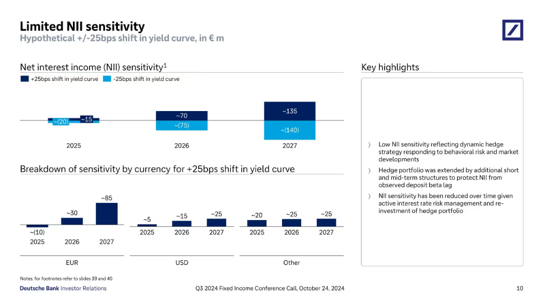
Two-part slide: bar charts showing NII sensitivity to ±25bps yield curve shifts across years, with currency breakdown for +25bps in lower section.
Risk Assessment and Management
Financial Services
Evaluates Deutsche Bank’s NII sensitivity to interest rate shifts from 2025–2027. Projects growing positive impact from a +25bps shift. EUR drives the largest exposure. Useful for forecasting interest rate risk and net income variability.
interest rate risk, NII, yield curve, sensitivity, EUR, forecast
Multiple Chart
Deutsche Bank
Saved
Multi-column layout with four categories, each with color-coded headers and bullet point issues
Regulatory and Compliance
Environmental Services & Sustainability
The slide outlines four main challenges to sustainability in Nigeria: weak technical capacity, exchange rate instability, lack of ESG standardization, and unpredictable consumer demand. Each category lists specific issues impacting green financing, reporting, and adoption of sustainable practices.
ESG, finance, sustainability, Nigeria, green financing, reporting, taxonomy, exchange rate
Pillar
PwC/Strategy&
Saved
Split slide: left side has a stylized visual with text; right side features a line graph showing cost-to-income ratio trends from 2003 to 2024.
Operational Efficiency
Financial Services
Demonstrates how the world's largest banks have successfully reduced their cost-to-income ratios over two decades, highlighting improvements in digital banking and operational efficiency.
Cost-to-Income, Efficiency, Digital Banking, CIR, Banking Trends, Global Banks, Operational Metrics
Mixed Chart
Accenture
Saved
The slide features a column chart showing changes in assets under management over time, with callout boxes indicating specific factors contributing to the increases or decreases, and an annotation explaining equity movements. The chart uses shades of blue and gray for visual differentiation.
Financial Performance
Financial Services
This slide presents the movements in Macquarie Infrastructure and Real Assets (MIRA) Equity Under Management (EUM), highlighting the impact of new equity raised, listed security price movements, and foreign exchange movements, suitable for financial analysis and investor presentations.
MIRA, EUM, equity, investment, financial analysis, Macquarie, bar graph, performance, capital, foreign exchange
Single Chart
Goldman Sachs
Saved
Similar layout as previous: blue sidebar on left, bar chart on right comparing trustworthy and untrustworthy scores for TV news readers across countries.
Market Analysis and Trends
Media & Entertainment
This slide displays comparative trust levels in TV news readers globally. Indonesia and South Africa rank highest in trust, while Argentina ranks lowest.
news, TV anchors, credibility, country comparison, Ipsos, media trust, 2023, survey
Mixed Chart
IPSOS
Saved
The slide displays a horizontal timeline with circular images and text boxes beneath each year from 2019 to the future, highlighting key events and trends in Greek tourism.
Strategic Planning
Hospitality & Tourism
This slide presents a timeline of significant events and trends in the Greek tourism and travel sector from 2019 to future projections.
Greek tourism, timeline, strategic planning, sector trends, travel industry
Linear Flow
EY
Saved
A two-column layout with a text section on the left and a cluster bubble chart on the right showing emotional responses to generative AI. Colors are green and grey.
Market Analysis and Trends
Technology & Software
The slide presents survey findings on the high interest and transformative expectations from generative AI in business and technology sectors, highlighting mixed emotions like excitement and uncertainty.
Generative AI, Survey, Emotions, Expectations, Business, Technology
Mixed Chart
Deloitte
Saved
Slide displays a line chart depicting the trend of mobile spending over several years, with projected future values indicated by a dashed line.
Market Analysis and Trends
Professional Services
Discusses the decline and expected rebound in mobile spending, valuable for financial analysis and planning in consumer goods and telecommunications industries.
mobile spending, trend, future, projection, consumer goods, telecommunications, financial, analysis, decline, rebound
Mixed Chart
Deloitte
Saved
The slide features a column chart indicating the influence of different types of fashion influencers on consumers, especially those under 30. It includes a list of trends for fashion KOLs.
Customer and Market Segmentation
Media & Entertainment
The slide shows that over 70% of young consumers are influenced by KOLs, with fashion bloggers having the highest impact, followed by stars/supermodels and internet celebrities. Trends in fashion KOLs are also discussed.
consumers, KOLs, fashion influencers, young consumers, WeChat
Mixed Chart
BCG
Saved
Bar chart comparison of men’s and women’s survey responses across various groups (e.g., people with disabilities, LGBTQ+, neurodivergent individuals). Left-side commentary explains gender differences in perceptions.
Market Analysis and Trends
Government & Public Sector
The slide contrasts how men and women perceive discrimination faced by various groups. Women show higher sensitivity to the unfair treatment of others, while men are more likely to believe that men face discrimination. Significant gender gaps are noted across most categories.
discrimination, gender gap, minorities, disability, LGBTQ+, survey results, public perception, inequality, Ipsos
Mixed Chart
IPSOS
Saved
This slide features a scatter plot showing the correlation between perceived leadership commitment and daily bias. It includes quotes and uses distinct color coding for clarity.
Human Resources and Talent Management
Government & Public Sector
The slide discusses the importance of leadership commitment to reducing day-to-day bias and obstacles in diversity and inclusion, supported by employee quotes and a scatter plot analysis.
Leadership, Commitment, Bias, Diversity, Inclusion, Day-to-Day, Employee Quotes, Correlation, Analysis
Mixed Chart
BCG
Saved
Features a funnel diagram and pie charts to show the influence of online interactions on luxury purchases from 2018 to 2025.
Technology and Digital Transformation
Retail & E-commerce
Explores how digital platforms influence the luxury goods purchasing process, predicting that by 2025, online interactions will affect almost every luxury purchase and enable half of them through technologies like VR and IoT.
Online Influence, Luxury Purchases, Digital Transformation
Multiple Chart
Bain
Saved
The slide features a line graph showing Macquarie's performance over time against the ASX200 index, with green fill indicating outperformance. It also includes a table comparing outperformance metrics since listing, over 10 years, and over 5 years. The layout is well-organized with a clear visual hierarchy.
Investment Analysis
Financial Services
The slide highlights Macquarie's outperformance compared to the ASX200 and MSCI World Capital Markets Index, focusing on the shareholder value generated over time. It is used to show Macquarie's long-term financial growth and its comparison with major indices for investor insights.
shareholder returns, Macquarie, ASX200, MSCI World Index, long-term performance, outperformance, financial analysis, investment
Single Chart
Morgan Stanley
Saved
The slide features three circular icons representing financial outlook, strategic priorities, and digitalization and innovation. Each icon is accompanied by a text box explaining the respective focus area.
Financial Performance
Healthcare & Pharmaceuticals
This slide provides an overview of financial outlook for hospitals, strategic priorities post-COVID-19, and ongoing focus on digitalization and innovation in the healthcare sector.
financial, outlook, strategy, digitalization, innovation
Pillar
LEK
Saved
The slide features statistics and pie charts highlighting the vulnerabilities in supply chains and the increase in cyber attacks targeting these vulnerabilities.
Risk Assessment and Management
Transportation & Logistics
This slide explains how the increasing digitalization and complexity of supply chains make them more susceptible to cyber attacks. It includes data on the percentage of attacks occurring through supply chains and the rise in such attacks during 2021.
supply chains, digitalization, complexity, cyber attacks, vulnerabilities, statistics, pie charts, BCG
Multiple Chart
BCG
Saved
Two donut charts displaying the distribution of podcast ad revenue by type of ad read mechanism between 2015 and 2016, noting a preference for host-read ads.
Market Analysis and Trends
Media & Entertainment
Explores revenue distribution by ad read mechanisms in podcasting, indicating a growing preference for host-read ads. Useful for media companies evaluating engagement strategies and ad format effectiveness.
podcast, ad revenue, host read, media
Multiple Chart
PwC/Strategy&
Saved
The slide features a column chart with data on 2020 IPO activity in main and junior markets. It also includes a text section summarizing IPO trends across EMEIA regions, with key statistics and sector analysis.
Market Analysis and Trends
Financial Services
Provides an overview of IPO market trends in EMEIA for 2020, noting a decline in proceeds despite an increase in deal numbers. Highlights sector performance and regional market activities.
IPO, EMEIA, market trends, sectors, 2020, financial services, Europe, Middle East, India, Africa
Multiple Chart
EY
Saved
A balance of text and graphics, showing the bank's strengths and how it aligns with J.P.Morgan's strategies, accompanied by a pie chart.
Mergers and Acquisitions
Financial Services
Slide compares the business models of First Republic Bank and J.P.Morgan, focusing on client service, credit performance, and strategic alignment. Suitable for M&A context or business model comparison.
First Republic Bank, client service, credit performance, strategic alignment, loan portfolio, high-growth markets, talent acquisition
Mixed Chart
JP Morgan
Saved
Contains text blocks and images showcasing infrastructure and activities in Switzerland's food sector.
Market Analysis and Trends
Agriculture & Food Production
Highlights Switzerland's role as a leader in food and nutrition, focusing on corporate and academic contributions.
Switzerland, innovation, food, academia, corporates
Header Horizontal
Accenture
Saved
The slide includes bar charts comparing average daily rates (ADR) and occupancy rates in August across different years and hotel categories, with text summarizing insights.
Performance Metrics and KPIs
Hospitality & Tourism
This slide analyzes hotel occupancy and ADR performance, highlighting improvements and shifts in customer preferences, and the potential for alternative tourism.
Hotel occupancy, ADR, performance analysis, tourism insights, bar charts
Multiple Chart
EY
Saved
The slide contains a world map with three pie charts representing Europe, Americas, and APAC. Each pie chart shows percentage recovery expectations.
Market Analysis and Trends
Consumer Goods
It discusses the expected recovery of personal luxury goods across different regions, with key insights from C-Level executives highlighted on the right.
Recovery, Luxury Goods, Europe, Americas, APAC, Covid
Multiple Chart
Deloitte
Saved
The slide features three charts: a bar chart for nonfarm payroll gains, a bar chart showing labor force growth by native and immigrant contributions, and a line chart for labor force participation rates.
Market Analysis and Trends
Financial Services
This slide analyzes labor supply in the U.S., including nonfarm payroll changes, labor force growth by demographics, and participation rates. Useful for understanding employment trends.
labor supply, nonfarm payroll, labor force, employment trends, demographics, participation rate
Multiple Chart
JP Morgan
Saved
The slide has two line charts comparing labor market indicators between the US and Euro area, with commentary on the right side and labeled data sources at the bottom.
Market Analysis and Trends
Financial Services
The slide discusses recent labor market movements in the US and Euro area, highlighting worker hoarding and labor market adjustments.
labor market, US, Euro area, employment, vacancies
Multiple Chart
Accenture
Saved
Horizontal bar chart format; countries listed on the left; right bars split between support and oppose.
Market Analysis and Trends
Government & Public Sector
This slide shows country-wise public support for brands promoting LGBT equality. Thailand, Spain, and Sweden top the list, while Türkiye and South Korea show the lowest support levels.
brands, equality, countries, LGBT, visibility, consumer sentiment, Ipsos
Mixed Chart
IPSOS
Saved
Bar graph with six categories comparing successful and unsuccessful businesses on practices used.
Operational Efficiency
Professional Services
The slide highlights six business practices—such as data-backed decision making and scaling processes—more common in successful new businesses. A bar graph shows percentage gaps between successful and unsuccessful businesses.
decision-making, scaling, agile, vendors, data, new business, McKinsey, success practices
Mixed Chart
McKinsey
Saved
Previous
Next
If nothing, comes up, please save your slides first
Create a FREE account to continue browsing
Receive Instant Access to 1,000+ slides from companies like McKinsey, Google, and Goldman Sachs
First Name
Last Name
Email
Password
I agree to all
Terms & Privacy Policy
Thank you! Your submission has been received!
Oops! Something went wrong while submitting the form.
Have an account?
Sign in
Column Chart
Heatmap
Chevron
Org Chart
Infographic
Callouts
Timeline
List
Graphic
Picture
Process Flow
Diagram
Paragraph
Map
Table
Framework
Subtitle
Takeaway Box
Icon
Other Chart
Radar Chart
Waterfall Chart
Mekko Chart
Pie Chart
Scatter Plot
Line Chart
Bar chart
Bullet points