My Account
My Slides
Search by Category
Templates
View All Templates
Download Template Slides
✦ AI Search
Feedback
Login
Logout
Get Started
Browse all Slides
Browse all Slides
Create a FREE Account
Instant access to 1,000+ real slides from top companies like McKinsey, BCG, Goldman Sachs, Google and many more!
First Name
Last Name
Email
Password
I agree to all
Terms & Privacy Policy
Thank you! Your submission has been received!
Oops! Something went wrong while submitting the form.
Have an account?
Sign in
Saved Slides
A graphically intensive slide that presents a colorful chart depicting future energy consumption trends, balanced with descriptive text to the side.
Technology and Digital Transformation
Energy & Utilities
The slide projects future trends in the global energy mix, with a focus on the growing role of electricity and hydrogen. The chart and accompanying text highlight key findings, such as the expected increase in the share of these energy sources, driven by technological advancements and policy measures. It offers a visual representation of the data discussed in the report, making complex projections more accessible and emphasizing the shift towards cleaner energy sources.
Energy Trends, Electricity, Hydrogen, Future Projections
Mixed Chart
McKinsey
Saved
It features a line chart with multiple data series showing core inflation rates over two decades for the US, Eurozone, and UK. The slide has a white background with minimal design elements.
Market Analysis and Trends
Financial Services
Presenting a longitudinal view of core inflation trends, this slide is instrumental in understanding persistent inflation across various economies. It's valuable for financial analysts and economists for long-term planning and policy development, especially considering recent spikes in the inflation data.
Core Inflation, Trend, US, Eurozone, UK, Long-Term, Finance, Policy, 2023
Single Chart
JP Morgan
Saved
A slide with a bold, purple background containing three key recommendations for marketers to build brand awareness. Each recommendation is supported by an icon and brief text description.
Strategic Planning
Media & Entertainment
This slide provides three key recommendations for marketers to enhance brand awareness: align marketing strategies with KPIs, stay top-of-mind with consumers, and leverage digital channels for long-term engagement and reach.
Recommendations, Marketing, Brand, Awareness, Strategy
Header Vertical
Nielsen
Saved
Presents a line graph tracking Macquarie's performance against the ASX 200 and a table with outperformance metrics, providing a historical overview and current data.
Investment Analysis
Financial Services
This slide illustrates Macquarie's long-term shareholder value creation, juxtaposing historical outperformance against market indices. Tailored for current and potential investors analyzing past and prospective returns.
shareholder, returns, performance, ASX, value, historical, investment, indices, market, outperformance
Mixed Chart
Goldman Sachs
Saved
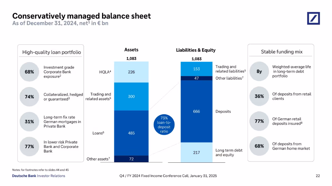
Split panel design showing assets and liabilities side-by-side using stacked bar formats. Flanked by callout bubbles for metrics (loan-to-deposit, quality, maturity). Structured with clean lines and shaded color segments.
Operational Efficiency
Financial Services
This slide provides a breakdown of Deutsche Bank’s assets and liabilities as of December 2024, showcasing a conservative balance sheet. Key data include 73% loan-to-deposit ratio, long average debt maturity, and high levels of investment-grade and collateralized loans. It underscores stability, funding quality, and prudent risk management.
balance sheet, assets, liabilities, loan-to-deposit, collateralized loans, HQLA, long-term debt, Deutsche Bank
Mixed Chart
Deutsche Bank
Saved
Slide features pie charts showing the diversified deposit base by business and product, and column charts for liquidity ratios.
Operational Efficiency
Financial Services
Discusses the funding sources and liquidity metrics of the bank, showcasing the stability and distribution of deposits and their impact on financial health.
funding, liquidity, financial health, deposits, ratios, banking, operational efficiency
Multiple Chart
Deutsche Bank
Saved
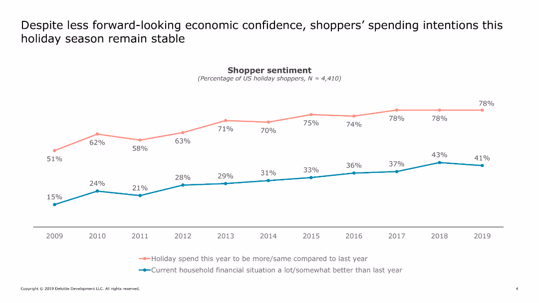
Displays a line chart comparing holiday spending intentions with household financial situations from 2009 to 2019.
Market Analysis and Trends
Retail & E-commerce
Analyzes shopper sentiment regarding holiday spending and household financial situations over a decade, showing trends and changes in economic confidence.
shopper, sentiment, holiday, spending, financial, confidence, trend, analysis
Single Chart
Deloitte
Saved
The slide includes bulleted points on collaboration initiatives and a column chart on asset management net new assets from private bank channels. It features a clean layout with blue and grey tones.
Strategic Planning
Financial Services
This slide details the initiatives to strengthen partnerships with PB through collaboration and distribution enhancement. It shows cumulative NNA growth and thematic equity fund launches.
Partnership, Collaboration, Asset Management, NNA Growth, Thematic Equity Funds
Mixed Chart
Credit Suisse
Saved
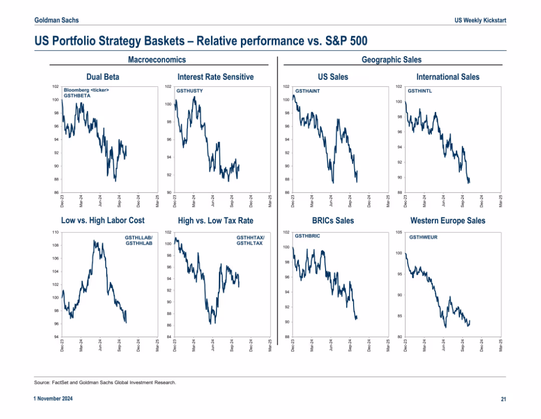
Nine-panel grid showing relative performance of macroeconomic and geographic strategy baskets vs. S&P 500
Market Analysis and Trends
Financial Services
Compares performance of strategy baskets (e.g., Dual Beta, BRICs Sales, Tax Themes) against the S&P 500, allowing investors to evaluate trends by macro or geographic exposure.
strategy themes, macroeconomics, BRICs, tax strategies, relative performance, portfolio positioning
Multiple Chart
Goldman Sachs
Saved
Uses pie charts to show CRE loan exposure by type and region, with a central focus on the large proportion of warehouse facilities.
Risk Assessment and Management
Financial Services
Provides insights into the composition and regional spread of CRE loan exposure, emphasizing the significance of warehouse facilities. Useful for discussions on risk exposure and investment decisions in the real estate sector.
Credit Risk, CRE, Loan Exposure, Warehouse Facilities, Regional Spread, Americas, EMEA, Asia, Distressed Properties, Healthcare, Residential Property
Multiple Chart
Goldman Sachs
Saved
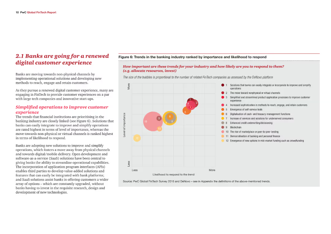
A content slide with text explaining the trends in the banking industry towards digital customer experiences. Includes a bubble chart ranking various trends in terms of importance and likelihood to respond.
Market Analysis and Trends
Financial Services
This slide highlights the shift in the banking industry towards enhancing digital customer experiences. It identifies key trends and their importance, supported by a bubble chart that ranks these trends based on their perceived significance and likelihood of adoption.
Banking, digital customer experience, trends, importance, likelihood to respond, bubble chart
Mixed Chart
PwC/Strategy&
Saved
The slide presents future projections using a bar chart showing the digital economy's growth, driven by tier 2 and 3 cities, with accompanying explanatory text.
Market Analysis and Trends
Technology & Software
Forecasts the increasing contribution of tier 2 and 3 cities to Indonesia's digital economy by 2025, indicating significant growth in e-commerce and other sectors.
forecast, digital economy, tier cities, Indonesia, growth, e-commerce, payments
Multiple Chart
Kearney
Saved
This slide presents a column chart comparing unlinked metro rides annually. Annotations and year markers provide a clear depiction of trends and significant data points.
Risk Assessment and Management
Transportation & Logistics
Offers a decade-long review of rail ridership, illustrating trends and discussing the factors influencing these patterns.
metro rides, annual trends, ridership data, transportation analysis
Single Chart
BCG
Saved
Line chart tracks changes in investors' priorities over time for financially healthy companies, highlighting shifts during and after the COVID-19 pandemic.
Investment Analysis
Financial Services
Highlights the evolving focus of investors on short-term goals versus long-term capabilities, showing how priorities shifted significantly during the pandemic. Useful for understanding investor behavior changes.
investors, focus, short-term, long-term, pandemic
Single Chart
BCG
Saved
Two charts: a line chart showing MVR real GDP projections and a bar chart showing 2-year GDP growth for selected industries in Canada, both labeled as preliminary projections.
Market Analysis and Trends
Financial Services
This slide projects Metro Vancouver’s GDP growth and outlines the expected growth rates for various Canadian industries over the next two years.
Baseline projection, MVR GDP, preliminary, industry growth, 2-year projection, Metro Vancouver
Multiple Chart
Deloitte
Saved
Features pie charts comparing revenue segments from 2018, 2022, and 2027, alongside a column for contextual data. The pie charts display proportions in distinct colors for different segments, and the slide is text-heavy, providing detailed contextual information about the impact of the COVID-19 pandemic and recovery predictions.
Market Analysis and Trends
Media & Entertainment
Discusses the segment distribution of the business-to-business market in Hong Kong, focusing on the major hit from COVID-19 and recovery projections. Useful for business planning and analysis in post-pandemic market scenarios.
Hong Kong, trade shows, business-to-business, market distribution, COVID-19 impact, recovery prediction
Multiple Chart
PwC/Strategy&
Saved
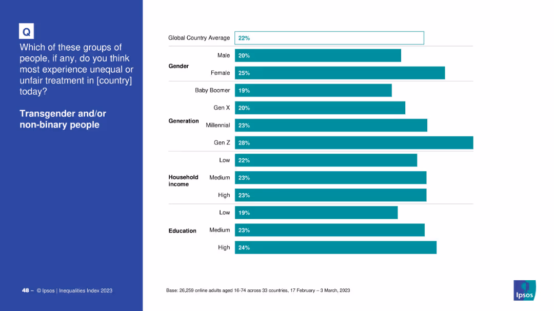
Bar chart segmented by demographics: gender, generation, income, and education
Market Analysis and Trends
Government & Public Sector
The slide shows perceptions of unfair treatment of transgender and non-binary people across global demographics. Gen Z and females perceive the highest levels of discrimination, suggesting generational awareness and gendered perspectives.
transgender, demographics, Gen Z, gender gap, Ipsos, income, education, inequality, survey
Mixed Chart
IPSOS
Saved
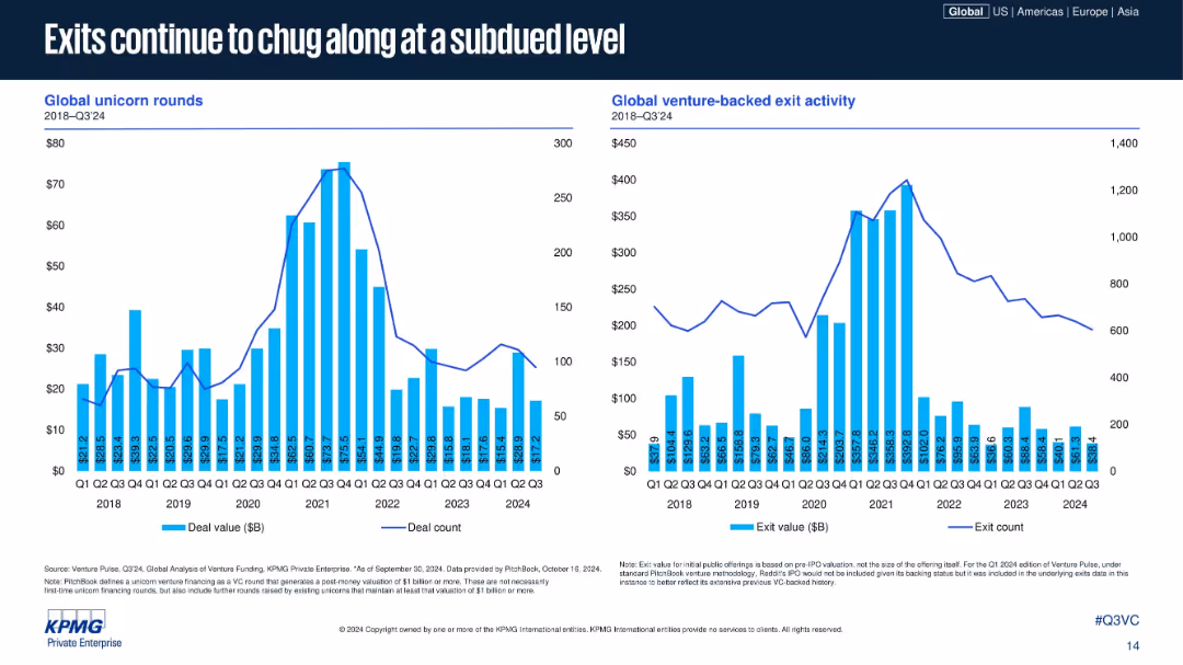
Two bar-line combo charts: one on unicorn rounds, the other on global exit activity; time-series layout; vertical blue bars and line for counts; standard KPMG chart design.
Risk Assessment and Management
Financial Services
This slide highlights the subdued levels of both unicorn financing rounds and exit activity from 2022–2024. Deal count and values have both decreased sharply since their 2021 peaks, reflecting investor caution and market cool-down in IPOs and M&A exits.
unicorns, exits, IPO, M&A, deal activity, venture exits, exit value, Q3 2024, unicorn rounds, global VC
Multiple Chart
KPMG
Saved
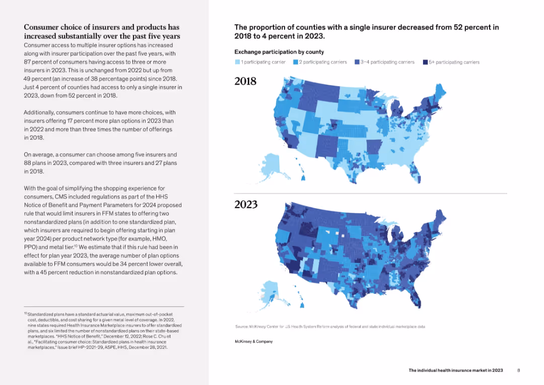
Left side contains detailed narrative text. Right side includes two U.S. maps comparing county-level insurer participation in 2018 vs 2023 using a 4-color gradient. Clear, geography-based visual format.
Strategic Planning
Healthcare & Pharmaceuticals
This slide illustrates the dramatic increase in consumer choice within the health insurance market between 2018 and 2023. The maps show a drop in counties with only one insurer from 52% to 4%, and a rise in counties with three or more insurers. The narrative also discusses regulatory developments and plan design standardization.
insurers, county-level access, coverage, maps, healthcare choice
Mixed Chart
McKinsey
Saved
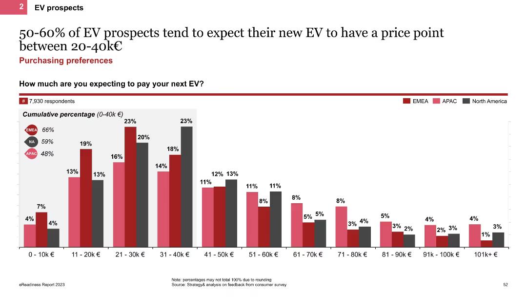
The slide features a column chart displaying the expected price range for new EVs among prospects. It shows cumulative percentages for different price points, with regional comparisons indicated by colored bars for EMEA, APAC, and North America.
Market Analysis and Trends
Transportation & Logistics
This slide presents the expected price range for new EVs among prospects, highlighting that 50-60% expect to pay between 20-40k€. It includes regional comparisons to show variations in price expectations across different markets.
EV price range, column chart, price expectations, regional comparison
Single Chart
PwC/Strategy&
Saved
This slide features a central column chart surrounded by explanatory text and smaller charts, highlighting the caseload distribution in two courts with a focus on family law. The layout is organized and color-coded for clarity.
Operational Efficiency
Government & Public Sector
It showcases the total number of court cases handled by two courts, emphasizing the distribution and percentage of family law cases, useful for workload analysis and operational insights.
caseload, courts, distribution, family law, analysis
Single Chart
PwC/Strategy&
Saved
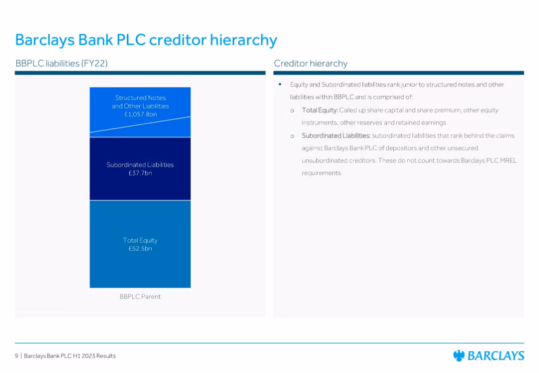
Stacked chart with equity and liability breakdown + bullet points explanation
Corporate Finance and Valuation
Financial Services
Illustrates the creditor hierarchy of Barclays Bank PLC for FY22. Details how structured notes, subordinated liabilities, and total equity are structured and ranked in terms of claims in the creditor stack.
Creditor Hierarchy, Subordinated Liabilities, Equity, Barclays, FY22, Capital Structure, Risk Ranking
Mixed Chart
Barclays
Saved
The slide features three blocks describing different types of outcome-oriented training providers, supported by logos of representative companies and brief descriptions.
Product and Service Analysis
Education & Training
This slide details outcome-oriented training providers, focusing on guaranteed outcomes for students or specific industries, along with examples of such providers.
training providers, outcome-oriented, guaranteed outcomes, industry focus, education analysis, training models, student placement
Pillar
LEK
Saved
The slide features bar graphs comparing projections from 2020 to 2025 in different sectors of Indonesia's Internet economy, like e-commerce and health-tech. It has a moderate visual complexity with clear labels.
Market Analysis and Trends
Technology & Software
The slide analyzes projected growth in sectors of Indonesia's Internet economy, providing insights for investors and companies planning expansion or entry into these markets.
Indonesia, Internet economy, e-commerce, growth, health-tech, ride-hailing, payments, lending, projections, investors
Multiple Chart
Kearney
Saved
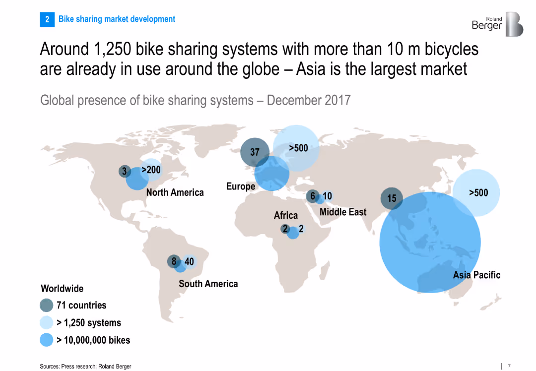
World map showing global presence of bike sharing systems with bubble markers for number of systems and bikes per region. Clean and global infographic design.
Market Analysis and Trends
Transportation & Logistics
The slide presents a global snapshot of bike sharing systems, highlighting Asia Pacific as the largest market. It shows the number of systems and bikes by region, indicating the global spread and significance of the industry.
bike sharing, global distribution, Asia Pacific, market size, transportation, infographic, global trends, 2017
Multiple Chart
Roland Berger
Saved
Previous
Next
If nothing, comes up, please save your slides first
Create a FREE account to continue browsing
Receive Instant Access to 1,000+ slides from companies like McKinsey, Google, and Goldman Sachs
First Name
Last Name
Email
Password
I agree to all
Terms & Privacy Policy
Thank you! Your submission has been received!
Oops! Something went wrong while submitting the form.
Have an account?
Sign in
Column Chart
Heatmap
Chevron
Org Chart
Infographic
Callouts
Timeline
List
Graphic
Picture
Process Flow
Diagram
Paragraph
Map
Table
Framework
Subtitle
Takeaway Box
Icon
Other Chart
Radar Chart
Waterfall Chart
Mekko Chart
Pie Chart
Scatter Plot
Line Chart
Bar chart
Bullet points