My Account
My Slides
Search by Category
Templates
View All Templates
Download Template Slides
✦ AI Search
Feedback
Login
Logout
Get Started
Browse all Slides
Browse all Slides
Create a FREE Account
Instant access to 1,000+ real slides from top companies like McKinsey, BCG, Goldman Sachs, Google and many more!
First Name
Last Name
Email
Password
I agree to all
Terms & Privacy Policy
Thank you! Your submission has been received!
Oops! Something went wrong while submitting the form.
Have an account?
Sign in
Saved Slides
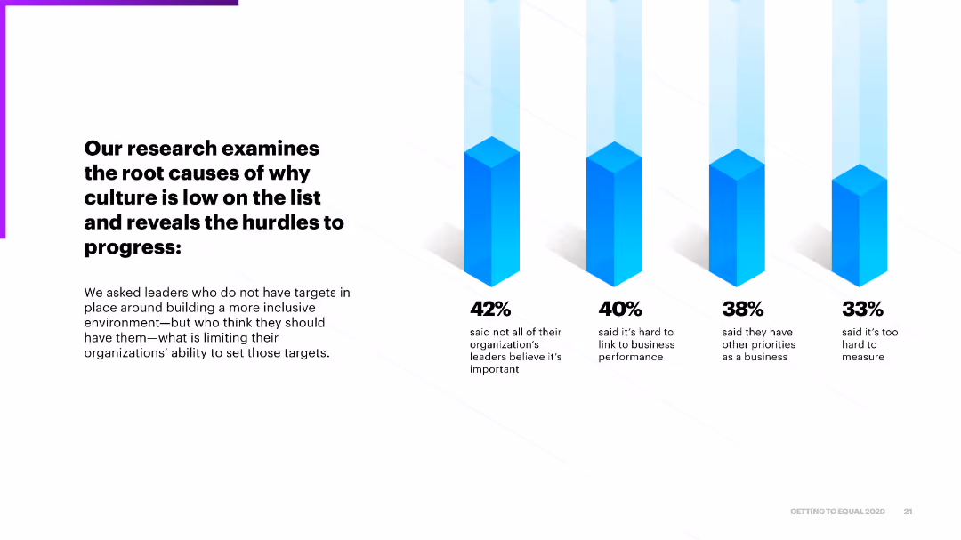
The slide includes four column charts highlighting the main reasons why leaders do not set targets for building an inclusive environment, such as perceived importance and difficulty linking to business performance.
Market Analysis and Trends
Professional Services
It examines the root causes that prevent leaders from prioritizing inclusive culture, identifying hurdles like linking inclusion to business performance and setting measurable targets.
hurdles, inclusive environment, business performance, targets, progress
Mixed Chart
Accenture
Saved
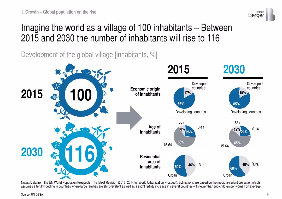
Infographic comparing 2015 vs. 2030: population structure by region, age, and residence.
Industry Overview
Government & Public Sector
Visualizes global demographic changes in a simplified 100-person village analogy, projecting more urbanization and aging population, especially in developing countries.
population growth, urbanization, demographics, global trends
Mixed Chart
Roland Berger
Saved
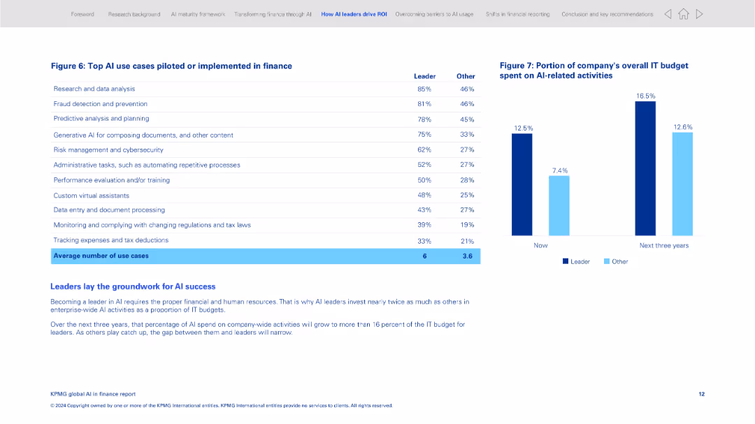
Two-panel layout with a data table on the left and a bar chart on the right; clean and grid-aligned
Product and Service Analysis
Financial Services
This slide lists the most common AI use cases implemented in finance, including research, fraud detection, and document processing. It compares leaders and other organizations in adoption levels and shows IT budget allocation to AI activities now and projected in 3 years.
AI use cases, finance operations, AI leaders, IT budget, fraud detection, predictive planning, automation, investment
Mixed Chart
KPMG
Saved
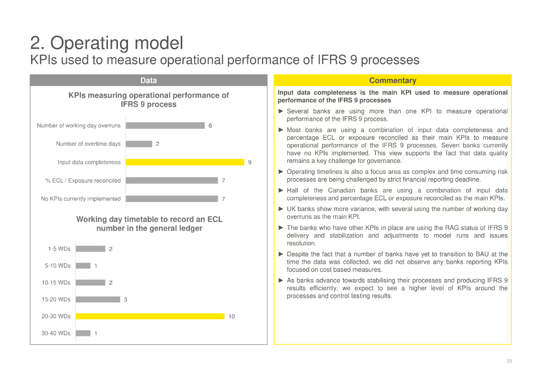
Displays column charts measuring operational performance of IFRS 9 processes using KPIs such as input data completeness and working day timetable, with a commentary discussing the main KPIs and their impact on operational performance.
Operational Efficiency
Financial Services
Evaluates the operational performance of IFRS 9 processes using various KPIs, emphasizing the importance of data completeness and timelines, and analyzing the effectiveness of current KPIs in measuring performance.
KPIs, operational performance, IFRS 9, data completeness, working day timetable
Multiple Chart
EY
Saved
This slide presents a horizontal bar chart detailing the high-end levelized cost components for various renewable and conventional energy technologies, including capital, fixed O&M, variable O&M, and fuel costs.
Operational Efficiency
Energy & Utilities
The slide analyzes the high-end levelized cost components for different energy sources, emphasizing the cost structures and potential areas for reducing overall costs in renewable and conventional energy generation.
LCOE Components, High-End Cost, Energy Efficiency, Cost Breakdown, Renewable Energy
Single Chart
Roland Berger
Saved
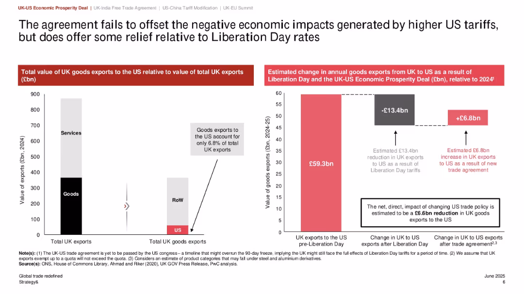
Dual bar charts: left shows export distribution, right shows economic impact; central column explains estimated changes in exports; clear numeric callouts
Regulatory and Compliance
Government & Public Sector
This slide quantifies the impact of the UK-US trade agreement, showing a net loss of £6.6bn in UK exports to the US even after accounting for gains from the new deal. It also emphasizes that UK goods exports to the US make up only 6.8% of total exports, highlighting limited trade dependency.
UK-US trade, export value, tariff policy, economic impact, Liberation Day, trade deficit, goods exports
Multiple Chart
PwC/Strategy&
Saved
The slide contains multiple charts: column charts for profit before tax, operating income, cost/income ratio, mandate volume, loans, and invested assets.
Financial Performance
Financial Services
The slide presents various financial metrics for Global Wealth Management, comparing data from multiple quarters to 1Q20.
wealth management, profit, operating income, cost ratio, loans
Multiple Chart
UBS
Saved
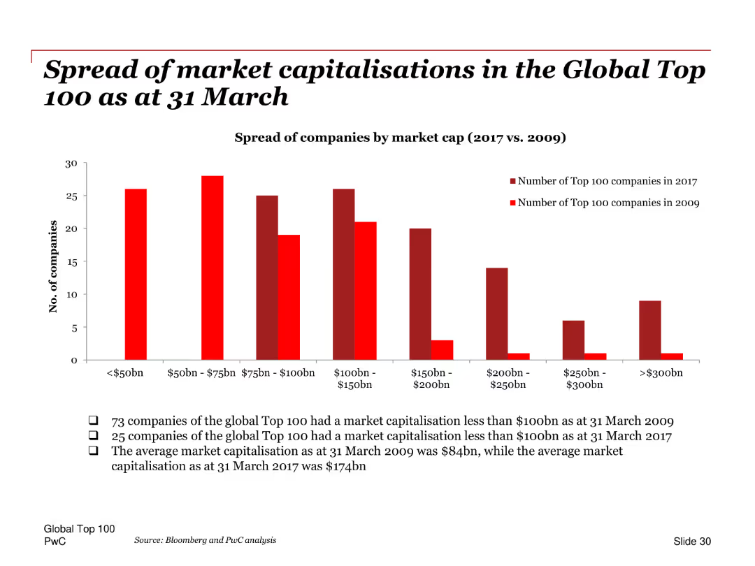
A column chart comparing the number of companies in different market cap ranges (<$50bn, $50bn-$75bn, etc.) for the years 2009 and 2017. Each range is represented by separate columns for each year.
Market Analysis and Trends
Financial Services
This slide compares the spread of market capitalizations among the Global Top 100 companies as of March 31 for the years 2009 and 2017. It provides insights into the distribution of company sizes within the top 100, highlighting shifts in market value categories over time.
Market capitalizations, Global Top 100, 2009, 2017, distribution, company sizes, column chart
Mixed Chart
PwC/Strategy&
Saved
Slide includes financial results tables and a column chart showing net revenues from FICC and equities. The layout is data-heavy with a clear distinction between the segments. Blue and grey bars represent the different revenue streams.
Market Analysis and Trends
Financial Services
Analyzes the financial results in global markets, presenting year-over-year and year-to-date comparisons. Useful for evaluating market trends, and understanding performance in FICC and equities for strategic decision-making.
Global Markets, FICC, Equities, Net Revenue
Mixed Chart
Goldman Sachs
Saved
Includes a table and a pie chart along with a timeline, presented in a straightforward, easy-to-read format.
Financial Performance
Financial Services
Projects future cash flows, dividend payments, and investment allocations over the upcoming years.
cash flow, dividends, investment, financial forecasting, future projections
Mixed Chart
Deutsche Bank
Saved
Presents a timeline with icons and process maps outlining the steps to identify SG&A improvement opportunities.
Operational Efficiency
Professional Services
Describes a fast-track approach to identifying and implementing cost-saving measures across an organization.
SG&A, cost-saving, operational, improvement, timeline
Diagram
Deloitte
Saved
The slide features a large pie chart with centered text, multiple bullet points, and two high-resolution images. The layout is dense with a blend of text and visuals.
Industry Overview
Industrial & Manufacturing
The slide presents the economic benefits of the Tempest programme, emphasizing the development of critical skills and investment in R&D within the UK. It serves as a detailed informational piece to stakeholders about the programme's broader impacts on the economy.
UK economy, R&D, critical skills, Tempest programme, STEM careers, Catapult networks, high-skilled jobs, technology integrators, innovation culture
Text Only
PwC/Strategy&
Saved
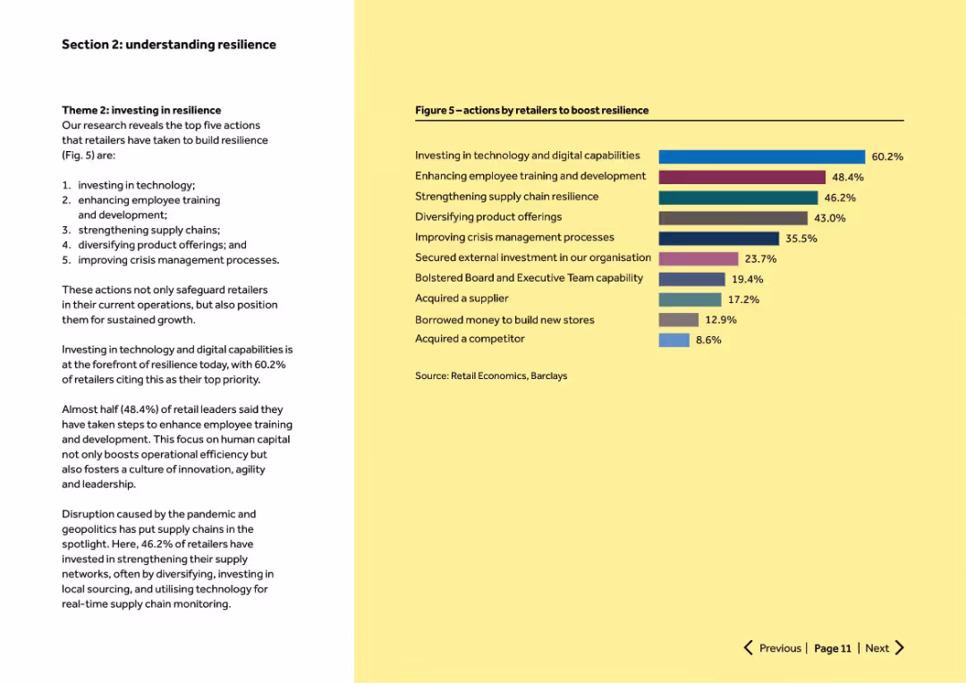
Left column text outlines top 5 resilience actions. Right side has a horizontal bar chart showing % adoption of actions.
Human Resources and Talent Management
Retail & E-commerce
Highlights top retailer resilience strategies: investing in technology, employee training, supply chain strengthening, product diversification, and crisis management. Shows relative importance of each initiative via survey percentages.
resilience, training, tech investment, crisis management, supply chain
Mixed Chart
Barclays
Saved
This comparative slide is divided into two sections contrasting what has been done with what is left to do regarding the company's optimisation efforts. It's a visually simple design with checkmarks for completed tasks and bullet points for planned tasks.
Operational Efficiency
Financial Services
This slide assesses the company's operational optimisation progress against future goals, serving as a status update and action plan for continuous improvement.
Optimisation, Progress, Future Goals, Action Plan, Improvement
Table
Morgan Stanley
Saved
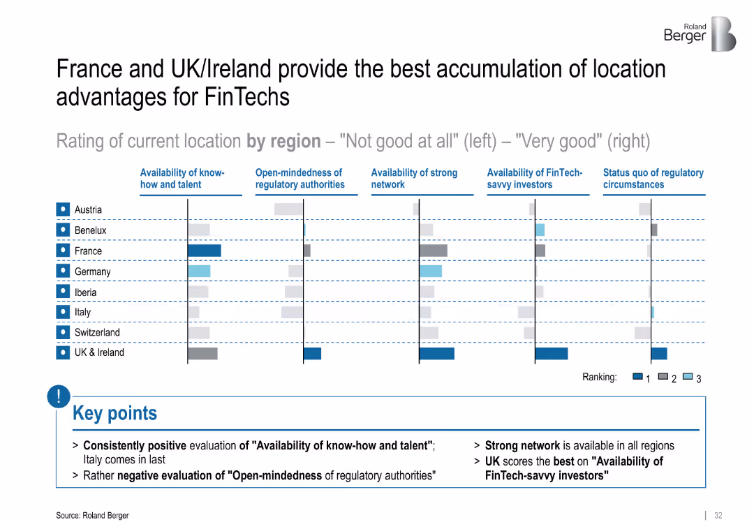
Comparative bar matrix showing location ratings across European regions; color-coded rankings (1–3); summary points highlighted below
Market Analysis and Trends
Financial Services
The slide benchmarks European regions based on FinTech-relevant criteria like talent, regulatory openness, and investor access. UK & Ireland and France rank highest across most factors. Italy scores poorly, particularly on regulatory openness.
FinTech, location analysis, regulatory openness, talent, investors, regional comparison, network
Mixed Chart
Roland Berger
Saved
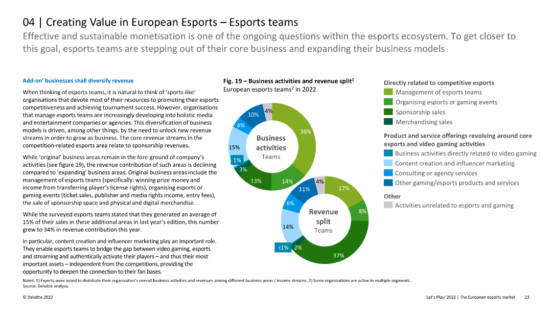
The slide features two pie charts depicting the revenue split and business activities of European esports teams, along with text discussing how these teams are diversifying their business models.
Market Analysis and Trends
Media & Entertainment
Analyzes how European esports teams are expanding beyond core activities to diversify revenue streams, supported by data on business activities and revenue contributions in different areas.
esports teams, revenue diversification, business activities, European market, esports market analysis
Multiple Chart
Deloitte
Saved
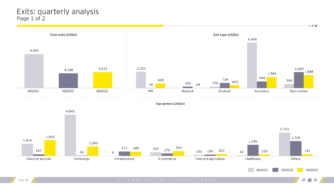
Displays column charts for total exits, exit types, and top sectors by exit value. Uses grey, purple, and yellow for color coding. Visual complexity is moderate.
Market Analysis and Trends
Financial Services
Provides a detailed analysis of quarterly exit trends, categorizing by exit type (IPO, buyback) and highlighting top sectors. Useful for market analysts and financial advisors.
exits, quarterly, analysis, sectors, financial
Multiple Chart
EY
Saved
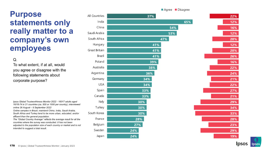
Bar chart, consistent with previous slides, comparing country responses, “Agree” vs “Disagree” format
Market Analysis and Trends
Professional Services
The chart reveals opinions about whether purpose statements matter primarily to employees. India, China, and Saudi Arabia show strong agreement. Many Western countries demonstrate higher disagreement, suggesting broader expectations.
purpose statement, employees, corporate identity, stakeholder opinion, Ipsos, public perception
Mixed Chart
IPSOS
Saved
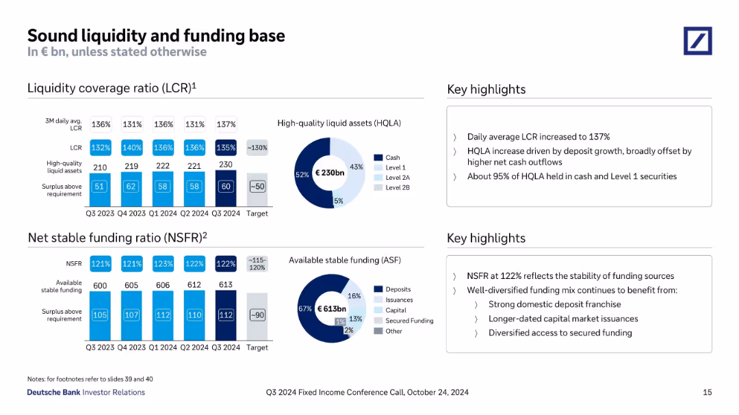
Dual sections with bar and donut charts showing liquidity coverage ratio (LCR), net stable funding ratio (NSFR), and breakdown of funding sources.
Risk Assessment and Management
Financial Services
The slide demonstrates robust liquidity and funding through LCR of 137% and NSFR of 122% in Q3 2024, supported by €230bn in HQLA and €613bn available stable funding. The bank emphasizes stability and diversified funding, with key metrics exceeding regulatory targets.
LCR, NSFR, liquidity, funding, HQLA, ASF, Deutsche Bank, Q3 2024, stability
Multiple Chart
Deutsche Bank
Saved
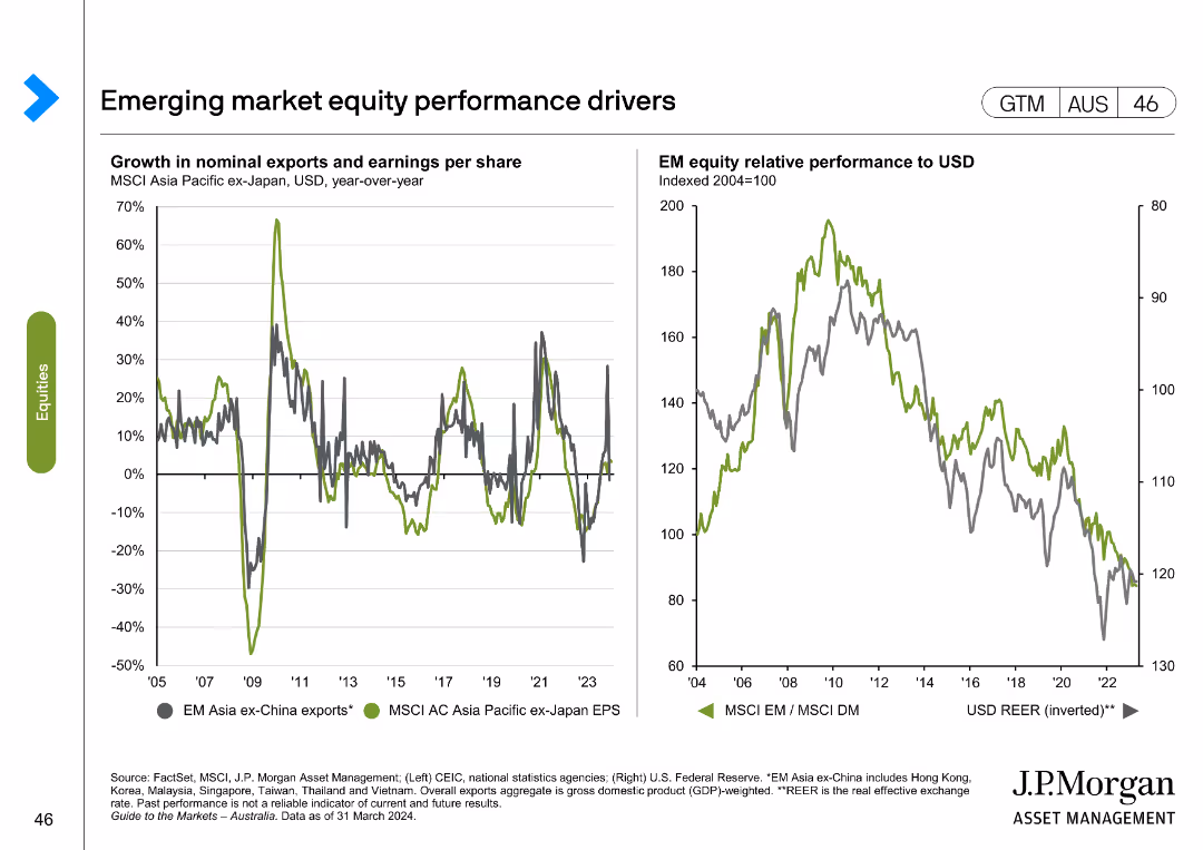
The slide displays two line charts: one showing growth in nominal exports and earnings per share for MSCI Asia Pacific ex-Japan, and another comparing EM equity relative performance to USD.
Market Analysis and Trends
Financial Services
This slide examines key drivers of emerging market equity performance, focusing on exports, earnings per share, and relative performance to USD.
emerging markets, equity performance, exports, earnings per share, MSCI Asia Pacific, USD performance, financial analysis, market drivers
Multiple Chart
JP Morgan
Saved
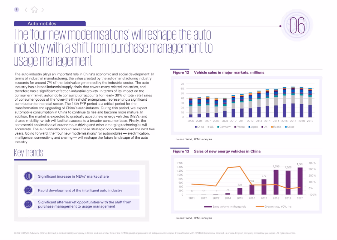
Layout features descriptive text and three key trends on the left; right contains two bar graphs: vehicle sales in major markets and NEV sales in China.
Technology and Digital Transformation
Industrial & Manufacturing
This slide highlights China's automotive industry transformation, focusing on new energy vehicles (NEVs), intelligent systems, and shared mobility. It underlines the move from ownership to usage-based models, supported by data showing increasing NEV sales and global vehicle sales.
auto modernization, NEVs, intelligent vehicles, usage management, automotive trends, shared mobility, China auto market, innovation, vehicle sales
Multiple Chart
KPMG
Saved
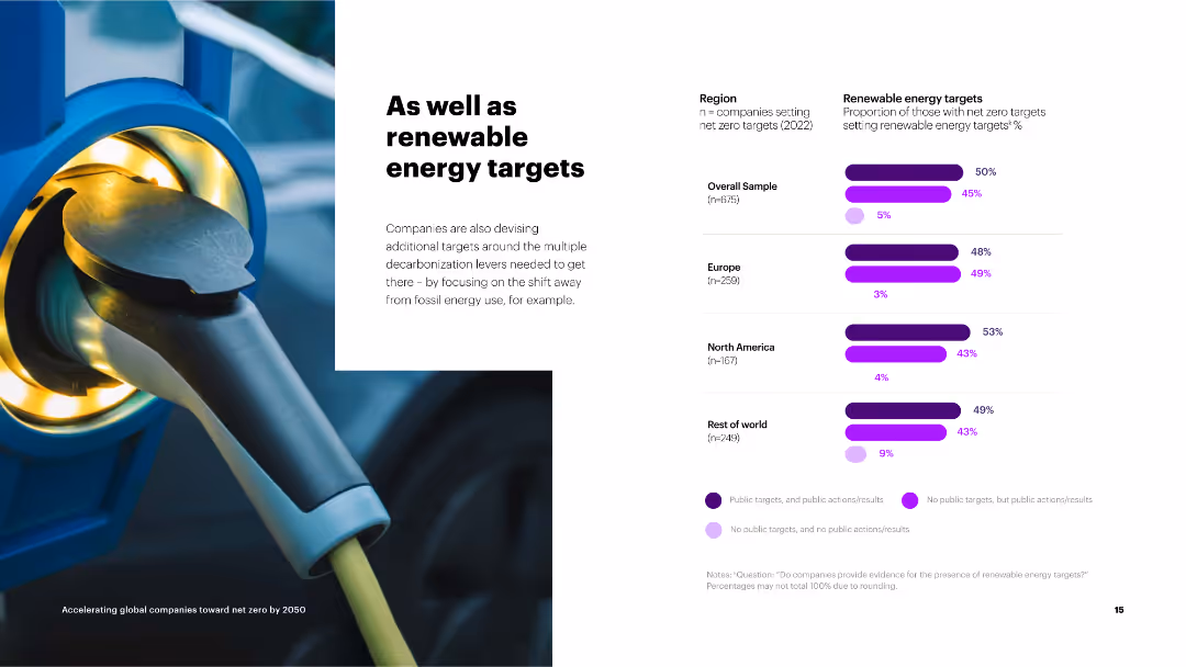
The slide contains a column chart on the right showing the proportion of companies setting renewable energy targets by region.
Strategic Planning
Environmental Services & Sustainability
The slide discusses the adoption of renewable energy targets by companies as part of their broader net zero strategies, with regional breakdowns.
renewable energy, targets, net zero, overall sample, Europe, North America, rest of world, public targets
Mixed Chart
Accenture
Saved
The slide contains a image of diagram, lists, and a large image of a car display technology on the right. The layout is text-heavy with bullet points and numerical data.
Financial Performance
Transportation & Logistics
This slide details Faurecia's financial performance in H1 2018, including sales growth, operating income, and net cash flow. It highlights technology partnerships and market expansion, particularly in China. It is useful for analyzing corporate financial health and strategic directions.
Automotive, Financials, Technology, China, Growth
Header Vertical
Deutsche Bank
Saved
This slide shows a series of column charts and line graphs related to digital financial services like payments, remittance, investment, insurance, and lending. The design employs a consistent blue color palette with percentages indicating growth rates (CAGR). The layout is clean, with each chart clearly labeled and easy to interpret.
Investment Analysis
Financial Services
This slide offers insights into the expected growth in various segments of digital financial services. It illustrates where the most significant advancements are likely to occur, making it a useful tool for presentations on financial market trends or investment opportunities.
DFS, payments, remittance, investment, insurance, lending, CAGR, growth, financial services
Multiple Chart
Bain
Saved
Slide includes two bar charts and a column chart, and detailed text explanations.
Technology and Digital Transformation
Technology & Software
Discusses methodology for assessing application diversity and interoperability in enterprise applications.
Enterprise, application, diversity, interoperability, methodology
Multiple Chart
Accenture
Saved
Previous
Next
If nothing, comes up, please save your slides first
Create a FREE account to continue browsing
Receive Instant Access to 1,000+ slides from companies like McKinsey, Google, and Goldman Sachs
First Name
Last Name
Email
Password
I agree to all
Terms & Privacy Policy
Thank you! Your submission has been received!
Oops! Something went wrong while submitting the form.
Have an account?
Sign in
Column Chart
Heatmap
Chevron
Org Chart
Infographic
Callouts
Timeline
List
Graphic
Picture
Process Flow
Diagram
Paragraph
Map
Table
Framework
Subtitle
Takeaway Box
Icon
Other Chart
Radar Chart
Waterfall Chart
Mekko Chart
Pie Chart
Scatter Plot
Line Chart
Bar chart
Bullet points