My Account
My Slides
Search by Category
Templates
View All Templates
Download Template Slides
✦ AI Search
Feedback
Login
Logout
Get Started
Browse all Slides
Browse all Slides
Create a FREE Account
Instant access to 1,000+ real slides from top companies like McKinsey, BCG, Goldman Sachs, Google and many more!
First Name
Last Name
Email
Password
I agree to all
Terms & Privacy Policy
Thank you! Your submission has been received!
Oops! Something went wrong while submitting the form.
Have an account?
Sign in
Saved Slides
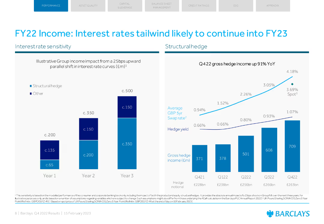
The slide has two main charts: one showing interest rate sensitivity and another displaying hedge income growth. It uses blue tones with a structured layout.
Market Analysis and Trends
Financial Services
The slide analyzes the impact of interest rates on Barclays' income, projecting continued benefits into FY23, supported by hedge income growth data.
interest rates, income, Barclays, FY22, market analysis
Multiple Chart
Barclays
Saved
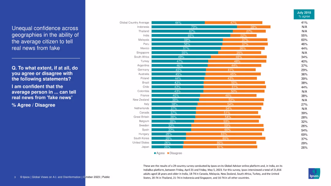
Stacked bar chart by country showing how confident people are in others' ability to detect fake news. Green vs. orange bars.
Market Analysis and Trends
Media & Entertainment
This slide shows global variation in trust in the average person’s ability to distinguish fake news. Southeast Asian countries (Indonesia, Thailand) rank high in confidence, while countries like Japan and the US rank low. The chart suggests skepticism about general media literacy.
fake news, media trust, global survey, confidence, misinformation, disinformation, Ipsos, perception
Mixed Chart
IPSOS
Saved
Displays contrasting column charts comparing planned growth actions among leaders and industry peers in areas like innovation and hiring, set against a nature-themed backdrop.
Strategic Planning
Financial Services
Discusses how industry leaders differ from their peers in terms of investing resources into growth opportunities, particularly focusing on areas like technology innovation and new talent acquisition.
growth opportunities, industry leaders, technology innovation, talent acquisition
Mixed Chart
BCG
Saved
Displays a series of bar charts in shades of purple, showcasing the adoption rates of various emerging technologies in different regions.
Technology and Digital Transformation
Technology & Software
Evaluates the readiness and adoption rates of emerging technologies like Metaverse, Next-gen Computation, and Intelligence in Growth Markets, offering insights for tech strategists and planners.
emerging technologies, Growth Markets, Metaverse, computation, intelligence
Mixed Chart
Accenture
Saved
The slide features a title, two column charts for GDP projections, and a combined line and column chart for inflation and interest rates.
Financial Performance
Financial Services
This slide presents forecasts for UK's GDP growth and inflation rates, alongside historical Bank of England interest rates, useful for financial analysis.
UK, GDP, inflation, forecast, Bank of England, interest rate, economic, analysis, projections
Multiple Chart
McKinsey
Saved
This slide presents four pie charts and a small table. Two charts show US Credit Cards Portfolio for 2017 and 3Q22, and one displays ICG Exposure By Region and By Grade Rating. The color scheme is blue and white.
Financial Performance
Financial Services
The slide compares credit card portfolio distributions over time and across regions and credit ratings, focusing on changes in US credit cards and total loans. It's suitable for financial reviews, strategic planning, or investor presentations to illustrate credit exposure and performance metrics.
Credit, Exposure, Portfolio, Regions, Rating, Financial, Comparison, Loans, ICG, PBWM
Multiple Chart
Citigroup
Saved
Includes multiple pie charts and a column chart detailing the deposit and loan distribution by business type and product, with annotations explaining key strategies.
Financial Performance
Financial Services
This slide details the bank's deposit and loan structures as of Q1 2023, highlighting diversity and stability across different banking sectors and products, and outlines how these are managed to mitigate risks and ensure growth.
Deposits, Loans, Banking, Diversification, Q1 2023, Risk Management, Stability, Growth
Multiple Chart
Deutsche Bank
Saved
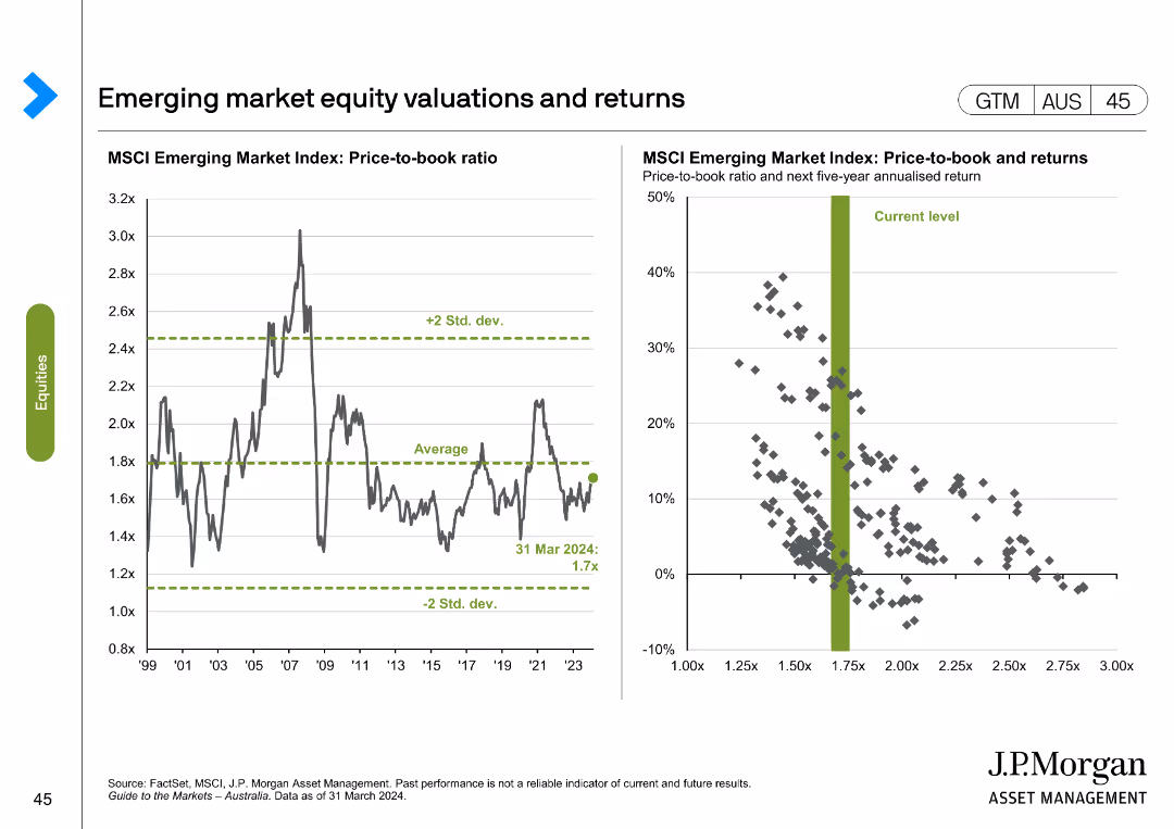
Line chart showing MSCI Emerging Market Index price-to-book ratio from 1999 to 2024. Scatter plot correlates price-to-book ratio with 5-year returns.
Investment Analysis
Financial Services
Displays historical and current valuations of emerging market equities, analyzing potential returns based on price-to-book ratio and historical data.
emerging markets, equity, valuations, returns, MSCI
Multiple Chart
JP Morgan
Saved
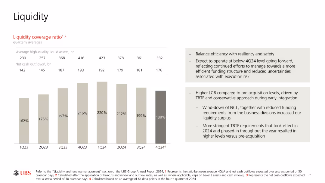
Bar chart showing liquidity coverage ratio (LCR) over 8 quarters; includes two text blocks explaining context and future expectations. Neutral color palette.
Risk Assessment and Management
Financial Services
Tracks UBS’s LCR over time from 1Q23 to 4Q24, noting shifts in liquid assets and net cash outflows. Provides interpretation regarding resilience, funding structure optimization, and higher post-acquisition LCRs due to regulatory requirements and risk management priorities.
LCR, liquidity, cash outflows, risk, funding structure, resilience
Mixed Chart
UBS
Saved
This slide includes a map of Europe with highlighted countries that were deeply analyzed in the survey. The map uses shades of pink and red to denote the depth of analysis per country.
Industry Overview
Professional Services
Provides a geographical overview of the countries involved in a Europe-focused survey, highlighting the depth of analysis conducted in certain countries. Used to set the context for discussing detailed findings in subsequent slides.
survey, Europe, country analysis, data depth
Graphic
PwC/Strategy&
Saved
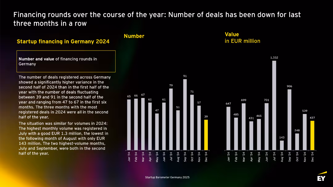
Monthly bar charts of deal numbers and values for 2024, with descriptive text on the left. Yellow highlight for December data.
Investment Analysis
Professional Services
Illustrates monthly fluctuations in startup deal counts and values for 2024. Highest activity was in Q3, while December marked the lowest. Emp
Multiple Chart
EY
Saved
Features column charts comparing revenue growth and operating margin between companies with and without a managed services partner from 2023-2025.
Strategic Planning
Professional Services
Highlights the advantages of partnering with managed services, showing expected improvements in revenue growth and operating margins.
managed services, growth, margins, comparison, strategy
Multiple Chart
Accenture
Saved
The slide features two column charts: one showing annual stock market returns by political party control and another showing stock market returns by year in the presidential cycle.
Market Analysis and Trends
Financial Services
This slide presents data indicating that past stock market performance, segmented by political control and presidential cycles, does not predict future results. It underscores the unpredictability of market performance.
Stock Market, Political Control, Presidential Cycle, Performance, Analysis
Multiple Chart
JP Morgan
Saved
The slide has a dominant column chart showing the AWM adjusted expense over years with portions marked for investments, volume-/revenue-related, and structural changes. To the right, there's a column chart depicting the breakdown of expense types and investment focuses.
Operational Efficiency
Financial Services
Detailing the relation between increased expenses and revenue growth, the slide breaks down investment areas and their impact on the firm's financials. Likely to be used in financial planning or cost management sessions.
expenses, revenue, investment, asset management, cost analysis
Mixed Chart
JP Morgan
Saved
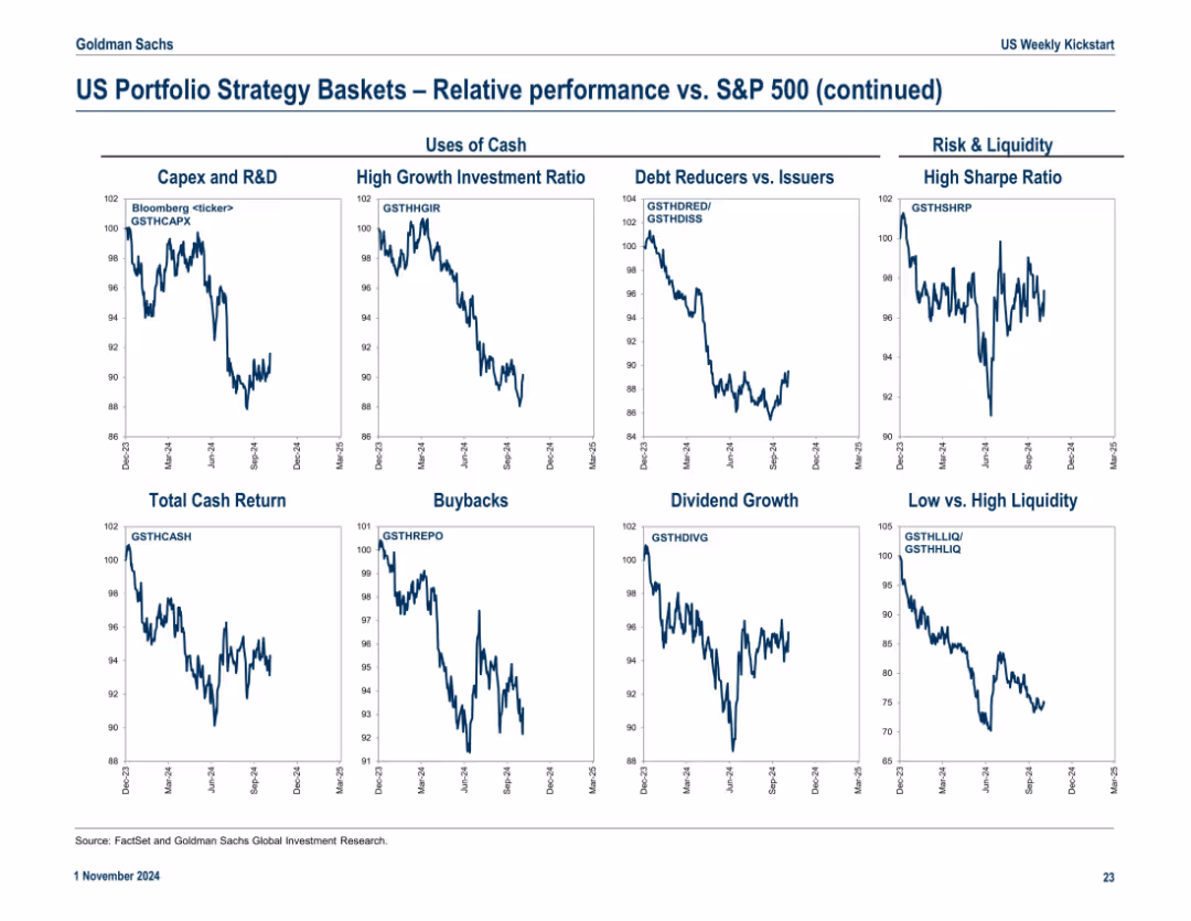
Another 3x3 grid of relative performance line charts. Categories organized under "Uses of Cash" and "Risk & Liquidity". Clear chart labels and consistent Y-axis formatting.
Performance Metrics and KPIs
Financial Services
The slide continues performance analysis, focusing on how companies allocate capital (R&D, buybacks, dividends) and handle liquidity and risk. It evaluates which strategies outperformed the S&P 500 over time.
capex, buybacks, dividends, liquidity, sharpe ratio, debt reducers, investment ratio
Multiple Chart
Goldman Sachs
Saved
The slide has a dark background with a highlighted yellow text box containing a quote. It includes a question and four circular charts with percentages showing responses.
Technology and Digital Transformation
Healthcare & Pharmaceuticals
The slide discusses Australian consumers' openness to personalized medicine, genetic testing, and non-urgent care in retail locations, using wearables, and sensors.
Technology-enhanced care, personalized medicine, genetic testing, wearables, Australia
Mixed Chart
EY
Saved
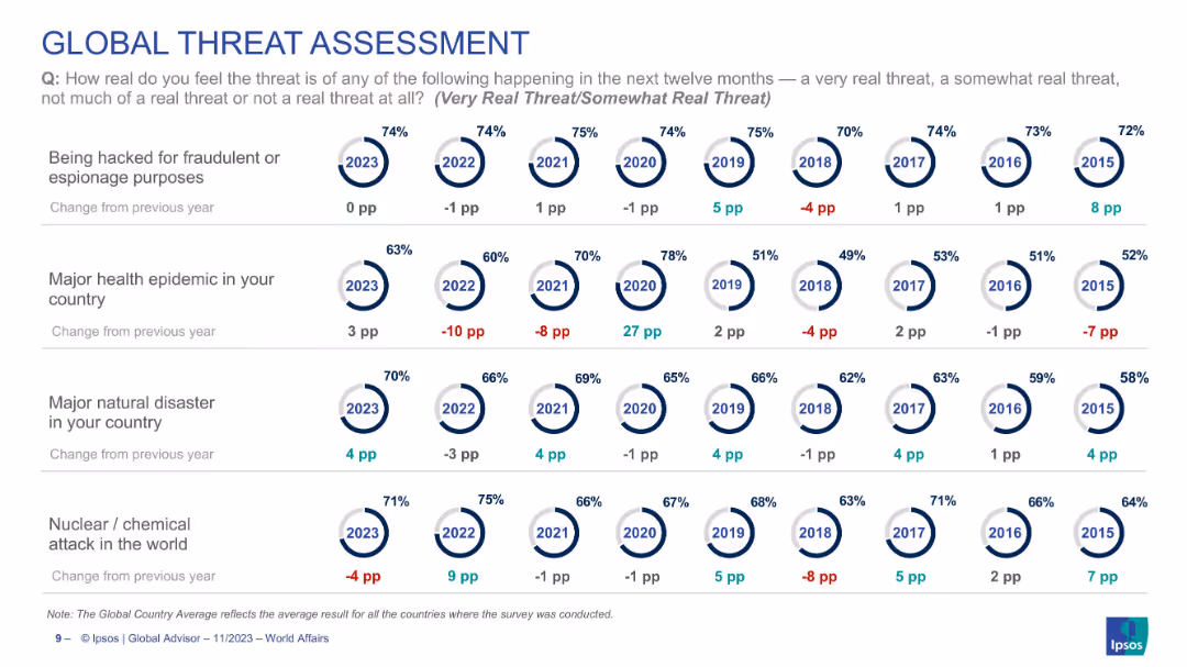
Grid layout with circular percentage indicators by year (2015–2023) across 4 threat types. Each includes a trend in percentage points.
Risk Assessment and Management
Government & Public Sector
Shows global perceptions of major threats (cyber hacking, epidemics, natural disasters, nuclear/chemical attack) over time. Each row tracks how serious the public sees these risks, indicating trend shifts (e.g., epidemic threat up 3 points in 2023). Provides historical trend context across 9 years.
threat perception, global risks, natural disaster, cyberattack, epidemic, nuclear threat, trend analysis, Ipsos, global survey
Single Chart
IPSOS
Saved
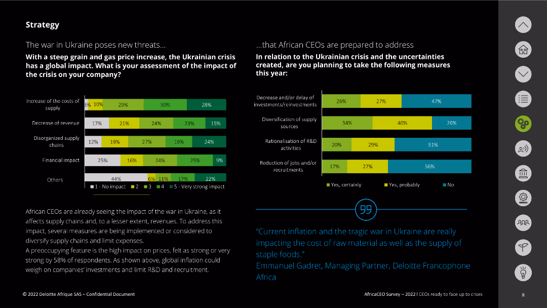
The slide features two column charts assessing the impact of the Ukrainian crisis on companies and the measures planned in response. The charts use various colors to denote the levels of impact and response. Text explanations are provided at the bottom.
Risk Assessment and Management
Energy & Utilities
This slide evaluates the impact of the war in Ukraine on companies, focusing on supply costs, revenue decrease, and supply chain disorganization. It also outlines measures African CEOs plan to take, including investment delays and diversification of sources.
Ukraine crisis, impact, supply chain, response, measures
Multiple Chart
Deloitte
Saved
Contains column charts, bar graphs, and icon legends, with annotations and a mix of conditional formatting. Colors vary across graphs to distinguish different data sets.
Market Analysis and Trends
Environmental Services & Sustainability
Details the estimated emissions gap required to achieve a 1.5°C pathway by 2030, with specific targets and reductions from various regions.
emissions, reduction, targets, SEA, 2030, NDCs, gap
Multiple Chart
Bain
Saved
Bar chart by generational cohort (Gen Z, Millennials, Gen X, Boomers) showing percentages for each discriminatory scenario. Consistent visual design with previous slide.
Risk Assessment and Management
Government & Public Sector
This slide compares experiences of gender discrimination across age groups. Gen Z reports the highest levels of witnessing sexist comments and other behaviors, while Boomers report the least. The chart emphasizes generational differences in social awareness and experience.
age cohorts, gender bias, workplace equity, generational comparison, harassment, discrimination trends
Mixed Chart
IPSOS
Saved
Multi-chart layout with pie charts and bar graphs analyzing CRE portfolio risk by region, sector, and loss provisioning (CLPs). Uses contrasting color schemes for segmentation.
Risk Assessment and Management
Real Estate & Construction
Deutsche Bank’s CRE exposure is analyzed, focusing on €28bn of higher-risk loans, stress testing, regional and sectoral distribution (especially US and Office sector), and provisions for credit losses. It also tracks quarterly trends in US CLPs, providing context on CRE risk concentration and mitigation strategies.
CRE, risk, CLP, stress test, loan-to-value, US exposure, sector analysis
Multiple Chart
Deutsche Bank
Saved
Informational layout with text and icons summarizing the key findings and methodologies of a 2023 study on true-luxury consumers.
Market Analysis and Trends
Media & Entertainment
Provides an overview of a 2023 study on true-luxury consumers, detailing the respondent demographics, average spending, and key methodologies used in the research.
true-luxury, consumer study, 2023, demographics, spending
Boxed
BCG
Saved
Slide includes an area chart showing marketing budget allocation over time with a prediction for the future. Title and data points are clearly labeled.
Market Analysis and Trends
Professional Services
This slide analyzes marketing budget trends targeting China, illustrating past allocations and future predictions, useful for strategy planning in technology and financial sectors.
marketing, budget, China, prediction, technology, financial, trend, strategy, allocation, planning
Mixed Chart
Deloitte
Saved
The slide uses a combination of column charts to compare budget outlook and profitability of public and private hospitals over the last three years, current year, and projected next three years.
Financial Performance
Healthcare & Pharmaceuticals
This slide compares the financial performance of public and private hospitals in terms of budget outlook and profitability, highlighting trends and projections over a three-year period.
financial, hospitals, profitability, public, private
Multiple Chart
LEK
Saved
Line graph on white background showing economic sentiment from May 2013 to May 2023, with annotation at end.
Market Analysis and Trends
Government & Public Sector
This slide tracks public sentiment about Turkey's economic situation over a 10-year period. The graph reflects fluctuations in economic confidence, ending at 32% in May 2023. A note highlights a 9 percentage point increase in positive sentiment, continuing a 3-month upward trend.
Turkey, economy, perception, sentiment, Ipsos, trend, increase, data, public opinion, May 2023
Single Chart
IPSOS
Saved
Previous
Next
If nothing, comes up, please save your slides first
Create a FREE account to continue browsing
Receive Instant Access to 1,000+ slides from companies like McKinsey, Google, and Goldman Sachs
First Name
Last Name
Email
Password
I agree to all
Terms & Privacy Policy
Thank you! Your submission has been received!
Oops! Something went wrong while submitting the form.
Have an account?
Sign in
Column Chart
Heatmap
Chevron
Org Chart
Infographic
Callouts
Timeline
List
Graphic
Picture
Process Flow
Diagram
Paragraph
Map
Table
Framework
Subtitle
Takeaway Box
Icon
Other Chart
Radar Chart
Waterfall Chart
Mekko Chart
Pie Chart
Scatter Plot
Line Chart
Bar chart
Bullet points