Create a FREE Account
Instant access to 1,000+ real slides from top companies like McKinsey, BCG, Goldman Sachs, Google and many more!
First Name
Last Name
Email
Password
I agree to all
Terms & Privacy Policy
Thank you! Your submission has been received!
Oops! Something went wrong while submitting the form.
Have an account?
Sign in
Library
Templates
Courses
Pricing
My Account
My Slides
My Templates
✦ AI
AI Prompt Library
AI Search
Sign in
Start Here
Logout
My Saved Slides
A pie chart shows the prioritization of different areas by CFOs since the start of COVID-19. The chart uses shades of green and blue to represent areas like cashflow management and people and talent, with cashflow management taking the largest portion (43%).
Risk Assessment and Management
Financial Services
Discusses the shifting priorities of CFOs during the COVID-19 pandemic, emphasizing the focus on cashflow management as the highest priority, followed by forecasting and people management. This indicates a strategic pivot towards essential financial management and resilience building in uncertain times.
CFO, COVID-19, financial priorities, cashflow management, risk management
Single Chart
Deloitte
Saved
Line chart displaying the incidence of first-time home buyers from Fall 2015 to Fall 2020, showing fluctuations over the years.
Market Analysis and Trends
Real Estate & Construction
This slide tracks the percentage of first-time home buyers over several years, indicating changes in market entry rates among new buyers.
first-time buyers, incidence, trends, Fall 2015-2020, market entry, home buying
Single Chart
IPSOS
Saved
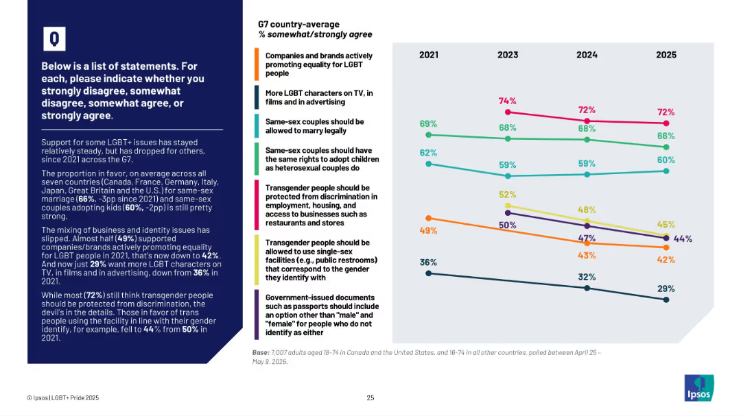
Line graph showing trends from 2021–2025 by issue; text box at left with summary insights
Market Analysis and Trends
Government & Public Sector
This slide tracks changes in public support for LGBT+ rights among G7 countries. It shows declining support in areas like brand promotion of LGBT causes and transgender rights, with the most consistent support for same-sex marriage and anti-discrimination protections.
LGBT+, G7, support trends, policy opinions, transgender, marriage, adoption, brand support, Ipsos
Mixed Chart
IPSOS
Saved
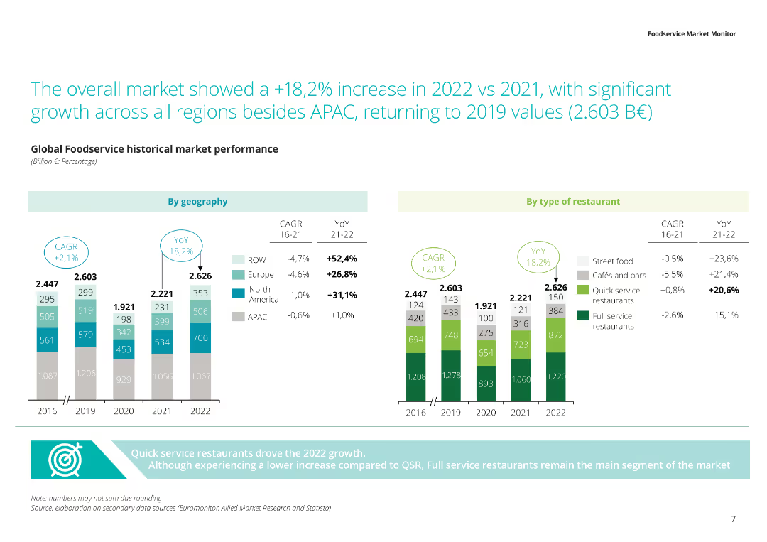
The slide includes a stacked column chart with green, gray, and blue segments representing different types of restaurants and their distribution across regions.
Market Analysis and Trends
Consumer Goods
Presents data on the global foodservice market, highlighting the distribution of various restaurant types across regions, and the overall market size in 2022.
Foodservice market, restaurant types, global distribution, market size, regional analysis
Multiple Chart
Deloitte
Saved
Dominated by a series of bar charts contrasting comfort levels with visiting various public places in the near future. Colors vary from gray to purple.
Market Analysis and Trends
Retail & E-commerce
Illustrates the level of consumer comfort in visiting different types of public places, reflecting on the impact of current events on consumer confidence and predicting a slight future increase.
Consumer confidence, Public spaces, Comfort levels, Predictive analysis, Bar chart, Near future, Hospitality, Retail, Market research
Mixed Chart
Accenture
Saved
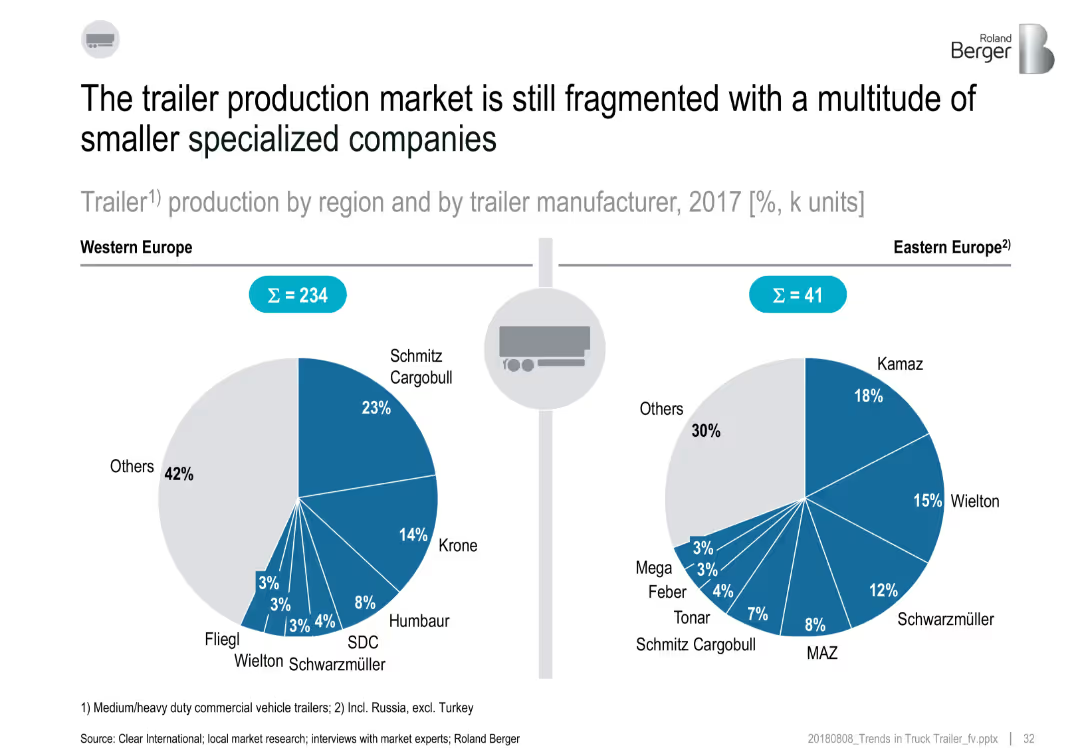
Split layout with two pie charts comparing trailer production market shares (2017) in Western and Eastern Europe; includes manufacturer names and percentages
Market Analysis and Trends
Transportation & Logistics
This slide compares the trailer manufacturing landscape in Western and Eastern Europe. Western Europe shows more dominance by major players like Schmitz Cargobull and Krone, while Eastern Europe is slightly less fragmented. Both regions show a high share of production by "Others," highlighting a fragmented market with many smaller manufacturers.
trailer production, market fragmentation, Western Europe, Eastern Europe, manufacturers, 2017, Schmitz, Krone, Kamaz
Multiple Chart
Roland Berger
Saved
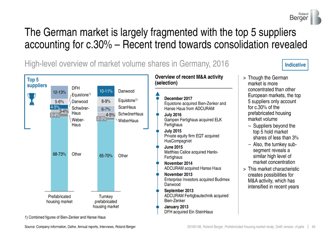
Two vertical bar charts and a timeline of M&A activity; light blue theme with clean, corporate design
Competitive Landscape
Real Estate & Construction
The slide presents a fragmented German prefab housing market where the top 5 suppliers hold only ~30% share. It includes market share breakdowns for the prefab and turnkey markets and outlines recent M&A activities, indicating industry consolidation.
German market, prefab housing, consolidation, top suppliers, Danwood, Equistone, acquisitions, market fragmentation
Mixed Chart
Roland Berger
Saved
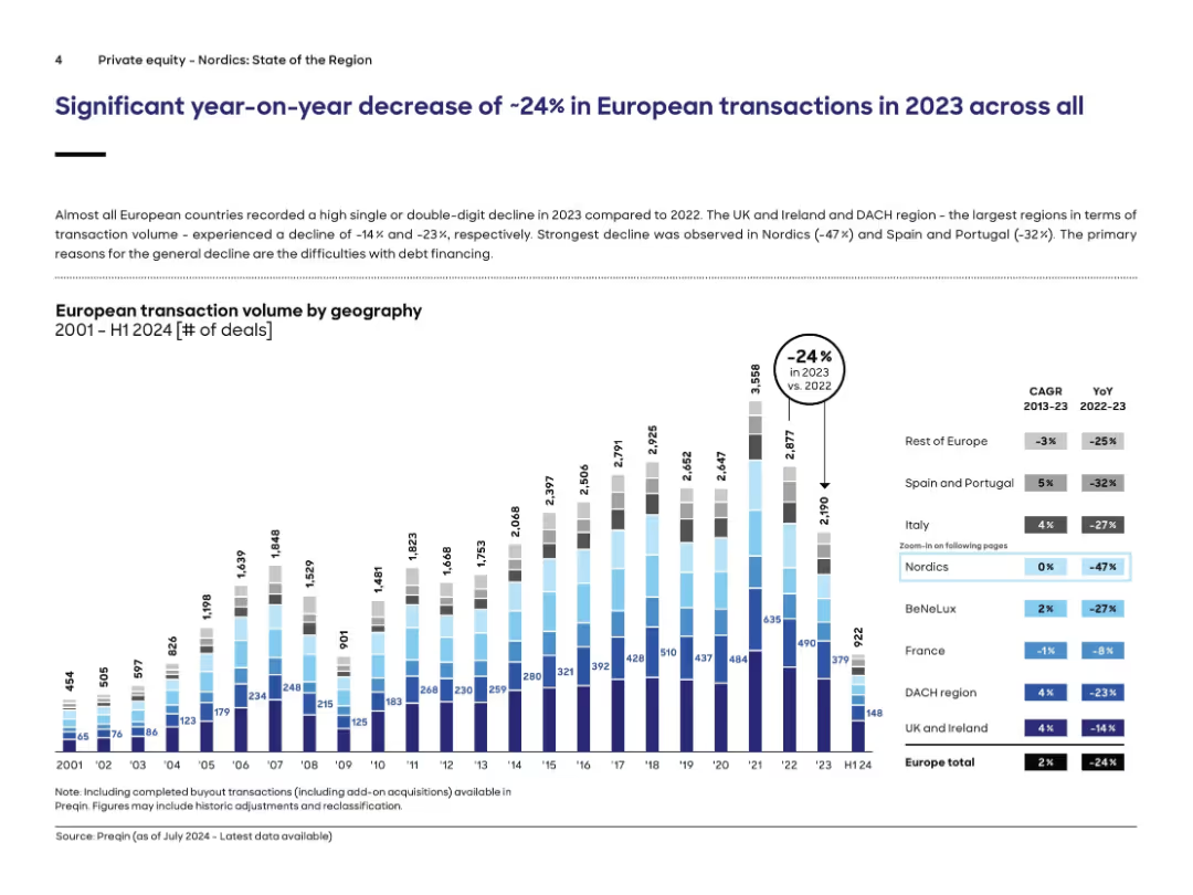
Bar chart displaying European transaction volumes by region over 20+ years; decline visualized for each region; title and CAGR/YoY table included.
Market Analysis and Trends
Financial Services
European transaction volume dropped 24% in 2023 vs. 2022 across nearly all regions. The chart breaks down deal count by geography (e.g., Nordics, DACH, UK). Nordics saw the steepest drop (-47%). Key causes cited include tightening debt financing. Supporting tables show YoY change and CAGR, with notable declines in major markets. Data sourced from Preqin.
transactions, private equity, Europe, volume, decline, Nordics, Preqin, DACH, market trend
Single Chart
Roland Berger
Saved
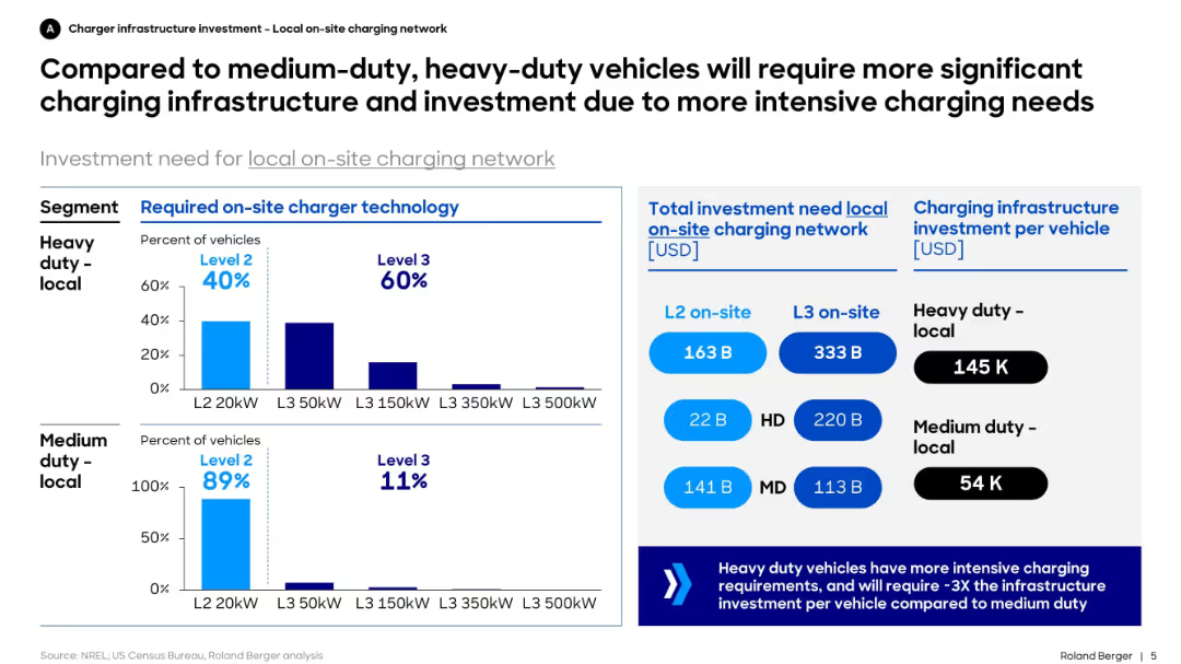
Dual bar charts for required charger levels by vehicle type, investment amount by segment, and cost per vehicle. Structured with blue-themed charts and callouts.
Technology and Digital Transformation
Transportation & Logistics
This slide contrasts the infrastructure needs of heavy-duty vs. medium-duty electric vehicles. It shows that heavy-duty fleets require higher-capacity chargers and more infrastructure investment, with significantly higher per-vehicle cost.
charging, infrastructure, EV, heavy-duty, investment, medium-duty, technology, fleet, Level 2, Level 3
Mixed Chart
Roland Berger
Saved
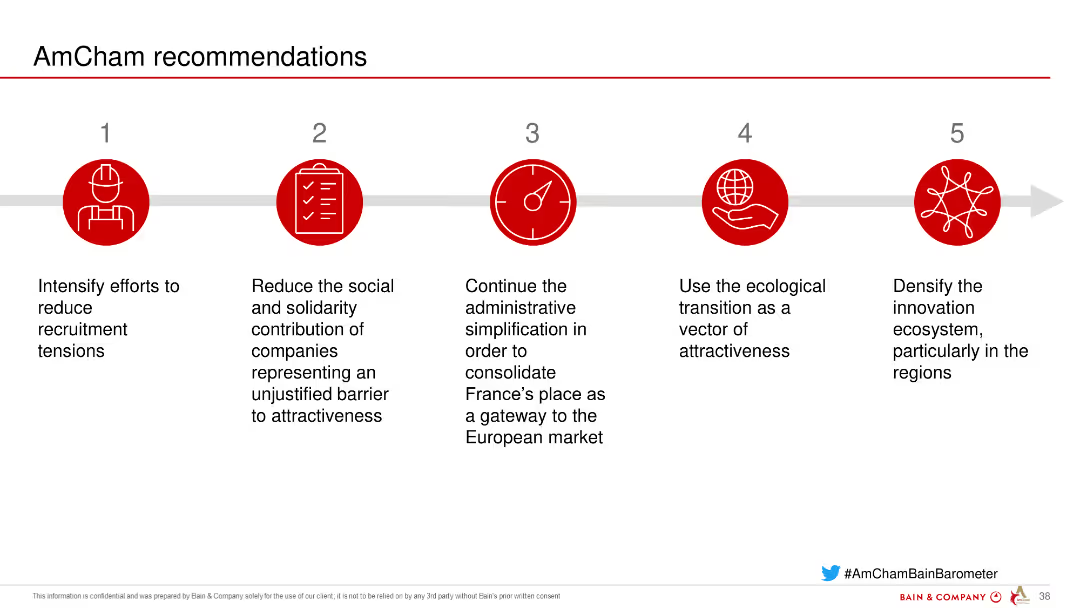
Icons and text describing five key recommendations from AmCham to improve attractiveness and reduce barriers for companies in France.
Strategic Planning
Professional Services
Outlines recommendations to enhance the attractiveness of France for businesses, including reducing recruitment tensions and promoting ecological transition.
recommendations, AmCham, France, attractiveness, barriers
Linear Flow
Bain
Saved
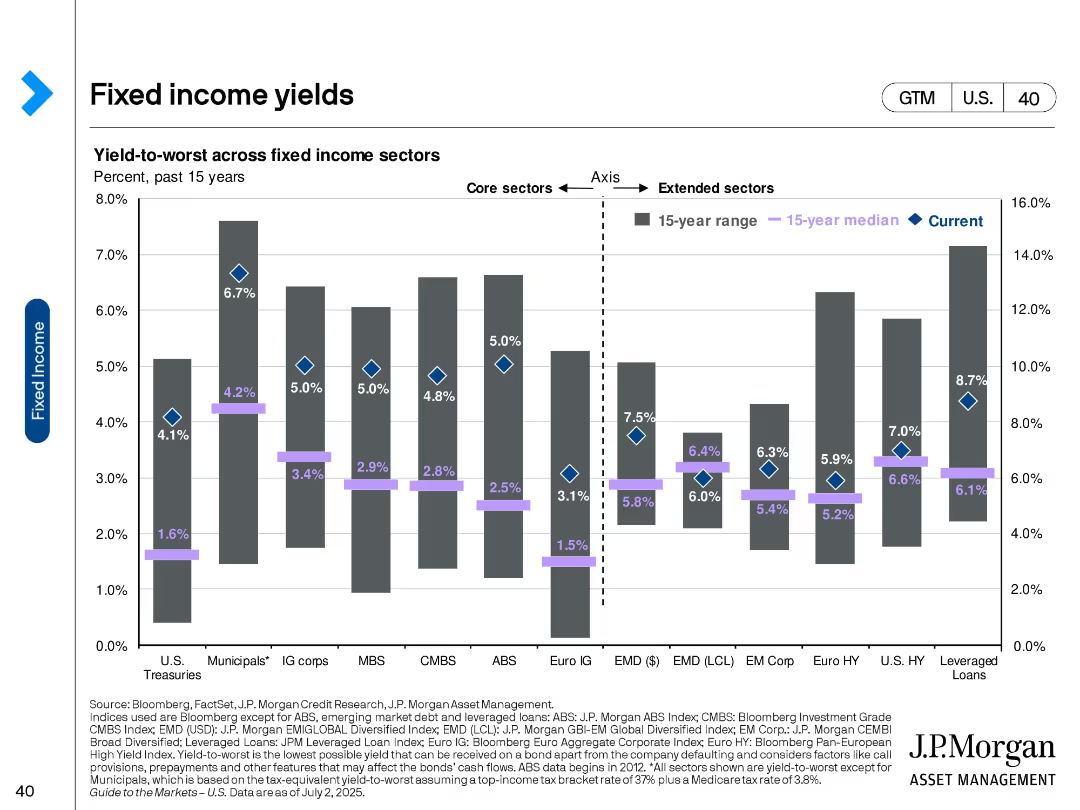
Bar chart with diamond markers comparing current, 15-year median, and range of yields across fixed income sectors.
Investment Analysis
Financial Services
This slide presents yield-to-worst data across core and extended fixed income sectors, showing how current yields compare to historical norms. It highlights opportunities in areas like leveraged loans and high-yield bonds.
Fixed income, yields, investment returns, sector analysis, bonds, interest rates, historical comparison, risk-return, income strategy
Single Chart
JP Morgan
Saved
Column and dot graphs showing the density of highly skilled workers and total labor force in various countries.
Strategic Planning
Professional Services
Analyzes the labor market potential by assessing the density of skilled workers and their distribution across multiple countries.
Labor market, skilled workers, workforce density, strategic planning
Single Chart
Accenture
Saved
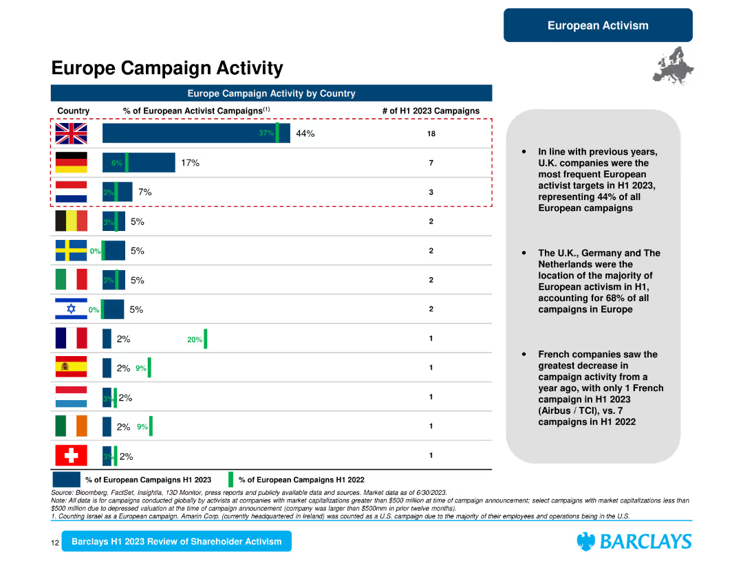
The slide presents a horizontal bar chart comparing the percentage of European activist campaigns by country and a summary text on the right.
Market Analysis and Trends
Financial Services
It provides a detailed look at European campaign activity by country, indicating that the U.K. led with 44% of campaigns, followed by Germany and the Netherlands.
Europe campaigns, country analysis, U.K., Germany, Netherlands, activism, shareholder trends
Mixed Chart
Barclays
Saved
The slide includes a large column chart tracking the funding volume of IEOs over several months, accompanied by a line chart detailing the share of IEOs in the overall token offering market. It employs a professional color scheme of red and grey shades.
Investment Analysis
Financial Services
Summarizes the recent trends in Initial Exchange Offerings (IEOs), particularly focusing on the significant roles they play despite a broader decline in token offerings. Highlights the largest IEO by Bitfinex and discusses the potential for IEOs as a stable crowdfunding mechanism.
IEOs, token offerings, funding volume, trends, Bitfinex, blockchain, 2019
Multiple Chart
PwC/Strategy&
Saved
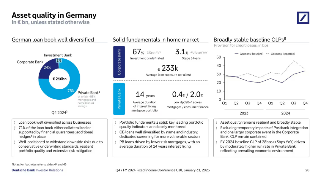
Multi-panel layout: donut chart, metrics, and line chart on credit loss provisions. Blue tones used for segmentation. Data-rich design with key stats and YoY comparisons.
Risk Assessment and Management
Financial Services
This slide focuses on Deutsche Bank's German loan portfolio (€216bn), with 75% in the Private Bank and high levels of mortgage exposure. It reports solid asset quality indicators: 67% investment grade in Corporate Bank and low delinquency rates in Private Bank. A line graph shows provision trends for credit losses over the last 8 quarters, highlighting resilience and stability.
asset quality, Germany, mortgages, credit loss provisions, delinquency, investment grade, Deutsche Bank, portfolio quality
Multiple Chart
Deutsche Bank
Saved
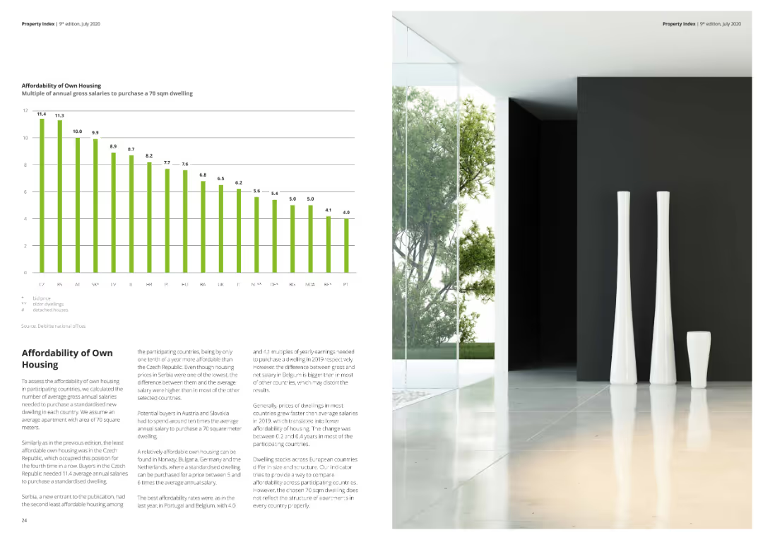
A column chart depicting the multiples of annual gross salaries required to purchase a 70 sqm dwelling.
Market Analysis and Trends
Real Estate & Construction
This slide assesses housing affordability by showing how many annual gross salaries are needed to purchase a standard-sized dwelling.
housing affordability, gross salaries, dwelling, market analysis, real estate, affordability index
Mixed Chart
Deloitte
Saved
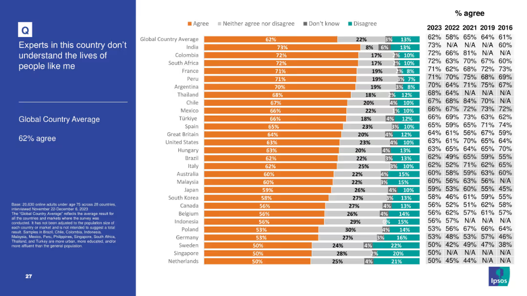
Follows consistent bar chart design with responses segmented and historical agreement percentages shown.
Customer and Market Segmentation
Government & Public Sector
With 62% of respondents agreeing, this slide reflects growing skepticism toward experts, especially in developed and developing nations alike. The sentiment suggests a perception that technocratic governance or expert advice may be disconnected from everyday concerns, fueling populist leanings and distrust.
experts, disconnection, skepticism, elite, populism, Ipsos, opinion, society, understanding
Mixed Chart
IPSOS
Saved
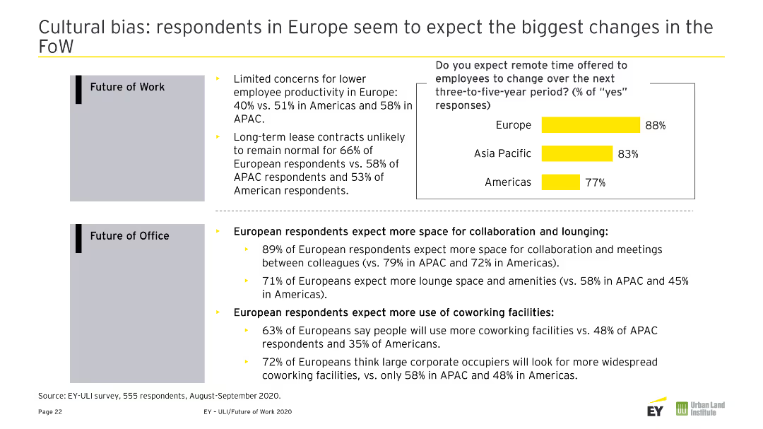
Includes text describing EY's operations in real estate, with a diagram in the center highlighting key areas of transformation. Right side contains EY viewpoints in a list format.
Industry Overview
Real Estate & Construction
Overview of EY’s involvement in real estate, hospitality, and construction sectors, with a focus on future transformation areas.
EY, Real Estate, Hospitality, Construction, Overview, Transformation, Industry, Operations, Viewpoints
Mixed Chart
EY
Saved
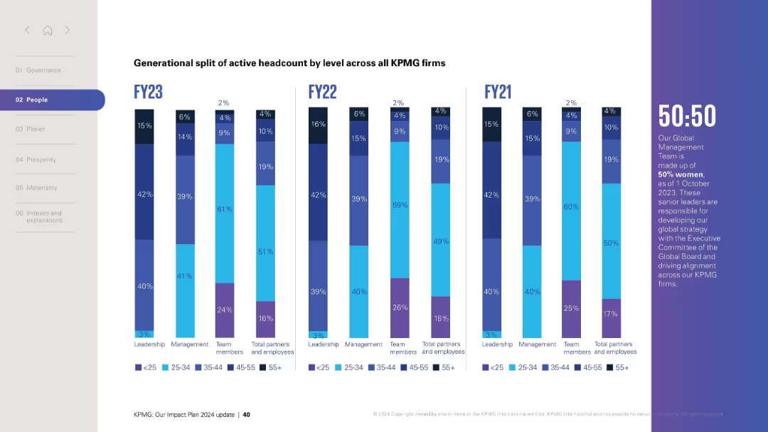
Vertical bar charts grouped by year (FY21–FY23) showing generational split by role. Right sidebar emphasizes 50:50 gender leadership.
Human Resources and Talent Management
Professional Services
Displays generational breakdown of workforce at KPMG over three fiscal years by leadership, management, and team roles, with emphasis on gender equity at leadership level.
generational split, age groups, workforce trends, gender parity, leadership
Mixed Chart
KPMG
Saved
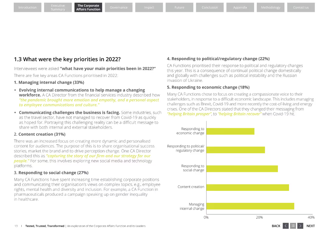
The slide features a list of key priorities for corporate affairs functions, including managing internal change, content creation, responding to social change, political/regulatory change, and economic change. It uses a professional layout with white and yellow colors.
Strategic Planning
Professional Services
This slide outlines the key priorities for corporate affairs functions in 2022, emphasizing areas like internal change management, content creation, and responses to social, political, and economic changes. It highlights the focus areas for corporate affairs directors.
corporate affairs, key priorities, internal change, content creation, social change, political change, economic change
Mixed Chart
Deloitte
Saved
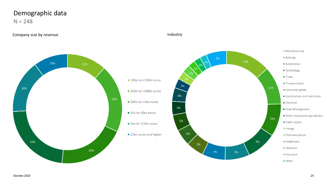
Two donut charts showing company size by revenue and industry distribution with color-coded segments.
Market Analysis and Trends
Professional Services
Provides demographic data on the companies surveyed, detailing their size and industry affiliations.
demographics, company size, industry, revenue, survey
Multiple Chart
Deloitte
Saved
The slide contains bold headers, bullet points, and infographics, illustrating macro and micro levels of sustainability impact.
Investment Analysis
Environmental Services & Sustainability
Urges the importance of sustainability for market potential and regulatory compliance. Suitable for leadership briefings.
sustainability, market size, regulations, corporate strategy, leadership
Header Horizontal
McKinsey
Saved
This slide features three sets of column charts comparing 'Electricity', 'Fuel', and 'Heat' purchased or acquired from 2019 to 2021, in MWh. The charts are placed side by side in a muted color scheme. Each chart has a corresponding table below detailing the exact figures. The overall design is clean, utilizing white space effectively.
Financial Performance
Environmental Services & Sustainability
The slide provides a visual comparison of energy consumption data over three years. It's used for analyzing environmental sustainability efforts, specifically in tracking energy usage trends to inform corporate ESG strategies. It illustrates changes in consumption, which may reflect the effectiveness of conservation measures or shifts in operational scale.
ESG, Sustainability, Energy, Trends, Consumption, Comparison, Data, Corporate, Environment
Multiple Chart
McKinsey
Saved
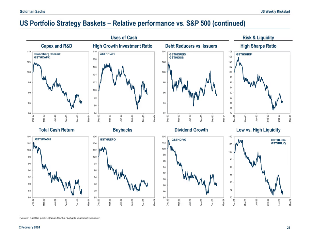
Final continuation slide featuring “Uses of Cash” and “Risk & Liquidity” strategy baskets. Includes 9 line charts with Bloomberg tickers. Each panel compares basket performance versus S&P 500 from Dec 2022 to Mar 2024.
Investment Analysis
Financial Services
The slide evaluates how different uses of cash (e.g., Capex, Buybacks, Dividends) and liquidity characteristics (e.g., High Sharpe Ratio, Low Liquidity) impact performance relative to the S&P 500. Trends indicate which corporate strategies align with investor preferences. For example, High Growth Investment Ratio and High Sharpe Ratio baskets underperformed recently.
capex, buybacks, dividend, liquidity, sharpe ratio, cash usage, S&P 500, investment themes, corporate strategy
Multiple Chart
Goldman Sachs
Saved
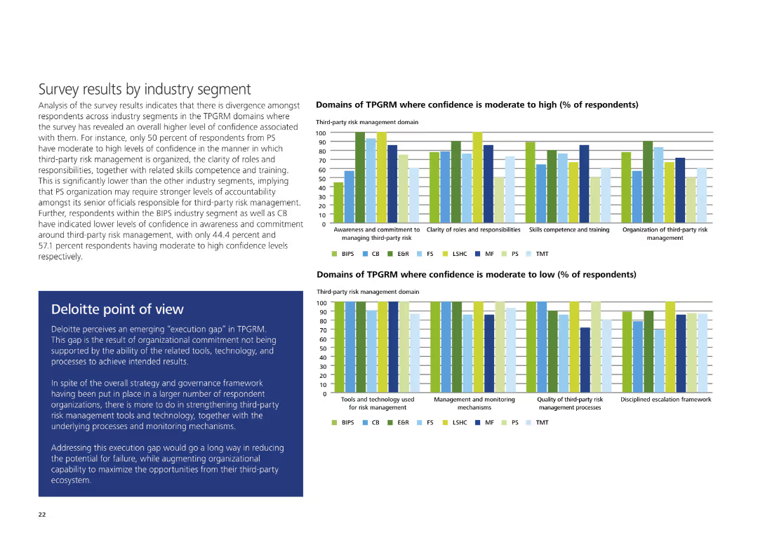
The slide contains two sets of column charts comparing domains of TPGRM with moderate to high and moderate to low confidence levels, alongside Deloitte's POV.
Risk Assessment and Management
Professional Services
It shows survey results indicating confidence levels in various TPGRM domains across industries and includes Deloitte's perspective on closing the execution gap in third-party risk management.
TPGRM, confidence levels, third-party risk management, execution gap, Deloitte, survey
Multiple Chart
Deloitte
Saved
Previous
Next
If nothing, comes up, please save your slides first
Create a FREE account to continue browsing
Receive Instant Access to 1,000+ slides from companies like McKinsey, Google, and Goldman Sachs
First Name
Last Name
Email
Password
I agree to all
Terms & Privacy Policy
Thank you! Your submission has been received!
Oops! Something went wrong while submitting the form.
Have an account?
Sign in
Column Chart
Heatmap
Chevron
Org Chart
Infographic
Callouts
Timeline
List
Graphic
Picture
Process Flow
Diagram
Paragraph
Map
Table
Framework
Subtitle
Takeaway Box
Icon
Other Chart
Radar Chart
Waterfall Chart
Mekko Chart
Pie Chart
Scatter Plot
Line Chart
Bar chart
Bullet points