Create a FREE Account
Instant access to 1,000+ real slides from top companies like McKinsey, BCG, Goldman Sachs, Google and many more!
First Name
Last Name
Email
Password
I agree to all
Terms & Privacy Policy
Thank you! Your submission has been received!
Oops! Something went wrong while submitting the form.
Have an account?
Sign in
Library
Templates
Courses
Pricing
My Account
My Slides
My Templates
✦ AI
AI Prompt Library
AI Search
Sign in
Start Here
Logout
My Saved Slides
This slide features a combination of column charts, a pie chart, and bar graphs arranged neatly alongside corresponding descriptions. It has a clean layout with a mix of blue tones against a white background, and each section is clearly separated by headings. The pie chart is highlighted in green in the lower right corner, providing a visual anchor.
Market Analysis and Trends
Technology & Software
The slide presents a detailed statistical analysis of digital consumers in Singapore, segmented into different services and media usage. It includes future usage intent, media consumption frequency, and the adoption rates of digital services among urban users. This would be used to understand market penetration and consumer behavior in digital services, as well as the willingness to pay for sustainable products.
digital consumers, Singapore, media usage, service adoption, sustainability
Multiple Chart
Bain
Saved
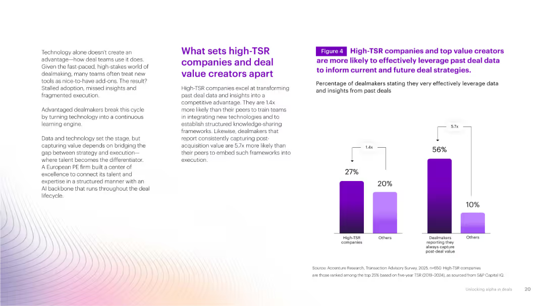
Two bar charts comparing high-TSR vs. others in data usage effectiveness. Light gradient background with supportive text and statistical insights.
Investment Analysis
Financial Services
Highlights how high-TSR companies and consistent value creators excel at utilizing past deal data to inform future strategies, creating a competitive edge through structured knowledge application.
past deal data, TSR, insights, performance, execution
Mixed Chart
Accenture
Saved
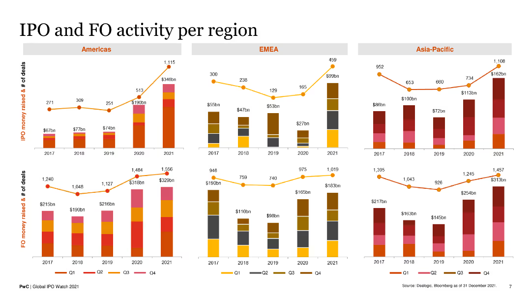
The slide has three sets of column charts, each representing IPO and FO activities by quarter in the Americas, EMEA, and Asia-Pacific regions from 2017 to 2021.
Market Analysis and Trends
Financial Services
It offers a detailed analysis of IPO and FO trends across three major regions, illustrating money raised and number of deals over the years.
IPOs, FOs, regional trends, financial data, quarterly analysis
Multiple Chart
PwC/Strategy&
Saved
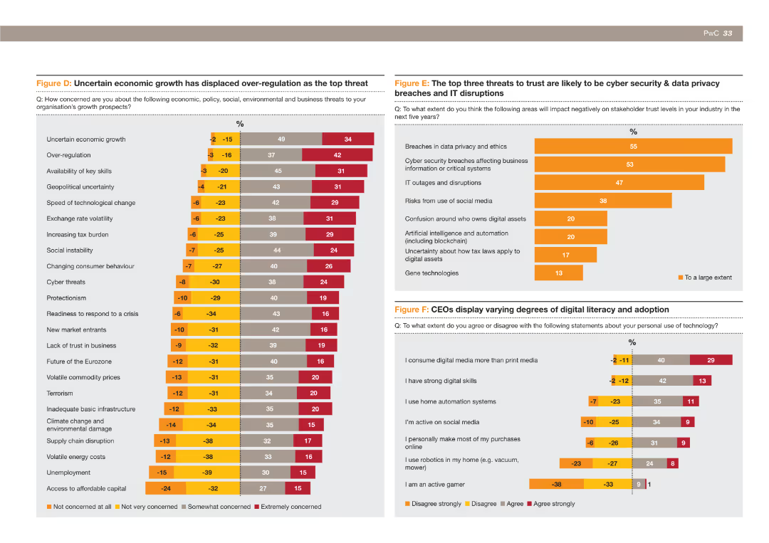
The slide includes a bar chart illustrating the top threats to organizational growth prospects, with uncertain economic growth now seen as a bigger threat than over-regulation.
Risk Assessment and Management
Financial Services
This slide shows the changing perceptions of CEOs regarding the top threats to growth, highlighting that uncertain economic growth is now considered a more significant threat than over-regulation and other issues like tax burden and geopolitical uncertainty.
Economic growth, over-regulation, threats, organizational growth, CEOs, financial services
Multiple Chart
PwC/Strategy&
Saved
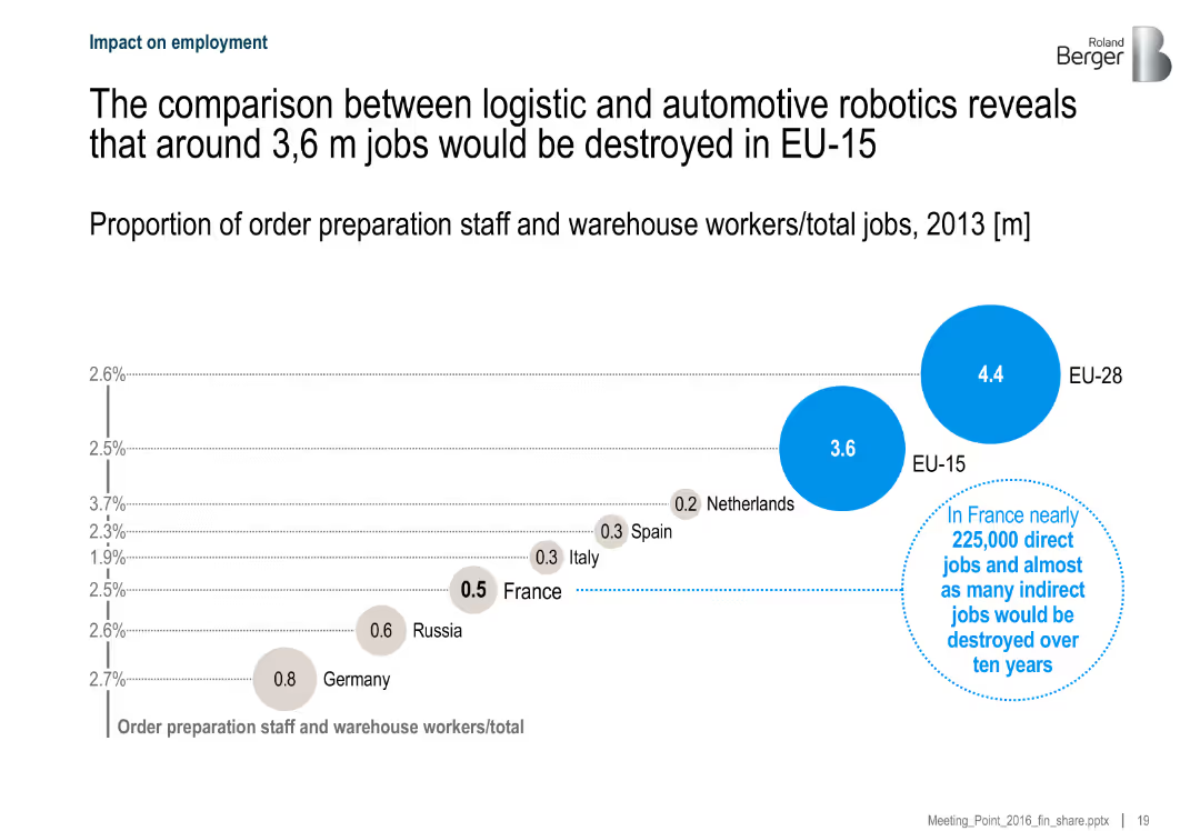
Bubble chart showing the number of jobs impacted by automation in logistics and automotive sectors across countries, with France highlighted. Includes textual insights.
Risk Assessment and Management
Industrial & Manufacturing
The slide compares potential job losses due to robotic automation in logistics across EU-15 and EU-28, estimating that around 3.6 million jobs could be displaced. It highlights the implications for France, projecting 225,000 direct and indirect job losses.
employment, automation, logistics, robotics, EU, job displacement, France, workforce impact
Single Chart
Roland Berger
Saved
Image of the Taj Mahal with accompanying text about India's UPI system, and a line chart showing the exponential growth of UPI transactions.
Market Analysis and Trends
Financial Services
Highlights the growth of UPI in India, showing its increasing use and impact on the payment landscape, with a focus on transaction volumes and values.
India, UPI, payments, growth, transactions, exponential, financial, services, system
Mixed Chart
PwC/Strategy&
Saved
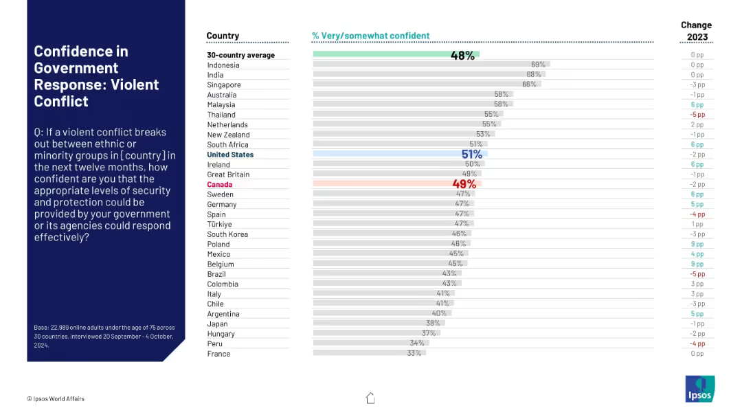
Bar chart on right with percentage values, country names on the left, and change figures on the far right. A large text box on the left presents the survey question. Colors highlight key countries like US and Canada.
Risk Assessment and Management
Government & Public Sector
Presents comparative survey results from 30 countries assessing public confidence in government response to violent ethnic or minority conflict. Highlights Canada and US with average ratings and changes from 2023.
security, conflict, public trust, government response, ethnic violence, international survey, Ipsos, Canada, United States, perception
Mixed Chart
IPSOS
Saved
Displays a circular diagram detailing the nine dimensions of organizational health, supplemented by statistics and performance impacts in side pie charts.
Human Resources and Talent Management
Professional Services
This slide advocates for regular assessments of organizational health across nine critical dimensions to better integrate SDG strategies into the core business processes, highlighting how such practices can lead to enhanced performance and competitive advantage.
Organizational Health, SDG Strategy, Performance Improvement, Competitive Advantage
Multiple Chart
McKinsey
Saved
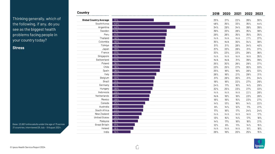
Layout consistent with previous: prompt on left, bar chart on right with time series from 2018–2023 for each country.
Market Analysis and Trends
Healthcare & Pharmaceuticals
This slide tracks stress perception as a major health issue across countries, with time series data. South Korea and Argentina show the highest concern. A global upward trend is visible, with stress becoming increasingly recognized as a health challenge.
stress, global health, trends, mental well-being, survey data
Mixed Chart
IPSOS
Saved
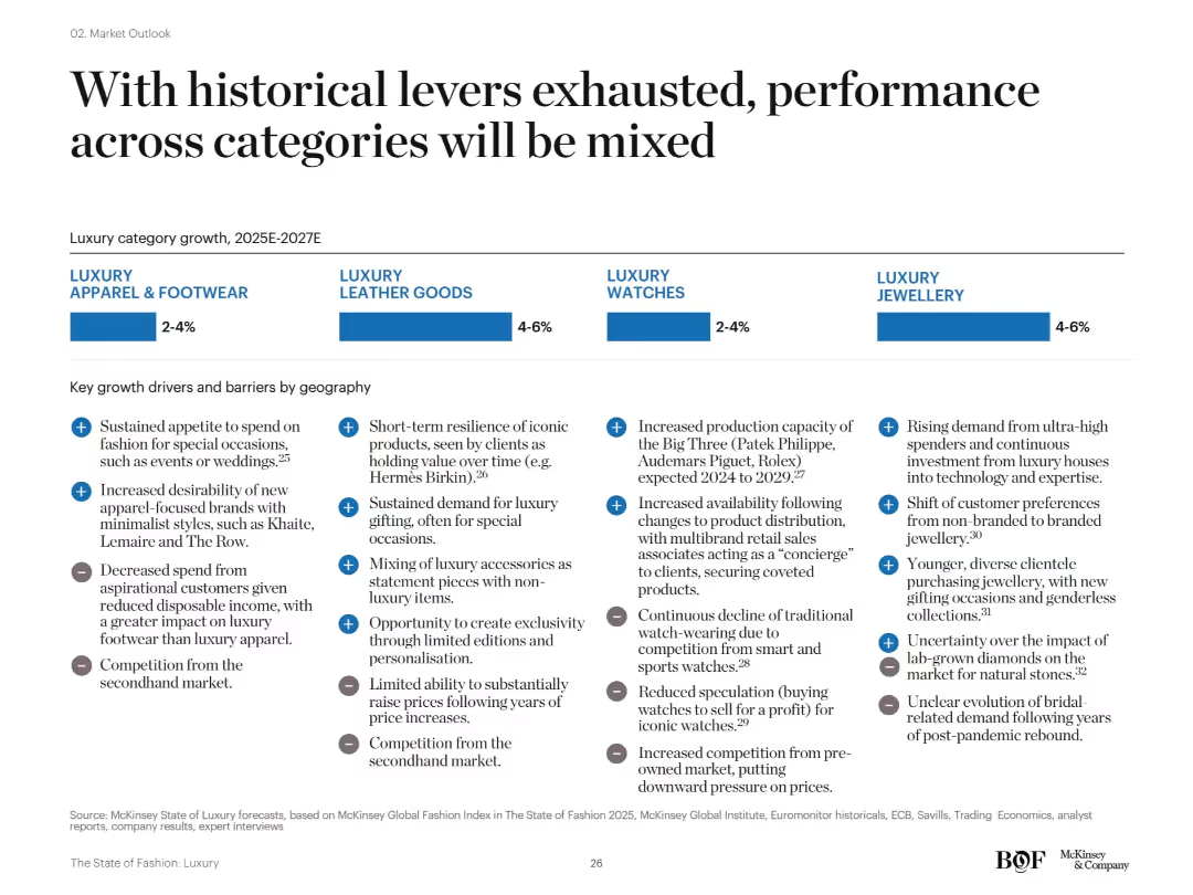
Four-segment layout comparing apparel & footwear, leather goods, watches, and jewellery. Each includes forecasted growth rates and key regional drivers and barriers in bullet format.
Strategic Planning
Consumer Goods
This slide emphasizes diverging performance among luxury categories from 2025–2027. While jewellery and leather goods are expected to grow 4–6%, apparel and watches will see only moderate growth. Key factors include secondhand market pressures, economic shifts, and consumer behavior changes.
category performance, growth forecast, secondhand competition, McKinsey, jewellery, apparel
Mixed Chart
McKinsey
Saved
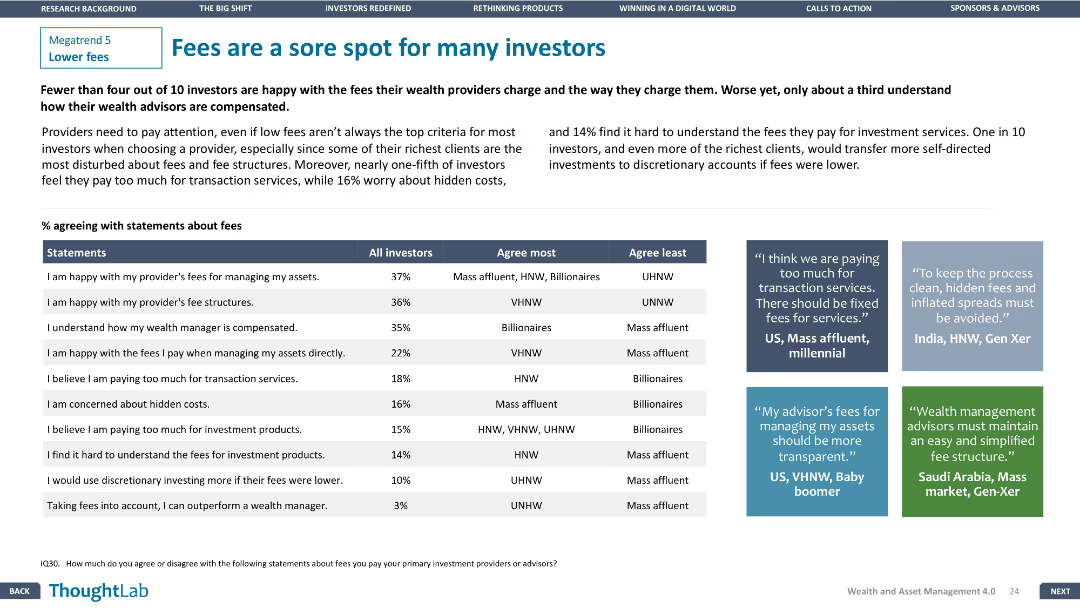
A table comparing investor agreement with fee statements. Three text boxes provide qualitative insights from different regions. Design is clear and focused.
Customer and Market Segmentation
Financial Services
Highlights investor dissatisfaction with fees and transparency issues, with specific agreement percentages and regional insights from investors.
fees, investors, satisfaction, transparency, regions
Header Vertical
Deloitte
Saved
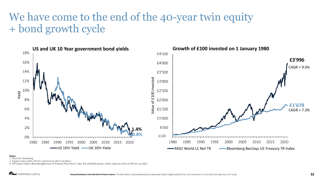
Column chart on the left shows US and UK 10-year government bond yields, line chart on the right shows investment growth.
Market Analysis and Trends
Financial Services
The slide analyzes the end of the 40-year growth cycle in equity and bonds, showing historical yields and investment growth.
bond yields, investment growth, market analysis, equity, bonds, financial cycle
Multiple Chart
Deloitte
Saved
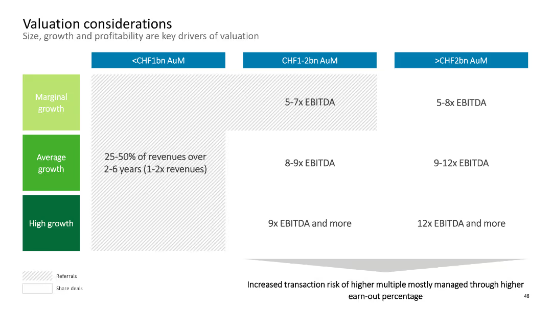
The slide contains a matrix chart with three columns representing AuM ranges and three rows representing growth levels. Each cell indicates EBITDA multiples. The layout is simple with colored sections for clarity.
Corporate Finance and Valuation
Financial Services
This slide discusses valuation considerations, focusing on size, growth, and profitability as key drivers. It provides EBITDA multiples based on AuM and growth levels. Suitable for analyzing company valuation for mergers and acquisitions.
Valuation, EBITDA, AuM, Growth, Financials
Table
Deloitte
Saved
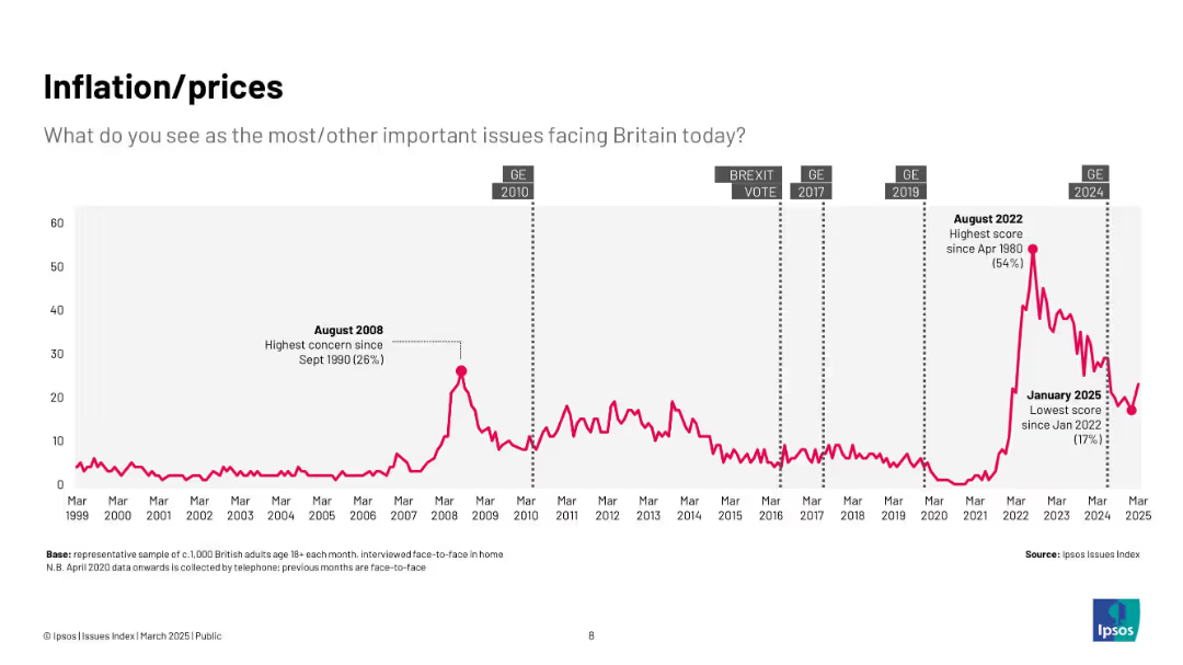
Pink line chart (1999–2025) with peak in 2022 and sharp drop by 2025; context points include financial crises and recent inflation spikes.
Market Analysis and Trends
Government & Public Sector
Highlights the rising and falling concern over inflation and prices, with major spikes during economic shocks such as 2008 and the post-COVID inflationary period.
inflation, prices, cost of living, Ipsos, economy, concern, UK, trends
Single Chart
IPSOS
Saved
Data visualization slide showing the population of Southeast Asian countries, with a simple map and corresponding data points.
Market Analysis and Trends
Technology & Software
Presents demographic data relevant to the e-Conomy SEA report, such as the population figures of countries in Southeast Asia.
e-Conomy SEA, demographics, Southeast Asia, population, country data, market analysis
Uncategorized
Bain
Saved
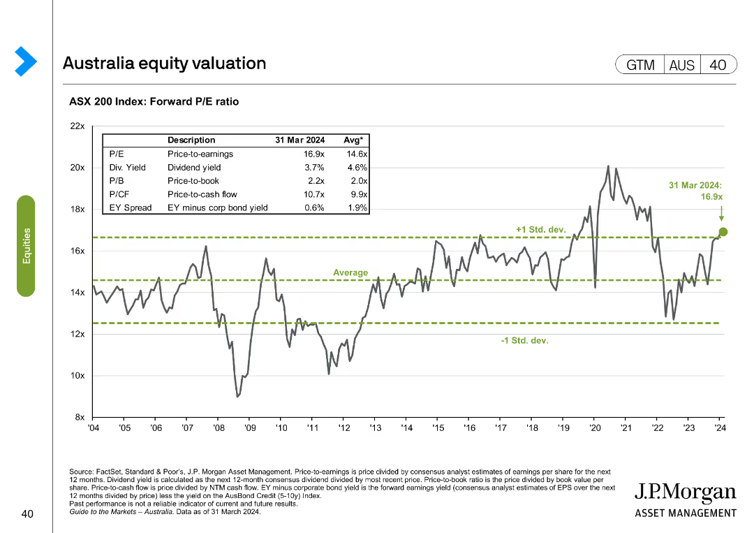
The slide presents a line chart with ASX 200 Index forward P/E ratio over time and a table with different valuation metrics as of March 2024 compared to historical averages.
Financial Performance
Financial Services
This slide evaluates the ASX 200 Index's forward P/E ratio and other valuation metrics, comparing current figures to historical averages.
ASX 200, valuation, metrics, forward P/E, historical
Single Chart
JP Morgan
Saved
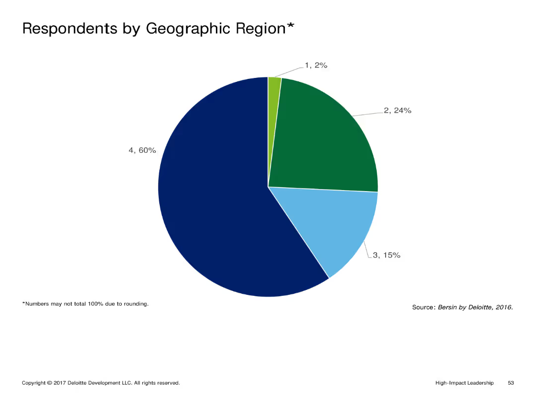
This slide shows a pie chart divided into different segments representing the percentage of respondents by geographic region. Each segment is color-coded and labeled with the corresponding percentage.
Market Analysis and Trends
Professional Services
The slide presents the distribution of survey respondents across different geographic regions. It highlights the proportion of respondents from each region, providing insights into the demographic spread of the survey participants.
Geographic Distribution, Respondents, Survey, Regions, Analysis
Single Chart
Deloitte
Saved
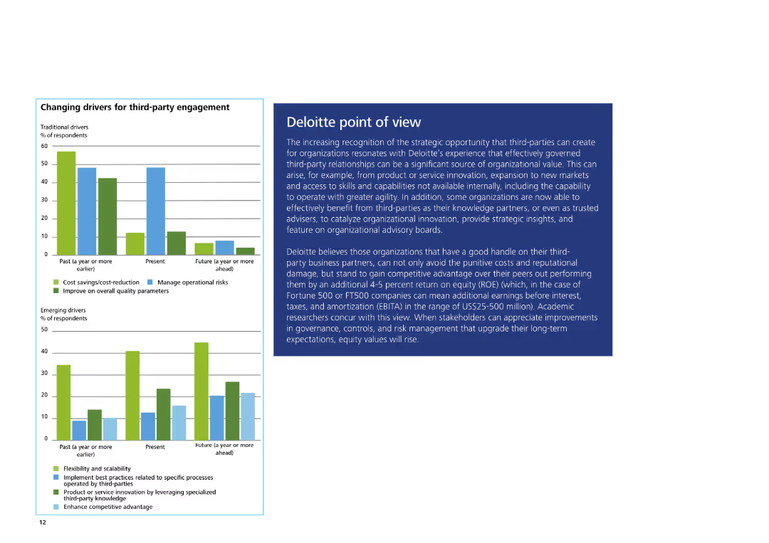
The slide features a column chart on the left showing traditional and emerging drivers for third-party engagement. On the right, there is a text box with Deloitte's POV.
Strategic Planning
Professional Services
The slide explains Deloitte's view on the strategic opportunities of third-party engagement, highlighting benefits, competitive advantage, and key organizational insights.
Third-party engagement, Deloitte, strategic opportunities, competitive advantage, organizational insights
Multiple Chart
Deloitte
Saved
Light background with yellow title banner, text-heavy content, and two charts illustrating cross-border listings and their performance.
Market Analysis and Trends
Financial Services
This slide highlights the outperformance of small cross-border IPOs compared to larger offerings in after-market returns. It features charts showing the number of cross-border listings over years and the percentage of IPOs with current prices above their offer prices.
cross-border listings, IPO performance, after-market returns, 2023, financial trends
Multiple Chart
EY
Saved
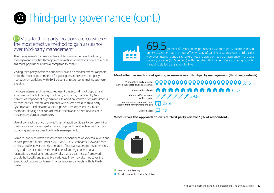
The slide features a pie chart on third-party review approaches and a column chart on methods for gaining assurance over third-party management, with explanatory text.
Regulatory and Compliance
Professional Services
It examines survey results on the most effective methods for gaining assurance over third-party management, emphasizing site visits, internal audits, and controls self-assessments.
Third-party management, assurance, survey results, site visits, internal audits, controls self-assessments
Mixed Chart
Deloitte
Saved
A column chart compares the ownership of various investment products between 2022 and 2023 among Canadians.
Market Analysis and Trends
Financial Services
It lists the most common investment products held by Canadians and compares the ownership rates between 2022 and 2023.
Investment, Products, Ownership, Canadians, 2023, 2022, Column Chart, Financial, Trends
Mixed Chart
IPSOS
Saved
The slide includes two sets of data visualizations. On the left, there are dual line graphs for manufacturing and service purchasing managers' indexes (PMIs), and on the right, there are two stock market index graphs. It uses a blue and purple color scheme, with a clear visual distinction between the datasets.
Market Analysis and Trends
Financial Services
This slide focuses on the recent performance of service and manufacturing PMIs in China and stock market trends, indicating economic activity levels. It may serve analysts and investors in evaluating the current business climate, informing decisions in the finance and manufacturing sectors.
PMI, Manufacturing, Services, Stock Market, Economic Indicators, China, Market Trends, Business Climate
Multiple Chart
McKinsey
Saved
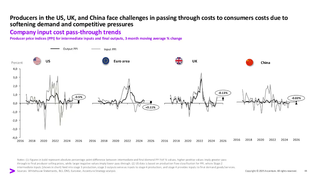
Line charts showing output and input PPI trends from 2016 to 2026 for US, Euro area, UK, and China, with callouts for PPI pass-through values.
Pricing Strategies
Industrial & Manufacturing
This slide presents producer price index (PPI) data, comparing intermediate input costs and final output prices across regions. The data highlights difficulties in cost pass-through to consumers, particularly in the US and UK, due to weak demand and competitive pressures.
PPI, cost pass-through, producer prices, inflation, input cost, output prices, US, UK
Single Chart
Accenture
Saved
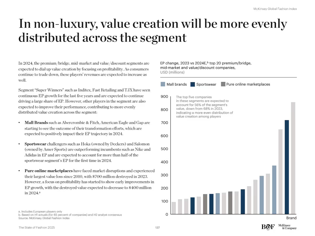
Left text discusses drivers of balanced value creation. Right bar chart categorizes EP growth by brand type (Mall, Sportswear, Online).
Strategic Planning
Retail & E-commerce
The slide shows that in 2024, value creation within non-luxury segments (mall brands, sportswear, online) will be more evenly spread. Growth is no longer driven by a few top performers, indicating broader improvements across brands.
Non-luxury, value creation, EP growth, segment balance, sportswear, online retail, mall brands, fashion strategy, brand performance
Mixed Chart
McKinsey
Saved
Presents a column chart tracking investor priorities for financially healthy companies over time, shown in a green gradient, highlighting shifts in investor focus during the COVID-19 pandemic.
Investment Analysis
Financial Services
Details the changing investment priorities among investors, particularly the balance between long-term growth and short-term performance expectations in response to global economic shifts.
investment priorities, COVID-19, long-term growth, short-term performance
Multiple Chart
BCG
Saved
Previous
Next
If nothing, comes up, please save your slides first
Create a FREE account to continue browsing
Receive Instant Access to 1,000+ slides from companies like McKinsey, Google, and Goldman Sachs
First Name
Last Name
Email
Password
I agree to all
Terms & Privacy Policy
Thank you! Your submission has been received!
Oops! Something went wrong while submitting the form.
Have an account?
Sign in
Column Chart
Heatmap
Chevron
Org Chart
Infographic
Callouts
Timeline
List
Graphic
Picture
Process Flow
Diagram
Paragraph
Map
Table
Framework
Subtitle
Takeaway Box
Icon
Other Chart
Radar Chart
Waterfall Chart
Mekko Chart
Pie Chart
Scatter Plot
Line Chart
Bar chart
Bullet points