My Account
My Slides
Search by Category
Templates
View All Templates
Download Template Slides
✦ AI Search
Feedback
Login
Logout
Get Started
Browse all Slides
Browse all Slides
Create a FREE Account
Instant access to 1,000+ real slides from top companies like McKinsey, BCG, Goldman Sachs, Google and many more!
First Name
Last Name
Email
Password
I agree to all
Terms & Privacy Policy
Thank you! Your submission has been received!
Oops! Something went wrong while submitting the form.
Have an account?
Sign in
Saved Slides
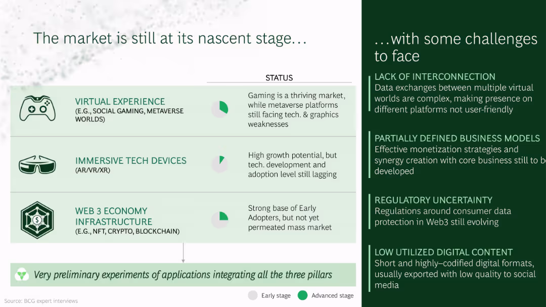
Split-screen layout with a light green left section listing three tech pillars (each with icons and brief status) and a dark green right section listing four challenges in bullet format.
Market Analysis and Trends
Technology & Software
Highlights the early-stage development of the virtual experience, immersive tech devices, and Web3 infrastructure. It outlines their current adoption status and identifies major challenges such as lack of interconnection, immature business models, regulation gaps, and underutilized content.
virtual experience, metaverse, AR/VR, Web3, adoption, early market, tech challenges
Mixed Chart
BCG
Saved
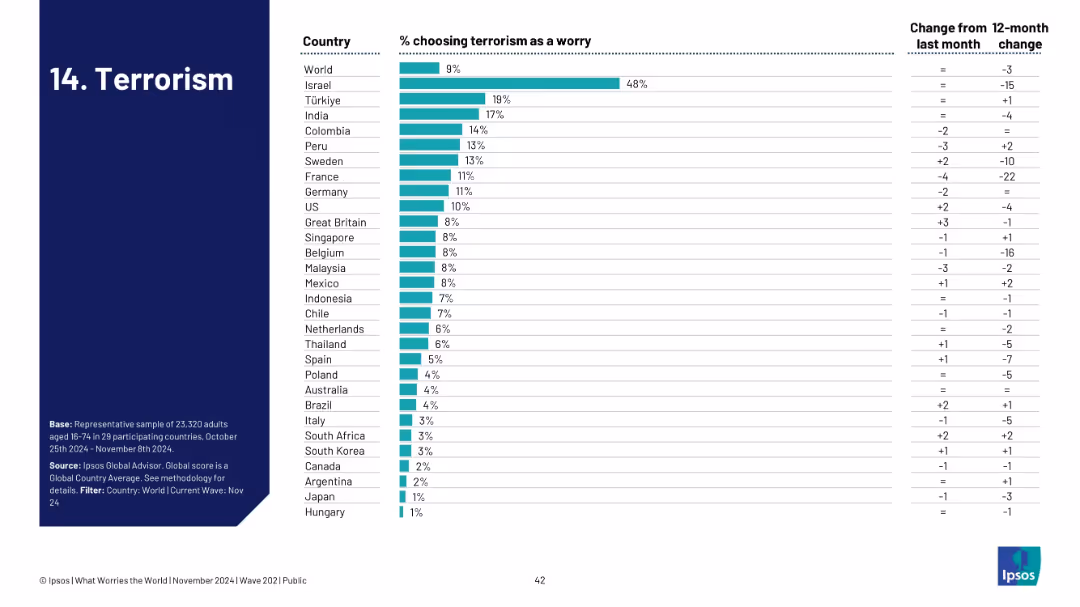
Ranked bar chart by country for terrorism concern; change columns provided.
Risk Assessment and Management
Government & Public Sector
Visualizes how terrorism ranks among public concerns across nations. Israel is highest at 48%, with most countries under 10%. The trend data indicates a general decline in worry, potentially reflecting a shift in geopolitical focus or threat levels.
terrorism, national security, global concern, Ipsos, survey, public safety, threat perception, geopolitical risk
Single Chart
IPSOS
Saved
The slide utilizes a mix of graph types, including a column chart and a pie chart, along with descriptive text and bullet points. It presents information using blue tones and is structured into two sections to illustrate customer solutions across the wealth spectrum.
Product and Service Analysis
Financial Services
This slide showcases how JPMorgan Chase & Co. has built a range of solutions to meet customer needs, emphasizing the student segment's new checking accounts and the card ownership among Sapphire and Private Client households. It's used to illustrate product segmentation and relationship deepening within various customer wealth brackets.
Solutions, Wealth Spectrum, Banking, Student Segment, Accounts, Sapphire, Private Client, Card Ownership, JPMorgan Chase & Co.
Multiple Chart
JP Morgan
Saved
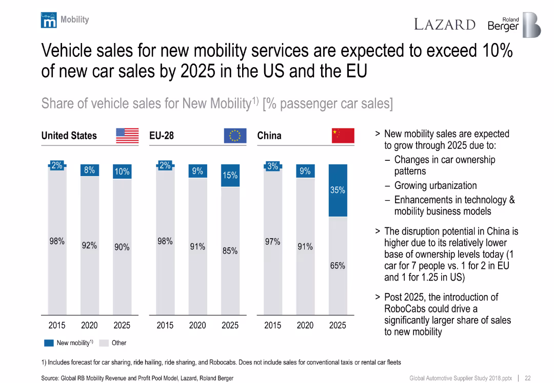
Clustered column chart showing forecasted share of new mobility vehicle sales by region (US, EU, China) from 2015–2025.
Market Analysis and Trends
Industrial & Manufacturing
Forecasts sharp growth in new mobility vehicle sales, especially in China. Drivers include urbanization, tech innovation, and ownership changes. China expected to leap ahead due to low current car ownership.
new mobility, car sharing, China, EU, US, ownership, future trends
Mixed Chart
Roland Berger
Saved
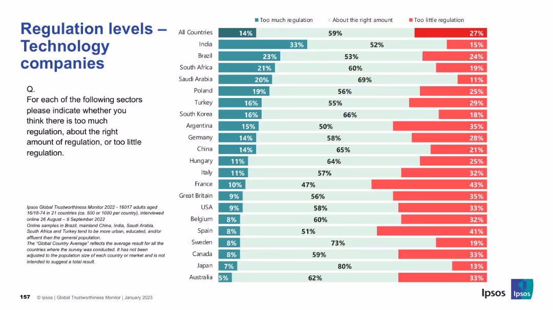
Consistent layout; country ranking by views; colors indicate opinions on regulation sufficiency.
Regulatory and Compliance
Technology & Software
This slide captures opinions on whether technology companies are properly regulated. The majority believe regulation levels are appropriate, but countries like Argentina and France indicate concerns about underregulation, while India and Brazil lean toward thinking there’s too much.
tech industry, regulation, public opinion, Ipsos, governance, compliance, digital policy, international, oversight, perception
Mixed Chart
IPSOS
Saved
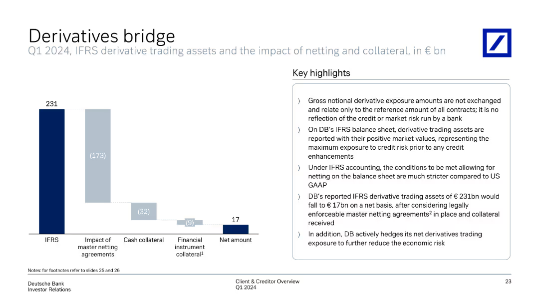
Contains a column chart explaining IFRS derivative trading assets, including the impact of netting and collateral. The right side summarizes key highlights of derivatives trading exposure and accounting treatment under IFRS.
Risk Assessment and Management
Financial Services
Summarizes IFRS derivative trading assets, illustrating netting and collateral impacts. The slide provides key highlights on gross notional exposure, IFRS accounting differences, and risk mitigation strategies employed by the bank to manage derivatives exposure.
derivatives, IFRS, netting, collateral, trading exposure
Mixed Chart
Deutsche Bank
Saved
Features textual content and statistics on what investors value from advisors, with supporting data in a table
Client Case Studies
Financial Services
Highlights the evolving expectations from financial advisors and the value they need to provide beyond technology.
advisors, investors, value, expectations, technology, financial services
Table
Deloitte
Saved
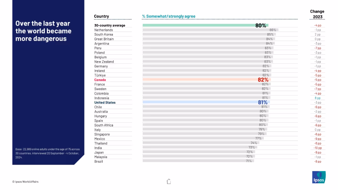
Horizontal bar chart ranking countries by agreement with the statement; red and blue highlights for key countries; change column on right.
Risk Assessment and Management
Government & Public Sector
This slide visualizes the percentage of people in each country who agree that the world became more dangerous in the past year. The global average is 80%, with notable concern in the Netherlands and South Korea. Changes from 2023 are also shown, highlighting shifts in perception.
risk perception, public sentiment, safety, geopolitical fear, country rankings, Ipsos, 2024, year-over-year change, world affairs, global danger
Mixed Chart
IPSOS
Saved
Column chart showing performance returns of the MS INVF Sustainable Asia Equity Fund over various periods.
Financial Performance
Financial Services
Displays fund performance for different time horizons, compared to a blended index, emphasizing past performance metrics.
Performance, returns, fund, equity, index
Mixed Chart
Morgan Stanley
Saved
The slide includes three donut charts representing the impact of the Great Resignation on different experience levels across total, hedge fund, and private equity sectors. An image on the left shows a meeting setting. The charts use shades of orange and red.
Human Resources and Talent Management
Financial Services
The slide discusses how the Great Resignation has most affected employees with 4-10 years of experience and highlights concerns about employee turnover rates among managers and investors.
Great Resignation, employee turnover, talent management, hedge fund, private equity
Multiple Chart
EY
Saved
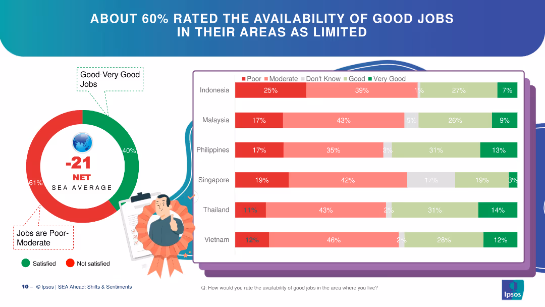
Circle chart and bar charts depicting perceptions of job availability in SEA countries.
Market Analysis and Trends
Financial Services
The slide discusses perceptions of job availability in SEA, with a majority rating availability as poor to moderate.
job availability, SEA, circle chart, bar chart, perceptions
Multiple Chart
IPSOS
Saved
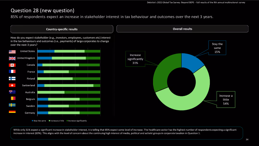
Contains horizontal bar charts for country-specific results and a pie chart for overall expectations of stakeholder interest in tax behaviors.
Market Analysis and Trends
Financial Services
The slide illustrates expectations of increased stakeholder interest in tax behavior and outcomes, with country-specific and overall data.
survey, bar charts, stakeholder interest, tax behavior
Multiple Chart
Deloitte
Saved
A doughnut chart in the center showing the distribution of crypto asset ownership categories, with percentages indicated in different colors.
Market Analysis and Trends
Financial Services
Presents data on crypto asset ownership among Canadians, highlighting the percentages of current and previous owners, and the breakdown of asset categories.
crypto ownership, crypto assets, investment funds, market analysis, financial services
Mixed Chart
IPSOS
Saved
The slide features a donut chart showing the responses to a question about inflation knowledge, with a breakdown of correct, incorrect, and unsure answers. The layout is moderately complex.
Performance Metrics and KPIs
Financial Services
This slide measures Canadians' understanding of inflation, revealing that 64% answered correctly about the impact of inflation on savings. It aims to assess public knowledge about inflation.
inflation, knowledge, savings, Canadians, understanding
Single Chart
IPSOS
Saved
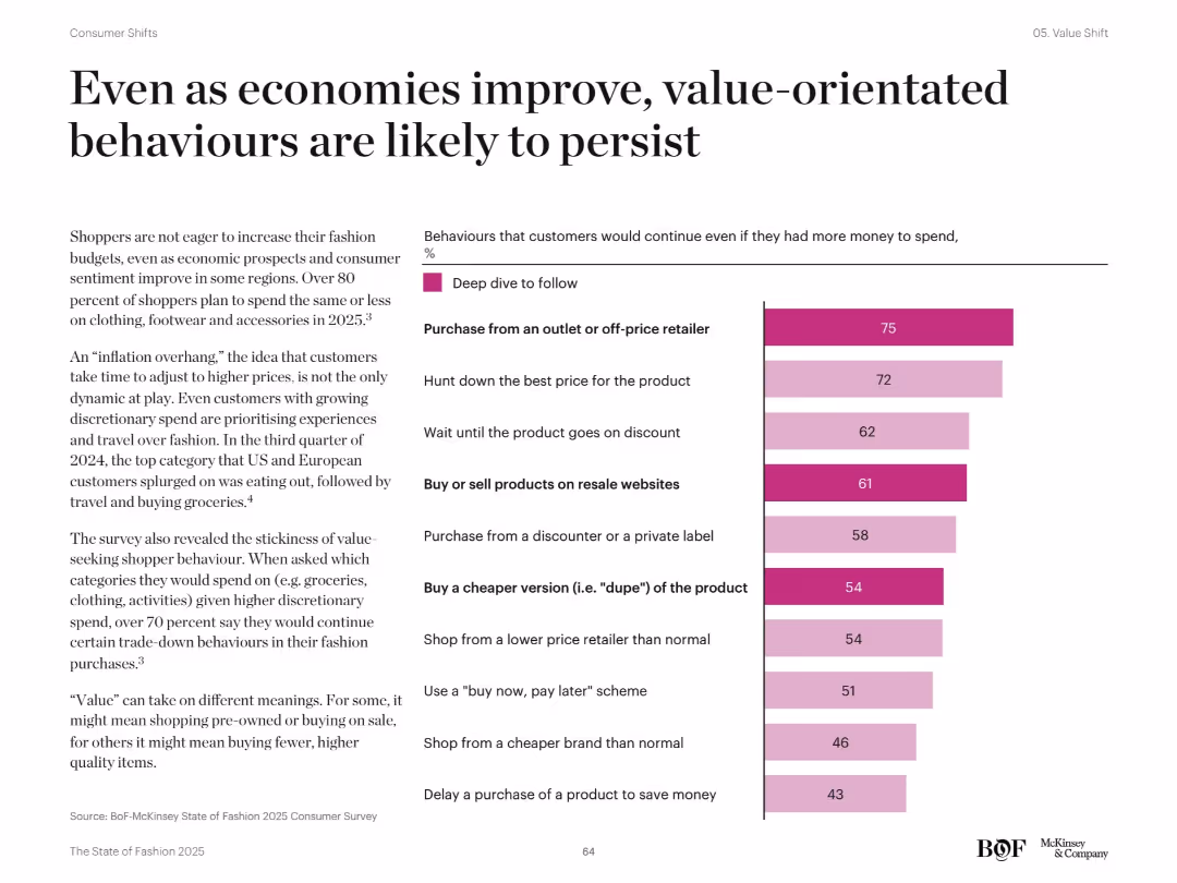
Right bar chart listing top 10 consumer trade-down behaviors with % deep dive follow. Left text discusses post-inflation and value-persistence behaviors. Dark pink bars indicate strong consumer intent.
Pricing Strategies
Retail & E-commerce
Despite improved economic outlook, shoppers are expected to maintain cost-conscious behaviors. Lists key actions such as buying from off-price retailers, waiting for discounts, and choosing cheaper versions. Highlights over 80% plan to spend the same or less on fashion in 2025.
value behavior, discount shopping, price sensitivity, trade-down, economic resilience
Mixed Chart
McKinsey
Saved
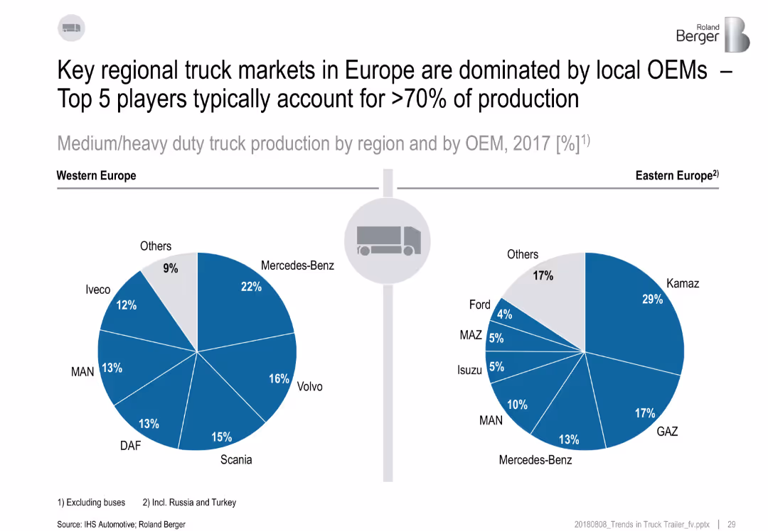
Two pie charts comparing market shares of OEMs in Western and Eastern Europe.
Competitive Landscape
Transportation & Logistics
The slide presents the OEM landscape for heavy-duty truck production in Europe. Western Europe is dominated by Mercedes-Benz, Volvo, and Scania, while Eastern Europe sees Kamaz, GAZ, and Mercedes-Benz leading. Top 5 OEMs hold over 70% share.
OEM, Europe, market share, trucks, production, Mercedes-Benz, Kamaz
Multiple Chart
Roland Berger
Saved
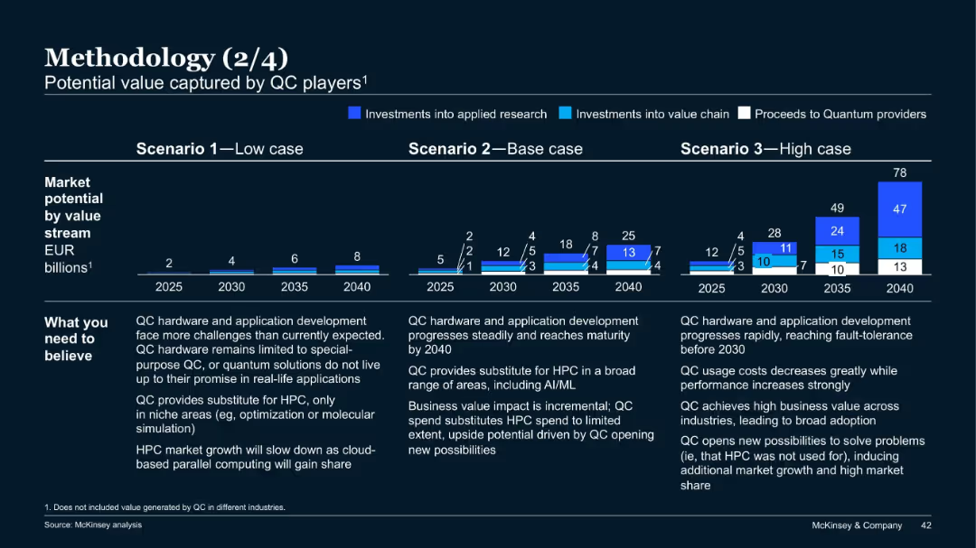
Three-scenario bar projection charts from 2025 to 2040; colored segments indicate investments and proceeds; notes on assumptions below charts.
Investment Analysis
Artificial Intelligence
This slide projects quantum computing (QC) market potential under low, base, and high scenarios, broken down by value stream. It explains what must be believed in each case and estimates value in EUR billions up to 2040 for each path.
quantum computing, market potential, investment, scenarios, projections, McKinsey
Mixed Chart
McKinsey
Saved
The slide includes text and pie charts showing demographic segmentation of UK consumers' returns behavior, categorized by age and gender.
Market Analysis and Trends
Retail & E-commerce
Provides analysis of consumer behavior regarding returns in the UK fashion market, segmented by age groups and gender, based on survey data.
Consumer behavior, Returns, UK, Demographics, Survey data
Multiple Chart
Roland Berger
Saved
This slide is divided into three content blocks, each with icons and bullet points to represent different aspects of business banking growth, like market share and digital engagement.
Market Analysis and Trends
Financial Services
It presents opportunities for growth in business banking, illustrating industry leadership, strong unit economics, and a widespread network. Data points include the formation of 450k small businesses and 80% client digital activity.
Market Leadership, Growth Opportunities, Digital Activity, Small Business, Banking
Table
JP Morgan
Saved
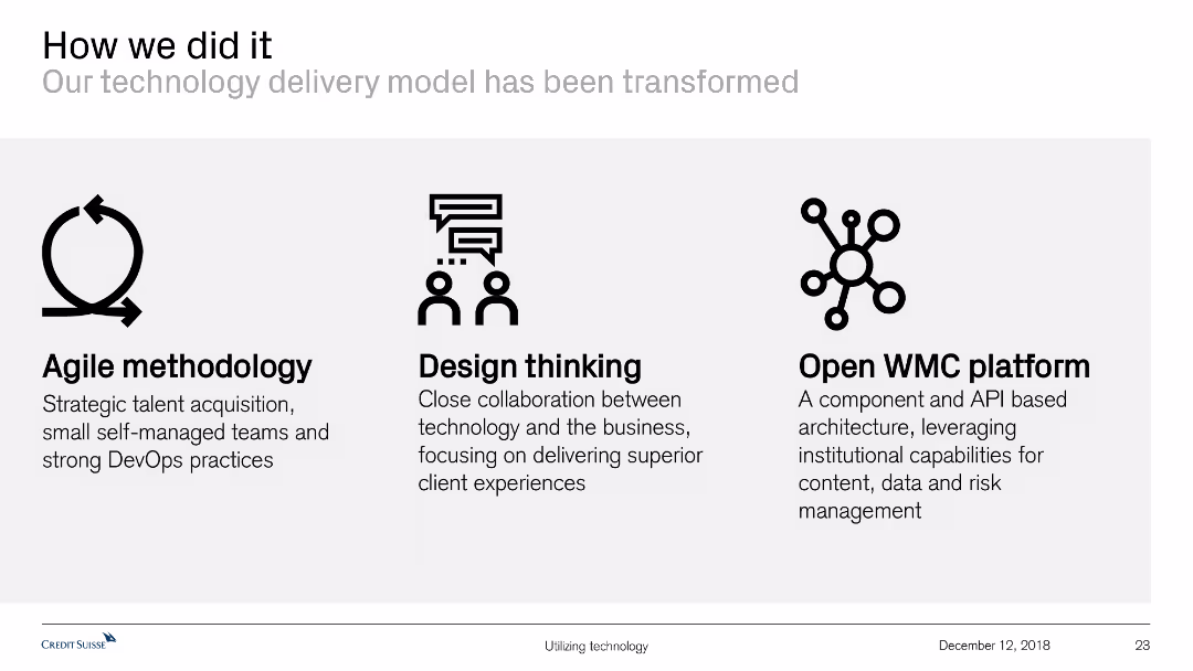
Features icons and text to describe the transformation of the technology delivery model through agile methodology, design thinking, and an open WMC platform.
Technology and Digital Transformation
Technology & Software
This slide explains the transformation of the technology delivery model, highlighting key methodologies and platforms used, such as agile practices and design thinking.
technology delivery, agile methodology, design thinking, open WMC platform, transformation, technology model, collaboration, client experience
Pillar
Credit Suisse
Saved
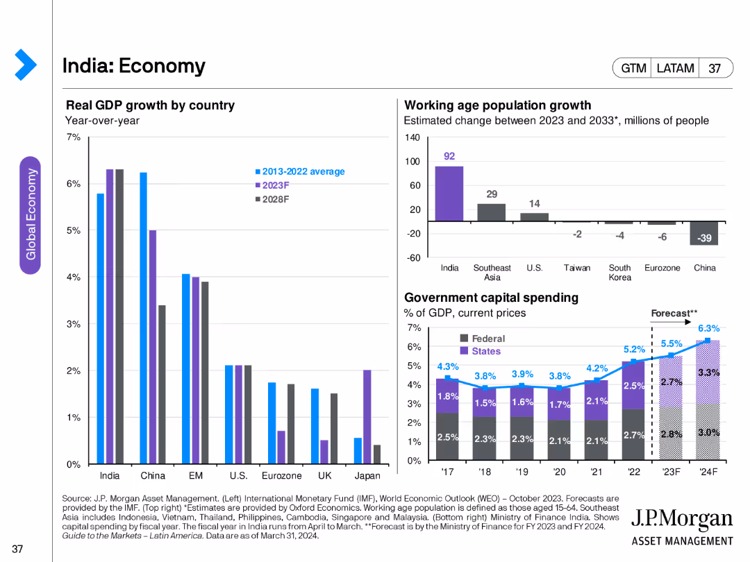
This slide includes a column chart showing India's real GDP growth by country, a bar chart showing working-age population growth, and a column chart displaying government capital spending by federal and state levels.
Market Analysis and Trends
Financial Services
The slide provides an overview of India's economic growth, demographic changes, and government spending trends, offering insights into the country's economic development and future prospects.
India, economy, GDP growth, working-age population, government spending, economic development, federal, state
Multiple Chart
JP Morgan
Saved
This slide features multiple line charts displaying year-on-year changes in credit card sales across various retail sectors. The layout includes two main sections for short-term impacts and recovery paths, with annotations and a clear color-coded legend.
Market Analysis and Trends
Retail & E-commerce
This slide analyzes the short-term impact of the COVID-19 pandemic on different retail sectors and predicts their recovery paths. It highlights the contrast between essential and non-essential retailers, using data-driven insights to project future industry trends.
Retail, COVID-19, Recovery, Online Sales, Impact Analysis
Multiple Chart
BCG
Saved
A large multi-colored area graph dominates this slide, charting the increase in daily COVID-19 cases by region from March to December. The background is gray, and each region (like North America, South America) is represented in a different color, with key data points highlighted on the graph.
Strategic Planning
Healthcare & Pharmaceuticals
Details the dramatic increase in COVID-19 cases globally with a focus on recent months. It provides a visual analysis of the pandemic's surge in different regions, emphasizing the growth in cases and the ongoing challenges in managing the spread.
COVID-19, daily cases, global, regions, pandemic, trends, healthcare
Single Chart
BCG
Saved
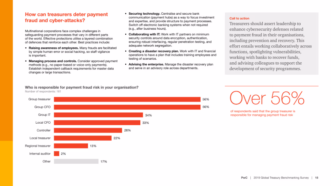
Contains text, a column chart, and a call-to-action section. The column chart shows who is responsible for managing payment fraud risk.
Risk Assessment and Management
Financial Services
This slide presents strategies for preventing payment fraud and cyber-attacks and identifies who within an organization is responsible for managing these risks.
Fraud prevention, cyber-attacks, risk management, survey, responsibility
Mixed Chart
PwC/Strategy&
Saved
Shows a donut chart and a gauge chart examining the emotional engagement of managers with their teams. The charts use distinct color segments to illustrate different responses.
Human Resources and Talent Management
Professional Services
Analyzes managers' emotional engagement, essential for HR strategy sessions aiming to improve internal communication and team morale.
emotional engagement, managers, HR
Multiple Chart
PwC/Strategy&
Saved
Previous
Next
If nothing, comes up, please save your slides first
Create a FREE account to continue browsing
Receive Instant Access to 1,000+ slides from companies like McKinsey, Google, and Goldman Sachs
First Name
Last Name
Email
Password
I agree to all
Terms & Privacy Policy
Thank you! Your submission has been received!
Oops! Something went wrong while submitting the form.
Have an account?
Sign in
Column Chart
Heatmap
Chevron
Org Chart
Infographic
Callouts
Timeline
List
Graphic
Picture
Process Flow
Diagram
Paragraph
Map
Table
Framework
Subtitle
Takeaway Box
Icon
Other Chart
Radar Chart
Waterfall Chart
Mekko Chart
Pie Chart
Scatter Plot
Line Chart
Bar chart
Bullet points