My Account
My Slides
Search by Category
Templates
View All Templates
Download Template Slides
✦ AI Search
Feedback
Login
Logout
Get Started
Browse all Slides
Browse all Slides
Create a FREE Account
Instant access to 1,000+ real slides from top companies like McKinsey, BCG, Goldman Sachs, Google and many more!
First Name
Last Name
Email
Password
I agree to all
Terms & Privacy Policy
Thank you! Your submission has been received!
Oops! Something went wrong while submitting the form.
Have an account?
Sign in
Saved Slides
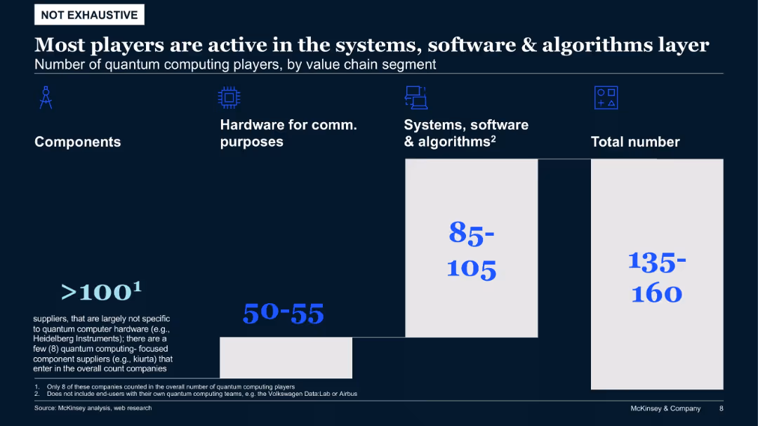
Bar-style chart comparing number of quantum players by value chain segment, with emphasis on software, hardware, and components
Product and Service Analysis
Artificial Intelligence
The majority of quantum computing players operate in the software and algorithms domain. Fewer focus on hardware and even fewer on components. The slide helps identify dominant value chain segments within the quantum computing industry.
quantum computing, value chain, software, hardware, algorithms, component suppliers
Single Chart
McKinsey
Saved
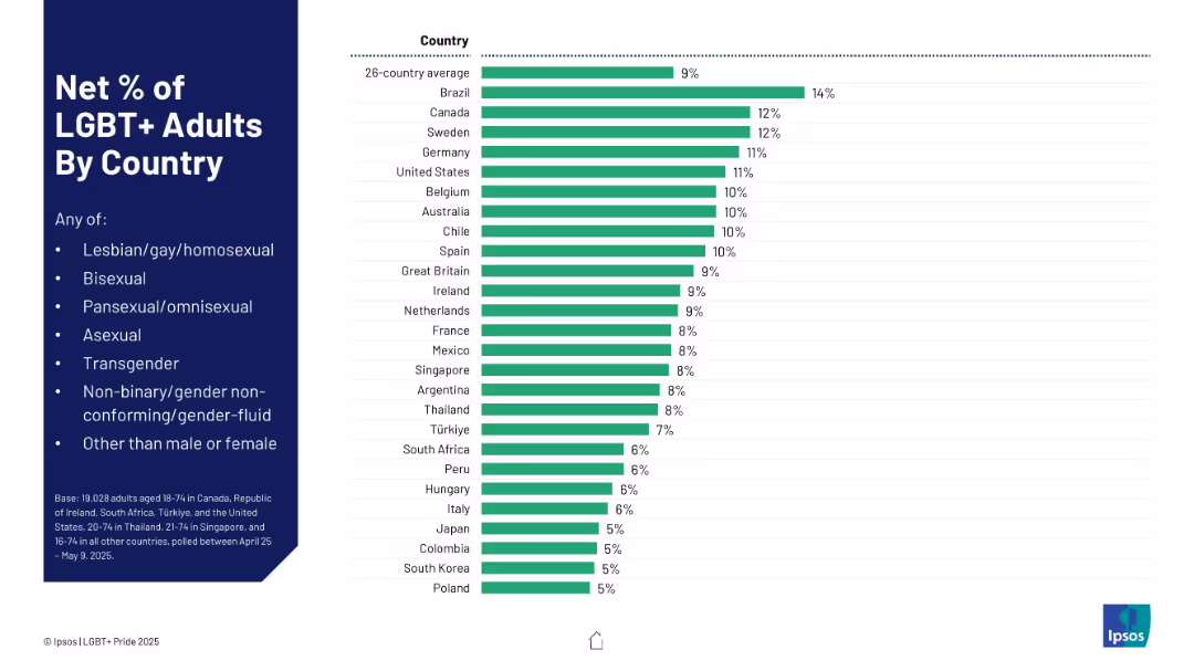
Horizontal bar chart ranking countries by percentage. Left-aligned legend and title; right-aligned bars.
Market Analysis and Trends
Government & Public Sector
This slide visualizes the net percentage of LGBT+ adults in 26 countries, showing Brazil, Canada, and Sweden at the top, with a global average of 9%. Categories include various sexual and gender identities.
LGBT+, global comparison, demographics, country stats, sexuality, identity
Mixed Chart
IPSOS
Saved
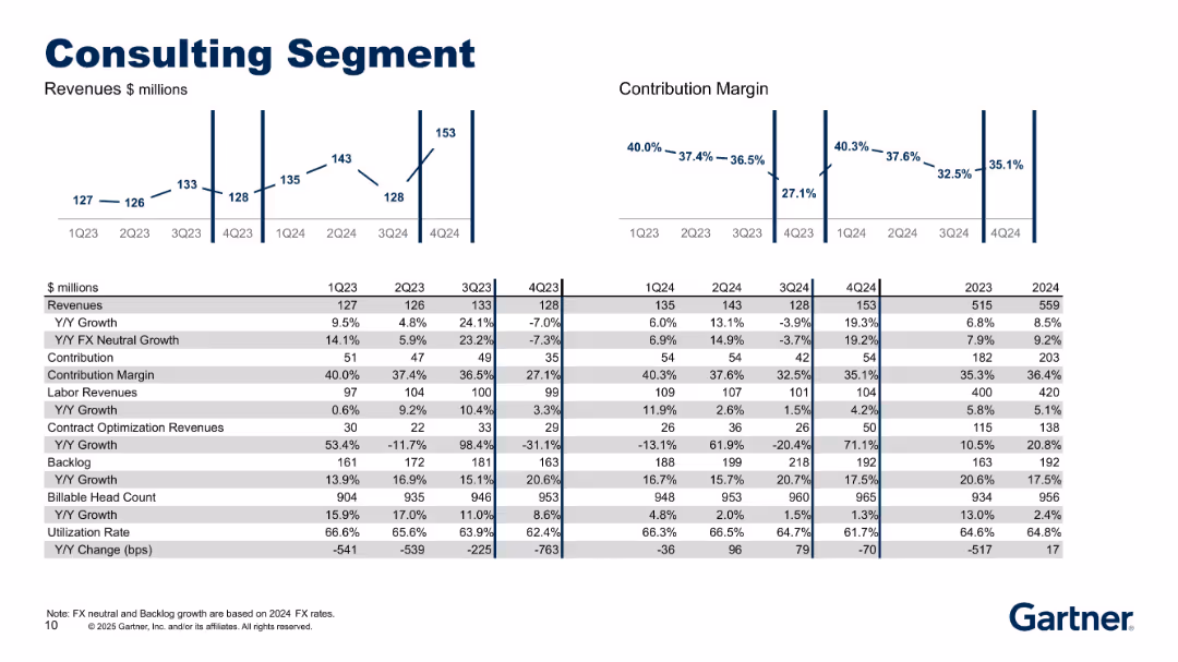
Includes revenue and margin charts above a detailed financial and operational table (e.g., backlog, utilization, headcount). Simple layout with emphasis on growth rates.
Product and Service Analysis
Professional Services
Summarizes the Consulting segment’s revenue, margin, and key drivers like backlog, billable headcount, and utilization rate. Shows how consulting performance has evolved and how labor vs. optimization revenue contribute to segment success.
consulting, backlog, utilization, labor revenue, growth, margins
Multiple Chart
Gartner
Saved
Slide includes a column chart detailing the composition of loss-absorbing capacity in a financial institution. Annotations and arrows explain the key components and regulatory context.
Risk Assessment and Management
Financial Services
Focuses on a bank's financial buffers and regulatory compliance regarding loss-absorbing capacity, showing various types of capital and their contribution to the total.
banking, regulatory compliance, financial stability, capital management
Mixed Chart
Deutsche Bank
Saved
Includes several column charts related to renewable energy consumption in EU member states, CO2 emissions, and a large text section discussing the role of renewable energy in EU energy targets.
Market Analysis and Trends
Energy & Utilities
Explores the expansion of renewable energy within the EU, noting specific contributions to energy targets and environmental benefits. Discusses the integration of solar and wind power into the energy mix and the impact on CO2 emissions.
Renewable Energy, Market Growth, EU
Multiple Chart
PwC/Strategy&
Saved
This slide features six gauge charts and a timeline. The top three charts indicate risk-weighted assets for 'Trading', 'Lending', and 'Operational Risk and CVA', each in a gauge format with color gradations from green to red. Below, a timeline marks key regulatory milestones for Basel III. The bottom three gauges represent capital buffers: GSIB, SCB, and CCyB. The overall design is structured, with blue as a dominant color and the use of arrows and timeline for historical and future projections.
Regulatory and Compliance
Financial Services
The slide presents the current and projected regulatory capital requirements, including Basel III endgame and various capital buffers like GSIB, SCB, and CCyB, with an emphasis on the uncertainty and preparation for potential regulatory changes.
Basel III, Regulatory, Capital, Risk, GSIB, SCB, CCyB, Timeline, Gauge Chart
Linear Flow
JP Morgan
Saved
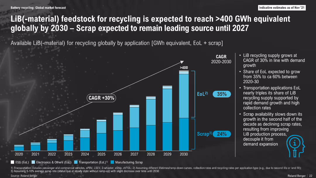
Stacked bar chart with CAGR trajectory, breakdown by application types (ESS, Electronics, Transportation, Scrap); dark theme, annotated with notes on trends
Market Analysis and Trends
Energy & Utilities
This slide forecasts LiB-material feedstock for recycling to exceed 400 GWh by 2030, driven by growing End-of-Life volumes and early scrap. Scrap remains dominant until 2027 before EoL overtakes it, indicating changes in battery production maturity and recycling dynamics.
LiB Recycling, GWh Feedstock, Scrap, End-of-Life, CAGR, Battery Materials, 2030, Market Growth
Mixed Chart
Roland Berger
Saved
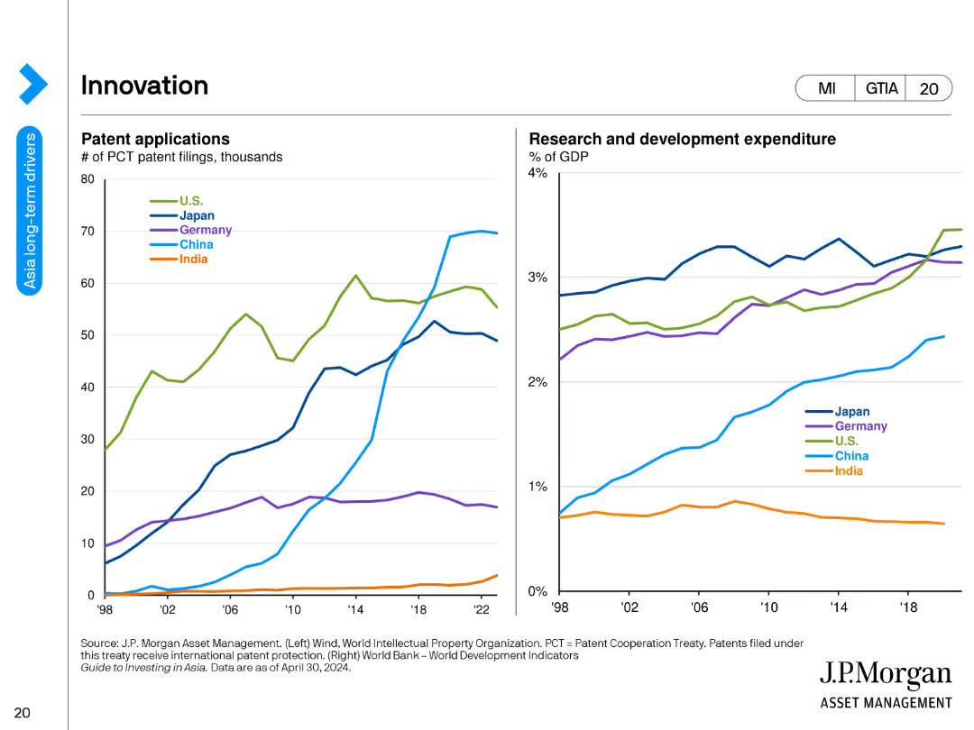
The slide features two line charts. The left chart shows the number of PCT patent filings in thousands for the US, Japan, Germany, China, and India from 1998 to 2023. The right chart presents research and development expenditure as a percentage of GDP for the same countries over the same period.
Market Analysis and Trends
Technology & Software
This slide analyzes innovation trends, illustrating patent applications and R&D expenditures across major countries. It shows the growth in patent filings and investment in research and development, indicating technological advancement and economic focus.
innovation, patents, R&D, US, Japan, Germany, China, India, line chart, technology
Multiple Chart
JP Morgan
Saved
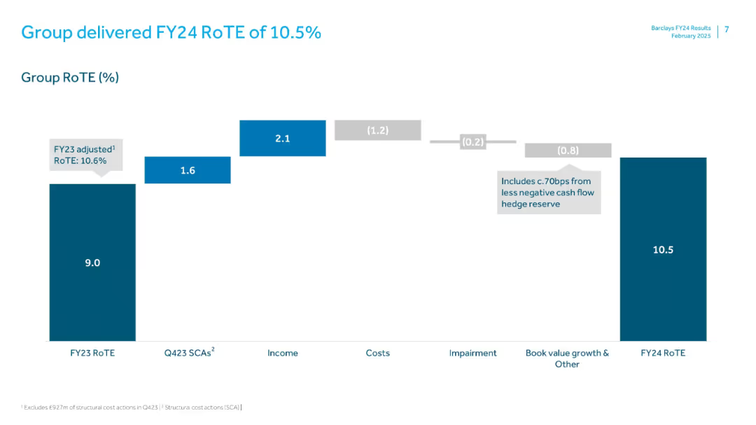
Waterfall chart illustrating components of return on tangible equity. Minimalist layout with teal and gray tones.
Financial Performance
Financial Services
Displays Barclays’ FY24 Return on Tangible Equity (RoTE), explaining the change from FY23’s 9.0% to FY24’s 10.5% through breakdowns of SCAs, income, costs, impairments, and other adjustments.
RoTE, FY24, Barclays, Return, Income, Costs, Performance, Hedge, Equity
Single Chart
Barclays
Saved
The slide includes a line chart displaying the 3-month London Interbank Offered Rate (LIBOR) from 2002 to 2040 with forecasts.
Financial Performance
Financial Services
This slide analyzes the historical and projected trends of borrowing costs using LIBOR rates, indicating expected future increases.
LIBOR, borrowing costs, interest rates, financial forecast, historical trends
Single Chart
UBS
Saved
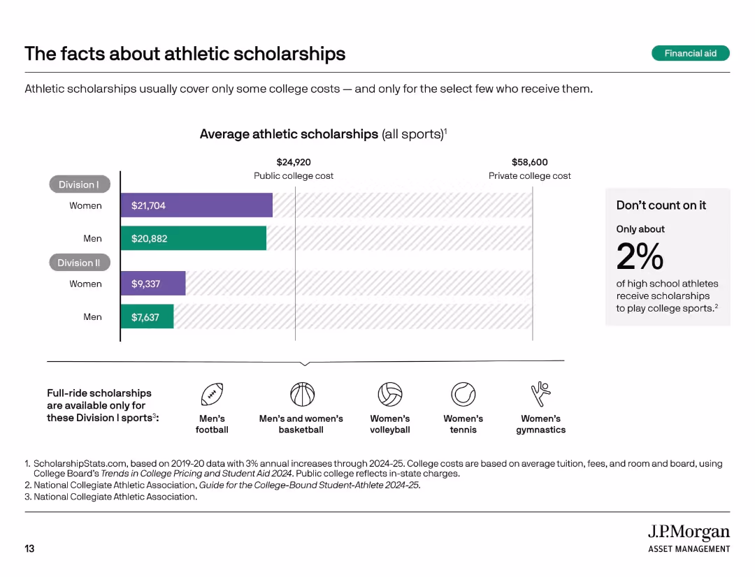
Horizontal bar chart by gender/division with icon row below; sidebar text in light gray box.
Market Analysis and Trends
Education & Training
This slide addresses common misconceptions about athletic scholarships, showing average scholarship values by division and gender, while stressing their rarity. Only about 2% of high school athletes receive these scholarships. It also identifies sports eligible for full-ride scholarships.
athletic scholarships, Division I, Division II, college costs, sports
Mixed Chart
JP Morgan
Saved
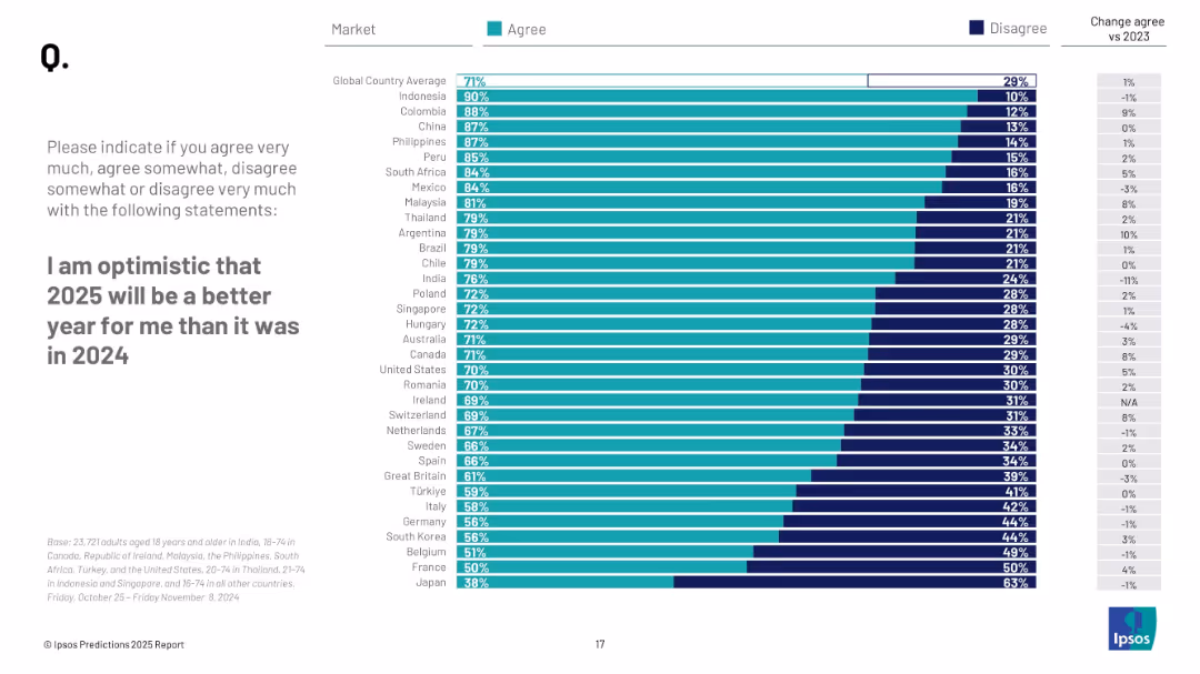
Bar chart comparing country-level agreement vs disagreement on personal optimism for 2025; right-aligned bar with % values; side column with change from 2023.
Market Analysis and Trends
Professional Services
This slide presents survey results on personal optimism for 2025 across countries, comparing how many people agree or disagree that 2025 will be better for them than 2024, and changes from previous year.
optimism, global attitudes, personal outlook, country comparison, 2025, Ipsos, bar chart, sentiment, improvement, survey results
Mixed Chart
IPSOS
Saved
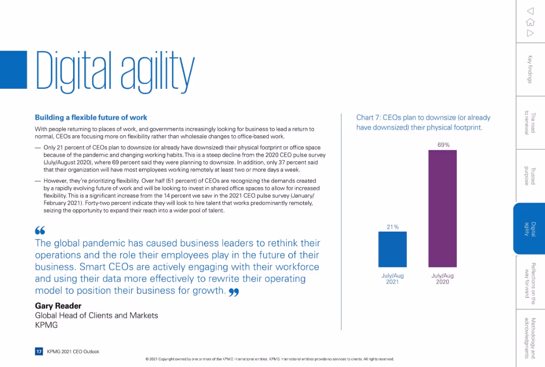
Clean layout with text-heavy left side and a tall vertical bar chart on the right. Blue-themed design with a quote at bottom.
Technology and Digital Transformation
Technology & Software
Discusses how CEOs are responding to the future of work, with emphasis on flexibility, hybrid work, and office downsizing. Shows drop in downsizing intent from 69% in 2020 to 21% in 2021. Focus on digital infrastructure and remote workforce hiring.
remote work, digital agility, office downsizing, hybrid work, flexibility
Mixed Chart
KPMG
Saved
Two-column layout with text on structural cost opportunities in 2023 and medium-term plans, including centralization, automation, and platform-driven scalability, with bullet points.
Operational Efficiency
Financial Services
The slide outlines structural cost opportunities through consolidation, focusing on centralization, automation, renegotiation, and long-term strategic plans for platform-driven scalability.
consolidation, cost, opportunities, centralization, automation
Boxed
Credit Suisse
Saved
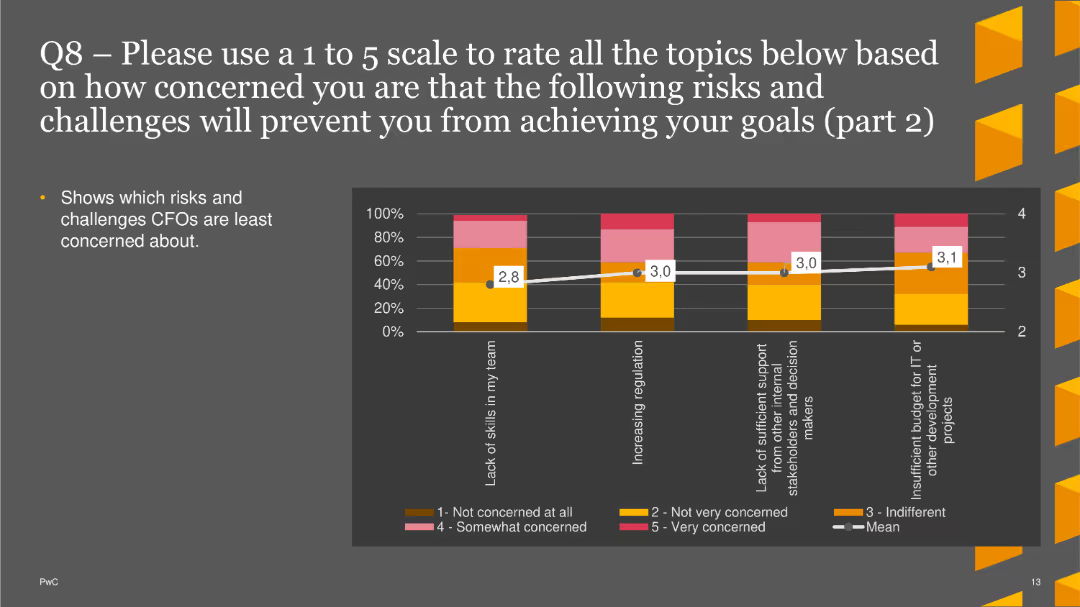
A column chart showing concern levels about various risks. The bars are vertical, with colors representing different levels of concern and mean scores marked
Risk Assessment and Management
Financial Services
This slide shows part 2 of the survey results about CFO concerns on risks such as lack of skills and increasing regulation.
risk assessment, CFO concerns, skills, regulation, survey results
Single Chart
PwC/Strategy&
Saved
Graphs and stats display current customer relationships and future improvement plans.
Customer and Market Segmentation
Financial Services
Details current state and strategic plans for enhancing customer relationships in banking.
customer relationships, banking, strategic plans, improvement
Multiple Chart
Barclays
Saved
The slide includes a donut chart displaying responses to a true/false question about the safety of company stocks versus mutual funds. The layout is moderately complex.
Market Analysis and Trends
Financial Services
This slide evaluates the perception of the safety of investing in company stocks versus mutual funds, showing that 51% correctly identified mutual funds as generally safer. It aims to assess investment knowledge.
stocks, mutual funds, safety, perception, investment
Single Chart
IPSOS
Saved
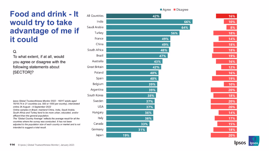
Horizontal bar chart indicating perceived exploitation potential of the food sector; disagreement on right side.
Risk Assessment and Management
Consumer Goods
The chart shows how much consumers across different countries believe the food and drink sector would exploit them if given the chance. A higher percentage in some countries indicates skepticism and perceived opportunism.
exploitation, trust, consumer risk, food industry, public perception, Ipsos, countries, bar chart, opinion, survey
Mixed Chart
IPSOS
Saved
Column charts showing tax-equivalent yield and correlation with municipals.
Investment Analysis
Financial Services
Analysis of municipal bonds yields, assessing tax implications and correlations for investment choices.
Municipal Bonds, Tax-equivalent Yield, Correlation, Investment Choices, Bar Chart, Column Chart, Morgan Stanley, Market Monitor
Multiple Chart
Morgan Stanley
Saved
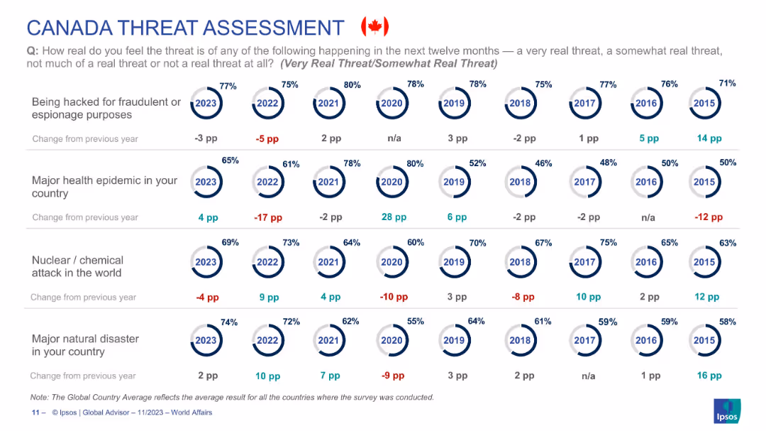
Circular year-wise risk perception visualization focused solely on Canadian public opinion across four threat types.
Risk Assessment and Management
Government & Public Sector
Reflects Canadians’ changing concern levels for hacking, health epidemics, nuclear/chemical attacks, and natural disasters from 2015–2023. Health epidemic threat rises 4pp in 2023, while hacking concerns decrease. The data highlights shifts in national sentiment toward global and domestic risks over time.
Canada, threat perception, epidemic, natural disaster, nuclear risk, cybersecurity, Ipsos, public opinion
Single Chart
IPSOS
Saved
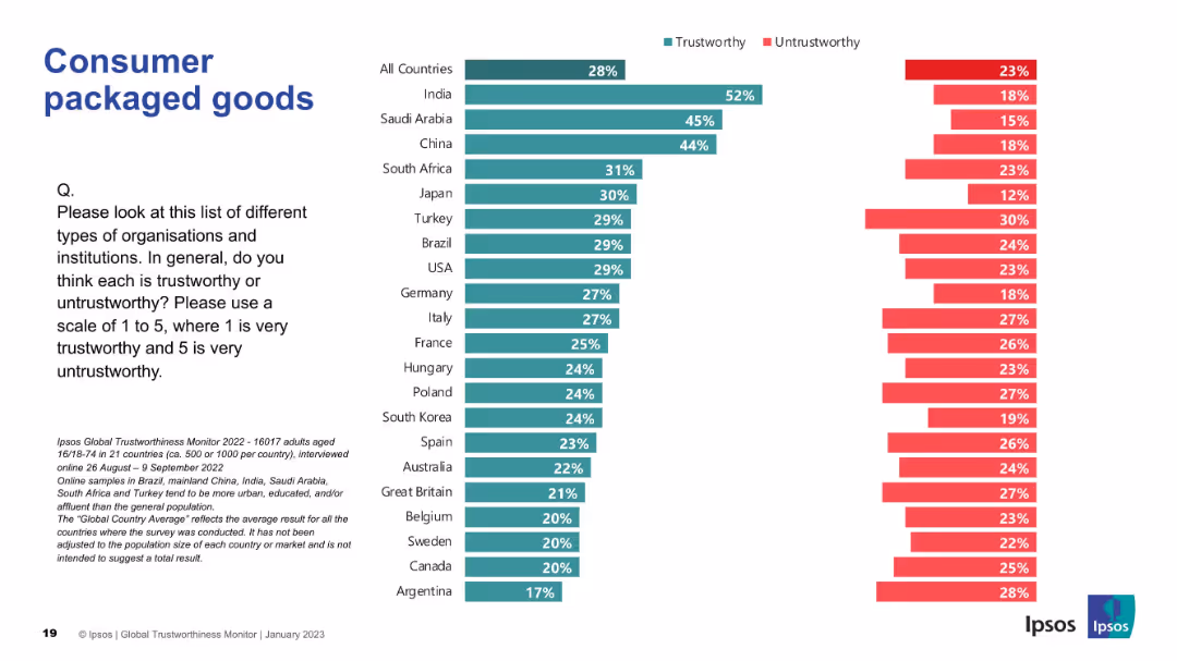
Vertical trust bar chart; color-coded by trustworthy/untrustworthy; countries compared.
Market Analysis and Trends
Consumer Goods
This slide highlights trust levels in consumer packaged goods firms globally. India again leads in public perception of trustworthiness.
consumer goods, packaged, trust, Ipsos, perception, survey, trustworthy, global, data visualization, public opinion
Mixed Chart
IPSOS
Saved
The slide uses column charts to show the intention to buy electric vehicles among different personas. It also features radial gauges indicating EV preference among each persona group. The layout is dense with multiple visual elements, including icons and illustrations.
Customer and Market Segmentation
Transportation & Logistics
This slide illustrates the EV purchase intentions among different personas, highlighting Tech Enthusiasts, Dreamers, Luxurious, and Pragmatic as key segments. It provides data on cluster sizes, regional distribution, and EV preference, focusing on key target groups.
EV intention, personas, column charts, radial gauges, target segments
Multiple Chart
PwC/Strategy&
Saved
Features a vertical column chart depicting liquidity coverage ratio and a text box outlining liquidity management strategies and goals.
Risk Assessment and Management
Financial Services
Discusses UBS Group AG's liquidity coverage ratio, efficiency, safety, and strategies to meet stringent Swiss liquidity requirements.
UBS, liquidity, coverage ratio, efficiency, safety, funding, management, requirements, Swiss
Mixed Chart
UBS
Saved
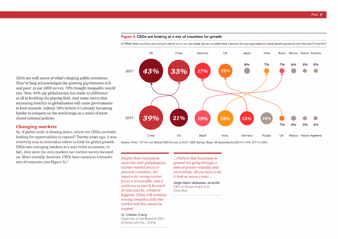
Text with a flow chart illustrating the shift in countries CEOs consider important for growth, comparing 2011 to 2017.
Strategic Planning
Professional Services
The slide highlights how CEOs' focus on countries for growth has shifted over time, based on PwC survey data.
CEO survey, growth, country focus, strategic planning, market shift
Multiple Chart
PwC/Strategy&
Saved
A slide with a line chart showing 'Red Flag Exposure' percentages over time, and two pie charts depicting the rating outlook for Non-IG and IG corporate bank portfolios.
Risk Assessment and Management
Financial Services
The slide shows the tracking of credit and market movements by PMG analysts, with a focus on red flag exposure and the rating outlook for corporate bank portfolios.
credit risk, market movements, PMG analysts, red flag exposure, corporate bank, rating outlook, non-IG, IG, financial analysis
Multiple Chart
Credit Suisse
Saved
Previous
Next
If nothing, comes up, please save your slides first
Create a FREE account to continue browsing
Receive Instant Access to 1,000+ slides from companies like McKinsey, Google, and Goldman Sachs
First Name
Last Name
Email
Password
I agree to all
Terms & Privacy Policy
Thank you! Your submission has been received!
Oops! Something went wrong while submitting the form.
Have an account?
Sign in
Column Chart
Heatmap
Chevron
Org Chart
Infographic
Callouts
Timeline
List
Graphic
Picture
Process Flow
Diagram
Paragraph
Map
Table
Framework
Subtitle
Takeaway Box
Icon
Other Chart
Radar Chart
Waterfall Chart
Mekko Chart
Pie Chart
Scatter Plot
Line Chart
Bar chart
Bullet points