My Account
My Slides
Search by Category
Templates
View All Templates
Download Template Slides
Leave Feedback
Login
Logout
Get Started
Browse all Slides
Browse all Slides
Create a FREE Account
Instant access to 1,000+ real slides from top companies like McKinsey, BCG, Goldman Sachs, Google and many more!
First Name
Last Name
Email
Password
I agree to all
Terms & Privacy Policy
Thank you! Your submission has been received!
Oops! Something went wrong while submitting the form.
Have an account?
Sign in
Saved Slides
Bar chart showing various savings goals among Canadians pre-COVID-19. Bars indicate the percentage of respondents with 'Yes', 'No', and 'Not applicable' responses for each savings goal. Dense text at the top explains the context.
Market Analysis and Trends
Financial Services
The slide presents data on the savings goals of Canadian investors before COVID-19, highlighting the percentage contributing to goals such as retirement, travel, and education. It notes gender differences and the high proportion of younger investors saving for these goals.
Savings, Goals, Canadians, Retirement, Travel, Education
Mixed Chart
IPSOS
Saved
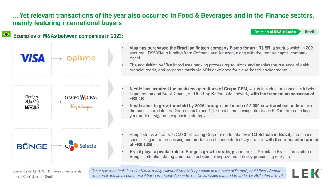
Contains logos of companies involved in M&A deals in 2023, with text descriptions next to each logo detailing the transactions.
Mergers and Acquisitions
Financial Services
Highlights significant M&A transactions in Brazil’s Food & Beverages and Finance sectors, listing the companies involved and details of each deal.
M&A, Brazil, Finance, Food & Beverages, Transactions
Table
LEK
Saved
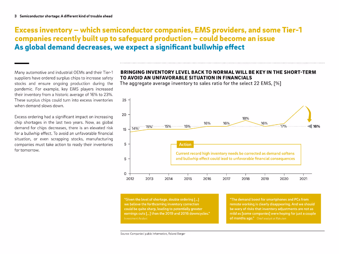
Two-column layout with a line chart on the right, text on the left, and yellow highlight boxes. Clean design with strong visual cues.
Risk Assessment and Management
Technology & Software
The slide discusses how excess inventory of semiconductor chips—accumulated by EMS and Tier-1 suppliers during the pandemic—could lead to financial trouble as demand drops. A "bullwhip effect" is predicted unless inventory levels are corrected. A chart shows inventory to sales ratio trends.
semiconductor, EMS, inventory, bullwhip effect, chip shortage, demand drop, financial risk, OEMs, pandemic, surplus chips
Mixed Chart
Roland Berger
Saved
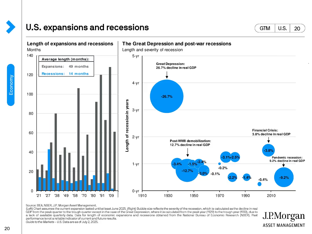
Two-panel design. Left: bar chart showing duration of U.S. expansions vs. recessions. Right: bubble chart comparing size and duration of major recessions by real GDP decline. Key events like the Great Depression are visually emphasized.
Industry Overview
Financial Services
This slide provides historical context on U.S. economic cycles, highlighting average durations (expansions: 49 months, recessions: 14 months). It visualizes the severity of downturns such as the Great Depression and the 2008 Financial Crisis.
expansions, recessions, GDP decline, Great Depression, historical economy, NBER, economic cycle, recovery duration
Multiple Chart
JP Morgan
Saved
A circular diagram in the center with icons around representing different stakeholders, text on left
Client Case Studies
Professional Services
Details the involvement of various stakeholders in EY, emphasizing internal and external communication
Stakeholders, engagement, EY, communication, plan
Diagram
EY
Saved
A color-coded horizontal bar graph contrasted against a black background, assessing CEO beliefs about the impact of AI compared to the internet.
Market Analysis and Trends
Technology & Software
Evaluates CEO perspectives on AI's potential impact versus the internet revolution, highlighting significant regional insights.
AI impact, internet revolution, CEO survey, global regions, data comparison, technology adoption, business insights, future outlook, market research
Mixed Chart
PwC/Strategy&
Saved
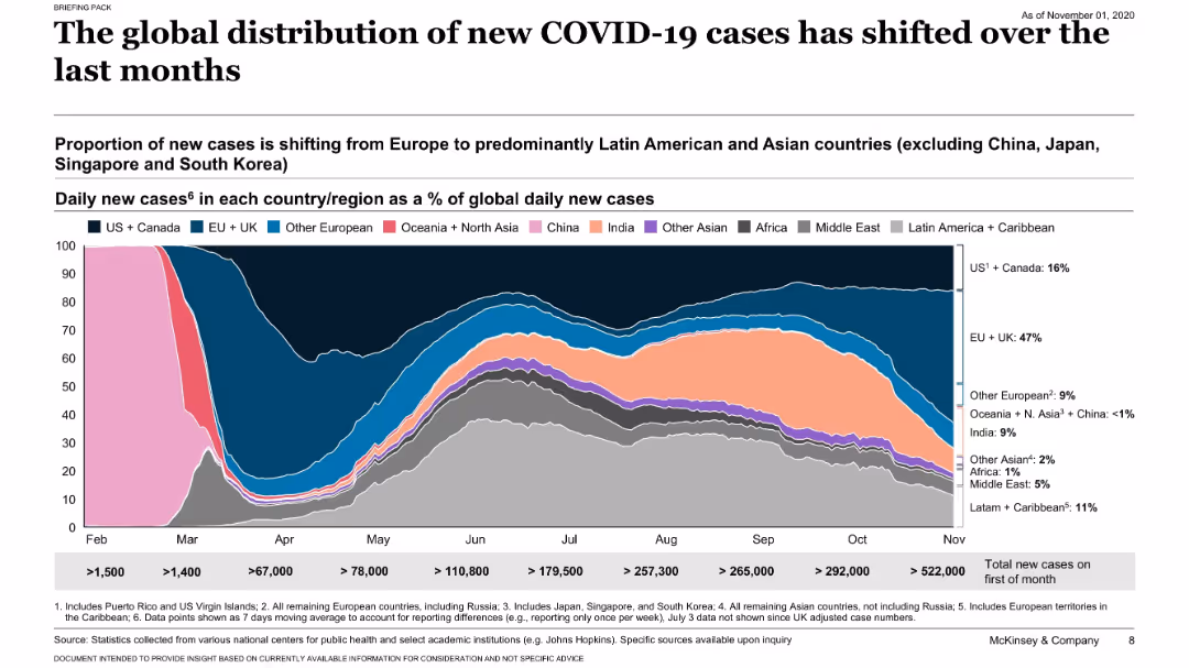
Stacked area chart showing regional proportions of global daily new cases; labeled by country group; legend and timeline below.
Risk Assessment and Management
Healthcare & Pharmaceuticals
The slide shows a shift in the proportion of daily COVID-19 cases from Europe to Latin America and Asia. It presents data as a percentage of global daily cases, reflecting geographic transitions in the pandemic.
COVID-19, cases, distribution, regional shifts, pandemic, McKinsey, trend
Single Chart
McKinsey
Saved
Text-heavy slide with a clear title and several bullet points; includes a timeline highlighting diversity milestones.
Organizational Structure and Change
Professional Services
Discusses the commitment to diversity, equity, and inclusion, showcasing programs and milestones, with the intent of building an inclusive and diverse workforce.
diversity, equity, inclusion, DEI, milestones, talent development, client service, corporate culture
Table
McKinsey
Saved
Features comparative bar graphs with annotations, indicating growth over time, using contrasting colors for clarity.
Market Analysis and Trends
Retail & E-commerce
Highlights the rapid growth of internet and smartphone users in India, suggesting a digitally transforming market. Important for digital strategy discussions.
Digital Transformation, India, Internet Users, Smartphone Adoption, Growth Analysis, Market Development, Technology Trends
Multiple Chart
BCG
Saved
Same format as prior slides. Horizontal bar chart with country-level percentages under "Important" and "Not important" responses.
Market Analysis and Trends
Government & Public Sector
The chart presents international responses on whether defending one’s country from criticism is an important trait. Responses are more divided here compared to previous slides, with a lower average (73%) considering it important. Cultural and regional differences are evident.
patriotism, national pride, defense, criticism, public opinion, Ipsos, bar chart, national identity
Mixed Chart
IPSOS
Saved
The slide uses a balanced combination of text and dual bar charts to compare perspectives of Millennials and Gen Zs on systemic racism. It includes a quote, a descriptive text, and two bar charts with contrasting green shades.
Risk Assessment and Management
Technology & Software
The slide compares how Millennials and Gen Z view efforts against systemic racism, indicating a disparity between perceived potential and actual effort in various sectors.
discrimination, systemic racism, Millennials, Gen Z, survey, societal change
Mixed Chart
Deloitte
Saved
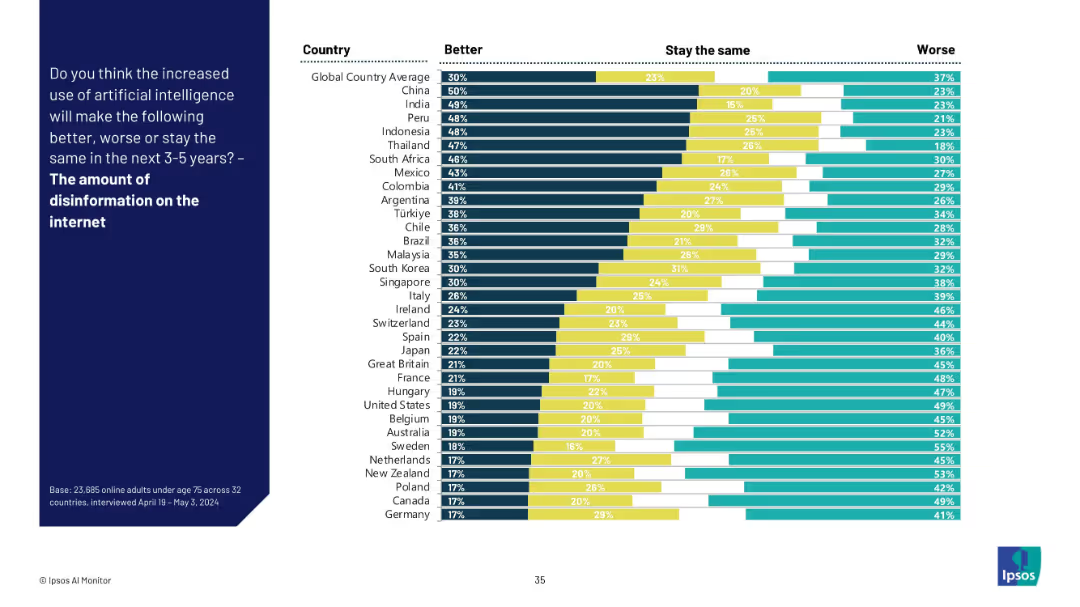
Stacked bar chart with three response categories for each country about AI’s role in internet disinformation.
Risk Assessment and Management
Artificial Intelligence
This slide explores global sentiment about AI’s effect on internet disinformation. While some countries believe AI can help reduce it, many believe it will worsen the problem, especially in Europe and North America.
Disinformation, AI ethics, internet, trust issues, information quality, public perception, AI governance, misinformation risk
Mixed Chart
IPSOS
Saved
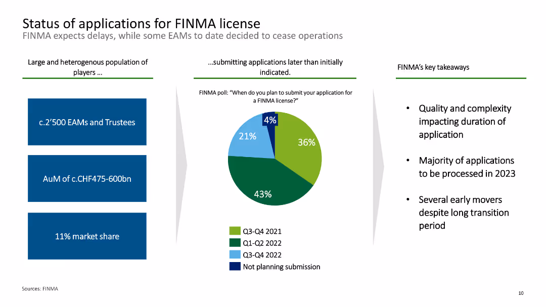
This slide features a pie chart and text boxes summarizing the application status for FINMA licenses among EAMs.
Regulatory and Compliance
Financial Services
It outlines the status of applications for FINMA licenses, indicating delays and key takeaways such as the quality and complexity impacting application duration.
FINMA, license, applications, EAMs, status
Mixed Chart
Deloitte
Saved
Contains column charts showing performance metrics of categories like Shoes, Jewelry, Leather, etc. Each category is marked in a circle with colors like red indicating negative trends. The layout is dense with textual annotations.
Market Analysis and Trends
Consumer Goods
This slide presents a 2020 performance review of various consumer categories such as Shoes, Jewelry, and Apparel, highlighting their market resilience. It shows performance metrics, like percentage changes and market values, providing a detailed comparison of year-over-year performance impacted by the COVID-19 pandemic.
performance, market, COVID-19, resilience, consumer goods
Mixed Chart
Bain
Saved
The slide includes two bar charts: the left chart shows investment values in infrastructure and real estate, while the right chart displays the number of deals in each sector.
Investment Analysis
Real Estate & Construction
This slide examines PE/VC investments in infrastructure and real estate sectors, detailing investment values and the number of deals over a specific period.
PE/VC investments, infrastructure, real estate, investment values, deal count
Multiple Chart
EY
Saved
The slide is advanced, filled with both text and icons representing different aspects of sustainability. Each category such as "Addressing climate change" or "Promoting inclusion and diversity" is accompanied by relevant icons and a brief list of achievements or goals. The design is clean and organized, using the company's color scheme of blue and green to differentiate sections.
Operational Efficiency
Financial Services
This slide details the company's sustainability priorities and metrics, focusing on addressing climate change, promoting inclusion, keeping the customer at the center, demonstrating employee commitment, and community strengthening. It's used to communicate corporate social responsibility efforts and operational efficiency in these areas.
Sustainability, Inclusion, Customer Focus, Employee Commitment, Community Engagement, Environmental Goals, Diversity, Growth Metrics
Pillar
Morgan Stanley
Saved
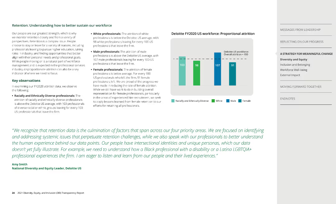
Bar chart shows proportional attrition data by race, ethnicity, and gender, with key observations on retention.
Human Resources and Talent Management
Professional Services
Discusses retention rates, identifying challenges and strategies for sustaining a diverse workforce.
retention, attrition, workforce, Deloitte
Mixed Chart
Deloitte
Saved
The slide includes pie charts and donut charts illustrating equity investments, debt investments, and consolidated investment entities by vintage, region, and industry. The color scheme uses different shades of blue and grey with clear labels.
Investment Analysis
Financial Services
Describes the asset management portfolio mix, providing insights into equity and debt investments, which is beneficial for investors and managers assessing diversification and investment strategies.
Asset Management, Investment Portfolio, Equity, Debt
Multiple Chart
Goldman Sachs
Saved
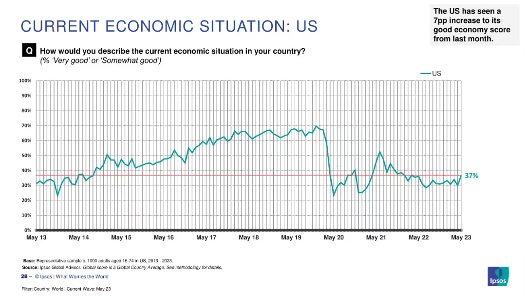
Line graph on white background charting US economic sentiment from May 2013 to May 2023, with annotation.
Market Analysis and Trends
Government & Public Sector
The slide presents long-term survey data on how US citizens perceive their national economy. Sentiment peaked between 2015–2019, declined in 2020, and recovered slightly to 37% by May 2023. It notes a 7 percentage point rise from the prior month.
US economy, trend, perception, Ipsos, 2023, sentiment, increase, historical data, survey
Single Chart
IPSOS
Saved
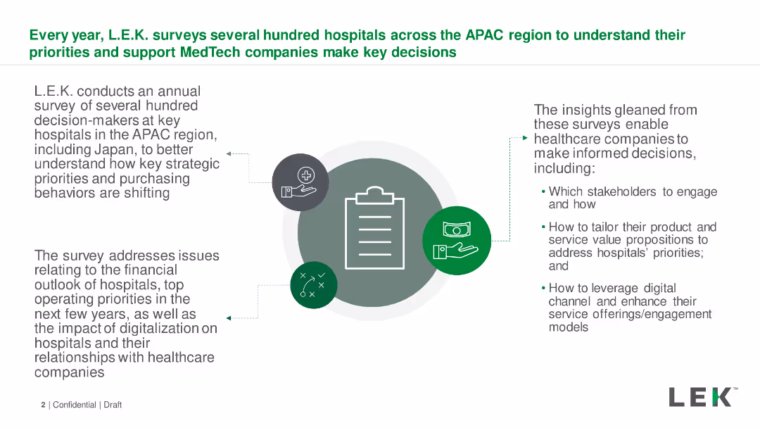
Text with icons describing L.E.K.'s survey process of APAC hospitals. Text boxes detail survey focus areas and insights. Simple layout.
Market Analysis and Trends
Healthcare & Pharmaceuticals
Description of an annual survey conducted by L.E.K. to understand strategic priorities and purchasing behaviors of hospitals in the APAC region.
Survey, APAC, Hospitals, Priorities, Purchasing Behaviors
Diagram
LEK
Saved
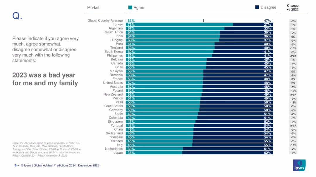
Similar bar chart to previous slide, but focused on personal/family-level sentiment across countries, with % change vs 2022.
Market Analysis and Trends
Professional Services
This slide details the global personal/family perception of 2023, with Turkey topping the chart at 73% agreement and Japan at the bottom with 38%. Global average agreement is 53%.
personal sentiment, bad year, family impact, country comparison, Ipsos, survey, 2023, bar chart
Mixed Chart
IPSOS
Saved
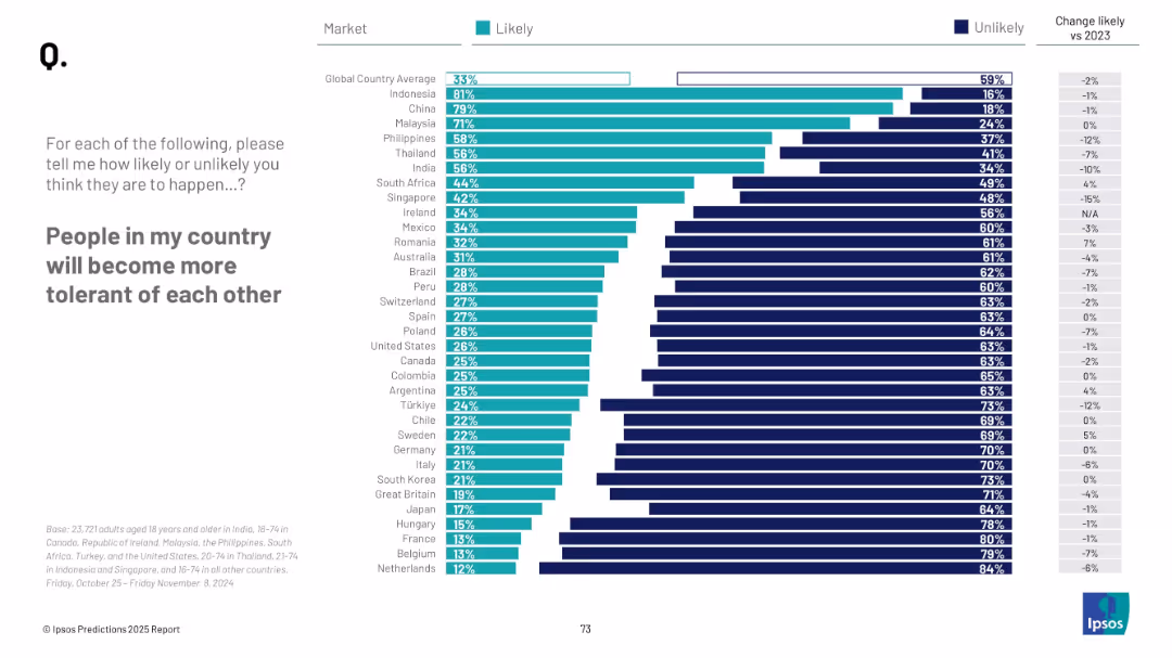
Bar chart with countries listed vertically, two-color segments (likely/unlikely), right-side numeric change column, text prompt on left.
Market Analysis and Trends
Government & Public Sector
This slide presents a global survey showing the percentage of people in various countries who believe their fellow citizens will become more tolerant. It contrasts "likely" versus "unlikely" responses and includes year-over-year changes. Indonesia and China top the list, while Western countries generally show lower optimism.
tolerance, global sentiment, social cohesion, public opinion, Ipsos, future outlook, country comparison, optimism, 2025, change tracking
Mixed Chart
IPSOS
Saved
This slide contains multiple pie charts displaying data regarding Barclays US Consumer Bank's performance in the US cards market. The layout is structured, with clear sections for each topic such as '20+ years of expertise in US cards' and 'US Cards Market'. The color scheme is predominantly blue and white, with textual information complementing the charts.
Industry Overview
Financial Services
This slide provides an overview of Barclays US Consumer Bank's current status in the US card market, detailing years of expertise, market position, and customer base. It emphasizes their core strengths like deep partnership card expertise and strong risk management.
US cards, market share, customer accounts, core strengths, FICO score
Multiple Chart
Barclays
Saved
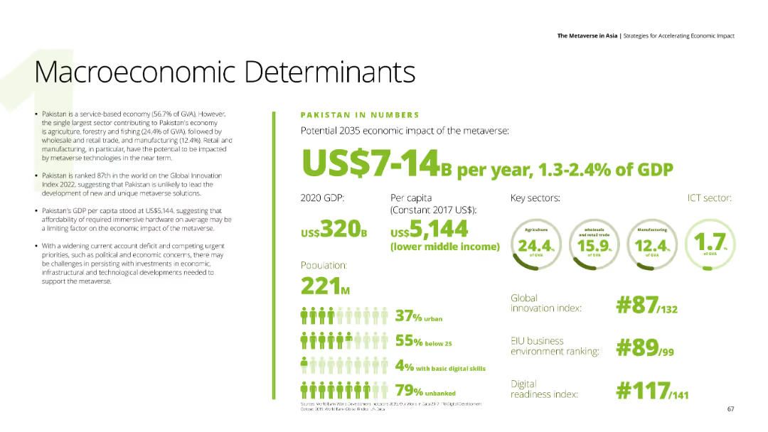
Presents text about Pakistan's economic impact of the metaverse, with data on GDP, per capita income, and key sectors like agriculture, wholesale trade, and manufacturing. The background is white with green and black text.
Market Analysis and Trends
Financial Services
Evaluates Pakistan's economic outlook regarding the metaverse, mentioning GDP, innovation index ranking, and challenges such as political and economic concerns.
Pakistan, metaverse, economic impact, agriculture, innovation
Mixed Chart
Deloitte
Saved
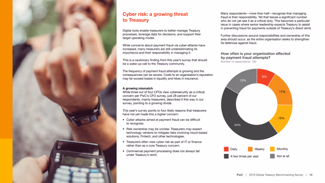
The slide includes a bar chart and a pie chart, and text explaining cyber risks and survey results on payment fraud attempts frequency.
Risk Assessment and Management
Financial Services
It highlights the growing threat of cyber risk to Treasury functions, with statistics on how often organizations face payment fraud attempts and how they manage it.
Cyber risk, Treasury, payment fraud, survey, statistics
Mixed Chart
PwC/Strategy&
Saved
Previous
Next
If nothing, comes up, please save your slides first
Create a FREE account to continue browsing
Receive Instant Access to 1,000+ slides from companies like McKinsey, Google, and Goldman Sachs
First Name
Last Name
Email
Password
I agree to all
Terms & Privacy Policy
Thank you! Your submission has been received!
Oops! Something went wrong while submitting the form.
Have an account?
Sign in
Column Chart
Heatmap
Chevron
Org Chart
Infographic
Callouts
Timeline
List
Graphic
Picture
Process Flow
Diagram
Paragraph
Map
Table
Framework
Subtitle
Takeaway Box
Icon
Other Chart
Radar Chart
Waterfall Chart
Mekko Chart
Pie Chart
Scatter Plot
Line Chart
Bar chart
Bullet points


![Defending [COUNTRY] when it is criticized](https://cdn.prod.website-files.com/654e70fb59937215cac87b19/6899bb31df0232a8a24f5889_qvBeDt21lyNdAQo81I-B9odvh0kcc792ylPZrvKQH_Y.avif)