Create a FREE Account
Instant access to 1,000+ real slides from top companies like McKinsey, BCG, Goldman Sachs, Google and many more!
First Name
Last Name
Email
Password
I agree to all
Terms & Privacy Policy
Thank you! Your submission has been received!
Oops! Something went wrong while submitting the form.
Have an account?
Sign in
Library
Templates
Courses
Pricing
My Account
My Slides
My Templates
✦ AI
AI Prompt Library
AI Search
Sign in
Start Here
Logout
My Saved Slides
Scatter plot showing return-on-equity (ROE) and price-to-book (P/B) ratios for different markets over the last 12 months.
Investment Analysis
Financial Services
Examines ROE and P/B ratios to assess market valuations, comparing current data with historical benchmarks to evaluate market performance.
ROE, P/B ratio, scatter plot, market valuation, financial metrics, investment analysis, historical comparison, global markets
Single Chart
JP Morgan
Saved
Circular diagram with labeled layers for systems, solutions, and outcomes; color-coded into systems-level vs enabling solutions
Technology and Digital Transformation
Environmental Services & Sustainability
Visualizes the relationship between foundational systems and high-impact solutions driving SEA decarbonization, including energy grids, finance, EVs, and green AI.
systems-level solutions, enabling solutions, SEA, decarbonization, green tech
Uncategorized
Bain
Saved
Features a pie chart with associated column charts detailing changes in broadband subscriptions. Color-coded for clarity and visually simple to enhance understanding.
Operational Efficiency
Telecommunications
Details the modifications in broadband packages by UK households over the past year, showing preferences for better packages and cost reductions. Useful for telecom businesses to understand consumer behavior changes.
broadband, consumer behavior, subscriptions, changes, UK
Multiple Chart
Deloitte
Saved
Includes a map of Australia showing different GDP uplifts in various regions, complemented by bar charts comparing the effects in remote, regional, and city areas.
Strategic Planning
Telecommunications
Analyzes geographical disparities in economic benefits from broadband speed increases, highlighting the greater impact on remote areas.
broadband access, regional development, economic disparity, GDP uplift, remote areas, strategic planning, risk management, public sector, telecommunications
Multiple Chart
Accenture
Saved
This slide utilizes a timeline layout detailing milestones from today through 2040 in the context of hydrogen production, applications, exports, and job creation, overlaid with icons.
Operational Efficiency
Energy & Utilities
Discusses the timeline for developing hydrogen infrastructure and related job creation in Chile, highlighting key actions from preparation through scaling up and expansion.
infrastructure, jobs, hydrogen, timeline
Single Chart
McKinsey
Saved
Three-column layout with a pie chart of total workforce distribution, bar charts for technology and operations, and text descriptions of workforce distribution and reinvestment opportunities.
Human Resources and Talent Management
Professional Services
The slide presents an analysis of workforce distribution and opportunities for reinvestment, emphasizing the mix of employees and externals in technology and operations.
workforce, reinvestment, distribution, technology, operations
Multiple Chart
Credit Suisse
Saved
This slide defines sustainable tourism according to UNWTO guidelines, emphasizing economic, social, and environmental impacts. It includes key points on sustainable practices and a box with statistics on sustainable travel preferences among travelers.
Strategic Planning
Hospitality & Tourism
Outlines principles of sustainable tourism, emphasizing the importance of conserving resources, respecting local cultures, and providing socio-economic benefits. It includes data on traveler preferences for sustainable travel options and government initiatives.
Sustainable tourism, UNWTO, Environment, Travelers, Preferences
Mixed Chart
EY
Saved
A slide with text on the left and a line chart on the right. The line chart compares the UK Index performance with the OECD average from 2000 to 2017. The slide has a moderate amount of text and visual elements.
Market Analysis and Trends
Government & Public Sector
Analyzes the UK's performance on the Women in Work Index, showing improvements over time and comparing it with the OECD average. Highlights key factors affecting progress, such as the gender pay gap and female labor force participation rates.
UK, Women in Work Index, OECD, gender pay gap, labor force participation
Mixed Chart
PwC/Strategy&
Saved
The slide features two column charts comparing the impact of a new CEO and M&A activity on cost reduction initiatives across various regions. Key findings are presented in text boxes.
Strategic Planning
Financial Services
The slide analyzes how the appointment of a new CEO and M&A activity affect cost reduction efforts globally and regionally, highlighting differences in likelihood and impact.
CEO impact, M&A activity, cost reduction, analysis, financial services
Multiple Chart
Deloitte
Saved
Two sections feature a ranking table and a line graph, showing the firm's market positioning and share growth with blue and grey shades.
Market Analysis and Trends
Financial Services
The slide compares the firm's current market position with growth potential, indicating areas for client base expansion and ranking improvements.
client base, market position, equities, FICC, market share, growth potential, competitive ranking, Goldman Sachs
Multiple Chart
Goldman Sachs
Saved
Bar chart comparing diseases and DALYs with pink bars indicating environmental attribution. Includes a sidebar with detailed bullet points on climate impact.
Performance Metrics and KPIs
Healthcare & Pharmaceuticals
The slide highlights the contribution of environmental factors to various diseases using DALYs. It shows that up to 28% of childhood deaths and over 600 million DALYs are due to environmental risks. Key diseases like cardiovascular issues and respiratory infections have large environmental components. Sidebar notes contextualize global warming and its impact on human health determinants such as air, water, and housing.
DALYs, environmental risks, disease burden, cardiovascular, respiratory, child mortality, WHO, climate impact
Mixed Chart
Roland Berger
Saved
Bar charts showing revenue and EBITDA across 2017, 2022, and post-SGGP; includes % margins and segment splits
Strategic Planning
Financial Services
Highlights revenue and EBITDA growth by business segment over time. Shows strengthened steel dust focus and margin trends while maintaining balanced growth across salt slags and secondary aluminium.
EBITDA, revenue, core business, steel dust, salt slags, portfolio growth, SGGP
Multiple Chart
Goldman Sachs
Saved
Donut charts showing economic value generated and distributed in FY22 and FY23 across different industry sectors
Financial Performance
Financial Services
This slide displays economic value generated and distributed at the group level, with comparisons between FY22 and FY23, highlighting various industry sectors such as automotive, healthcare, and technology
economic performance, value distribution, industry sectors, FY22, FY23
Multiple Chart
PwC/Strategy&
Saved
Matrix slide with rows of messages and columns of target audiences; uses color-coded relevance indicators (high, moderate, limited) and includes icons and communication channels.
Strategic Planning
Transportation & Logistics
This slide shows how communication strategies for Central Asian rail corridor development should be tailored to various stakeholders like financing partners, governments, infrastructure providers, and logistics platforms. It uses a matrix to visualize message relevance and preferred communication channels.
stakeholder communication, Central Asia, railway development, message relevance, logistics, infrastructure, communication strategy, rail corridors, target audience
Table
Roland Berger
Saved
Two data tables, line graph on rate assumptions; left-to-right timeline progression; clean, blue-white layout
Risk Assessment and Management
Financial Services
This slide models Barclays’ sensitivity to a -25bps rate change over three years, projecting Group income impact. It compares February 2024 and 2025 plans and includes swap and base rate projections. The assumption includes stable balance sheet reinvestment over time.
interest rate risk, swap rates, base rates, income sensitivity, macroeconomic trends
Multiple Chart
Barclays
Saved
This slide features three column charts comparing maturity stages by firm size, type, and region. Text on the left provides context.
Competitive Landscape
Financial Services
The slide compares the digital maturity of various financial institutions, highlighting the differences in competitiveness by firm size, type, and region.
Digital competitiveness, Financial Services, Maturity, Firm size, Region
Multiple Chart
Deloitte
Saved
Dark-themed layout; two bar charts; icons and large headline text
Technology and Digital Transformation
Telecommunications
Illustrates global internet access gap, showing 2.6B people unconnected; underscores need for over $400B investment and 14% annual growth in data infrastructure to meet demand.
internet access, connectivity gap, fiber, infrastructure, investment, data traffic, unconnected population
Multiple Chart
McKinsey
Saved
The slide depicts a circular diagram with four quadrants, each containing an icon and text. The purple central circle anchors the design, while arrows point outward to the individual pathways described.
Strategic Planning
Technology & Software
Outlines four strategic pathways that High Tech companies can pursue to expand industry boundaries, such as mergers & acquisitions, strategic alliances, demand sensors, and leveraging the installed base for expansion into adjacent areas.
High Tech, mergers & acquisitions, strategic alliances, demand sensors, adjacent areas, industry ecosystems, leapfrog growth, market-relevant joint offerings, bespoke solutions, installed base
Diagram
Accenture
Saved
Four sections with icons detailing competition, positioning, distribution, and insurers
Market Analysis and Trends
Healthcare & Pharmaceuticals
Outlines key market entry considerations for OEMs in Latin America, including competition, positioning, and insurance coverage
OEMs, market entry, Latin America, competition, positioning
Pillar
LEK
Saved
A column chart comparing revenue performance across segments, a table of financial results, and key highlights. The slide is moderately dense with a balanced mix of text and visual elements.
Financial Performance
Financial Services
This slide provides an overview of the Corporate Bank's Q1 2024 financial results, including revenue, profit, and other key metrics, comparing them across different business segments.
Corporate Bank, revenue performance, financial results, Q1 2024, business segments
Mixed Chart
Deutsche Bank
Saved
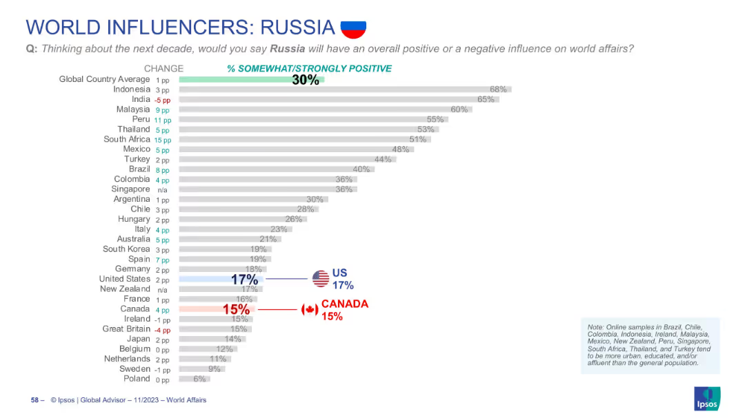
Horizontal bar chart showing level of agreement across countries. Follows same visual format.
Customer and Market Segmentation
Financial Services
Analyzes how well people feel the banking sector aligns with their personal values. Emerging markets show stronger alignment perceptions than Western countries. This has implications for market trust and engagement.
values alignment, banking, global sentiment, public opinion, Ipsos, segmentation
Mixed Chart
IPSOS
Saved
The slide features a world map highlighting Ipsos' global offices and operations.
Market Analysis and Trends
Professional Services
The slide showcases Ipsos' global reach with offices in 90 countries and operations in over 130 countries.
global coverage, local understanding, Ipsos, offices, operations, countries
Graphic
IPSOS
Saved
World map in pink gradients highlighting the top 10 healthiest countries according to Health Grade 2019. Right sidebar summarizes regional and dietary factors.
Industry Overview
Healthcare & Pharmaceuticals
This slide maps the top-ranked countries in terms of health based on the Bloomberg Health Index. Spain, Italy, and other European nations dominate the top 10. It attributes the high health rankings to lifestyle factors such as the Mediterranean diet. The sidebar offers brief insights into country-specific improvements and trends.
Health index, global health, country ranking, Mediterranean diet, wellness, Bloomberg
Graphic
Roland Berger
Saved
Full-slide with three line graphs on seat capacity forecasts and accompanying explanation of airline and aerospace trends. Emphasizes post-Covid recovery in the US, China, and Europe.
Strategic Planning
Transportation & Logistics
Forecasts suggest airline seat capacities will exceed 2019 levels by H1 2023. The slide also highlights industry pressures such as resource scarcity, labor shortages, and rising fuel costs. Aerospace orders have rebounded, especially in the US and Europe.
Airline capacity, post-Covid recovery, seat forecast, labor shortages, fuel prices, aerospace orders, air travel market
Multiple Chart
Roland Berger
Saved
Mixed layout: stacked bar showing year-on-year AuM movement; pie charts show asset class composition across three periods.
Performance Metrics and KPIs
Financial Services
This slide shows the development of Asset Management’s AuM, which grew from €859bn in Q2 2023 to €933bn in Q2 2024. It identifies key drivers such as market performance and FX. The asset composition is visualized by class, with noticeable growth in passive and SQI categories, reflecting investor preference shifts.
asset management, AuM, asset classes, FX impact, market performance
Multiple Chart
Deutsche Bank
Saved
Previous
Next
If nothing, comes up, please save your slides first
Create a FREE account to continue browsing
Receive Instant Access to 1,000+ slides from companies like McKinsey, Google, and Goldman Sachs
First Name
Last Name
Email
Password
I agree to all
Terms & Privacy Policy
Thank you! Your submission has been received!
Oops! Something went wrong while submitting the form.
Have an account?
Sign in
Column Chart
Heatmap
Chevron
Org Chart
Infographic
Callouts
Timeline
List
Graphic
Picture
Process Flow
Diagram
Paragraph
Map
Table
Framework
Subtitle
Takeaway Box
Icon
Other Chart
Radar Chart
Waterfall Chart
Mekko Chart
Pie Chart
Scatter Plot
Line Chart
Bar chart
Bullet points