Create a FREE Account
Instant access to 1,000+ real slides from top companies like McKinsey, BCG, Goldman Sachs, Google and many more!
First Name
Last Name
Email
Password
I agree to all
Terms & Privacy Policy
Thank you! Your submission has been received!
Oops! Something went wrong while submitting the form.
Have an account?
Sign in
Library
Templates
Courses
Pricing
My Account
My Slides
My Templates
✦ AI
AI Prompt Library
AI Search
Sign in
Start Here
Logout
My Saved Slides
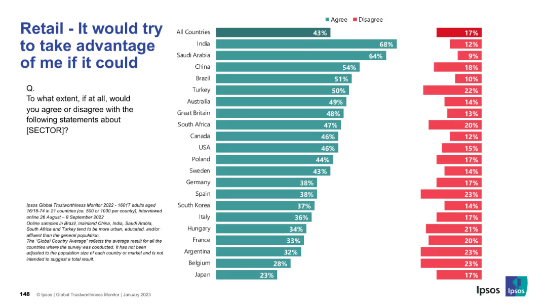
Bar chart depicting skepticism; high “agree” means higher distrust; visual emphasis on concern.
Risk Assessment and Management
Retail & E-commerce
This chart represents distrust in the retail sector, with the statement “It would try to take advantage of me if it could.” Higher scores indicate more consumer skepticism.
distrust, manipulation, consumer opinion, risk, skepticism, Ipsos
Mixed Chart
IPSOS
Saved
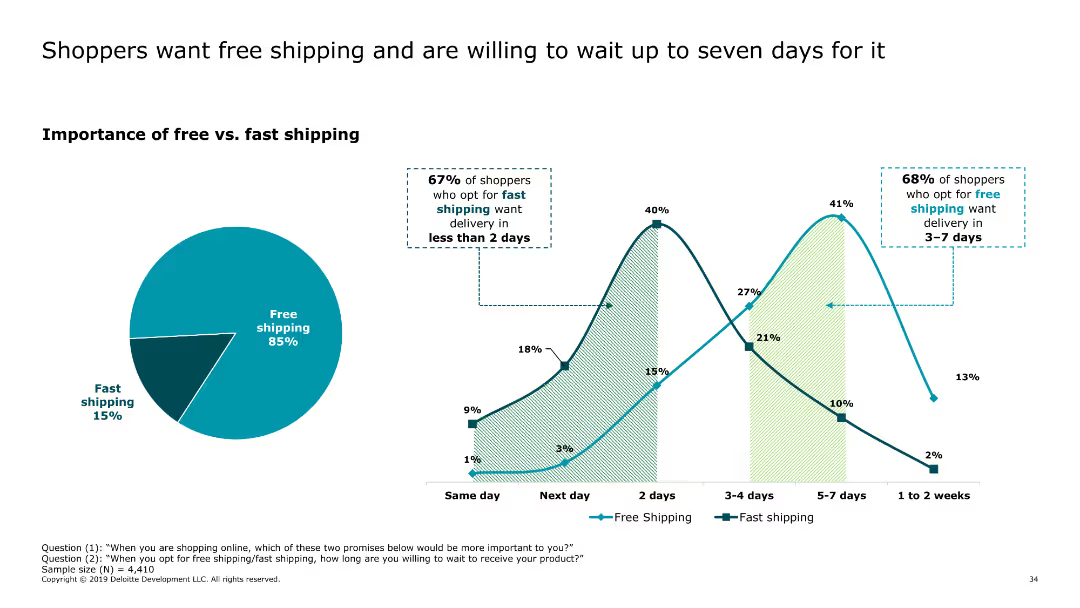
This slide includes a pie chart showing the importance of free versus fast shipping, along with a line chart illustrating delivery time preferences for free and fast shipping options.
Market Analysis and Trends
Retail & E-commerce
The slide highlights consumer preferences for free shipping over fast shipping, with many shoppers willing to wait up to seven days for free delivery. It provides insights into delivery expectations and preferences.
free shipping, delivery preferences, consumer behavior, online shopping, shipping options
Multiple Chart
Deloitte
Saved
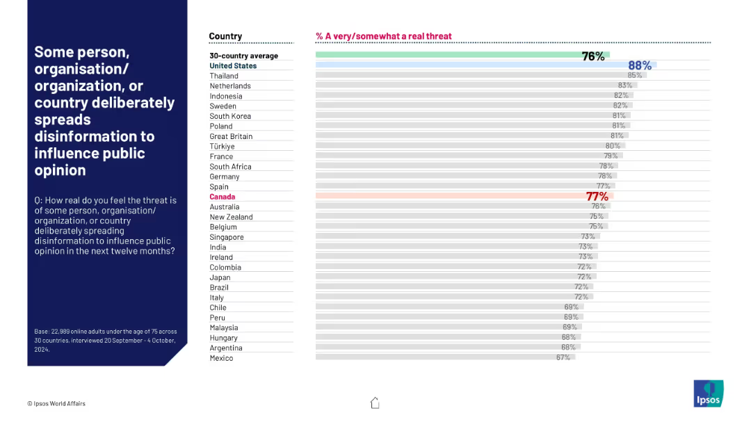
Horizontal bar chart by country with strong pink title emphasis; percentage agreement shown; global average marked.
Risk Assessment and Management
Government & Public Sector
This slide captures public concern about disinformation campaigns. 76% globally see this as a real threat. The United States tops the list at 88%, followed closely by Thailand and the Netherlands. Canada is highlighted at 77%, indicating high awareness across regions.
disinformation, media trust, public opinion, misinformation, perception, security threat, Ipsos, global survey, political influence, digital risk
Mixed Chart
IPSOS
Saved
An advanced layout featuring a large pie chart illustrating the investment portfolio composition, with detailed textual information to the right. The slide utilizes shades of blue and gray for the chart, with distinct sections indicating types of investments, such as Agency CMBS and Non-agency CMBS.
Financial Performance
Financial Services
The slide showcases the company's investment portfolio composition, highlighting the robustness and ratings of its CMBS portfolio. It is geared toward investors or stakeholders interested in understanding the company's investment strategies and risk management approaches.
Investment Portfolio, CMBS, AAA-Rated, Asset Management, Risk Management, Financial Assets, Agency, Non-Agency
Mixed Chart
Morgan Stanley
Saved
The slide features a column chart showing month-over-month changes in total nonfarm employment (Jan 2021-Dec 2023) and a line chart for US real consumption expenditures and disposable income (Jan 2020-Nov 2023). The layout is clear with data points well-illustrated.
Market Analysis and Trends
Financial Services
This slide analyzes consumer trends for 2024, predicting a decline in enthusiasm due to softer employment and cost fatigue. It also suggests positive income growth could support spending, highlighting key economic indicators and their potential impacts.
employment, consumer spending, income growth, trends
Multiple Chart
EY
Saved
This slide features a circular chart showing Australian consumers' ratings of the healthcare system's performance in optimizing health experiences across different personal circumstances.
Market Analysis and Trends
Healthcare & Pharmaceuticals
It evaluates Australian consumers' ratings of their healthcare system's ability to optimize health experiences irrespective of personal circumstances, with a focus on equitable treatment.
healthcare system, performance, optimization, personal circumstances, equitable treatment
Mixed Chart
EY
Saved
Incorporates a pie chart displaying the adoption status of AI tools and a bar graph showing the top business applications of AI, complete with accompanying descriptions.
Technology and Digital Transformation
Technology & Software
Highlights the uptake of AI technologies in business with an emphasis on operational applications, signaling a trend towards digital transformation and the integral role of AI in business strategies.
AI, Technology, Adoption, Business Operations
Multiple Chart
JP Morgan
Saved
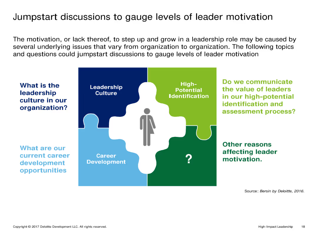
The slide uses a puzzle piece layout, with each piece representing different aspects of leader motivation. There is a mix of text and icons, with a person icon in the center linking the components together.
Market Analysis and Trends
Professional Services
It discusses various factors affecting leader motivation, including leadership culture, career development opportunities, and the value communicated to leaders in high-potential identification and assessment processes.
Leadership, Motivation, Career Development, Culture, Assessment
Diagram
Deloitte
Saved
Includes a bar chart and detailed statistical breakdowns to illustrate job growth over periods due to broadband expansion. The slide uses color coding to differentiate between past and projected figures.
Market Analysis and Trends
Telecommunications
Highlights the employment impact of the nbn network, which has significantly increased job numbers nationwide, especially benefiting women's employment more than men's.
nbn, Jobs, Growth, Women, Projection
Multiple Chart
Accenture
Saved
A column chart showing Namibia's total revenue versus expenditure over three fiscal years, depicting a budget deficit in each year as represented by different shades of red in the lower section of the bars.
Financial Performance
Government & Public Sector
Examines Namibia's fiscal performance over three years, highlighting the ongoing budget deficits. This visual comparison is crucial for discussions on governmental budget management and fiscal policy.
fiscal, budget, Namibia, government finance
Multiple Chart
PwC/Strategy&
Saved
The slide combines a comprehensive narrative on community development with a pie chart on the left side displaying funding allocation. There is also an image depicting urban housing, tying back to the slide's theme of community support and development.
Financial Performance
Financial Services
The slide highlights JPMorgan Chase's commitment to community development, focusing on the allocation of funds to support home ownership and affordable housing. The urban housing image conveys the practical impact of these investments. Typically, this slide would be used to illustrate the company's efforts in enhancing community living standards and its role in societal development.
community development, funding, home ownership, affordable housing, urban living, JPMorgan Chase
Mixed Chart
JP Morgan
Saved
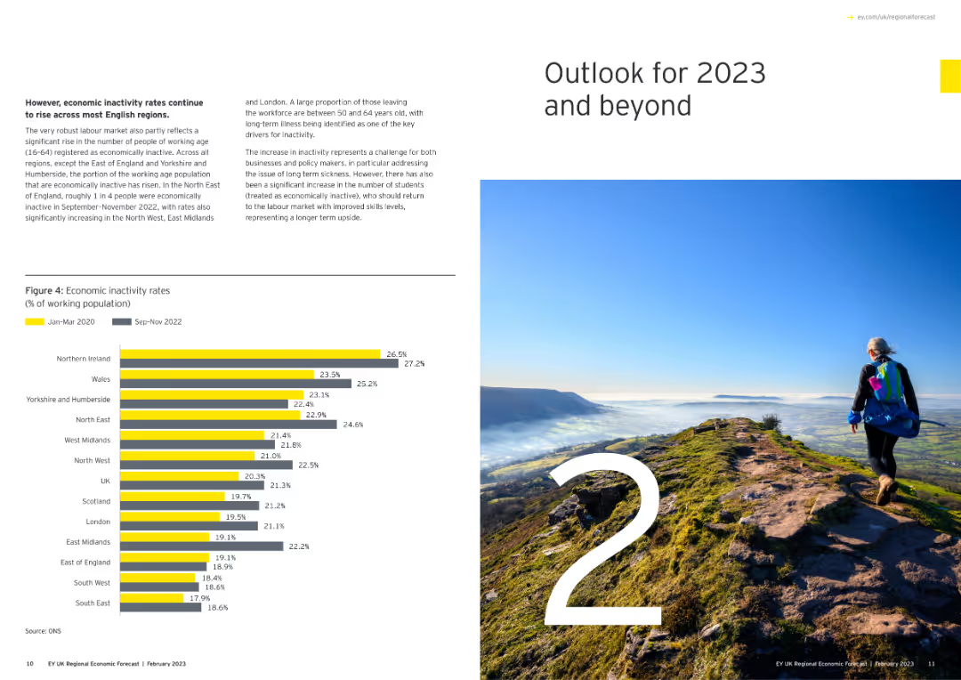
Features a large number "2" with an image of a person hiking on a mountain, and a column chart showing economic inactivity rates.
Strategic Planning
Government & Public Sector
Outlines the economic outlook for 2023 and beyond, focusing on inactivity rates among the working population across various regions.
economic outlook, 2023, inactivity rates, regional, column chart
Mixed Chart
EY
Saved
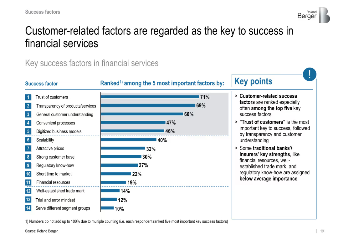
Ranked bar chart showing key success factors; highlights top 14 elements including customer trust
Performance Metrics and KPIs
Financial Services
Emphasizes customer trust, transparency, and understanding as top factors for FinTech success. Traditional factors like regulatory know-how rank lower.
customer trust, transparency, success drivers, FinTech priorities, performance factors
Mixed Chart
Roland Berger
Saved
Describes the expected impact of ML industrialization across various sectors, with representative icons for each.
Technology and Digital Transformation
Technology & Software
Explores the potential impact of ML industrialization across a variety of industries and how it could offer competitive advantages.
ML, industries, impact, tech trend, competitive advantage
Header Vertical
McKinsey
Saved
Presents a blue column chart with amounts of cash returned to shareholders over four fiscal years, highlighting a significant share repurchase initiative.
Financial Performance
Consumer Goods
Reviews the substantial amounts returned to shareholders through dividends and share repurchases, underscoring the company's commitment to shareholder returns.
shareholder return, dividends, share repurchase, fiscal years, investment
Single Chart
Barclays
Saved
A comparison of rating movements from Standard & Poor's and Moody's for Macquarie and other banks from 2007 to 2020. Each bank has a track line with markers indicating rating changes over time.
Risk Assessment and Management
Financial Services
Focuses on Macquarie Bank's credit ratings stability over 13 years, comparing it with other major banks, which is crucial for risk assessment and confidence among investors and stakeholders.
ratings, stability, Macquarie, banks, credit, Standard & Poor's, Moody's, risk, assessment, confidence
Multiple Chart
Goldman Sachs
Saved
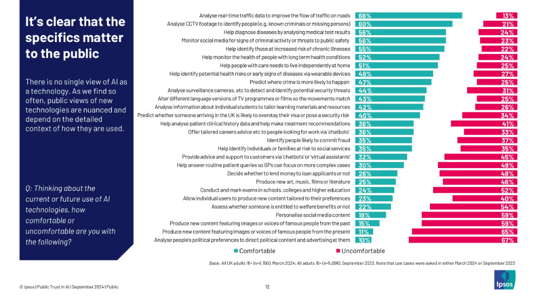
Left: paragraph explaining context dependence; right: bar chart ranking comfort vs discomfort by use case
Customer and Market Segmentation
Artificial Intelligence
Public comfort with AI varies greatly depending on its application. People feel most comfortable when AI supports societal needs (e.g., traffic, healthcare), but uncomfortable with tasks involving content creation, surveillance, or political manipulation.
AI use cases, public comfort, Ipsos, detailed context, segmentation, content creation, healthcare
Single Chart
IPSOS
Saved
This slide includes a line chart showing the GDP distribution among continents from 2015 to 2030, emphasizing the rise of Asia Pacific.
Financial Performance
Professional Services
Highlights the shifting global economic power from North America and Europe to Asia Pacific, projecting future GDP distributions.
GDP, Asia Pacific, economic shift, financial forecasting, global economy
Multiple Chart
Roland Berger
Saved
Pie chart contrasts the views of companies on digital technology as disruptive versus sustaining.
Technology and Digital Transformation
Technology & Software
Assesses how companies perceive the impact of digital technology on their business models.
digital technology, disruption, business model, digital impact, sustaining
Single Chart
BCG
Saved
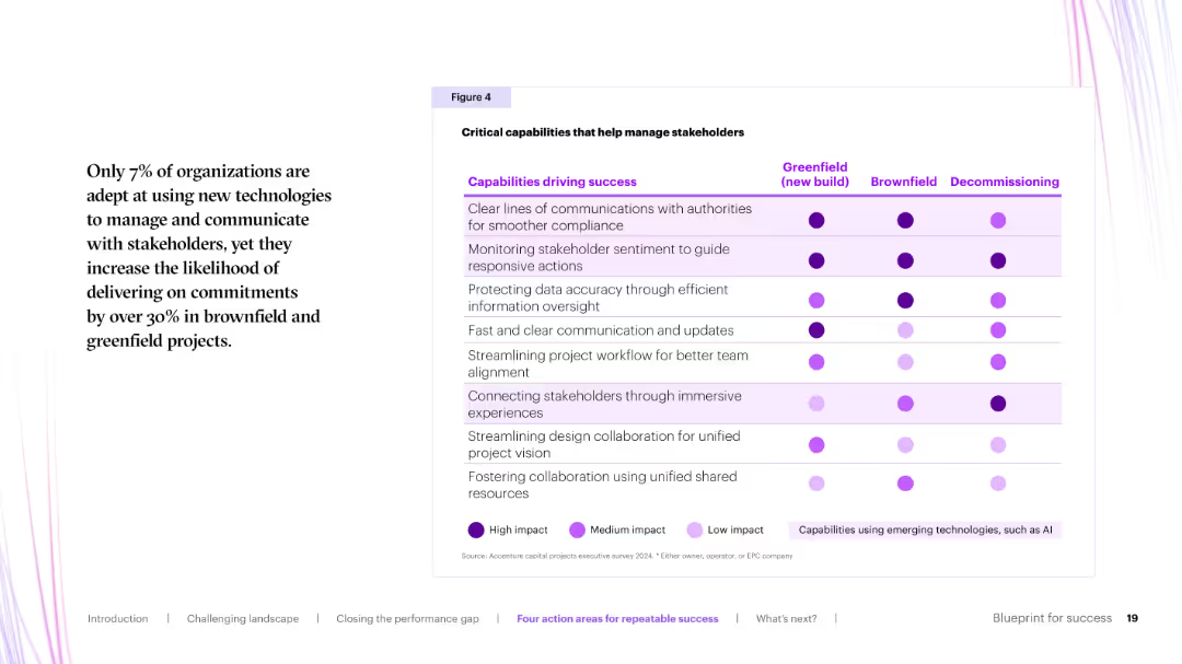
Matrix chart with purple dots indicating impact level across project phases (greenfield, brownfield, decommissioning) for each stakeholder-related capability.
Organizational Structure and Change
Real Estate & Construction
This slide maps stakeholder management capabilities across project phases. High-impact areas include clear communication with authorities and stakeholder sentiment monitoring. Technology-enabled approaches are also noted.
stakeholder engagement, communication, capabilities, AI, impact matrix
Table
Accenture
Saved
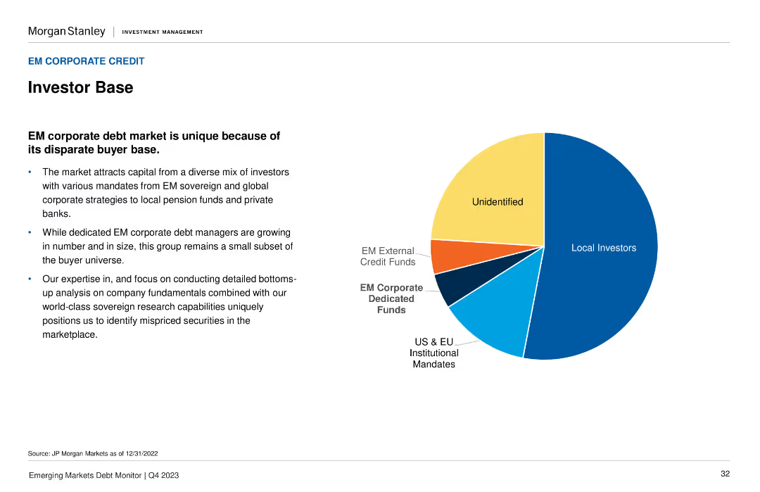
The slide features a pie chart displaying the composition of the EM corporate debt market investor base, with segments for Local Investors, US & EU Institutional, and others.
Market Analysis and Trends
Financial Services
It describes the diverse mix of investors in the EM corporate debt market and emphasizes the unique buyer base. Useful for understanding the investor landscape in emerging markets.
investor base, corporate debt, EM, market composition, analysis
Mixed Chart
Morgan Stanley
Saved
The slide features a circular segmented diagram in red and yellow shades, each segment titled with a different reform area like 'Small Business Tax Registration' and 'Post Tax Amnesty'.
Regulatory and Compliance
Government & Public Sector
Outlines various governmental reforms in areas such as tax amnesty, small business registration, and transfer pricing, targeting an audience interested in the broader scope of Namibia's fiscal policy changes in 2018.
reforms, tax, government, Namibia, 2018, transfer pricing, amnesty, registration
Linear Flow
PwC/Strategy&
Saved
The slide presents a structured layout with four sections, each containing logos of brands categorized under Professional products, Consumer products, L'Oréal Luxe, and Active cosmetics.
Market Analysis and Trends
Consumer Goods
This slide displays L'Oréal's diverse brand portfolio, segmented into various product categories with associated market share percentages, demonstrating the company's market positioning.
L'Oréal, brand portfolio, market share, consumer products, professional products
Table
Deutsche Bank
Saved
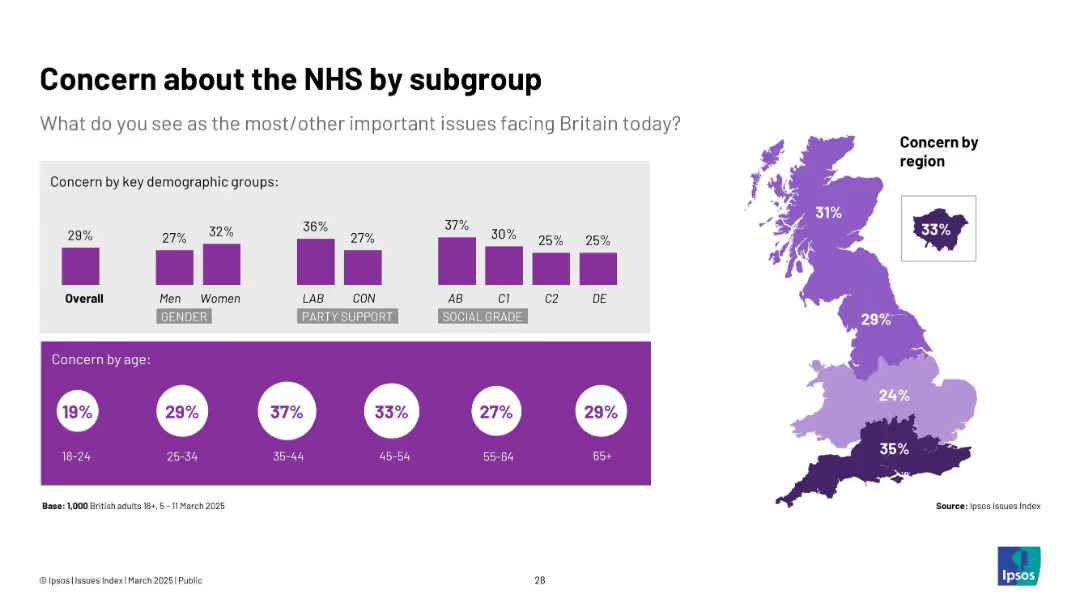
Purple-toned chart; similar demographic breakdown with map and bar visuals. Focuses on NHS concern levels by group.
Market Analysis and Trends
Healthcare & Pharmaceuticals
Explores NHS concern by age, gender, party, region, and social grade. Women, older adults, Labour supporters, and South England show higher concern. Least concern from young adults and DE social grade.
NHS, healthcare concern, regional views, Ipsos, demographics, UK healthcare
Multiple Chart
IPSOS
Saved
Column charts showing underlying revenues, costs, PBT, and key metrics
Financial Performance
Financial Services
Highlights financial performance metrics for 1Q24, including revenues, costs, PBT, and key metrics
financial, performance, 1Q24, metrics
Multiple Chart
UBS
Saved
Previous
Next
If nothing, comes up, please save your slides first
Create a FREE account to continue browsing
Receive Instant Access to 1,000+ slides from companies like McKinsey, Google, and Goldman Sachs
First Name
Last Name
Email
Password
I agree to all
Terms & Privacy Policy
Thank you! Your submission has been received!
Oops! Something went wrong while submitting the form.
Have an account?
Sign in
Column Chart
Heatmap
Chevron
Org Chart
Infographic
Callouts
Timeline
List
Graphic
Picture
Process Flow
Diagram
Paragraph
Map
Table
Framework
Subtitle
Takeaway Box
Icon
Other Chart
Radar Chart
Waterfall Chart
Mekko Chart
Pie Chart
Scatter Plot
Line Chart
Bar chart
Bullet points