Create a FREE Account
Instant access to 1,000+ real slides from top companies like McKinsey, BCG, Goldman Sachs, Google and many more!
First Name
Last Name
Email
Password
I agree to all
Terms & Privacy Policy
Thank you! Your submission has been received!
Oops! Something went wrong while submitting the form.
Have an account?
Sign in
Library
Templates
Courses
Pricing
My Account
My Slides
My Templates
✦ AI
AI Prompt Library
AI Search
Sign in
Start Here
Logout
My Saved Slides
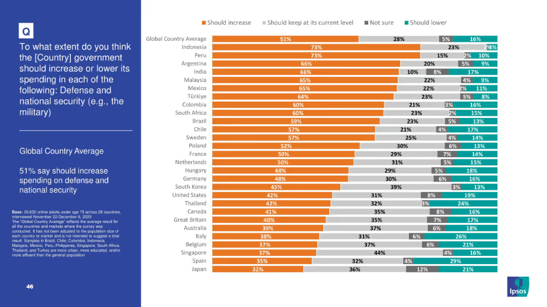
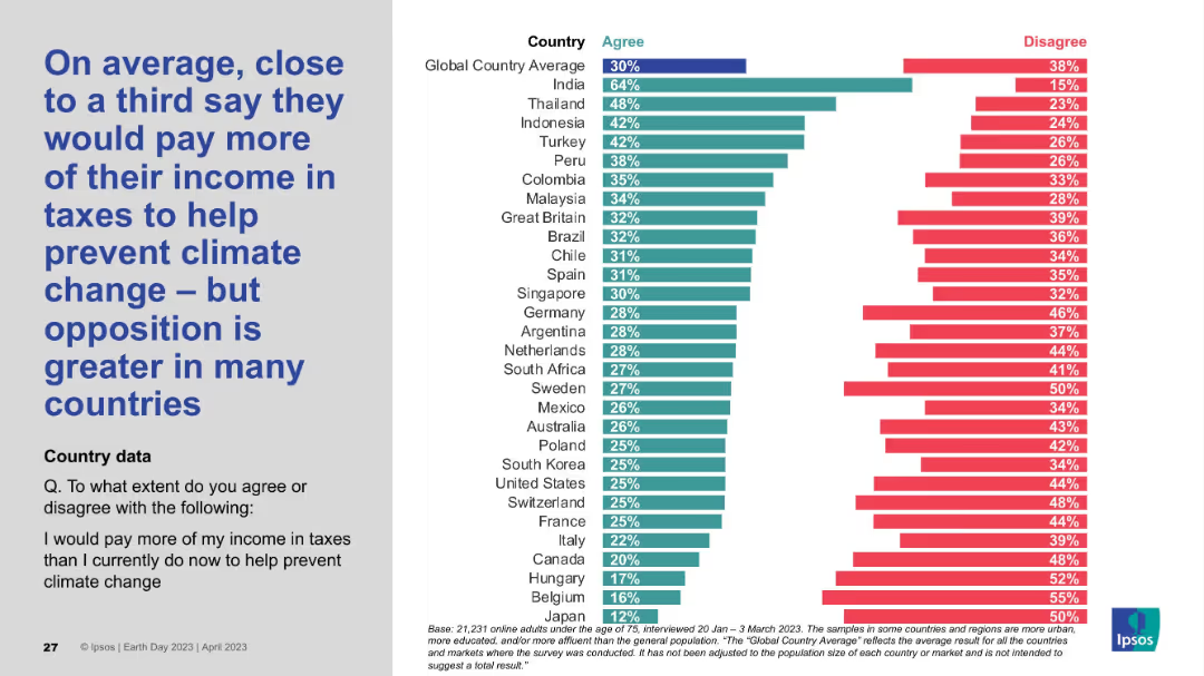
Split slide: left side has text on a blue background, right side has a horizontal bar chart with color-coded responses from multiple countries.
Market Analysis and Trends
Government & Public Sector
The slide shows public opinion across multiple countries on whether governments should increase spending on creating jobs. 69% globally support increased spending. The bar chart ranks countries by percentage agreeing with this view.
job creation, government spending, public opinion, global survey, policy support, country comparison, economic priorities, Ipsos, employment policy, chart visualization
Mixed Chart
IPSOS
Saved
The slide features a vertical column chart displaying credit loss provisions by quarter, with detailed annotations. Additional key highlights are listed on the right.
Risk Assessment and Management
Financial Services
The slide details the provisions for credit losses across different quarters, emphasizing the impact of economic factors and forecast adjustments.
credit losses, provisions, financial health, risk management, Deutsche Bank, Q1 2024, economic forecast, quarterly performance, investor relations
Mixed Chart
Deutsche Bank
Saved
Similar to the previous slide, featuring a radar chart and text summarizing market outlook, value and collaboration, and leadership in consumer business.
Industry Overview
Professional Services
Discusses the consumer business industry's market performance, strategic priorities, and areas for improvement in procurement and leadership.
Consumer business, market outlook, strategy, performance
Mixed Chart
Deloitte
Saved
Bubble chart showing CARG and growth for various IT segments from 2020-2025. Segments like Supply Chain Management, IaaS, and Business Intelligence Platforms are plotted with bubbles varying in size to represent different scales of impact.
Strategic Planning
Technology & Software
The slide analyzes the shift from purchasing solutions to building them in-house across various IT segments, with a focus on growth and CARG predictions.
CARG, growth, IT segments, bubble chart, strategy
Single Chart
Gartner
Saved
This slide uses a colorful, icon-driven design to represent various strategic areas such as profitability, portfolio transformation, and corporate responsibility. Each area is highlighted with distinct icons and color blocks, making the information approachable and easy to digest.
Strategic Planning
Agriculture & Food Production
Presents Tyson's multi-faceted strategic approach in a visually engaging manner. It outlines core areas of focus including profitability, product portfolio, and corporate responsibility, aiming to communicate the company's long-term objectives and commitments to stakeholders in a clear and memorable way.
Strategy, Tyson, Profitability, Sustainability, Corporate Responsibility
Pillar
Barclays
Saved
Includes a bar chart and multiple column charts representing financial projections and synergy estimates post-acquisition, presented in a clear, structured manner.
Financial Performance
Financial Services
Provides detailed financial projections following Faurecia's acquisition of Clarion, emphasizing expected synergies and EPS growth, and showcasing the financial strategy and its expected outcomes.
financial projections, synergies, EPS, growth, strategy, acquisition
Multiple Chart
Deutsche Bank
Saved
Features a column chart detailing Copernicus contributions to air quality monitoring and its economic impacts.
Market Analysis and Trends
Environmental Services & Sustainability
Discusses the benefits and economic impacts of using Copernicus for air quality monitoring across different regions and its significance for health and environment.
Copernicus, air quality, health, economic impact, environmental monitoring, data accuracy, public health
Mixed Chart
PwC/Strategy&
Saved
The slide features a diagram showing the biomass-to-energy carbon cycle, detailing the flow of CO2 from biofuel production to consumption, and its subsequent absorption by biomass through photosynthesis.
Technology and Digital Transformation
Energy & Utilities
This slide explains the carbon neutrality of bioenergy through the natural carbon cycle of biomass, illustrating how CO2 emissions from biofuel production and consumption are balanced by biomass absorption.
biomass, bioenergy, carbon cycle, CO2 emissions, carbon neutrality, biofuel production
Linear Flow
Kearney
Saved
Two individuals under a multicolored umbrella looking at a phone. Text on the left. Moderate complexity.
Market Analysis and Trends
Retail & E-commerce
Explores digital habits post-pandemic, particularly in Southeast Asia, with a focus on technology adoption.
Southeast Asia, technology adoption, digital habits
Agenda
Bain
Saved
Uses bar graphs and segmented emissions charts; clean visual segmentation by region and vehicle type
Market Analysis and Trends
Transportation & Logistics
Demonstrates the contribution of road transport to SEA emissions, with projections of growing mobility demand and vehicle sales. Stresses need for cleaner transport solutions amid rising emissions.
road transport, emissions, vehicle sales, SEA-6, mobility demand, GHG
Multiple Chart
Bain
Saved
The slide contains a column chart on the left showing historic investments in tech startups and four circular data points on the right summarizing current trends in capital investment.
Investment Analysis
Financial Services
This slide shows the growth in capital investment in tech startups over time and highlights significant trends in increased investment and deal flow in European startups.
Investment, Startups, Capital, Trends, Financial
Mixed Chart
BCG
Saved
The slide features two line charts. The left chart shows the number of PCT patent filings in thousands for the US, Japan, Germany, China, and India from 1998 to 2023. The right chart presents research and development expenditure as a percentage of GDP for the same countries over the same period.
Market Analysis and Trends
Technology & Software
This slide analyzes innovation trends, illustrating patent applications and R&D expenditures across major countries. It shows the growth in patent filings and investment in research and development, indicating technological advancement and economic focus.
innovation, patents, R&D, US, Japan, Germany, China, India, line chart, technology
Multiple Chart
JP Morgan
Saved
Features a column chart and text detailing the forecasted supply challenges for lithium, nickel, and cobalt. The charts and textual content are arranged in a grid layout on a dark background.
Operational Efficiency
Energy & Utilities
Analyzes the projected shortages in key battery materials and their impact on the battery supply chain, emphasizing the need for increased mining and recycling efforts.
battery materials, lithium, nickel, cobalt, supply chain, shortages, mining, recycling
Mixed Chart
Accenture
Saved
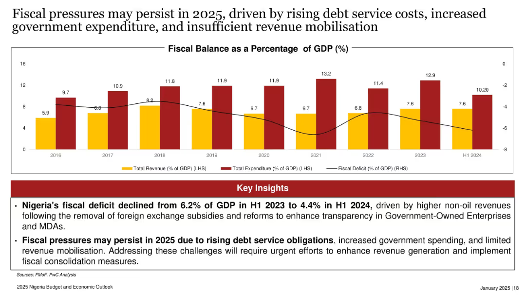
Line graph of Eurobond yields (2018–2024), illustrating volatility and recent stabilization.
Investment Analysis
Government & Public Sector
The slide reports stabilized Eurobond yields at around 7.5% in 2024, signaling improving investor confidence amid government reforms and favorable interest rates. However, rising debt risks may threaten this positive trend in 2025.
Eurobond, yield, interest rates, investor confidence, Nigeria, fiscal reforms
Mixed Chart
PwC/Strategy&
Saved
The slide contains a V-shaped line chart illustrating EBITA over time, two text boxes for past results and forecasts, and a section for quarterly results. Red is used for emphasis.
Market Analysis and Trends
Industrial & Manufacturing
Offers insights into the Space sector's performance, showcasing EBITA trends, with a focus on the manufacturing recovery and satellite service performance.
space, EBITA, manufacturing recovery, satellite services, financial performance, telecommunication business
Single Chart
Goldman Sachs
Saved
Bar charts per bank showing stage-wise ECL mix, plus an aggregate ECL bar chart. The slide uses three distinct colors to show Stage 1–3 loans. Summary box on the left includes main insights.
Risk Assessment and Management
Financial Services
Analyzes Expected Credit Loss (ECL) distribution by loan stage. Stage 1 loans grew across all banks while Stage 3 loans are well provisioned. ALRAJHI contributed significantly to Stage 3 loan increases. The visual format highlights bank-wise and stage-wise credit quality metrics.
ECL, stage 3 loans, provisions, credit quality, ALRAJHI, loan stages
Multiple Chart
Alvarez & Marsal
Saved
The slide presents a series of stacked column charts with highlights, showcasing asset management across investments, deposits, and loans. The design uses blue and purple hues, with annotations for key data.
Financial Performance
Financial Services
It shows year-end balances for investments, deposits, and loans, with highlights on significant achievements, indicating a robust asset management strategy focused on serving clients comprehensively.
Asset Management, Investments, Deposits, Loans, Client Service, Balance Sheet, Financial Services, Highlights, Growth
Multiple Chart
JP Morgan
Saved
Shows growth trends in corporate decarbonization commitments alongside charts on the forecasted supply of key resources.
Strategic Planning
Environmental Services & Sustainability
Discusses the importance of early adoption in sustainability practices, correlating corporate commitments with resource scarcity forecasts. Useful for strategic and sustainability planning.
sustainability, corporate commitments, resource scarcity, strategic planning, decarbonization, early adoption
Mixed Chart
BCG
Saved
Pie charts and bar charts showing breakdown of US CRE by property type and location; risk metrics on the right
Investment Analysis
Financial Services
Deep dive into €15bn US CRE stress-tested loans, focusing on offices, especially in major US cities. Highlights a 5.6% CLP impact over time and shows historical quarterly CLPs. Risk is mainly from refinancing and low coverage ratios; risk mitigation strategies are actively pursued.
US CRE, office loans, CLPs, refinancing risk, stress test, risk exposure
Multiple Chart
Deutsche Bank
Saved
Black line graph with time axis from 2008 to 2025; notable spikes in 2009 (Swine flu) and 2020–2021.
Market Analysis and Trends
Healthcare & Pharmaceuticals
Tracks public concern over pandemics, with a dramatic peak in April 2020 during COVID-19. Smaller peaks correspond to Ebola and swine flu. Concern plummets post-2022.
COVID-19, pandemic, healthcare, public opinion, Ipsos, H1N1, Ebola, virus, disease, health concern
Single Chart
IPSOS
Saved
Text-heavy slide with a global map of BCG immunization rates among 1-year-olds; includes summary of research insights and implications.
Market Analysis and Trends
Healthcare & Pharmaceuticals
Suggests possible correlation between BCG vaccination and lower COVID-19 burden. While not proven, the hypothesis supports investigating existing vaccines’ protective effects. Map shows global BCG coverage to contextualize this theory.
BCG vaccine, COVID-19, immunity, correlation, vaccination, epidemiology
Mixed Chart
McKinsey
Saved
Radar charts compare three company groups (experimenting, progressing, AI reinvention-ready) across foundational and new AI capabilities. Left-aligned descriptive text.
Performance Metrics and KPIs
Artificial Intelligence
Introduces a capability maturity model, showing how companies fall into three AI adoption categories. Uses radar charts to illustrate progress in foundational and new Gen AI capabilities, including LLMOps, data governance, and talent practices. Reinvention-ready firms show the highest maturity across all axes.
maturity model, AI readiness, radar chart, data capabilities, LLMOps
Mixed Chart
Accenture
Saved
The slide features a line chart comparing the likelihood of listing investment properties for sale from Fall 2018 to Fall 2020.
Market Analysis and Trends
Real Estate & Construction
This slide presents data on the likelihood of investment property owners listing their properties for sale, comparing trends over three years.
property sale, market trends, investment, likelihood, line chart, historical data, real estate
Single Chart
IPSOS
Saved
This slide includes a column chart of assets and liabilities and equity, with text highlights on loan portfolio quality and funding mix.
Financial Performance
Financial Services
It describes Deutsche Bank's balance sheet management, highlighting high-quality loan portfolio, assets, liabilities, equity, and funding.
balance sheet, assets, liabilities, equity, funding mix, high-quality loan portfolio, Deutsche Bank
Multiple Chart
Deutsche Bank
Saved
Grid and column layout with forecast charts, comparative stats, and emissions breakdown
Risk Assessment and Management
Technology & Software
Shows projections that data centers will represent up to 3.1% of SEA power demand and ~2% of emissions by 2030. Includes a comparison between IEA and Bain estimates and outlines market-driven strategies to lower emissions, particularly through hardware/software improvements and green energy sourcing.
GHG emissions, data center emissions, AI workloads, SEA energy use, power demand, sustainability, decarbonization
Mixed Chart
Bain
Saved
Previous
Next
If nothing, comes up, please save your slides first
Create a FREE account to continue browsing
Receive Instant Access to 1,000+ slides from companies like McKinsey, Google, and Goldman Sachs
First Name
Last Name
Email
Password
I agree to all
Terms & Privacy Policy
Thank you! Your submission has been received!
Oops! Something went wrong while submitting the form.
Have an account?
Sign in
Column Chart
Heatmap
Chevron
Org Chart
Infographic
Callouts
Timeline
List
Graphic
Picture
Process Flow
Diagram
Paragraph
Map
Table
Framework
Subtitle
Takeaway Box
Icon
Other Chart
Radar Chart
Waterfall Chart
Mekko Chart
Pie Chart
Scatter Plot
Line Chart
Bar chart
Bullet points