My Account
My Slides
Search by Category
Templates
View All Templates
Download Template Slides
Leave Feedback
Login
Logout
Get Started
Browse all Slides
Browse all Slides
Create a FREE Account
Instant access to 1,000+ real slides from top companies like McKinsey, BCG, Goldman Sachs, Google and many more!
First Name
Last Name
Email
Password
I agree to all
Terms & Privacy Policy
Thank you! Your submission has been received!
Oops! Something went wrong while submitting the form.
Have an account?
Sign in
Saved Slides
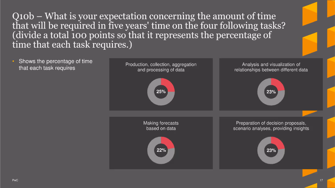
Text and visual indicators (percentage gaps, agreement bars) showing divergence in views between employees and employers on work preferences.
Human Resources and Talent Management
Professional Services
This slide highlights the differences in perceptions between employees and employers regarding new work preferences, including hybrid work, flexibility, travel, and productivity.
Work preferences, divergence, employee, employer, hybrid work, flexibility, percentage gaps
Multiple Chart
EY
Saved
The slide features a column chart displaying the percentage growth of urban agglomerations with the highest population growth from 2015-35. The chart differentiates between African and Asian cities. Below the chart are annotations and additional notes regarding urbanization trends in Africa.
Market Analysis and Trends
Technology & Software
This slide analyzes the fastest-growing cities in terms of population, comparing urban agglomerations in Africa and Asia. It highlights the impact of rapid urbanization on consumption expenditure in Africa, suggesting significant opportunities for economic growth in these regions.
urban growth, population, Africa, Asia, urbanization
Mixed Chart
LEK
Saved
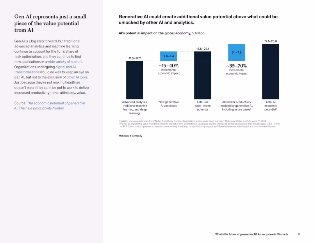
Left text description with bar chart on right showing estimated economic value from various AI categories, including gen AI.
Investment Analysis
Artificial Intelligence
Generative AI, while impactful, is part of a larger AI ecosystem. Traditional AI methods still contribute the majority of economic value. The slide quantifies the incremental and total economic potential.
AI value, economic impact, generative AI, analytics, investment potential, productivity
Mixed Chart
McKinsey
Saved
Features multiple bar charts illustrating the investment needs and technology drivers for various commodities to meet future demand. Colored bars represent different commodities.
Risk Assessment and Management
Environmental Services & Sustainability
Discusses the sustainability of commodity demand under current extraction rates and potential technological influences, important for risk management in resource allocation.
commodities, demand sustainability, bar chart, resource management, investment needs, technology drivers, risk assessment
Multiple Chart
McKinsey
Saved
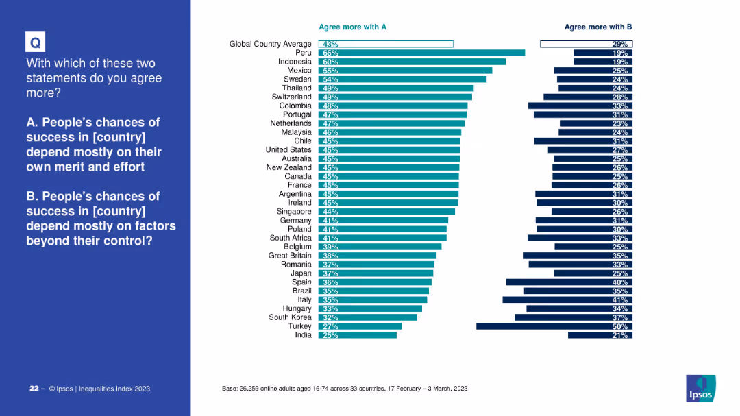
Bar chart comparing global and country-level agreement with: A) Success depends on merit and effort; B) Success depends on external factors. Dark teal vs. dark blue colors distinguish responses.
Market Analysis and Trends
Government & Public Sector
The slide captures attitudes across countries on whether success is determined by personal merit or external conditions. The global average leans slightly toward merit-based views, but with large variation between countries such as Peru (high merit belief) and India (low merit belief).
success, merit, external factors, perception, Ipsos, socioeconomics, global attitudes, inequality, control
Mixed Chart
IPSOS
Saved
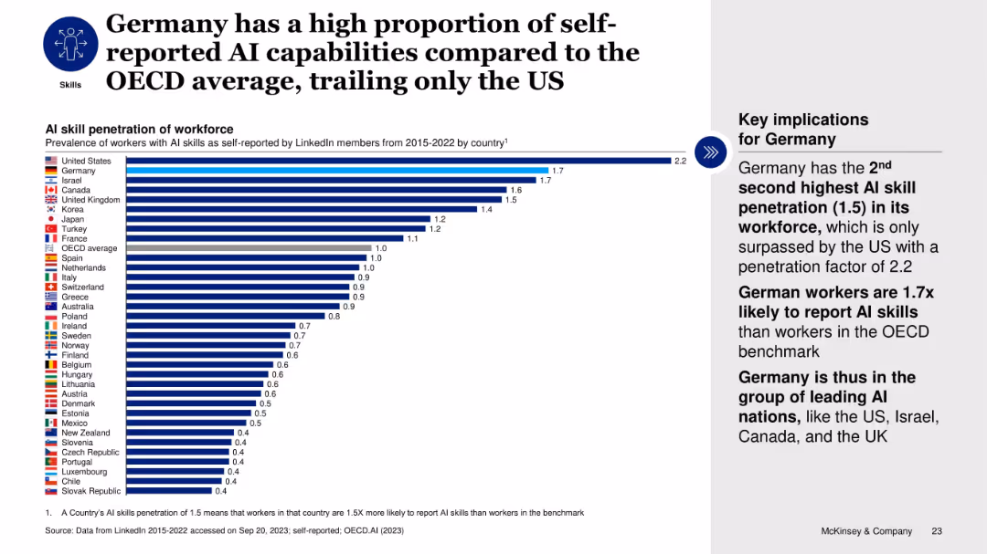
Horizontal bar chart comparing AI skill penetration across OECD countries; text box highlights Germany’s rank.
Human Resources and Talent Management
Artificial Intelligence
The slide ranks countries by AI skill penetration based on LinkedIn self-reports. Germany ranks second after the US, with a 1.5x OECD average. This emphasizes Germany’s strong AI talent base and its inclusion among leading AI nations despite lower investment and startup funding.
AI skills, workforce, Germany, OECD, LinkedIn, talent, self-reported, ranking, penetration
Mixed Chart
McKinsey
Saved
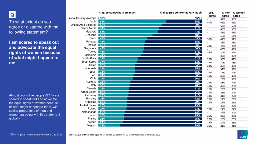
Horizontal bar chart with country breakdown of fear levels; includes gender-specific and 2017 comparison data
Risk Assessment and Management
Professional Services
The slide examines how many people fear advocating for women's rights due to potential consequences. It shows significant variation across countries and compares 2023 results with earlier data to highlight increases in fear.
advocacy fear, women’s rights, global fear levels, risk perception, international comparison, Ipsos
Mixed Chart
IPSOS
Saved
A pie chart showing the distribution of responses about technology infrastructure. Different segments represent various levels of satisfaction and automation
Operational Efficiency
Financial Services
This slide describes the current state of budgeting and forecasting technology infrastructure, highlighting the use of spreadsheets and automation levels.
technology infrastructure, budgeting, forecasting, automation, spreadsheets
Multiple Chart
PwC/Strategy&
Saved
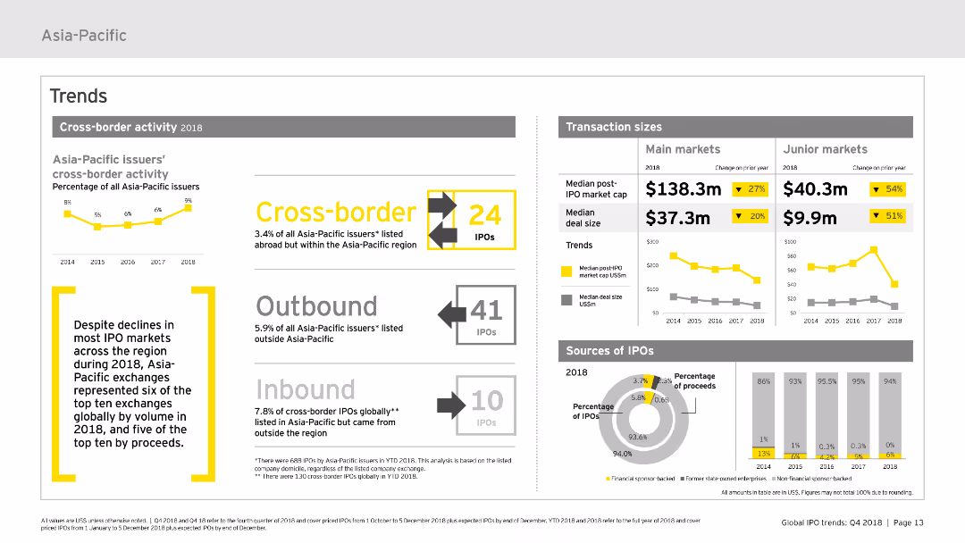
Features various charts and infographics focusing on cross-border activity within the Asia-Pacific IPO market. It uses bar charts to illustrate transaction sizes and sources of IPOs, along with textual highlights to provide context. The layout is clear, designed to show trends effectively.
Market Analysis and Trends
Financial Services
Analyzes the cross-border IPO activities in the Asia-Pacific region for 2018, detailing transaction sizes and the origins and destinations of IPOs. It highlights key trends and changes over the year.
cross-border, IPO, transaction sizes, trends, Asia-Pacific
Multiple Chart
EY
Saved
This slide uses a combination of icons, bar charts, and descriptive text to outline the risks associated with generator use in Nigerian markets, including fire risks and operational safety hazards, using visual elements to emphasize key data points.
Regulatory and Compliance
Industrial & Manufacturing
Detailing the safety issues related to generator use in Nigerian markets, this slide outlines how improper use and lack of safety measures contribute to a significant number of market fires, advocating for improved safety practices and alternative energy sources to mitigate these risks.
generators, safety, market fires, Nigeria, risks, operational safety, fire hazards, energy
Mixed Chart
BCG
Saved
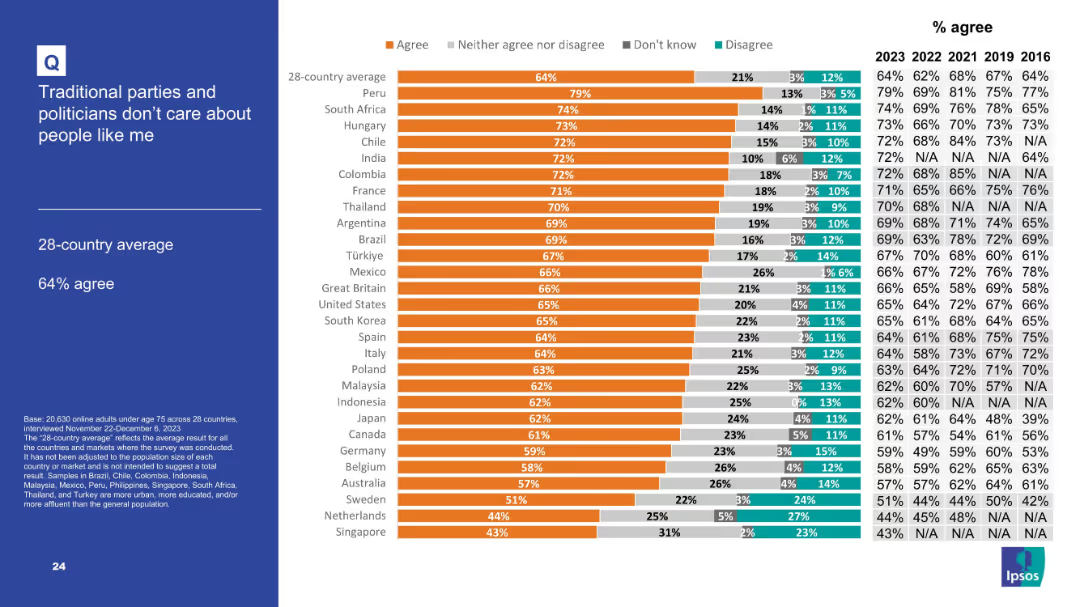
Similar to previous slide with title on the left and detailed bar chart on the right.
Market Analysis and Trends
Government & Public Sector
This slide indicates public disillusionment with traditional political parties. With a 28-country average of 64% agreement, it reflects a consistent perception that mainstream politicians are disconnected from ordinary citizens.
politicians, public trust, political dissatisfaction, survey, global sentiment
Mixed Chart
IPSOS
Saved
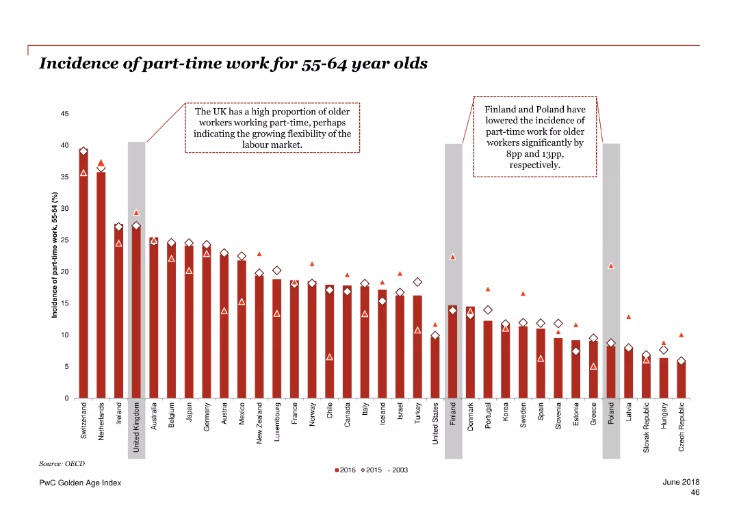
Column chart illustrating the incidence of part-time work for 55-64 year olds in various countries over three periods.
Market Analysis and Trends
Professional Services
The slide presents data on the proportion of older adults working part-time across multiple countries over 2003, 2015, and 2016.
part-time work, employment, older adults, OECD, trend
Single Chart
PwC/Strategy&
Saved
This slide features a dark background with a header, body text, and a column chart showing three percentage indicators. Each indicator is accompanied by descriptive text explaining consumer openness to virtual primary care consultations versus in-person consultations.
Technology and Digital Transformation
Healthcare & Pharmaceuticals
The slide discusses the openness of US consumers to switch to virtual primary care consultations, despite a general preference for in-person consultations. It highlights the percentage of consumers willing to consider virtual consultations.
healthcare, virtual care, primary care, US, consultations
Mixed Chart
EY
Saved
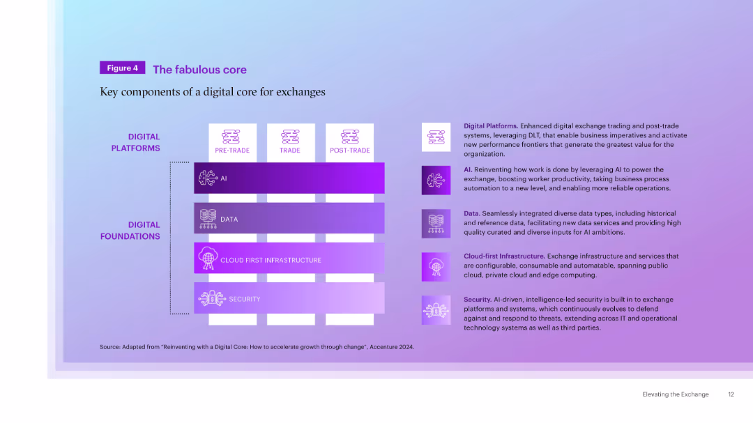
Two-column layout with diagram on left showing stacked elements (AI, Data, Cloud, Security) under Digital Platforms/Foundations, and descriptions on right.
Technology and Digital Transformation
Technology & Software
The slide outlines the core components of a digital core for exchanges, highlighting AI, data, cloud-first infrastructure, and security as foundational elements enabling robust digital platforms for trading and post-trade services.
Digital Core, AI, Data, Infrastructure, Security, Exchange, Technology, Platforms, Automation
Table
Accenture
Saved
Slide contains three column charts displaying financial performance over time, including changes in revenue, loan growth, and market share between 2015 and 2016 among major competitors. Colored in various shades of blue, and includes key textual annotations for clarity.
Financial Performance
Financial Services
Focuses on the financial performance and market position of Citigroup's branded cards. It highlights revenue growth, loan volume increases, and market share against competitors, using a projected CAGR through 2020. Designed to emphasize the strength and growth potential of Citigroup's card services.
financial growth, market share, revenue, loans, branded cards
Multiple Chart
Citigroup
Saved
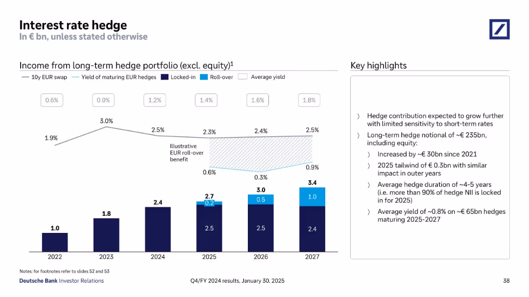
Bar and line charts showing income from long-term hedges with supporting bullet insights
Risk Assessment and Management
Financial Services
This slide explains the structure and benefits of Deutsche Bank’s long-term interest rate hedge portfolio, excluding equity. The chart highlights locked-in and rollover components, and the narrative emphasizes minimal short-term sensitivity, duration of ~4-5 years, and a €0.3bn expected benefit in 2025.
Interest Rate Hedge, Yield, Portfolio, Rollover, Locked-in, Duration
Mixed Chart
Deutsche Bank
Saved
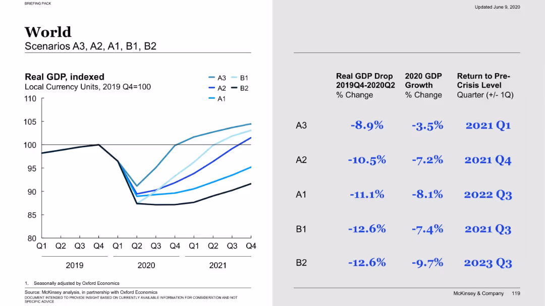
Left side: a multi-line graph comparing global GDP under different scenarios. Right side: scenario-specific metrics (GDP drop, 2020 growth, recovery timeline).
Market Analysis and Trends
Financial Services
Compares global GDP performance under five economic scenarios, outlining percentage GDP drop and estimated recovery quarters. Scenario A3 recovers fastest; B2 is the most pessimistic with prolonged recovery into late 2023.
GDP forecast, economic scenarios, global trends, recovery, A1-B2 scenarios
Mixed Chart
McKinsey
Saved
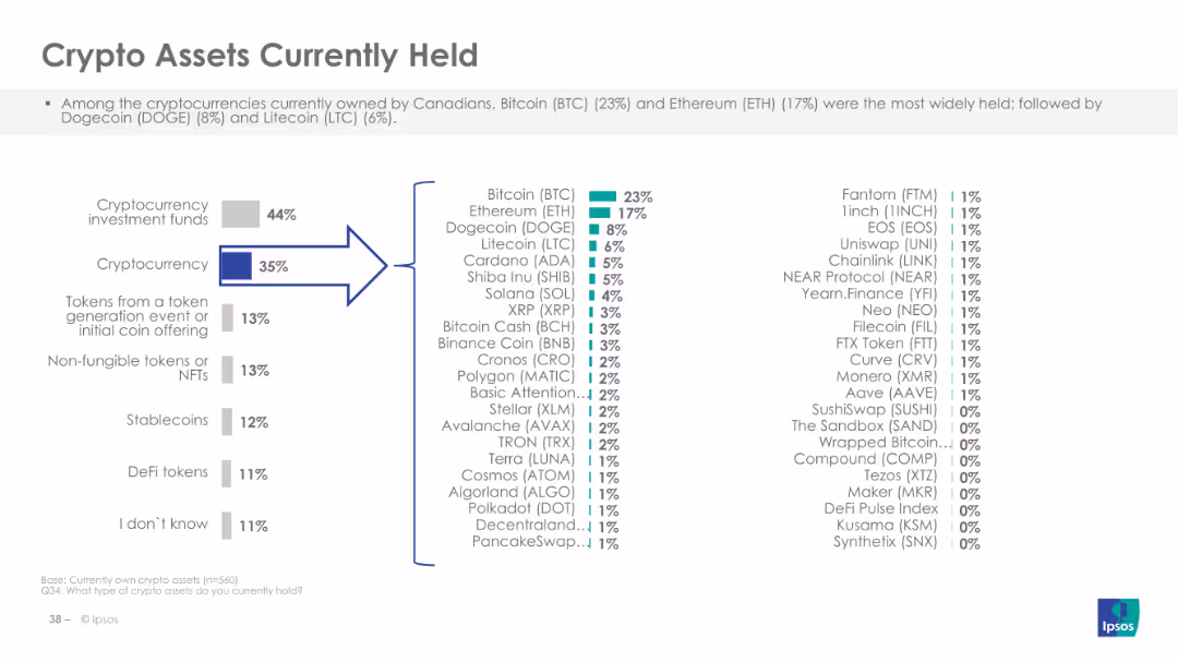
Displays a column chart listing the types of crypto assets currently held, like Bitcoin and Ethereum.
Market Analysis and Trends
Financial Services
The slide shows the types of crypto assets currently owned by Canadians, highlighting Bitcoin and Ethereum as the most popular, and providing detailed percentages for various other cryptocurrencies and digital assets.
Crypto assets, ownership, types
Multiple Chart
IPSOS
Saved
Contains a color-coded map of Australia with detailed GDP uplift and job creation figures for each state and territory. Various colors represent different levels of economic benefit.
Market Analysis and Trends
Telecommunications
Analyzes the economic benefits of the nbn network across Australia, detailing GDP uplift, job creation, and business development in each state and territory from 2012 to 2022.
nbn, Economic, Australia, States, GDP
Graphic
Accenture
Saved
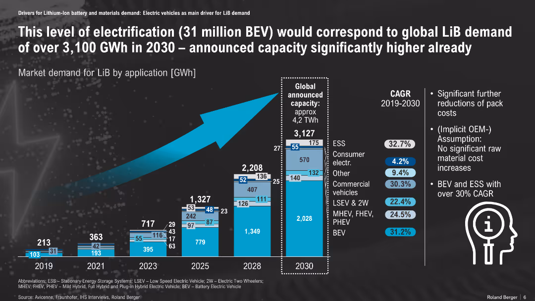
Bar chart showing LiB demand growth by application; forecast to 2030
Market Analysis and Trends
Energy & Utilities
Projected lithium-ion battery demand by application suggests a 3,100 GWh requirement by 2030 driven by BEV growth. The supply capacity is expected to exceed this, with BEV and ESS leading CAGR over 30%.
LiB demand, energy storage, BEV, GWh forecast, CAGR, application mix
Mixed Chart
Roland Berger
Saved
This slide features two sets of column charts comparing fiscal year results with annotations explaining each financial figure. The color red is used for textual emphasis and outlining chart areas.
Financial Performance
Industrial & Manufacturing
It's a financial report slide transitioning from EBITA to net results, showing year-over-year changes. Such a slide would be used in financial presentations to stakeholders to outline the company’s financial health and operational results.
Financial Report, EBITA, Net Result, Fiscal Year, Corporate Finance
Multiple Chart
Goldman Sachs
Saved
Contains column charts comparing caseloads, with a focus on color contrasts between red, brown, and beige to highlight differences among locations.
Regulatory and Compliance
Government & Public Sector
Presents a comparative analysis of the caseloads in different court locations and the trend in the number of case finalizations.
Caseload, courts, family law, applications, finalizations, judicial system, comparative analysis, trend
Multiple Chart
PwC/Strategy&
Saved
Includes column charts projecting future capital ratios and a diagram showing capital allocation strategies, along with a pie chart illustrating forecasted asset management.
Operational Efficiency
Financial Services
Discusses methods to improve capital ratios, focusing on strategic investments and asset management to maintain financial stability and growth.
capital, finance, strategy, growth, investment
Multiple Chart
Barclays
Saved
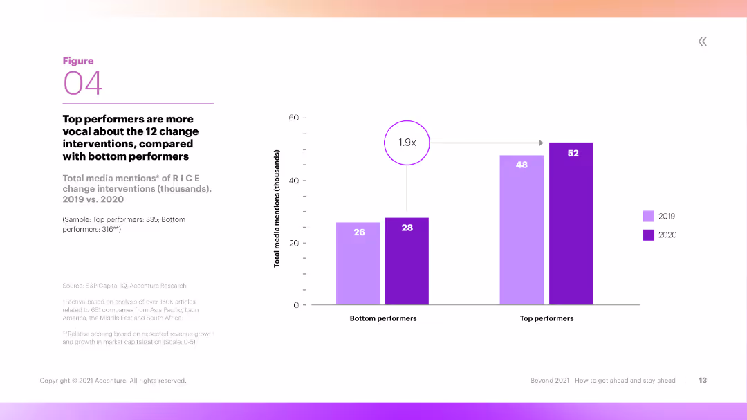
The slide features a column chart showing the number of media mentions of RICE change interventions by top and bottom performers over two years. The chart is clear, with distinct colors for different years and performance levels.
Performance Metrics and KPIs
Professional Services
The slide compares the total media mentions of RICE change interventions between top and bottom performers in 2019 and 2020. It shows that top performers are significantly more vocal about these interventions, indicating proactive engagement.
Media Mentions, RICE, Top Performers, Interventions, Engagement
Mixed Chart
Accenture
Saved
Slide shows column charts tracking material margin over time and a line graph depicting intercompany volumes, supplemented with performance data annotations.
Operational Efficiency
Industrial & Manufacturing
Examines the production efficiency and financial success in the specialty products sector, focusing on trends in material costs and production volumes.
manufacturing, efficiency, production, financial, trends
Multiple Chart
Barclays
Saved
Previous
Next
If nothing, comes up, please save your slides first
Create a FREE account to continue browsing
Receive Instant Access to 1,000+ slides from companies like McKinsey, Google, and Goldman Sachs
First Name
Last Name
Email
Password
I agree to all
Terms & Privacy Policy
Thank you! Your submission has been received!
Oops! Something went wrong while submitting the form.
Have an account?
Sign in
Column Chart
Heatmap
Chevron
Org Chart
Infographic
Callouts
Timeline
List
Graphic
Picture
Process Flow
Diagram
Paragraph
Map
Table
Framework
Subtitle
Takeaway Box
Icon
Other Chart
Radar Chart
Waterfall Chart
Mekko Chart
Pie Chart
Scatter Plot
Line Chart
Bar chart
Bullet points