My Account
My Slides
Search by Category
Templates
View All Templates
Download Template Slides
Leave Feedback
Login
Logout
Get Started
Browse all Slides
Browse all Slides
Create a FREE Account
Instant access to 1,000+ real slides from top companies like McKinsey, BCG, Goldman Sachs, Google and many more!
First Name
Last Name
Email
Password
I agree to all
Terms & Privacy Policy
Thank you! Your submission has been received!
Oops! Something went wrong while submitting the form.
Have an account?
Sign in
Saved Slides
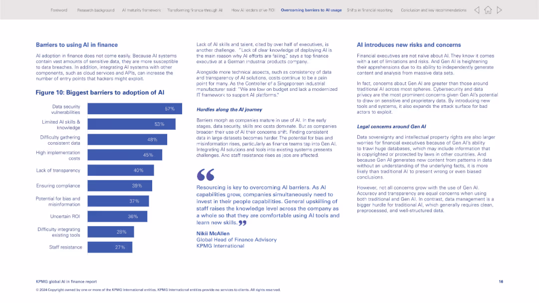
Left-heavy layout with a horizontal bar chart listing top barriers; narrative and quotes on the right
Risk Assessment and Management
Financial Services
This slide outlines the primary challenges to adopting AI in finance, with data security, lack of skills, and data consistency as top concerns. It includes executive commentary and highlights new risks posed by Gen AI, including legal and ethical issues.
AI barriers, data security, Gen AI risks, finance technology, implementation challenges, compliance, staff resistance
Mixed Chart
KPMG
Saved
Similar to the previous slide, this one has a circular diagram with the Goldman Sachs logo at the center. "Continuous Improvement" is highlighted, and there are bullet points for different aspects like "Risk Appetite and Cycle Preparedness."
Risk Assessment and Management
Financial Services
This slide expands on the element of "Continuous Improvement" from the risk management cycle at Goldman Sachs. It enumerates key areas such as risk appetite, regulatory compliance, cybersecurity, and reputation. The slide is suitable for presentations aimed at detailing risk mitigation strategies and preparedness in financial operations.
risk, management, Goldman Sachs, continuous improvement, compliance
Linear Flow
Goldman Sachs
Saved
The slide balances text with a set of illustrative icons. It is organized into four sections, each with headers and bullet points.
Financial Performance
Financial Services
The slide highlights the target for Return on Tangible Common Equity (ROTCE), and how various strategies contribute to achieving this financial goal.
ROTCE, target, financial goals, strategy, common equity, icons, JPMorgan
Table
JP Morgan
Saved
Features column charts and icons representing various contact channels used in customer service, with emphasis on digital and traditional methods. The slide is well-organized with a modern design, employing light blue and green colors.
Technology and Digital Transformation
Telecommunications
Highlights the current usage and investment trends in different customer service channels, particularly in digital transformation. Offers valuable insights for telecommunications and service-oriented companies looking to enhance customer interaction through technological advancements.
contact channels, customer service, digital transformation, investment trends, telecommunications
Multiple Chart
Deloitte
Saved
Displays a comprehensive table summarizing the bank's balance sheet over three periods (31.03.2021, 31.12.2021, and 31.03.2022). The table includes assets, liabilities, and equity figures, complemented by a column chart showing the growth in loans to customers. The layout is clear, with distinct sections and headings for easy readability and comparison.
Financial Performance
Financial Services
Provides a detailed snapshot of the bank's financial stability through a balance sheet summary and trends in loan growth. Highlights key changes in assets, liabilities, and equity over specified periods, reflecting strong growth in customer loans and stability in core deposits, contributing to a robust liquidity position amidst dividend and buy-back strategies.
balance sheet, financial stability, loans, assets, liabilities, equity
Mixed Chart
Deutsche Bank
Saved
A line chart displaying trends in GDP per capita from 2011 to 2016 for several US metro areas, each represented by a different colored line, with highlighted points for areas like San Francisco and Washington DC.
Financial Performance
Transportation & Logistics
Analyzes economic growth in U.S. metropolitan areas through GDP per capita over time, highlighting regions with significant changes. Useful for economic planning and assessment.
GDP, economic growth, metro areas, US, trends, financial analysis
Single Chart
BCG
Saved
Slide is text-heavy with bullet-point recommendations for organizations on climate action. Features three circular green icons, representing different strategies like frameworks, plans, and education.
Strategic Planning
Environmental Services & Sustainability
Provides strategic recommendations for organizations aiming to enhance their environmental sustainability efforts, including planning, education, and framework adoption.
Climate Action, Strategic Recommendations, Sustainability, Organizational Planning, Education, Frameworks
Header Vertical
Deloitte
Saved
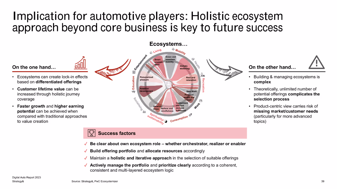
The slide displays a circular diagram representing different ecosystem domains (e.g., mobility, living, entertainment) and their interconnections. The bottom section lists success factors for ecosystem management.
Strategic Planning
Transportation & Logistics
The slide discusses the importance of a holistic ecosystem approach for automotive players, emphasizing the integration of various domains like mobility, living, and entertainment. It highlights success factors such as clear ecosystem roles and iterative approach in managing portfolios.
Automotive, Ecosystem, Holistic Approach, Mobility, Integration, Success Factors, Strategic Planning, Portfolio Management
Diagram
PwC/Strategy&
Saved
Multi-bar chart with detailed job gains and losses by region in New Zealand. Provides a clear visual breakdown.
Strategic Planning
Industrial & Manufacturing
Detailed analysis of job market changes in New Zealand’s regions, highlighting areas with net job gains or losses, critical for HR and regional planners.
Jobs, Detail, New Zealand, Regions, Analysis
Multiple Chart
McKinsey
Saved
The slide has two sections with descriptions of the basic oxygen furnace and direct reduction of iron processes, including images of the relevant furnaces.
Market Analysis and Trends
Energy & Utilities
The slide details hydrogen consumption in the steel industry, explaining basic oxygen furnace and direct reduction of iron processes, market trends, and hydrogen sources.
hydrogen, steel, oxygen furnace, direct reduction, iron, market trends, case study
Mixed Chart
Kearney
Saved
Contains bullet points and column chart comparing different capital requirement metrics with annotations explaining surplus and deficits.
Regulatory and Compliance
Financial Services
Analyzes compliance with MREL/TLAC financial regulations, displaying the bank's capital against required thresholds, highlighting surpluses and shortages.
financial regulation, compliance, capital requirements, banking
Multiple Chart
Deutsche Bank
Saved
Utilizes flowcharts and connectors to detail the family law application process, with red and black colors to denote different courts and actions. The content is arranged for easy step-by-step tracking.
Regulatory and Compliance
Government & Public Sector
This slide compares the family law application process between two courts, highlighting the steps and variations in procedure. The clear delineation aids understanding of the complex legal procedures involved in family law cases.
Family Law, Application Process, Court Procedure, Legal Comparison, Australia
Diagram
PwC/Strategy&
Saved
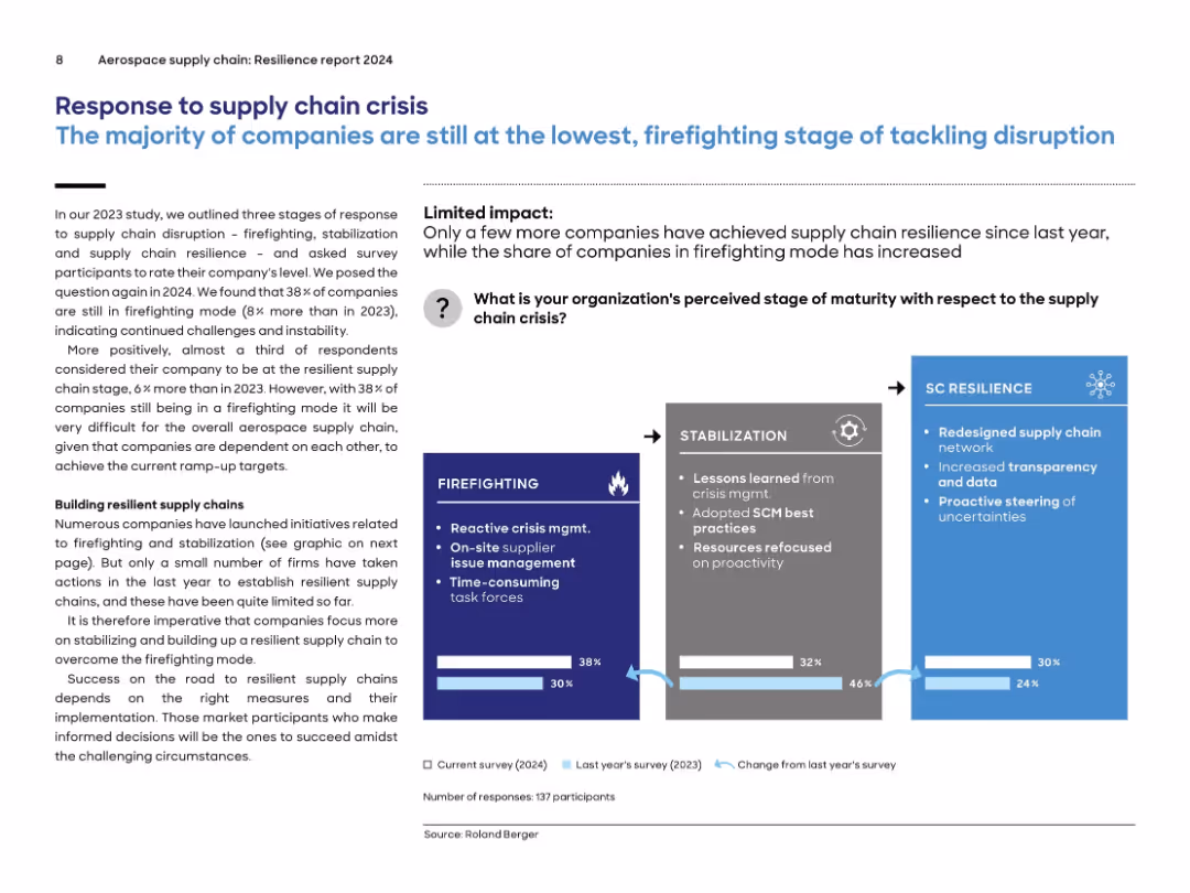
Horizontal 3-stage graphic from “Firefighting” to “SC Resilience”; percentage breakdown shown at the bottom; annotated illustrations explain each stage.
Strategic Planning
Environmental Services & Sustainability
The slide categorizes company responses to supply chain disruption into three maturity stages: Firefighting (38%), Stabilization (32%), and Resilience (30%). Most companies remain in the initial, reactive stage. Although there is improvement over 2023, only a small number have developed proactive supply chain strategies. An arrow-based visual conveys progression across maturity stages.
supply chain, crisis response, maturity, firefighting, stabilization, resilience, aerospace, survey
Mixed Chart
Roland Berger
Saved
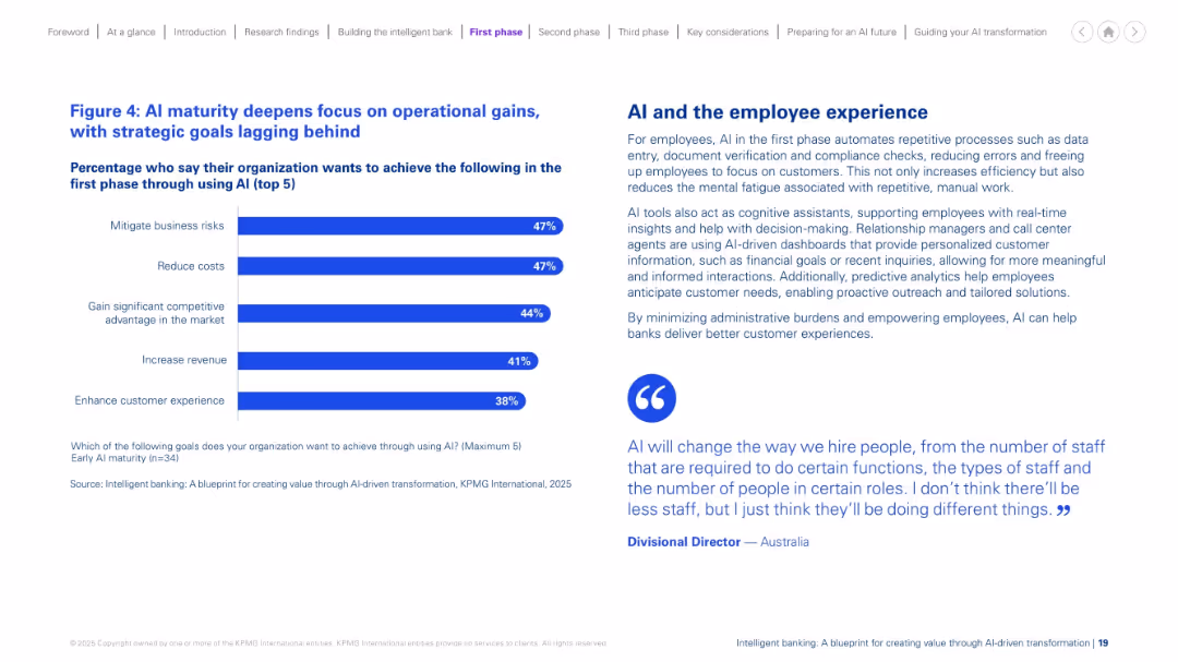
Split design: bar chart on the left with top 5 AI goals; descriptive text and a quote on the right. Blue and purple color scheme. Balanced and minimalistic.
Performance Metrics and KPIs
Financial Services
The slide shows that at early AI maturity, organizations prioritize operational improvements such as risk mitigation and cost reduction over strategic goals. It explains how AI enhances employee experience through automation, reducing manual effort and improving decision-making and customer interactions. A quote adds perspective on AI’s workforce impact.
AI maturity, operations, efficiency, cost, employee, experience, early phase
Mixed Chart
KPMG
Saved
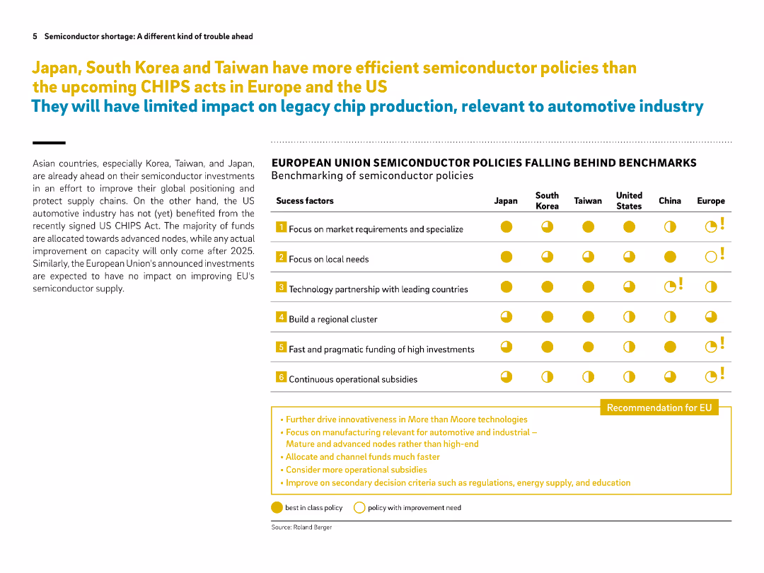
Left side contains narrative text, right side shows a benchmarking comparison table of policy success factors across regions. Bright icons emphasize comparisons.
Regulatory and Compliance
Government & Public Sector
The slide benchmarks global semiconductor policies, showing that Asian countries lead in effective policy implementation while Europe and the US lag behind. It suggests key recommendations for the EU to catch up, such as faster funding and focus on legacy chips.
semiconductor policy, CHIPS act, Europe, benchmarking, subsidies, legacy nodes, Japan, Korea, Taiwan, EU recommendations
Table
Roland Berger
Saved
Horizontal bar chart with each country's agreement levels on the statement about economic unfairness. Historical changes are shown on the right.
Market Analysis and Trends
Government & Public Sector
This slide reveals how citizens perceive economic inequality in their countries. Thailand and South Korea show high belief in systemic economic bias. Italy, France, Germany, and Canada have seen significant increases in agreement, correlating with cost-of-living crises.
economic inequality, rigged economy, Ipsos, public perception, systemic bias, international sentiment
Mixed Chart
IPSOS
Saved
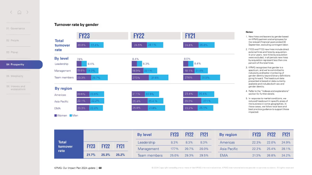
Layout mirrors previous slides with rates displayed by role and region; total turnover shown at bottom.
Human Resources and Talent Management
Professional Services
Analyzes turnover rate segmented by gender across fiscal years FY21–FY23. Detailed by leadership level and global region, the chart supports strategic planning and retention initiatives. Notes reiterate data scope and inclusion principles.
turnover rate, gender analysis, retention, HR strategy, leadership, team, regions, FY data
Mixed Chart
KPMG
Saved
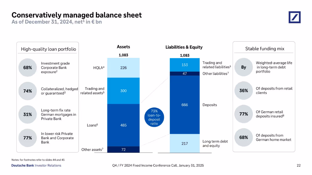
Split panel design showing assets and liabilities side-by-side using stacked bar formats. Flanked by callout bubbles for metrics (loan-to-deposit, quality, maturity). Structured with clean lines and shaded color segments.
Operational Efficiency
Financial Services
This slide provides a breakdown of Deutsche Bank’s assets and liabilities as of December 2024, showcasing a conservative balance sheet. Key data include 73% loan-to-deposit ratio, long average debt maturity, and high levels of investment-grade and collateralized loans. It underscores stability, funding quality, and prudent risk management.
balance sheet, assets, liabilities, loan-to-deposit, collateralized loans, HQLA, long-term debt, Deutsche Bank
Mixed Chart
Deutsche Bank
Saved
A mixed chart showing the short- and long-term impacts of various marketing channels. The chart uses bars and lines to depict the effectiveness of channels like TV, social media, and print in driving sales and brand awareness.
Market Analysis and Trends
Media & Entertainment
This slide analyzes the effectiveness of different marketing channels in driving both short-term sales and long-term brand awareness. It highlights the impact of channels like TV, social media, and print on overall marketing effectiveness.
Channels, Impact, Marketing, Effectiveness, Sales
Mixed Chart
Nielsen
Saved
Featuring a line and bar graph, this slide compares the number of venture investing deals between technology and other sectors, noting the decline and its relation to the sector's deal share.
Investment Analysis
Technology & Software
Analyzing the venture market, this slide presents the overall decline in the number of deals, particularly within the technology sector, while also highlighting that the sector's share of deals remains within historical norms. It suggests that this decline does not impact the market's overall health and provides insights into investment trends and preferences.
tech sector, venture deals, market trends, investment analysis, sector comparison
Mixed Chart
Oliver Wyman
Saved
The slide compares the compound annual growth rate (CAGR) of technology investments to other sectors using a bar graph and provides explanatory text for observed trends in deal value growth.
Market Analysis and Trends
Technology & Software
This slide contrasts the growth rates in technology venture investing with other sectors, highlighting periods of resilience and expansion. It discusses the macroeconomic conditions influencing these trends and the notable increase in deal values in technology, emphasizing the sector's robust performance compared to others.
technology growth, CAGR, venture investing, market analysis, sector comparison
Mixed Chart
Oliver Wyman
Saved
Bar chart comparing top client-facing use cases for retail and commercial banks.
Customer and Market Segmentation
Financial Services
Highlights top client-facing use cases, emphasizing cross-selling and personalized advertising for both retail and commercial banks.
client-facing, retail, commercial, banks, use cases
Multiple Chart
EY
Saved
Slide includes a pathway diagram outlining steps for leveraging risk management in organizational growth, with clear visual markers and directional flow.
Strategic Planning
Professional Services
Provides a strategic guide on integrating risk management into business growth plans, emphasizing realistic goals and leadership, applicable in strategic business planning workshops or seminars.
risk management, strategy, growth, leadership
Linear Flow
PwC/Strategy&
Saved
This slide combines bar chart and a line graph to illustrate vaccination rates and daily vaccine doses administered in the Philippines.
Market Analysis and Trends
Government & Public Sector
This slide offers a visual analysis of COVID-19 vaccination progress in the Philippines, highlighting coverage and vaccination rates.
COVID-19, vaccination, Philippines, public health, pie charts, line graph, vaccine doses, coverage
Multiple Chart
Deloitte
Saved
Features a pie chart showing the distribution of global primary energy demand by country cluster in 2015 and projected for 2030.
Market Analysis and Trends
Energy & Utilities
Discusses the projected increase in global energy demand, particularly from non-OECD countries, highlighting the growing impact on energy resources. Useful for energy policy and investment discussions.
energy demand, OECD, non-OECD, 2030 projections, energy policy
Multiple Chart
Roland Berger
Saved
Previous
Next
If nothing, comes up, please save your slides first
Create a FREE account to continue browsing
Receive Instant Access to 1,000+ slides from companies like McKinsey, Google, and Goldman Sachs
First Name
Last Name
Email
Password
I agree to all
Terms & Privacy Policy
Thank you! Your submission has been received!
Oops! Something went wrong while submitting the form.
Have an account?
Sign in
Column Chart
Heatmap
Chevron
Org Chart
Infographic
Callouts
Timeline
List
Graphic
Picture
Process Flow
Diagram
Paragraph
Map
Table
Framework
Subtitle
Takeaway Box
Icon
Other Chart
Radar Chart
Waterfall Chart
Mekko Chart
Pie Chart
Scatter Plot
Line Chart
Bar chart
Bullet points


![Q: And how much do you agree or disagree with the following statements? -[COUNTRY]'s economy is rigged to advantage the rich and powerful](https://cdn.prod.website-files.com/654e70fb59937215cac87b19/6899bad4f03e6a89283027d8_2ZYX6BNkjwxb5FzZGpK0ak8VxeeqF3xAPSlmT0j-j0o.avif)