Create a FREE Account
Instant access to 1,000+ real slides from top companies like McKinsey, BCG, Goldman Sachs, Google and many more!
First Name
Last Name
Email
Password
I agree to all
Terms & Privacy Policy
Thank you! Your submission has been received!
Oops! Something went wrong while submitting the form.
Have an account?
Sign in
Library
Templates
Courses
Pricing
My Account
My Slides
My Templates
✦ AI
AI Prompt Library
AI Search
Sign in
Start Here
Logout
My Saved Slides
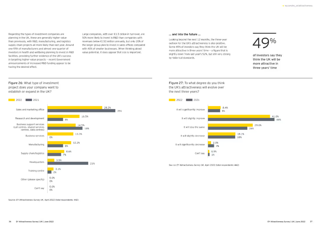
Displays a bar chart showing the leading city destinations of UK investment projects, excluding London, for 2020 and 2021.
Market Analysis and Trends
Financial Services
This slide highlights the top cities in the UK, excluding London, that attracted investment projects in 2020 and 2021, showing the comparative data.
UK cities, investment projects, 2020-21, bar chart
Multiple Chart
EY
Saved
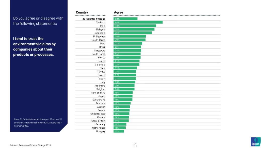
Bar chart of 32 countries showing levels of trust in corporate environmental claims. Dark left panel with white text.
Customer and Market Segmentation
Consumer Goods
Shows public trust in corporate environmental claims. Thailand ranks highest in trust, while many Western countries report low trust in such claims.
corporate trust, environmental claims, greenwashing, consumer perception, Ipsos, brand credibility, sustainability, survey, public opinion, ESG
Mixed Chart
IPSOS
Saved
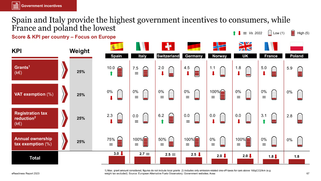
The slide includes a table with bar charts showing government incentives for EVs in various European countries. Metrics include grants, VAT exemption, and tax reductions, each weighted differently.
Regulatory and Compliance
Transportation & Logistics
The slide compares government incentives for EVs across European countries, highlighting Spain and Italy as offering the most incentives. It aims to illustrate the impact of government policies on EV adoption.
government incentives, EVs, Europe, grants, tax exemptions
Multiple Chart
PwC/Strategy&
Saved
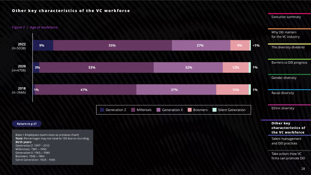
The slide includes a column chart showing the age distribution of the venture capital workforce, divided into different generational cohorts. Textual notes provide context about the data sources and definitions.
Human Resources and Talent Management
Professional Services
This slide analyzes the age demographics of the venture capital workforce, illustrating the proportion of employees in different generational groups, and highlighting changes in the workforce composition over time.
Age demographics, Workforce analysis, Generational cohorts, VC industry, Demographic trends
Mixed Chart
Deloitte
Saved
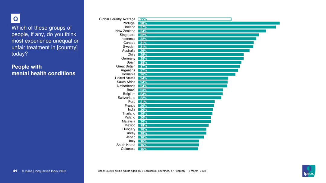
Blue question panel with right-hand bar chart ranking countries by perceived unfair treatment.
Market Analysis and Trends
Healthcare & Pharmaceuticals
Ranks countries based on the percentage of people who believe those with mental health conditions face unfair treatment. Portugal and Ireland are highest.
mental health, discrimination, country comparison, inequality, treatment, global perception
Mixed Chart
IPSOS
Saved
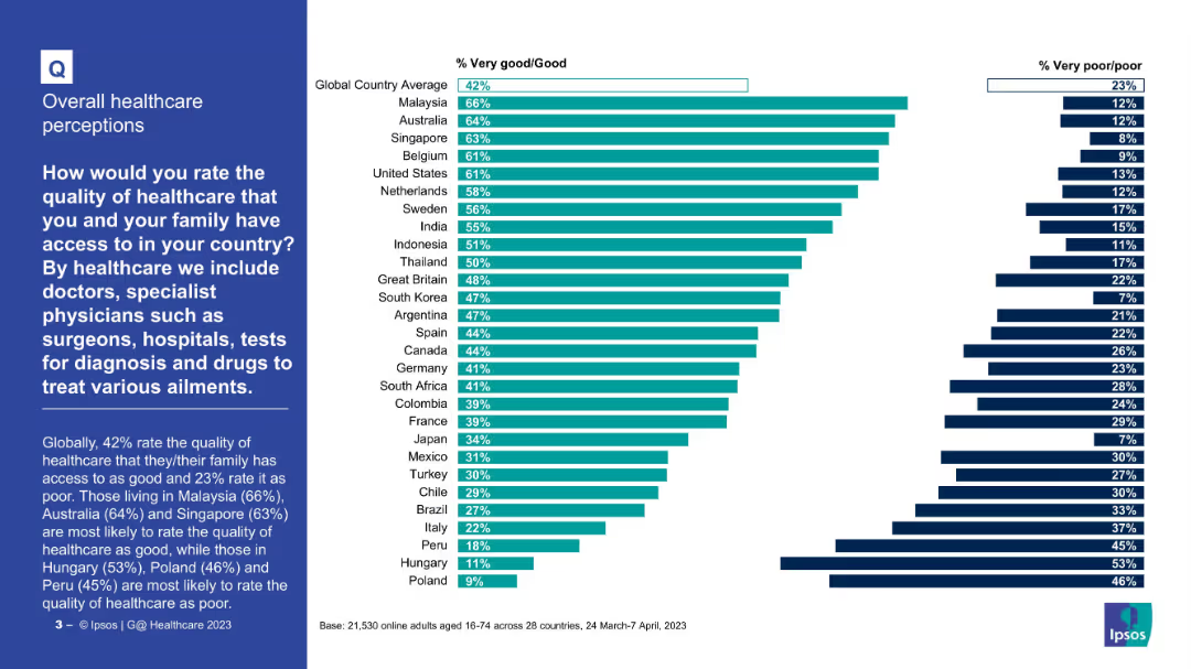
Horizontal bar chart comparing countries by percent rating healthcare as “Very good/Good” or “Poor”
Market Analysis and Trends
Healthcare & Pharmaceuticals
The chart compares how people in 28 countries rate the quality of healthcare. Malaysia, Australia, and Singapore top the list positively. Hungary, Peru, and Poland have the lowest satisfaction levels with highest “poor” ratings.
Healthcare quality, international comparison, satisfaction, global survey, medical care, Ipsos
Mixed Chart
IPSOS
Saved
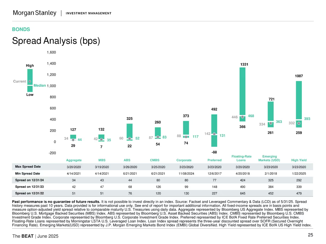
Bar chart comparing spread ranges (low, median, high) for various bond categories, with data tables at the bottom.
Risk Assessment and Management
Financial Services
Compares current bond spreads across sectors such as ABS, MBS, Corporate, High Yield, and EM. Includes historical spread extremes and recent data trends.
bond spreads, credit risk, ABS, MBS, high yield, floating rate, emerging markets, historical data, fixed income
Mixed Chart
Morgan Stanley
Saved
A structured grid layout with bars and percentages showing projected profits under different market scenarios for BEV adoption. Each OEM type is categorized by strategy alignment.
Strategic Planning
Transportation & Logistics
Analyzes the impact of different electrification strategies on OEM profitability under various market scenarios, providing a strategic overview for stakeholders in the electric vehicle market.
BEV, OEM, profitability, market scenarios, strategy
Table
BCG
Saved
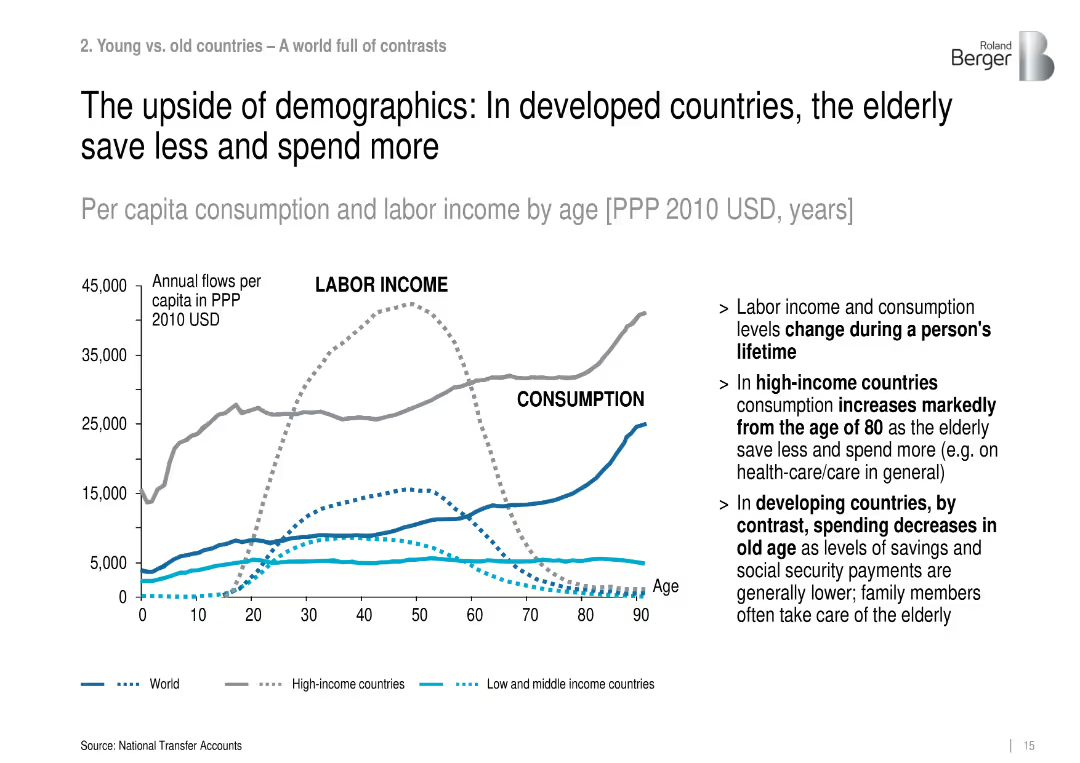
Line graph showing labor income vs. consumption by age across different country income levels (World, High, Low-Mid).
Market Analysis and Trends
Government & Public Sector
The slide presents per capita labor income and consumption over age, revealing that elderly populations in high-income countries consume more and save less, especially after age 80, contrasting with developing regions.
consumption, labor income, aging, high-income, developing countries, elderly spending, economic behavior
Mixed Chart
Roland Berger
Saved
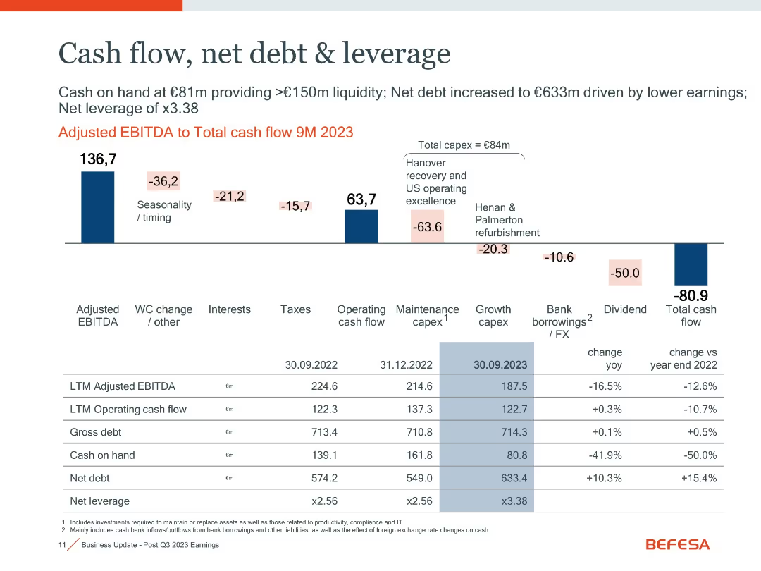
Waterfall chart with financial metrics and a table comparing key indicators over time
Financial Performance
Industrial & Manufacturing
Illustrates cash flow changes and leverage metrics. Shows adjusted EBITDA to total cash flow with detailed breakdowns. Net debt increased to €633m due to lower earnings and capex, leading to 3.38x leverage.
cash flow, net debt, leverage, EBITDA, capex, liquidity
Mixed Chart
Goldman Sachs
Saved
The slide features icons representing methodology elements like interviews, data inputs, and research sources for the venture capital study.
Market Analysis and Trends
Financial Services
Details the methodology of the joint study on Indonesia’s venture capital outlook by Google and A.T. Kearney, highlighting data sources and research.
Venture Capital, Indonesia, Methodology, Research
Multiple Chart
Kearney
Saved
Column charts display recurring net fee income, net interest income, and transaction-based income.
Financial Performance
Financial Services
Discusses growth in all revenue lines for Global Wealth Management, highlighting fee and interest incomes.
wealth management, revenue growth, fee income, interest income, transaction income
Multiple Chart
UBS
Saved
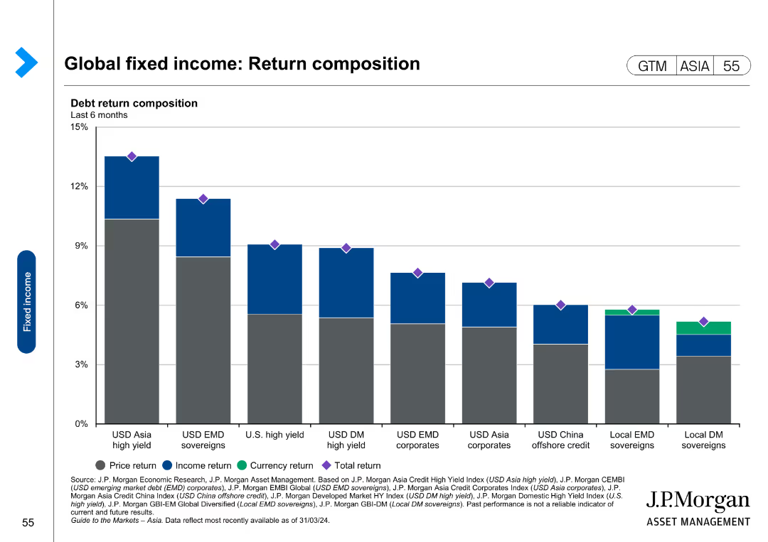
The slide contains a bar chart showing debt return composition for different fixed income categories, divided into price return, income return, and currency return.
Financial Performance
Financial Services
This slide evaluates return composition for global fixed income investments, breaking down returns into price, income, and currency components. It is used for financial performance analysis and investment strategy development.
Global fixed income, return composition, price return, income return, currency return, investment strategy
Single Chart
JP Morgan
Saved
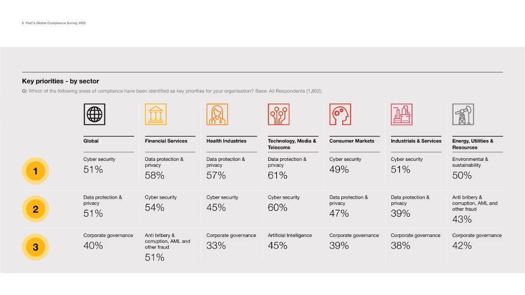
Grid layout with icons for sectors and ranking columns for top 3 priorities per sector.
Strategic Planning
Professional Services
Presents a sector-specific breakdown of top compliance priorities, with cybersecurity and data privacy leading in most sectors. Notably, sustainability and AI also appear prominently in certain industries.
sector comparison, cybersecurity, data privacy, priorities, governance
Table
PwC/Strategy&
Saved
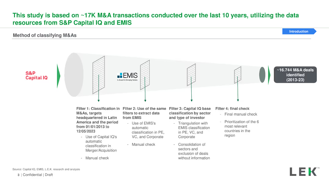
Funnel diagram with four filters for classifying M&As using data from S&P Capital IQ and EMIS, representing various stages of data filtration and classification.
Mergers and Acquisitions
Financial Services
Explains the method of classifying M&A transactions using data from S&P Capital IQ and EMIS, including filtering by region, investor type, and manual checks for accuracy.
M&As, classification, S&P Capital IQ, EMIS, filtering
Linear Flow
LEK
Saved
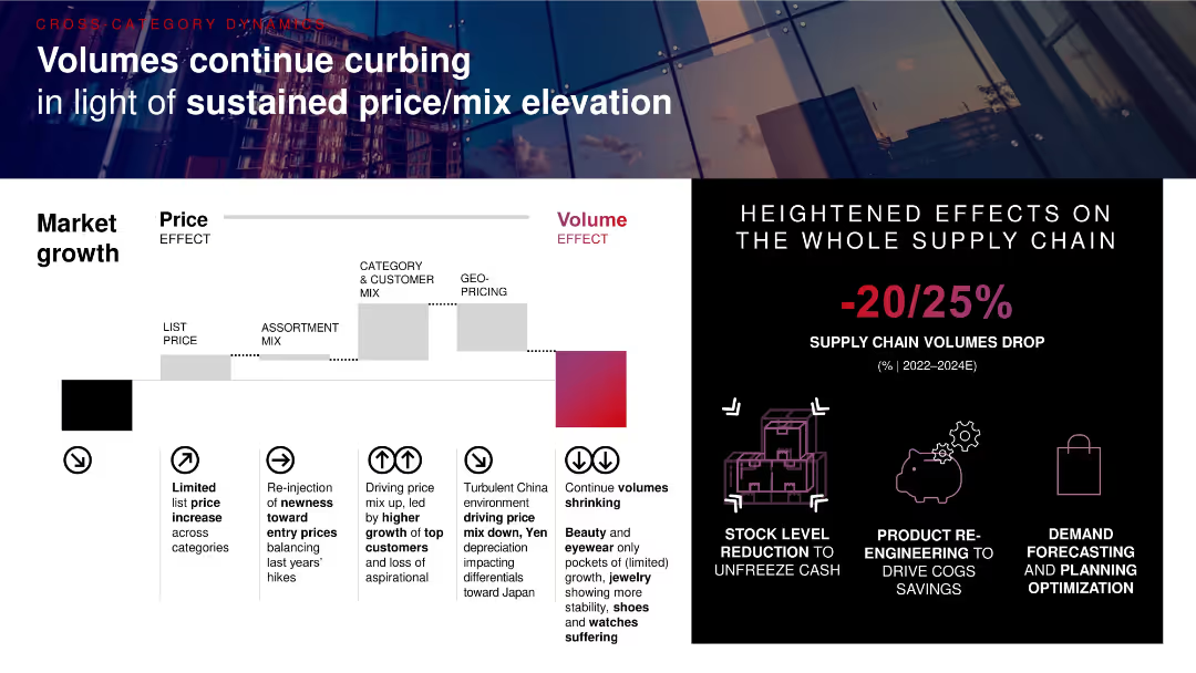
Waterfall chart illustrating price vs. volume effects on growth; callout boxes summarize drivers and impacts; right panel shows supply chain effects and visual icons.
Strategic Planning
Consumer Goods
Volume contraction is impacting luxury markets despite sustained price/mix elevation. Factors include limited price hikes, shifts in assortment and geographic pricing, and supply chain adjustments, with volume drops projected at 20–25% through 2024.
volume drop, pricing strategy, mix effect, supply chain, market growth, COGS savings
Mixed Chart
Bain
Saved
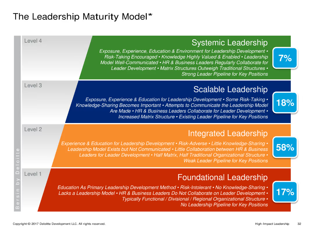
A hierarchical diagram with four levels of leadership maturity: Foundational, Integrated, Scalable, and Systemic Leadership. Each level is described with key characteristics and a percentage indicating prevalence.
Market Analysis and Trends
Professional Services
The slide explains the different levels of leadership maturity, from basic foundational leadership to advanced systemic leadership. It describes the characteristics and prevalence of each level within organizations.
Leadership Maturity, Hierarchical, Foundational, Integrated, Scalable, Systemic
Framework
Deloitte
Saved
Two donut charts side by side comparing the share of FDI in Central America from the USA between 2021 and 2022. Each segment is color-coded.
Investment Analysis
Financial Services
The slide compares the share of Foreign Direct Investment in Central America from the USA for the years 2021 and 2022, highlighting the changes in investment distribution by country.
FDI, Central America, USA, donut chart, comparison
Multiple Chart
Deloitte
Saved
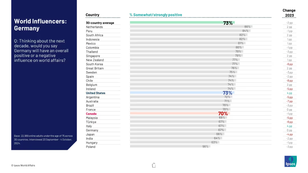
Same format as others in the “World Influencers” series; shows global public views on Germany’s future influence.
Strategic Planning
Government & Public Sector
The slide presents international sentiment about Germany’s role in world affairs over the next decade, with 30 countries ranked by percentage of positive response. Comparative change from 2023 is shown.
Germany, international perception, soft power, global influence, public opinion, Ipsos, strategic role, world affairs
Mixed Chart
IPSOS
Saved
The slide includes multiple bar charts with percentage values representing future-ready organizations excelling in various business areas. These bars are colored differently to represent categories such as operational efficiency, customer experience, and innovation.
Operational Efficiency
Technology & Software
This slide presents statistical data showing improvements in operational efficiency, customer experience, speed of product and service innovation, employee engagement, and business value generated from data over three years. The focus is on illustrating the progress and efficiency of future-ready organizations compared to others.
future-ready, operational efficiency, customer experience, innovation, data-driven, business improvement, comparison, survey data, Accenture Research
Multiple Chart
Accenture
Saved
The slide features column charts with different color-coded bars representing total population, radio listeners, and podcast listeners. The chart measures consumer willingness to shop and make purchases.
Market Analysis and Trends
Media & Entertainment
The slide highlights that audio consumers are more willing to engage in various activities like shopping and travel post-pandemic. It compares the willingness of the total population with radio and podcast listeners.
Audio, consumers, recovery, shopping, travel, pandemic, willingness, market trends, Nielsen
Multiple Chart
Nielsen
Saved
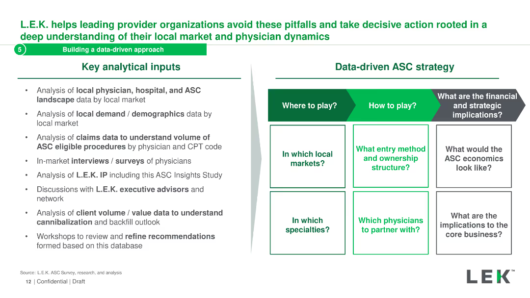
The slide is split into two sections: key analytical inputs and a matrix for a data-driven ASC strategy. It lists various data analysis methods and strategic questions.
Strategic Planning
Healthcare & Pharmaceuticals
It describes the analytical inputs and strategic considerations for building a data-driven ASC strategy, including local market analysis and physician dynamics.
data-driven, ASC, strategy, analysis, inputs
Header Horizontal
LEK
Saved
Includes infographics and bullet points, detailing reasons why immersive-reality technologies are significant for business leaders.
Technology and Digital Transformation
Technology & Software
Argues for the importance of immersive-reality technologies, pointing to trends and forecasts for market growth and innovation.
immersive reality, market trends, innovation, venture capital, training scalability
Header Horizontal
McKinsey
Saved
The slide contains a line chart comparing the volume of wheat exports from Canada, Australia, and Ukraine from 1999 to 2018. It also includes key data points and CAGR.
Market Analysis and Trends
Agriculture & Food Production
The slide illustrates the significant growth in wheat exports from Ukraine compared to Canada and Australia, with data highlighting Ukraine's competitive edge in recent years.
Wheat exports, Canada, Australia, Ukraine, CAGR, market trends, export volume, agriculture, food production, growth rate
Mixed Chart
LEK
Saved
The slide has a central pyramid diagram detailing EY's private equity services, surrounded by text boxes explaining different service categories.
Corporate Finance and Valuation
Professional Services
This slide describes the various services EY offers for private equity clients, organized into fund services, strategy and transaction services, and portfolio services, aimed at enhancing investment value and performance.
Private Equity, EY Services, Fund Services, Strategy, Transaction, Portfolio
Framework
EY
Saved
Previous
Next
If nothing, comes up, please save your slides first
Create a FREE account to continue browsing
Receive Instant Access to 1,000+ slides from companies like McKinsey, Google, and Goldman Sachs
First Name
Last Name
Email
Password
I agree to all
Terms & Privacy Policy
Thank you! Your submission has been received!
Oops! Something went wrong while submitting the form.
Have an account?
Sign in
Column Chart
Heatmap
Chevron
Org Chart
Infographic
Callouts
Timeline
List
Graphic
Picture
Process Flow
Diagram
Paragraph
Map
Table
Framework
Subtitle
Takeaway Box
Icon
Other Chart
Radar Chart
Waterfall Chart
Mekko Chart
Pie Chart
Scatter Plot
Line Chart
Bar chart
Bullet points