My Account
My Slides
Search by Category
Templates
View All Templates
Download Template Slides
Leave Feedback
Login
Logout
Get Started
Browse all Slides
Browse all Slides
Create a FREE Account
Instant access to 1,000+ real slides from top companies like McKinsey, BCG, Goldman Sachs, Google and many more!
First Name
Last Name
Email
Password
I agree to all
Terms & Privacy Policy
Thank you! Your submission has been received!
Oops! Something went wrong while submitting the form.
Have an account?
Sign in
Saved Slides
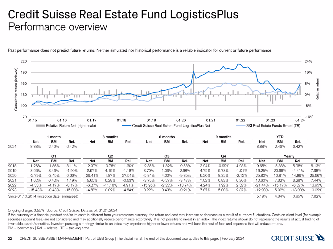
This slide features a line chart and a table summarizing the performance of the Credit Suisse Real Estate Fund LogisticsPlus.
Financial Performance
Financial Services
It reviews the performance of the LogisticsPlus fund, highlighting its returns and comparison with benchmarks and historical trends.
performance, Credit Suisse, Real Estate Fund, LogisticsPlus, benchmarks
Mixed Chart
Credit Suisse
Saved
Dark blue slide with white and blue text boxes stacked vertically, highlighting key agenda items
Strategic Planning
Artificial Intelligence
The agenda outlines the structure of the presentation: understanding Gen AI, examining asset manager practices, exploring use cases across the value chain, and guidance on implementation and scaling.
Gen AI, agenda, value chain, asset managers, implementation, scaling
Agenda
McKinsey
Saved
The slide contains a column chart showing total funds raised over months and a line chart overlay indicating the number of funds raised. The visual is moderately dense, with detailed numerical data that highlights trends and patterns in fundraising activities.
Market Analysis and Trends
Financial Services
This slide provides an overview of monthly fundraising trends in PE/VC, showing the total funds raised and the number of fundraising activities. It helps in analyzing the fundraising landscape and identifying trends, useful for strategic financial planning and analysis.
PE/VC, fundraising, trends, total funds, number of funds
Single Chart
EY
Saved
A mix of text and process diagrams illustrating the Value Engineering Team (VET) concept and its practical applications.
Strategic Planning
Professional Services
Describes the VET concept, detailing structured processes for implementing value engineering decisions efficiently.
Value Engineering Team, VET, strategic planning, process, implementation, efficiency, procurement, structured sessions, concept
Linear Flow
Kearney
Saved
Details tax service offerings along the M&A lifecycle with a structured flowchart that links stages from Funds formation to Exit planning.
Investment Analysis
Professional Services
Explores the comprehensive tax services provided by Alvarez & Marsal throughout the M&A lifecycle, ensuring tax efficiency from start to finish.
Tax, M&A, Lifecycle, Services, Planning
Table
Alvarez & Marsal
Saved
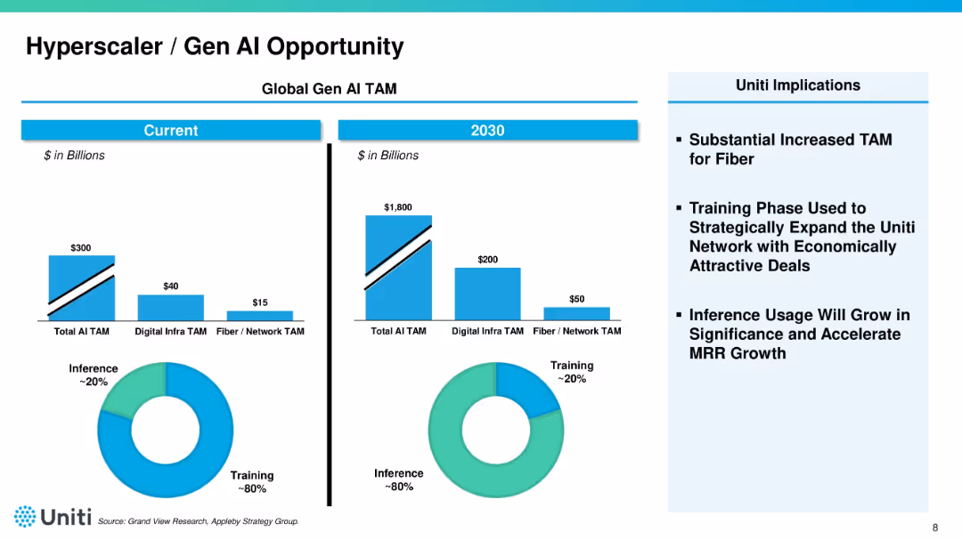
Split-panel layout showing "Current" vs. "2030" projections for AI TAM with bar charts and pie charts. Right side shows bullet-pointed implications for Uniti. Blue color palette dominates.
Market Analysis and Trends
Telecommunications
Compares current and projected total addressable market (TAM) for AI, digital infrastructure, and fiber. Notes a shift from training to inference usage by 2030. Emphasizes the strategic opportunity for Uniti in the AI infrastructure space.
AI, TAM, hyperscaler, fiber, training, inference, growth opportunity
Multiple Chart
Goldman Sachs
Saved
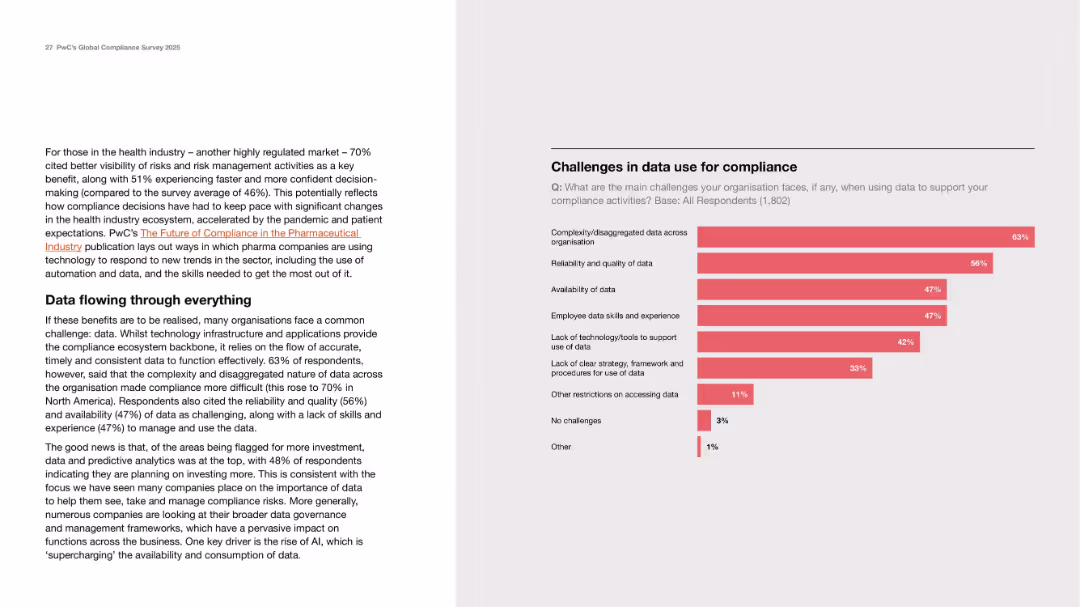
Two-column layout with explanatory text on left and horizontal bar chart on right showing survey data.
Risk Assessment and Management
Healthcare & Pharmaceuticals
The slide highlights the challenges organizations face in using data for compliance, particularly in highly regulated sectors like healthcare. It discusses fragmented data, poor data quality, lack of tools, and skills gaps. A bar chart quantifies the top challenges reported by 1,802 respondents, with data complexity and quality being most cited.
data challenges, compliance, healthcare, risk, skills, infrastructure
Mixed Chart
PwC/Strategy&
Saved
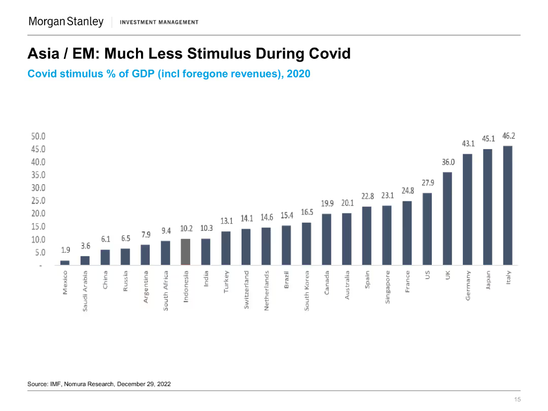
The slide presents a column chart showing the COVID stimulus as a percentage of GDP for various countries in 2020. Each column represents a different country with varying stimulus percentages.
Market Analysis and Trends
Financial Services
The slide compares the level of fiscal stimulus provided by different countries during the COVID-19 pandemic, highlighting the relatively lower stimulus in Asian and emerging markets.
COVID Stimulus, GDP, Fiscal Policy, Market Analysis, Economic Impact, Government Response, Comparative Analysis, Financial Services
Single Chart
Morgan Stanley
Saved
Text-dominant slide with a professional layout, utilizing bold headers and bullet points to delineate sections and present complex information in a digestible format.
Technology and Digital Transformation
Energy & Utilities
The slide discusses the uncertainties and potential impacts of the conflict in Ukraine on the global energy transition and decarbonization paths. It outlines various scenarios and raises questions regarding government policies, consumer responses, and the broader implications for GDP and energy supply and demand. This slide aims to provoke thought and discussion on how current geopolitical events may shape the future of energy and environmental policy.
Geopolitical, Energy Transition, Ukraine, Decarbonization
Header Horizontal
McKinsey
Saved
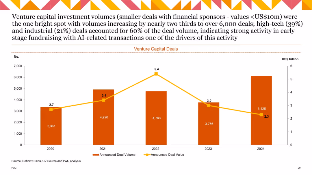
Column and line chart showing VC deal volume and value (2020–2024), labeled bars for volume and yellow trend line for value.
Investment Analysis
Technology & Software
This slide outlines venture capital (VC) deal trends, showing a steady increase in volume with a peak in 2024, while deal values peaked in 2022 and declined after. High tech and industrial sectors accounted for most of the activity, with AI-related deals playing a key role in early-stage fundraising momentum.
Venture capital, deal volume, deal value, AI, early-stage, high tech, fundraising
Single Chart
PwC/Strategy&
Saved
Comprises a descriptive text and a series of bar charts illustrating adherence levels to public health guidelines, segmented by millennials and Gen Z.
Client Case Studies
Healthcare & Pharmaceuticals
Reviews the adherence of millennials and Gen Z to COVID-19 health guidelines, providing statistical insights and societal behaviors.
COVID-19, Millennials, Gen Z, Health Guidelines, Social Research
Mixed Chart
Deloitte
Saved
Includes column charts and icons related to security. The design is compact with a significant amount of data points and narrative information organized for clear readability.
Risk Assessment and Management
Technology & Software
Focuses on cybersecurity initiatives, including data on alert processing and expenditure. It discusses efforts to improve security infrastructure and partnerships with public entities.
cybersecurity, expenditure, compliance, security alerts, authentication, regulatory, infrastructure, partnership, NIST, resilience
Multiple Chart
JP Morgan
Saved
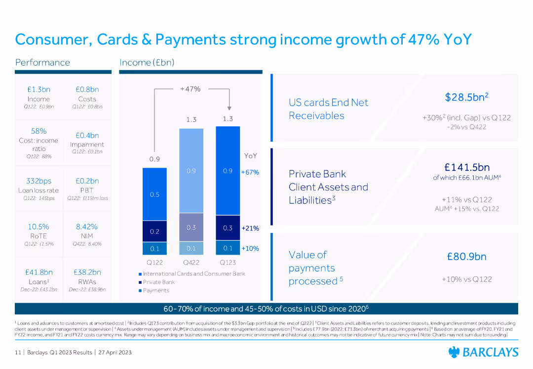
Column chart showing income and costs, with percentage growth YoY, and additional metrics on US cards, private bank client assets, and value of payments processed.
Financial Performance
Financial Services
The slide highlights the significant income growth in Consumer, Cards & Payments, with detailed figures on US cards and other financial metrics, demonstrating strong performance.
income growth, Consumer Cards, Payments, US cards, private bank, financial performance
Mixed Chart
Barclays
Saved
The slide displays a balance of text and graphical elements, highlighting targeted investments and outcomes in sectors and regions.
Strategic Planning
Financial Services
Focuses on strategic investment planning and the outcomes in various sectors and regions, reflecting market share gains.
Investments, Market Share, Sectors, Regions, Strategic Planning, Outcomes, Text, Graphics
Linear Flow
JP Morgan
Saved
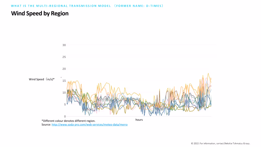
Contains a line chart with multiple colored lines representing wind speed variations across different regions over time. The chart is labeled with wind speed on the Y-axis and hours on the X-axis, with a note indicating the source of data.
Market Analysis and Trends
Environmental Services & Sustainability
Illustrates wind speed variations by region, using a line chart to track changes over time. This data visualization helps in analyzing regional wind patterns, essential for renewable energy planning and assessing the viability of wind power projects.
Wind Speed, Region, Data, Renewable, Analysis
Single Chart
Deloitte
Saved
Text-heavy left panel with bullet points discussing therapeutic use, and right panel with bar chart showing pipeline stages for different therapeutic categories.
Technology and Digital Transformation
Healthcare & Pharmaceuticals
The slide suggests therapeutics as an alternative or supplement to herd immunity through vaccines. It discusses examples of pre/post-exposure treatments and shows a pipeline of over 400 therapeutic candidates in various development stages. These treatments could help return to normal even without reaching herd immunity.
therapeutics, COVID-19, drug pipeline, herd immunity, treatment options
Mixed Chart
McKinsey
Saved
Bar chart showing the changes in the number of jobs due to one additional robot in the manufacturing sector, by income level of country.
Market Analysis and Trends
Technology & Software
The slide examines the impact of automation and robotics on employment, focusing on the manufacturing sector. It shows how each additional robot affects job numbers in high-income, average, and low-income countries, highlighting the greater substitutive effect in low-income countries.
Automation, Robotics, Manufacturing, Job Loss
Mixed Chart
Roland Berger
Saved
Features a combination of bar graphs and textual analysis, using color coding to differentiate data points across multiple sectors.
Strategic Planning
Environmental Services & Sustainability
Reviews strategic decarbonization levers across Southeast Asia, highlighting key sectors and the potential for carbon abatement.
decarbonization, SEA, carbon abatement, strategy, sectors
Mixed Chart
Bain
Saved
This slide contains multiple elements: column charts for GDP share per industry, a table for total NY private sector GDP and incremental UI claims. Each industry's impact on GDP and UI claims is detailed.
Market Analysis and Trends
Financial Services
The slide gives a detailed breakdown of New York's private sector GDP by industry in 2019, correlating it with unemployment insurance claims during the pandemic to show economic impact across sectors.
GDP, unemployment, NY private sector, industries, bar chart, pie chart, pandemic impact
Single Chart
BCG
Saved
The slide shows a table listing various sectors (e.g., agriculture, industry) and their respective gross estimates of greenhouse gas emissions with potential CCUS applications. Different stages of technology maturity are also indicated.
Technology and Digital Transformation
Energy & Utilities
This slide outlines how CCUS technology can significantly reduce CO2 emissions in key sectors responsible for large amounts of greenhouse gases, highlighting its critical role in achieving emission targets.
CCUS, decarbonization, sectors, CO2 emissions, technology maturity
Single Chart
Kearney
Saved
This slide features a title at the top, a multi-bullet point section on the left outlining key assumptions, and a line graph depicting unemployment rate scenarios. On the right is a data table with net credit loss projections.
Risk Assessment and Management
Financial Services
Discussing the impact of various unemployment rates on credit card loss scenarios, the slide provides an analysis for planning under different economic conditions.
stress scenario, credit card, unemployment rate, loss projections, economic conditions, baseline, moderate recession
Mixed Chart
JP Morgan
Saved
Bar chart comparing pre-approved mortgage rates among those pre-approved, with different colors representing data from Fall 2018, Fall 2019, and Fall 2020.
Market Analysis and Trends
Real Estate & Construction
The slide presents a comparison of pre-approved mortgage rates over three years, showing shifts in mortgage rate preferences.
mortgage rates, pre-approved, comparison, Fall 2018-2020, trends
Single Chart
IPSOS
Saved
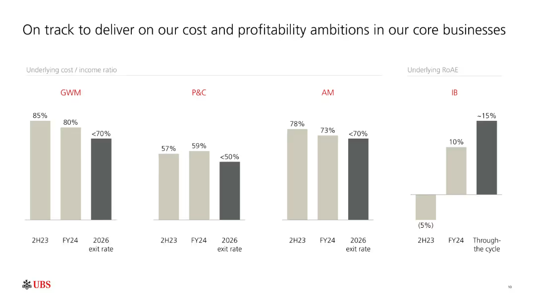
Multiple grouped bar charts comparing cost/income ratios and RoAE across business units (GWM, P&C, AM, IB). Color-coded by year and projection.
Performance Metrics and KPIs
Financial Services
Provides an overview of UBS’s progress in lowering cost/income ratios and improving RoAE across core business units. Forecasts continued improvement by 2026, aiming for sustainable profitability.
UBS, cost-income ratio, RoAE, profitability, core business, GWM, P&C, AM, IB, projections
Single Chart
UBS
Saved
Column chart showing negative to positive impacts of EU politics on US investments in France, accompanied by authoritative quotes.
Strategic Planning
Government & Public Sector
Discusses the investment climate in France influenced by European political uncertainties and the strategies suggested by experts.
EU politics, US investments, France, political uncertainties, Merkel, Italian budget
Mixed Chart
Bain
Saved
Two line charts show the growth in loan balances and the net change in credit standards for small and medium-sized banks versus large banks from 2019 to Q4 2022. Accompanying text outlines implications for corporate strategies regarding financing and market conditions.
Market Analysis and Trends
Financial Services
This slide analyzes the impact of market and regulatory pressures on smaller US banks and the resultant credit contraction. It highlights implications for corporates, including increased costs for borrowing, stricter lending standards, and potential economic impacts.
Credit growth, lending standards, small banks, large banks, market pressure, regulatory impact, financing, corporate implications, economic impact
Multiple Chart
Accenture
Saved
Previous
Next
If nothing, comes up, please save your slides first
Create a FREE account to continue browsing
Receive Instant Access to 1,000+ slides from companies like McKinsey, Google, and Goldman Sachs
First Name
Last Name
Email
Password
I agree to all
Terms & Privacy Policy
Thank you! Your submission has been received!
Oops! Something went wrong while submitting the form.
Have an account?
Sign in
Column Chart
Heatmap
Chevron
Org Chart
Infographic
Callouts
Timeline
List
Graphic
Picture
Process Flow
Diagram
Paragraph
Map
Table
Framework
Subtitle
Takeaway Box
Icon
Other Chart
Radar Chart
Waterfall Chart
Mekko Chart
Pie Chart
Scatter Plot
Line Chart
Bar chart
Bullet points