Create a FREE Account
Instant access to 1,000+ real slides from top companies like McKinsey, BCG, Goldman Sachs, Google and many more!
First Name
Last Name
Email
Password
I agree to all
Terms & Privacy Policy
Thank you! Your submission has been received!
Oops! Something went wrong while submitting the form.
Have an account?
Sign in
Library
Templates
Courses
Pricing
My Account
My Slides
My Templates
✦ AI
AI Prompt Library
AI Search
Sign in
Start Here
Logout
My Saved Slides
This slide displays a column chart and a line graph. The column chart shows half-yearly rent reversion percentages, and the line graph tracks portfolio occupancy rates over time. The colors in the bar graph correlate with the periods shown on the x-axis. The line graph is superimposed to demonstrate the relationship between occupancy and rent reversion. There's also a note clarifying the occupancy calculation.
Financial Performance
Real Estate & Construction
Examines the portfolio's performance in terms of occupancy rates and rent reversion, suggesting high levels of retention and positive financial trends.
Portfolio Occupancy, Rent Reversion, Asset Management, Performance Analysis, Tenant Retention, Financial Indicators
Single Chart
Morgan Stanley
Saved
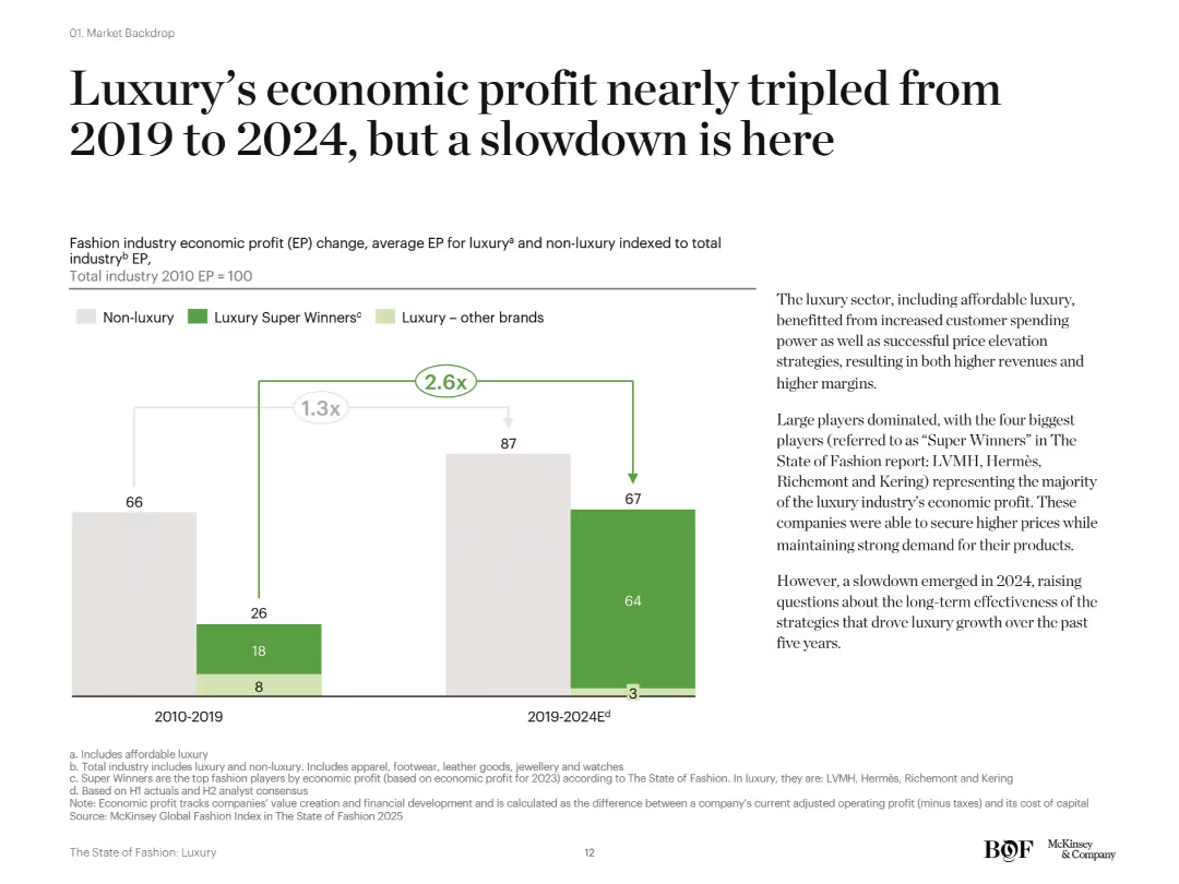
Vertical stacked bar chart comparing luxury and non-luxury EP across two periods. Right side has descriptive text with large headline and explanation of industry concentration and future risks.
Financial Performance
Consumer Goods
The fashion industry’s economic profit, especially from top luxury brands ("Super Winners"), significantly increased between 2019 and 2024, nearly tripling compared to 2010–2019. The growth was driven by pricing power and brand dominance, but signs of a 2024 slowdown have emerged.
luxury profit, economic profit, super winners, LVMH, fashion industry, slowdown, McKinsey
Mixed Chart
McKinsey
Saved
Three column charts, showing projected use of coal, oil, and gas from 2015 to 2050 under different climate policy scenarios.
Market Analysis and Trends
Energy & Utilities
Analysis of future fossil fuel usage under various global warming scenarios, highlighting potential declines or growth in coal, oil, and gas usage depending on environmental policies.
fossil fuels, coal, oil, gas, climate policies
Multiple Chart
BCG
Saved
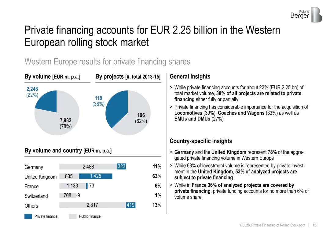
Pie charts, bar chart, and annotated insights by country
Investment Analysis
Transportation & Logistics
Highlights Western Europe’s private rail financing landscape, with country-specific breakdowns showing the UK and Germany as leading contributors.
private investment, Western Europe, rolling stock, country insights, rail market
Multiple Chart
Roland Berger
Saved
The slide has a balanced comparative layout with a mix of column charts and text explanations, contrasting past and current performance metrics for home lending.
Performance Metrics and KPIs
Financial Services
Highlights the high-quality customer focus of JPMorgan Chase's Home Lending business, detailing improvements in experience, productivity, and financial health.
Home lending, customer experience, productivity, financial health, JPMorgan Chase
Multiple Chart
JP Morgan
Saved
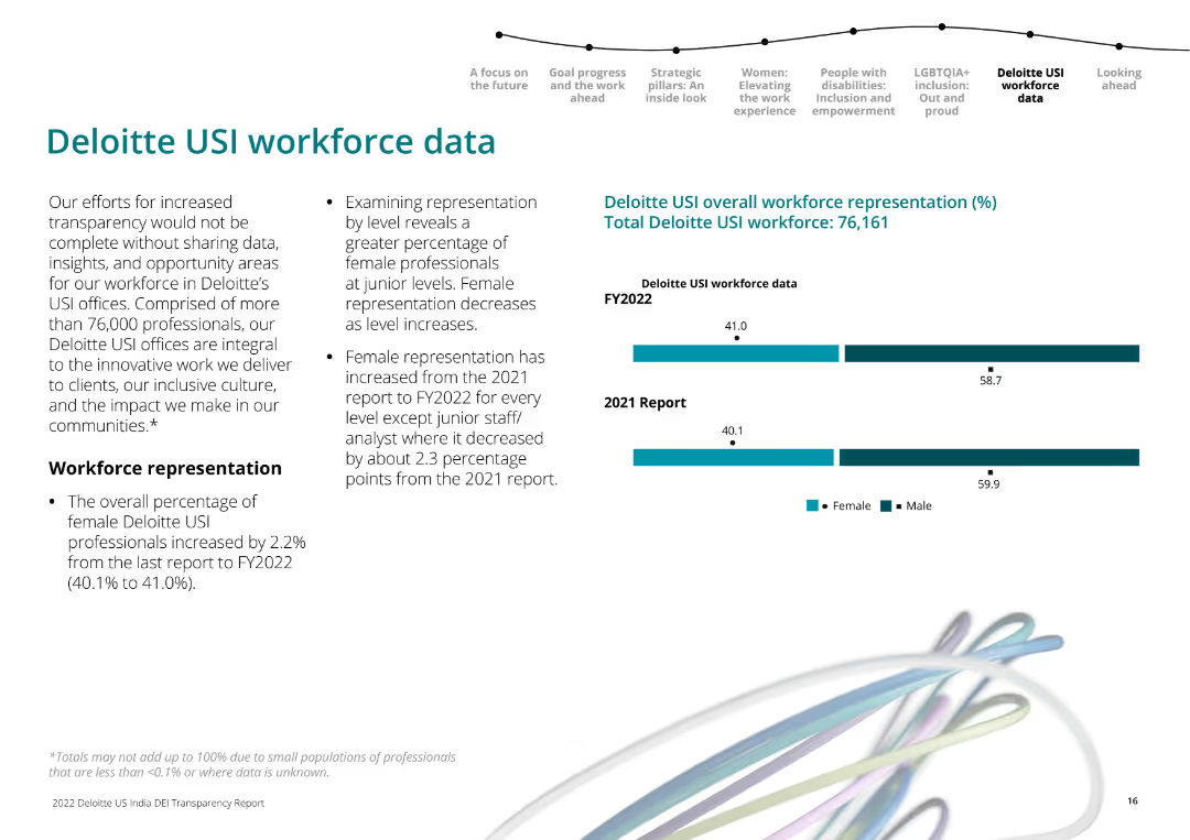
The slide includes textual information on the left about Deloitte USI workforce representation. On the right, there are horizontal bar charts comparing female and male workforce representation in 2021 and 2022.
Human Resources and Talent Management
Professional Services
Presents Deloitte USI’s workforce representation data, emphasizing the increase in female representation across most levels from 2021 to 2022.
workforce data, gender representation, Deloitte USI, 2022, 2021
Mixed Chart
Deloitte
Saved
This slide has multiple column charts displaying revenue, income, and assets, with key financial metrics highlighted on the right.
Financial Performance
Financial Services
Demonstrates consistent growth in Asset Wealth Management, represented by yearly performance data and growth trends in bar graphs, intending to convey JPMorgan's financial stability and success over a decade.
AWM, financial performance, growth, JPMorgan, bar graphs
Multiple Chart
JP Morgan
Saved
Column chart showing other actions taken to manage lower income during the COVID-19 pandemic, comparing May 2020 and December 2020 data.
Financial Performance
Financial Services
Discusses additional measures households took to cope with lower income during the pandemic, such as food banks and grants.
lower income, financial management, food banks, COVID-19, household actions
Single Chart
IPSOS
Saved
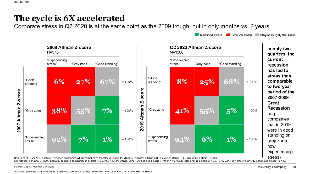
Dual heatmap chart comparing Altman Z-scores from 2009 vs. 2020 with labeled stress categories
Risk Assessment and Management
Financial Services
This slide shows how rapidly corporate financial stress increased during the COVID-19 recession compared to the 2008 crisis. It uses Altman Z-scores to classify companies' financial health, revealing a sharp acceleration in stress levels across firms.
Altman Z-score, financial stress, recession, corporate risk, COVID-19
Multiple Chart
McKinsey
Saved
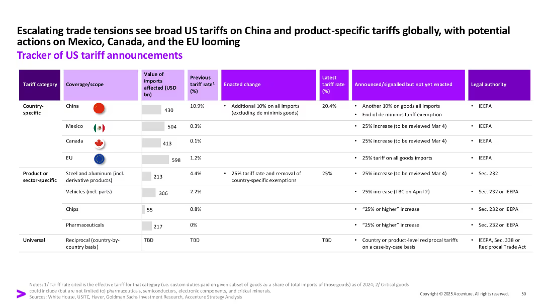
Tabular layout with icons and color-coded cells, detailing tariff categories, coverage, rates, changes, and legal authorities across countries and sectors.
Regulatory and Compliance
Government & Public Sector
This slide provides a structured tracker of US tariff policies across countries and sectors, including changes in tariff rates, enactment timelines, and legal authorities. It emphasizes the broadening scope of US trade measures in 2024–2025.
tariffs, US trade, China, Mexico, EU, regulations, compliance, imports
Single Chart
Accenture
Saved
Time-series graph showing the growth trajectory of the personal luxury goods market from 1996 to 2020 with annotations for significant events.
Market Analysis and Trends
Consumer Goods
Tracks the growth trends in the luxury goods market, highlighting disruptions and recoveries over 24 years.
luxury goods, market trends, economic impact, Covid-19, market recovery
Single Chart
Bain
Saved
The slide features two column charts. The upper chart shows total PE/VC investments in agriculture from 2018 to Jan-23. The lower chart details deal types by the number of deals and investment values in US$m. The charts use blue and orange to differentiate data points.
Market Analysis and Trends
Agriculture & Food Production
This slide focuses on PE/VC investment trends in the agriculture sector from 2018 to January 2023. It provides an overview of total investment values and the number of deals over the years, along with a detailed breakdown of deal types and their respective values.
PE/VC, investment trends, agriculture, deal types, financial data, investment values, number of deals, market trends, sector analysis, financial services
Multiple Chart
EY
Saved
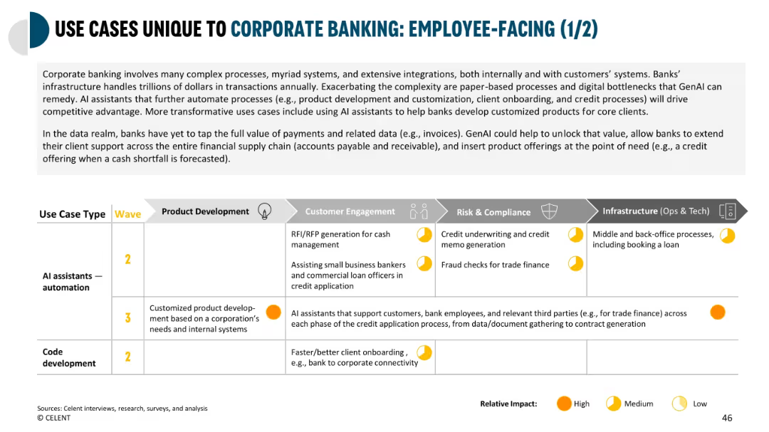
Large grid format categorizing corporate use cases by department, wave, and impact level.
Product and Service Analysis
Financial Services
Explores how GenAI can be used in corporate banking for product development, onboarding, and credit underwriting. Emphasizes the value in automating RFP responses and customizing offerings based on business needs.
corporate banking, GenAI, product development, onboarding, underwriting, credit processing
Mixed Chart
Oliver Wyman
Saved
This slide includes two line graphs tracking investor focus over time.
Investment Analysis
Financial Services
Depicts how investor priorities between long-term and short-term results fluctuated from 2020 to 2023, reflecting a shift towards long-term investments during COVID-19.
investors, long-term, short-term, focus, trends
Mixed Chart
BCG
Saved
Contains a column chart showing the growth trajectory of the personal luxury goods market from 1996 to 2018 with significant historical events noted.
Market Analysis and Trends
Consumer Goods
Discusses the growth trends and economic impacts on the personal luxury goods market, providing a historical perspective. Useful for understanding market evolution and planning.
luxury goods, market growth, historical perspective, economic impact, market evolution
Single Chart
Bain
Saved
The slide features a mix of text on the left and a column chart on the right. The column chart illustrates different sectors and their plans to partner with creators.
Strategic Planning
Professional Services
The slide discusses the trend of creative collaboration beyond the traditional organization structure, highlighting sectors that are planning to partner more with creators, with a supporting column chart showing sector-wise data.
Collaboration, CMOs, sectors, creative partnerships, trend
Mixed Chart
Deloitte
Saved
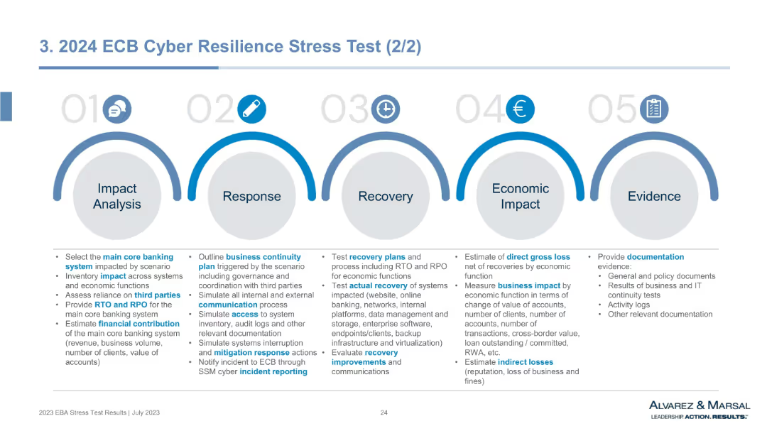
Horizontal infographic with 5 blue arc-shaped sections labeled 01–05 for stages from Impact Analysis to Evidence. Each section contains bullet-point lists.
Risk Assessment and Management
Financial Services
This slide outlines the framework for the ECB's cyber resilience stress test. It maps the response process across five steps—from identifying core banking system impacts to evaluating economic damage and providing audit evidence. The format emphasizes operational preparedness, continuity, recovery, and communication under cyberattack scenarios.
cyber resilience, ECB stress test, business continuity, recovery planning, impact analysis, cyber risk, documentation, RTO, RPO
Pillar
Alvarez & Marsal
Saved
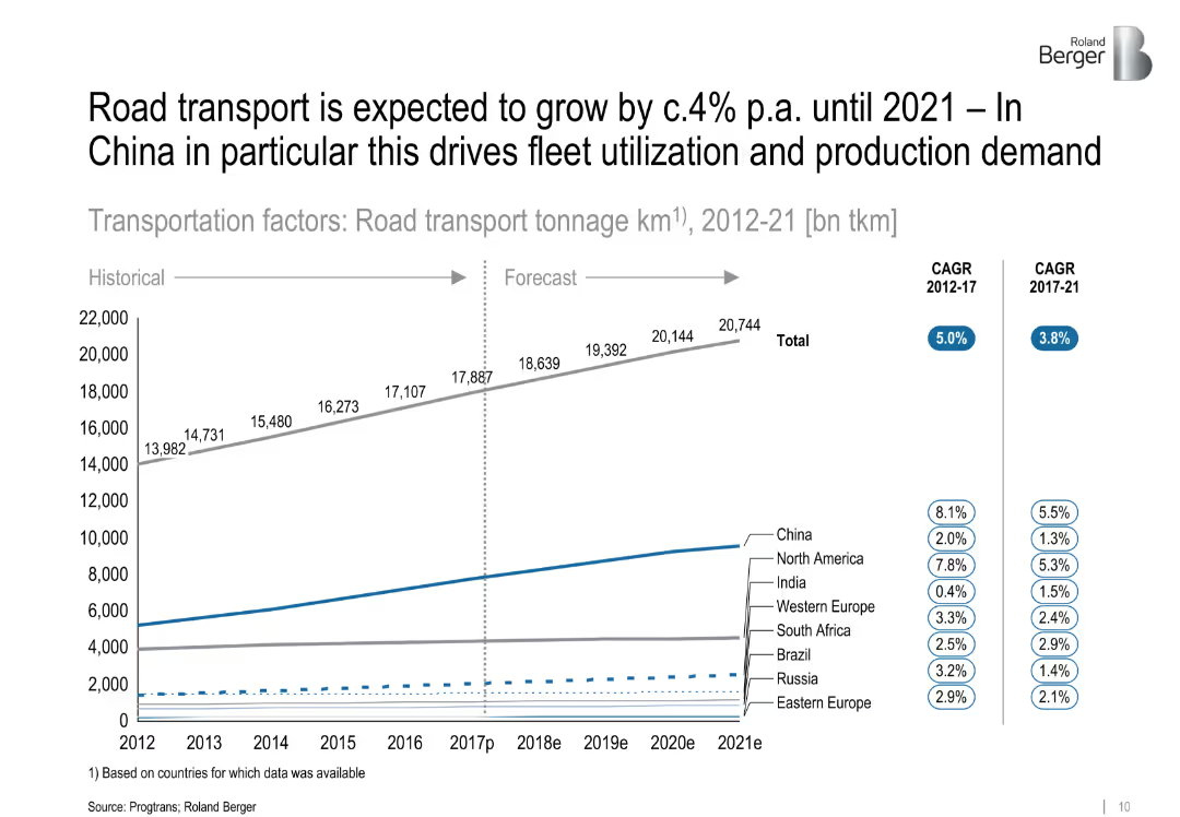
Line graph depicting road transport tonnage from 2012 to 2021 by region, with CAGR stats on the side. Clear separation between historical and forecast data.
Market Analysis and Trends
Transportation & Logistics
This slide analyzes road transport volume (in billion ton-km), indicating a steady global increase with China leading in growth. It links increased road transport to greater demand for fleets and vehicle production.
['road transport', 'fleet utilization', 'China', 'market growth', 'CAGR', 'logistics', 'forecast', 'tonnage']
Single Chart
Roland Berger
Saved
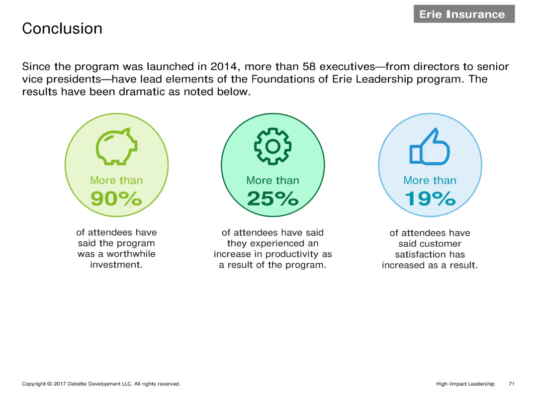
Three infographic elements highlighting key statistics: More than 90% found the program worthwhile, More than 25% saw productivity increase, More than 19% saw customer satisfaction improvement.
Client Case Studies
Financial Services
Summarizes the impact of the Erie Leadership program with key statistics showing high satisfaction rates, increased productivity, and improved customer satisfaction among participants.
Conclusion, statistics, leadership program, satisfaction, productivity
Pillar
Deloitte
Saved
This slide presents a table in varying shades of blue, each representing different industries and showing the impact of 'timely offers' and 'knowledgeable customer service' on purchase decisions, based on a consumer survey.
Operational Efficiency
Professional Services
Highlights the effectiveness of AI-enhanced customer service strategies across various industries, from automotive to banking. The data suggests that knowledgeable customer service and timely offers are pivotal in influencing purchase decisions.
customer service, AI, retail, automotive, banking, purchase decisions
Table
Deloitte
Saved
This slide presents column charts comparing time allocation in finance tasks with desired changes due to digital transformation.
Technology and Digital Transformation
Financial Services
Discusses the gap between current and desired states in finance due to digital transformation challenges, emphasizing the need for improvement in support and efficiency.
digital transformation, finance challenges, time allocation, efficiency improvement, support needs
Multiple Chart
Deloitte
Saved
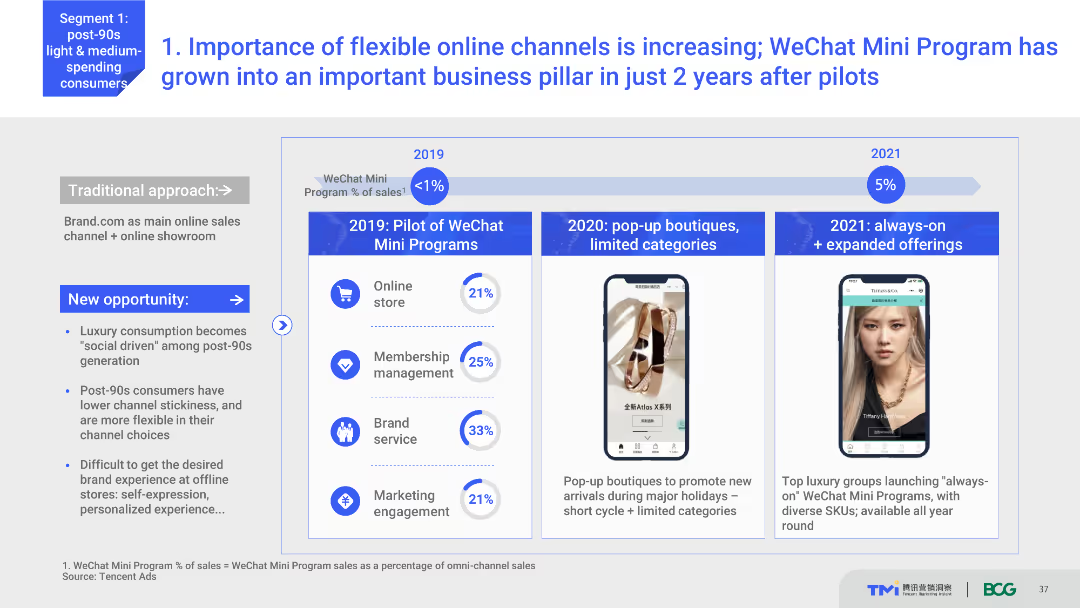
Timeline chart showing the growth of WeChat Mini Programs from 2019 to 2021. Includes key milestones like the introduction of pop-up boutiques and expanded offerings. Text explains the significance of these developments.
Technology and Digital Transformation
Retail & E-commerce
Discusses the growing importance of flexible online channels like WeChat Mini Programs for luxury brands. Shows the timeline of their implementation and growth, highlighting key milestones and their impact on business.
WeChat Mini Programs, online channels, luxury brands, digital transformation, business growth
Mixed Chart
BCG
Saved
The slide includes column charts showing the types of medical supplies hospitals are standardizing, segmented by overall, private, and public hospitals.
Operational Efficiency
Healthcare & Pharmaceuticals
The slide highlights the trends in standardizing medical supplies, focusing on diagnostic imaging equipment, surgical instruments, and medical consumables, comparing overall trends with private and public hospitals.
Standardization, medical supplies, hospitals, imaging, trends
Multiple Chart
LEK
Saved
Diagram with strategic business units around a central circle named 'Goldman Sachs' with dashed lines pointing to partner logos.
Investment Analysis
Technology & Software
Explores Goldman Sachs' business segments and strategic partnerships with tech companies like GitLab and Pensando.
innovation, Goldman Sachs, partnerships, business segments, tech companies, GitLab, Pensando
Framework
Goldman Sachs
Saved
The slide includes a pie chart and text highlighting the significance of short and medium-length videos in digital consumption habits.
Customer and Market Segmentation
Retail & E-commerce
Explains the integral role of short and medium videos in digital consumption, providing statistics on the average number of videos viewed each day by consumers, underscoring the importance for marketing strategies.
Digital consumption, videos, consumer habits, Southeast Asia, statistics
Single Chart
Bain
Saved
Previous
Next
If nothing, comes up, please save your slides first
Create a FREE account to continue browsing
Receive Instant Access to 1,000+ slides from companies like McKinsey, Google, and Goldman Sachs
First Name
Last Name
Email
Password
I agree to all
Terms & Privacy Policy
Thank you! Your submission has been received!
Oops! Something went wrong while submitting the form.
Have an account?
Sign in
Column Chart
Heatmap
Chevron
Org Chart
Infographic
Callouts
Timeline
List
Graphic
Picture
Process Flow
Diagram
Paragraph
Map
Table
Framework
Subtitle
Takeaway Box
Icon
Other Chart
Radar Chart
Waterfall Chart
Mekko Chart
Pie Chart
Scatter Plot
Line Chart
Bar chart
Bullet points