Create a FREE Account
Instant access to 1,000+ real slides from top companies like McKinsey, BCG, Goldman Sachs, Google and many more!
First Name
Last Name
Email
Password
I agree to all
Terms & Privacy Policy
Thank you! Your submission has been received!
Oops! Something went wrong while submitting the form.
Have an account?
Sign in
Library
Templates
Courses
Pricing
My Account
My Slides
My Templates
✦ AI
AI Prompt Library
AI Search
Sign in
Start Here
Logout
My Saved Slides
Bar charts showing the key decision-makers in data analytics tools procurement and the top attributes considered in purchasing these tools.
Strategic Planning
Technology & Software
The slide identifies the primary decision-makers for data analytics tools procurement and the critical attributes considered during the purchase process, with a focus on interface-friendliness and compatibility. Useful for understanding procurement dynamics and criteria.
data analytics, procurement, decision-makers, attributes
Multiple Chart
Deloitte
Saved
Featuring a mixture of column charts and stacked bar graphs, this slide presents AWM client assets, NAV, and net returns for various alternative investment options over several years. The data is segmented by asset type and performance against benchmarks.
Investment Analysis
Financial Services
This slide reviews the growth and scaling of alternative investments, presenting data on net asset value and returns compared to benchmarks. Useful for investor meetings or strategic reviews focusing on diversification and alternative investment strategies.
alternatives, investment, growth, benchmarks, net asset value
Multiple Chart
JP Morgan
Saved
Includes pie charts and a stacked bar chart, presenting survey data about C-level executives. Visual elements are clearly structured with labels and percentages.
Market Analysis and Trends
Professional Services
Describes the methodology of a survey conducted among C-level executives from various industries, focusing on the number of employees, revenue, and job titles within surveyed companies.
survey methodology, C-level executives, industry distribution, company size, revenue analysis
Multiple Chart
Deloitte
Saved
Circular flow diagram centralizing the key criteria for blockchain application, such as distributed ledger and economic benefits, each represented with an icon and brief description, set against a clean background.
Strategic Planning
Technology & Software
Discusses the critical considerations for applying blockchain technology, focusing on aspects like economic benefits and trust absence. Useful for strategic discussions on where blockchain can be effectively implemented.
blockchain, criteria, application, distributed ledger, trust
Linear Flow
McKinsey
Saved
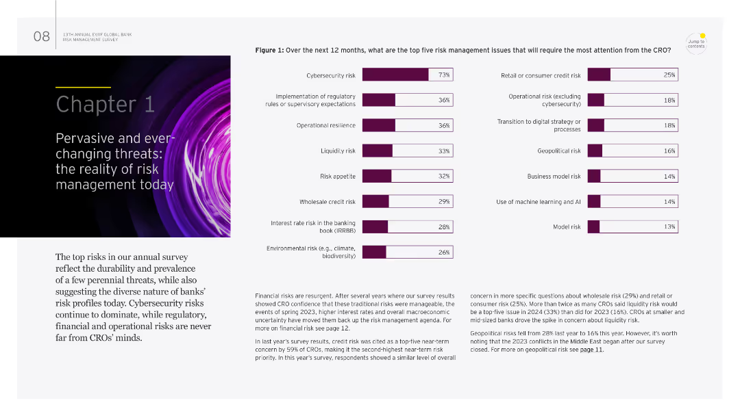
The slide features a mix of text and a column chart. It highlights the top risk management issues for the next 12 months, such as cybersecurity risk and regulatory expectations.
Risk Assessment and Management
Financial Services
It provides an overview of the most pressing risk management challenges, including cybersecurity and regulatory changes, emphasizing the dynamic nature of these threats. This slide is useful for risk assessment and management strategies.
risk management, cybersecurity, regulatory expectations, operational resilience, threats
Multiple Chart
EY
Saved
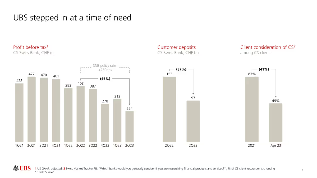
Three-panel layout; bar charts on profit before tax, customer deposits, and client consideration.
Client Case Studies
Financial Services
The slide depicts Credit Suisse's decline in profitability, customer deposits, and client trust leading up to UBS’s intervention. It emphasizes steep declines during 2022–2023 and underscores UBS's role in stabilizing the situation.
UBS, Credit Suisse, customer deposits, client trust, acquisition, Swiss bank, profit before tax
Multiple Chart
UBS
Saved
The slide includes a pie chart showing the distribution of loans and multiple annotations describing different loan types.
Financial Performance
Financial Services
The slide details the loan portfolio composition, highlighting key segments and growth or decline trends since 2014.
loan, portfolio, real estate, secured, credit, risk, financial, performance
Mixed Chart
UBS
Saved
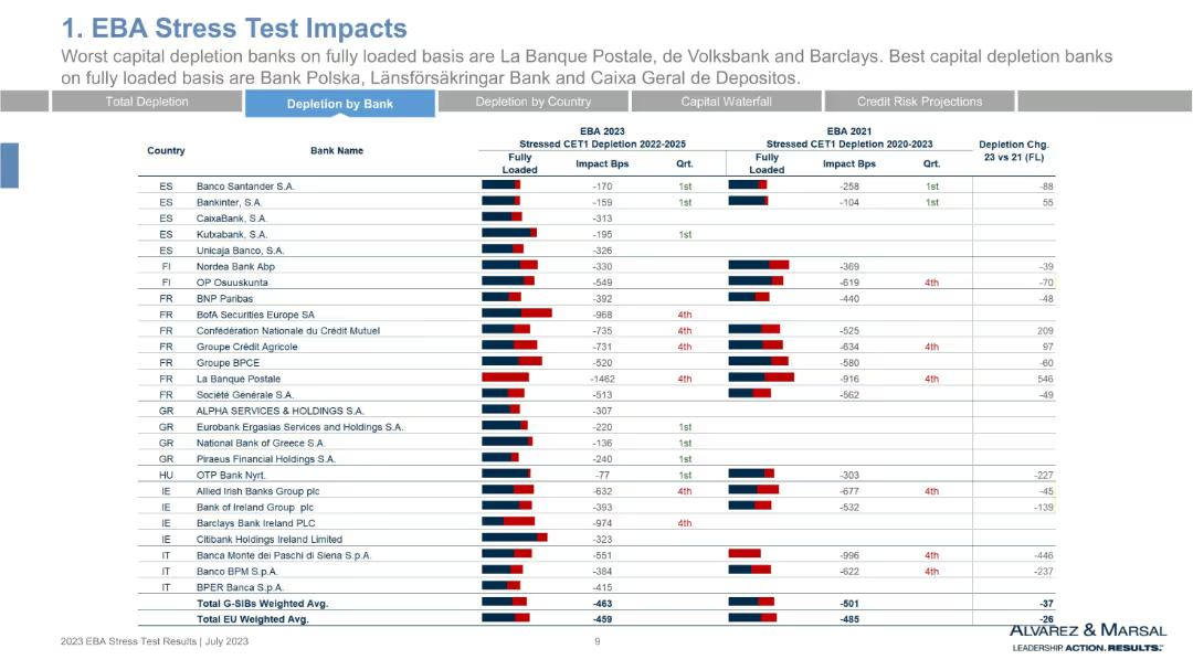
Continuation of previous table, displaying CET1 depletion per bank across additional European countries. Red and blue bar comparisons per bank, numeric basis points data.
Risk Assessment and Management
Financial Services
Continuation of the stress test depletion analysis, expanding bank-level comparisons across Spain, Finland, France, Greece, Ireland, Italy, and more. Emphasizes capital weaknesses and resilience. Includes Banque Postale with extreme CET1 depletion (-1462bps).
CET1, capital impact, France, Greece, La Banque Postale, stress test, resilience
Single Chart
Alvarez & Marsal
Saved
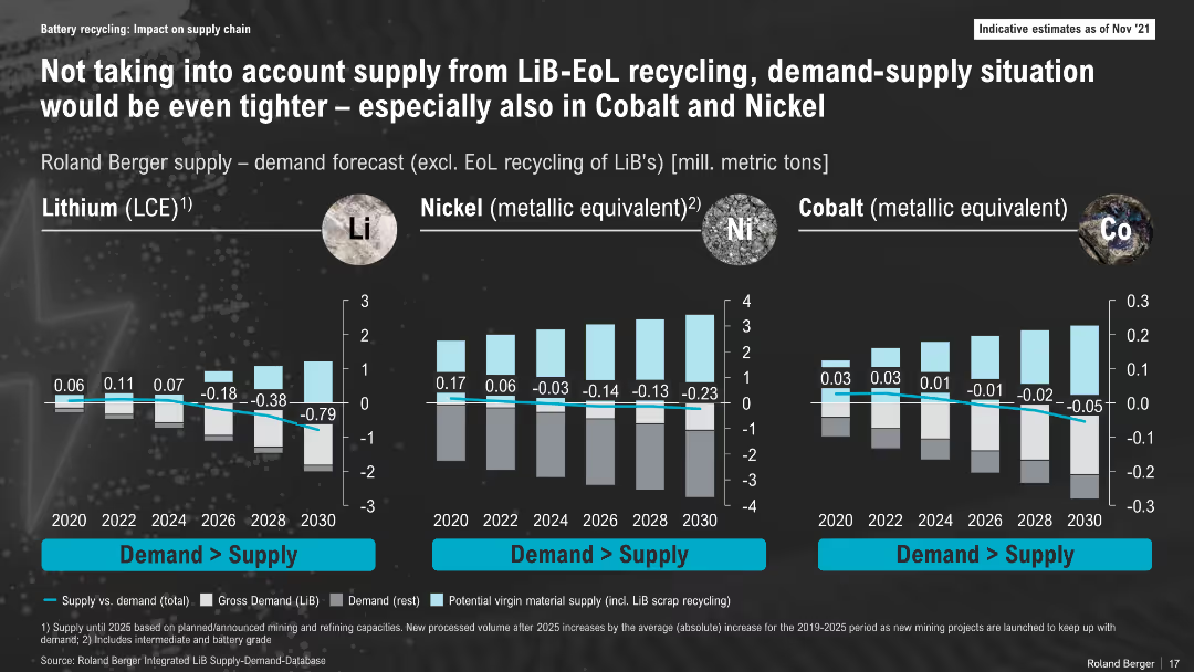
Bar chart layout comparing lithium, nickel, and cobalt supply-demand gaps over time (2020–2030); dark background, labeled vertical axes, colored bars and annotations for deficits
Risk Assessment and Management
Energy & Utilities
This slide illustrates projected shortfalls in lithium, nickel, and cobalt supply versus demand, excluding End-of-Life (EoL) recycling. It highlights a worsening deficit, particularly for lithium, emphasizing the importance of integrating recycling into future supply models.
Lithium, Nickel, Cobalt, Supply Gap, Forecast, Battery Materials, 2030, Mining, Recycling, Shortfall
Multiple Chart
Roland Berger
Saved
Utilizes a stacked area chart to depict the distribution of new COVID-19 cases across US regions from April to July 2020, colored by region.
Market Analysis and Trends
Healthcare & Pharmaceuticals
Presents the regional distribution of new COVID-19 cases in the US, showing how the case load has shifted from the Northeast to the Southern and Western states, providing insights into the dynamics of the pandemic’s domestic spread.
COVID-19, US, cases, regional, 2020
Single Chart
McKinsey
Saved
White background with a single purple column chart on talent confidence in NYC
Human Resources and Talent Management
Technology & Software
It shows the confidence levels of companies in securing tech skills from New York City's talent pool
Talent, NYC, Confidence, Tech Skills, Workforce
Multiple Chart
Accenture
Saved
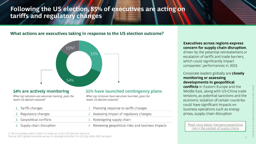
Donut chart shows 54% monitoring and 31% launching contingency plans. Supporting list of tracked and planned actions. Right text panel outlines concerns about supply chain and geopolitical instability.
Risk Assessment and Management
Professional Services
Majority of executives are reacting to the US election by monitoring and planning responses to tariffs, regulations, and geopolitical conflict. Highlights increased concern over supply chain risks and regional instability.
US election, contingency planning, tariffs, regulatory change, supply chain, monitoring, risk management
Mixed Chart
BCG
Saved
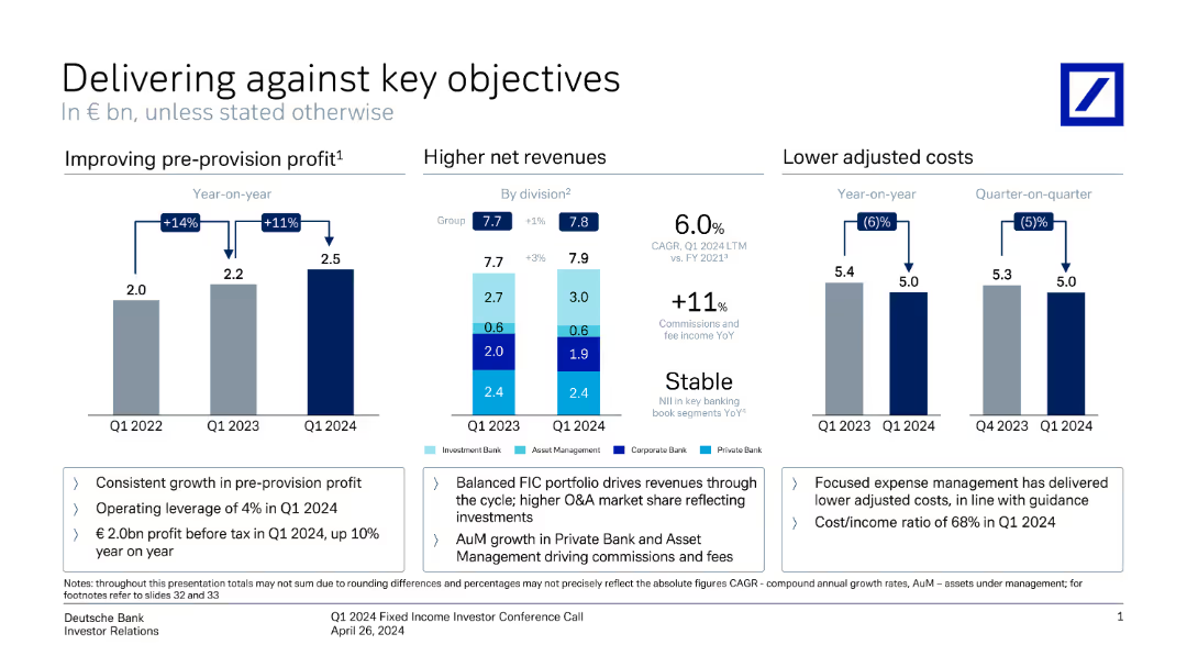
This slide contains three vertical column charts comparing pre-provision profit, net revenues, and adjusted costs over different periods. Annotations provide key metrics.
Financial Performance
Financial Services
It shows Deutsche Bank's performance metrics, highlighting improvements in profit, revenue, and cost management from Q1 2022 to Q1 2024.
profit, revenue, costs, financial performance, metrics, comparison, Deutsche Bank, investor relations, growth, Q1 2024
Multiple Chart
Deutsche Bank
Saved
This slide showcases a list of industries with relevant examples of how they are affected by software development trends. Icons and colored markers are used to denote the level of industry relevance, creating a clear visual hierarchy and focus points. The layout is simple, prioritizing clarity and readability.
Industry Overview
Technology & Software
The slide addresses the broad impact of software development trends across various industries, providing examples and common industry qualities. It emphasizes the transformative role of technology in sectors like financial services, healthcare, and manufacturing, making it relevant for a cross-industry audience.
Industries, Software Development, Impact, Financial Services, Healthcare, Manufacturing
Header Vertical
McKinsey
Saved
The slide shows three different growth trajectory graphs, each with a distinct shape (S-shaped, Trendline, and U-shaped), and is accompanied by descriptive text. The design uses grey tones with blue highlights. It's cleanly structured, presenting the information in an easily digestible format.
Strategic Planning
Technology & Software
This slide illustrates the post-pandemic growth trajectories of SEA's digital sectors, which can inform strategic decisions. It differentiates between sustained growth, a return to trendline, and U-shaped recovery, offering a nuanced view of market dynamics that can guide investment and operational planning.
growth trajectories, digital sectors, SEA, post-pandemic, strategic planning, market dynamics, recovery
Multiple Chart
Bain
Saved
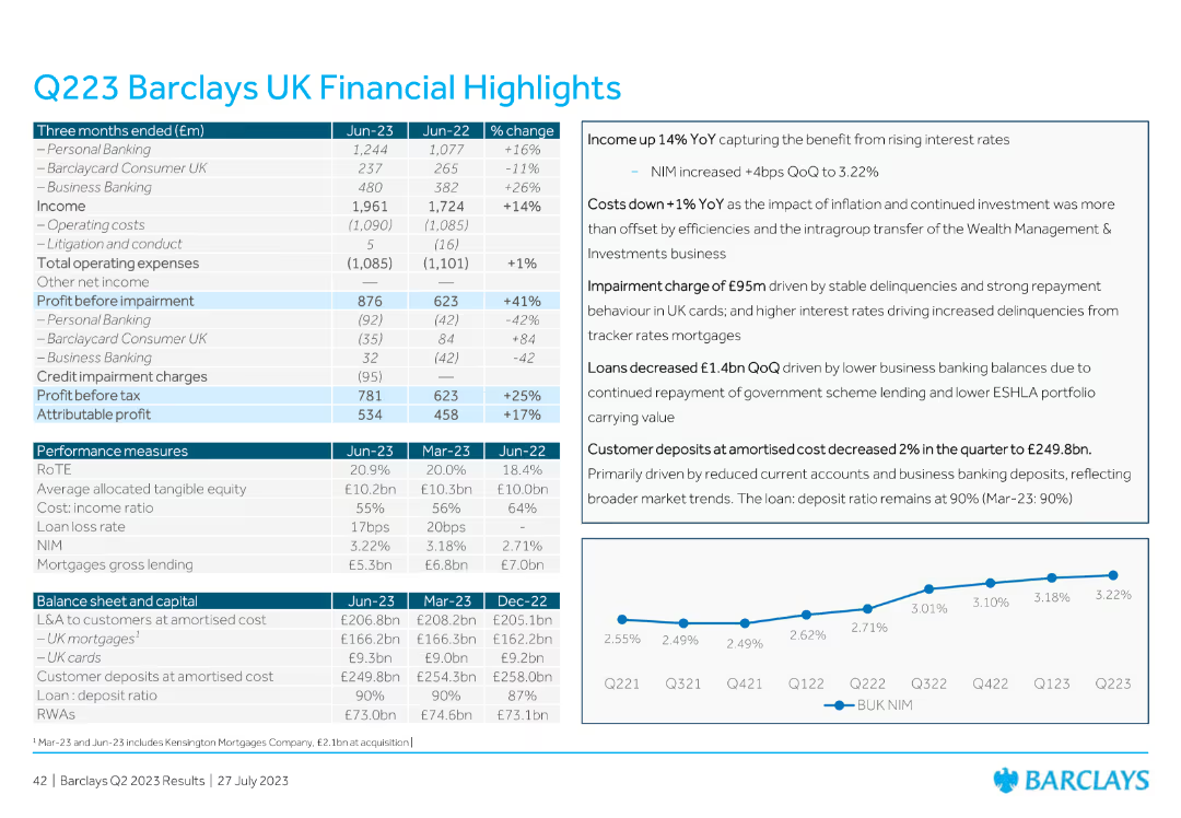
The slide contains a detailed table with financial metrics for Barclays UK, including income, operating costs, profit before impairment, credit impairment charges, and various performance measures. Includes commentary on the right.
Financial Performance
Financial Services
The slide presents detailed financial highlights for Barclays UK for Q223, including metrics like income, operating costs, profit before and after impairment, and various performance measures, with accompanying commentary.
financial highlights, Barclays UK, Q223, income, operating costs
Mixed Chart
Barclays
Saved
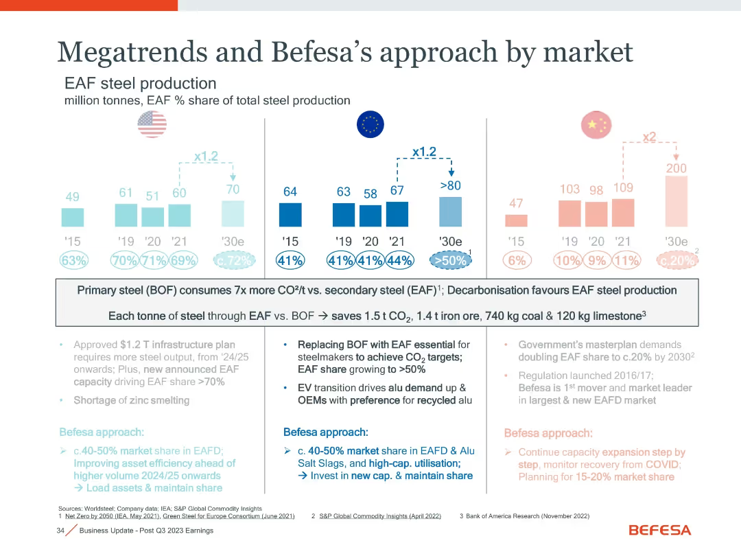
Duplicate of slide 18031 with same layout, bar charts, and content, showing EAF market evolution and regional strategies
Strategic Planning
Industrial & Manufacturing
Repeats slide 18031 content, summarizing EAF production trends in the US, EU, and China, with a focus on carbon reduction benefits and Befesa’s regional strategic responses to policy and demand shifts.
EAF, steel production, CO2 reduction, regional strategy, US, EU, China, decarbonisation, infrastructure
Mixed Chart
Goldman Sachs
Saved
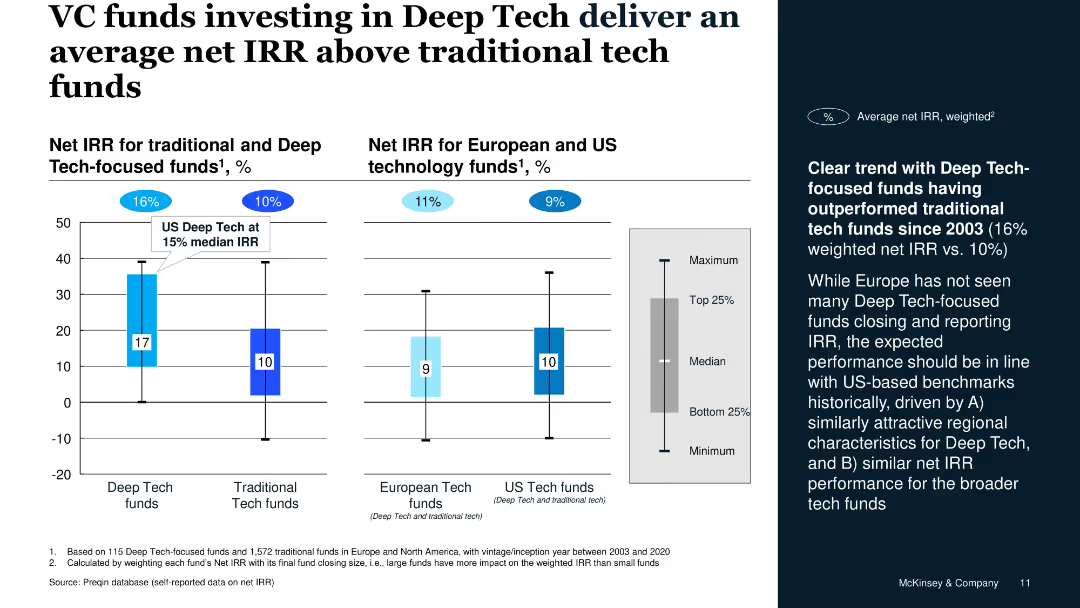
Vertical bar charts for IRR, segregated by fund type and geography, includes side commentary on trend data
Investment Analysis
Financial Services
The slide illustrates that Deep Tech-focused VC funds have historically outperformed traditional tech funds with a 16% weighted net IRR versus 10%, supported by Preqin data. U.S. Deep Tech shows a 15% median IRR.
net IRR, Deep Tech, VC funds, performance, US vs. Europe, investment returns
Mixed Chart
McKinsey
Saved
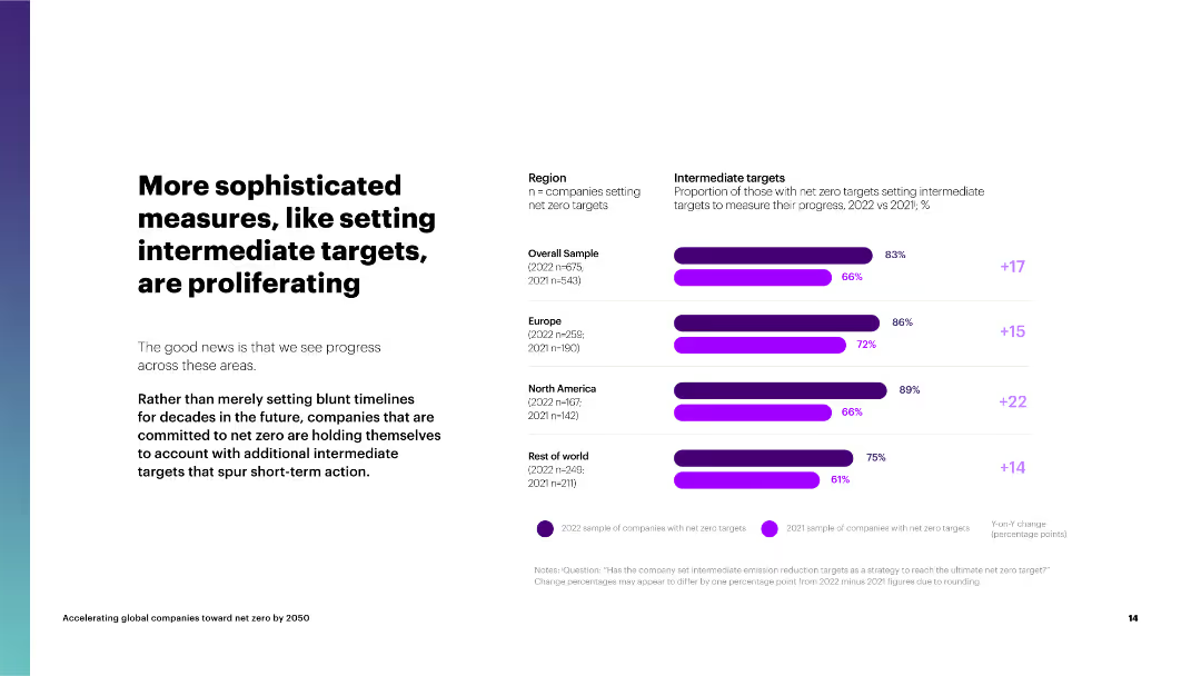
The slide features a column chart on the right comparing the proportion of companies setting intermediate targets by region and their progress.
Strategic Planning
Environmental Services & Sustainability
The slide highlights the increasing trend of companies setting intermediate targets for net zero, emphasizing the importance of short-term goals to spur action.
intermediate targets, net zero, regions, overall sample, Europe, North America, rest of world, progress
Mixed Chart
Accenture
Saved
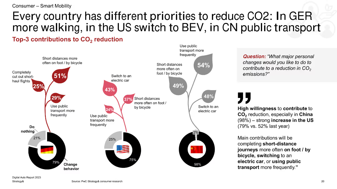
A combination of column charts showing CO2 reduction methods for Germany, the US, and China. The charts are accompanied by text highlighting key points and percentages.
Market Analysis and Trends
Transportation & Logistics
The slide compares the top three methods for reducing CO2 emissions in Germany, the US, and China, emphasizing walking, BEV, and public transport use.
CO2 reduction, Germany, US, China, walking, BEV, public transport
Multiple Chart
PwC/Strategy&
Saved
Multiple column charts showing year-to-date (YTD) performance metrics for the S&P 500 Index, including earnings growth, P/E, ROE, market cap, beta, and dividend yield.
Financial Performance
Financial Services
This slide offers a YTD analysis of the S&P 500 Index, presenting various performance metrics to give a clear picture of financial performance over the year.
S&P 500, YTD, performance, metrics, analysis
Multiple Chart
Morgan Stanley
Saved
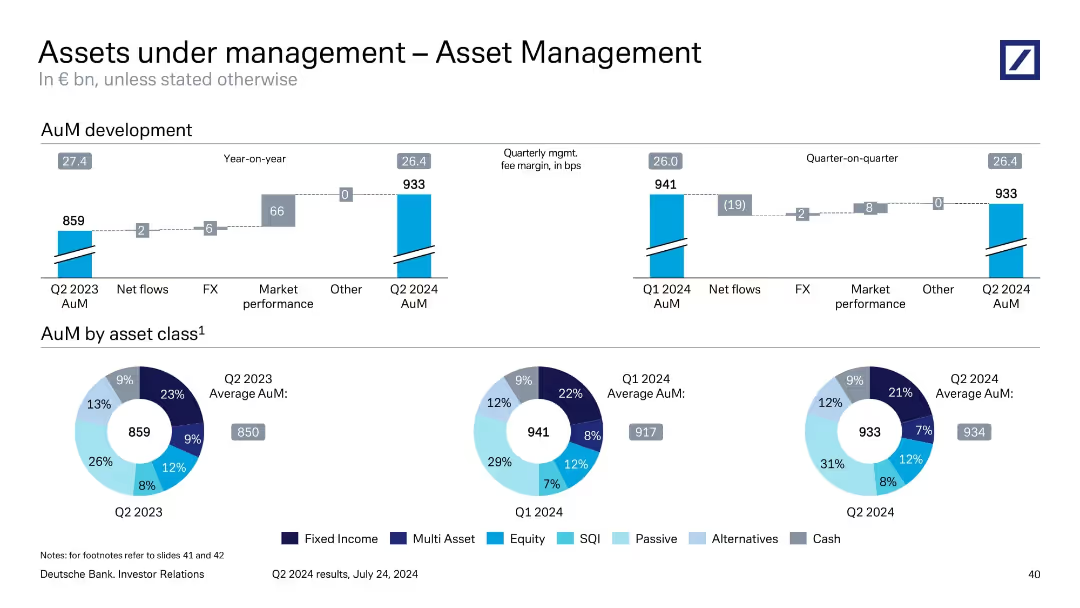
Mixed layout: stacked bar showing year-on-year AuM movement; pie charts show asset class composition across three periods.
Performance Metrics and KPIs
Financial Services
This slide shows the development of Asset Management’s AuM, which grew from €859bn in Q2 2023 to €933bn in Q2 2024. It identifies key drivers such as market performance and FX. The asset composition is visualized by class, with noticeable growth in passive and SQI categories, reflecting investor preference shifts.
asset management, AuM, asset classes, FX impact, market performance
Multiple Chart
Deutsche Bank
Saved
This slide uses a content layout with a process flow diagram and a detailed table outlining reasons for IV-E ineligibility and related processes. The layout is moderately detailed with a balance of text and visual elements.
Financial Performance
Government & Public Sector
Slide features a flowchart of the fiscal specialist unit process and a table of reasons for IV-E ineligibility with solutions.
Details the fiscal process for identifying funding and overcoming ineligibility issues, providing a flowchart and a table with next steps to address common problems.
Linear Flow
Alvarez & Marsal
Saved
The slide includes column charts showing the budget outlook for medium-size and large-size public hospitals over the last three years, current year, and next three years.
Financial Performance
Healthcare & Pharmaceuticals
This slide details the budget outlook for public hospitals in APAC, comparing medium-size and large-size facilities. It highlights budget deficit and surplus trends over a three-year period.
public, hospitals, budget, outlook, financial
Multiple Chart
LEK
Saved
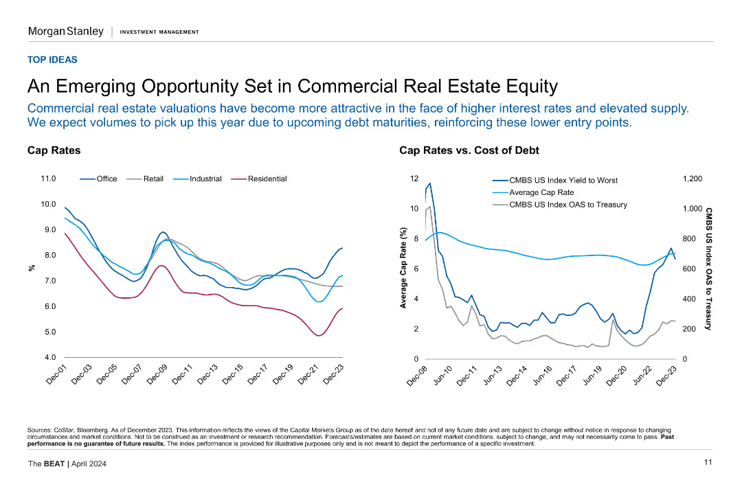
Two line charts showing cap rates for different property types and cap rates vs. cost of debt.
Market Analysis and Trends
Real Estate & Construction
This slide explores the opportunities in commercial real estate equity, highlighting the relationship between cap rates and the cost of debt across various sectors.
Commercial Real Estate, Cap Rates, Cost of Debt, Market Analysis, Opportunities
Multiple Chart
Morgan Stanley
Saved
Previous
Next
If nothing, comes up, please save your slides first
Create a FREE account to continue browsing
Receive Instant Access to 1,000+ slides from companies like McKinsey, Google, and Goldman Sachs
First Name
Last Name
Email
Password
I agree to all
Terms & Privacy Policy
Thank you! Your submission has been received!
Oops! Something went wrong while submitting the form.
Have an account?
Sign in
Column Chart
Heatmap
Chevron
Org Chart
Infographic
Callouts
Timeline
List
Graphic
Picture
Process Flow
Diagram
Paragraph
Map
Table
Framework
Subtitle
Takeaway Box
Icon
Other Chart
Radar Chart
Waterfall Chart
Mekko Chart
Pie Chart
Scatter Plot
Line Chart
Bar chart
Bullet points