Create a FREE Account
Instant access to 1,000+ real slides from top companies like McKinsey, BCG, Goldman Sachs, Google and many more!
First Name
Last Name
Email
Password
I agree to all
Terms & Privacy Policy
Thank you! Your submission has been received!
Oops! Something went wrong while submitting the form.
Have an account?
Sign in
Library
Templates
Courses
Pricing
My Account
My Slides
My Templates
✦ AI
AI Prompt Library
AI Search
Sign in
Start Here
Logout
My Saved Slides
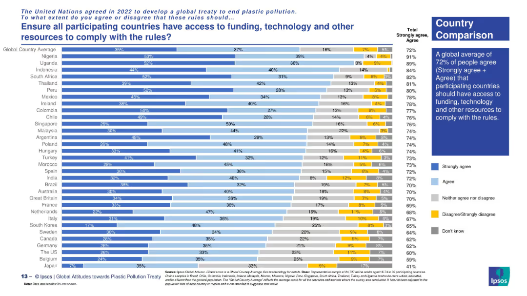
Country comparison via horizontal stacked bars with clear response categories.
Regulatory and Compliance
Environmental Services & Sustainability
The slide explores support across nations for ensuring equitable access to resources for treaty compliance. Highest support comes from Nigeria, Uganda, and South Africa. The global average for agreement is 72%.
global equity, treaty implementation, resource access, plastic rules, funding support, Ipsos survey, environmental policy, country views
Mixed Chart
IPSOS
Saved
Features a column chart tracking the appeal caseload over multiple years. The slide is data-dense, with a significant amount of textual information supporting the graphical elements.
Operational Efficiency
Government & Public Sector
It details the Appeal Division's caseload over several years, showing filed, finalized, and pending appeals, which provides insights into the trends and workload of the division.
caseload, appeals, finalization, trend analysis, workload
Mixed Chart
PwC/Strategy&
Saved
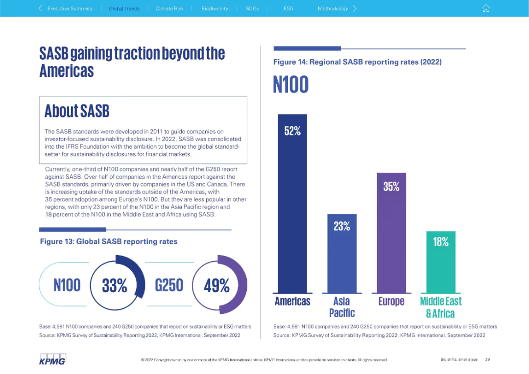
Left side explains SASB framework; right shows global and regional adoption bar charts
Regulatory and Compliance
Professional Services
Discusses adoption of the SASB framework for sustainability disclosure. It shows that the Americas lead (52%), followed by Europe (35%), with lower uptake in Asia Pacific (23%) and Middle East & Africa (18%). Global rates for N100 and G250 are also included.
SASB, sustainability disclosure, ESG standards, global adoption, Americas, G250, N100
Multiple Chart
KPMG
Saved
Column charts comparing PMI output/activity for various industries and regions
Market Analysis and Trends
Financial Services
This slide analyzes PMI trends across different industries globally, highlighting the performance of consumer-facing sectors.
global industry, PMI, snapshot, February, trends
Multiple Chart
Accenture
Saved
Includes column charts showing past and projected expenses, with a legend explaining different categories of expenses. The design is clean with the use of colors to differentiate data.
Operational Efficiency
Financial Services
It presents J.P.Morgan's firmwide expenses over time with projections, indicating areas of investment and expected declines in growth rate.
Expenses, Projections, Investment, Efficiency, Growth Rate, Financial Services, J.P.Morgan
Mixed Chart
JP Morgan
Saved
Includes column charts depicting potential network cost reductions across various industries after shifting to network modernization.
Strategic Planning
Telecommunications
Advocates for shifting budget allocations towards network modernization to achieve cost savings and efficiency gains in various industries.
budget allocation, cost reduction, network modernization, industry comparison, operational efficiency, strategic decisions
Multiple Chart
Accenture
Saved
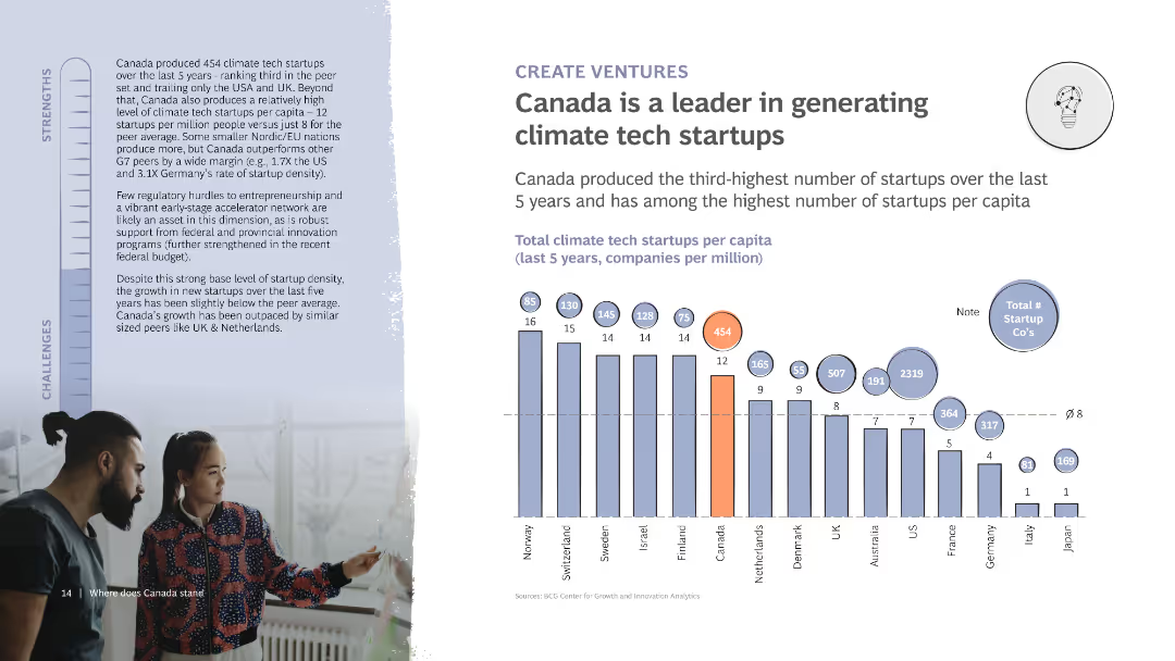
The slide includes a column chart showing the number of climate tech startups per capita in various countries. It also features detailed text discussing Canada’s startup ecosystem and its strengths and challenges, with a photo of two people collaborating.
Market Analysis and Trends
Technology & Software
Highlights Canada's leadership in generating climate tech startups, showing it ranks high in startups per capita. Discusses the supportive ecosystem and challenges in maintaining growth and innovation in the sector.
Startups, Climate tech, Canada, Innovation, Ecosystem
Mixed Chart
BCG
Saved
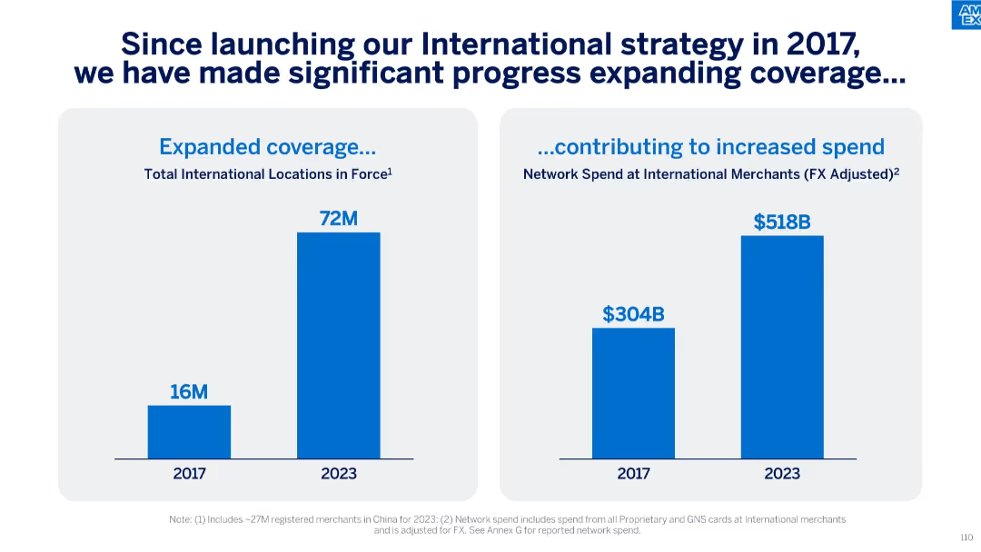
Two vertical bar charts: one for expanded international locations, another for network spend growth at international merchants.
Strategic Planning
Financial Services
This slide shows the outcome of the 2017 international strategy, highlighting significant increases in locations (from 16M to 72M) and FX-adjusted network spend (from $304B to $518B) at international merchants by 2023.
International Strategy, Merchant Spend, FX Adjusted, Location Growth, Global Expansion
Single Chart
McKinsey
Saved
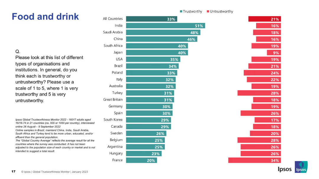
Bar chart by country; shows trust in food and drink sector; green/red color-coded bars.
Market Analysis and Trends
Agriculture & Food Production
This slide presents global views on trust in food and drink companies. India, Saudi Arabia, and China are rated highest in trustworthiness.
food, beverage, trust, global Ipsos survey, perception, countries, trustworthy, public opinion, ranking
Mixed Chart
IPSOS
Saved
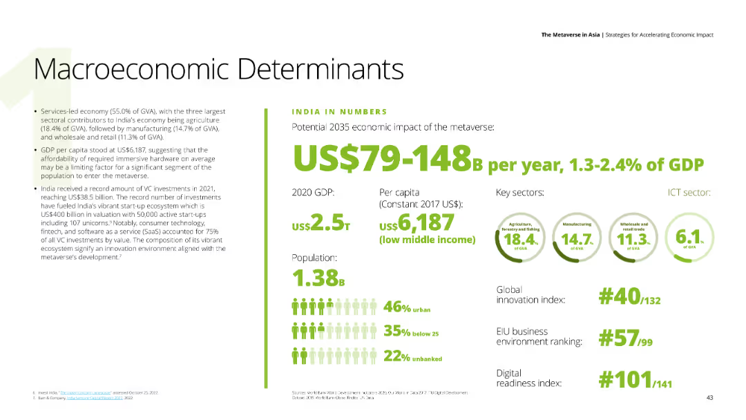
A data-driven slide with key economic indicators for India, including GDP, population, and sector contributions.
Financial Performance
Financial Services
The slide presents India’s macroeconomic determinants, highlighting the potential economic impact of the metaverse by 2035.
India, GDP, economic impact, metaverse, financial indicators
Mixed Chart
Deloitte
Saved
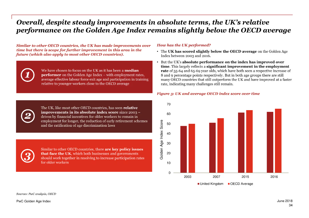
This slide includes a column chart comparing the UK’s Golden Age Index score over time to the OECD average. Text sections highlight the UK’s relative performance and key policy issues.
Performance Metrics and KPIs
Government & Public Sector
The slide reviews the UK’s performance on the Golden Age Index, showing steady improvements but remaining below the OECD average. It discusses factors driving these trends and key policy issues to enhance participation rates for older workers.
Golden Age Index, UK performance, OECD, employment, older workers, policy issues, index score, trends
Mixed Chart
PwC/Strategy&
Saved
This slide presents two column charts, one for average commercial and industrial loans and the other for average commercial real estate loans, with supporting text below. The design is straightforward and data-centric.
Financial Performance
Financial Services
Highlighting the quality and growth of loan portfolios, the slide presents data on commercial and industrial loans and commercial real estate loans, indicating a conservative approach to credit and a leadership position in the middle market lending space.
Loan portfolio, credit quality, market lending, commercial real estate
Multiple Chart
JP Morgan
Saved
Features a column chart detailing the reconciliation of ERR scalar for Japan from 2015 to current with steps outlined in text.
Market Analysis and Trends
Financial Services
This slide explains the reconciliation process of the ERR scalar for Japan, detailing the steps involved and the resulting scalar value for 2023.
Japan, ERR scalar, financial services, market trends, reconciliation
Mixed Chart
Oliver Wyman
Saved
The slide features three charts: a line chart showing annualized CPI growth rates, a column chart depicting real year-over-year wage growth, and a column chart comparing policy interest rates. It uses a consistent blue and white color scheme with clear labels and legends.
Market Analysis and Trends
Financial Services
The slide examines inflation's impact on prices, wages, and monetary policy, highlighting volatile prices, real wage erosion, and global central bank policy tightening as key challenges and opportunities for businesses.
inflation, prices, wages, monetary policy, CPI growth
Multiple Chart
EY
Saved
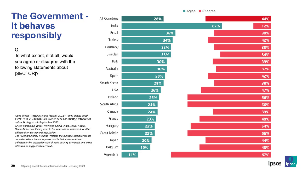
Same bar layout as previous slides; agree/disagree rating per country
Strategic Planning
Government & Public Sector
This slide presents opinions on whether governments act responsibly. India shows the highest agreement, but in most countries, disagreement exceeds agreement.
responsibility, trust, behavior, governance, Ipsos, ethics, survey results, international comparison
Mixed Chart
IPSOS
Saved
A column chart showing reasons for buying investments during the pandemic. There is a large 40% graphic to the left indicating the percentage of buyers, and a list of reasons with bars on the right.
Market Analysis and Trends
Financial Services
The slide explains why Canadian investors bought investments during the pandemic, highlighting regular contributions, undervalued assets, high returns, guarantees, lower risks, and other reasons.
investments, pandemic, buying, Canadian, reasons
Multiple Chart
IPSOS
Saved
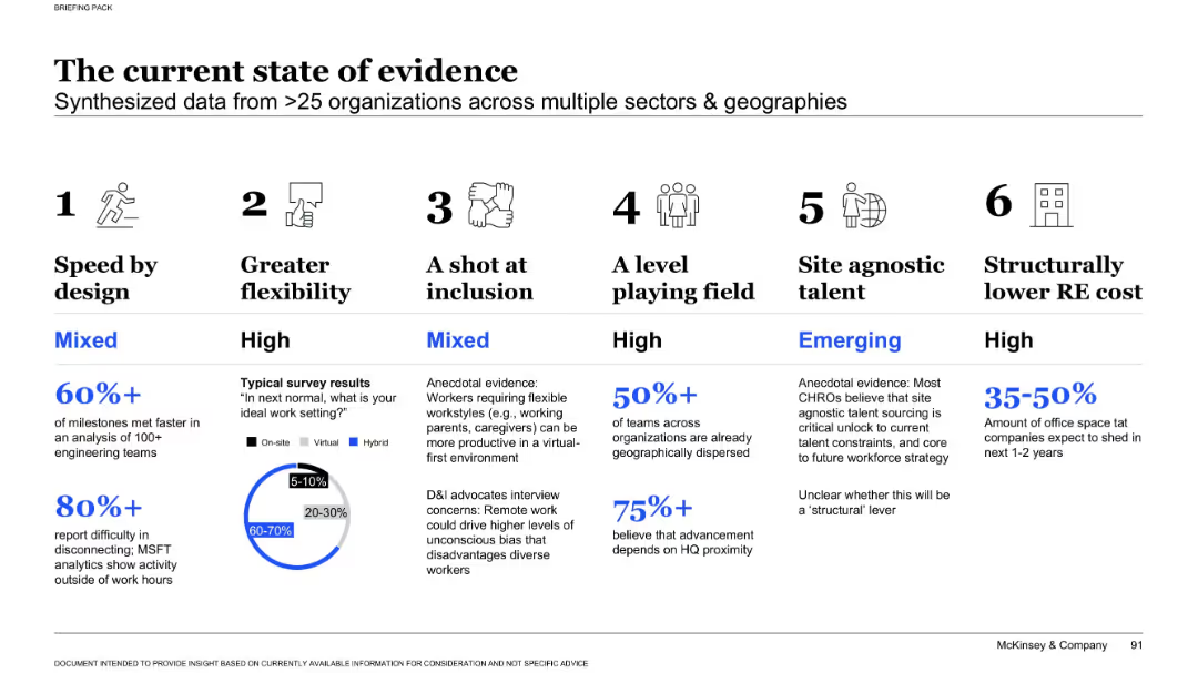
Infographic-style layout with 6 columns, each showing a theme with icons, text, and mixed qualitative/quantitative evidence.
Market Analysis and Trends
Professional Services
This slide summarizes data from over 25 organizations about trends in flexibility, inclusion, cost savings, and performance post-COVID. It presents evidence for hybrid work advantages while noting challenges like disconnection and equity concerns.
hybrid work, flexibility, inclusion, speed, office cost, evidence, survey, productivity, remote, trends
Mixed Chart
McKinsey
Saved
Comprises two bar charts assessing the importance of geopolitical and macro factors in the US equity market. Each chart uses green, red, and teal colors to indicate investor sentiments.
Investment Analysis
Financial Services
Evaluates the key factors that investors consider critical for the US equity market, including interest rate policies and geopolitical risks, and how these perceptions influence market optimism.
US equity market, interest rates, geopolitical risks, investor sentiment
Multiple Chart
BCG
Saved
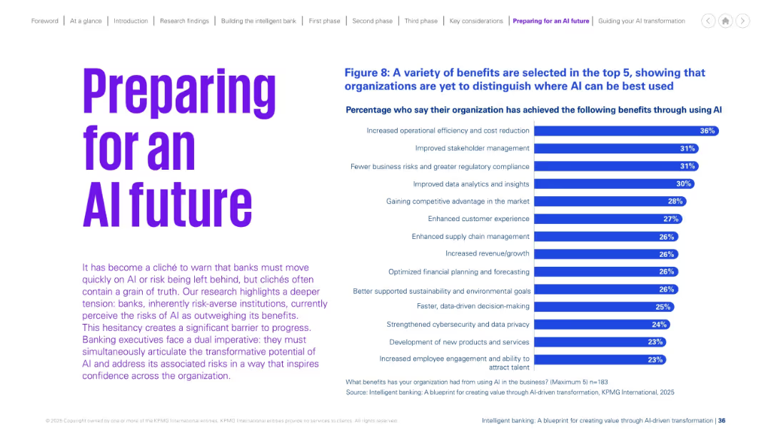
Left-aligned bold heading with a paragraph of explanatory text and a right-aligned bar chart showing benefits of AI.
Technology and Digital Transformation
Financial Services
Highlights benefits achieved through AI such as efficiency, stakeholder management, compliance, and analytics. The data implies organizations are still unclear on where AI yields the greatest value.
AI benefits, operational efficiency, stakeholder management, cost reduction, analytics, transformation, financial planning, sustainability
Mixed Chart
KPMG
Saved
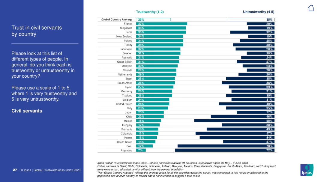
Blue sidebar with instructions; right side chart ranks trust in civil servants across countries. Countries like France rank high; Argentina lowest.
Regulatory and Compliance
Government & Public Sector
This slide visualizes public trust in civil servants, showing significant differences across countries. France, Singapore lead, while Peru and Argentina score lowest.
civil service, trust index, governance, Ipsos, public opinion, countries, regulation
Mixed Chart
IPSOS
Saved
Includes three separate column charts showing forecasts for subsea equipment, services, and SURF from 2014 to 2023, with projected growth trends indicated by arrows.
Market Analysis and Trends
Energy & Utilities
Analyzes trends in offshore oil and gas investments, focusing on equipment, services, and SURF sectors, with forecasts showing growth, which could inform strategic decisions in these areas.
offshore, oil and gas, forecast, trends, investments
Multiple Chart
Barclays
Saved
The slide displays two column charts showing survey responses by country with varying data-to-ink ratios.
Technology and Digital Transformation
Professional Services
The slide explains Tufte's data-to-ink ratio principle, demonstrating how reducing non-data ink can make charts clearer and more efficient.
Tufte, data-to-ink, ratio, survey, responses, visualization, chart, efficiency, clarity, design
Multiple Chart
EY
Saved
The slide features an illustrative map with arrows and bubbles indicating the magnitude of cross-border data flows among different regions. A sidebar provides a color-coded key for bandwidth ranges, with larger bubbles on the map representing greater interregional bandwidth usage.
Market Analysis and Trends
Technology & Software
The slide communicates the exponential growth in cross-border data flows, emphasizing a 45x increase since 2008. The map and side key effectively showcase the regional disparities in data flow volume, providing a clear visualization of how digital connectivity is evolving globally. This serves as an indicator of international digital communication and business collaboration trends.
Data Flows, Global Connectivity, Bandwidth, Regions, Digital Communication, Business Collaboration, Growth, Telecommunications
Multiple Chart
McKinsey
Saved
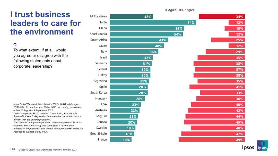
Similar bar chart format to Slide 19311; teal and red bars for agree/disagree; countries listed vertically; layout and design are consistent with previous slide.
Regulatory and Compliance
Environmental Services & Sustainability
The slide measures public belief in corporate leaders’ commitment to environmental issues. India, China, and Saudi Arabia rank high in trust, while Western nations express more skepticism.
sustainability, environment, leadership, ESG, perception, global views, Ipsos, corporate responsibility
Mixed Chart
IPSOS
Saved
Scatter plot comparing the Global Innovation Index with GDP per capita PPP for 2019, with emerging markets and advanced countries highlighted. Text discusses the relationship between innovation and prosperity.
Technology and Digital Transformation
Technology & Software
The slide illustrates the correlation between innovation capabilities and economic prosperity, showing how countries with higher Global Innovation Index scores tend to have higher GDP per capita. It highlights the importance of innovation for economic growth and development.
Innovation, GDP, Global Index, Prosperity
Mixed Chart
Roland Berger
Saved
Previous
Next
If nothing, comes up, please save your slides first
Create a FREE account to continue browsing
Receive Instant Access to 1,000+ slides from companies like McKinsey, Google, and Goldman Sachs
First Name
Last Name
Email
Password
I agree to all
Terms & Privacy Policy
Thank you! Your submission has been received!
Oops! Something went wrong while submitting the form.
Have an account?
Sign in
Column Chart
Heatmap
Chevron
Org Chart
Infographic
Callouts
Timeline
List
Graphic
Picture
Process Flow
Diagram
Paragraph
Map
Table
Framework
Subtitle
Takeaway Box
Icon
Other Chart
Radar Chart
Waterfall Chart
Mekko Chart
Pie Chart
Scatter Plot
Line Chart
Bar chart
Bullet points