Create a FREE Account
Instant access to 1,000+ real slides from top companies like McKinsey, BCG, Goldman Sachs, Google and many more!
First Name
Last Name
Email
Password
I agree to all
Terms & Privacy Policy
Thank you! Your submission has been received!
Oops! Something went wrong while submitting the form.
Have an account?
Sign in
Library
Templates
Courses
Pricing
My Account
My Slides
My Templates
✦ AI
AI Prompt Library
AI Search
Sign in
Start Here
Logout
My Saved Slides
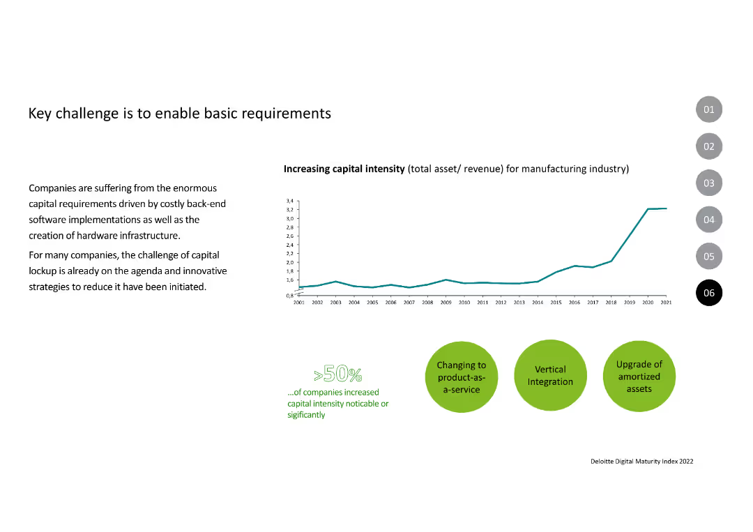
Three circular diagrams, percentage figures, green theme
Technology and Digital Transformation
Technology & Software
Discusses readiness and impact of technology in business
Technology, readiness, business impact
Multiple Chart
Deloitte
Saved
This slide presents a line graph showing the U.S. market podcast ad revenue percentage share by quarter from 2017 to 2022. Each line is color-coded to represent a different quarter, illustrating trends and changes over time.
Market Analysis and Trends
Media & Entertainment
Analyzes the seasonal distribution of podcast advertising revenue in the U.S. market, noting a decrease in the fourth quarter share in 2022. Useful for understanding seasonal impacts on marketing and advertising budgets.
Quarterly Trends, Podcast Advertising, Revenue Share, Marketing Budgets
Single Chart
PwC/Strategy&
Saved
Showcases a dual-axis column charts and a line graph, illustrating the growth of data and increase in execution speed in technology. The slide has a blue color scheme and is marked with number 8.
Investment Analysis
Financial Services
Presents statistical data on the growth of digital data and the increase in execution speeds, highlighting technological advancements and their impact on the market.
data growth, execution speed, technology, market trends
Multiple Chart
Goldman Sachs
Saved
This slide features multiple bar charts detailing the impact of COVID-19 on various industries like hotels, food services, and entertainment in New York. It shows year-over-year changes in unemployment claims and daily worker hours. Colors differentiate industries for clarity.
Risk Assessment and Management
Financial Services
Analyzes sector-specific impacts of COVID-19, highlighting industries like hospitality and retail severely affected. Suitable for discussions on risk management and strategic planning in response to economic downturns.
COVID-19, industries, unemployment, hospitality, retail, risk management, New York, sector analysis
Multiple Chart
BCG
Saved
The slide shows three vertical bar charts comparing the total addressable IVD market, QuidelOrtho addressable market by disease state, and platform. The design is clear and uses distinct colors for different segments.
Market Analysis and Trends
Healthcare & Pharmaceuticals
The slide provides an analysis of the in-vitro diagnostics (IVD) market, illustrating QuidelOrtho's market opportunities and competitive positioning within various market segments.
IVD market, QuidelOrtho, market analysis
Multiple Chart
JP Morgan
Saved
Chart measuring global trust in the US as a democratic leader; US and Canada marked; title and bars are bold and clear.
Strategic Planning
Government & Public Sector
Survey on whether the US is still seen as a reliable democratic leader. 58% globally agree, with 64% in the US and only 47% in Canada. Indicates skepticism about US leadership among some allies and globally.
US leadership, democracy, global opinion, trust, Canada, Ipsos
Single Chart
IPSOS
Saved
The slide features text and icons representing different client segments and services offered. Sections provide details on corporate and personal banking.
Strategic Planning
Financial Services
This slide describes UBS's balanced mix of personal and corporate banking, highlighting the client base and services offered.
UBS, Banking, Client Segments, Services, Strategic Planning
Multiple Chart
UBS
Saved
Features column charts and bullet points detailing key economic impacts and applications of Copernicus in forestry.
Industry Overview
Environmental Services & Sustainability
Explores the benefits of Earth Observation data for forestry, emphasizing improvements in forest management and economic benefits.
Forestry, Earth Observation, Management, Economic Benefits, Sustainability
Mixed Chart
PwC/Strategy&
Saved
Split-screen layout with a large left-aligned title, explanatory question, and bar graph on the right.
Customer and Market Segmentation
Energy & Utilities
This slide shows global and country-specific agreement/disagreement percentages about the energy sector being trustworthy if it provides good customer service.
energy, trust, customer service, perception, Ipsos, agreement, survey, countries, utilities, public opinion
Mixed Chart
IPSOS
Saved
Bar chart comparing percentage of people in 29 countries describing the economy as "Good" vs "Bad", with annotations.
Market Analysis and Trends
Financial Services
This slide visualizes global public sentiment about the current economic situation, showing a 36% global average rating of "good". Singapore, India, and Indonesia lead in optimism, while Japan and Argentina have the lowest. Commentary highlights regional trends and month-over-month changes.
economic sentiment, global comparison, Ipsos, economic perception, survey, bar chart, economic optimism, Asia-Pacific, country ranking, economic trends
Mixed Chart
IPSOS
Saved
Slide features a stacked column chart comparing discount levels observed by consumers in different countries over three months. Colors indicate whether discounts are higher, in line, or lower than pre-crisis levels.
Market Analysis and Trends
Technology & Software
This slide examines changes in consumer observed discount levels during COVID-19 across multiple countries, useful for market trend analysis in retail and consumer goods.
discounts, COVID-19, consumer trends, retail, market analysis, e-commerce
Multiple Chart
McKinsey
Saved
White background line chart showing agreement over time that society is broken by world region; blue info box on left.
Market Analysis and Trends
Government & Public Sector
Regional view of dissatisfaction with societal conditions, comparing LATAM, North America, Europe, and APAC regions; LATAM consistently shows higher agreement levels.
regional perception, societal issues, dissatisfaction, Ipsos, public opinion, trend
Mixed Chart
IPSOS
Saved
The slide includes a map of Maranoa and several infographics showing economic output, employment, and emissions data for the region.
Client Case Studies
Agriculture & Food Production
This case study slide presents the current state of the Maranoa electorate in Southern Queensland, highlighting economic output, employment statistics, and emissions data for the agriculture sector.
Maranoa, Case study, Economic output, Employment, Emissions
Multiple Chart
EY
Saved
Three-column layout on pale blue background with icons and text describing three metrics: country decline, broken system, and immigration/elite sentiments.
Strategic Planning
Government & Public Sector
Explains indicators of populist sentiment across 28 countries, covering belief in national decline, systemic dysfunction, and anti-elite/anti-immigrant attitudes, with examples of countries with strongest sentiments.
populism, elites, immigration, system distrust, perception, Ipsos, decline, sentiment
Pillar
IPSOS
Saved
Waterfall bar chart with financial table and YoY comparisons
Operational Efficiency
Industrial & Manufacturing
This slide details the performance of aluminium salt slags recycling operations, showing a decrease in EBITDA due to pricing pressure, partially offset by volume growth.
Aluminium, Recycling, EBITDA, Salt Slags, Energy Prices, Q3 2023
Mixed Chart
Goldman Sachs
Saved
The slide contains a chart depicting the progression from stable to future-ready operations, with explanatory text on technology, talent, processes, and data.
Technology and Digital Transformation
Technology & Software
This slide explains how intelligent operations can lead to significant productivity and efficiency gains, highlighting the path to becoming future-ready.
intelligent operations, productivity, efficiency gains, future-ready, technology transformation
Table
Accenture
Saved
The slide contains a flowchart linking global trends to Nigeria’s FX market, local trends, and FX outcomes. The flowchart uses arrows and color-coded boxes to differentiate between different elements.
Market Analysis and Trends
Financial Services
The slide explains the impact of global trends on Nigeria's foreign exchange market, covering local fiscal policies and financial activities.
FX market, global trends, Nigeria, local trends, fiscal policy, financial activities
Diagram
PwC/Strategy&
Saved
Line chart comparing returns of various credit sectors since Fed rate cut in Sept 2024. Each line represents a different fixed income type.
Financial Performance
Financial Services
Bank loans have outperformed other fixed income sectors (e.g., Treasuries, IG corporates, high yield) since the Fed's September 2024 rate cuts. The slide emphasizes strong relative returns and high carry appeal of bank loans.
bank loans, fixed income, Fed rate cut, high yield, IG corporates, returns, performance
Single Chart
Morgan Stanley
Saved
This slide features a detailed area graph depicting the rolling average of daily new COVID-19 cases globally, segmented by continent. The design is straightforward, focusing on the data presentation with minimal distractions. The color coding by region helps in distinguishing the data visually.
Market Analysis and Trends
Healthcare & Pharmaceuticals
Offers an in-depth analysis of the spread of the COVID-19 Delta variant and its impact on global case numbers. Highlights the effectiveness of vaccination efforts in reducing case numbers and discusses potential future trends in the pandemic's progression, providing valuable insights for healthcare and public health planning.
COVID-19, Delta variant, global health, pandemic trends, vaccination impact, public health, area graph
Mixed Chart
BCG
Saved
This slide features multiple column charts comparing the Total Incident Frequency (TIF) and Total Recordable Incident Frequency (TRIF) of Seadrill against industry benchmarks over several years. The graphs are color-coded to differentiate between TIF, TRIF, and a benchmark, providing a clear visual distinction. The design is clean, with minimal text to allow focus on the trends shown by the graphs. Annotations highlight significant data points and trends.
Operational Efficiency
Energy & Utilities
The slide demonstrates Seadrill's commitment to safety and efficiency, showing a downward trend in incident rates compared to industry standards. It is likely used in safety briefings, regulatory reviews, or investor meetings to underscore Seadrill's strong safety record and operational excellence. The line graphs serve to reassure stakeholders of the company’s adherence to high safety standards and its effectiveness in minimizing operational risks, which is crucial for maintaining trust and fulfilling regulatory requirements.
safety, operational efficiency, Seadrill, line graphs, incident rates, industry benchmarks, safety standards, regulatory compliance, stakeholder reassurance, trust
Multiple Chart
Barclays
Saved
Split bar and table visualization of 2021 transaction volume vs. USD flows by instrument
Performance Metrics and KPIs
Financial Services
The slide highlights that while cash was the most used payment method by volume in 2021, ACH dominated in dollar flows, accounting for 68.8% of total value. This illustrates a divergence between transaction count and transaction value across instruments.
cash usage, ACH, transaction volume, dollar flows, payment instruments, 2021 data
Single Chart
McKinsey
Saved
The slide includes a map of the US Northeast with locations of cement plants and port terminals, along with icons representing different supply chain stages.
Operational Efficiency
Transportation & Logistics
Describes the supply chain characteristics of the US Northeast cement industry. Emphasizes the role of water-based freight and identifies key logistical challenges and constraints.
Supply chain, water-based freight, cement, US Northeast, logistics
Graphic
LEK
Saved
Contains two pie charts comparing GDP percentage and market capitalization across countries, indicating the distribution of global equity allocations.
Investment Analysis
Financial Services
Highlights the disproportionate allocation of global equity towards the U.S., illustrated by its GDP versus market capitalization share, significant for strategic investment planning.
equity allocation, GDP, market capitalization, strategic planning, investment, USA dominance, global distribution
Multiple Chart
Morgan Stanley
Saved
Integrates a scatter plot correlating outbreak lengths with GDP forecasts, complemented by color-coded annotations.
Risk Assessment and Management
Professional Services
Correlates outbreak lengths with economic performance forecasts, providing insights into the impact of health crises on economies.
outbreak, GDP growth, economic performance, health crisis, forecast, correlation
Single Chart
BCG
Saved
Two side-by-side graphs: left shows premium increase vs wildfire exposure; right shows written unit growth vs wildfire exposure; both use bar and line combinations; includes blue and grey callout boxes explaining correlation insights.
Risk Assessment and Management
Financial Services
This slide examines the correlation between wildfire exposure and both premium increases and policy growth. Premiums rise more sharply in high-risk ZIP codes, but written unit growth is not disproportionately impacted, suggesting broad rating actions not limited to wildfire exposure. Carrier responses vary but overall market exposure remains.
wildfire correlation, premium changes, policy growth, ZIP code risk, insurance pricing, Colorado, exposure segmentation, rating strategy
Multiple Chart
Oliver Wyman
Saved
Previous
Next
If nothing, comes up, please save your slides first
Create a FREE account to continue browsing
Receive Instant Access to 1,000+ slides from companies like McKinsey, Google, and Goldman Sachs
First Name
Last Name
Email
Password
I agree to all
Terms & Privacy Policy
Thank you! Your submission has been received!
Oops! Something went wrong while submitting the form.
Have an account?
Sign in
Column Chart
Heatmap
Chevron
Org Chart
Infographic
Callouts
Timeline
List
Graphic
Picture
Process Flow
Diagram
Paragraph
Map
Table
Framework
Subtitle
Takeaway Box
Icon
Other Chart
Radar Chart
Waterfall Chart
Mekko Chart
Pie Chart
Scatter Plot
Line Chart
Bar chart
Bullet points