Create a FREE Account
Instant access to 1,000+ real slides from top companies like McKinsey, BCG, Goldman Sachs, Google and many more!
First Name
Last Name
Email
Password
I agree to all
Terms & Privacy Policy
Thank you! Your submission has been received!
Oops! Something went wrong while submitting the form.
Have an account?
Sign in
Library
Templates
Courses
Pricing
My Account
My Slides
My Templates
✦ AI
AI Prompt Library
AI Search
Sign in
Start Here
Logout
My Saved Slides
Waterfall bar chart with color-coded reductions, textual callouts, and emissions trajectory lines
Risk Assessment and Management
Environmental Services & Sustainability
Demonstrates the emission reduction potential of prioritized solutions, projecting that SEA could reduce emissions by ~320 MtCO2e by 2030, closing about half the gap to target levels. Contributions by bioeconomy, grid, and EV ecosystem are quantified.
emissions reduction, GHG, 2030 targets, SEA, climate strategy, systems-level solutions, sustainability
Single Chart
Bain
Saved
This slide offers a visual breakdown of four strategic approaches to enhancing DEI within organizations, represented through vibrant icons and a quadrant layout. Each section is clearly defined with headings and concise bullet points, paired with relevant imagery that complements the textual content.
Organizational Structure and Change
Professional Services
Encourages a shift in how DEI is perceived within business strategies, urging companies to integrate it as a fundamental aspect of business planning and innovation. It emphasizes the importance of viewing DEI through a broader lens, not just as a moral obligation but as a strategic advantage that can drive substantial organizational and societal benefits.
DEI strategy, business innovation, organizational change, sustainable advantage, leadership commitment
Header Vertical
BCG
Saved
Dual line graph chart: left panel shows household income vs. agreement on inequality; right panel shows education level vs. same. Color-coded lines represent responses to different inequality-related statements. Text block on left provides interpretation.
Strategic Planning
Government & Public Sector
This slide explores how income and education levels influence sensitivity to inequality. People with higher education and income are more likely to acknowledge inequality and support stronger measures to address it, despite being potential beneficiaries of the current system.
socio-economic status, education, income, inequality, perceptions, public opinion, Ipsos, fairness
Mixed Chart
IPSOS
Saved
Three-panel layout with line graphs showing the DXY index, U.S. trade balance, and 10-year yield differentials; peak/trough annotations included.
Market Analysis and Trends
Financial Services
The slide explores drivers of the U.S. dollar, including historical dollar index cycles, the trade balance as % of GDP, and interest rate differentials with developed markets. It outlines current trends and historic context.
dollar index, trade balance, yield differential, forex, macroeconomics, DXY, GDP, interest rate
Multiple Chart
JP Morgan
Saved
A line graph illustrates the forecasted price trends for lithium-ion battery packs up to 2030, accompanied by detailed text analysis. The graph is set against a dark background with purple and grey lines.
Financial Performance
Energy & Utilities
Discusses the impact of critical material shortages on the future pricing of lithium-ion battery packs, highlighting expected price increases and their implications for the market.
battery prices, lithium-ion, market trends, price increase, economic impact, forecasting
Mixed Chart
Accenture
Saved
Bar chart with horizontal bars for three regions on a blue background, with supporting headline and subheadline text
Market Analysis and Trends
Transportation & Logistics
Companies plan to intensify trade, data, and personnel flows in Europe, the US, and Asia Pacific (excl. China), reflecting shifting global trade preferences.
Global trade, CxO, regions, Europe, US, Asia-Pacific, flows, 2025, intensification
Single Chart
McKinsey
Saved
World map with data bubbles showing number of threatened species by region.
Strategic Planning
Environmental Services & Sustainability
Identifies biodiversity hotspots with high numbers of threatened species, focusing on endemic-rich regions like Ecuador, Indonesia, and Madagascar.
threatened species, biodiversity hotspots, endemic, conservation regions
Mixed Chart
Roland Berger
Saved
Slide includes pie charts and column chart to detail the composition of the loan book and provision for credit losses, respectively, with clear visual differentiation among categories.
Risk Assessment and Management
Financial Services
Offers detailed insights into the bank's loan book composition and credit loss provisions, suitable for risk management and loan portfolio analysis.
loan book, credit, risk, management, provisions, portfolio, analysis, composition, financial, insights
Multiple Chart
Deutsche Bank
Saved
Features bar charts comparing SPAC and traditional IPOs in the Americas and globally. Also includes a bar chart for IPO performance post-IPO. The design is data-heavy.
Financial Performance
Financial Services
This slide focuses on SPAC issuance trends and IPO performance in 2021, discussing underperformance and investor sentiment shifts in the latter half of the year.
SPAC Issuance, IPO Performance, Investor Sentiment, 2021 Trends, Financial Analysis
Multiple Chart
PwC/Strategy&
Saved
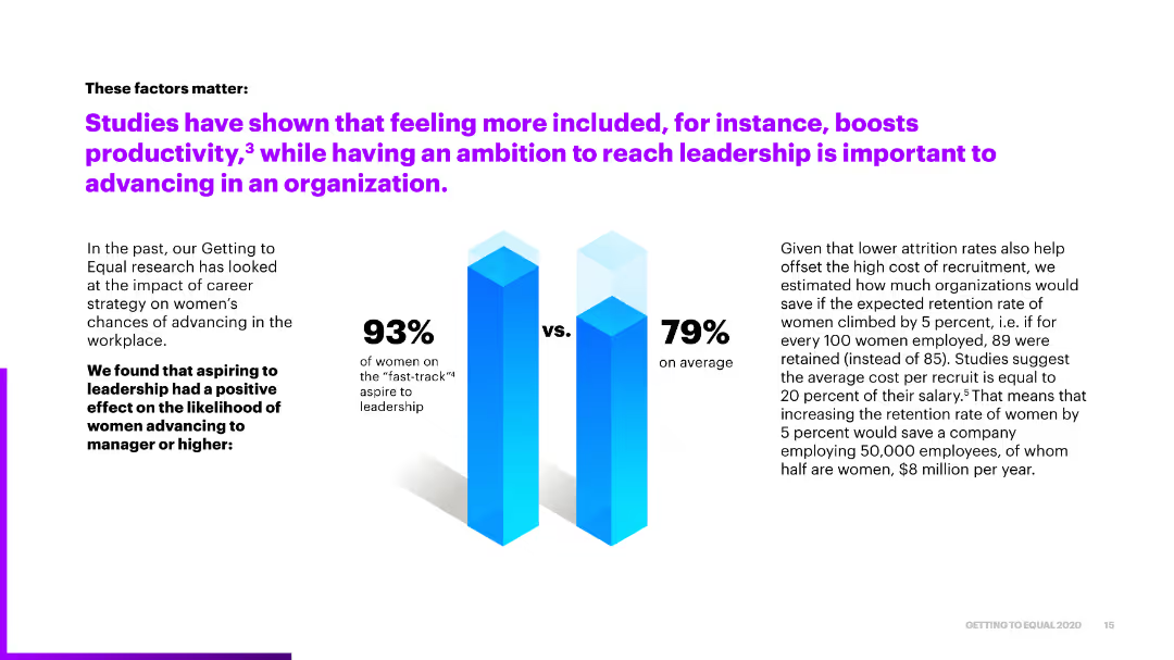
This slide includes a column chart comparing revenue growth rates of bottom performers and top performers over two periods. The chart is clear, with different colors representing different time periods and performance levels.
Market Analysis and Trends
Financial Services
The slide highlights the anticipated revenue growth for 2021, showing the difference between bottom and top performers. It indicates that top performers are expected to see significant growth, rebounding strongly from previous lows.
Revenue Growth, Performance, Top Performers, 2021, Comparison
Mixed Chart
Accenture
Saved
Multiple column charts depicting issuances and redemptions over time, along with upcoming maturities and first calls, including detailed callouts.
Investment Analysis
Financial Services
Analysis of capital market activities, including issuances, redemptions, and future call schedules.
Issuances, redemptions, maturities, bonds, capital markets
Multiple Chart
UBS
Saved
Displays a circular diagram divided into six sections, each representing a key factor in digital marketing maturity. The diagram is supported by icons and brief text labels.
Organizational Structure and Change
Media & Entertainment
Outlines six critical technical and organizational factors that support digital marketing maturity, such as strategic partnerships, connected data, and agile teaming. This slide is essential for organizations aiming to enhance their digital marketing capabilities through strategic and structural adjustments.
digital marketing, organizational factors, technical enablers, strategic partnerships, connected data, agile teaming, diagram, capability enhancement
Diagram
BCG
Saved
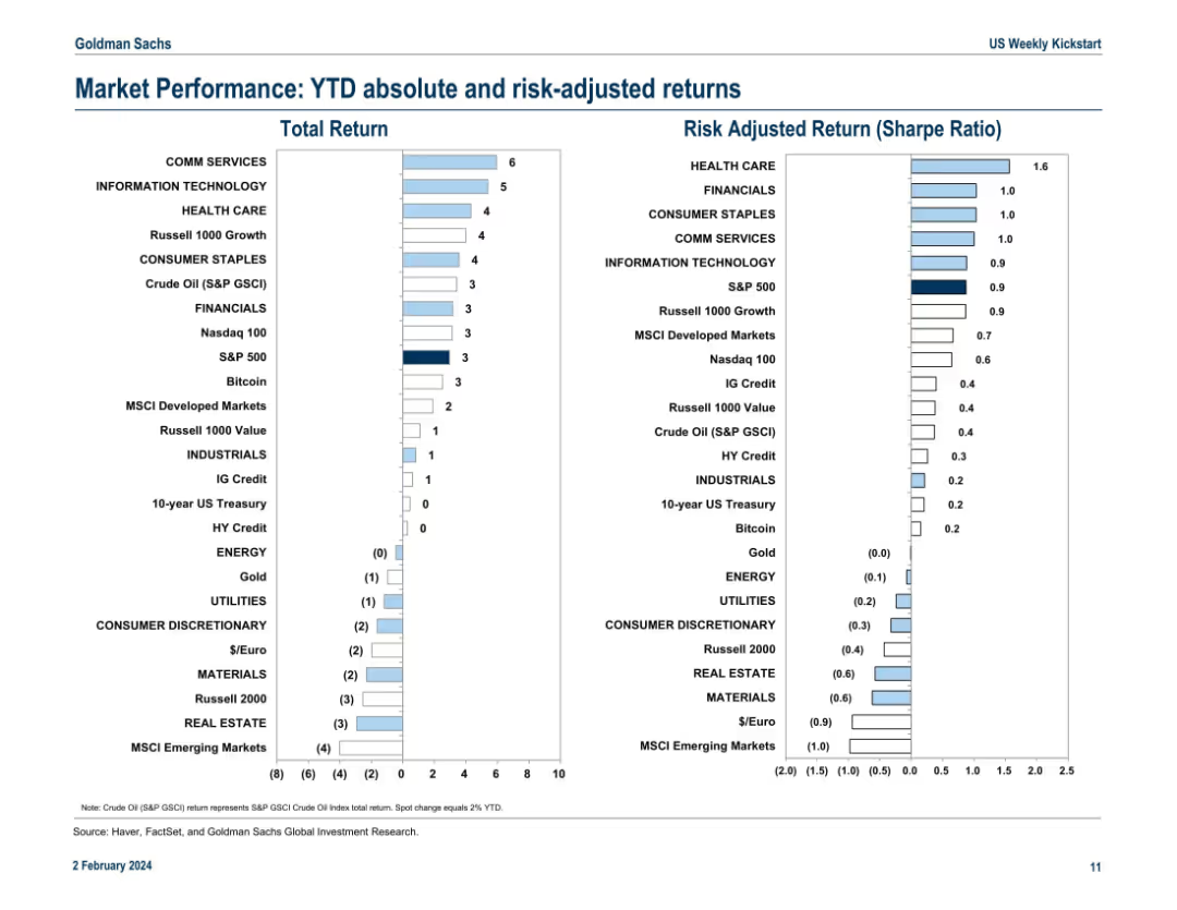
This slide features a comparative column chart displaying consumer priorities for online shopping in June 2021 and March 2021. It includes numerical percentages and color-coded bars for clarity.
Market Analysis and Trends
Retail & E-commerce
The slide presents data from a survey comparing consumer priorities for online shopping between June 2021 and March 2021. It highlights the importance of fast delivery, stock availability, and return policy changes over time.
fast delivery, online shopping, consumer priorities, survey data, comparative analysis
Mixed Chart
PwC/Strategy&
Saved
This slide offers vertical column charts divided by consumer nationality, highlighting their market contributions and trends from 2018 to 2019.
Customer and Market Segmentation
Consumer Goods
Examines the impact of consumer nationality on the luxury goods market in 2019, with a significant focus on Chinese consumers.
Consumer nationality, Market impact, Luxury goods
Multiple Chart
Bain
Saved
This slide shows two declining line charts for banking and insurance stock indexes, alongside quotes from industry leaders on future economic challenges and the strategic outlook.
Market Analysis and Trends
Financial Services
Details the indirect and delayed impacts of COVID-19 on the finance and insurance sectors, using stock performance and executive insights to outline expected challenges and industry responses.
finance, insurance, COVID-19, stock indexes, economic challenges, line chart, executive insights
Mixed Chart
BCG
Saved
This slide features a dark background, a pie chart illustrating revenue distribution, a column chart showing return on equity, and stats on firmwide revenues and shareholder returns.
Financial Performance
Financial Services
Illustrating financial resilience, this slide provides a revenue breakdown and return on equity over different market conditions, reflecting performance stability.
financial resilience, revenue distribution, return on equity, market conditions, net revenues, shareholder returns, firmwide performance
Multiple Chart
Goldman Sachs
Saved
Column charts displaying total TLAC, CET1 capital, and leverage ratios
Financial Performance
Financial Services
Shows capital and leverage ratios, including CET1 capital ratio guidance and leverage ratio guidance
TLAC, CET1, leverage, ratios, capital
Multiple Chart
UBS
Saved
Features bar charts showing the potential production costs for battery cells and packs in various global locations, detailing cost differences and advantages in specific regions.
Financial Performance
Financial Services
Provides a comparative cost analysis for battery cell manufacturing and pack assembly, showing how Australia could be competitive globally, especially post-incentive adjustments in the US.
battery manufacturing, cost analysis, global competition, Australia
Multiple Chart
Accenture
Saved
Column charts displaying methods to define alternative scenarios and build probability weights, alongside a detailed commentary section.
Risk Assessment and Management
Financial Services
Explores methods banks use to define alternative scenarios and build probability weights for ECL, including historical data and expert judgment approaches.
ECL, scenarios, probability, banks, methods, historical, expert judgment, weights, alternative, downside
Multiple Chart
EY
Saved
Vertical bar chart showing global averages for 6 healthcare-related statements
Market Analysis and Trends
Healthcare & Pharmaceuticals
This slide shows global average agreement levels on key healthcare system statements. 61% agree wait times are too long, and 56% believe the system is overstretched. Only 34% believe care is equal for all.
Healthcare perception, survey, global average, access to care, equity, satisfaction
Mixed Chart
IPSOS
Saved
Contains two tables with detailed assumptions on battery industry growth and demand, separated by domestic and international sources, and growth scenarios for different mining and refining stages.
Competitive Landscape
Energy & Utilities
Detailed assumptions for growth scenarios in the battery industry, covering everything from mining raw materials to end-of-life scenarios, highlighting domestic and international growth drivers.
battery industry, growth assumptions, domestic demand, international supply
Table
Accenture
Saved
This slide contains a column chart comparing confidence levels in partnering with Chinese companies across different regions before and after the US BioSecure Act. It shows three separate regions with varying confidence levels indicated by green and grey bars.
Risk Assessment and Management
Healthcare & Pharmaceuticals
The slide shows the impact of the US BioSecure Act on the confidence levels of partnering with Chinese companies, with a significant drop observed in the US. This is used to assess changes in partnership dynamics.
BioSecure Act, confidence levels, Chinese companies, partnership, US, impact
Multiple Chart
LEK
Saved
Horizontal bar chart of lithium mines by production volume and type; country flags and shares
Market Analysis and Trends
Energy & Utilities
This slide shows that lithium production is concentrated among a few operations, with over 50% from just three sites. The chart highlights the dominance of Australia and Chile in global spodumene and brine production.
lithium production, concentration, spodumene, brine, mining, resource distribution
Single Chart
Roland Berger
Saved
This slide includes two sets of column charts comparing the impact of energy prices and macroeconomic factors on investments in France versus other European countries, with executive commentary on energy costs and economic policies.
Investment Analysis
Financial Services
Discusses the economic influences affecting business investments in France, highlighting the adverse impacts of energy prices and macroeconomic factors like inflation and interest rates from 2022 to 2023.
investments, France, energy costs, inflation, interest rates, economic impact, business environment, European comparison, macroeconomic factors, corporate investment
Multiple Chart
Bain
Saved
Structured layout with left-side sectioned narrative and right-side survey bar charts. Purple color scheme aligns with legal focus. Clearly segmented advantages/disadvantages.
Investment Analysis
Financial Services
Discusses growth prospects for Ireland's asset management sector, emphasizing regulatory clarity and tech innovation. Survey results show strong sentiment on legal stability and tax neutrality as advantages. Critiques focus on slow policy changes and lack of promotion.
asset management, growth, legal, tax neutrality, regulation, innovation
Multiple Chart
EY
Saved
Previous
Next
If nothing, comes up, please save your slides first
Create a FREE account to continue browsing
Receive Instant Access to 1,000+ slides from companies like McKinsey, Google, and Goldman Sachs
First Name
Last Name
Email
Password
I agree to all
Terms & Privacy Policy
Thank you! Your submission has been received!
Oops! Something went wrong while submitting the form.
Have an account?
Sign in
Column Chart
Heatmap
Chevron
Org Chart
Infographic
Callouts
Timeline
List
Graphic
Picture
Process Flow
Diagram
Paragraph
Map
Table
Framework
Subtitle
Takeaway Box
Icon
Other Chart
Radar Chart
Waterfall Chart
Mekko Chart
Pie Chart
Scatter Plot
Line Chart
Bar chart
Bullet points