My Account
My Slides
Search by Category
Companies
Slide Type
Use Case
Industry
Pricing
Templates
View All Templates
Download Template Slides
✦ AI
AI Prompt Library
AI Search
Feedback
Login
Logout
Get Started
Browse all Slides
Browse all Slides
Create a FREE Account
Instant access to 1,000+ real slides from top companies like McKinsey, BCG, Goldman Sachs, Google and many more!
First Name
Last Name
Email
Password
I agree to all
Terms & Privacy Policy
Thank you! Your submission has been received!
Oops! Something went wrong while submitting the form.
Have an account?
Sign in
Saved Slides
Text with a quote and a map of Europe, highlighting the reliability and speed of Ipsos surveys. Three numbered points describing the benefits of knowledge panel expansion.
Product and Service Analysis
Professional Services
Describes the expansion of Ipsos' knowledge panels and their benefits, including brand recognition, market revenue gains, and EU market presence. Emphasizes the reliability of data.
Knowledge Panels, Expansion, Reliability, EU Market, Surveys
Boxed
IPSOS
Saved
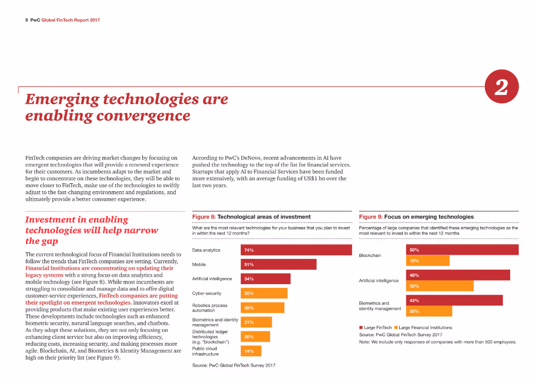
Two column charts show technological areas of investment and focus on emerging technologies, with different colors representing large FinTech and financial institutions.
Technology and Digital Transformation
Financial Services
The slide highlights how emerging technologies like AI and blockchain are driving changes in FinTech, with investment trends in data analytics, mobile, and artificial intelligence.
Emerging technologies, Investment, FinTech, AI, Blockchain
Multiple Chart
PwC/Strategy&
Saved
Consists of a stacked column chart detailing regulatory capital movement within Macquarie Capital, segmented by type of investment. The chart uses color coding to differentiate between investment categories, with a clear legend and date annotations.
Investment Analysis
Financial Services
This slide presents the regulatory capital movement within Macquarie Capital, breaking down investments and realizations over time, intended for use in investment analysis and regulatory reporting.
regulatory capital, Macquarie Capital, investments, realizations, analysis, reporting, finance
Single Chart
Goldman Sachs
Saved
This slide uses multiple lists and a large bar chart detailing sustainable finance volumes and targets.
Regulatory and Compliance
Environmental Services & Sustainability
Covering sustainability efforts and achievements, this slide details increased finance volumes, partnerships, and strategic sustainability initiatives. It is useful for stakeholders and regulatory bodies interested in corporate environmental responsibilities and progress towards sustainability goals, including long-term financial commitments to sustainability-linked projects and reporting on environmental, social, and governance (ESG) criteria.
Sustainability, Finance, ESG, Partnerships, Regulatory Compliance
Mixed Chart
Deutsche Bank
Saved
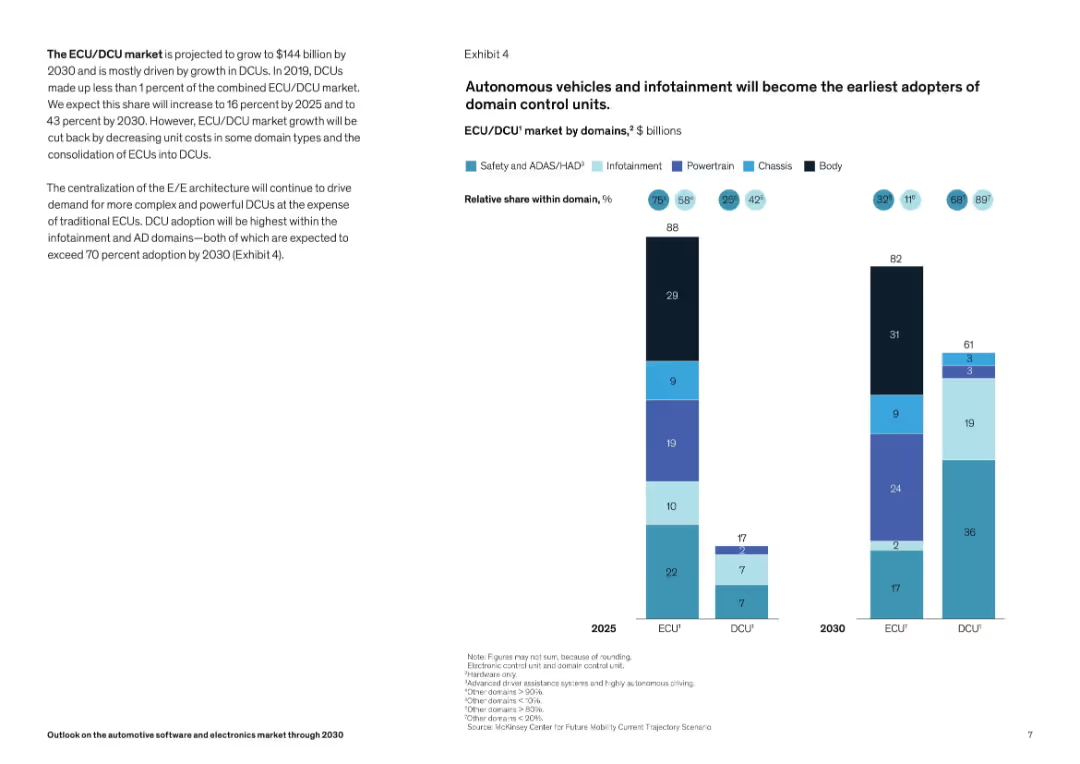
Two-column layout; left side has textual insights, right side features a stacked bar chart comparing ECU and DCU market values and domain shares for 2025 and 2030. Color-coded bars indicate different vehicle domains.
Market Analysis and Trends
Industrial & Manufacturing
This slide highlights the growth of the ECU/DCU market to $144B by 2030, driven by DCU adoption, especially in autonomous driving (AD) and infotainment. A bar chart shows domain-wise distribution and projected adoption trends for 2025 and 2030. Centralized E/E architecture is emphasized as a growth driver for DCUs.
ECU, DCU, ADAS, infotainment, autonomous driving, domain architecture, market growth, vehicle electronics, 2030 forecast, automotive
Mixed Chart
McKinsey
Saved
Various pie charts and maps showing the composition of survey respondents by jurisdiction, title/role, revenue, and industry sectors.
Market Analysis and Trends
Professional Services
This slide provides an overview of survey respondents' profiles, including their jurisdiction, revenue, roles, and industry sectors, offering insights into the survey's demographic.
Survey, respondents, jurisdiction, revenue, roles, industry, composition, demographics, analysis, profile
Multiple Chart
EY
Saved
Pie chart and bullet points detailing emissions reduction methods and economic benefits. Text highlights farmer contributions and potential income from carbon projects.
Technology and Digital Transformation
Agriculture & Food Production
Highlights the role of Australian farmers in reducing emissions through various technologies and practices, emphasizing economic and environmental benefits.
Farmers, Emissions Reduction, Agriculture, Technology, Carbon Projects, Economic Benefits, Environmental Impact
Multiple Chart
EY
Saved
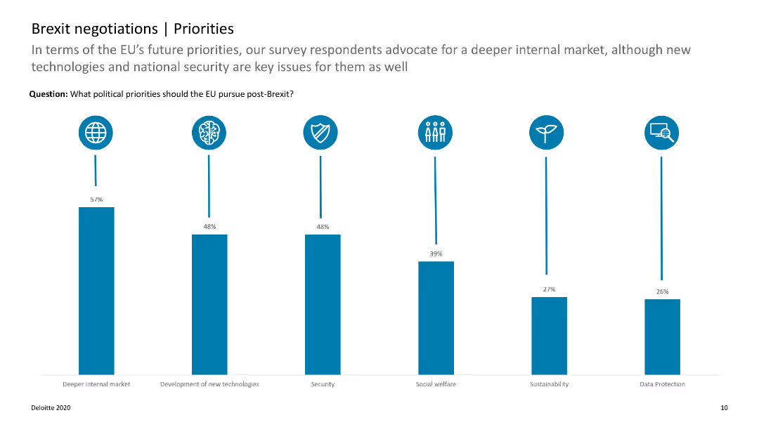
The slide features a column chart with data on the top political priorities for the EU post-Brexit, such as internal market and new technologies.
Strategic Planning
Government & Public Sector
This slide highlights the key political priorities for the EU after Brexit, showing the importance of internal market and technology development. It helps in understanding EU strategic focuses.
Brexit, EU priorities, political priorities, internal market, technology
Single Chart
Deloitte
Saved
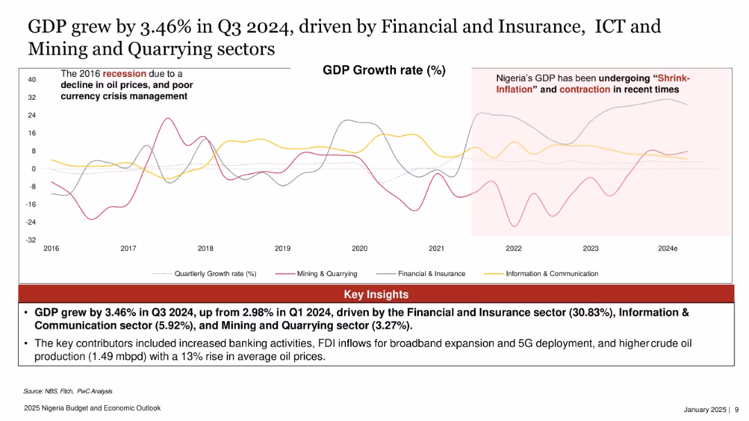
Line graph with three color-coded lines tracking sectoral GDP growth rates over time, with callouts and shaded highlights.
Market Analysis and Trends
Government & Public Sector
GDP in Nigeria grew by 3.46% in Q3 2024, driven primarily by Financial & Insurance (30.83%), ICT (5.92%), and Mining & Quarrying (3.27%). The slide shows sectoral trends since 2016, noting impacts from oil price fluctuations and currency crises.
GDP, Nigeria, sector growth, ICT, financial services, mining, quarterly growth, PwC
Mixed Chart
PwC/Strategy&
Saved
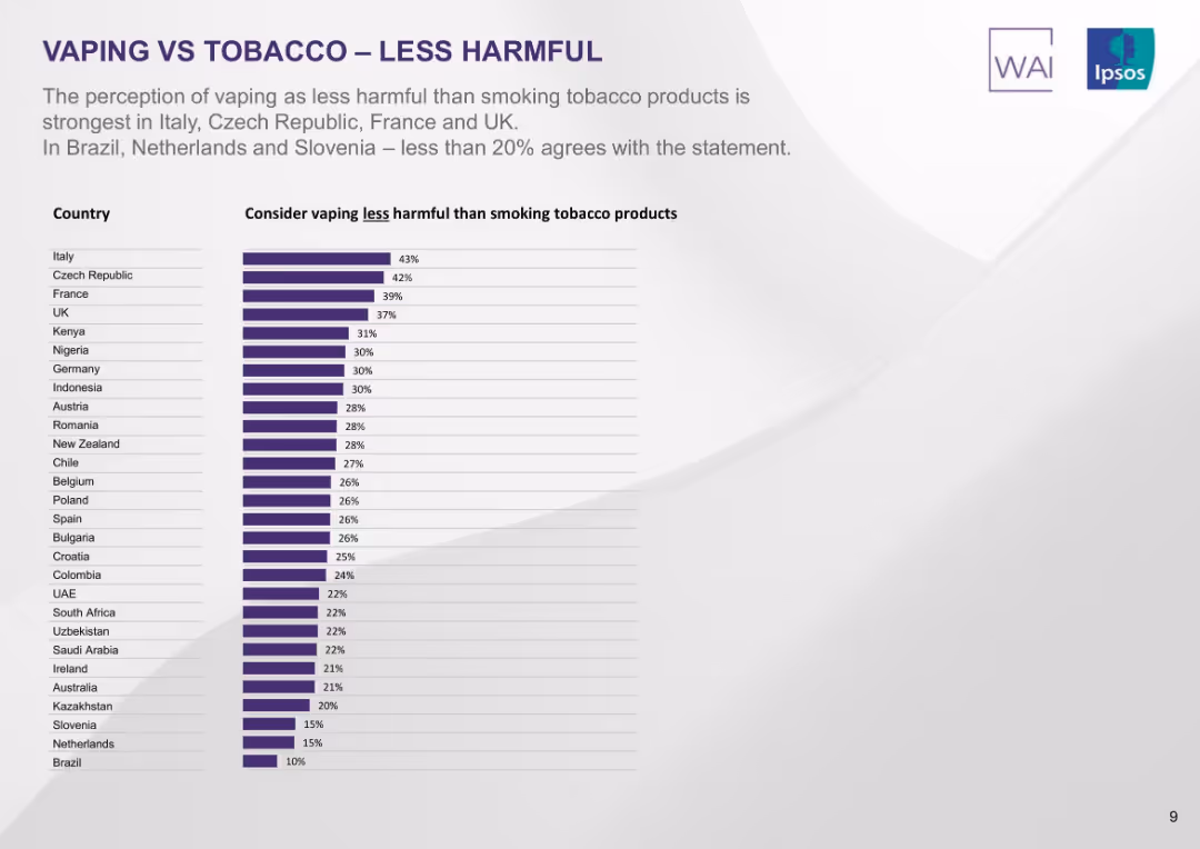
Ranked bar chart by country showing percentage who believe vaping is less harmful than smoking. Purple bars with white background.
Market Analysis and Trends
Healthcare & Pharmaceuticals
The slide shows countries where the belief that vaping is less harmful than smoking is most prevalent. Italy leads with 43%, followed by Czech Republic and France. The lowest perceptions are found in Brazil and Slovenia.
vaping less harmful, perception, smoking, comparative risk, countries, public opinion, Ipsos, ranking
Single Chart
IPSOS
Saved
Circle chart and bar charts showing worker satisfaction levels across different SEA countries.
Market Analysis and Trends
Financial Services
This slide presents the levels of worker satisfaction in various SEA countries, indicating a significant portion of dissatisfaction.
worker satisfaction, SEA, circle chart, bar chart, survey
Multiple Chart
IPSOS
Saved
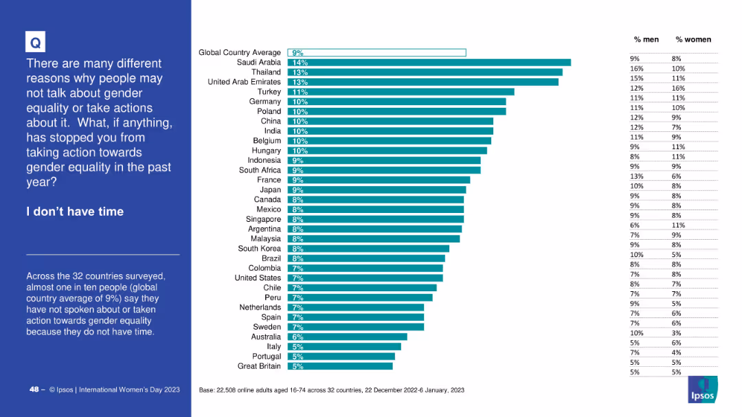
Horizontal bar graph with consistent design—country rankings, global average, gender splits; left-aligned blue panel describes the context and finding.
Operational Efficiency
Government & Public Sector
The slide presents data on people who did not take action for gender equality due to time constraints. The global average is 9%. Countries like Saudi Arabia and Thailand have higher percentages, and gender differences are also shown.
time constraints, gender action, survey, equality, barriers, Ipsos, country rankings
Mixed Chart
IPSOS
Saved
This slide features a series of column charts comparing challenges faced by German and Global organizations in preparing their workforce for Industry 4.0. The graphs illustrate disparities in skillset mismatches, attraction and retention of skilled talent, and the lack of necessary training programs.
Human Resources and Talent Management
Education & Training
Analyzes challenges in workforce development for Industry 4.0, showing German executives' perspectives versus global trends in skill mismatches, talent attraction, retention, and training initiatives.
Workforce, Industry 4.0, Talent, Training, Skills, Germany, Global, Challenges
Multiple Chart
Deloitte
Saved
Split layout with statement and average percentage on left; right side contains stacked bar chart showing country-wise agreement/disagreement, with historical % agree data (2016–2023).
Market Analysis and Trends
Government & Public Sector
This slide shows public sentiment on whether countries would be stronger without immigration. A horizontal stacked bar chart displays responses across 28 countries, categorized by agreement levels and changes over time, providing a comparative and historical perspective.
immigration, nationalism, public sentiment, Ipsos survey, 2023 trends, immigration policy, demographic opinion, agreement rate
Mixed Chart
IPSOS
Saved
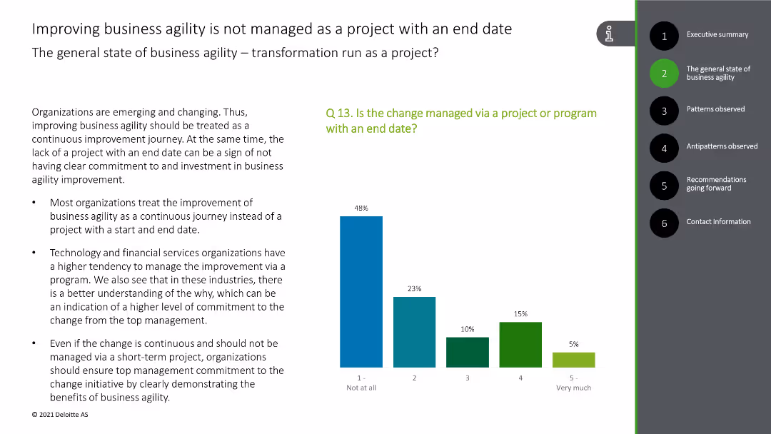
This slide includes a column chart depicting the management of business agility as a continuous journey rather than a project with an end date, with green and blue bars.
Strategic Planning
Technology & Software
The slide explains that business agility improvements are treated as ongoing processes rather than finite projects, with survey data for support.
business agility, continuous improvement, project management, survey data, strategy
Mixed Chart
Deloitte
Saved
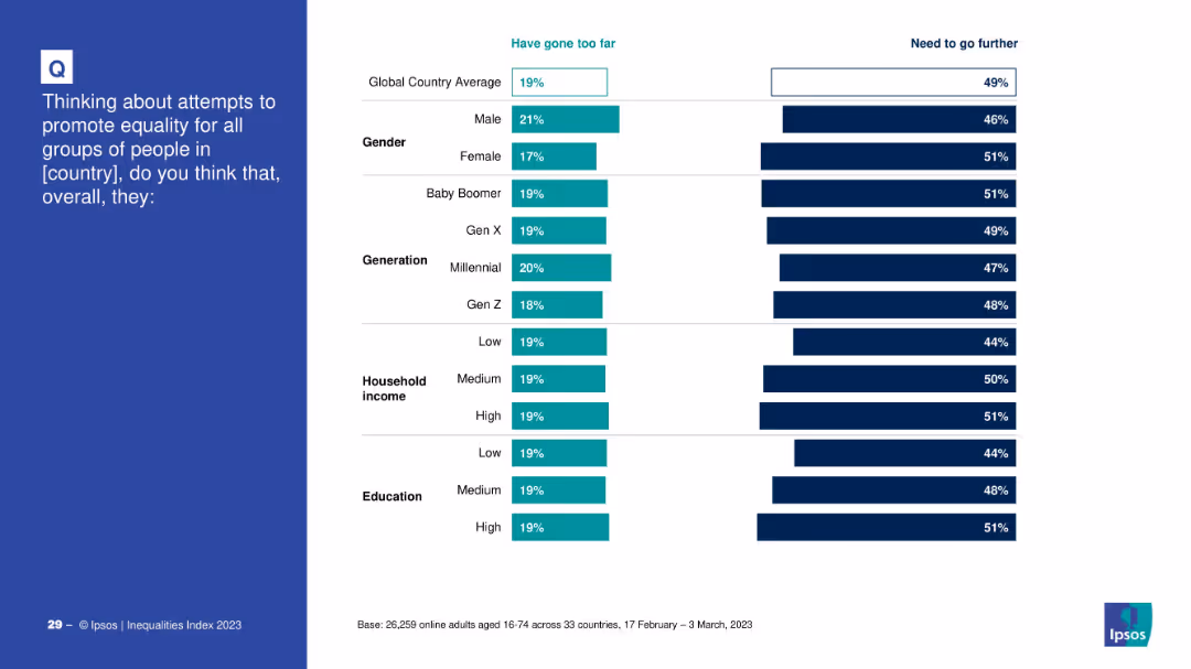
Bar charts showing demographic breakdowns of those who believe equality efforts have gone too far vs. need to go further.
Strategic Planning
Government & Public Sector
The slide explores demographic opinions on national equality efforts. It provides comparative percentages across gender, generation, income, and education, assessing whether groups feel progress has been excessive or insufficient.
demographic analysis, equality, opinions, survey, gender, generation, income, education
Mixed Chart
IPSOS
Saved
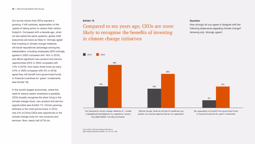
This slide includes a column chart comparing CEO responses from 2010 and 2020 on the benefits of investing in climate change initiatives, with clear visual distinctions.
Regulatory and Compliance
Environmental Services & Sustainability
The slide shows that CEOs are now more likely to acknowledge the advantages of climate change investments, including reputational benefits and new opportunities.
Climate change, investment benefits, CEO recognition, sustainability, comparison
Mixed Chart
PwC/Strategy&
Saved
Slide displays 4 critical management practices as icons with descriptions below each. Blue and black color scheme.
Organizational Structure and Change
Professional Services
Explains critical management practices for evaluating organizational health during transformation. Helps in management training.
transformation, management, health, practices, organizational
Linear Flow
McKinsey
Saved
Comprising a stacked column chart, this slide visually represents like-for-like DPU history with layers indicating operating DPU, fees in units, and capital top-up. Each column represents a year from 2018 to 2022, with a color-coding scheme and annotations for additional details. There's a legend explaining the components of the bars and a footnote defining like-for-like DPU.
Financial Performance
Financial Services
Provides a historical perspective on the Distribution Per Unit (DPU), indicating the company's financial performance and operational efficiency over a five-year period.
DPU Trends, Financial Performance, Operational Efficiency, Yearly Comparison, Capital Management, Fee Structure
Single Chart
Morgan Stanley
Saved
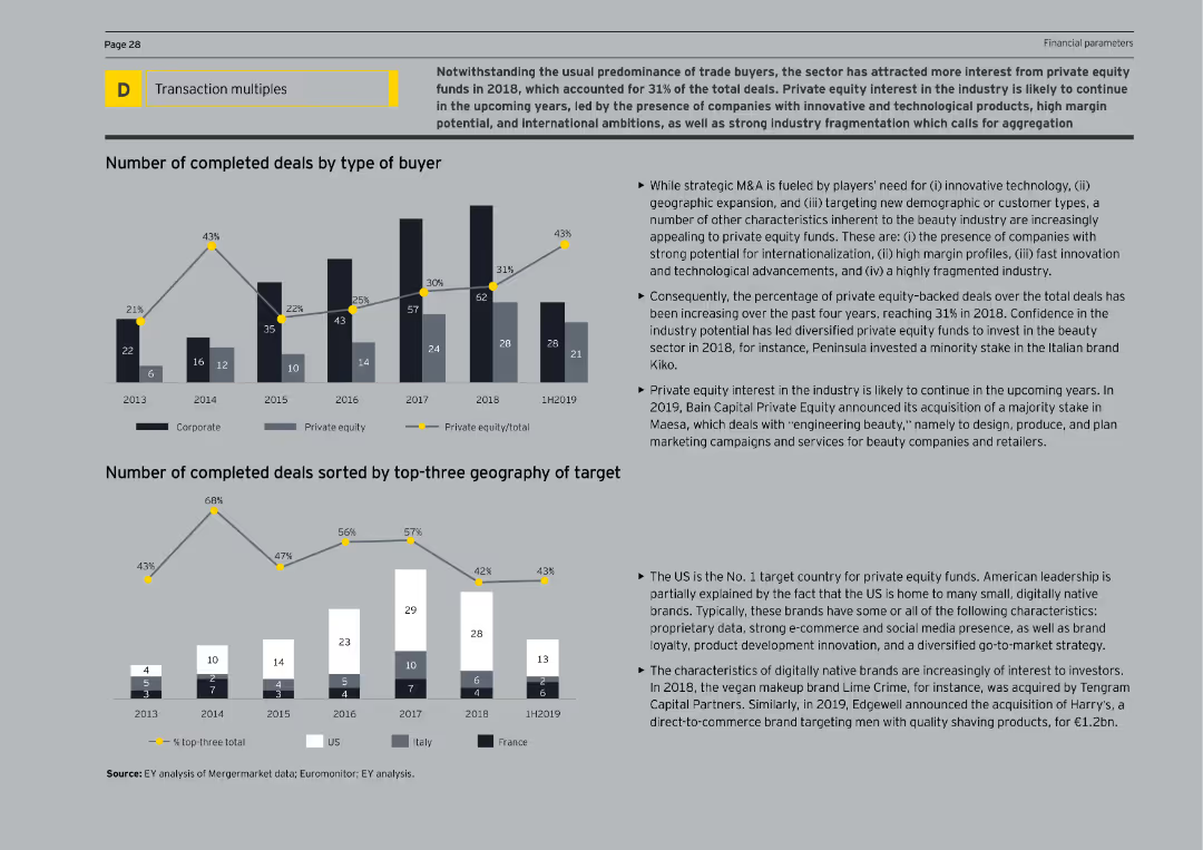
The slide features column charts showing the number of completed deals by buyer type and geography of targets from 2013 to 1H2019. The text explains the growing interest from private equity funds and the characteristics of attractive target companies.
Mergers and Acquisitions
Consumer Goods
The slide examines the growing interest of private equity funds in the beauty sector, highlighting the increasing number of deals by these investors. It provides an overview of the types of companies attracting private equity and the geographical distribution of these investments.
Private Equity, Beauty, M&A, Investments, Deals
Multiple Chart
EY
Saved
The slide uses stacked column charts to illustrate the growth in sales volume of Off-Grid Solar (OGS) products from 2018 to 2020, split by cash and PAYGo sales. Annotations highlight the percentage increase and CAGR, providing a clear visualization of market trends.
Market Analysis and Trends
Energy & Utilities
Details the increase in sales of off-grid solar products under different payment models, emphasizing the rising consumer acceptance and market expansion for solar products in less accessible regions.
off-grid, solar products, sales growth, PAYGo, market expansion
Single Chart
BCG
Saved
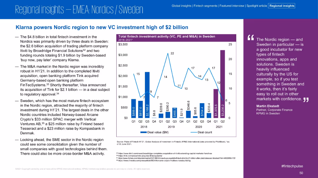
Layout mirrors other regional slides; commentary on the left, bar/line chart in center-right, expert quote far right. Emphasis on Sweden.
Investment Analysis
Financial Services
The Nordic region, led by Sweden, achieved record VC investment levels in H1 2021 due to major deals including Klarna and Itiviti. The slide emphasizes Sweden’s leadership in fintech and its role as a testing ground for innovation.
Nordics, Sweden, Klarna, VC Investment, Fintech, H1 2021, Innovation, Itiviti
Mixed Chart
KPMG
Saved
The slide features a two-column layout with a title and text explaining the key enhancements in financial risk management planned for the next 12 months, supported by a column chart.
Financial Performance
Financial Services
This slide presents planned enhancements in financial risk management, such as stress testing, risk measurement, and data aggregation, to improve financial stability.
financial risk management, enhancements, stress testing, risk measurement, data aggregation
Mixed Chart
EY
Saved
Combines text with circular icons representing various strategic strengths such as experienced management, market growth, and sustainability. The design is clean, utilizing a balanced mix of visuals and text to enhance comprehension and retention of the information presented.
Market Analysis and Trends
Industrial & Manufacturing
Summarizes the core strengths and market advantages of TI Fluid Systems, focusing on its leadership in automotive fluid systems with emphasis on sustainable practices and strong market positioning. Highlights key aspects such as above-market growth, alignment with electrification trends, and recognition for environmental contributions.
investment, sustainability, market growth, automotive, leadership
Pillar
Deutsche Bank
Saved
Exhibit 2 displays a table categorizing technology trends and their relevance across multiple industries with color-coded relevance.
Industry Overview
Technology & Software
This table slide exhibits the relevance of various technology trends across different industry sectors.
Industries, Technology, Trends, Relevance, Silicon Age, Engineering Tomorrow
Single Chart
McKinsey
Saved
Previous
Next
If nothing, comes up, please save your slides first
Create a FREE account to continue browsing
Receive Instant Access to 1,000+ slides from companies like McKinsey, Google, and Goldman Sachs
First Name
Last Name
Email
Password
I agree to all
Terms & Privacy Policy
Thank you! Your submission has been received!
Oops! Something went wrong while submitting the form.
Have an account?
Sign in
Column Chart
Heatmap
Chevron
Org Chart
Infographic
Callouts
Timeline
List
Graphic
Picture
Process Flow
Diagram
Paragraph
Map
Table
Framework
Subtitle
Takeaway Box
Icon
Other Chart
Radar Chart
Waterfall Chart
Mekko Chart
Pie Chart
Scatter Plot
Line Chart
Bar chart
Bullet points


![[Country] would be stronger if we stopped immigration](https://cdn.prod.website-files.com/654e70fb59937215cac87b19/6899be436cb8c4720c8d5c48_2PPpHevHHqBR2M5cxv5elYBkz_0ss3_-jn7jUB4DuiM.avif)