My Account
My Slides
Search by Category
Companies
Slide Type
Use Case
Industry
Pricing
Templates
View All Templates
Download Template Slides
✦ AI
AI Prompt Library
AI Search
Feedback
Login
Logout
Get Started
Browse all Slides
Browse all Slides
Create a FREE Account
Instant access to 1,000+ real slides from top companies like McKinsey, BCG, Goldman Sachs, Google and many more!
First Name
Last Name
Email
Password
I agree to all
Terms & Privacy Policy
Thank you! Your submission has been received!
Oops! Something went wrong while submitting the form.
Have an account?
Sign in
Saved Slides
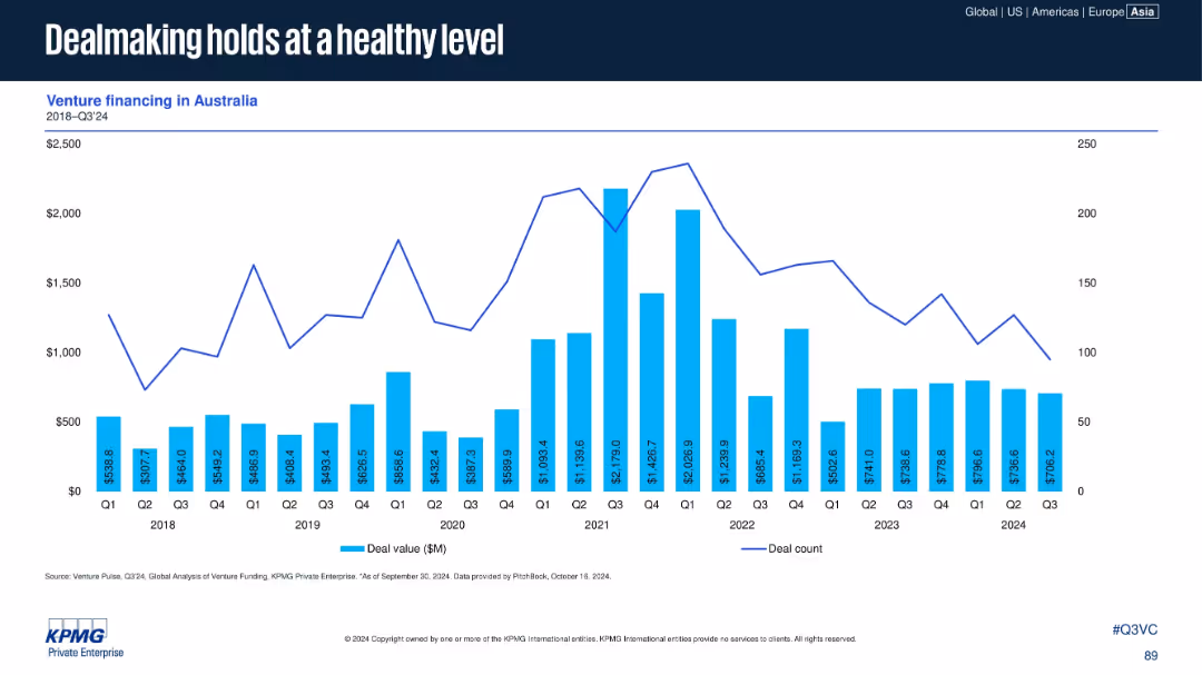
Bar and line chart presenting venture financing data (deal value and count) in Australia from 2018 to Q3 2024.
Investment Analysis
Financial Services
Australia has maintained relatively stable VC activity, with healthy dealmaking volumes in 2024. Although deal counts declined slightly, deal values remain resilient, supported by consistent investor interest in the region.
Australia, deal value, deal count, venture financing, KPMG, investment stability
Single Chart
KPMG
Saved
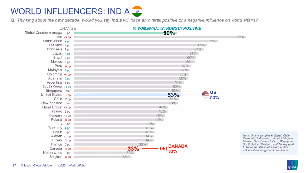
Horizontal bar chart ranking countries by % of positive influence attributed to India; includes flags and % changes.
Market Analysis and Trends
Government & Public Sector
The slide evaluates how global respondents view India's influence in the coming decade. While globally India holds a 50% positivity rating, the highest positivity comes from South Africa, and the lowest from Canada.
India, global image, public opinion, influence, Ipsos, rankings, decade outlook, soft power
Single Chart
IPSOS
Saved
Bar chart with horizontal country-by-country comparisons, color-coded by response category; historical comparison columns on right.
Risk Assessment and Management
Government & Public Sector
This slide reports on agreement with halting immigration, with 43% globally in favor. There is significant variation between countries—Türkiye and India show high support, while Japan and South Korea show low. The slide suggests immigration remains a polarizing issue globally, tied to national identity, economic concerns, and political narratives.
immigration, nationalism, identity, population, politics, Ipsos, opinion, integration
Mixed Chart
IPSOS
Saved
This slide compares cold storage capacities per 1000 urban residents in several countries using column charts, showing Nigeria's low capacity relative to others. It includes a statistic on the loss percentage due to inadequate storage.
Strategic Planning
Agriculture & Food Production
The slide exposes the critical gaps in cold storage infrastructure in Nigeria compared to other countries, linking these deficiencies to high food loss rates. It underscores the necessity for investing in enhanced cold storage solutions to support food security initiatives.
Cold Storage, Capacity, Nigeria, Challenges, Comparison
Mixed Chart
BCG
Saved
Displays three pie charts showing the evolution of podcast advertising campaigns by type from 2018 to 2020, highlighting a shift towards branding.
Strategic Planning
Media & Entertainment
Evaluates changes in the types of advertising campaigns in podcasts, moving from direct response to a focus on branding.
podcast advertising, campaign types, branding, direct response, 2018-2020
Multiple Chart
PwC/Strategy&
Saved
The slide features a graph showing the biofuels competitive advantage over time, from 2020 to 2050. It highlights two possible market segments for advanced biofuels: the pivot market (power and trucks) and the end-game market (shipping and aviation).
Market Analysis and Trends
Energy & Utilities
This slide analyzes the market dynamics for advanced biofuels, identifying two potential markets: one where biofuels are mature and another where they are still developing, highlighting the competitive advantage and market potential up to 2050.
advanced biofuels, market dynamics, competitive advantage, power, trucks, shipping, aviation, 2020-2050
Single Chart
Kearney
Saved
Pie chart displaying the distribution of approaches to ML governance among various firms.
Regulatory and Compliance
Technology & Software
Provides an overview of how different organizations are handling ML governance and framework adaptation.
ML governance, framework, adaptation, distribution
Single Chart
PwC/Strategy&
Saved
The slide features an elegant design with a bar chart and professional imagery of a business setting. It compares satisfaction levels within an organization concerning various risk management activities, highlighting differences between more capable and less capable groups.
Strategic Planning
Professional Services
This slide explores the effectiveness of risk management practices across different organizational levels. It contrasts the satisfaction rates between groups with varying capabilities, underscoring the strategic benefits of comprehensive risk management training and integration within business processes. This comparison serves to motivate improvements in company-wide risk awareness and proactive management strategies.
risk management, empowerment, organizational levels, satisfaction rates, training, strategic benefits
Mixed Chart
Accenture
Saved
This slide features four images, each representing a different development project, with corresponding cost estimates and timelines from 2022 to 2035. The images have an 'artist impression' label, indicating they are conceptual representations. There is also a footnote about the manager's monitoring of development under contract compliance with regulations.
Strategic Planning
Real Estate & Construction
Depicts a timeline of major construction projects within a real estate portfolio, showing investment in development projects currently underway or in planning stages.
Development Pipeline, Real Estate Projects, Construction Investment, Projected Costs, Timeline, Regulatory Compliance
Image
Morgan Stanley
Saved
Features pie charts, percentage callouts, and bullet points emphasizing the focus of high-tech leaders on as-a-service models for growth.
Investment Analysis
Technology & Software
Highlights the strategic focus of high-tech leaders on as-a-service for scaling businesses and the priorities of C-suite executives.
high-tech, as-a-service, leadership, C-suite, strategy, scaling
Multiple Chart
Accenture
Saved
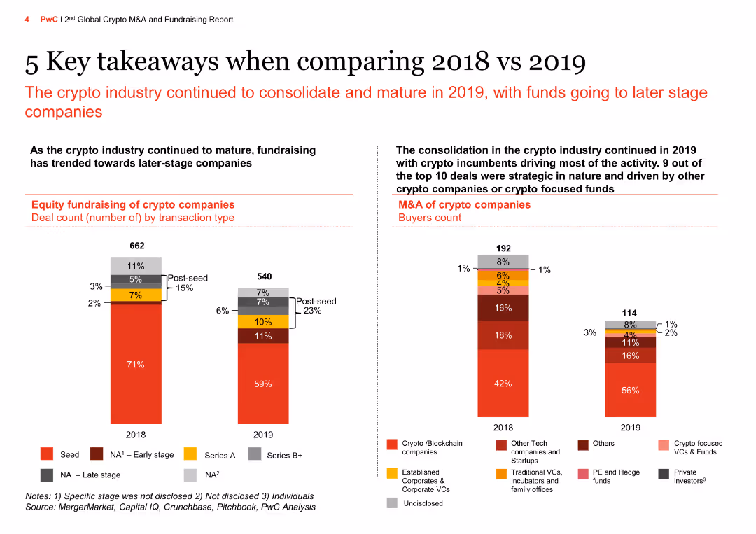
The slide features column charts comparing equity fundraising and M&A of crypto companies in 2018 vs 2019 by transaction type and buyers count, showing the consolidation of the crypto industry and investment trends.
Market Analysis and Trends
Financial Services
The slide highlights trends in crypto equity fundraising and M&A, showing consolidation towards later-stage companies and strategic deals driven by other crypto companies or focused funds.
Crypto industry, equity fundraising, M&A, transaction type, buyers count, consolidation, investment trends, financial services, market analysis, 2018 vs 2019
Multiple Chart
PwC/Strategy&
Saved
The slide features a balanced layout with a text section on the left and a column chart on the right. The text section explains strategic choices driven by technology. The column chart shows disruption levels increasing over time.
Strategic Planning
Technology & Software
The slide discusses how tech-forward companies accelerate strategy cycle times using real-time data. It highlights disruption forces with a chart showing disruption index growth.
strategy, disruption, technology, cycle times, real-time data
Mixed Chart
Accenture
Saved
Two-column layout with a table on the left detailing equity and net debt and a column chart on the right showing gross debt maturity profile.
Financial Performance
Financial Services
Provides an overview of the balance sheet and liquidity position as of June 2023, including equity, net debt, gearing ratios, and liquidity with debt maturity projections.
balance sheet, liquidity, equity, debt, financials
Mixed Chart
IPSOS
Saved
Utilizes column charts to display revenue mix across different business segments over recent quarters.
Strategic Planning
Financial Services
Discusses the growth and revenue distribution within Deutsche Bank's various business units throughout recent quarters.
revenue growth, strategic planning, business segments, corporate banking
Mixed Chart
Deutsche Bank
Saved
A matrix layout correlates technology trends with their predictability and impact on the mineral industry. Includes icons and labels for various technologies like AI and 3D printing.
Strategic Planning
Technology & Software
Analyzes potential future technologies and their impacts on mineral demand, useful for strategic planning in technology investments and market forecasting.
technology trends, mineral industry, impact analysis, predictability, strategic planning, 3D printing, AI
Mixed Chart
McKinsey
Saved
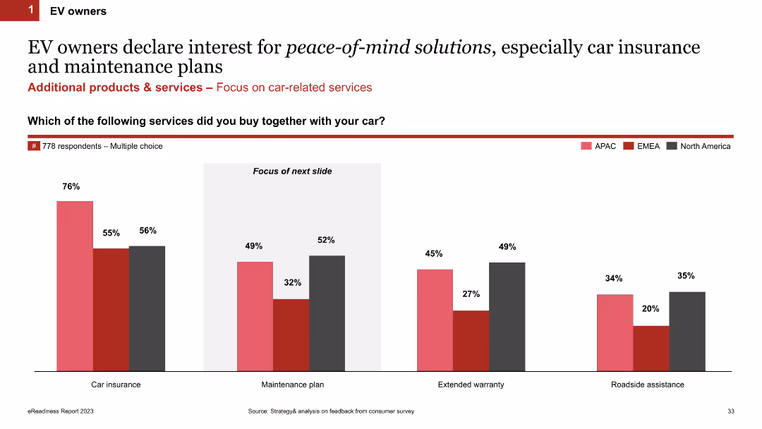
Column chart showing percentages of additional services bought by EV owners across different regions (APAC, EMEA, North America)
Market Analysis and Trends
Transportation & Logistics
This slide presents survey data on additional services purchased by EV owners, highlighting regional differences in the uptake of car insurance and maintenance plans.
EV owners, car insurance, maintenance, services, regional analysis
Single Chart
PwC/Strategy&
Saved
Presents column chart to depict asset management growth, alongside textual annotations. The design is straightforward, utilizing different shades of blue to distinguish between categories.
Investment Analysis
Financial Services
Shows asset under management movement, useful for investment analysis and understanding the impact of various financial factors such as foreign exchange and market movements on asset management.
Asset Management, Investment Growth, MAM, MIRA, Financial Impact
Single Chart
Goldman Sachs
Saved
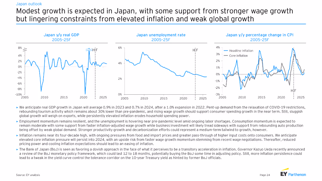
Three line charts showing Japan y/y real GDP, Japan unemployment rate, and Japan y/y percentage change in CPI from 2005-25F. Moderate complexity, well-structured for presenting economic projections and trends.
Market Analysis and Trends
Financial Services
This slide forecasts modest economic growth in Japan, supported by wage growth and rebounding tourism. It addresses ongoing inflation, employment trends, and the impact of global demand on economic performance.
Japan, GDP, unemployment, inflation, growth
Multiple Chart
EY
Saved
Three-panel design illustrating phases of stabilization, sustainable growth, and future leadership aspirations with icons.
Strategic Planning
Financial Services
This slide outlines the bank's strategic roadmap post-2019, focusing on past achievements and future goals aimed at establishing industry leadership, highlighting key phases in strategy implementation.
Leadership, Growth, Strategy, Aspirations, Roadmap, Industry, Future
Linear Flow
Deutsche Bank
Saved
Bar chart showing the growth of MGAs relative to brokers in the UK from 2010 to 2019, highlighting a significant increase in the number of MGAs over the period.
Market Analysis and Trends
Financial Services
Examines the growth trends of Managing General Agents (MGAs) compared to brokers in the UK, showing a 41% increase in MGAs from 2010 to 2019.
MGA growth, brokers, UK, market trends, 2019
Multiple Chart
Roland Berger
Saved
The slide presents stacked column charts representing capital movement with labels for dates and financial segments. It uses a color gradient to differentiate segments within the bars.
Financial Performance
Financial Services
This slide shows capital movement within Macquarie Capital over two time points, highlighting changes across different financial sectors like debt and various types of energy investments.
Capital, Investments, Realizations, FX, Debt
Single Chart
Morgan Stanley
Saved
The slide contains text and graphical elements, including a large "16 of the top 30" in teal, a pie chart showing 72% of US businesses, and a financial figure for the cloud computing market size. The design is clean and modern.
Sales and Business Development
Professional Services
The slide highlights Ipsos' engagement with top B2B companies, emphasizing the predominance of B2B businesses in the US and the significant market size of cloud computing.
B2B, market opportunity, cloud computing, US, engagement
Mixed Chart
IPSOS
Saved
The slide provides information on "Leonardo Labs" and "DAVINCI-1 HPC" with two separate sections, each with bullet points and a map highlighting locations.
Technology and Digital Transformation
Industrial & Manufacturing
Showcases the company's R&D capabilities and strategic positioning in technology and aerospace. It details the structure and accomplishments of Leonardo Labs and the DAVINCI-1 HPC system, potentially for investor presentations or to showcase technological advancements.
R&D, Technology, Aerospace, Leonardo Labs, DAVINCI-1 HPC
Graphic
Goldman Sachs
Saved
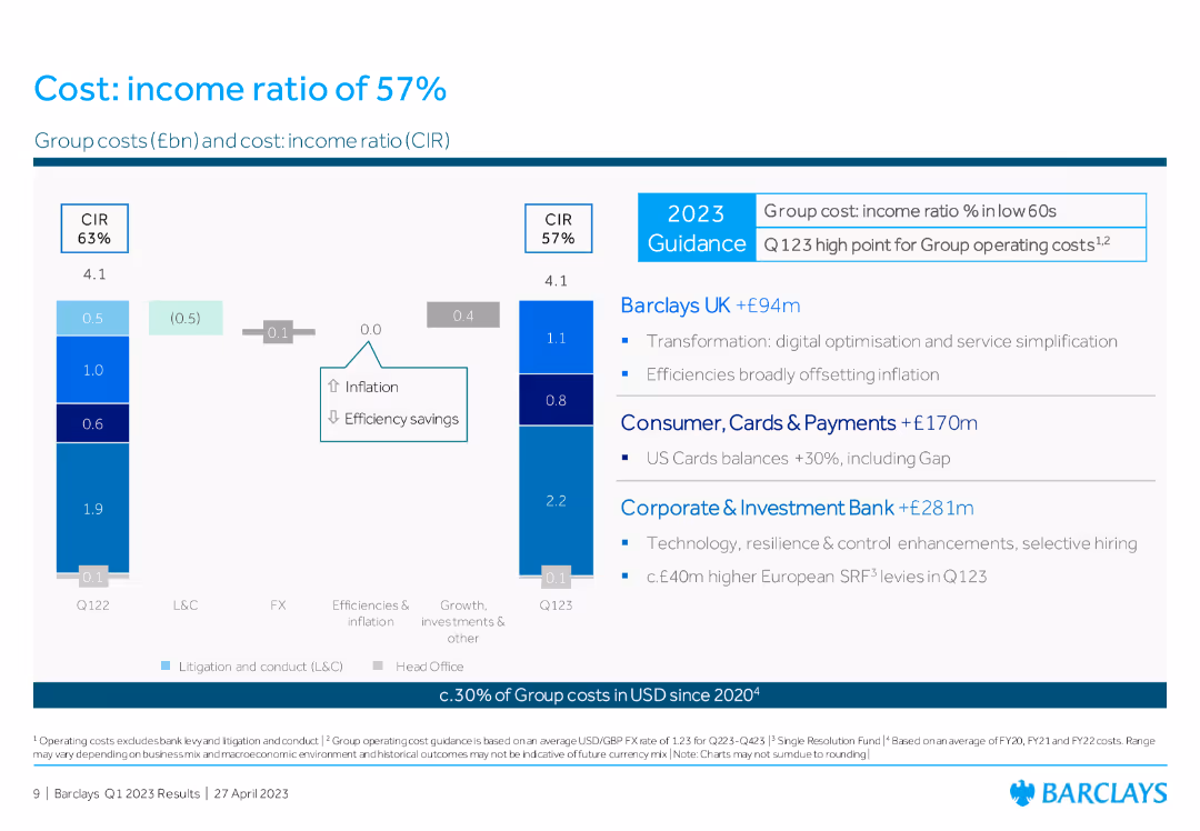
Column chart comparing group costs and cost: income ratio (CIR) between Q1 2022 and Q1 2023, with text boxes summarizing contributions from Barclays UK, Consumer, and CIB.
Operational Efficiency
Financial Services
The slide presents the cost: income ratio of Barclays, illustrating the changes in group costs and highlighting efficiencies and inflation impacts.
cost: income ratio, group costs, operational efficiency, Barclays UK, Consumer, CIB
Multiple Chart
Barclays
Saved
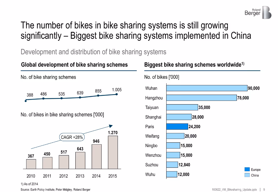
Left side has two growth charts (number of systems and bikes); right side bar chart lists largest global schemes by city
Market Analysis and Trends
Transportation & Logistics
This slide highlights significant global growth in bike-sharing schemes, especially in China. It includes a CAGR of 28% and lists top cities by number of bikes, with Wuhan and Hangzhou leading.
bike sharing, growth, China, CAGR, top cities, mobility, transportation, schemes
Multiple Chart
Roland Berger
Saved
Previous
Next
If nothing, comes up, please save your slides first
Create a FREE account to continue browsing
Receive Instant Access to 1,000+ slides from companies like McKinsey, Google, and Goldman Sachs
First Name
Last Name
Email
Password
I agree to all
Terms & Privacy Policy
Thank you! Your submission has been received!
Oops! Something went wrong while submitting the form.
Have an account?
Sign in
Column Chart
Heatmap
Chevron
Org Chart
Infographic
Callouts
Timeline
List
Graphic
Picture
Process Flow
Diagram
Paragraph
Map
Table
Framework
Subtitle
Takeaway Box
Icon
Other Chart
Radar Chart
Waterfall Chart
Mekko Chart
Pie Chart
Scatter Plot
Line Chart
Bar chart
Bullet points


![[Country] would be stronger if we stopped immigration](https://cdn.prod.website-files.com/654e70fb59937215cac87b19/6899bd5abc303b7d94f02f12_0Te_jmPYnbVvw-qHnHze3tKEeBz4_dT5PizkF-m_TSY.avif)