My Account
My Slides
Search by Category
Companies
Slide Type
Use Case
Industry
Pricing
Templates
View All Templates
Download Template Slides
✦ AI
AI Prompt Library
AI Search
Feedback
Login
Logout
Get Started
Browse all Slides
Browse all Slides
Create a FREE Account
Instant access to 1,000+ real slides from top companies like McKinsey, BCG, Goldman Sachs, Google and many more!
First Name
Last Name
Email
Password
I agree to all
Terms & Privacy Policy
Thank you! Your submission has been received!
Oops! Something went wrong while submitting the form.
Have an account?
Sign in
Saved Slides
The slide features a column chart showing the growth in operating margin over several years, depicted in varying shades of pink, with the year marked below each column.
Financial Performance
Consumer Goods
This slide illustrates L'Oréal's increasing operating margin over the years, demonstrating their consistent financial growth and successful business model.
operating margin, financial growth, L'Oréal, business model
Single Chart
Deutsche Bank
Saved
Slide with bullet points and checkboxes detailing strategies for businesses to consider in anticipation of returning to normal operations.
Strategic Planning
Professional Services
Provides a checklist for businesses on considerations and actions for transitioning back to normal operations after a crisis.
Return strategy, business preparedness, employee protection, customer reassurance
Vertical Flow
McKinsey
Saved
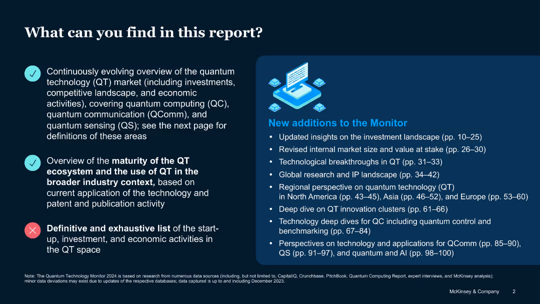
Split-screen layout with bullet points and infographic; check and cross icons indicate inclusion/exclusion
Industry Overview
Artificial Intelligence
Introduces the scope and limitations of the report, outlining what is and isn’t included. Focuses on QT market trends, ecosystem maturity, and new additions such as investment insights and IP analysis, but excludes a full inventory of economic activities.
Quantum technology, market overview, QComm, QC, QS, insights, exclusions
Boxed
McKinsey
Saved
The slide features a diagonal line dividing it into four segments, each labeled as Turnaround, Fund, Grow, Transform, with icons and brief descriptions.
Strategic Planning
Professional Services
The slide presents a strategic shift from a save-to-grow to a save-to-transform approach in business, emphasizing different strategic phases like Turnaround, Fund, Grow, and Transform with concise definitions and implications for business strategy.
Business Strategy, Transformation, Growth, Cost Management, Stability
Vertical Flow
Deloitte
Saved
A U.S. map highlights locations and prospective clients in the Middle Market Banking & Specialized Industries sector, using color-coding to differentiate data. The slide is data-driven and informative with minimal text for clarity.
Market Analysis and Trends
Financial Services
Offers a geographical overview of opportunities in the Middle Market segment, ideal for strategic discussions or investor presentations focused on expansion and market potential.
Middle Market, client franchise, growth opportunity, geographical overview, market potential
Graphic
JP Morgan
Saved
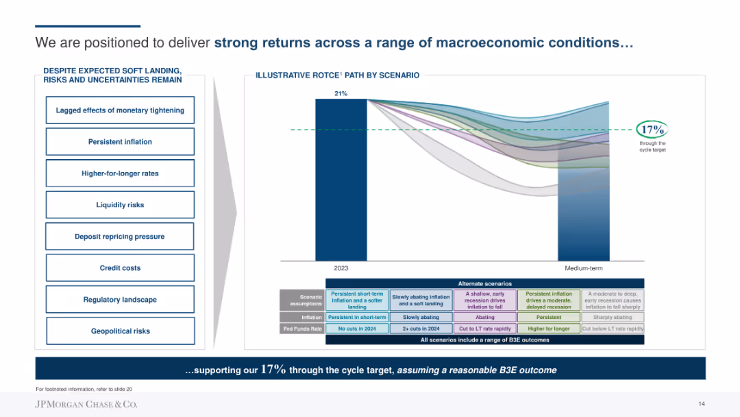
Combination of bar chart showing ROTCE by scenario and a side panel listing economic risks and uncertainties. Uses color-coded scenarios and a line to indicate the target return.
Strategic Planning
Financial Services
Outlines JP Morgan's strategy to deliver strong returns through different economic scenarios, emphasizing risk management and strategic planning. Shows ROTCE projections and lists potential risks like inflation and credit costs.
Returns, Strategy, Planning, ROTCE, Risks, Economic, Financial
Mixed Chart
JP Morgan
Saved
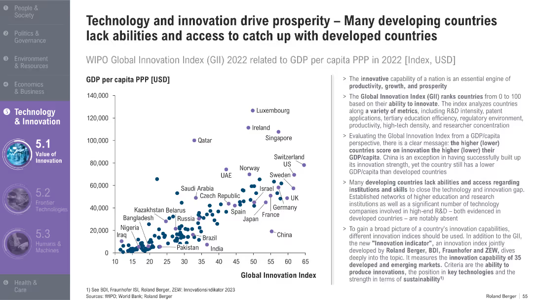
Scatterplot comparing GDP per capita vs. Global Innovation Index; developed and developing countries marked; explanatory text to the right
Market Analysis and Trends
Technology & Software
This slide explores the correlation between innovation and GDP per capita, identifying how many developing countries lag due to limited access to R&D infrastructure and education. It also introduces a new innovation index.
innovation, GDP per capita, R&D, Global Innovation Index, developing countries, productivity, skills, tech access
Mixed Chart
Roland Berger
Saved
A slide with a column chart illustrating the public funding value for 2020, 2021, and H1 2022, accompanied by a deal count. The chart shows a significant peak in 2021 compared to a steep decline in H1 2022. Annotations provide context about a bull run in 2021 and a cool-off period happening in 2022 due to various market conditions.
Investment Analysis
Financial Services
The slide shows a marked decline in public market funding, including IPOs and post-IPO financing, in H1 2022, contrasting with the previous year's bull run and outlining contributing economic factors like rising interest rates and stock valuation challenges.
public markets, funding, IPO, post-IPO, bull run, economic factors, decline
Single Chart
Bain
Saved
Features a large bar graph with color-coding to denote the digital consumer population growth across Southeast Asian countries, contrasting 2019 and 2020 data.
Market Analysis and Trends
Retail & E-commerce
Discusses the migration of offline shoppers to online platforms in Southeast Asia with Indonesia seeing the highest increase in digital consumers.
Online shopping, Southeast Asia, digital consumers, Indonesia, graph
Single Chart
Bain
Saved
The slide shows a benchmarking set of AEP scores across various categories with bar charts indicating leader and other averages.
Performance Metrics and KPIs
Professional Services
It benchmarks AEP scores for team excellence, organizational alignment, buy/pay channels, performance management, and more, indicating quartile rankings.
AEP scores, benchmarking, team excellence, performance management, digital technology, organizational alignment
Multiple Chart
Kearney
Saved
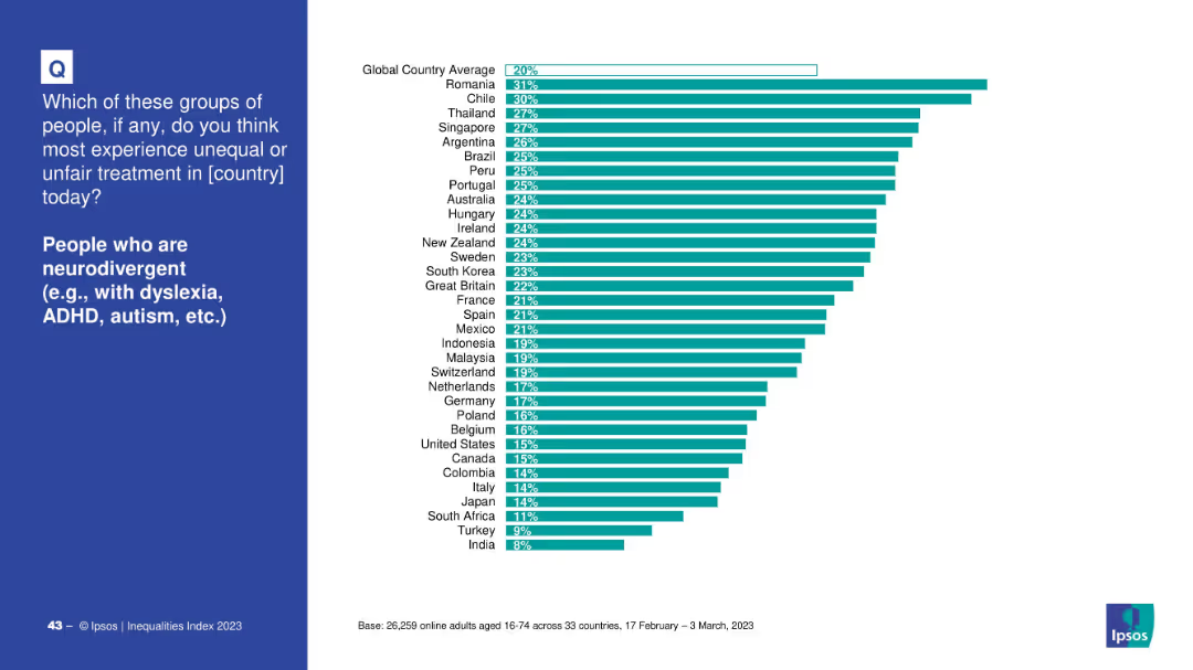
Blue panel with topic on left, bar chart by country on right.
Market Analysis and Trends
Healthcare & Pharmaceuticals
Displays cross-national perceptions of discrimination against neurodivergent individuals. Romania, Chile, and Thailand are highest; global average is 20%.
neurodivergence, ADHD, autism, dyslexia, inequality, global ranking, public opinion, discrimination
Mixed Chart
IPSOS
Saved
A column chart displays CCB revenue from 2018 to 2019. Adjacent to it, smaller bar segments represent contributing factors like volume, pricing actions, and others.
Market Analysis and Trends
Financial Services
The slide provides an analysis of the revenue growth in Consumer & Community Banking, identifying the impact of volume, pricing, macro rates, and other factors. It serves to break down the components of revenue changes over the year.
revenue, growth, volume, pricing, CCB, analysis, trends, topline
Single Chart
JP Morgan
Saved
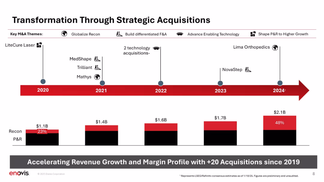
Horizontal timeline with icons and acquisition names; bar chart at bottom showing Recon vs. P&R growth.
Strategic Planning
Healthcare & Pharmaceuticals
Depicts Enovis’s strategic acquisitions since 2020, categorized by theme (e.g., globalize Recon, enabling tech). Shows revenue growth over time and increase in Recon's share of sales. Emphasizes +20 acquisitions as a key driver of transformation.
M&A, acquisitions, Recon, P&R, strategy, timeline, revenue growth, expansion
Mixed Chart
JP Morgan
Saved
The slide presents pie charts for sector allocation and tables for index characteristics across various indices, including S&P 500 and MSCI World, with a clean, professional layout.
Market Analysis and Trends
Financial Services
Tailored for market analysts, this slide provides an insightful overview of sector weights and key characteristics for multiple indices, serving as a tool for benchmarking and strategic investment decisions.
Sector Weights, Index Characteristics, S&P 500, MSCI, Pie Charts, Tables, Investment Planning
Multiple Chart
Morgan Stanley
Saved
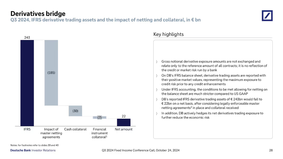
Waterfall chart on left and explanatory bullet points on right; simple, segmented bars; dark-to-light blue gradient shows reduction stages
Financial Performance
Financial Services
The slide explains how Deutsche Bank’s derivative trading assets are adjusted from IFRS-reported values to net amounts through master netting agreements and collateral. It emphasizes risk reduction strategies and accounting treatment.
derivatives, IFRS, netting, collateral, credit risk, financial exposure, accounting, Deutsche Bank, Q3 2024, trading assets
Mixed Chart
Deutsche Bank
Saved
With a deep purple backdrop, the slide includes vertical bar graphs illustrating pre and post-COVID-19 online activity changes.
Market Analysis and Trends
Technology & Software
Highlights the amplified use of telehealth, online learning, shopping, and government services on the nbn network as a result of COVID-19.
COVID-19, digital alternatives, nbn network, online activities, telehealth, online learning, government services
Multiple Chart
Accenture
Saved
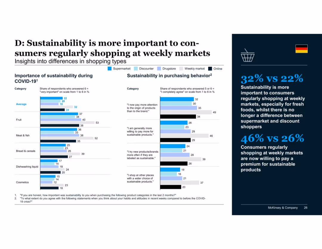
Multi-category comparison chart with different shopper types (supermarket, discounter, drugstore, weekly market, online) shown via color-coded bars across product categories; insights panel on the right.
Customer and Market Segmentation
Retail & E-commerce
Consumers who regularly shop at weekly markets value sustainability more, especially for fresh food categories. They also exhibit higher willingness to pay premiums, unlike discount and supermarket shoppers where differentiation has diminished.
shopping types, weekly markets, sustainability, fresh produce, consumer segmentation, willingness to pay
Mixed Chart
McKinsey
Saved
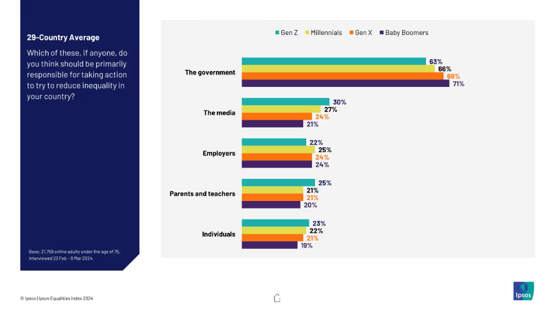
Bar chart showing perspectives by generation (Gen Z to Baby Boomers) on which entities should act. Five categories shown in grouped bars. Simple horizontal layout.
Strategic Planning
Government & Public Sector
This slide compares generational views on who should reduce inequality. While the government is seen as the primary actor across all age groups, support declines with younger respondents. Gen Z is more likely than older groups to assign responsibility to media and individuals.
generational opinion, inequality responsibility, policy, survey, Ipsos, media, government, activism
Mixed Chart
IPSOS
Saved
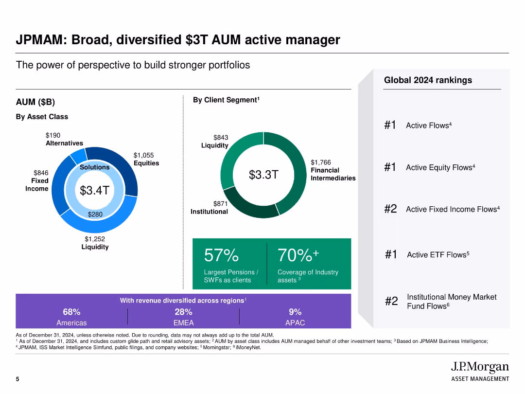
Visually segmented slide with donut and pie charts showing AUM by asset class and client segment; right column with global rankings
Industry Overview
Financial Services
The slide highlights J.P. Morgan Asset Management's diversified $3T AUM, showcasing asset class distribution, client segments, and geographic revenue split. It emphasizes leadership in global rankings across multiple fund flow categories and the firm's wide industry asset coverage.
Asset management, AUM, client segmentation, fund flows, industry leadership, global rankings, J.P. Morgan, diversified portfolio
Multiple Chart
JP Morgan
Saved
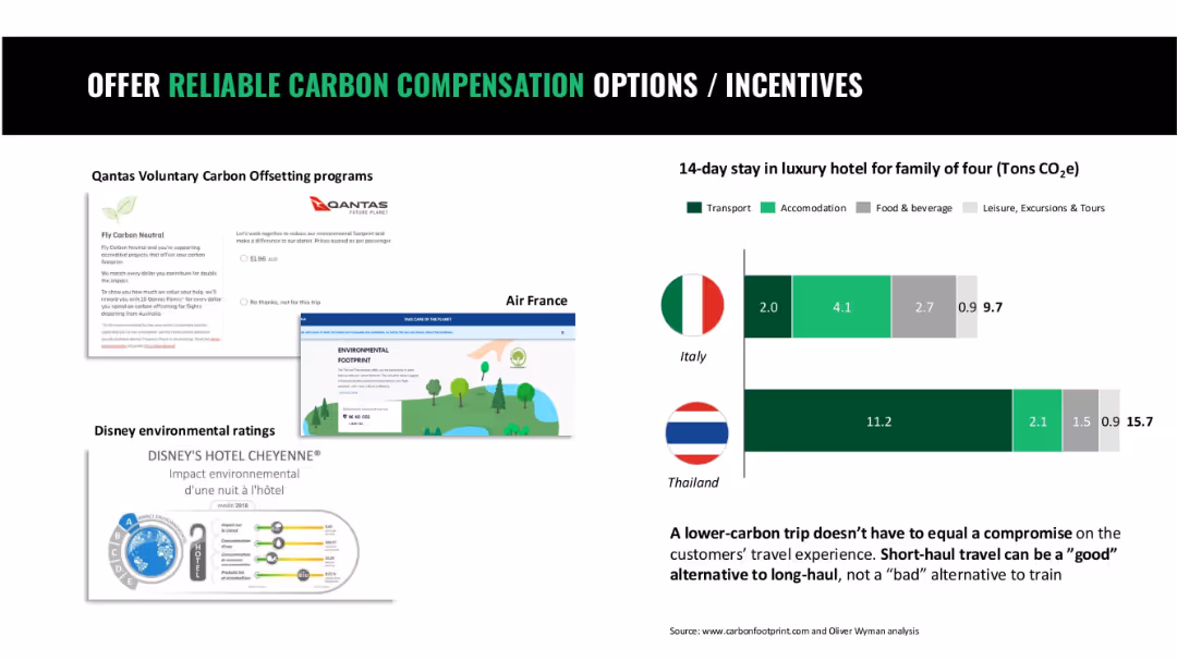
Four-part layout with screenshots of airline and hotel initiatives and bar chart comparing vacation CO2 footprints
Operational Efficiency
Hospitality & Tourism
This slide showcases carbon offset programs by airlines and hospitality providers and compares carbon footprints of short-term travel by country to emphasize low-carbon options.
carbon offset, tourism, hotel footprint, airline programs, travel sustainability
Mixed Chart
Oliver Wyman
Saved
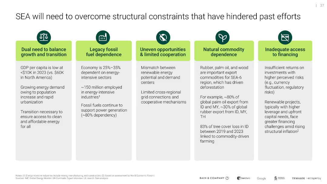
Five-column layout with icons atop text boxes; each represents a structural challenge hindering decarbonization
Operational Efficiency
Environmental Services & Sustainability
Outlines five structural barriers in SEA—low GDP per capita, fossil dependency, lack of cooperation, commodity reliance, and poor financing access—that must be addressed to enable effective climate action and transition.
structural barriers, fossil fuels, SEA, cooperation, financing
Pillar
Bain
Saved
Multiple line charts displaying global freight rates by sea and air, with annotations for major events affecting prices.
Market Analysis and Trends
Transportation & Logistics
Analyzes the impact of global events on sea and air freight rates, highlighting trends and fluctuations.
Transportation, Logistics, Freight, Global, Rates, Sea, Air, Trends, Market Analysis
Multiple Chart
PwC/Strategy&
Saved
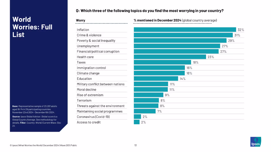
Ranked bar chart listing all mentioned worries by %; teal bars with grey background; left-aligned text.
Market Analysis and Trends
Government & Public Sector
This slide presents a full ranked list of the global public’s most pressing worries as of December 2024. Inflation, crime, and inequality top the list, with education, climate change, and corruption also noted as major concerns.
public worry, Ipsos, global issues, inflation, crime, climate, education, inequality, full list, ranking, priorities
Mixed Chart
IPSOS
Saved
Similar to the previous slide, this one uses line charts and icons to profile Dreamers. It includes demographic information and EV purchase intentions, showing differences from Tech Enthusiasts in terms of age, income, family size, and car usage.
Customer and Market Segmentation
Transportation & Logistics
This slide focuses on Dreamers, detailing their lower car usage, environmental consciousness, and moderate tech confidence compared to Tech Enthusiasts. It provides demographic data and insights into their EV purchase motivations.
EV prospects, Dreamers, line charts, demographics, motivation
Multiple Chart
PwC/Strategy&
Saved
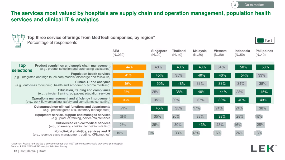
Vertical column chart listing the top three valued services from MedTech companies by region. Color-coded bars indicate the percentage of respondents per service.
Market Analysis and Trends
Healthcare & Pharmaceuticals
Outlines the top three service offerings from MedTech companies valued by hospitals, such as supply chain management, population health services, and clinical IT & analytics, with regional preferences detailed.
MedTech, valued services, hospitals, supply chain management, population health, clinical IT, analytics
Multiple Chart
LEK
Saved
Previous
Next
If nothing, comes up, please save your slides first
Create a FREE account to continue browsing
Receive Instant Access to 1,000+ slides from companies like McKinsey, Google, and Goldman Sachs
First Name
Last Name
Email
Password
I agree to all
Terms & Privacy Policy
Thank you! Your submission has been received!
Oops! Something went wrong while submitting the form.
Have an account?
Sign in
Column Chart
Heatmap
Chevron
Org Chart
Infographic
Callouts
Timeline
List
Graphic
Picture
Process Flow
Diagram
Paragraph
Map
Table
Framework
Subtitle
Takeaway Box
Icon
Other Chart
Radar Chart
Waterfall Chart
Mekko Chart
Pie Chart
Scatter Plot
Line Chart
Bar chart
Bullet points