My Account
My Slides
Search by Category
Companies
Slide Type
Use Case
Industry
Pricing
Templates
View All Templates
Download Template Slides
✦ AI
AI Prompt Library
AI Search
Feedback
Login
Logout
Get Started
Browse all Slides
Browse all Slides
Create a FREE Account
Instant access to 1,000+ real slides from top companies like McKinsey, BCG, Goldman Sachs, Google and many more!
First Name
Last Name
Email
Password
I agree to all
Terms & Privacy Policy
Thank you! Your submission has been received!
Oops! Something went wrong while submitting the form.
Have an account?
Sign in
Saved Slides
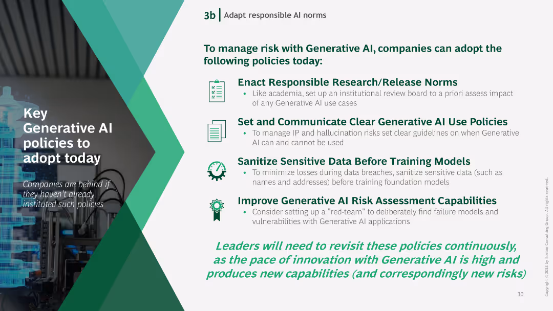
Text-based slide with bullet points outlining key policies for managing Generative AI risks, accompanied by icons representing each policy.
Regulatory and Compliance
Technology & Software
The slide lists essential policies for managing Generative AI risks, including responsible research norms, clear use policies, data sanitization, and risk assessment improvements.
Generative AI, policies, risk management, research norms, data sanitization
Vertical Flow
BCG
Saved
Contains a grid layout showing the maturity of loyalty programs across various industries with color-coded maturity levels.
Strategic Planning
Retail & E-commerce
Summarizes the state of loyalty programs in industries such as retail, CPG, and BFSI, suggesting potential for strategic improvements.
loyalty programs, industry comparison, strategic planning, maturity levels, grid
Table
BCG
Saved
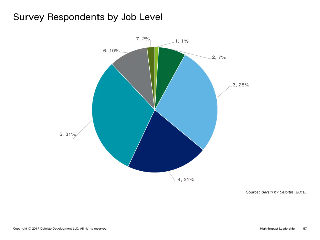
Pie chart presenting the percentage distribution of survey respondents by job level. The chart uses multiple colors for different job levels.
Market Analysis and Trends
Professional Services
Highlights the distribution of survey respondents by their job levels, offering insights into the hierarchical diversity of the participants.
Pie chart, survey, job level, distribution, hierarchy
Single Chart
Deloitte
Saved
The slide presents a comparative table of various players in the market research industry, showing turnover and focus areas.
Competitive Landscape
Professional Services
The slide compares Ipsos with other market research companies, highlighting turnover figures and areas of specialization.
Comparative, Market Research, Turnover, Specialization, Ipsos
Multiple Chart
IPSOS
Saved
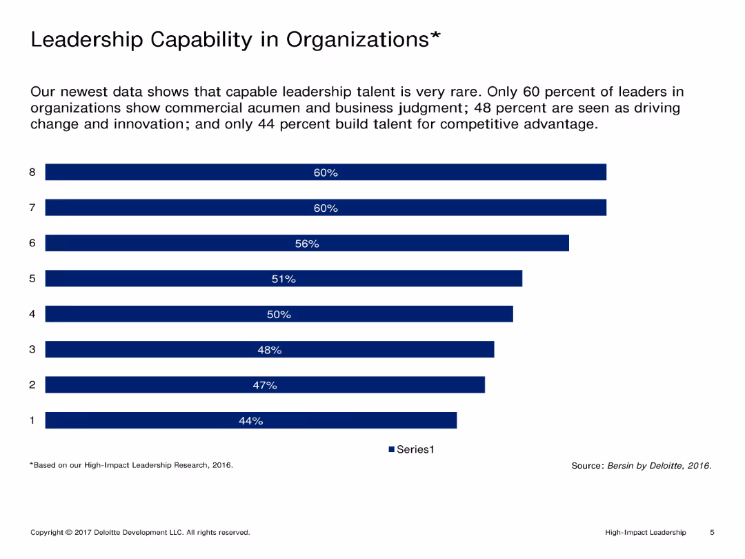
Single-column layout with text at the top and a column chart showing percentages of leadership capabilities below. Text is minimal.
Market Analysis and Trends
Professional Services
Analyzes leadership capabilities in organizations, highlighting areas such as commercial acumen, business judgment, innovation, and competitive advantage.
Leadership, Capability, Organizations, Commercial acumen, Business judgment, Innovation, Competitive advantage
Single Chart
Deloitte
Saved
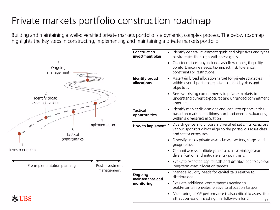
Depicts a roadmap with five key steps for constructing and maintaining a diversified private markets portfolio, from investment plan to ongoing management.
Strategic Planning
Financial Services
Outlines the process of building a private markets portfolio, including investment planning, asset allocation, tactical opportunities, implementation, and management.
Portfolio construction, private markets, roadmap, investment planning, management
Linear Flow
UBS
Saved
The slide features text and two column charts. The charts outline elements of digital asset strategy pursued by banks and methods for informing the strategy.
Technology and Digital Transformation
Financial Services
It discusses the development of digital asset strategies by banks, including key elements and methods for effectively implementing and managing digital assets.
Digital assets, strategy, development, banks, management
Multiple Chart
EY
Saved
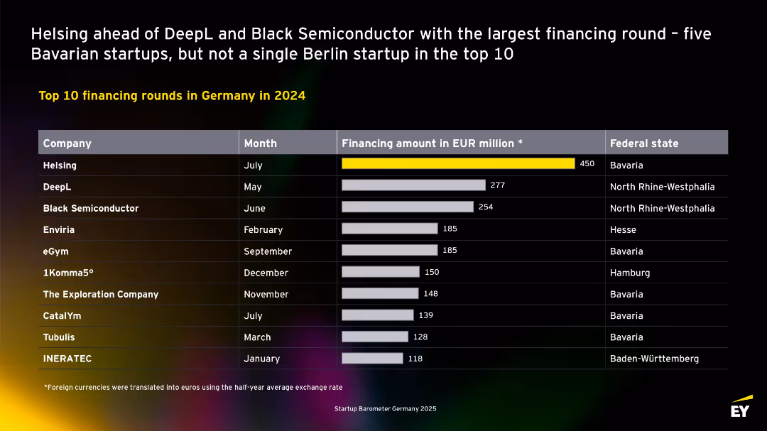
Table format with company names, months, financing amounts, and states. Highlights top deals of the year. No Berlin companies in the top 10, majority from Bavaria.
Investment Analysis
Technology & Software
Lists the top 10 startup financing rounds in Germany for 2024. Helsing leads with €450M, followed by DeepL and Black Semiconductor. Most top-funded companies are based in Bavaria and North Rhine-Westphalia. Berlin is notably absent from the list.
top deals, Bavaria, DeepL, Helsing, financing rounds, 2024, Germany, startups, investment
Single Chart
EY
Saved
The slide features a circular diagram showing "Macro Forces," "Shifts," and "Signals" with arrows indicating change and response/inspiration actions.
Strategic Planning
Professional Services
The slide explains how change happens at various levels, using macro forces, shifts, and signals, and how Ipsos uses this framework to monitor trends over time.
change, macro forces, shifts, signals, Ipsos
Diagram
IPSOS
Saved
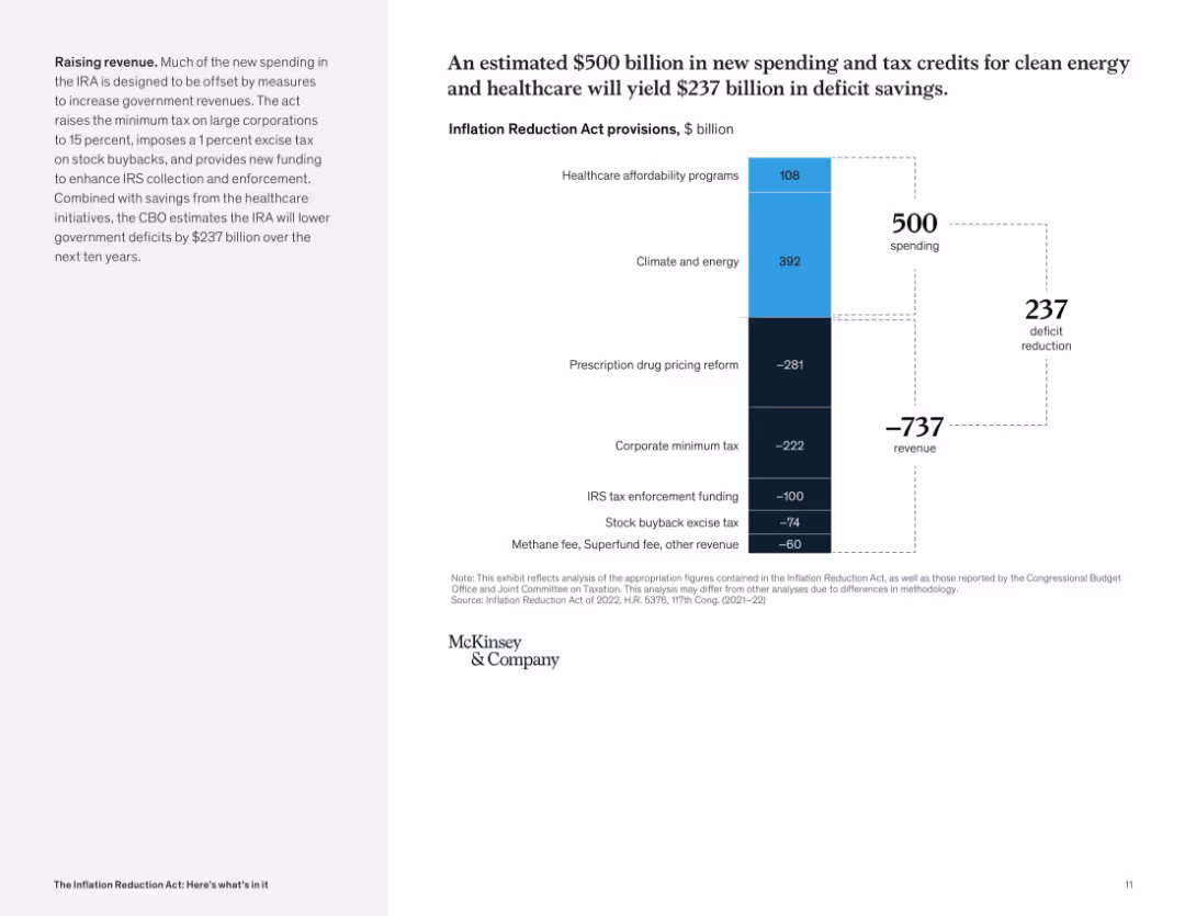
Waterfall chart comparing spending and revenue measures; large contrast between top and bottom segments; left panel describes fiscal goals.
Financial Performance
Government & Public Sector
The slide illustrates how the IRA balances $500B in new spending with $737B in revenue measures, resulting in a projected $237B deficit reduction. Key policies include tax reforms and enhanced IRS enforcement.
deficit reduction, tax revenue, healthcare, clean energy, spending, government finance
Mixed Chart
McKinsey
Saved
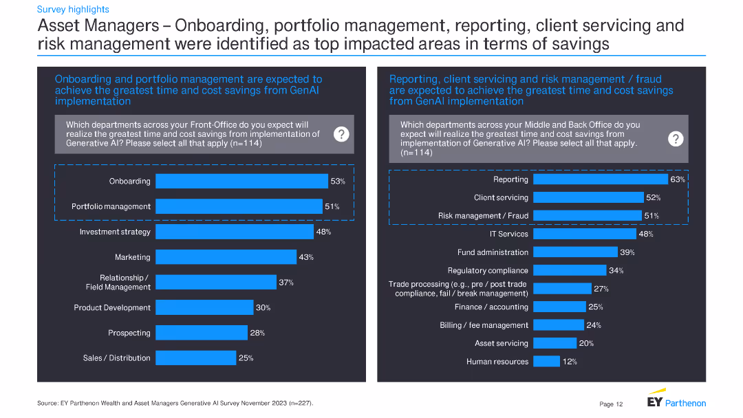
This slide contains two bar charts showing which departments in asset management expect the greatest time and cost savings from GenAI implementation. Additional text provides context and detailed survey findings.
Operational Efficiency
Financial Services
The slide presents survey data on anticipated time and cost savings in asset management from GenAI implementation. It focuses on departments like onboarding, portfolio management, and reporting.
GenAI, time savings, cost savings, asset management, onboarding, portfolio management, reporting, survey
Multiple Chart
EY
Saved
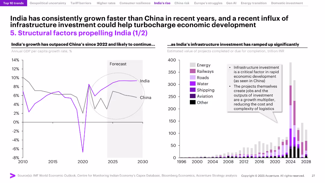
Split slide with left-side GDP growth comparison chart (India vs. China) and right-side bar chart of infrastructure investments by sector. Forecast zones shaded.
Investment Analysis
Government & Public Sector
India’s recent economic outperformance relative to China is showcased, alongside a rapid increase in infrastructure investment across sectors such as energy, roads, and railways. The slide underscores how infrastructure acts as a growth catalyst by creating jobs and improving logistics, positioning India for continued expansion.
India growth, GDP, infrastructure, China comparison, economic development, energy, railways, logistics, investment, capital spending
Multiple Chart
Accenture
Saved
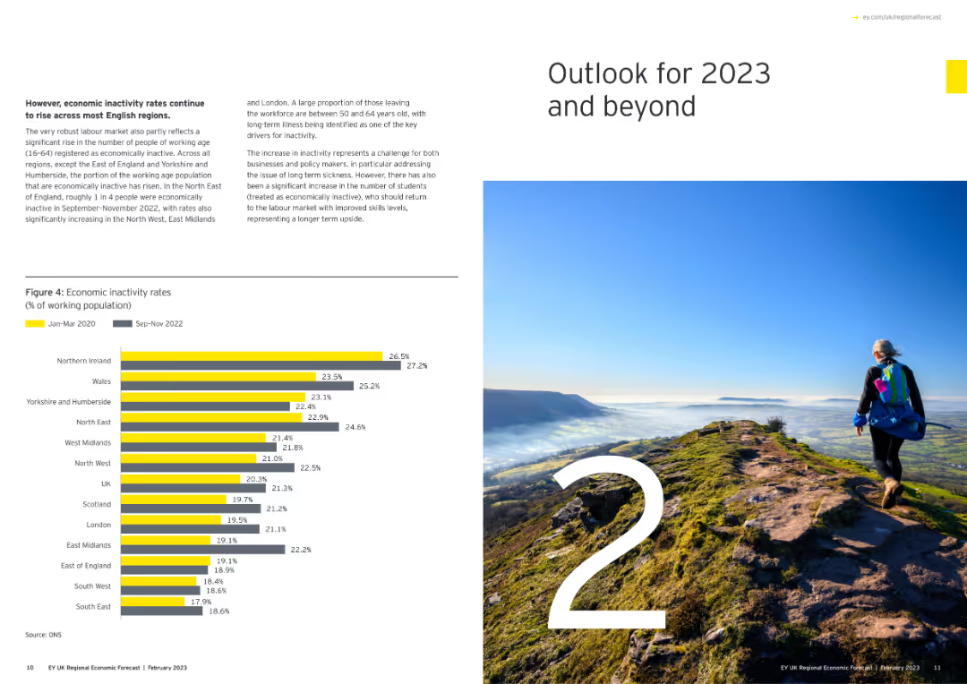
Features a large number "2" with an image of a person hiking on a mountain, and a column chart showing economic inactivity rates.
Strategic Planning
Government & Public Sector
Outlines the economic outlook for 2023 and beyond, focusing on inactivity rates among the working population across various regions.
economic outlook, 2023, inactivity rates, regional, column chart
Mixed Chart
EY
Saved
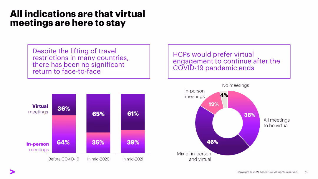
The slide contains three column charts comparing the preferences and prevalence of virtual vs. in-person meetings before, during, and after the COVID-19 pandemic.
Strategic Planning
Healthcare & Pharmaceuticals
The slide indicates that despite lifting travel restrictions, HCPs prefer virtual meetings, with significant percentages indicating a preference for continued virtual engagement.
virtual meetings, COVID-19, HCPs, preferences, engagement
Multiple Chart
Accenture
Saved
Timeline from 1871 to 2020 showing major milestones for Handelsbanken, including restructures and financial crises, with a large image of a bank building, text annotations detailing each phase.
Strategic Planning
Financial Services
Chronicles the history and significant events in the development of Handelsbanken, emphasizing its stability and resilience through financial crises. Useful for corporate presentations and history lessons on banking.
Handelsbanken, banking, history, financial stability, crises, corporate resilience, timeline
Linear Flow
Bain
Saved
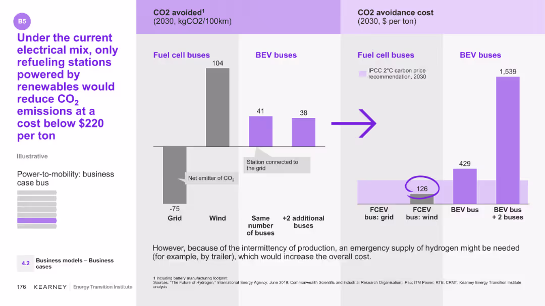
The slide features a column chart showing CO2 avoided for fuel cell buses and BEV buses, along with their CO2 avoidance costs.
Technology and Digital Transformation
Energy & Utilities
The slide compares CO2 emissions and avoidance costs between fuel cell and BEV buses under different energy sources. It suggests that only renewable-powered refueling stations can reduce CO2 emissions cost-effectively.
CO2, emissions, fuel cell buses, BEV buses, renewables
Multiple Chart
Kearney
Saved
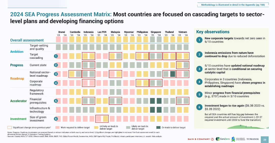
Heatmap-style matrix with qualitative color-coded indicators; boxed key insights on the right
Strategic Planning
Environmental Services & Sustainability
Provides a country-level assessment of progress in emissions reduction and green planning. It evaluates ambition, roadmap development, and financial readiness across dimensions. Key findings highlight significant advances in corporate targeting, updated roadmaps, and increasing investment.
progress matrix, SEA, roadmap, target setting, climate finance, national planning, emissions
Multiple Chart
Bain
Saved
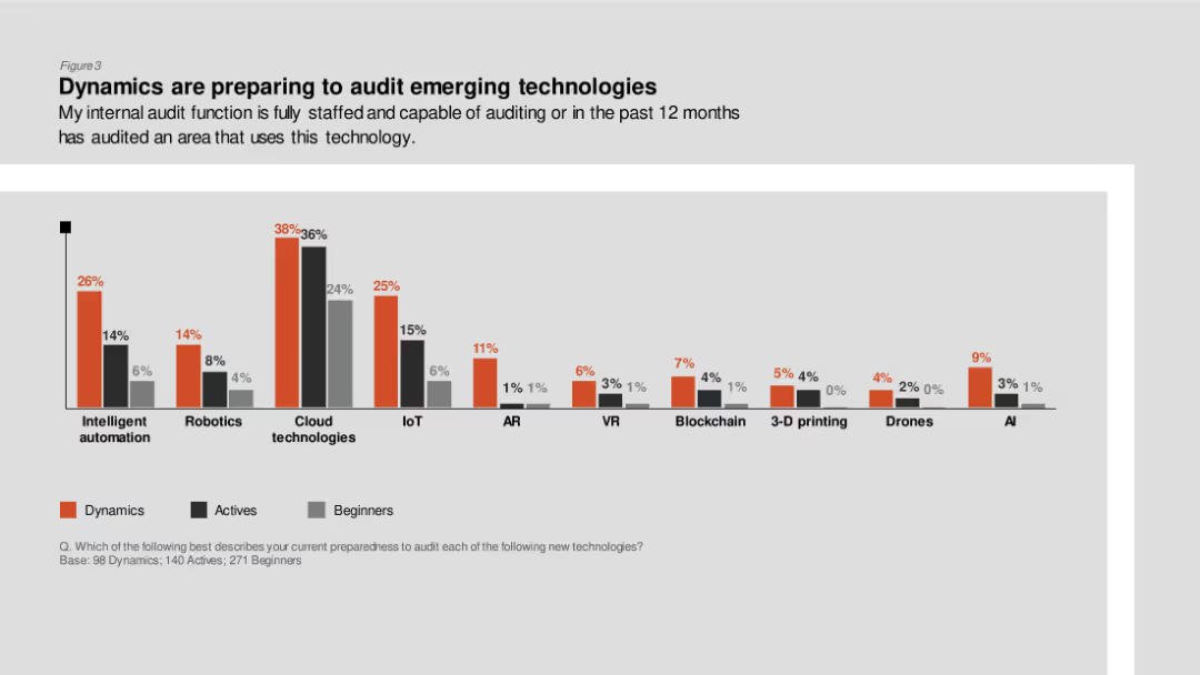
Column chart showing the preparedness of internal audit functions to audit various emerging technologies like robotics, cloud technologies, and AI, divided by Dynamics, Actives, and Beginners.
Technology and Digital Transformation
Professional Services
The slide presents data on how prepared internal audit functions are to audit emerging technologies, emphasizing higher preparedness in Dynamics for technologies like cloud and AI.
Emerging technologies, internal audit, preparedness, Dynamics, Actives
Single Chart
PwC/Strategy&
Saved
Slide includes text and icons to represent different market segments.
Market Analysis and Trends
Consumer Goods
Identifies new phases in luxury market growth, such as digital influences and changes in consumer behavior towards ownership and sustainability.
luxury market, digital, consumer trends, sustainability
Pillar
Bain
Saved
A comparative slide featuring a pie chart on the left and a table on the right. The pie chart shows four categories: Champions, Leaders, Strivers, and Traditionalists. The table compares EBIT, SEBIT, ARR, and NSR percentages for these categories.
Market Analysis and Trends
Professional Services
This slide identifies four categories of service players based on service management maturity. It compares their EBIT, SEBIT, ARR, and NSR percentages to illustrate their performance.
service players, EBIT, SEBIT, ARR, NSR, comparison
Mixed Chart
Accenture
Saved
This slide consists of six line graphs, each for a different country, showing search volume trends for food delivery services over time, indexed to 2017 levels. The graphs are accompanied by annotations indicating the fold increase in search interest. The layout is clean, with each graph neatly separated and clearly labeled.
Market Analysis and Trends
Hospitality & Tourism
The slide details the enduring high interest in food delivery services post-COVID, as demonstrated by search volume data from Google Trends. Each country's graph underscores the sustained increase in consumer interest, with annotations providing a quick reference to the scale of change compared to 2017 levels.
food delivery, search trends, COVID-19 impact, consumer interest, Southeast Asia, Google Trends, index comparison, market analysis
Multiple Chart
Bain
Saved
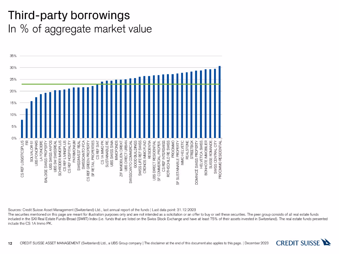
The slide features a column chart illustrating the percentage of third-party borrowings across different funds.
Financial Performance
Financial Services
This slide presents the percentage of third-party borrowings in aggregate market value for various funds managed by Credit Suisse as of December 31, 2023.
third-party, borrowings, market value, funds, Credit Suisse
Single Chart
Credit Suisse
Saved
Consists of a large column chart with additional small charts and text to explain changes in net interest income over time.
Investment Analysis
Financial Services
Projects net interest income with breakdowns of contributing factors, vital for financial planning and forecasting.
net interest income, rates, deposit growth, forecast
Single Chart
JP Morgan
Saved
Slide displays two line charts tracking the Value-at-Risk for DB Group's trading and regulatory books. Annotations and quarterly averages are shown. Colors are primarily blue and white.
Risk Assessment and Management
Financial Services
Analysis of DB Group's trading and regulatory risk over quarterly periods, illustrating changes and risk management effectiveness.
Risk, trading, regulatory, finance, analysis, value-at-risk, quarterly, management, DB Group
Multiple Chart
Deutsche Bank
Saved
Displays a circular diagram divided into six sections, each representing a key factor in digital marketing maturity. The diagram is supported by icons and brief text labels.
Organizational Structure and Change
Media & Entertainment
Outlines six critical technical and organizational factors that support digital marketing maturity, such as strategic partnerships, connected data, and agile teaming. This slide is essential for organizations aiming to enhance their digital marketing capabilities through strategic and structural adjustments.
digital marketing, organizational factors, technical enablers, strategic partnerships, connected data, agile teaming, diagram, capability enhancement
Diagram
BCG
Saved
Previous
Next
If nothing, comes up, please save your slides first
Create a FREE account to continue browsing
Receive Instant Access to 1,000+ slides from companies like McKinsey, Google, and Goldman Sachs
First Name
Last Name
Email
Password
I agree to all
Terms & Privacy Policy
Thank you! Your submission has been received!
Oops! Something went wrong while submitting the form.
Have an account?
Sign in
Column Chart
Heatmap
Chevron
Org Chart
Infographic
Callouts
Timeline
List
Graphic
Picture
Process Flow
Diagram
Paragraph
Map
Table
Framework
Subtitle
Takeaway Box
Icon
Other Chart
Radar Chart
Waterfall Chart
Mekko Chart
Pie Chart
Scatter Plot
Line Chart
Bar chart
Bullet points