My Account
My Slides
Search by Category
Companies
Slide Type
Use Case
Industry
Pricing
Templates
View All Templates
Download Template Slides
✦ AI
AI Prompt Library
AI Search
Feedback
Login
Logout
Get Started
Browse all Slides
Browse all Slides
Create a FREE Account
Instant access to 1,000+ real slides from top companies like McKinsey, BCG, Goldman Sachs, Google and many more!
First Name
Last Name
Email
Password
I agree to all
Terms & Privacy Policy
Thank you! Your submission has been received!
Oops! Something went wrong while submitting the form.
Have an account?
Sign in
Saved Slides
Text and data tables showing past and projected financials.
Strategic Planning
Financial Services
Provides a comprehensive view of financial performance and targets for 2026.
Financials, Targets, Forecasting, 2026, Performance Metrics
Multiple Chart
Barclays
Saved
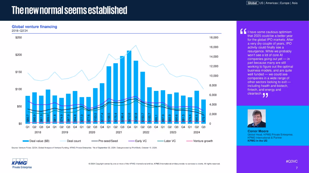
A single global bar and line chart tracking deal value, count, and deal stages in venture funding.
Market Analysis and Trends
Financial Services
The chart covers global venture funding from 2018 to Q3 2024, showing a peak around 2021 followed by normalization. The breakdown includes Pre-seed to Venture Growth, indicating stabilizing patterns in deal count and investment level.
Global, Venture, VC, Funding, Trends, Normalization, Pre-seed
Mixed Chart
KPMG
Saved
The slide features a timeline showing key milestones in the development of biomass-to-energy value chain products, starting from 125,000 BC to 2018. Milestones include the first biodigester in India, commercial-scale waste-to-energy plant in the US, and approval for biofuels in aviation.
Market Analysis and Trends
Energy & Utilities
This slide provides a historical overview of significant developments in the biomass-to-energy sector, emphasizing the evolution and advancements in biofuel technologies and applications over time.
biomass-to-energy, value chain, history, timeline, biodigester, biofuels, waste-to-energy, aviation
Linear Flow
Kearney
Saved
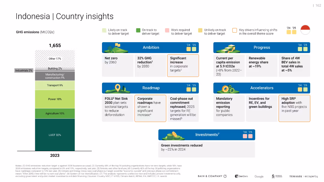
Vertical emissions bar with categories; multiple blue-highlighted cards for ambition, roadmap, progress, investment
Strategic Planning
Environmental Services & Sustainability
Provides Indonesia's green economy profile. Emphasizes emissions sources, current targets (e.g., net zero by 2060), and reduced green investment in 2024. Notes recent rollback on coal phase-out.
Indonesia
Mixed Chart
Bain
Saved
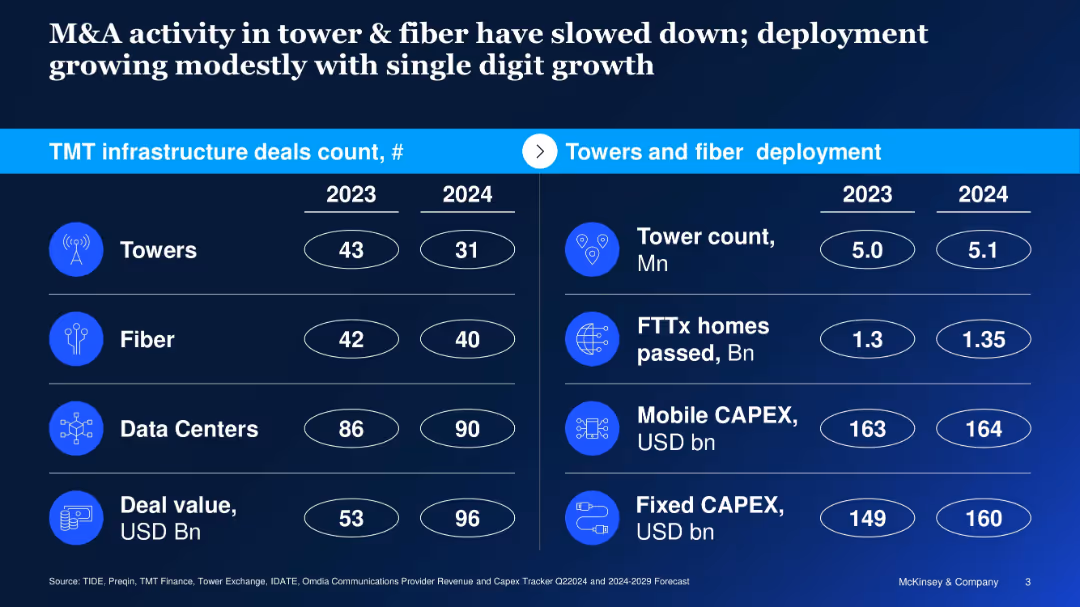
Split-table layout with deal counts on left and deployment metrics on right; icons used
Mergers and Acquisitions
Telecommunications
Reports on declining M&A activity in towers and fiber between 2023–2024, despite modest infrastructure growth; contrasts deal count and value with operational metrics like CAPEX and homes passed.
telecom M&A, towers, fiber, deployment, capex, infrastructure, 2024 outlook, deal value
Table
McKinsey
Saved
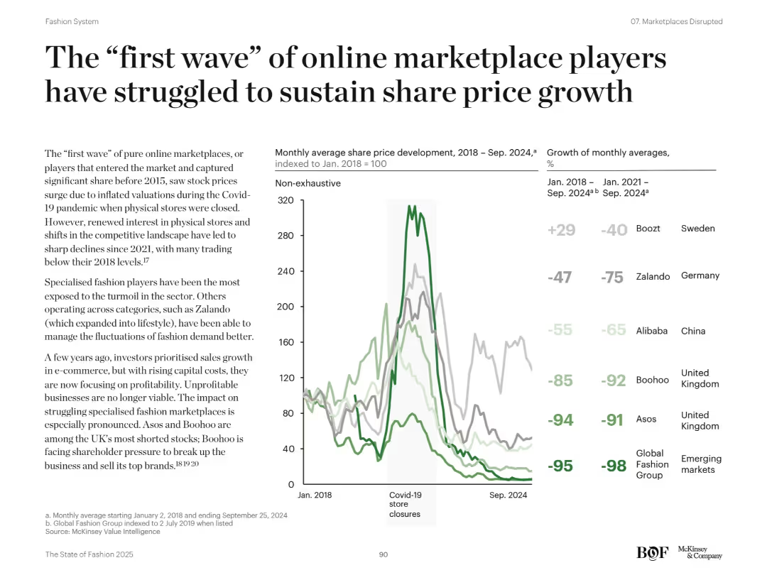
Left-aligned narrative on online marketplaces and right-side line chart and bar graph comparing stock performance of fashion e-commerce players. Green and gray lines show trends.
Strategic Planning
Retail & E-commerce
Analyzes decline in share prices for early e-commerce marketplace players post-Covid boom. Highlights underperformance of specialized players like Boohoo and Asos. Attributes decline to increased competition, profit pressure, and consumer return to physical stores.
e-commerce decline, stock trends, Boohoo, Asos, profitability, market correction
Mixed Chart
McKinsey
Saved
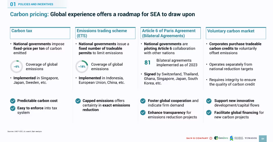
Four-column layout covering carbon tax, emissions trading, Article 6 bilateral agreements, and voluntary carbon markets. Uses icons and checkmarks for benefits.
Regulatory and Compliance
Environmental Services & Sustainability
Outlines four global carbon pricing models that SEA can adopt: carbon tax, emissions trading, bilateral agreements, and voluntary markets. Includes global adoption stats, benefits such as transparency and enforceability, and lists of countries that have implemented them. The slide serves as a strategic framework for SEA carbon policy design.
carbon pricing, ETS, carbon tax, bilateral agreements, voluntary market, emissions, SEA, regulation, global roadmap
Mixed Chart
Bain
Saved
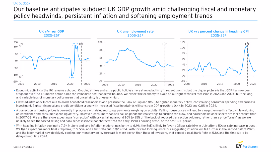
Three line charts depicting UK y/y real GDP, UK unemployment rate, and UK y/y percent change in headline CPI from 2005-25F. Moderate complexity with clear visual representations for economic trends analysis.
Market Analysis and Trends
Financial Services
The slide provides an economic forecast for the UK, projecting subdued GDP growth, persistent inflation, and softening employment trends. It discusses the effects of fiscal and monetary policies, as well as ongoing strikes and public holidays on economic activity.
UK, GDP, unemployment, CPI, forecast
Multiple Chart
EY
Saved
Left side shows percentage bubbles, right side has a column chart and text
Technology and Digital Transformation
Technology & Software
Insights into the use of synthetic data for model improvement and efficiency, highlighting challenges
model accuracy, efficiency, synthetic data, challenges
Multiple Chart
Gartner
Saved
The slide includes an image of a person holding a green plant, with two columns of text and a trend assessment.
Operational Efficiency
Consumer Goods
Explains the concept of sustainable consumption, focusing on the importance of eco-friendly practices and consumer expectations.
Sustainable Consumption, Eco-friendly, Consumer Expectations, Greenwashing, Ethical Consumption, Sustainability
Multiple Chart
Deloitte
Saved
The slide features two column charts with and without bold effects, highlighting Tufte's principle to remove bold effects for clarity.
Technology and Digital Transformation
Professional Services
The slide explains how removing bold effects can enhance the clarity and effectiveness of data presentations, following Tufte's data-to-ink ratio principle.
Tufte, data-to-ink, ratio, survey, responses, visualization, bold effects, chart, clarity, design
Multiple Chart
EY
Saved
This slide contains a map of Australia with markers indicating various states and their climate targets. It includes several text boxes detailing the efforts of different states in achieving net-zero emissions by 2050.
Regulatory and Compliance
Government & Public Sector
This slide discusses how Australian state governments are supporting landowners with land restoration and biodiversity efforts to achieve net-zero emissions by 2050. It highlights different state initiatives and targets in the context of climate change.
Climate change, Net zero, Government, Land restoration, Biodiversity
Graphic
EY
Saved
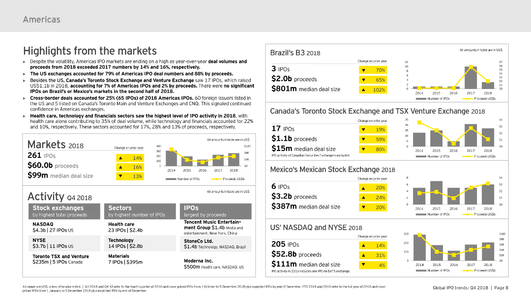
The slide includes text summaries and column charts showing market highlights for the Americas in 2018, focusing on IPO volumes, proceeds, and notable exchanges and sectors.
Market Analysis and Trends
Financial Services
This slide summarizes IPO market highlights for the Americas in 2018, discussing key market metrics, performance by stock exchanges, and sectors with the highest IPO activity.
IPOs, Americas, 2018, market highlights, sectors
Multiple Chart
EY
Saved
The slide presents various graphical representations, including pie charts, bar graphs, and an illustrative side panel with an image of an industrial scenario. It utilizes green, black, and white color scheme with clean lines and a structured layout.
Technology and Digital Transformation
Technology & Software
Focuses on integrating AI into business processes, highlighting the importance of collaboration between tech teams and business units for effective AI adoption. Stresses on both the financial and transformational impacts of AI with real-world business examples.
AI adoption, business transformation, collaboration, technology integration, industry case study
Mixed Chart
BCG
Saved
Slide displays bar graphs, text sections, and percentage changes. Colors differentiate various elements, with clear labels for each data set.
Product and Service Analysis
Financial Services
Highlights the growth of digital products and installment lending customers. Could be used in strategic presentations or business development discussions.
digital products, installment lending, customer growth, pay-over-time solutions
Table
JP Morgan
Saved
Utilizes a scatter plot chart with textual and numeric data to discuss global phenomena impacts, incorporating color-coded risk levels for clarity.
Risk Assessment and Management
Financial Services
Discusses various global risks perceived by executives and their expected impacts on businesses, with a focus on economic factors.
risk assessment, executives, global phenomena, impact
Mixed Chart
BCG
Saved
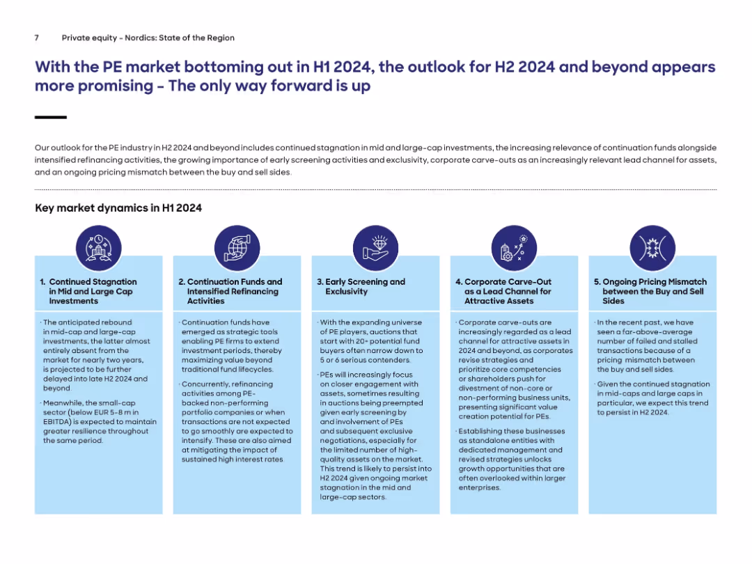
Five-column infographic with icons and text, each describing key PE market dynamics. Header text is in large font, followed by explanatory paragraph and infographic.
Market Analysis and Trends
Financial Services
The slide outlines five major dynamics affecting the private equity market in H1 2024, including stagnation in mid/large-cap investments, continuation funds, early screening, carve-outs, and pricing mismatches. Outlook for H2 2024 is more optimistic.
private equity, continuation funds, carve-outs, market dynamics, refinancing, H1 2024
Pillar
Roland Berger
Saved
The slide is divided into four quadrants, each with a title, image, and bullet points discussing various megatrends. It uses a clear, readable font, with a color palette that enhances readability and focus. Images are contemporary and relevant to the text content.
Market Analysis and Trends
Professional Services
Explores the key megatrends shaping the future of business and productivity, such as urbanization, digitalization, sustainability, and changing demography, crucial for trend analysis and business development planning.
megatrends, growth, productivity, urbanization, digitalization, sustainability, demography, business trends
Table
Goldman Sachs
Saved
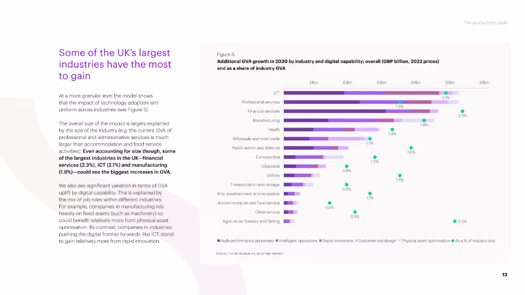
A mixed layout slide with text and a bar chart. The bar chart displays additional GVA growth by industry in 2030 due to digital capability, shown in GBP billion and as a share of industry GVA.
Market Analysis and Trends
Technology & Software
The slide outlines the industries in the UK that stand to gain the most from digital adoption, with a focus on professional services, ICT, and manufacturing, showing projected GVA growth by 2030.
industry growth, GVA, digital capability, professional services, ICT, manufacturing
Mixed Chart
Accenture
Saved
The slide lists core, business, procurement, and digital skills, categorized by yesterday's, today's, and tomorrow's skills with a detailed skills layout table.
Technology and Digital Transformation
Professional Services
It outlines the evolving skills needed for procurement success, emphasizing digital transformation, strategic alliances, and advanced analytics.
Procurement skills, digital transformation, strategic alliances, analytics, talent development, future skills
Table
Kearney
Saved
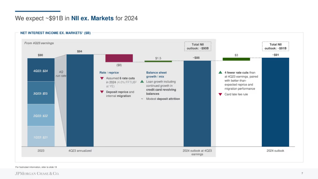
Column chart showing net interest income (NII) outlook, with factors affecting rate, repricing, balance sheet growth, and deposit migration.
Financial Performance
Financial Services
Forecasts the net interest income excluding markets for 2024, detailing rate and repricing assumptions, balance sheet growth, and migration impacts.
NII, forecasting, net interest income, rate, repricing, balance sheet growth, deposits
Single Chart
JP Morgan
Saved
Multiple column charts displaying Unilever Nutrition's sales growth, market share, and operational profitability. Blue charts with clear labels.
Product and Service Analysis
Consumer Goods
Discusses Unilever Nutrition's market position and financial performance, emphasizing its growth in sales and profitability. Describes its leadership in sustainability within the food industry.
Nutrition, Sales Growth, Market Leadership, Profitability, Sustainability
Multiple Chart
Deutsche Bank
Saved
This slide offers a visual breakdown of four strategic approaches to enhancing DEI within organizations, represented through vibrant icons and a quadrant layout. Each section is clearly defined with headings and concise bullet points, paired with relevant imagery that complements the textual content.
Organizational Structure and Change
Professional Services
Encourages a shift in how DEI is perceived within business strategies, urging companies to integrate it as a fundamental aspect of business planning and innovation. It emphasizes the importance of viewing DEI through a broader lens, not just as a moral obligation but as a strategic advantage that can drive substantial organizational and societal benefits.
DEI strategy, business innovation, organizational change, sustainable advantage, leadership commitment
Header Vertical
BCG
Saved
The slide features a red and grey donut chart contrasting "Audio Only" and "Video-Enabled" podcast revenue shares for 2020, with large text highlighting the main statistic.
Market Analysis and Trends
Media & Entertainment
This slide presents the 2020 revenue share between audio-only and video-enabled podcasts, showing a significant majority in audio-only.
podcasts, revenue share, advertising, media, video-enabled, audio-only, 2020, comparison
Single Chart
PwC/Strategy&
Saved
Horizontal bar chart with 31-country ranking based on agreement with the statement about needing a strong leader willing to break the rules. Time-based comparison of agreement shown on the right.
Strategic Planning
Government & Public Sector
This slide assesses public support for strong, possibly authoritarian leadership to address perceived national problems. Thailand and South Korea show the highest agreement. France and Italy show substantial declines in support since 2016.
authoritarianism, strong leader, rule-breaking, political preference, public sentiment, Ipsos, international
Mixed Chart
IPSOS
Saved
Previous
Next
If nothing, comes up, please save your slides first
Create a FREE account to continue browsing
Receive Instant Access to 1,000+ slides from companies like McKinsey, Google, and Goldman Sachs
First Name
Last Name
Email
Password
I agree to all
Terms & Privacy Policy
Thank you! Your submission has been received!
Oops! Something went wrong while submitting the form.
Have an account?
Sign in
Column Chart
Heatmap
Chevron
Org Chart
Infographic
Callouts
Timeline
List
Graphic
Picture
Process Flow
Diagram
Paragraph
Map
Table
Framework
Subtitle
Takeaway Box
Icon
Other Chart
Radar Chart
Waterfall Chart
Mekko Chart
Pie Chart
Scatter Plot
Line Chart
Bar chart
Bullet points


![Q: And how much do you agree or disagree with the following statements? -To fix [COUNTRY], we need a strong leader willing to break the rules](https://cdn.prod.website-files.com/654e70fb59937215cac87b19/6899bac6275395ca2ee21890_cVhYy_J5vgErtgEbtHPMKnr6f4_dvd9PQDn0TvNaSgo.avif)