My Account
My Slides
Search by Category
Companies
Slide Type
Use Case
Industry
Pricing
Templates
View All Templates
Download Template Slides
✦ AI
AI Prompt Library
AI Search
Feedback
Login
Logout
Get Started
Browse all Slides
Browse all Slides
Create a FREE Account
Instant access to 1,000+ real slides from top companies like McKinsey, BCG, Goldman Sachs, Google and many more!
First Name
Last Name
Email
Password
I agree to all
Terms & Privacy Policy
Thank you! Your submission has been received!
Oops! Something went wrong while submitting the form.
Have an account?
Sign in
Saved Slides
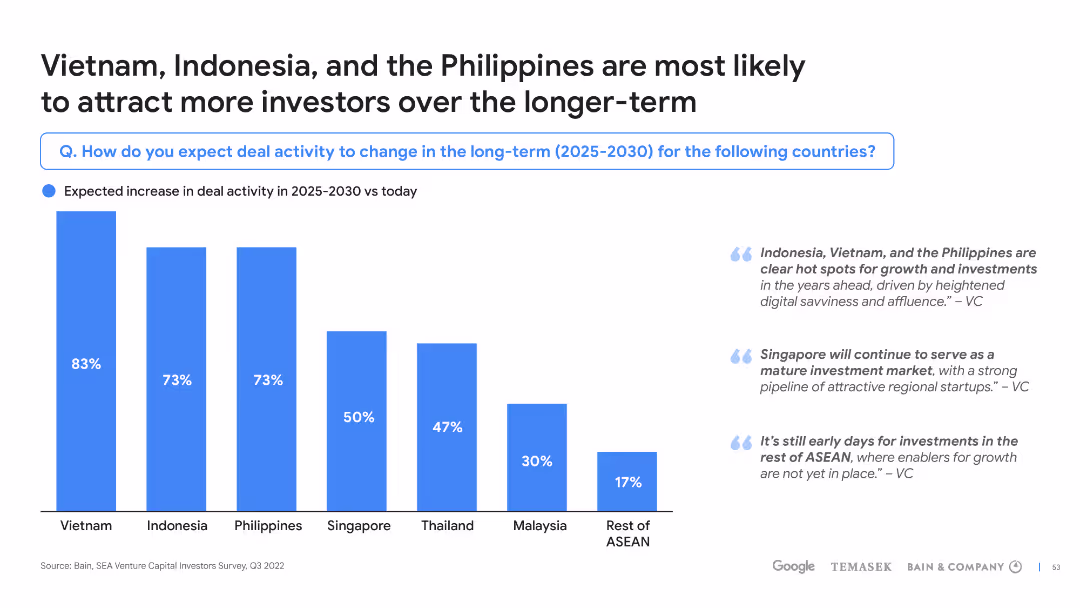
Column chart with future projections and quotes from VCs, along with a title and explanatory text on the side.
Investment Analysis
Financial Services
Predicts an increase in deal activity in Vietnam, Indonesia, and the Philippines by 2025-2030, citing VC insights on market growth.
deal activity, long-term investment, Vietnam, Indonesia, Philippines, growth, VC insights, 2025-2030
Mixed Chart
Bain
Saved
Vertical column chart showing loan exposure by sector, alongside a descriptive table.
Risk Assessment and Management
Financial Services
Summarizes corporate loan exposure and impairment risks by sector, highlighting synthetic protection levels.
loans, corporate, risk assessment, sectors, protection
Mixed Chart
Barclays
Saved
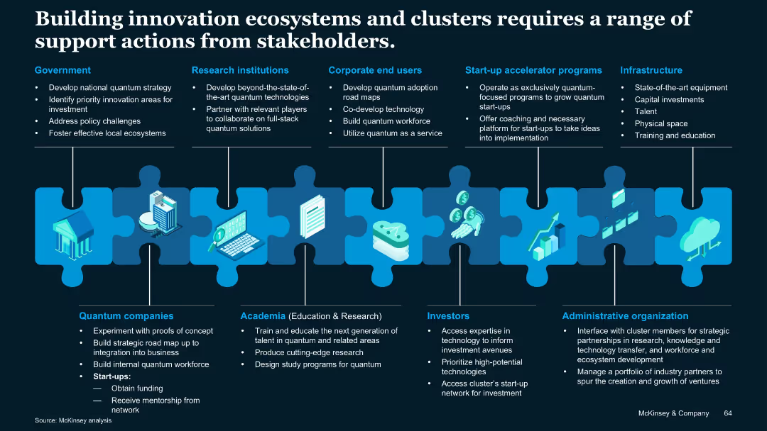
Puzzle piece metaphor visual linking different stakeholder groups; icons and vertical segments describe roles of various players.
Technology and Digital Transformation
Artificial Intelligence
Describes stakeholder roles—government, academia, industry, investors, infrastructure—in building innovation ecosystems for quantum tech. Emphasizes coordinated contributions to support development and commercialization.
Stakeholders, quantum clusters, infrastructure, investment, academia
Uncategorized
McKinsey
Saved
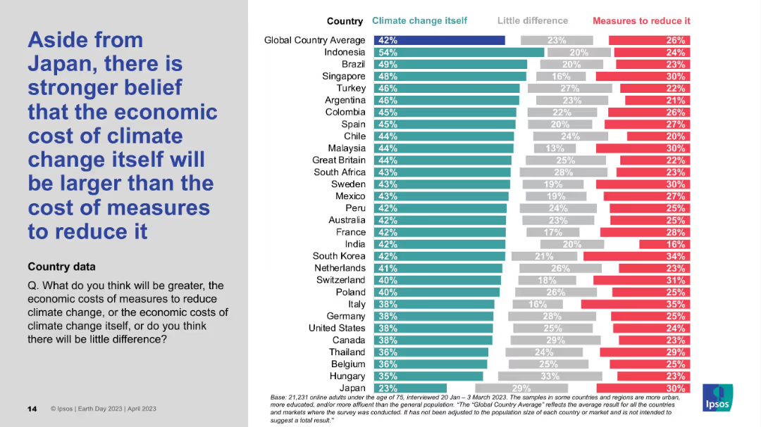
Detailed country-by-country horizontal bar chart; shows comparative belief in economic cost of climate change vs. action.
Market Analysis and Trends
Environmental Services & Sustainability
This chart shows that, aside from Japan, most countries believe the economic cost of inaction on climate change exceeds the cost of mitigation. Indonesia, Brazil, and Singapore lead this sentiment, while Japan stands out for its skepticism.
Economic impact, Climate cost, Mitigation, Global survey, Ipsos data
Mixed Chart
IPSOS
Saved
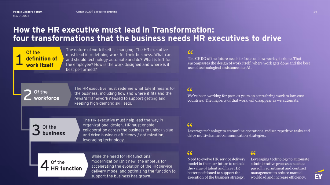
Purple slide with four large numbered transformation areas, each with a supporting quote and short paragraph.
Organizational Structure and Change
Professional Services
Outlines four major transformations HR must lead: redefining work, workforce, business, and the HR function itself. Each theme addresses how HR leaders should adapt to automation, workforce evolution, strategic business involvement, and HR service delivery to remain relevant and impactful in the age of AI and digital transformation.
HR transformation, automation, future of work, leadership, organizational design
Vertical Flow
EY
Saved
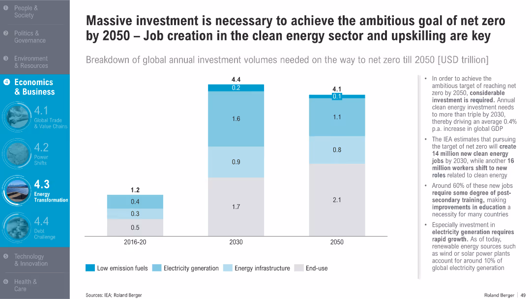
Vertical bar charts showing clean energy investment requirements by sector from 2016 to 2050; bullet points to the right provide analysis on economic and employment impacts
Investment Analysis
Energy & Utilities
This slide quantifies global investment needs in low-emission fuels, energy infrastructure, and electricity to achieve net zero by 2050. It projects clean energy job creation and underscores the importance of workforce upskilling.
clean energy, investment, net zero, jobs, electricity, training, GDP impact, energy infrastructure, renewables, 2050
Mixed Chart
Roland Berger
Saved
Contains a bullet list of firmwide funding sources and column chart detailing funding sources by type in billions. Text emphasizes the increased role of deposits and diversification of debt. There's a growth trajectory in the deposit percentage as a share of unsecured funding from 2019 to 2022.
Financial Performance
Financial Services
Discusses the diversified funding sources for firmwide operations, including the increasing significance of deposits. It presents a comparative financial analysis of the company's funding structure over several quarters, highlighting the strategic use of unsecured long-term and short-term debt.
funding sources, deposits, unsecured debt, diversification, financial strategy, column chart
Mixed Chart
Goldman Sachs
Saved
This slide includes comparative data in blue bar charts and two columns with demographics and geographical segmentation. It provides a contrast in online spending between HVUs and non-HVUs in Vietnam. Source includes Bain analysis.
Market Analysis and Trends
Technology & Software
The slide compares online spending habits of high-value users (HVUs) to non-HVUs in Vietnam, useful for understanding consumer segmentation and targeting strategies in the digital economy.
Vietnam, High-Value Users, Consumer Spending, Digital Economy, Online Spend, Demographic Analysis, Geographic Segmentation, Market Research, Spending Habits
Multiple Chart
Bain
Saved
Includes various column charts, textual analysis, and quantitative data showcasing business diversity.
Risk Assessment and Management
Financial Services
Discusses the benefits of diversification across businesses and client geographies in challenging environments.
Diversification, mortgage trading, client geographies, business resilience, economic challenges
Multiple Chart
JP Morgan
Saved
Text and bullet points presenting factors affecting profitability, with a clear separation of industry and company specifics.
Operational Efficiency
Professional Services
Discusses the interplay between industry-specific and company-specific factors in profitability.
Profitability, Industry Factors, Company Factors, Distribution, Efficiency
Table
EY
Saved
Bar charts, comparative analysis, color-coded data.
Market Analysis and Trends
Professional Services
Displays CEOs' concerns by region regarding various economic, policy, and social threats.
CEO, cyber threats, policy, health crises, economic growth, uncertainty, regulation
Single Chart
PwC/Strategy&
Saved
The slide displays a comparison of Type I to IV H2 tanks, detailing materials, pressure levels, prices, and targeted applications. Visuals include detailed diagrams of each tank type.
Technology and Digital Transformation
Industrial & Manufacturing
Provides a comprehensive overview of different H2 storage tanks, their expected technology readiness by 2030, and specific use cases for mobility and infrastructure.
H2 storage, Type I, Type II, Type III, Type IV, technology readiness, market study, application, pressure levels
Table
Roland Berger
Saved
The slide features a flowchart with statistical data, grouped under two categories: formal and informal education users. It includes percentage statistics, positive and negative impact highlights, and color coding for clarity (purple and blue). The right side presents a summary block with overall impact statistics.
Market Analysis and Trends
Telecommunications
This slide explores the impact of nbn broadband on educational outcomes, highlighting both positive and negative aspects as reported by users.
Education, Internet, Broadband, Impact, Statistics, Positive, Negative, Formal, Informal, Telecommunications
Multiple Chart
Accenture
Saved
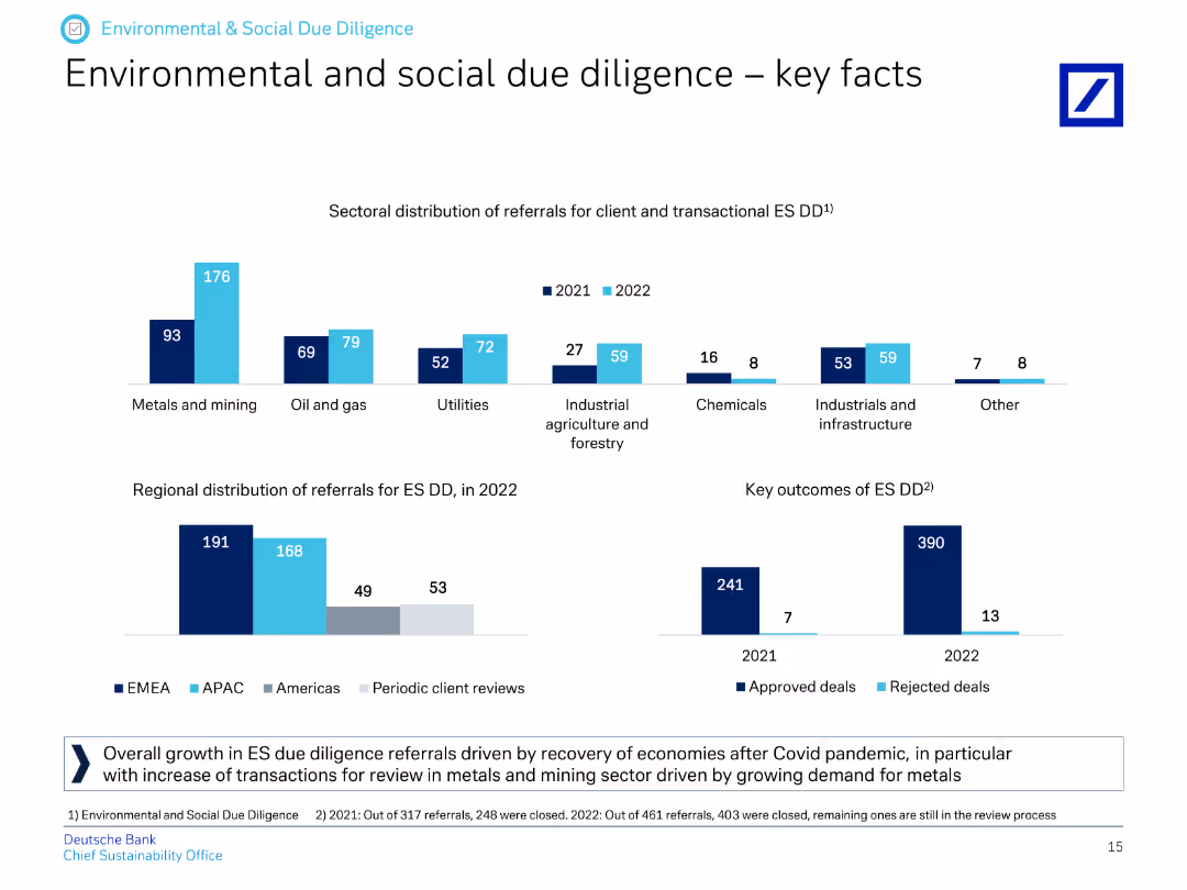
The slide contains column charts showing the sectoral distribution and regional distribution of referrals for environmental and social due diligence in 2021 and 2022.
Regulatory and Compliance
Financial Services
It provides key facts about environmental and social due diligence, highlighting sectoral and regional distribution of referrals and outcomes for approved and rejected deals.
due diligence, sector distribution, regional distribution, referrals, environmental, social, approved deals, rejected deals
Multiple Chart
Deutsche Bank
Saved
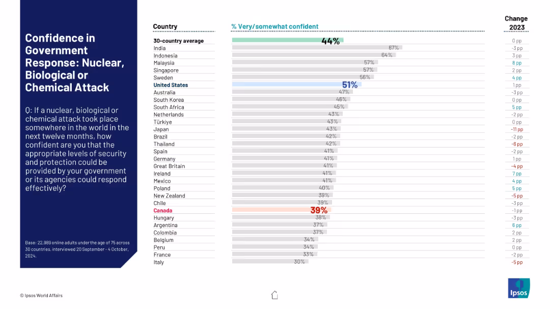
Follows consistent layout. Bars show perceived preparedness for a global NBC (nuclear, biological, chemical) attack. Canada again highlighted in red for low confidence.
Risk Assessment and Management
Government & Public Sector
Compares international public perceptions of governmental preparedness for catastrophic NBC attacks. Shows varying degrees of confidence, with many countries showing decreased confidence from the previous year.
NBC threats, chemical attack, biohazard, nuclear, public security, international perceptions, crisis response
Mixed Chart
IPSOS
Saved
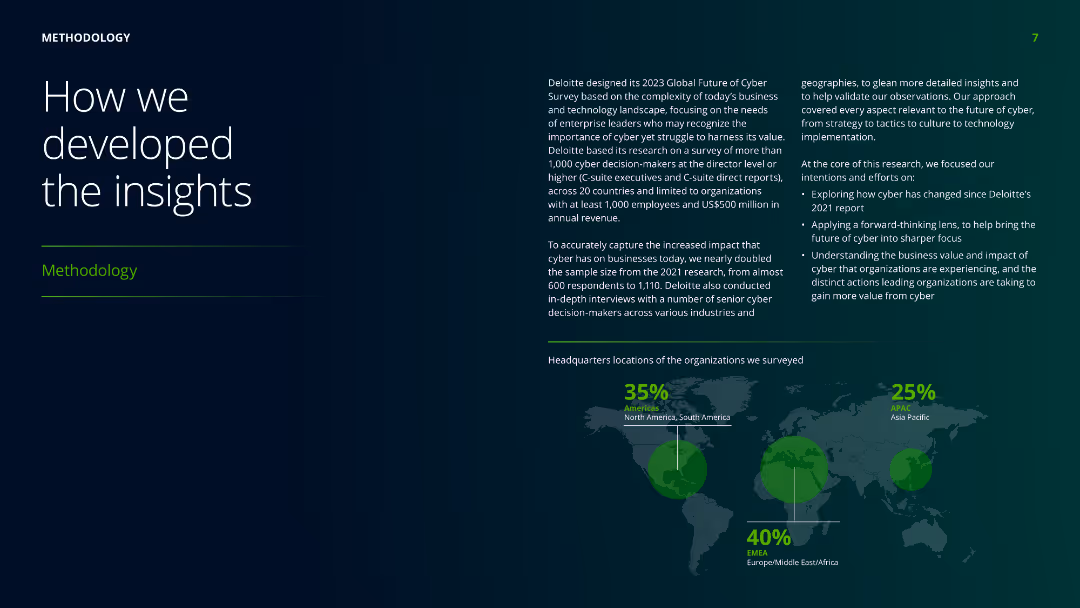
The slide features a world map with highlighted regions, accompanied by text boxes explaining the methodology used in developing the insights, including survey details and participant demographics.
Risk Assessment and Management
Professional Services
Describes the methodology behind the research, including the survey's scope, participant demographics, and objectives to ensure comprehensive insights into the business and technology landscape.
methodology, insights, survey, demographics, research, professional services, global, participant, business, technology
Mixed Chart
Deloitte
Saved
The slide showcases horizontal bar charts comparing the superior ratings in talent management from two different years across various criteria. Each bar is distinctly color-coded to represent different years, enhancing the visual comparison between them.
Human Resources and Talent Management
Financial Services
Compares talent management performance across two surveys, showing trends over time in aspects like collaboration and career path development. It’s instrumental for longitudinal analysis and strategic planning in human resources within the financial sector.
talent management, trends, comparison, historical data, HR, financial services
Single Chart
Accenture
Saved
Detailed bullet points with strategic advice on channel exploration, accompanied by colorful icons and case study examples.
Strategic Planning
Retail & E-commerce
Provides guidance on the exploration of new channels, emphasizing the importance of value understanding and experimentation for growth.
New Channels, Experimentation, Value Drivers, Strategy, Market Opportunities
Graphic
BCG
Saved
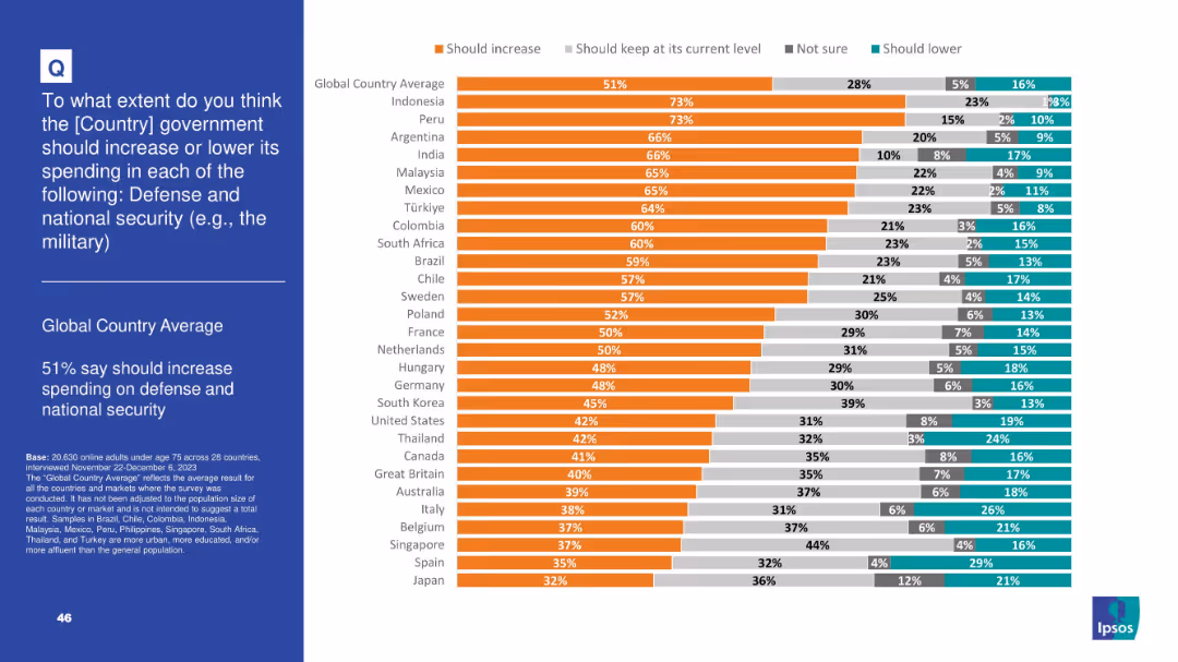
Orange-dominant bar chart showing country-level agreement on boosting defense spending; includes categories: increase, same, unsure, decrease
Strategic Planning
Government & Public Sector
A smaller majority (51%) globally favor increased defense and national security spending. Countries like Indonesia and Peru show highest support, while Japan and Spain express the lowest. Indicates regional variations in perceived threat levels.
defense, military, national security, public opinion, government budget, threat perception, Ipsos, geopolitics, spending
Mixed Chart
IPSOS
Saved
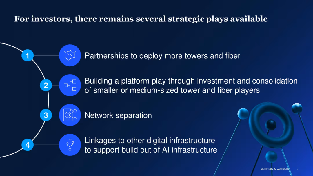
Vertical list with icons and numbered segments; clean blue design
Investment Analysis
Telecommunications
Identifies four strategic opportunities for telecom infrastructure investors: partnerships, platform plays, network separation, and integration with AI infrastructure to enhance scalability and ROI.
telecom investment, infrastructure, strategic plays, fiber, AI, partnerships, platform consolidation
Vertical Flow
McKinsey
Saved
This slide includes a large pie chart illustrating sales distribution among various business segments, enhanced by imagery representing each segment. It details the percentage of sales, main drivers, and notes the impact of the FCG acquisition. The slide includes various icons and a dotted line highlighting cyclicality levels for different segments, accompanied by the Michelin logo.
Product and Service Analysis
Industrial & Manufacturing
It conveys information on sales distribution across different business segments post-FCG acquisition, emphasizing the strengthening of premium positioning across tire businesses. It is potentially used to present growth strategies, market positioning, and the impact of acquisitions to stakeholders or in business development meetings.
polymer, composite, growth, sales, FCG, Michelin, acquisition, market, segmentation, strategy
Single Chart
Morgan Stanley
Saved
The slide features a column chart comparing food loss in millions of tons from 2020 to 2025, segmented by perishable and non-perishable produce losses. Orange and grey hues dominate, with clean text and percentage annotations.
Strategic Planning
Agriculture & Food Production
This slide presents FGN's goals for halving post-harvest food losses by 2025, displaying past data and future targets in a visually comparative format to emphasize the potential impact of reduced food waste.
food loss, perishable produce, 2025 target, post-harvest, reduction
Mixed Chart
BCG
Saved
The slide features a column chart comparing the frequency of mental health visits among different generations.
Market Analysis and Trends
Healthcare & Pharmaceuticals
This slide presents data on how often different generations seek mental health support, highlighting generational differences in mental health care engagement.
Mental health, generational differences, survey, healthcare, mental health visits
Mixed Chart
IPSOS
Saved
This slide features a line chart depicting the maturity curve of CO₂ separation and capture technologies. It includes different colored lines representing various industries and technologies.
Technology and Digital Transformation
Energy & Utilities
It illustrates the maturity stages of CO₂ separation and capture technologies from lab work to widely deployed stages, highlighting the capital requirements and technology risk involved.
CO₂ capture, maturity curve, separation technologies, capture technologies, energy, utilities, capital requirements
Single Chart
Kearney
Saved
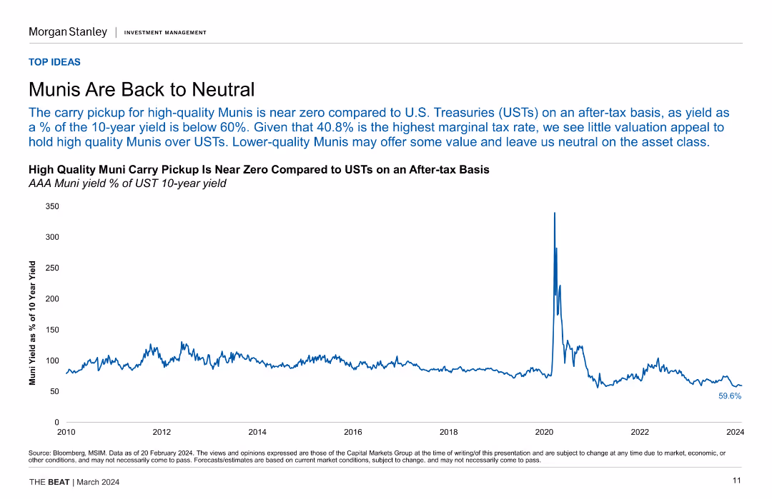
Line chart depicting the yield of AAA Muni bonds as a percentage of UST 10-year yields, indicating the near-zero carry pickup for high-quality Munis.
Investment Analysis
Financial Services
This slide analyzes the yield comparison between high-quality Munis and USTs, suggesting limited valuation appeal for Munis on an after-tax basis and a neutral stance.
Munis, UST, Yields, Investment, Valuation, After-tax, Financial Analysis
Single Chart
Morgan Stanley
Saved
Previous
Next
If nothing, comes up, please save your slides first
Create a FREE account to continue browsing
Receive Instant Access to 1,000+ slides from companies like McKinsey, Google, and Goldman Sachs
First Name
Last Name
Email
Password
I agree to all
Terms & Privacy Policy
Thank you! Your submission has been received!
Oops! Something went wrong while submitting the form.
Have an account?
Sign in
Column Chart
Heatmap
Chevron
Org Chart
Infographic
Callouts
Timeline
List
Graphic
Picture
Process Flow
Diagram
Paragraph
Map
Table
Framework
Subtitle
Takeaway Box
Icon
Other Chart
Radar Chart
Waterfall Chart
Mekko Chart
Pie Chart
Scatter Plot
Line Chart
Bar chart
Bullet points