My Account
My Slides
Search by Category
Companies
Slide Type
Use Case
Industry
Pricing
Templates
View All Templates
Download Template Slides
✦ AI
AI Prompt Library
AI Search
Feedback
Login
Logout
Get Started
Browse all Slides
Browse all Slides
Create a FREE Account
Instant access to 1,000+ real slides from top companies like McKinsey, BCG, Goldman Sachs, Google and many more!
First Name
Last Name
Email
Password
I agree to all
Terms & Privacy Policy
Thank you! Your submission has been received!
Oops! Something went wrong while submitting the form.
Have an account?
Sign in
Saved Slides
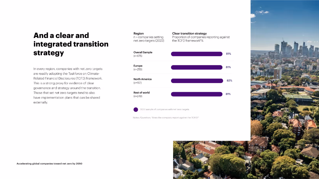
The slide has a column chart on the right depicting the proportion of companies with clear transition strategies by region.
Strategic Planning
Environmental Services & Sustainability
The slide focuses on companies adopting the TCFD framework for clear transition strategies towards net zero, showing consistent adoption across regions.
transition strategy, TCFD, net zero, overall sample, Europe, North America, rest of world, clear governance
Mixed Chart
Accenture
Saved
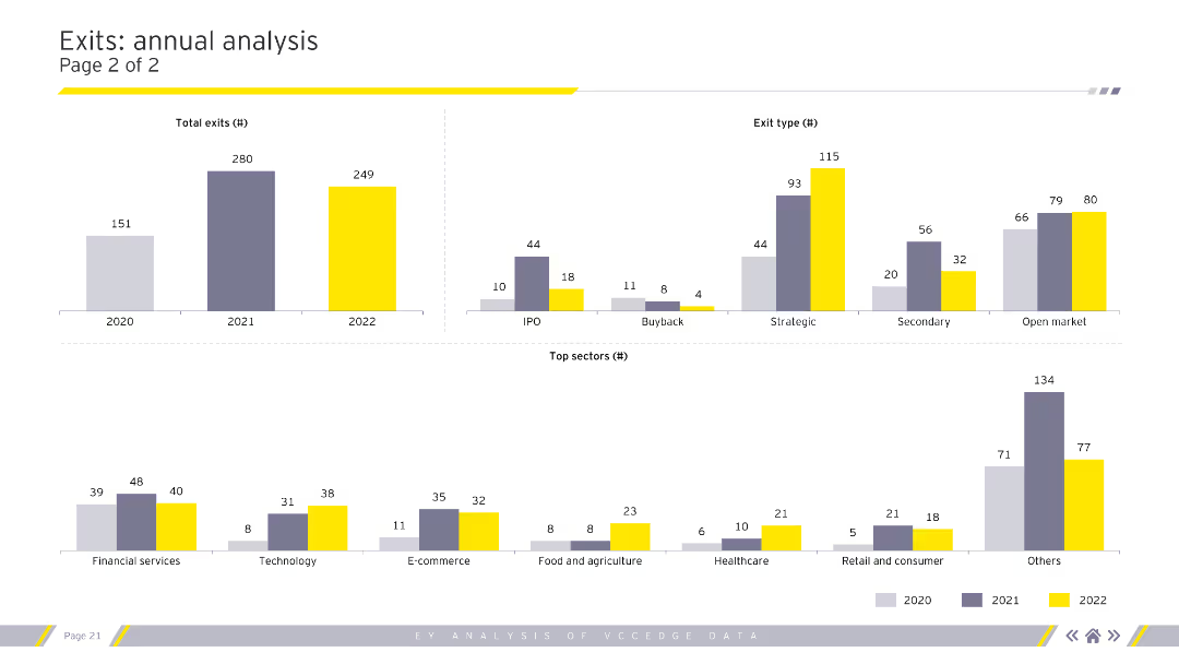
The slide presents two column charts and one bar chart, illustrating total exits by year, exit type, and top sectors. The charts use different colors to represent each year (2020, 2021, and 2022).
Financial Performance
Financial Services
The slide analyzes annual exits, detailing the number of exits per year, types of exits (IPO, buyback, etc.), and top sectors in terms of exit count. This can be used to track industry performance over time.
Annual exits, exit types, sectors, IPO, buyback
Multiple Chart
EY
Saved
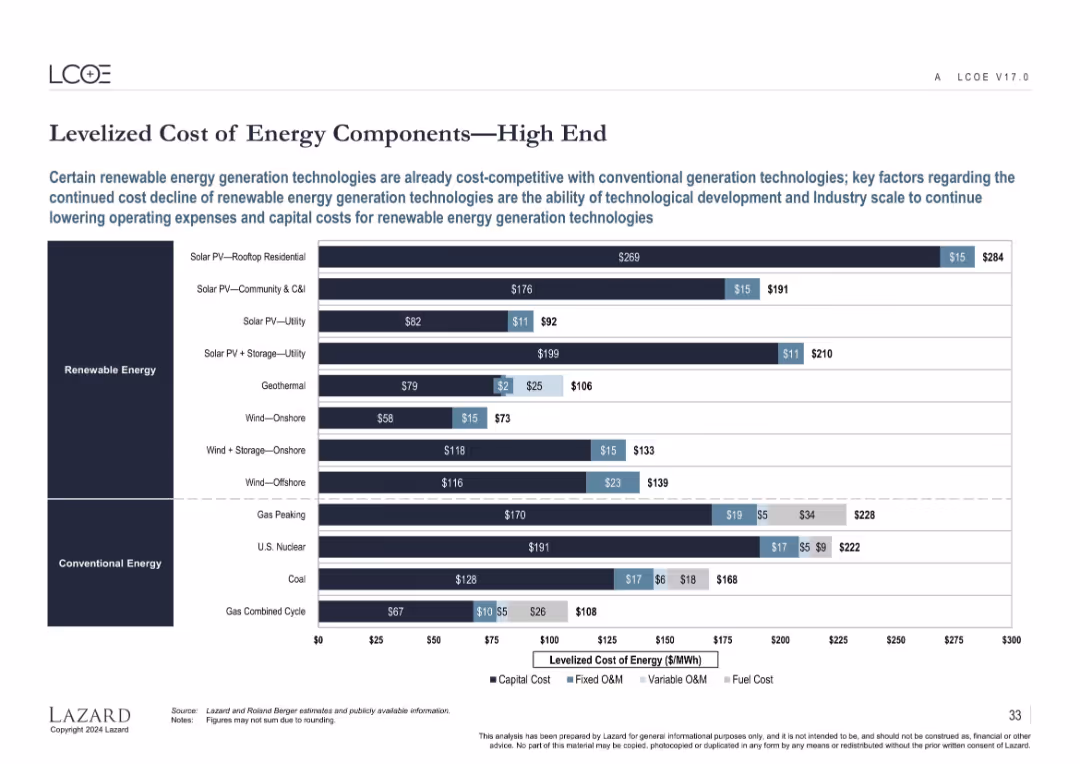
Same structure as slide 16648 but illustrates the high-end cost estimates for the same energy technologies.
Performance Metrics and KPIs
Energy & Utilities
Complements the previous slide by illustrating high-end LCOE estimates, revealing the cost variability in energy generation technologies. Highlights upper-bound costs influenced by regional and technological factors across renewable and conventional sources.
high LCOE, energy cost, renewables, fossil fuels, operating cost, capital intensity
Single Chart
Roland Berger
Saved
The slide features a multi-faceted analysis with icons and bullet points, highlighting the impact of rural e-commerce strategies in China.
Market Analysis and Trends
Retail & E-commerce
Discussing the successful increase in rural e-commerce due to service centers and partnerships, this slide presents a case study on expanding digital comfort and online purchasing within rural communities in China.
E-commerce, rural strategy, China, digital adoption
Header Vertical
BCG
Saved
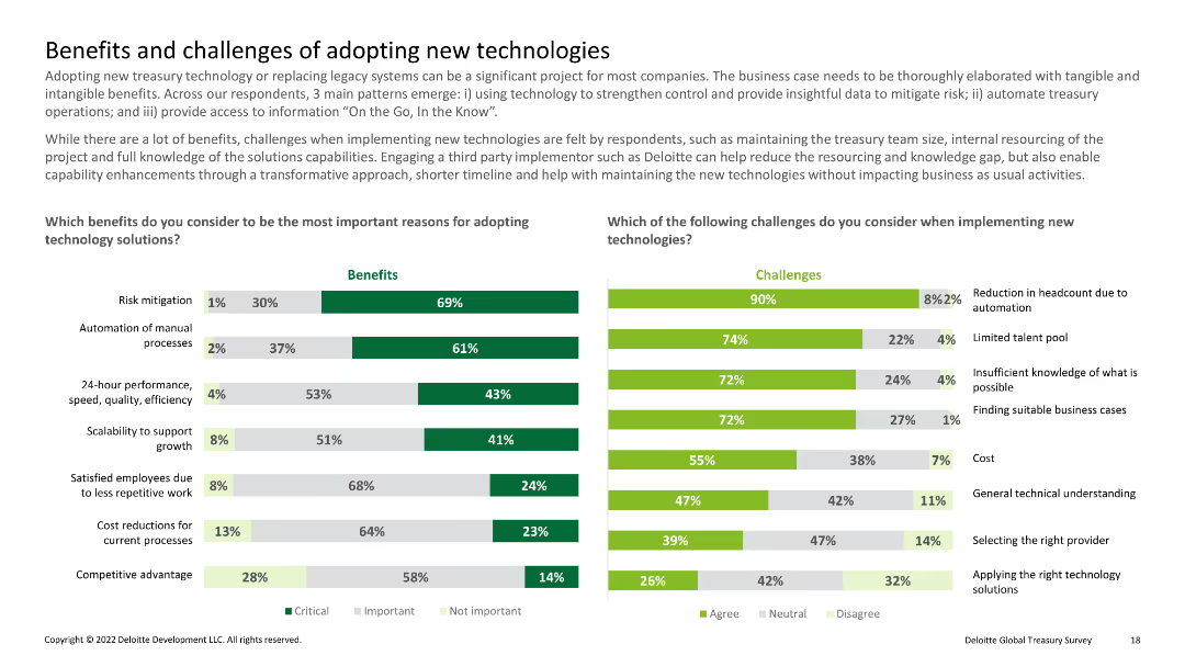
Dual column charts comparing benefits and challenges of new technology adoption, with categories like risk mitigation and cost
Technology and Digital Transformation
Financial Services
Highlights the benefits and challenges associated with adopting new treasury technologies, focusing on risk mitigation and operational efficiency.
New technology, benefits, challenges, treasury, adoption
Multiple Chart
Deloitte
Saved
Line charts depicting US unit labor cost and labor productivity growth y/y from 2007 to 2023.
Operational Efficiency
Professional Services
Highlights how robust productivity growth buffers against compensation growth, reducing unit labor costs and easing inflation pressures.
productivity growth, labor costs, compensation, inflation, line chart, labor productivity, economic buffer, 2007-2023, US economy
Mixed Chart
EY
Saved
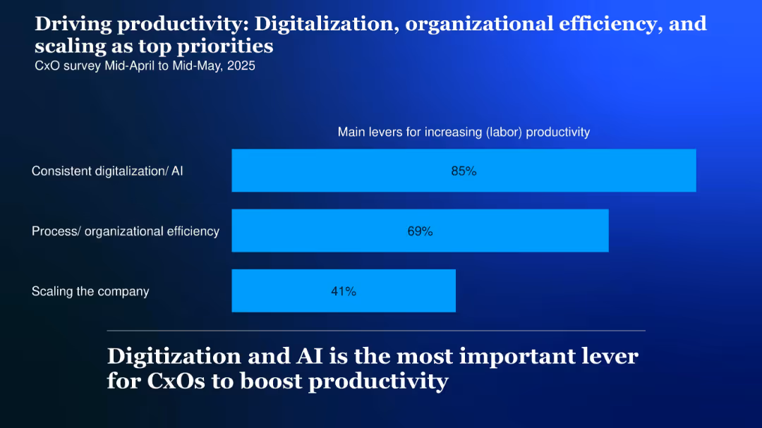
Horizontal bar chart with three bars showing productivity drivers, labeled on the left; high-contrast background and bold headline
Performance Metrics and KPIs
Technology & Software
CxOs cite digitalization and AI (85%), organizational efficiency (69%), and company scaling (41%) as top productivity levers for 2025.
Productivity, digitalization, AI, scaling, efficiency, levers, 2025
Single Chart
McKinsey
Saved
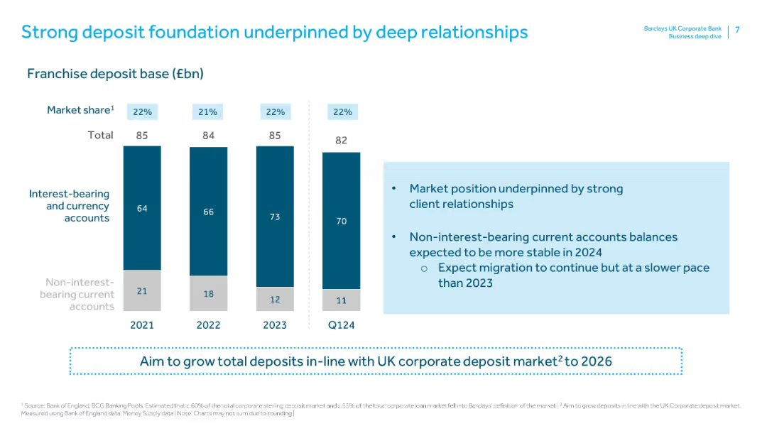
Contains vertical bars showing interest-bearing and non-interest-bearing accounts (2021–Q1 2024). Right side has a text box detailing market position and expectations for 2024.
Strategic Planning
Financial Services
Highlights Barclays UKCB’s strong market share (22%) and client relationships in deposits. It also shows a shift from non-interest to interest-bearing accounts and outlines expectations for stabilization and slower migration in 2024.
deposits, interest-bearing, market share, client relationships, account balances, deposit growth, franchise base, strategic planning
Mixed Chart
Barclays
Saved
The slide includes two pie charts showing percentages and timelines representing early mover advantage in technology. It uses a minimalistic design with a black background and white and red text.
Market Analysis and Trends
Technology & Software
This slide presents data on how AI influences competition in business, emphasizing the advantages of being an early adopter in technological advancements.
AI, competition, technology, early adoption, business models
Multiple Chart
Bain
Saved
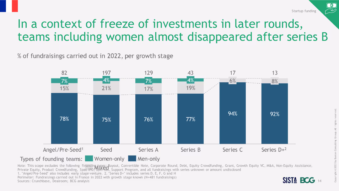
Column chart showing percentage of fundraisings in 2022 per growth stage. The slide uses a combination of blue and green bars to differentiate between women-only, men-only, and mixed founding teams.
Investment Analysis
Financial Services
This slide highlights the declining trend in fundraisings involving women after Series B funding stages in 2022. It shows the percentage distribution of different team types across various growth stages.
Fundraising, Investment, Women, Teams, Stages
Single Chart
BCG
Saved
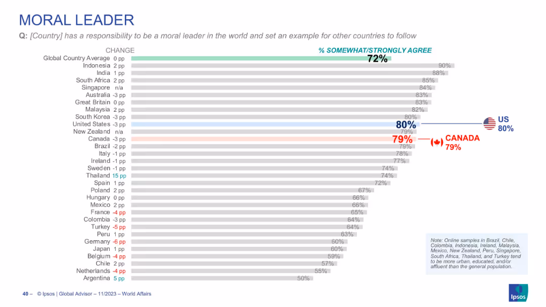
Horizontal chart showing country views on moral leadership, with % agreement, Canada at 79%
Strategic Planning
Government & Public Sector
Evaluates the perception that a country should serve as a moral leader. Canada and U.S. score similarly (79% and 80% respectively), both above global average (72%).
moral leadership, international ethics, national role, diplomacy, Canada, US, public responsibility
Single Chart
IPSOS
Saved
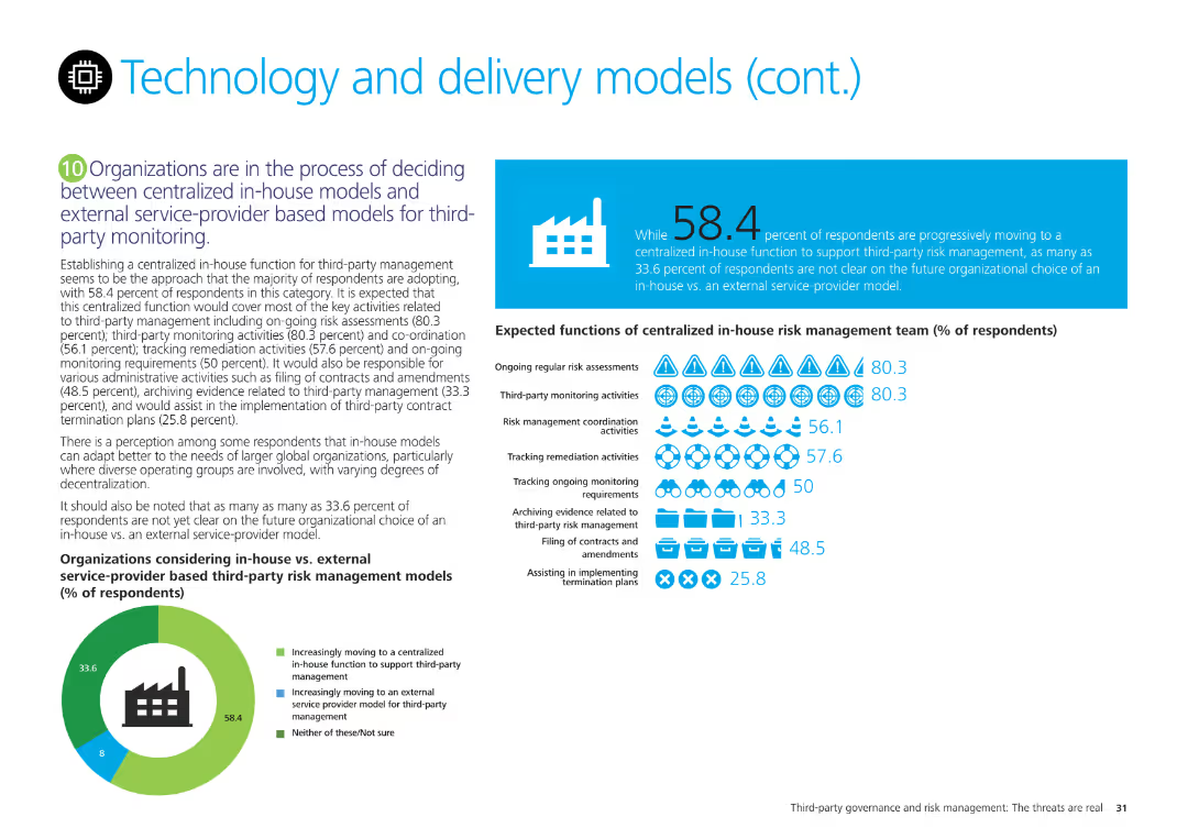
Pie chart showing organizational decisions on centralized in-house vs. external service-provider models for third-party management, with detailed expected functions.
Technology and Digital Transformation
Technology & Software
Discusses organizational preferences for centralized in-house vs. external models for third-party risk management and their expected functions, based on survey results.
centralized, in-house, external, third-party, management, pie chart
Mixed Chart
Deloitte
Saved
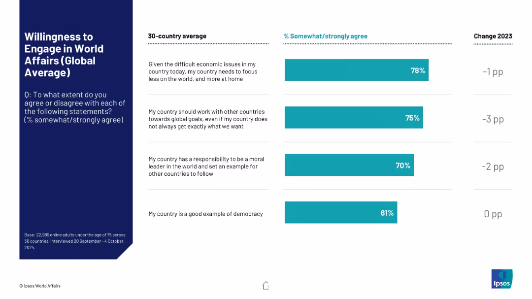
Split format with list-style layout on right showing 4 statements and their global average agreement levels as vertical bars; includes yearly changes.
Market Analysis and Trends
Government & Public Sector
The slide shows average global agreement with four statements about countries’ roles in world affairs, including economic focus, global cooperation, moral leadership, and democratic values. Year-over-year changes are also listed.
world affairs, international cooperation, public opinion, global survey, governance, moral leadership, democracy, foreign policy, Ipsos
Mixed Chart
IPSOS
Saved
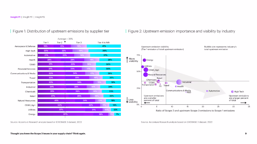
The slide features a horizontal bar chart on the left showing emission distribution by tier and a scatter plot on the right comparing emission importance.
Market Analysis and Trends
Environmental Services & Sustainability
This slide provides a detailed analysis of upstream emissions across different supplier tiers and their visibility by industry, highlighting key emission sources.
Emissions, supplier tier, distribution, visibility, industry, analysis, environmental impact, upstream, importance, sustainability
Multiple Chart
Accenture
Saved
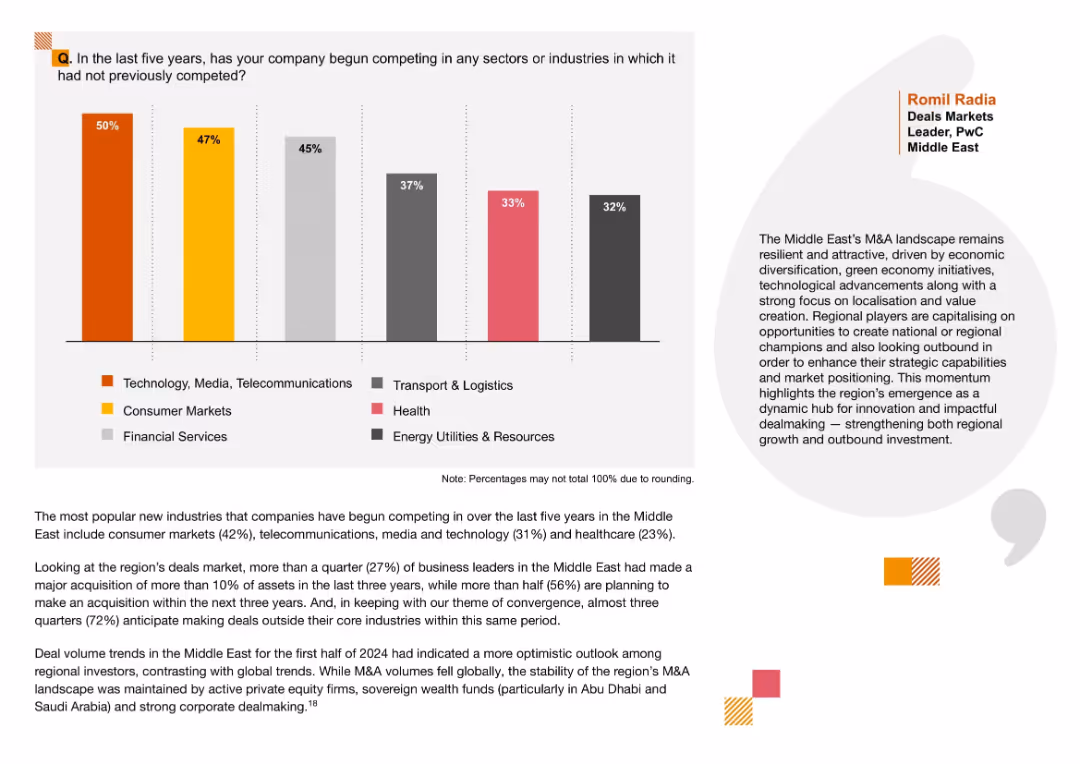
Left-aligned vertical bar chart with labeled segments in different colors; includes brief commentary and a quote on the right; clean layout with side margin and color-coded legend.
Strategic Planning
Professional Services
This slide shows the sectors companies in the Middle East have expanded into over the last five years. The most entered sector is Technology, Media, and Telecommunications (50%), followed by Consumer Markets and Financial Services. Commentary emphasizes regional momentum in M&A activity due to localization, innovation, and green economy initiatives.
sector expansion, M&A, Middle East, localization, diversification, strategic growth, outbound investment, new markets, private equity, dealmaking
Mixed Chart
PwC/Strategy&
Saved
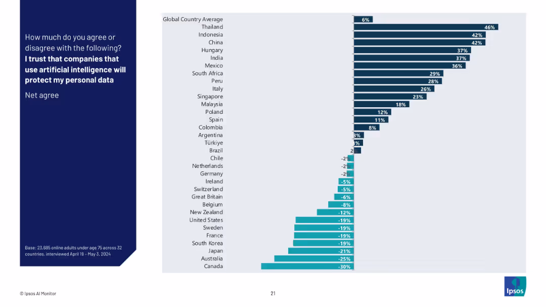
Simplified bar graph showing net agreement percentages (Agree minus Disagree) by country, highlighting positive and negative sentiment regions.
Risk Assessment and Management
Artificial Intelligence
This slide illustrates the net trust score for each country in regard to companies using AI to safeguard personal data. Countries with negative values show public distrust, while positive values suggest confidence in AI-related data protection.
net trust, AI security, personal data, public perception, Ipsos, international attitudes, AI ethics, country ranking
Mixed Chart
IPSOS
Saved
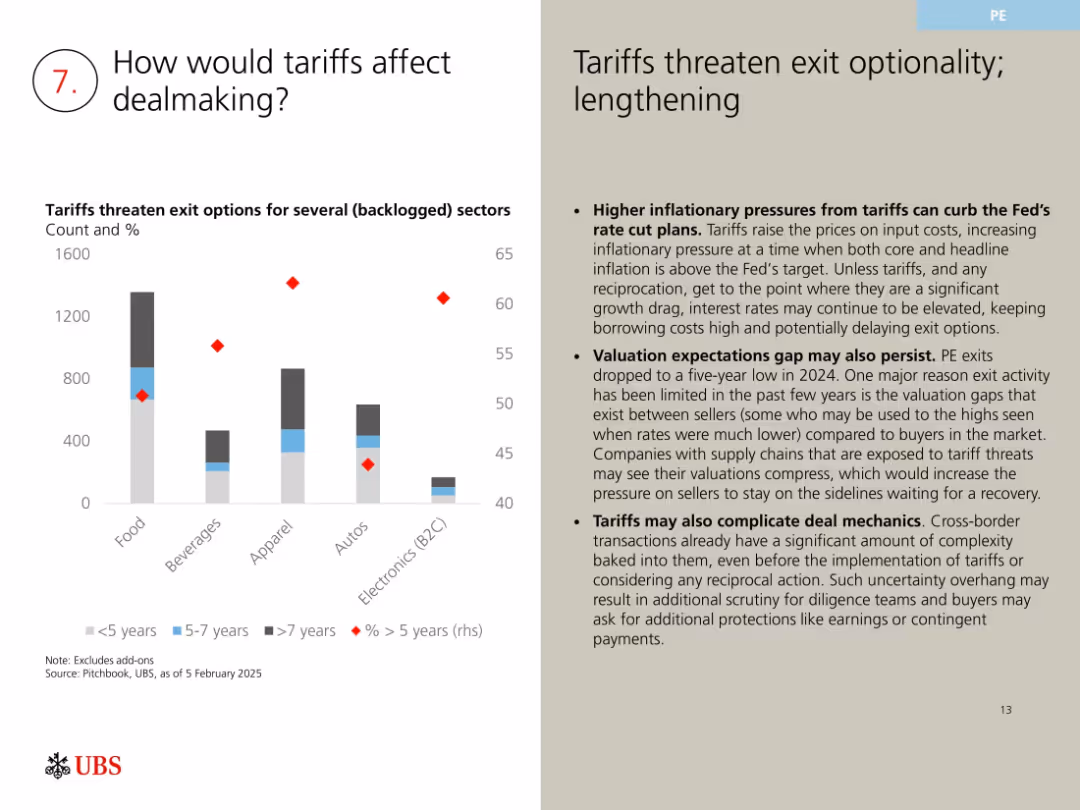
Bar and scatter chart showing deal aging by sector; commentary to the right
Regulatory and Compliance
Financial Services
Examines how tariffs may impact M&A by increasing inflationary pressure, complicating deal structures, and widening valuation gaps. Highlights sectoral risks and suggests potential delays in deal execution due to uncertainty.
tariffs, M&A risk, regulatory pressure, deal timing, exit optionality, valuation gap
Mixed Chart
UBS
Saved
The slide combines textual information with visuals like icons and graphs. There is a bar graph on the left and bullet points on the right, separated by vertical dividers. Logos and small graphics highlight specific points.
Industry Overview
Financial Services
It presents an overview of the commodities and global markets division, highlighting net profit contribution, client activity, and specialized finance. It includes accolades to emphasize expertise and achievements, supported by visual representations of key financial data.
commodities, markets, finance, global, net profit, client activity, specialization, awards
Mixed Chart
Morgan Stanley
Saved
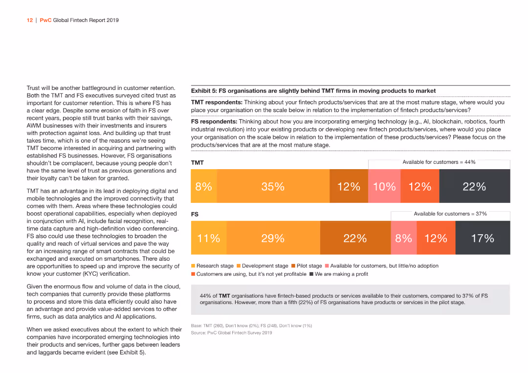
This slide has a bar chart comparing the implementation stages of fintech products/services between TMT and FS sectors. The bars are in shades of orange and gray.
Market Analysis and Trends
Financial Services
Illustrates the differences between TMT and FS sectors in the implementation stages of fintech products/services, showing the proportion of firms at each stage from research to profitability.
fintech, implementation, TMT, FS, products/services
Mixed Chart
PwC/Strategy&
Saved
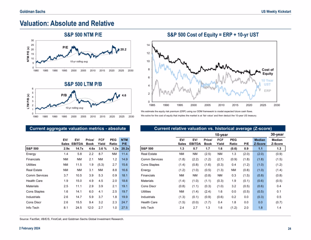
Multi-chart layout including line graphs and data tables. Shows S&P 500 valuation metrics (P/E, P/B), cost of equity, and sector-level valuation comparisons. Clean and data-dense with side-by-side segmentation.
Financial Performance
Financial Services
This slide provides an overview of absolute and relative valuation metrics for the S&P 500 and its sectors. It compares historical trends in P/E and P/B ratios and evaluates the cost of equity using ERP and Treasury yields. Sector-specific data is organized into clear tables and visuals.
valuation, P/E ratio, P/B ratio, cost of equity, ERP, sector metrics
Multiple Chart
Goldman Sachs
Saved
The slide features a column chart displaying the number of IPOs and proceeds from 2019 to YTD 2023, a table of cross-border IPOs by country, and line charts for percentage trends.
Market Analysis and Trends
Financial Services
This slide presents data on US IPO performance, highlighting cross-border deals, their origin countries, and their percentage of total US IPOs, along with pricing and performance metrics.
IPO, cross-border, US, financial, trends
Multiple Chart
EY
Saved
The slide includes two large column charts flanking a central area with detailed breakdowns of noninterest expenses, highlighted by various colors and icons to distinguish between categories.
Strategic Planning
Financial Services
Discusses the expected changes in noninterest expenses at JPMorgan Chase & Co. and the strategic implications of these changes for funding investment growth.
noninterest expense, investment growth, structural expenses, JPMorgan, strategy, funding
Single Chart
JP Morgan
Saved
Donut chart showing percentages of employee access to HRIS, with 55% having access, 24% having limited access, and 21% with no access.
Human Resources and Talent Management
Professional Services
Explores how employees can access their data on HR information systems, showing a majority have some form of access.
HRIS, employee access, data records, donut chart
Single Chart
PwC/Strategy&
Saved
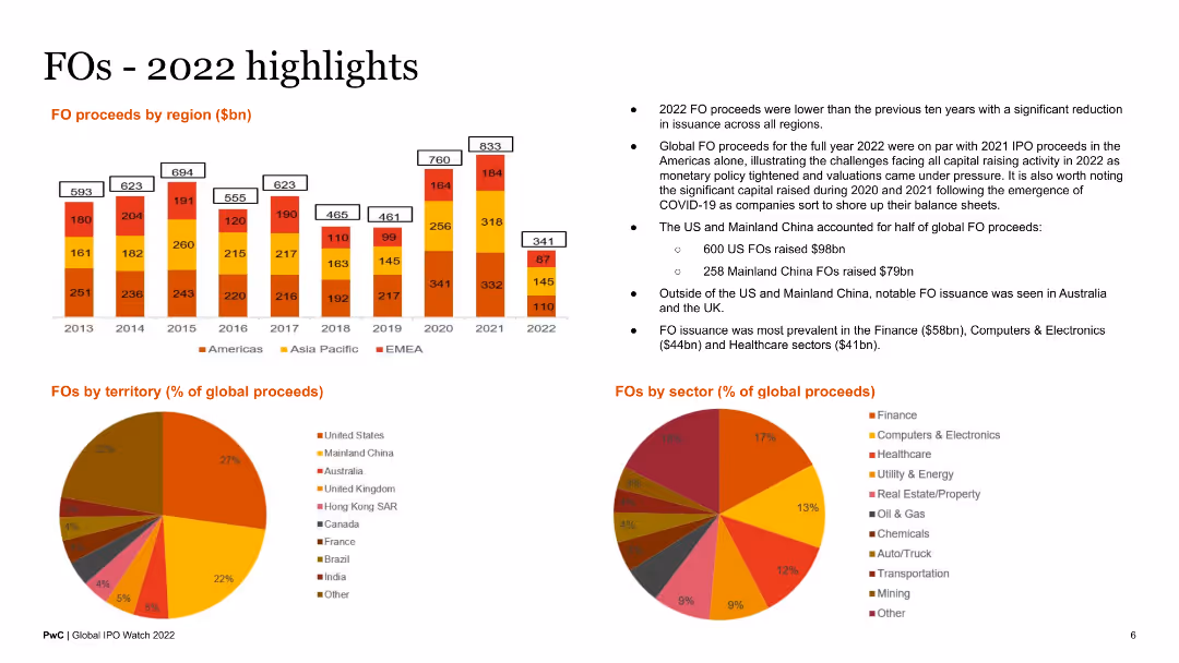
The slide features a column chart of FO proceeds by region, a pie chart of FOs by territory, and another pie chart by sector. Text blocks summarize key points about FO activities in 2022.
Market Analysis and Trends
Financial Services
This slide reviews follow-on offering (FO) activities in 2022, presenting data on proceeds by region, territory, and sector. It provides a comprehensive overview for analysts and stakeholders.
FOs highlights, 2022, regional proceeds, sector analysis, territory
Multiple Chart
PwC/Strategy&
Saved
The slide includes two column charts showing the reduction in RWA and leverage exposure over time, with detailed text explaining the transactions and strategies that led to these reductions.
Financial Performance
Financial Services
Presents data on the reduction of risk-weighted assets (RWA) and leverage exposure in the financial sector. The column charts illustrate the decline over specific quarters, while the text explains the transactions and strategies that contributed to this progress, highlighting the impact of these measures on financial stability.
RWA, Leverage, Financial Stability, Reduction, Strategies
Multiple Chart
Credit Suisse
Saved
Previous
Next
If nothing, comes up, please save your slides first
Create a FREE account to continue browsing
Receive Instant Access to 1,000+ slides from companies like McKinsey, Google, and Goldman Sachs
First Name
Last Name
Email
Password
I agree to all
Terms & Privacy Policy
Thank you! Your submission has been received!
Oops! Something went wrong while submitting the form.
Have an account?
Sign in
Column Chart
Heatmap
Chevron
Org Chart
Infographic
Callouts
Timeline
List
Graphic
Picture
Process Flow
Diagram
Paragraph
Map
Table
Framework
Subtitle
Takeaway Box
Icon
Other Chart
Radar Chart
Waterfall Chart
Mekko Chart
Pie Chart
Scatter Plot
Line Chart
Bar chart
Bullet points