My Account
My Slides
Search by Category
Companies
Slide Type
Use Case
Industry
Pricing
Templates
View All Templates
Download Template Slides
✦ AI
AI Prompt Library
AI Search
Feedback
Login
Logout
Get Started
Browse all Slides
Browse all Slides
Create a FREE Account
Instant access to 1,000+ real slides from top companies like McKinsey, BCG, Goldman Sachs, Google and many more!
First Name
Last Name
Email
Password
I agree to all
Terms & Privacy Policy
Thank you! Your submission has been received!
Oops! Something went wrong while submitting the form.
Have an account?
Sign in
Saved Slides
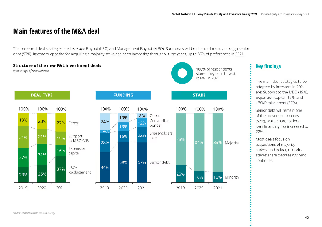
Column charts showing deal types, funding structures, and stake preferences for F&L investment deals, highlighting Leverage Buyouts and Management Buyouts.
Mergers and Acquisitions
Financial Services
Preferred deal strategies are Leverage Buyout (LBO) and Management Buyout (MBO), with senior debt being the primary funding source and majority stakes preferred.
M&A deals, investment strategies, funding structures, stake preferences, Leverage Buyouts
Multiple Chart
Deloitte
Saved
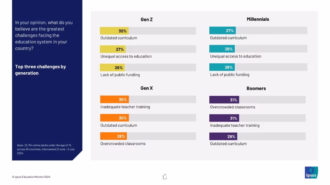
Split into four quadrant-style boxes by generation (Gen Z to Boomers), each showing top three challenges with percentages. Color-coded bars by generation.
Customer and Market Segmentation
Education & Training
This slide breaks down the top three perceived educational challenges by generation. Gen Z focuses on access and funding; Boomers highlight overcrowded classrooms and outdated content. Each group shows differing priorities.
generational views, education concerns, curriculum, access, teacher training, overcrowding
Mixed Chart
IPSOS
Saved
Text-heavy slide with purple highlights and four numbered sections providing details of the company’s investment thesis, including visual emphasis on key points.
Strategic Planning
Financial Services
Describes the company's strategic advantages and goals, used to build trust with investors and stakeholders by outlining a roadmap for future growth and stability.
investment, strategy, growth, performance, trust
Linear Flow
Goldman Sachs
Saved
The slide includes a column chart showing cost reduction targets over the years, accompanied by text explanations of selected cost levers.
Operational Efficiency
Financial Services
The slide outlines a plan to reduce group costs by 15% by 2025 through various strategic cost management initiatives and operational efficiencies.
cost, reduction, efficiency, target, strategy
Mixed Chart
Credit Suisse
Saved
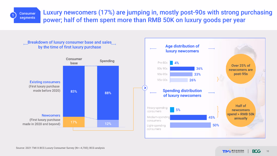
A slide with two column charts depicting the consumer base and spending, and bar charts showing age and spending distribution. Light blue, white, and orange colors are used with text explanations.
Customer and Market Segmentation
Consumer Goods
The slide shows the breakdown of luxury consumers by the time of their first luxury purchase, age distribution, and spending habits of newcomers, primarily post-90s.
Luxury, Consumer Segmentation, Spending, Age Distribution, Post-90s
Multiple Chart
BCG
Saved
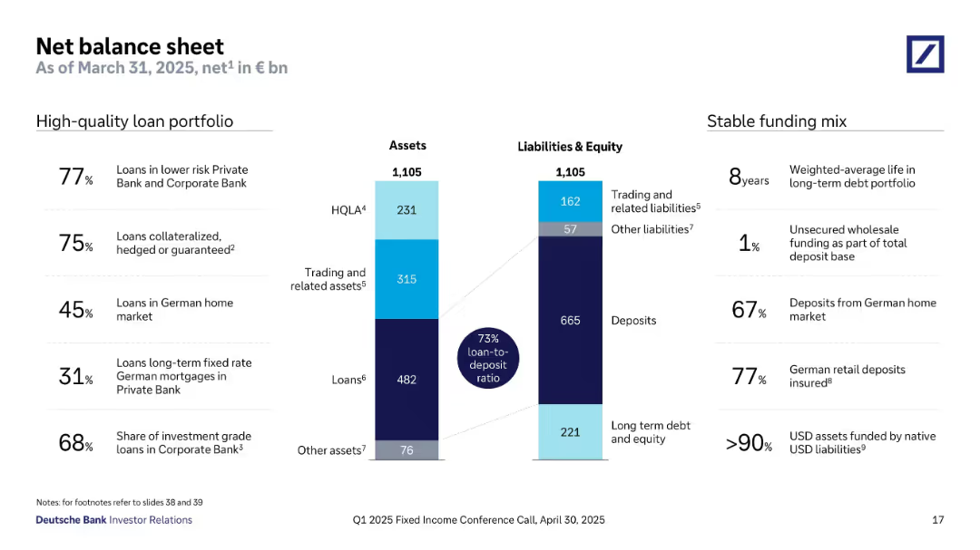
Two vertical bar charts represent total assets and liabilities (€1,105bn each), segmented into loans, HQLA, trading assets, deposits, etc. Annotations and stats highlight portfolio quality and funding mix. Side notes list loan quality and deposit stability percentages.
Financial Performance
Financial Services
This slide presents a balanced asset-liability snapshot with a 73% loan-to-deposit ratio. Key asset categories include loans and trading assets, while liabilities are dominated by deposits. High-quality metrics show a strong deposit base and minimal reliance on unsecured wholesale funding. The asset breakdown reflects conservative lending, strong deposit coverage, and high collateralization levels. The funding mix is shown to be stable and mostly domestic.
net balance sheet, loan-to-deposit ratio, HQLA, deposits, trading assets, stable funding, German market
Mixed Chart
Deutsche Bank
Saved
The slide contains a series of stacked column charts comparing data points across regions.
Market Analysis and Trends
Professional Services
Compares CEO outlook on global economic growth by region, showing a significant rise in those expecting decline.
CEO, Economy, Global, Region, Outlook
Single Chart
PwC/Strategy&
Saved
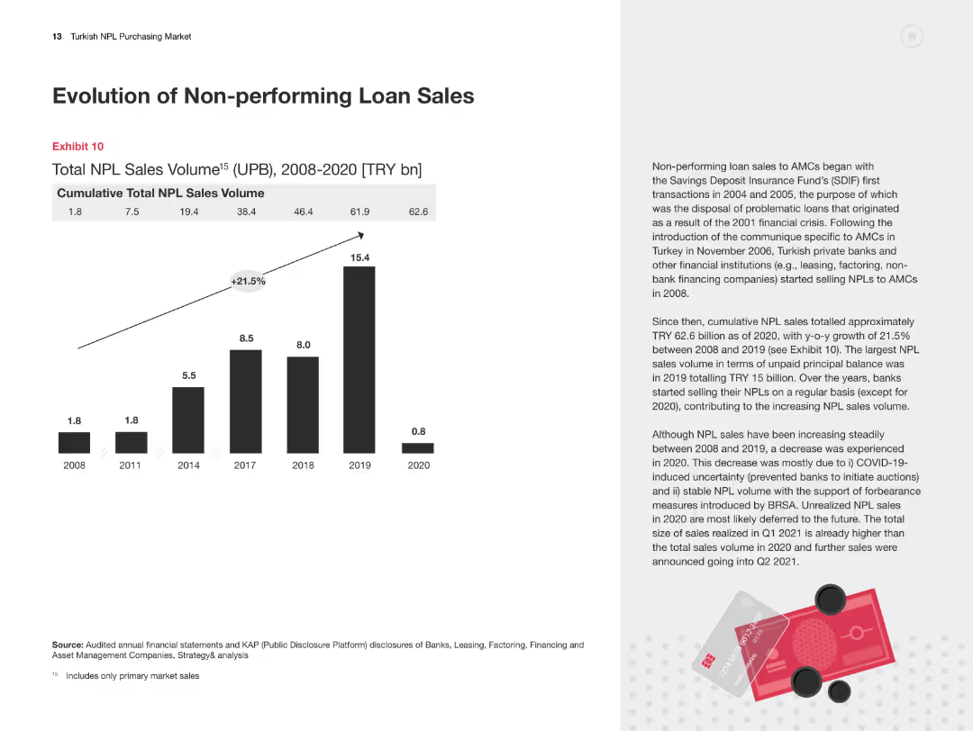
Column chart showing cumulative total NPL sales volume from 2008-2020. Text on the right explains trends and changes.
Market Analysis and Trends
Financial Services
The slide provides data on the cumulative total NPL sales in Turkey from 2008-2020, highlighting growth trends and key factors.
Non-performing loans, NPL sales, financial trends, market analysis, Turkey
Mixed Chart
PwC/Strategy&
Saved
Presents data in the form of a line chart showing the focus of wealth firms on different wealth levels currently and in the next three years. The visual arrangement allows for immediate comparison across wealth categories.
Strategic Planning
Financial Services
Explores strategies of wealth firms focusing on different client wealth levels, showing trends toward focusing more on higher-net-worth individuals and the implications for service offerings.
wealth management, high-net-worth, strategic focus, wealth levels, future trends
Mixed Chart
Deloitte
Saved
The slide presents a stacked area chart illustrating total revenue by sales channel for an IT distributor over five years, complemented by a side text box with case studies.
Market Analysis and Trends
Technology & Software
This slide provides a visual and statistical analysis of sales growth in different channels and discusses strategies in distributor case studies.
sales, strategy, IT distributor, revenue growth, account management, case studies, e-commerce, tech sales, CRM, ERP
Single Chart
EY
Saved
Slide divided into three vertical sections showing a progression from left to right. The left and right sections feature images of nature and stacked coins respectively. Middle section contains a query icon with questions.
Market Analysis and Trends
Environmental Services & Sustainability
This slide compares the current status of green capital deployment and its untapped potential against future revenue and investment needs by 2030 in Southeast Asia's green sector, emphasizing economic opportunities and requirements.
green investment, capital, SEA, 2030, revenue, economic opportunity, cumulative investment
Boxed
Bain
Saved
Line chart slide tracking the contribution of social media to company performance over time, with annotations for different time points.
Performance Metrics and KPIs
Professional Services
Highlights the consistent lack of growth in social media's impact on business performance, suggesting a reassessment of social media strategies.
social media, company performance, performance review, strategy reassessment, line graph
Single Chart
Deloitte
Saved
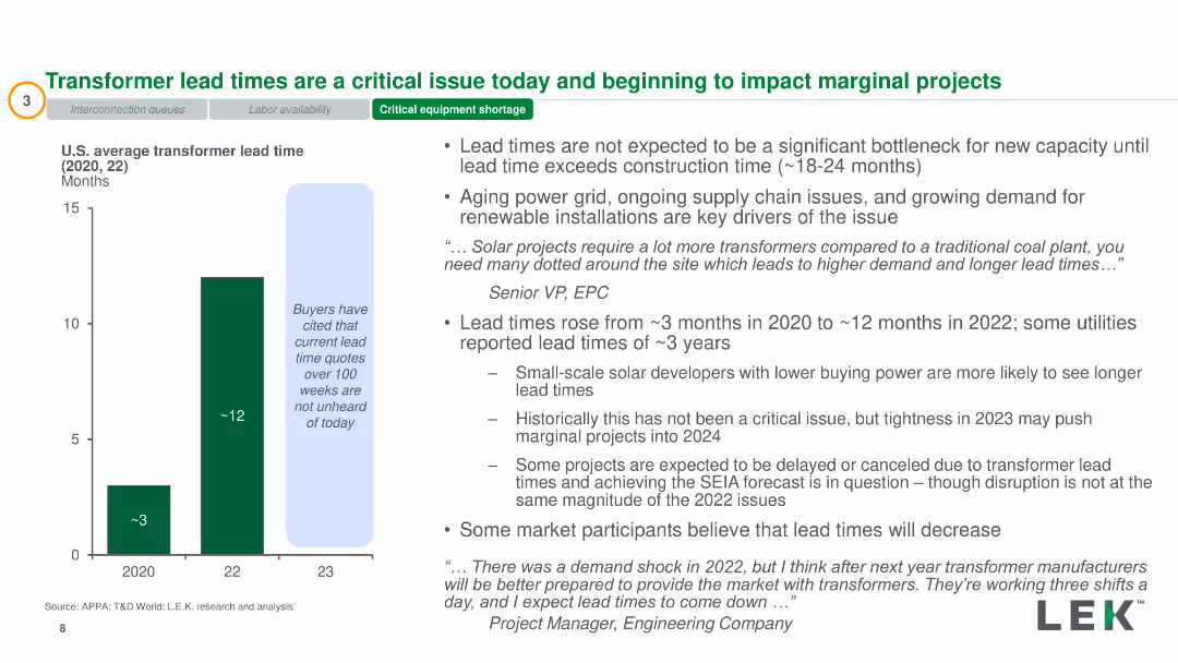
Bar chart showing transformer lead times from 2020 to 2023. Text boxes highlight issues related to supply chain and lead times. Dense with data.
Operational Efficiency
Energy & Utilities
Examination of transformer lead times and their impact on solar project timelines, highlighting supply chain issues and increased lead times.
Transformer, Lead Times, Supply Chain, Solar Projects, Impact
Mixed Chart
LEK
Saved
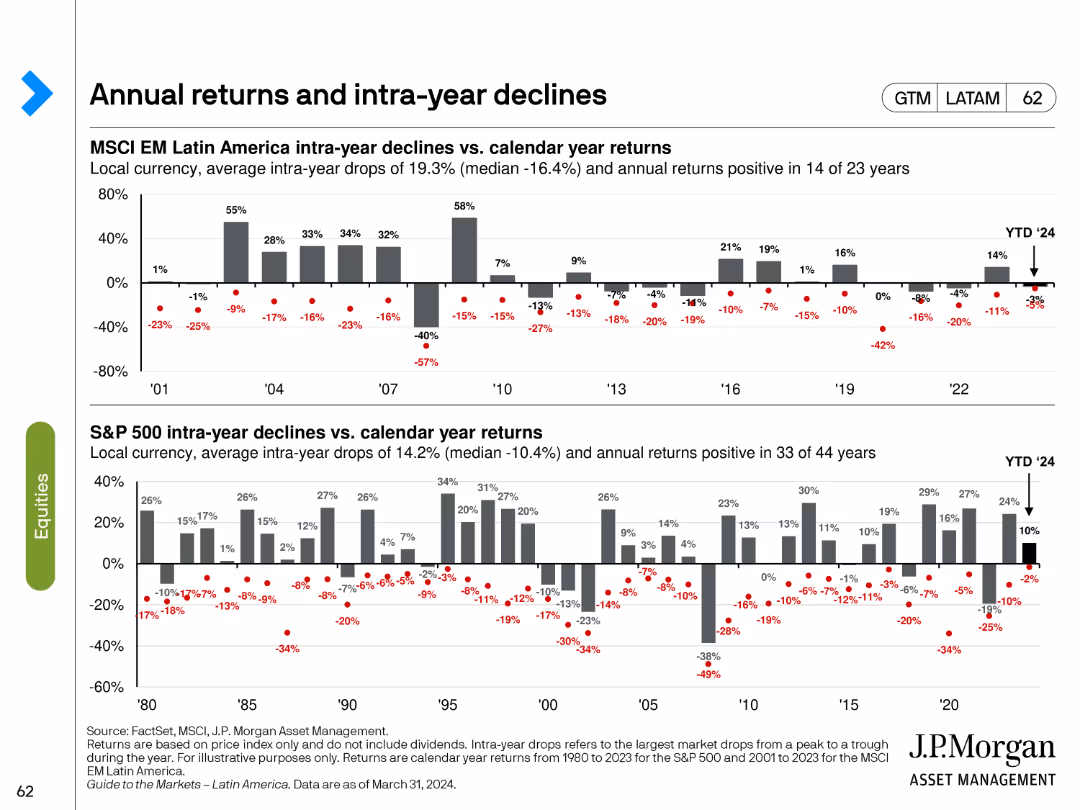
The slide consists of two bar charts showing intra-year declines vs. calendar year returns for MSCI EM Latin America and S&P 500.
Market Analysis and Trends
Financial Services
This slide examines the annual returns and intra-year declines for MSCI EM Latin America and S&P 500, providing a historical perspective on market volatility and performance.
annual returns, intra-year declines, MSCI EM, S&P 500, market performance
Multiple Chart
JP Morgan
Saved
Contains text boxes with bullet points highlighting different factors contributing to the business model and barriers.
Strategic Planning
Education & Training
Explains various barriers to entry and elements of the business model that enhance the attractiveness of private K-12.
barriers, business model, K-12, private, strategy
Multiple Chart
LEK
Saved
Table displaying donations and collected figures; text on left
Regulatory and Compliance
Professional Services
Details the donations and social value created by EY's initiatives, with a focus on specific projects
Social value, donations, projects, community, EY
Table
EY
Saved
Layout includes distinct sections for types of services with relevant icons.
Regulatory and Compliance
Professional Services
Highlights the services and approaches for ensuring compliance and handling anti-corruption measures across global operations, focusing on regulatory demands, risk assessment, and ensuring ethical business practices.
compliance, anti-corruption, regulatory, global operations, ethics
Table
Alvarez & Marsal
Saved
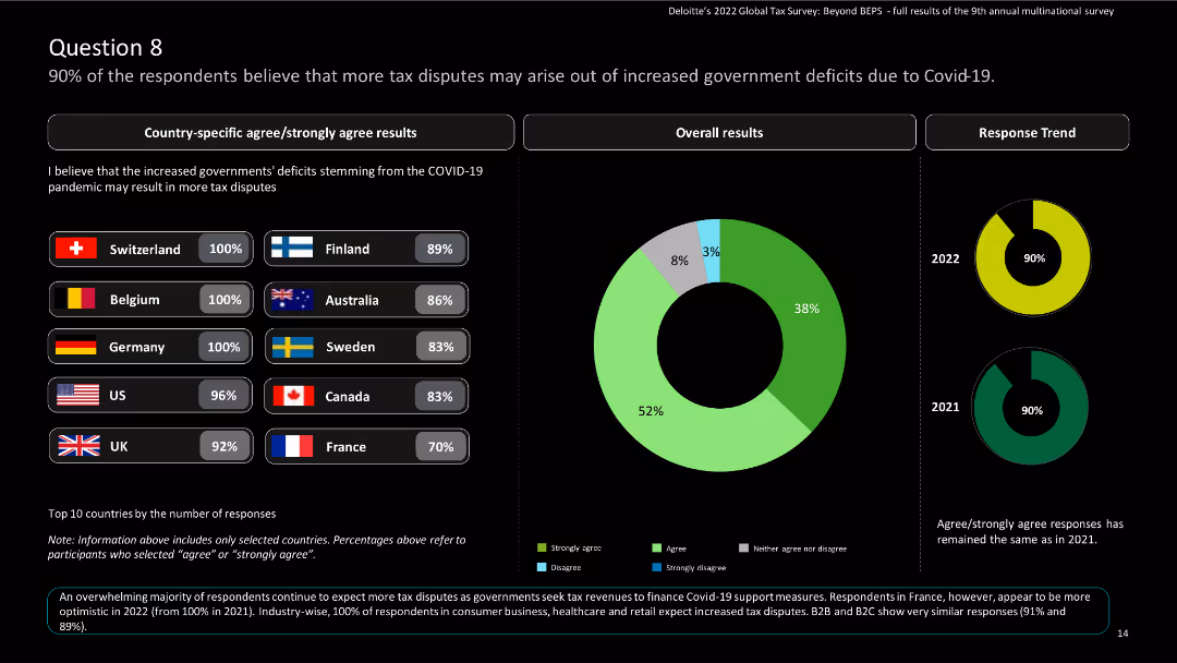
The slide features country-specific results and a pie chart showing overall results and response trend results over the years.
Regulatory and Compliance
Financial Services
The slide emphasizes the expectation of increased tax disputes due to government deficits caused by COVID-19.
Tax disputes, government deficits, COVID-19, global tax, Deloitte, agree, strongly agree, survey, multinational
Multiple Chart
Deloitte
Saved
Bar charts showing survey results about management difficulty over time in various countries.
Organizational Structure and Change
Professional Services
Highlights perceptions of increased difficulty in management roles from both managers and employees, useful for assessing global workforce sentiments and planning interventions.
management difficulty, survey results, global comparison, workforce sentiment, professional services, organizational challenges
Multiple Chart
BCG
Saved
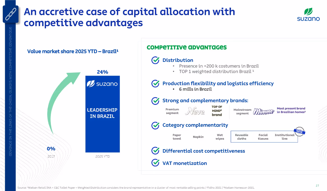
Left-aligned bar chart with growth arrow; right-aligned list of competitive advantages with icons and bullet points. Clean, corporate layout.
Investment Analysis
Consumer Goods
This slide presents Suzano’s increase in Brazilian market share from 0% in 2017 to 24% in 2025, driven by its distribution reach, production flexibility, strong brands, and cost competitiveness. It emphasizes VAT monetization and brand/category complementarity.
market share, Brazil, Suzano, distribution, production efficiency, brand strength, cost advantage, VAT
Mixed Chart
Goldman Sachs
Saved
The slide contains a column chart and detailed lists of key drivers with explanatory notes. The layout is neatly organized for clear comprehension of complex financial information.
Financial Performance
Financial Services
Focuses on the financial performance of Macquarie Asset Management, particularly base and performance fees. It’s useful for financial reviews and assessing the impact of operating expenses on net income.
Asset Management, Performance Fees, Operating Expenses, Financial Review, Net Income
Mixed Chart
Goldman Sachs
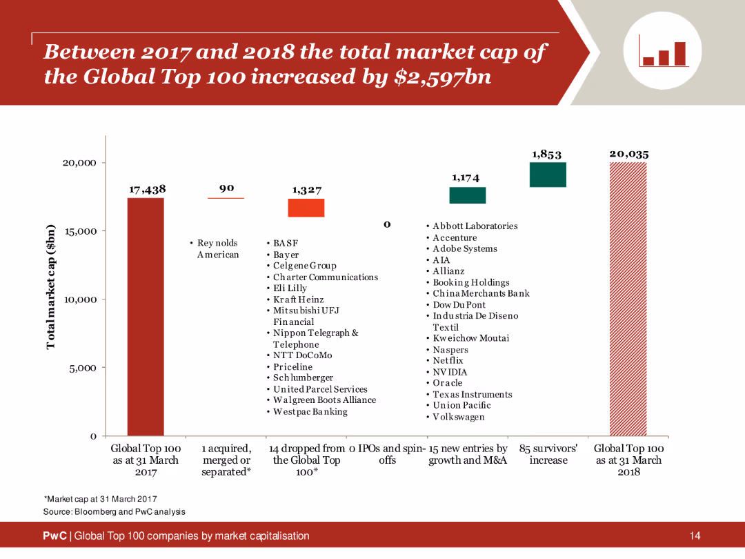
Saved
Column chart depicting changes in the total market cap of the Global Top 100 companies from 2017 to 2018, with sections showing new entries and survivors.
Financial Performance
Financial Services
Analysis of the market cap increase of the Global Top 100 companies, showing growth driven by new entries and existing companies.
market cap, global top 100, 2017, 2018, increase
Single Chart
PwC/Strategy&
Saved
Simple design with two columns comparing 'Secular Forces' on the left to their 'Impact' on the right, minimal graphical elements.
Strategic Planning
Financial Services
Slide presenting strategic business changes and their implications, likely aimed at stakeholders for discussing future plans.
Secular Forces, Impact, Strategy, Business, Future
Table
Goldman Sachs
Saved
The slide features a complex line graph showing the percentage draw-down of the United States Real GDP from the 1900s to the projected 2020s. Two scenarios are highlighted post-2020 with projected impacts of -8% and -13%. The timeline is divided into Pre-WWII and Post-WWII periods. The color scheme includes grey for historical data and blue for future projections.
Market Analysis and Trends
Financial Services
The slide presents a historical analysis of the U.S. GDP over a century, with a focus on the projected economic impact of COVID-19. It suggests that the pandemic could have unprecedented negative effects on the economy, surpassing post-WWII figures.
COVID-19, U.S. GDP, economic impact, historical analysis, projection, WWII, financial crisis, market trends, scenario analysis
Single Chart
McKinsey
Saved
Map highlighting surveyed regions, icons representing survey waves and respondent statistics.
Market Analysis and Trends
Transportation & Logistics
Summarizes the scope and methodology of a global survey on automotive and mobility trends amid COVID-19.
COVID-19, Mobility, Survey, Global, Automotive
Pillar
McKinsey
Saved
Previous
Next
If nothing, comes up, please save your slides first
Create a FREE account to continue browsing
Receive Instant Access to 1,000+ slides from companies like McKinsey, Google, and Goldman Sachs
First Name
Last Name
Email
Password
I agree to all
Terms & Privacy Policy
Thank you! Your submission has been received!
Oops! Something went wrong while submitting the form.
Have an account?
Sign in
Column Chart
Heatmap
Chevron
Org Chart
Infographic
Callouts
Timeline
List
Graphic
Picture
Process Flow
Diagram
Paragraph
Map
Table
Framework
Subtitle
Takeaway Box
Icon
Other Chart
Radar Chart
Waterfall Chart
Mekko Chart
Pie Chart
Scatter Plot
Line Chart
Bar chart
Bullet points