My Account
My Slides
Search by Category
Companies
Slide Type
Use Case
Industry
Pricing
Templates
View All Templates
Download Template Slides
✦ AI
AI Prompt Library
AI Search
Feedback
Login
Logout
Get Started
Browse all Slides
Browse all Slides
Create a FREE Account
Instant access to 1,000+ real slides from top companies like McKinsey, BCG, Goldman Sachs, Google and many more!
First Name
Last Name
Email
Password
I agree to all
Terms & Privacy Policy
Thank you! Your submission has been received!
Oops! Something went wrong while submitting the form.
Have an account?
Sign in
Saved Slides
Column chart showing changes in waste treatment methods in the EU from 2004-2020.
Regulatory and Compliance
Environmental Services & Sustainability
Highlights the impact of regulations on recycling and waste management.
waste treatment, EU regulations, recycling rates, incineration, sustainability
Mixed Chart
Roland Berger
Saved
Features a pie chart depicting the C&I portfolio by industry and a line chart comparing the C&I net charge-off rate against the industry average, along with commentary on market conditions.
Risk Assessment and Management
Financial Services
Evaluates the C&I loan portfolio's risk discipline, focusing on diversified industry spread and underwriting quality, paired with market trend observations and net charge-off rates.
C&I, loan portfolio, risk management, JPMC, industry diversification, charge-off rates, market trends, underwriting quality
Multiple Chart
JP Morgan
Saved
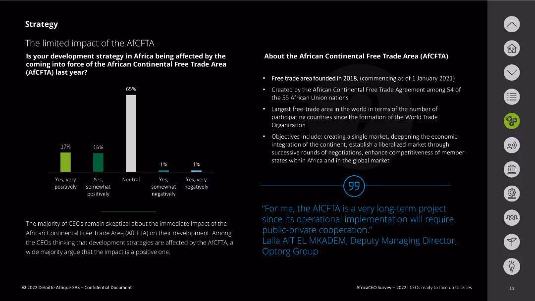
The slide features a column chart displaying survey responses about the impact of the AfCFTA. It also includes a text box explaining the AfCFTA, its founding, and objectives. A quote from a CEO is included at the bottom right.
Regulatory and Compliance
Government & Public Sector
This slide presents the survey results on the impact of the African Continental Free Trade Area (AfCFTA) on development strategies. It highlights skepticism among CEOs about its immediate impact and outlines the AfCFTA's key objectives and background.
AfCFTA, impact, survey, objectives, development strategy
Mixed Chart
Deloitte
Saved
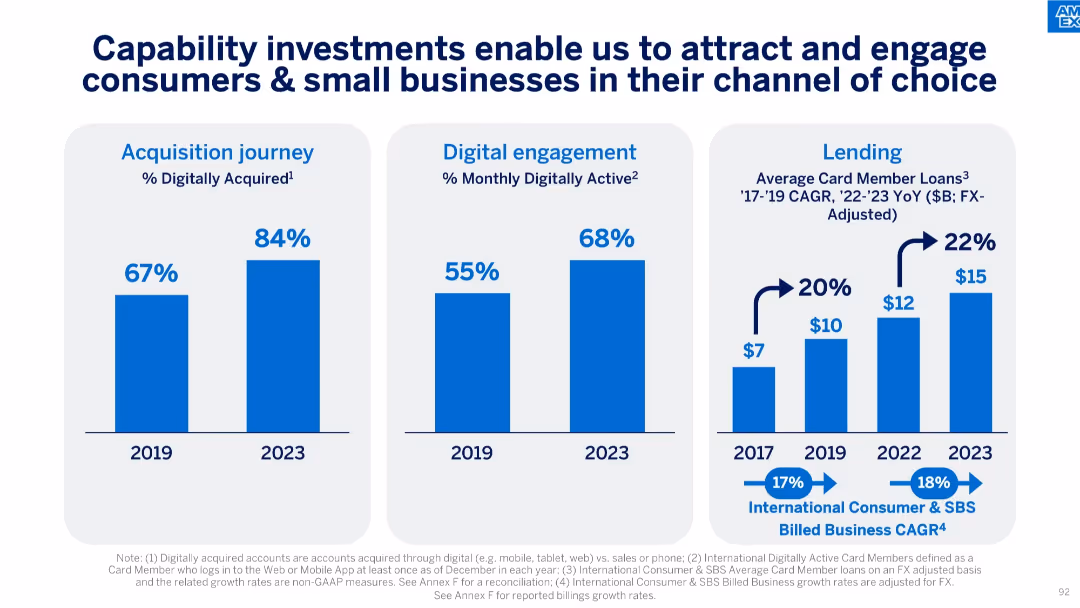
Three vertical bar charts showing trends in digital acquisition, engagement, and lending from 2017–2023.
Technology and Digital Transformation
Financial Services
The slide emphasizes improvements in digital engagement and lending as a result of capability investments. It shows increasing digital acquisition and activity, as well as growth in average card member loans over time.
Digital Acquisition, Lending, Engagement, Growth, Technology Investment, Card Members, CAGR, Loans
Multiple Chart
McKinsey
Saved
Slide with various column charts showing past and planned issuances and redemptions of financial instruments.
Strategic Planning
Financial Services
Plans and reviews issuance strategies for 2024, detailing amounts and types of instruments, aligned with financial goals.
issuance, finance, planning, bonds, securities, strategy
Multiple Chart
Deutsche Bank
Saved
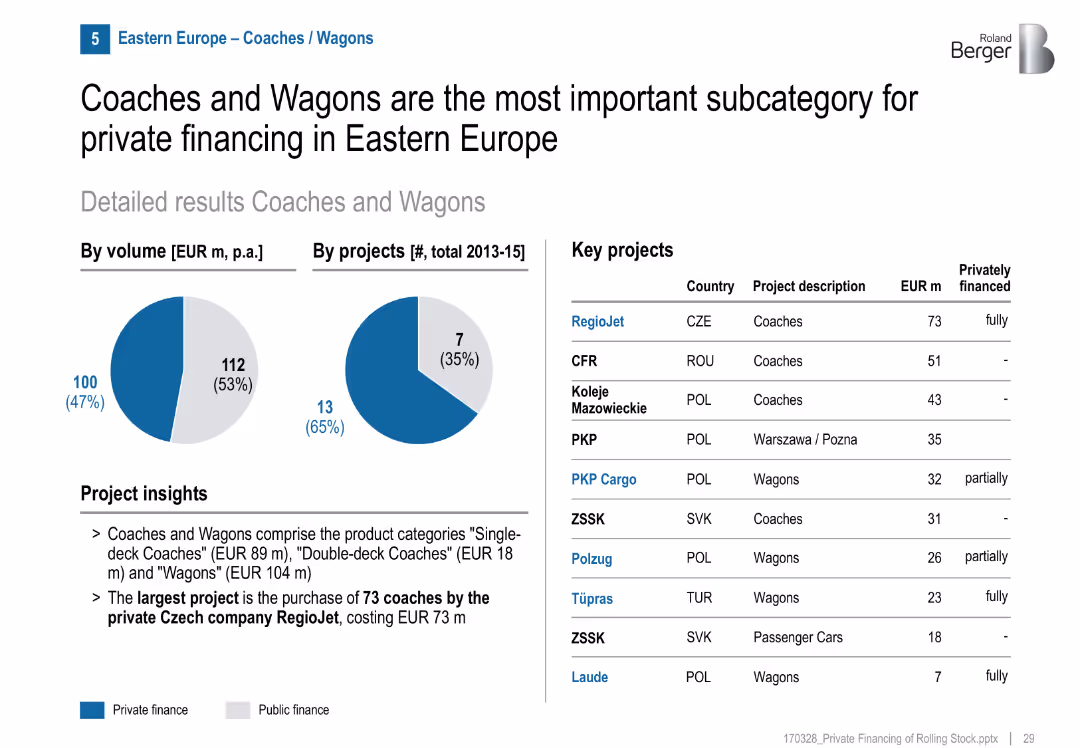
Two pie charts highlight a 47% private finance volume and 35% by project count. Key projects list includes financing type. Visuals and text are balanced.
Investment Analysis
Transportation & Logistics
Coaches and wagons receive the highest level of private investment among rolling stock categories. RegioJet's coach project is the largest privately funded project.
coaches, wagons, private financing, Eastern Europe, rolling stock, RegioJet, rail investment, transportation
Mixed Chart
Roland Berger
Saved
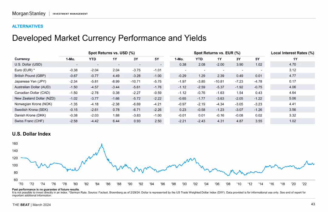
The slide features a detailed table comparing spot returns and yields of various developed market currencies against USD and EUR, along with a line chart showing the historical performance of the U.S. Dollar Index.
Market Analysis and Trends
Financial Services
The slide provides an analysis of developed market currency performance and yields, including spot returns versus USD and EUR, and historical performance of the U.S. Dollar Index, aiding in currency market analysis and investment strategy formulation.
currency performance, yields, USD, EUR, developed markets, U.S. Dollar Index, spot returns, financial analysis
Mixed Chart
Morgan Stanley
Saved
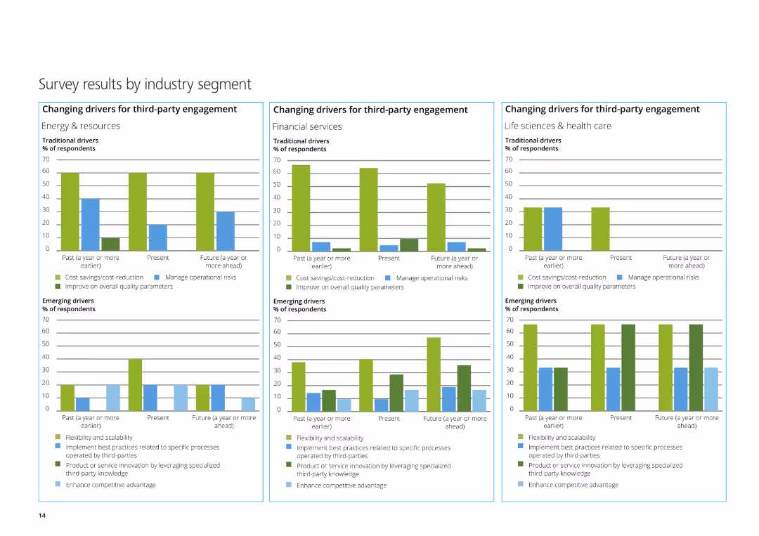
The slide features three column charts depicting the changing drivers for third-party engagement in Energy & Resources, Financial Services, and Life Sciences & Healthcare.
Market Analysis and Trends
Professional Services
This slide presents survey results by industry segment, focusing on traditional and emerging drivers for third-party engagement in various sectors.
Energy & Resources, Financial Services, Life Sciences, third-party engagement, survey
Multiple Chart
Deloitte
Saved
The slide presents column charts comparing brand consideration (premium vs. volume) in vehicle purchases before and during COVID-19 across multiple countries (US, UK, Germany, France, Italy, China, Japan).
Market Analysis and Trends
Transportation & Logistics
Details shifts in consumer brand consideration for vehicles during the pandemic, highlighting how preferences have changed over time and across different regions.
brand consideration, vehicle purchases, COVID-19, column chart, international
Multiple Chart
McKinsey
Saved
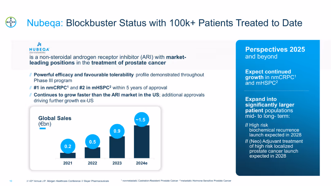
Split layout with product description and future outlook on the right, sales bar graph at bottom. Blue and black colors dominate. Clinical highlights and growth expectations are presented in bullet points.
Product and Service Analysis
Healthcare & Pharmaceuticals
Details the success of Nubeqa (Darolutamide) in prostate cancer treatment, highlighting market leadership, sales trajectory, and growth strategy. Future plans include expansion into larger patient segments with launches expected in 2028 for high-risk prostate cancer treatments.
Nubeqa, prostate cancer, ARI, patient growth, blockbuster drug, oncology, pharma sales
Mixed Chart
JP Morgan
Saved
Comparative charts illustrating retail sales changes across various categories and countries, color-coded by percentage change.
Market Analysis and Trends
Retail & E-commerce
Discusses recovery in retail sectors across different regions, highlighting differences in consumer spending patterns post-pandemic.
retail sales, recovery trends, consumer spending, market analysis, COVID-19 impact
Table
BCG
Saved
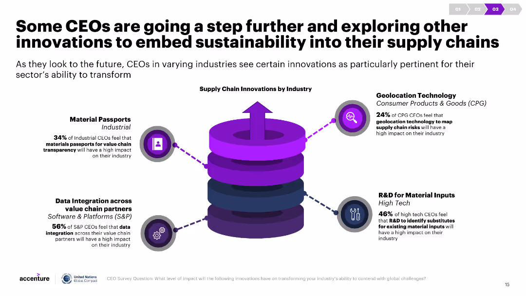
The slide has a central 3D diagram depicting a supply chain surrounded by icons and text descriptions of innovations by industry. It is visually engaging.
Technology and Digital Transformation
Environmental Services & Sustainability
This slide highlights innovations such as geolocation technology and material passports that CEOs are using to enhance sustainability in their supply chains.
Sustainability, innovation, supply chain, material passports, geolocation technology, R&D, data integration, industry, transformation, impact
Diagram
Accenture
Saved
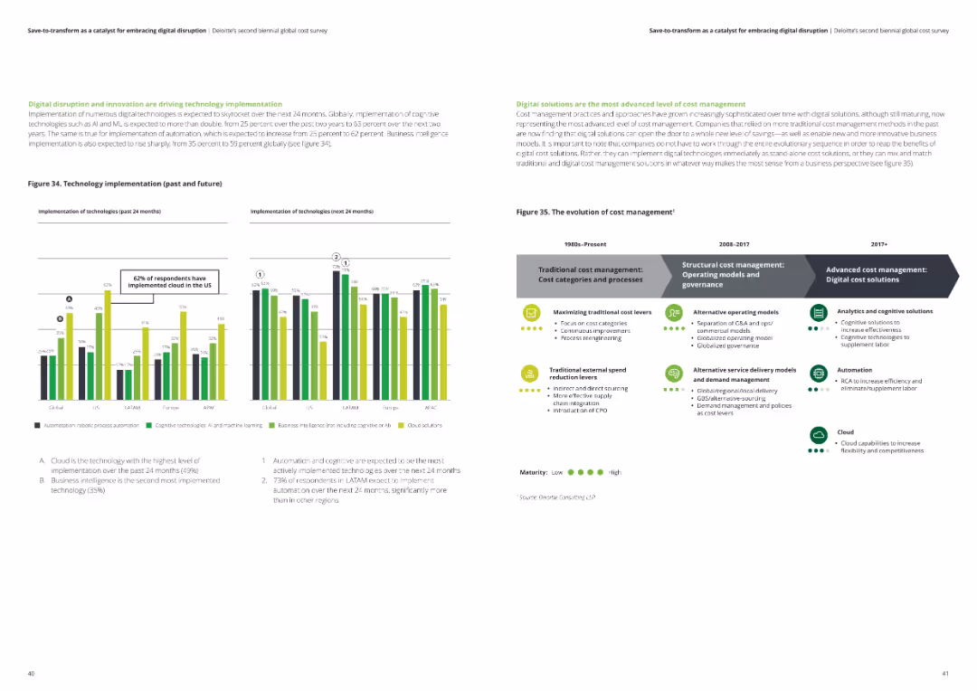
This slide features multiple column charts comparing past and future technology implementations, as well as a timeline chart showing the evolution of cost management.
Operational Efficiency
Professional Services
The slide analyzes the driving factors behind technology implementation and cost management. It presents data on the growth of cloud and business intelligence technology implementations and the evolution of cost management practices.
technology implementation, cost management, cloud technology, business intelligence, survey data
Multiple Chart
Deloitte
Saved
Bar and line chart tracking venture financing in Japan (2018–Q3 2024), accompanied by an expert quote on VC trends.
Market Analysis and Trends
Financial Services
VC investments in Japan rose notably in Q3 2024, largely driven by a few large outlier deals. The accompanying quote emphasizes growing foreign interest in Japanese VC funds and notes this could accelerate deeptech and innovation ecosystem development.
Japan, venture capital, outlier deals, deeptech, foreign investment, KPMG
Mixed Chart
KPMG
Saved
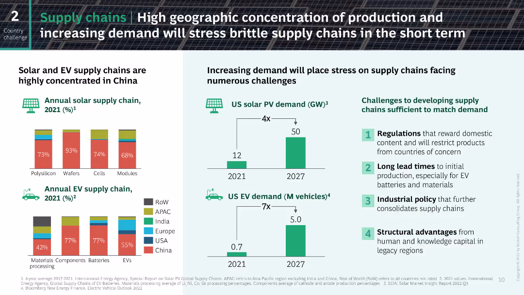
The slide contains a series of column charts and bar charts illustrating the concentration of solar and EV supply chains in China and the projected demand increases in the US. The layout is data-heavy with clear, color-coded segments representing different regions and their respective market shares.
Risk Assessment and Management
Industrial & Manufacturing
This slide analyzes the concentration of solar and EV supply chains in China and the projected increase in demand for these technologies in the US, highlighting the potential challenges in meeting this demand and the associated risks.
supply chains, solar, EV, China, demand
Multiple Chart
BCG
Saved
Features maps and bar graphs depicting the distribution of mobile and fixed broadband access across Indonesia's districts and provinces.
Strategic Planning
Telecommunications
Addresses the uneven distribution of broadband connectivity in Indonesia, particularly the lack of mobile signal and low fixed broadband penetration in many areas.
broadband, Indonesia, mobile signal, fixed broadband, connectivity, provinces, districts
Graphic
BCG
Saved
The slide presents a mixed layout with arrows, lines and a table of data. It features a color scheme of blues and greens, with icons illustrating various growth strategies.
Financial Performance
Financial Services
The slide details the growth in merchant services, compares volume growth to revenue, and outlines strategies for continued margin expansion.
Merchant services, growth, revenue, strategies, margin expansion, financial analysis, comparison, APIs, international expansion
Mixed Chart
JP Morgan
Saved
Contains a column chart comparing the importance of future food priorities to businesses and the applications companies are working on, such as plant-based proteins and conservation.
Strategic Planning
Agriculture & Food Production
Explores corporate strategies towards future food trends, revealing that most companies prioritize sustainable practices but recognize a need for capabilities improvement. It also highlights areas like conservation and plant-based innovations.
future food trends, sustainability, corporate strategies, priorities
Mixed Chart
Deloitte
Saved
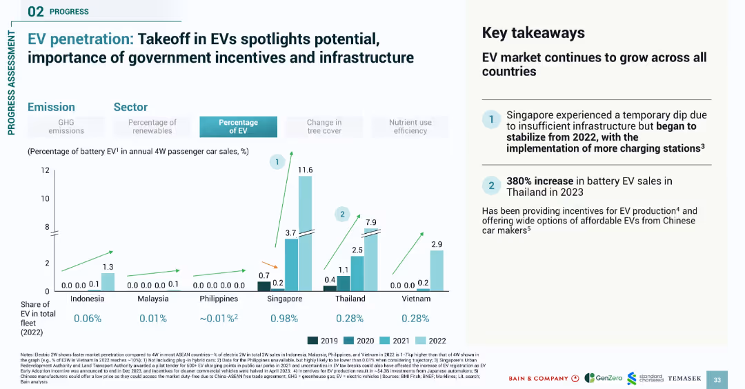
Bar chart comparing EV adoption from 2019 to 2022; right-side summary box with key findings
Market Analysis and Trends
Transportation & Logistics
Analyzes electric vehicle (EV) penetration across SEA countries from 2019–2022, revealing growth in EV sales, particularly in Singapore and Thailand. Highlights government incentives and infrastructure as critical drivers of EV market expansion.
EV, electric vehicles, SEA, adoption trends, incentives, infrastructure, passenger cars
Mixed Chart
Bain
Saved
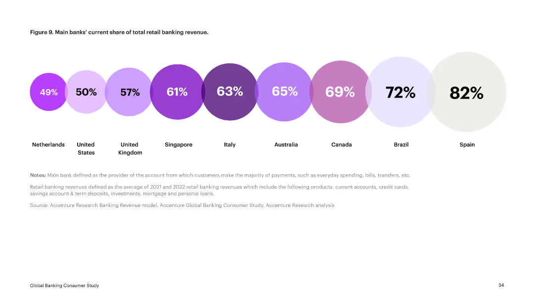
The slide presents a series of circular charts indicating the current share of total retail banking revenue for main banks in various countries. Each country is represented by a different colored circle.
Financial Performance
Financial Services
This slide displays the current market share of retail banking revenue by main banks in several countries, showing significant variation. It serves as a comparative analysis of market penetration.
retail banking, revenue share, market comparison, financial services, main banks
Single Chart
Accenture
Saved
Combines text with a column chart of top strategic risks for the next three years, emphasizing the ubiquity of cyber threats and geopolitical risks.
Risk Assessment and Management
Financial Services
This slide discusses the top external forces impacting CROs, focusing on the increasing threat of cyber attacks and geopolitical tensions, supported by survey data on strategic risks.
External Forces, Cyber Threats, Geopolitical Risks, Strategic Risks
Single Chart
EY
Saved
The slide uses a structured format with headers and bullet points under each of the seven steps, describing the actions associated with each phase of social impact reporting.
Regulatory and Compliance
Telecommunications
This slide outlines a structured seven-step approach for assessing social impact, using NBN Co as a case study, highlighting industry-referenced frameworks.
social impact, NBN Co, frameworks, reporting, case study, structured approach
Linear Flow
Accenture
Saved
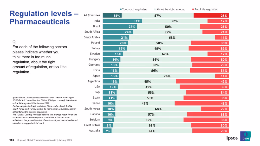
Same visual template; bar chart segmented by regulation perception; countries arranged top to bottom.
Regulatory and Compliance
Healthcare & Pharmaceuticals
The slide assesses how different countries perceive regulation in the pharmaceutical industry. While the global average suggests most think regulation is appropriate, countries such as Argentina, France, and USA show notable concern about underregulation. Japan, in contrast, sees regulation as sufficient.
pharma, healthcare, drug regulation, Ipsos, international survey, compliance, governance, public perception, health industry, oversight
Mixed Chart
IPSOS
Saved
The slide features a column chart comparing budgets allocated to customer acquisition versus retention, with summary statistics and illustrative arrows.
Market Analysis and Trends
Professional Services
Analyzes the budget allocation between customer acquisition and retention, highlighting a greater focus on acquisition in terms of budgetary spending.
customer acquisition, retention, budgets, analysis, comparison
Mixed Chart
Deloitte
Saved
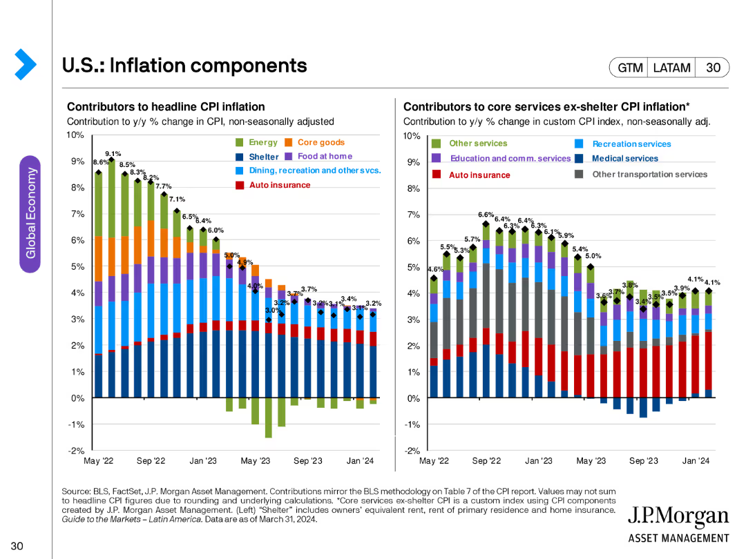
The slide includes two bar charts: one showing contributors to headline CPI inflation and another for core services ex-shelter CPI inflation, both broken down by various categories.
Market Analysis and Trends
Financial Services
This slide breaks down the components contributing to headline and core CPI inflation, offering a detailed view of inflationary pressures in the economy.
inflation, CPI, core services, economic analysis, price indices, headline CPI
Multiple Chart
JP Morgan
Saved
Previous
Next
If nothing, comes up, please save your slides first
Create a FREE account to continue browsing
Receive Instant Access to 1,000+ slides from companies like McKinsey, Google, and Goldman Sachs
First Name
Last Name
Email
Password
I agree to all
Terms & Privacy Policy
Thank you! Your submission has been received!
Oops! Something went wrong while submitting the form.
Have an account?
Sign in
Column Chart
Heatmap
Chevron
Org Chart
Infographic
Callouts
Timeline
List
Graphic
Picture
Process Flow
Diagram
Paragraph
Map
Table
Framework
Subtitle
Takeaway Box
Icon
Other Chart
Radar Chart
Waterfall Chart
Mekko Chart
Pie Chart
Scatter Plot
Line Chart
Bar chart
Bullet points