My Account
My Slides
Search by Category
Companies
Slide Type
Use Case
Industry
Pricing
Templates
View All Templates
Download Template Slides
✦ AI
AI Prompt Library
AI Search
Feedback
Login
Logout
Get Started
Browse all Slides
Browse all Slides
Create a FREE Account
Instant access to 1,000+ real slides from top companies like McKinsey, BCG, Goldman Sachs, Google and many more!
First Name
Last Name
Email
Password
I agree to all
Terms & Privacy Policy
Thank you! Your submission has been received!
Oops! Something went wrong while submitting the form.
Have an account?
Sign in
Saved Slides
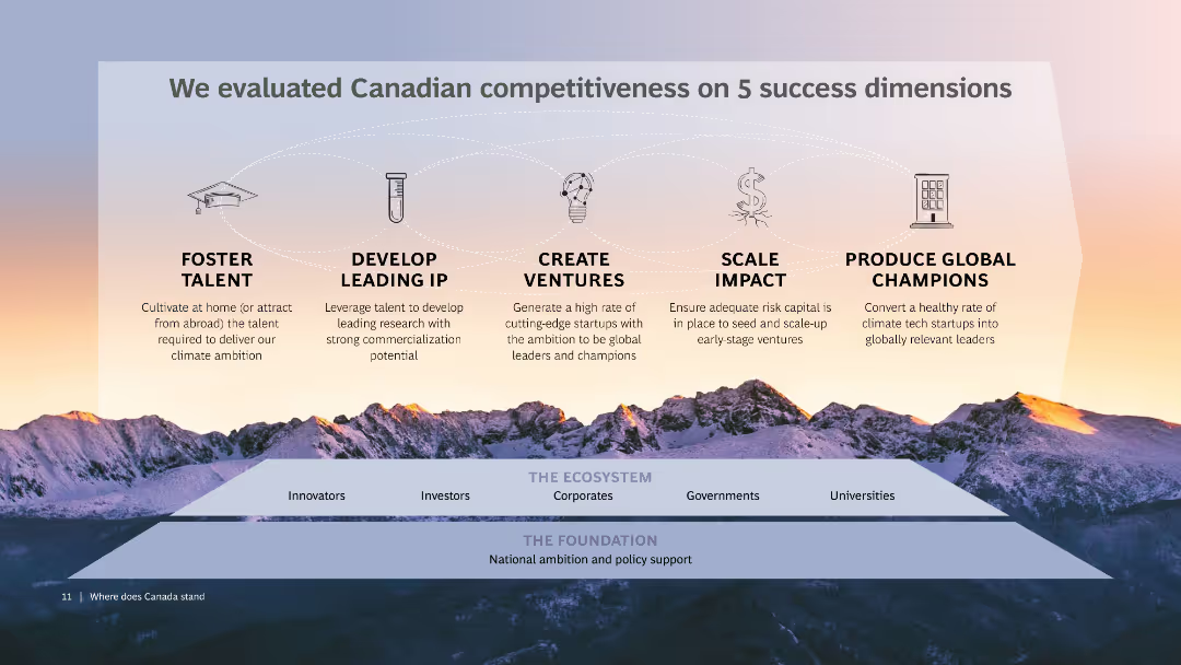
The slide shows five icons representing key success dimensions: talent, IP, ventures, impact, and champions, over a backdrop of a mountain range at sunset. Below the icons, there is a diagram linking "The Ecosystem" and "The Foundation" with various stakeholders like innovators and government.
Strategic Planning
Professional Services
Evaluates Canadian competitiveness based on talent, leading IP, venture creation, scaling impact, and producing global champions. Provides a framework connecting various stakeholders within the ecosystem and foundation.
Competitiveness, Canada, Success dimensions, Talent, IP
Pillar
BCG
Saved
Displays column charts showing changes in capital metrics like CET1 ratio and leverage ratio, alongside MREL/TLAC requirements with surplus figures.
Performance Metrics and KPIs
Financial Services
Provides an update on the bank's capital position, detailing changes in capital ratios and requirements, key for regulatory compliance and stability assessment.
Capital, CET1 ratio, leverage, compliance
Multiple Chart
Deutsche Bank
Saved
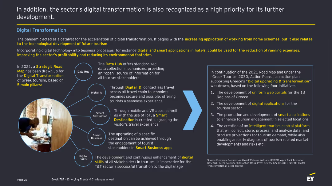
The slide showcases the digital transformation in the T&T sector with a diagram illustrating five pillars: Data Hub, Digital ID, Smart Destination, Smart Business, and Digital Skills. There are descriptions of each pillar and related initiatives.
Technology and Digital Transformation
Hospitality & Tourism
Highlights the acceleration of digital transformation in the Greek T&T sector, focusing on initiatives like Data Hub, Digital ID, and smart applications to improve profitability and reduce environmental impact. Details strategic goals and actions.
Digital transformation, Technology, T&T sector, Smart applications, Digital skills
Framework
EY
Saved
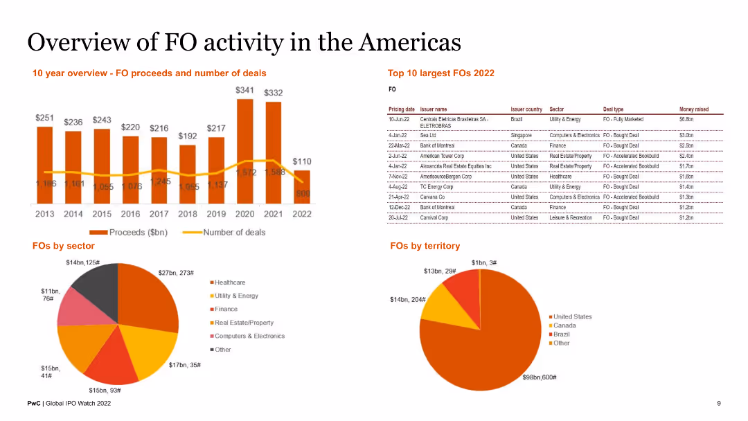
The slide features a 10-year overview of FO proceeds and number of deals, a table of top 10 largest FOs in 2022, and pie charts of FOs by sector and territory. It is visually dense, with detailed data and brief text summaries.
Market Analysis and Trends
Financial Services
This slide reviews FO activities in the Americas, presenting historical data, largest deals, and sectoral and territorial distributions. It is targeted at financial analysts and investors.
FO activity, Americas, top FOs, sector analysis, territorial overview
Multiple Chart
PwC/Strategy&
Saved
Detailed slide with multiple column charts, each representing a different aspect of Indonesia's digital financial services. Utilizes shades of blue for a clean look.
Financial Performance
Financial Services
This slide gives an in-depth view of the projected growth in digital lending, payments, insurance, and wealth in Indonesia's financial sector.
Indonesia, Digital Financial Services, Lending, Payments, Insurance, Wealth, Growth Projections, Financial Sector
Multiple Chart
Bain
Saved
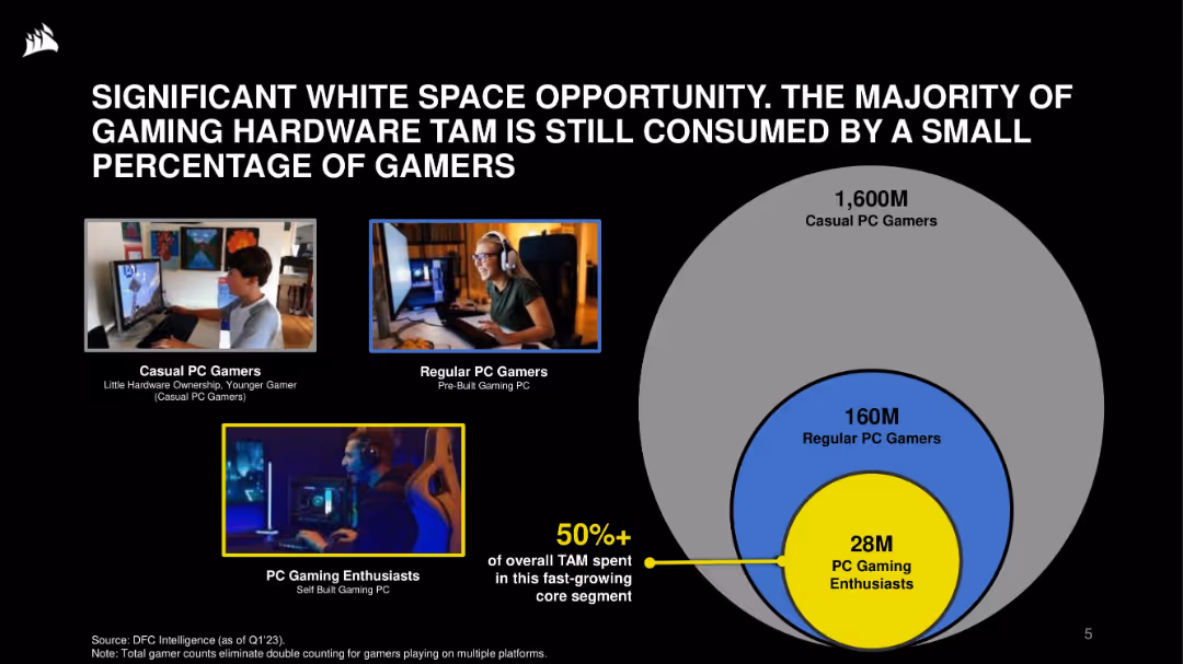
Visual layout: images of user types on left; concentric circle Venn diagram on right showing TAM breakdown. Black background with blue and yellow highlights.
Market Analysis and Trends
Technology & Software
This slide emphasizes the opportunity in the gaming hardware market, where a small core of 28M enthusiasts account for over 50% of TAM. It categorizes the gamer market by engagement level and hardware ownership, suggesting strong growth potential.
gaming hardware, TAM, market opportunity, PC gamers, segmentation, enthusiasts, casual users, growth
Single Chart
Goldman Sachs
Saved
Features bar graphs comparing the cost and value of nbn™ plans, with visuals illustrating user benefits, clear labeling, and explanatory text.
Financial Performance
Telecommunications
Demonstrates the financial value derived by users from the nbn™ network, detailing consumer surplus and its economic significance.
Financial Value, nbn, Consumer Surplus, Economic Impact, Telecommunications
Agenda
Accenture
Saved
The slide features two line charts showing quarterly revenue and contribution margin trends. Text explains Gartner's research services for executives and their teams.
Industry Overview
Professional Services
It provides an overview of Gartner's research services, highlighting ongoing access to research, on-demand response, and support for major enterprise functions.
Gartner, research, revenue, contribution margin, executives, services, trends
Multiple Chart
Gartner
Saved
Text, percentage circles, and horizontal bar chart illustrating employee empowerment and primary reasons for job changes, such as pay and career growth.
Human Resources and Talent Management
Professional Services
This slide discusses employee expectations in a tight labor market, focusing on empowerment, likelihood of leaving, and primary reasons for considering new job offers, including pay and career advancement.
Employee expectations, empowerment, job change reasons, pay, career growth, labor market
Mixed Chart
EY
Saved
The slide includes a line chart depicting the trend in capital importation from 2015 to Q3 2023, with separate lines for capital importation, FPI, and FDI. Below the chart are key insights and outlooks regarding the cautious investment outlook for 2024.
Investment Analysis
Financial Services
The slide discusses the cautious investment outlook for 2024, emphasizing the impact of ongoing fiscal and monetary reforms. It provides a historical perspective on capital importation trends and forecasts future investment scenarios.
investment outlook, capital importation, fiscal reforms, monetary reforms, investment trends
Mixed Chart
PwC/Strategy&
Saved
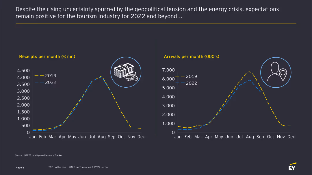
The slide features two line charts comparing monthly receipts and arrivals in 2019 and 2022, accompanied by text describing the positive expectations despite geopolitical tensions.
Market Analysis and Trends
Hospitality & Tourism
This slide shows a positive outlook for the tourism industry in 2022, comparing monthly receipts and arrivals with those of 2019 and discussing the industry's resilience.
Tourism industry, expectations, line charts, market trends, financial data
Multiple Chart
EY
Saved
The slide includes a column chart tracking CET1 ratio development over time, with additional text boxes explaining different factors influencing the CET1 ratio.
Financial Performance
Financial Services
This slide projects the group’s CET1 ratio aiming for a target of more than 13.5% by 2025, explaining the various financial actions and changes that will influence this target.
CET1 ratio, financial targets, performance metrics, capital planning, investment strategy
Single Chart
Credit Suisse
Saved
The slide includes a column chart depicting edtech funding over time, with annotations and a yellow circle highlighting trends. Text boxes with bullet points are present to explain the chart's context.
Market Analysis and Trends
Education & Training
Discusses the trend of decreased investment in edtech post-pandemic, with a focus on the impact of economic reopening and shifting investor interests towards other sectors like SaaS and Web3.
edtech, investments, pandemic, e-learning, in-person learning, funding, SaaS, Web3, economic reopening
Single Chart
Bain
Saved
Two-column layout with line and column charts illustrating rent growth and CPI services growth excluding shelter from 2017-2025F and 2021-2024.
Market Analysis and Trends
Real Estate & Construction
Analyzes the easing of services inflation driven by rent disinflation and wage pressures amid labor market rebalancing.
services inflation, rent growth, CPI services, labor market, disinflation
Multiple Chart
EY
Saved
This slide displays a complex line and column chart showing the VaR and sVaR levels over multiple quarters, with annotations explaining key peaks and trends in trading risk.
Risk Assessment and Management
Financial Services
Analyzes trading risk within the bank's portfolio, highlighting Value-at-Risk and stressed scenarios over time. Key for risk management teams to monitor and adjust strategies based on trading volatility and market conditions. Useful in financial planning and risk mitigation efforts.
VaR, sVaR, trading risk, portfolio management, market conditions, risk mitigation, financial planning
Single Chart
Deutsche Bank
Saved
A slide with detailed text analysis on the left and a pie chart on the right illustrating the preferred online discovery channels for consumers.
Market Analysis and Trends
Retail & E-commerce
Analyzes the preferred online channels for product discovery, indicating a high preference for social media and video content as sources for finding new products and making purchasing decisions.
Discovery commerce, social media, video content, consumer preferences, pie chart
Single Chart
Bain
Saved
Slide with pie charts, a stacked column chart, and legends explaining diversification in currency, tenor, and funding type. Visual elements are arranged in a balanced layout.
Strategic Planning
Financial Services
Demonstrates Macquarie's strategic approach to diversification of funding by currency, tenor, and type, also showing term funding maturity profiles.
Issuance, Currency, Tenor, Type, Maturity
Multiple Chart
Morgan Stanley
Saved
A dark background slide with column charts depicting reasons for switching to virtual consultations, with white and yellow text.
Technology and Digital Transformation
Healthcare & Pharmaceuticals
It discusses consumer preferences for virtual consultations for prescription renewal, discussing test results, and saving time.
virtual care, consultations, convenience, survey, Germany
Mixed Chart
EY
Saved
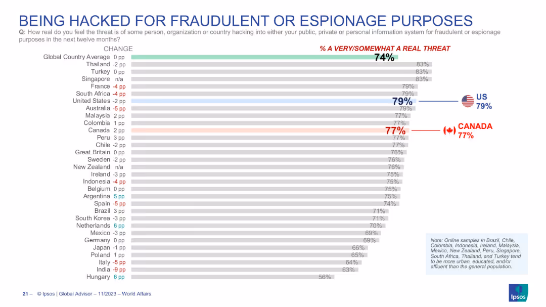
Bar graph showing perceived threat of hacking incidents; horizontal layout; Canada and US emphasized with bold numbers and flags.
Risk Assessment and Management
Technology & Software
The slide conveys the perceived risk of being hacked for fraudulent or espionage purposes over the next twelve months. A high percentage of respondents—79% in the US and 77% in Canada—consider it a real threat. The global average stands at 74%, indicating a widespread concern over cybersecurity.
cybersecurity, hacking, fraud, espionage, threat perception, survey, Canada, USA, digital risk, Ipsos
Single Chart
IPSOS
Saved
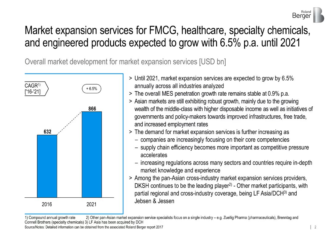
Bar chart comparing 2016 vs 2021 global MES volume; bullet points explaining drivers.
Market Analysis and Trends
Professional Services
Projects global MES (market expansion services) growth to reach $866B by 2021, citing demand, Asian market drivers, and increased efficiency focus across sectors.
MES, CAGR, global growth, Asia, FMCG, infrastructure, outsourcing
Mixed Chart
Roland Berger
Saved
Slide showcasing L.E.K.'s healthcare sector overview, detailing their vertical and horizontal practices, and key capabilities.
Industry Overview
Healthcare & Pharmaceuticals
This slide provides an overview of L.E.K.'s comprehensive coverage of the healthcare ecosystem, including their practices and specialized capabilities.
Healthcare ecosystem, L.E.K., vertical practices, horizontal practices, capabilities
Diagram
LEK
Saved
This slide includes a column chart comparing port costs in Australia, the US, and France, with bullet points discussing various factors affecting port costs and their implications for supply chains.
Market Analysis and Trends
Transportation & Logistics
It evaluates the direct port costs in Australia compared to the US and France, highlighting factors that influence these costs and the competitive position of Australian ports within the global market.
port costs, Australia, US, France, supply chain, comparison
Mixed Chart
LEK
Saved
This slide discusses various asset classes within the green economy, using background images and concise text to highlight key areas like solar and wind energy, and electric mobility.
Investment Analysis
Energy & Utilities
Explores deep dives into investor activities in Southeast Asia, identifying significant investment opportunities and challenges in sectors like renewable energy and electric mobility, emphasizing the potential for growth and the need for enhanced infrastructure and policies.
renewable energy, investments, Southeast Asia, electric mobility
Text Only
Bain
Saved
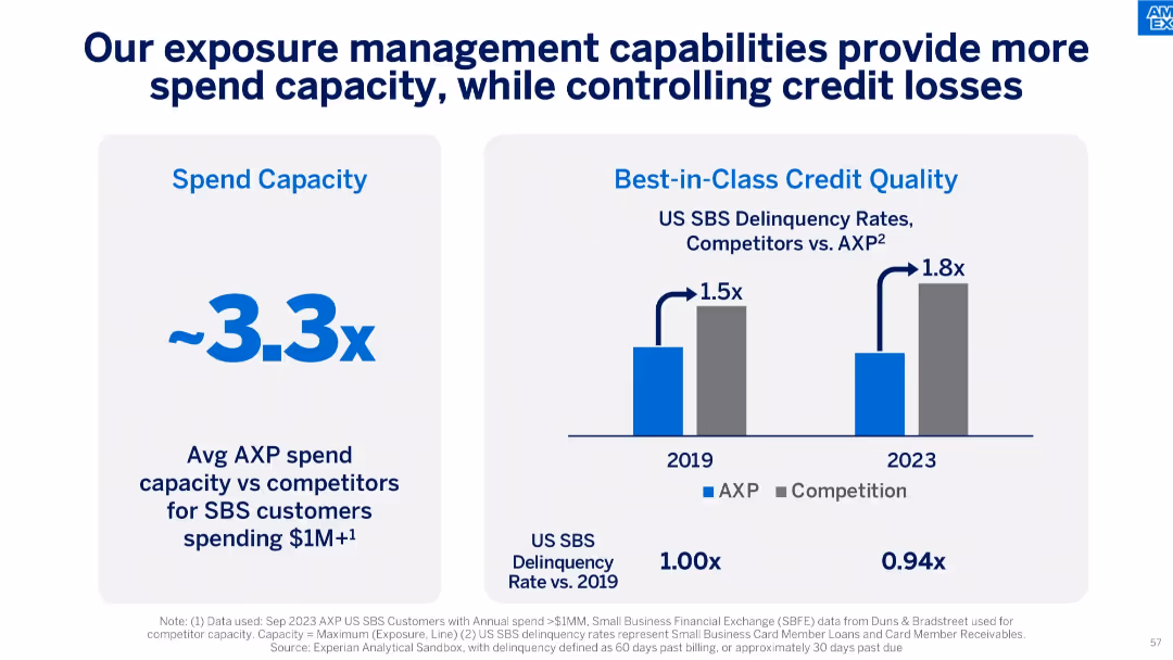
Two-panel layout: left shows 3.3x spend capacity advantage, right shows comparative delinquency rates between AXP and competitors for 2019 and 2023.
Risk Assessment and Management
Financial Services
This slide highlights AXP’s superior exposure management capabilities, offering higher spend capacity while maintaining industry-leading low delinquency rates, enhancing both growth and risk control.
credit risk, delinquency, spend capacity, AXP, exposure management, small business, financial discipline
Mixed Chart
McKinsey
Saved
The slide has a two-column layout with a title and text explaining the importance of holistic risk management practices and a column chart listing actions taken to enhance these practices.
Operational Efficiency
Financial Services
The slide emphasizes the importance of comprehensive risk management practices, including capital planning and contingency measures, to strengthen operational resilience.
risk management, operational resilience, holistic practices, capital planning, contingency measures
Multiple Chart
EY
Saved
Previous
Next
If nothing, comes up, please save your slides first
Create a FREE account to continue browsing
Receive Instant Access to 1,000+ slides from companies like McKinsey, Google, and Goldman Sachs
First Name
Last Name
Email
Password
I agree to all
Terms & Privacy Policy
Thank you! Your submission has been received!
Oops! Something went wrong while submitting the form.
Have an account?
Sign in
Column Chart
Heatmap
Chevron
Org Chart
Infographic
Callouts
Timeline
List
Graphic
Picture
Process Flow
Diagram
Paragraph
Map
Table
Framework
Subtitle
Takeaway Box
Icon
Other Chart
Radar Chart
Waterfall Chart
Mekko Chart
Pie Chart
Scatter Plot
Line Chart
Bar chart
Bullet points