My Account
My Slides
Search by Category
Companies
Slide Type
Use Case
Industry
Pricing
Templates
View All Templates
Download Template Slides
✦ AI
AI Prompt Library
AI Search
Feedback
Login
Logout
Get Started
Browse all Slides
Browse all Slides
Create a FREE Account
Instant access to 1,000+ real slides from top companies like McKinsey, BCG, Goldman Sachs, Google and many more!
First Name
Last Name
Email
Password
I agree to all
Terms & Privacy Policy
Thank you! Your submission has been received!
Oops! Something went wrong while submitting the form.
Have an account?
Sign in
Saved Slides
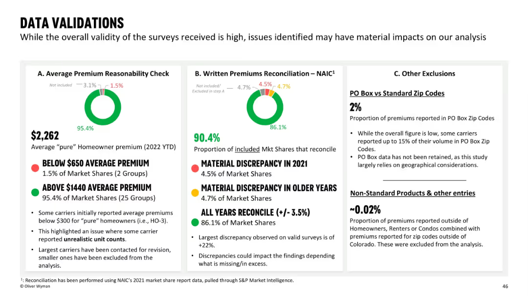
The slide includes a pie chart in the center showing the distribution of total deposits across different sectors, with detailed bullet points surrounding it.
Market Analysis and Trends
Financial Services
This slide presents the distribution and stability of the deposit base, emphasizing the diversity across different banking sectors and the overall increase in deposits, despite a slight decline in some areas.
deposits, stability, banking sectors, market trends
Mixed Chart
Barclays
Saved
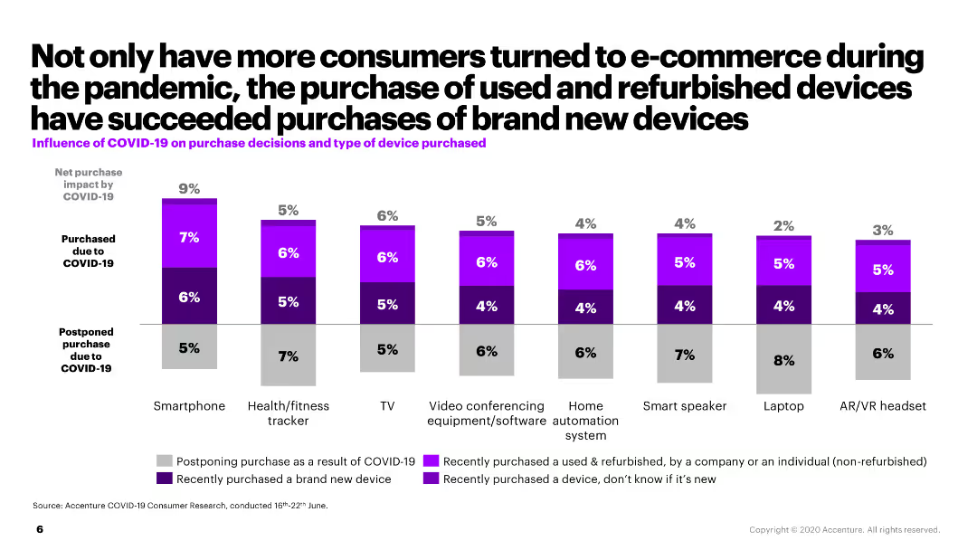
This slide uses a dark background with white and blue text. It includes a list of technologies under categories like ACES and adjacent tech. Visuals include stylized icons representing each technology category.
Technology and Digital Transformation
Transportation & Logistics
It outlines innovative technologies in the mobility sector, such as autonomy and electrification, with descriptions of each. Additional adjacent technologies like lightweight materials are also presented.
autonomy, connectivity, electrification, smart mobility, lightweight technologies, decarbonization
Header Horizontal
McKinsey
Saved
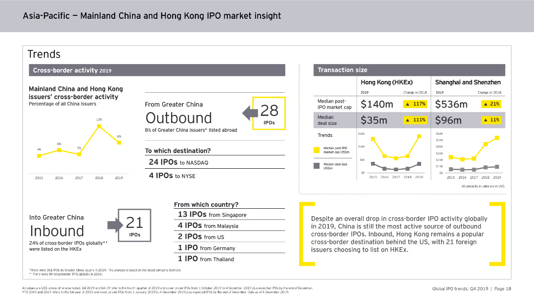
A table outlining alternative investments AUS and effective fees, with bar charts for historical principal investments rollforward.
Investment Analysis
Financial Services
Highlights alternative investments in AUS, detailing effective fees and changes in principal investments over time.
alternative investments, AUS, effective fees, principal investments, bar chart, financial overview
Multiple Chart
Goldman Sachs
Saved
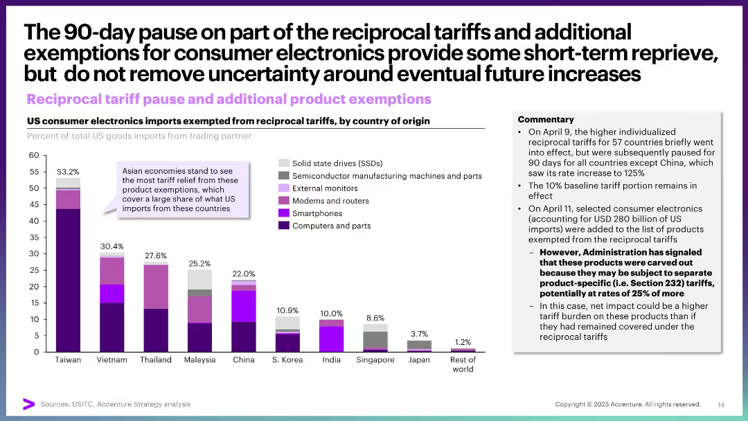
The slide includes line charts and icons to profile Pragmatic personas. It shows demographic details and EV purchase intentions, highlighting their rational approach to buying, with less emphasis on environmental concerns and more on cost and practicality.
Customer and Market Segmentation
Transportation & Logistics
This slide profiles Pragmatic personas, noting their rational decision-making, emphasis on cost and practicality, and moderate environmental consciousness. It includes demographic data and insights into their EV purchase intentions.
EV prospects, Pragmatic, line charts, demographics, rational
Multiple Chart
PwC/Strategy&
Saved
Dual-line chart tracking public vs. private payroll growth since Dec 2022; clean white background with bold annotations; arrows emphasize crowding effect.
Market Analysis and Trends
Government & Public Sector
Illustrates that payroll growth has been dominated by public sector hiring (e.g., government, health, education), crowding out private sector job growth. This trend may impact future productivity and inflation, with policy implications depending on political changes.
employment, payroll, public sector, private sector, labor market
Single Chart
Morgan Stanley
Saved
This slide features multiple column charts and bar charts displaying data about labor force distribution, GDP, and poverty rates across various regions in Indonesia.
Strategic Planning
Telecommunications
The slide compares economic indicators like labor force distribution, GDP per capita, and poverty rates to emphasize the need for tailored school connectivity solutions.
labor force, GDP, poverty, connectivity, regions, Indonesia, economic indicators, school connectivity
Multiple Chart
BCG
Saved
Detailed with multiple small bar charts for each trend category within the Swiss FoodTech ecosystem, showing startup numbers in specific areas.
Market Analysis and Trends
Agriculture & Food Production
Details niche areas within the Swiss FoodTech ecosystem like Nutricosmetics and Precision Agriculture, highlighting startup involvement and emerging trends. Valuable for stakeholders interested in niche investment or innovation opportunities.
Swiss FoodTech, Trend Categories, Startups, Nutricosmetics, Precision Agriculture
Multiple Chart
Accenture
Saved
This slide contains two column charts. The first chart shows MSCI Japan earnings growth estimates by sector for 2024 and 2025. The second chart shows MSCI Japan price-to-book ratios by sector. Color coding is used to differentiate data points.
Financial Performance
Financial Services
The slide analyzes sector earnings and valuations in Japan, focusing on earnings growth estimates and price-to-book ratios for different sectors. It is used for financial performance evaluation and investment decision-making.
Japan, sector earnings, valuations, MSCI, price-to-book, financial performance, investment
Multiple Chart
JP Morgan
Saved
This slide includes a column chart showing FO proceeds and number of deals over 10 years, a pie chart for FOs by sector, another pie chart for FOs by territory, and a table listing the top 10 largest FOs in 2022.
Market Analysis and Trends
Financial Services
The slide presents an overview of Follow-On (FO) activities in the Asia-Pacific region, including proceeds, number of deals, sector distribution, and geographical distribution, along with top FO deals in 2022.
FO, Asia-Pacific, proceeds, deals, sector, territory, top 10, financial, market
Multiple Chart
PwC/Strategy&
Saved
Similar layout to Slide 16853, with focus solely on fixed income. Includes categories like U.S. Treasuries, Eurozone Bonds, and various credits. Commentary details relative valuations and macro trends affecting positions.
Investment Analysis
Financial Services
This slide presents Morgan Stanley’s fixed income positioning across sovereign and credit markets. It shows overweight in EM local currency bonds and Eurozone bonds, with underweight in U.S. Treasuries. Commentary reflects inflation, rate differentials, and geopolitical risk considerations.
fixed income, sovereign bonds, credit, Treasuries, emerging markets, inflation, Eurozone, valuations, investment positioning
Table
Morgan Stanley
Saved
Two-column layout with a bar chart on the right and text explanation on the left. The bar chart uses horizontal stacked bars in different shades of blue to show adoption stages of various technologies.
Technology and Digital Transformation
Real Estate & Construction
Presents a survey of how different digital and emerging technologies are being adopted in capital projects. AI, RPA, AR, ML, digital twins, and PMIS are highlighted. Adoption rates remain low for most technologies, showing potential for growth.
technology adoption, AI, PMIS, construction, survey, analytics, digital twins, robotics, ML, AR, VR
Mixed Chart
KPMG
Saved
The slide features graphs showing the engagement metrics of WeChat official accounts by top luxury brands, including follower counts and post views. Additional bar charts illustrate the functions used by these accounts.
Customer and Market Segmentation
Retail & E-commerce
This slide explains how luxury brands are leveraging WeChat official accounts to engage with consumers, providing product information, customer service, and more, with substantial follower engagement metrics.
WeChat, luxury brands, consumer engagement, social media, digital strategy
Mixed Chart
Bain
Saved
This slide contains four column charts, each showing the number and value of SPACs and traditional IPOs in different regions (Americas, EMEA, Asia-Pacific) from 2017 to 2021.
Market Analysis and Trends
Financial Services
The slide provides a comparative overview of SPAC and IPO activities across various regions, highlighting significant growth in the Americas.
SPACs, IPOs, financial markets, regional analysis, growth trends
Multiple Chart
PwC/Strategy&
Saved
Features a bar chart showing the frequency of reviews for healthcare professional speakers. The layout is straightforward, using varying shades of green to represent different frequencies, which aids in distinguishing the data points clearly.
Regulatory and Compliance
Healthcare & Pharmaceuticals
Surveys the frequency at which healthcare organizations review their speaker rosters and contract statuses. It aims to provide insights into how often healthcare professionals are engaged and reassess their roles, contributing to better management and compliance in healthcare engagements.
speaker review, healthcare, engagement frequency, compliance, survey results
Single Chart
Deloitte
Saved
The slide features a multi-column table comparing performance metrics across Europe, North America, and South America, with each region highlighted in a different color. There are metrics like RoTE and efficiency ratios with 2019 data and mid-term goals. Icons representing each region add a visual element. The slide uses a combination of red, pink, and light blue, with the Santander logo in the corner and a watermark of the company logo in the background.
Operational Efficiency
Financial Services
This slide compares the bank's operational performance metrics by region and outlines goals for improvement. It's suited for internal strategic discussions or investor presentations to demonstrate operational efficiency and targets in different markets.
Regional Performance, RoTE, Efficiency, Santander, Banking Metrics, Performance Goals, Operational Analysis, Financial Targets
Table
Morgan Stanley
Saved
The slide contains two charts: a line chart for Brent crude oil spot prices and a column chart for global inventory changes, both from Jan 2021 to Jan 2023.
Market Analysis and Trends
Energy & Utilities
The slide discusses the recent trends in crude oil prices and inventories, emphasizing supply-demand dynamics and future price pressures.
crude oil, prices, inventories, energy, market trends, supply-demand
Multiple Chart
Accenture
Saved
Infographic-style layout with icons and color-coded sections representing six global megatrends (People, Politics, Environment, Business, Tech, Health)
Strategic Planning
Professional Services
This slide presents six global megatrends projected to shape societal and economic development through 2050, spanning demographics, governance, climate, business, innovation, and healthcare. Each trend is categorized and visually represented.
Megatrends, Society, Environment, Governance, Innovation, Future, Global Trends, 2050
Pillar
Roland Berger
Saved
Line chart of MSCI World Index performance under different scenarios and a column chart of S&P 500 cumulative price returns since 1980.
Investment Analysis
Financial Services
This slide demonstrates the impact of compounding on investments, comparing MSCI World Index performance and S&P 500 cumulative returns under different scenarios and missed days.
compounding, MSCI, S&P 500, returns, scenarios
Multiple Chart
JP Morgan
Saved
Contains a comparative bar graph of cash as a percentage of the annual budget for various states, showing legislative and actual cash reserves, complemented by a summary of cash flow sources and budget sizes.
Regulatory and Compliance
Government & Public Sector
Examines the cash limit requirements for NCDOT compared to other states, discussing the challenges in meeting these limits and the implications for fiscal planning, especially regarding the lack of segregated reserve funds.
cash limits, fiscal planning, NCDOT, state comparison, budget management
Single Chart
McKinsey
Saved
Various charts including bar and pie charts depicting firms' confidence levels, challenges, and growth expectations.
Market Analysis and Trends
Financial Services
This slide assesses firms' confidence in the economic outlook for 2023, highlighting major concerns such as supply chain issues, tight margins, and growth prospects.
Economic outlook, firms' confidence, supply chain, margins, growth, challenges, expectations, trends, 2023
Multiple Chart
EY
Saved
The slide features a comparative column chart depicting expense growth, a sidebar with key strategic points, and a blue background. The column chart contrasts the company's low expense growth against the peer average, using shades of blue to differentiate the data. The sidebar uses icons and bullet points to concisely present information.
Operational Efficiency
Financial Services
This slide outlines Fifth Third's expense management strategy, emphasizing its disciplined approach relative to peers. It also details investments focused on talent and capabilities, alongside technology modernization efforts. The data and content suggest its use in financial and operational strategy discussions, highlighting cost management while investing for future growth.
Expense Management, Investment, Future Growth, Comparative Analysis, Strategy, Financial Services, Technology Modernization, Talent Development
Mixed Chart
Goldman Sachs
Saved
Slide shows two column charts comparing the growth of the luxury second-hand market against the total personal luxury market.
Market Analysis and Trends
Retail & E-commerce
Examines the growth of the second-hand luxury market, projecting significant increases and discussing market share.
Second-hand luxury, market growth, market analysis, trends, market share, projections, personal luxury
Multiple Chart
BCG
Saved
Features split design with icons: potential of AI on the left, challenges of AI adoption on the right.
Technology and Digital Transformation
Technology & Software
Highlights AI's potential for success and disruptive capability, alongside the challenges faced by organizations in adopting and scaling AI solutions.
AI, leadership, potential, challenges, adoption, success
Text Only
McKinsey
Saved
The slide contains two column charts side by side, showing cumulative gross cost reductions and cumulative integration-related expenses as percentages of total saves and expenses.
Operational Efficiency
Financial Services
This slide demonstrates the projected cost savings and integration-related expenses from 2023 to 2026, detailing the impact on gross cost savings.
cost savings, expenses, integration, gross cost, 2026
Multiple Chart
UBS
Saved
Two-column table layout with top contributors and detractors, a sector attribution bar chart, and clean color-coded impact visuals
Financial Performance
Financial Services
This slide presents a one-year performance attribution for the J.P. Morgan Large Cap Growth Strategy SMA, showing the top contributing and detracting stocks with respective weights and impacts. It also includes a sector-level attribution chart, highlighting stock selection and sector allocation contributions.
performance, attribution, sector, impact, contributors, detractors, stocks, strategy, J.P. Morgan, Russell 1000
Mixed Chart
JP Morgan
Saved
Previous
Next
If nothing, comes up, please save your slides first
Create a FREE account to continue browsing
Receive Instant Access to 1,000+ slides from companies like McKinsey, Google, and Goldman Sachs
First Name
Last Name
Email
Password
I agree to all
Terms & Privacy Policy
Thank you! Your submission has been received!
Oops! Something went wrong while submitting the form.
Have an account?
Sign in
Column Chart
Heatmap
Chevron
Org Chart
Infographic
Callouts
Timeline
List
Graphic
Picture
Process Flow
Diagram
Paragraph
Map
Table
Framework
Subtitle
Takeaway Box
Icon
Other Chart
Radar Chart
Waterfall Chart
Mekko Chart
Pie Chart
Scatter Plot
Line Chart
Bar chart
Bullet points