My Account
My Slides
Search by Category
Companies
Slide Type
Use Case
Industry
Pricing
Templates
View All Templates
Download Template Slides
✦ AI
AI Prompt Library
AI Search
Feedback
Login
Logout
Get Started
Browse all Slides
Browse all Slides
Create a FREE Account
Instant access to 1,000+ real slides from top companies like McKinsey, BCG, Goldman Sachs, Google and many more!
First Name
Last Name
Email
Password
I agree to all
Terms & Privacy Policy
Thank you! Your submission has been received!
Oops! Something went wrong while submitting the form.
Have an account?
Sign in
Saved Slides
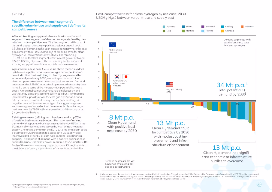
Vertical bar chart color-coded by use case; right side text box with key metrics; bottom with volume segments and annotations
Market Analysis and Trends
Energy & Utilities
This slide analyzes competitiveness by comparing value-in-use and cost of clean hydrogen across use cases. It segments demand into three groups: positive business case, marginally viable, and segments needing significant support. Key insights show which sectors and geographies are most likely to adopt clean hydrogen based on cost dynamics.
hydrogen segments, competitiveness, value-in-use, cost delta, demand breakdown, business case, EU policy, CHPS, refining
Mixed Chart
McKinsey
Saved
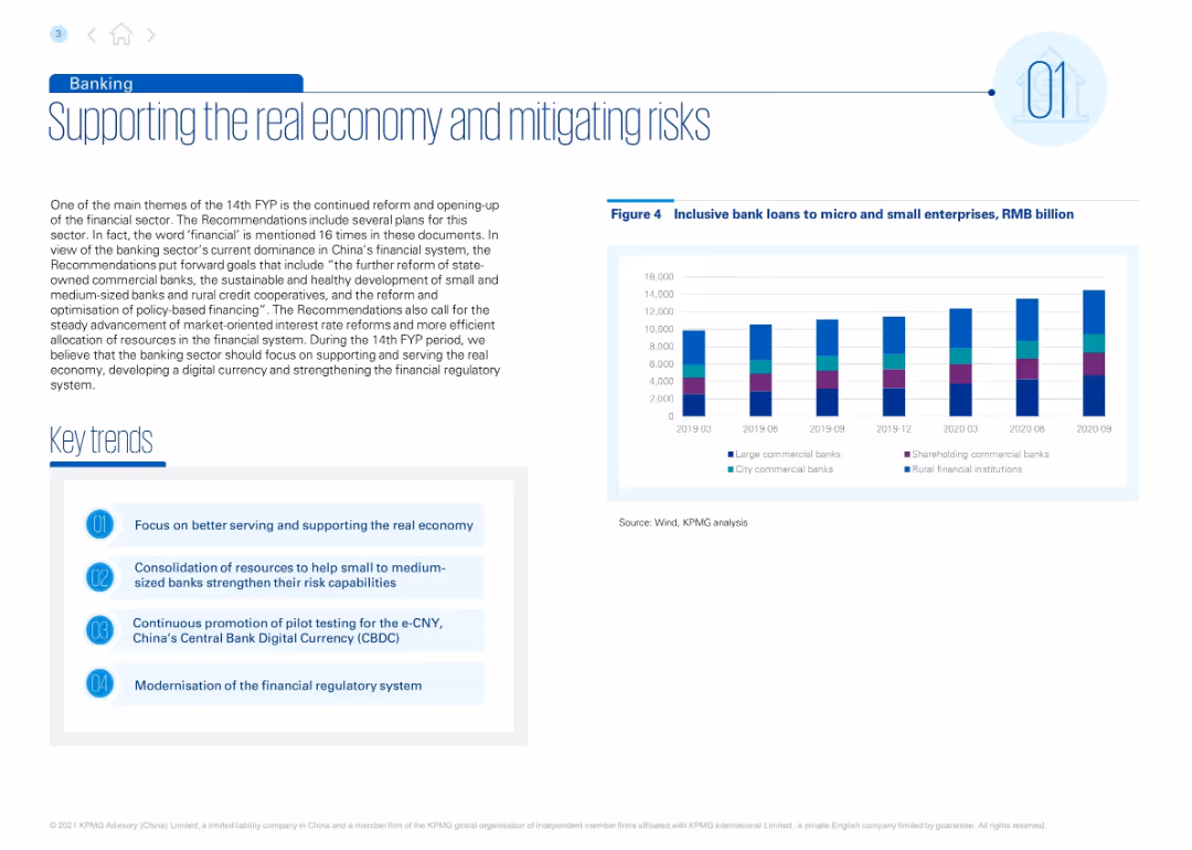
Left-aligned title with blue accents. Includes descriptive text, a list of key trends, and a bar chart of inclusive loans over time. Right section features the chart with multi-color bars by bank type.
Regulatory and Compliance
Financial Services
Discusses goals under China’s 14th FYP to support small and medium banks, improve credit access, and advance digital currency (e-CNY). Inclusive loan trends from 2019–2020 are shown by bank type.
banking, inclusive finance, e-CNY, microloans, regulatory reform, small banks, FYP
Mixed Chart
KPMG
Saved
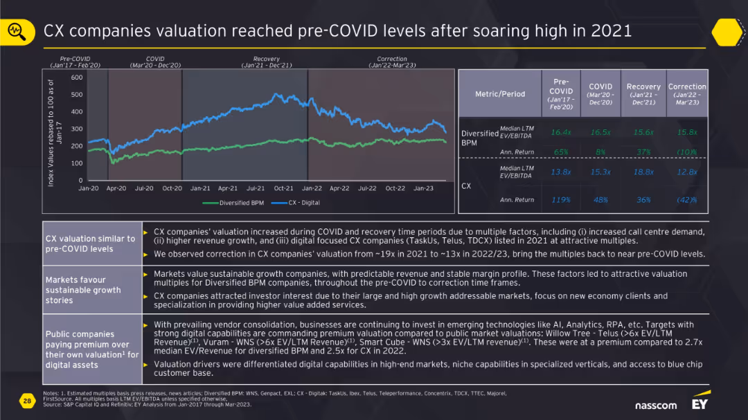
Line chart of Diversified BPM vs CX-Digital with a metrics table on valuation and returns over four phases; annotated analysis below.
Financial Performance
Professional Services
This slide shows how CX companies saw a valuation surge during COVID and recovery phases due to digital expansion and demand growth. By 2023, valuations corrected back to pre-COVID levels. Diversified BPM firms with stable margins maintained better valuation profiles, while CX companies still commanded premium due to niche digital capabilities.
CX, BPM, valuation, digital growth, COVID impact, returns, premium, public markets
Mixed Chart
EY
Saved
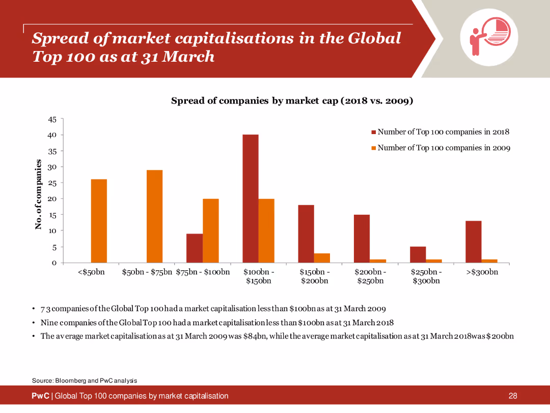
Column chart showing the distribution of market capitalizations of the Global Top 100 companies in 2009 and 2018, with textual analysis below.
Market Analysis and Trends
Financial Services
Comparison of the spread of market capitalizations among the Global Top 100 companies between 2009 and 2018, highlighting growth and changes.
market capitalisation, global top 100, 2009, 2018, spread
Mixed Chart
PwC/Strategy&
Saved
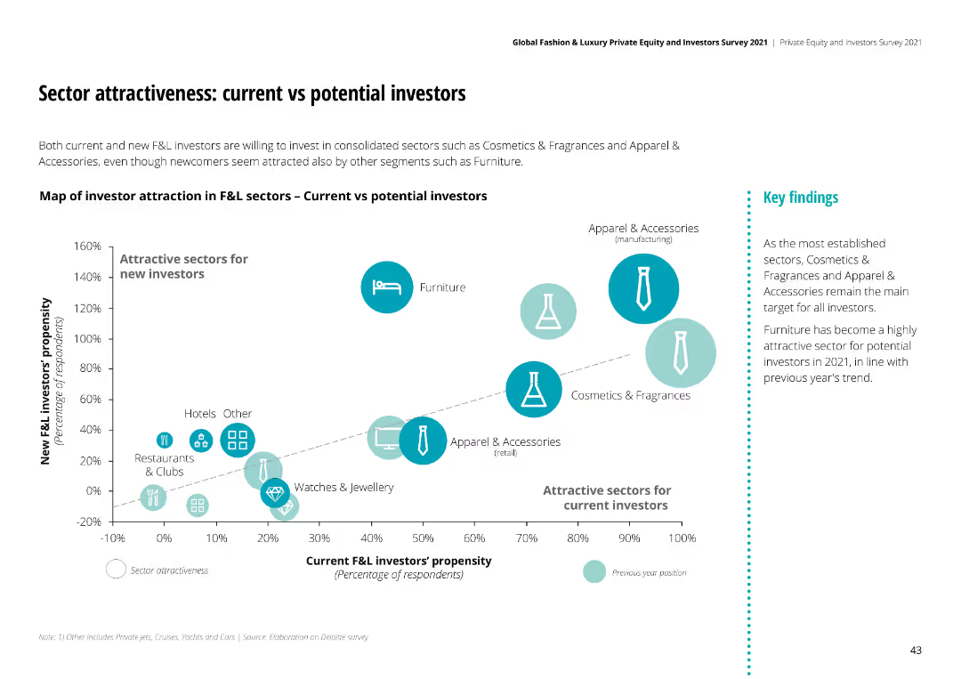
Bubble chart comparing attractiveness of sectors for current vs new investors. Sectors like Cosmetics & Fragrances and Apparel & Accessories are highly attractive.
Investment Analysis
Financial Services
Both current and new investors are drawn to sectors like Cosmetics & Fragrances and Apparel & Accessories, with Furniture also being highly attractive in 2021.
current investors, potential investors, sector attractiveness, F&L industry, investment trends
Mixed Chart
Deloitte
Saved
Slide includes flow charts and bar charts depicting types of transactions in the informal market and their tender types.
Market Analysis and Trends
Financial Services
Details the prevalence of cash transactions in B2C and B2B sectors within informal markets, highlighting types of payments.
B2C, B2B, cash transactions, informal market, payment types
Multiple Chart
BCG
Saved
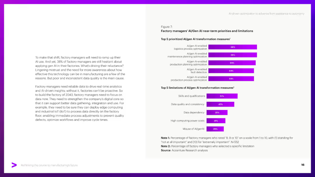
Similar layout to 15913; paragraph left, bar charts right. Focus on AI/Gen AI aspects.
Technology and Digital Transformation
Industrial & Manufacturing
Explores AI/Gen AI transformation priorities like logistics and maintenance optimization. Addresses challenges like data quality, skill gaps, and computing costs based on manager feedback.
Gen AI, factory AI, data quality, AI limitations, transformation
Mixed Chart
Accenture
Saved
Slide displays a bar chart listing top investors in Manchester tech companies, with counts of equity deals from 2011–2020, alongside descriptive text.
Investment Analysis
Technology & Software
Reviews major tech investors in Manchester, showing the number of deals each investor has completed, indicating a strong investment landscape.
Manchester, investors, tech companies, equity deals, investment trends, Mercia Asset Management, Growth Company Angels, Northern Powerhouse, business funding
Mixed Chart
Barclays
Saved
Contains a grey column chart comparing the SG&A of different companies, with a goal marker for staying below 14% of sales.
Operational Efficiency
Consumer Goods
Focuses on the operational effectiveness of maintaining low SG&A costs across various companies, with specific goals and benchmarks.
SG&A, operational efficiency, benchmark, competitors, goal
Single Chart
Barclays
Saved
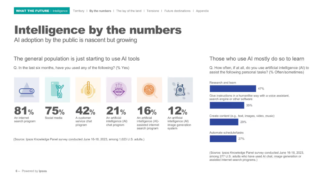
Split layout with icons, bold percentages, and bar charts; clean white background; left section shows icon-based usage stats, right shows bar chart.
Technology and Digital Transformation
Artificial Intelligence
Highlights early adoption trends in AI usage among the general population. Shows top tools used (e.g., search, chat, image generation), and indicates that AI is mostly used for learning. Includes survey data and clear icons to enhance understanding.
AI usage, internet tools, public adoption, learning, survey, Ipsos, image generation, chatbot, statistics, behavior
Mixed Chart
IPSOS
Saved
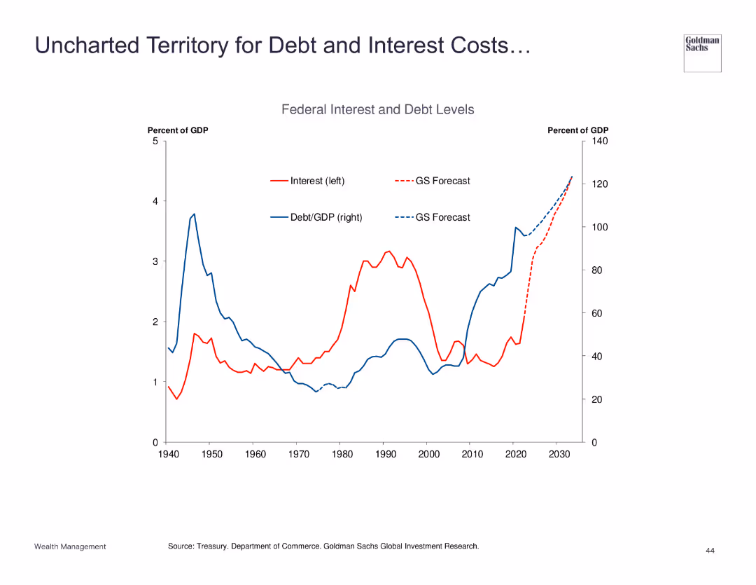
Line chart showing federal interest and debt levels as a percentage of GDP.
Risk Assessment and Management
Financial Services
Examines the rising federal interest and debt levels, forecasting significant future costs and implications for economic policy.
debt, interest, GDP, forecast, risk
Single Chart
Goldman Sachs
Saved
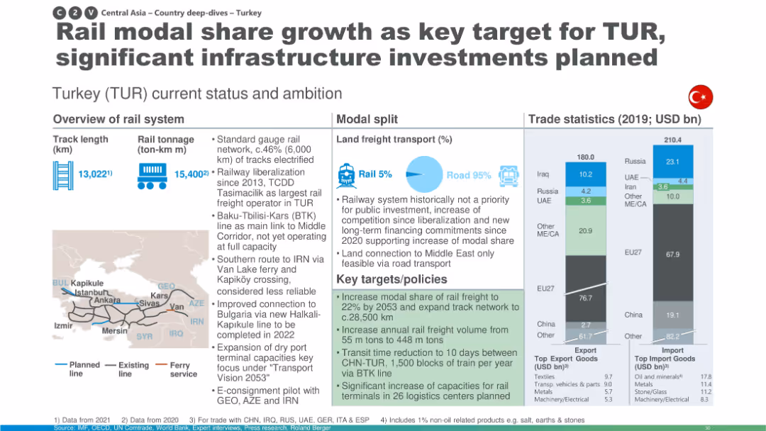
Similar to others: includes trade stats, modal split, and map; highlights investment plans to increase rail freight share.
Strategic Planning
Transportation & Logistics
Turkey’s rail network status and future ambitions are described, with plans to increase modal share of rail freight, expand the network, and improve logistics centers. The slide also touches on liberalization and international connectivity with surrounding countries.
Turkey, rail share, investment, modal split, BTK line, logistics, transport planning
Multiple Chart
Roland Berger
Saved
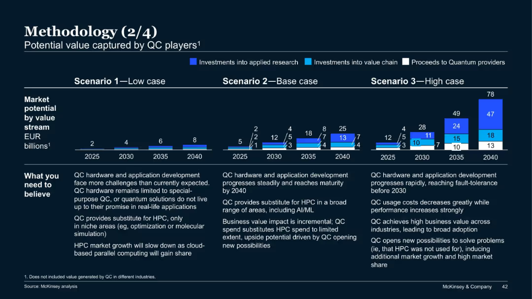
Three-scenario bar projection charts from 2025 to 2040; colored segments indicate investments and proceeds; notes on assumptions below charts.
Investment Analysis
Artificial Intelligence
This slide projects quantum computing (QC) market potential under low, base, and high scenarios, broken down by value stream. It explains what must be believed in each case and estimates value in EUR billions up to 2040 for each path.
quantum computing, market potential, investment, scenarios, projections, McKinsey
Mixed Chart
McKinsey
Saved
This slide features a pie chart showing the impact of regulations on short-term rental decisions. Segments include no longer purchase (teal), have tenants rent (light blue), and no impact (dark blue).
Regulatory and Compliance
Real Estate & Construction
The slide analyzes survey data on the impact of short-term rental regulations, indicating how regulatory changes affect investment property purchasing decisions.
short-term rentals, regulations, survey, rental decisions, investment property
Single Chart
IPSOS
Saved
The slide includes a ranked index chart and supporting text boxes, visually distinguishing between the least prepared threat types for organizations. The colors used are primarily black, grey, and red, enhancing the visual impact and readability of the data presented.
Operational Efficiency
Professional Services
This slide analyzes preparedness against various cybersecurity threats, noting that organizations are least prepared for cyber criminals, hacktivists, and insider threats. It discusses the disparity in organizational readiness and emphasizes the need for improved security measures in response to increasing cyber threats.
Cybersecurity, Threats, Preparedness, Hacktivists, Insider Threats, Rank Index Chart
Mixed Chart
PwC/Strategy&
Saved
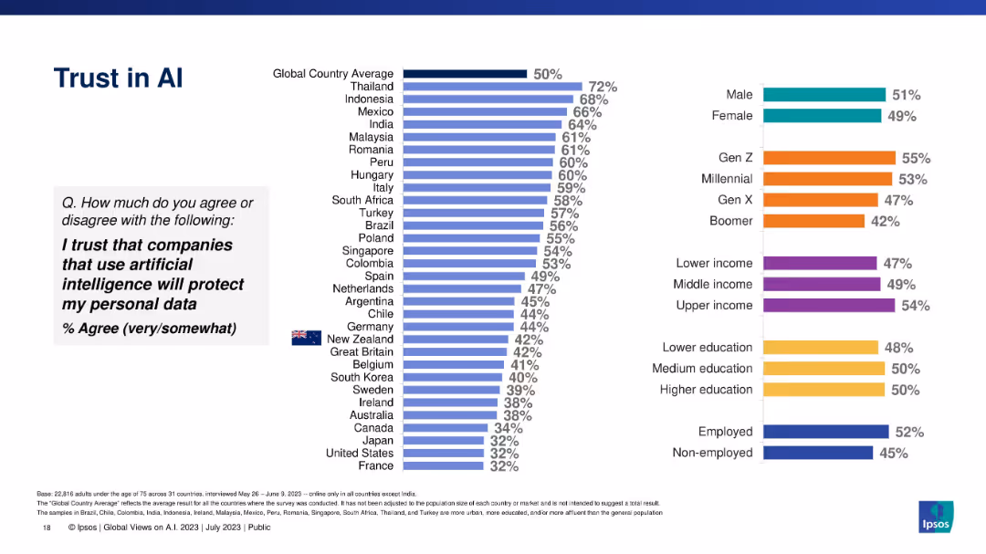
Vertical bars representing belief that AI-using companies will protect personal data, by country/demographic.
Risk Assessment and Management
Artificial Intelligence
Highlights global trust levels in data protection by AI-using companies, comparing demographic and national responses. Overall global trust is at 50%, with wide variation.
data privacy, AI, consumer trust, cybersecurity, global sentiment, Ipsos
Multiple Chart
IPSOS
Saved
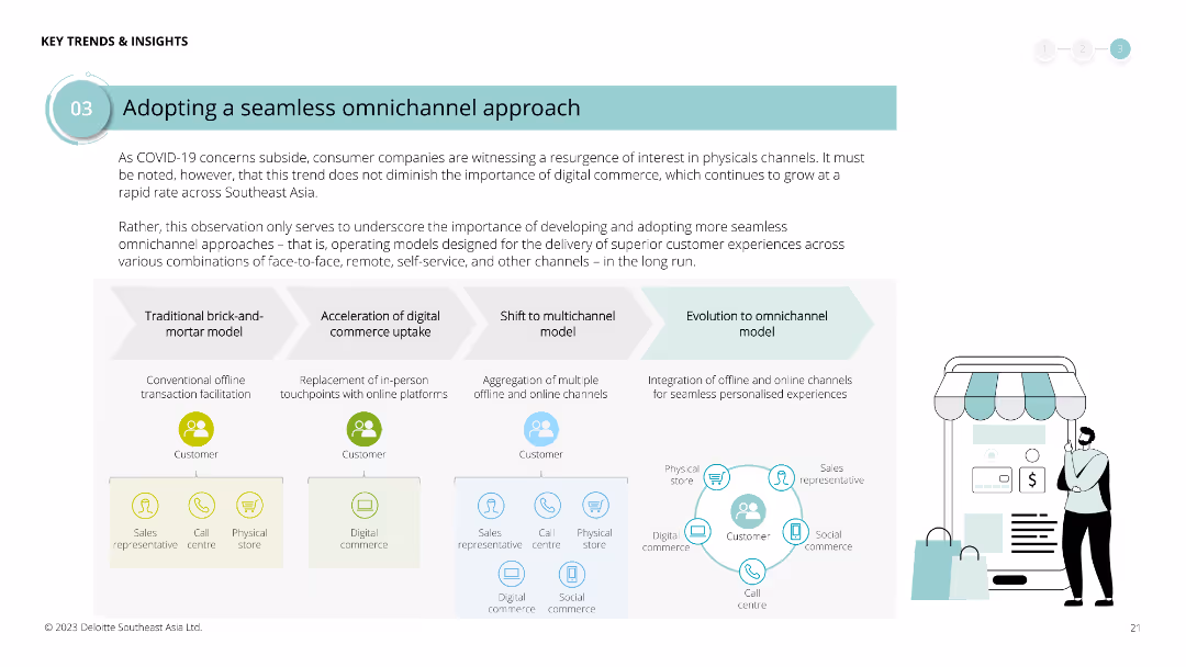
Diagram illustrating the evolution from traditional brick-and-mortar to omnichannel models, with text boxes explaining each phase. Icons represent various channels and stages.
Strategic Planning
Retail & E-commerce
Highlights the importance of developing seamless omnichannel approaches in the post-COVID era, detailing the steps from traditional models to integrated omnichannel experiences for customer satisfaction.
omnichannel, COVID-19, retail, e-commerce, digital commerce, customer experience, strategic planning, evolution
Linear Flow
Deloitte
Saved
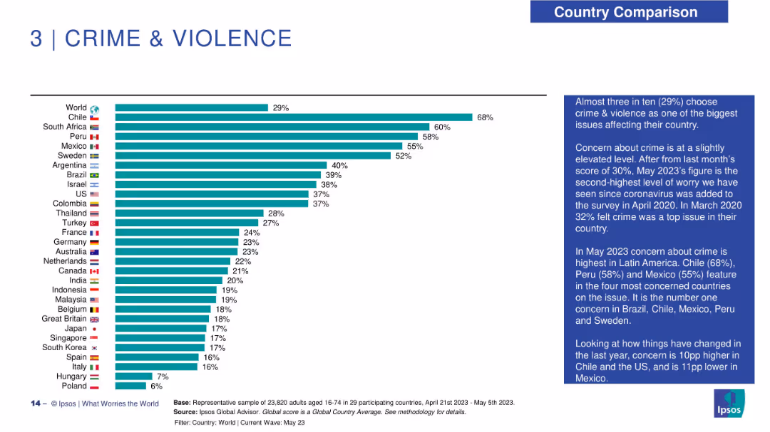
Bar chart layout on left with country flags and names on the Y-axis and horizontal bars indicating concern percentage. Right side features a narrative analysis in a dark blue box. Consistent with other slides in visual style.
Market Analysis and Trends
Government & Public Sector
This slide presents public concern over crime and violence across 29 countries. Chile has the highest concern (68%), followed by South Africa (60%) and Peru (58%). The global average is 29%. The right-hand commentary discusses Latin America's prominence in concern and notes recent changes, such as increased concern in Chile and decreased concern in Mexico.
crime, violence, public safety, global perception, concern levels, Latin America, Ipsos, societal issues, survey trends, insecurity
Mixed Chart
IPSOS
Saved
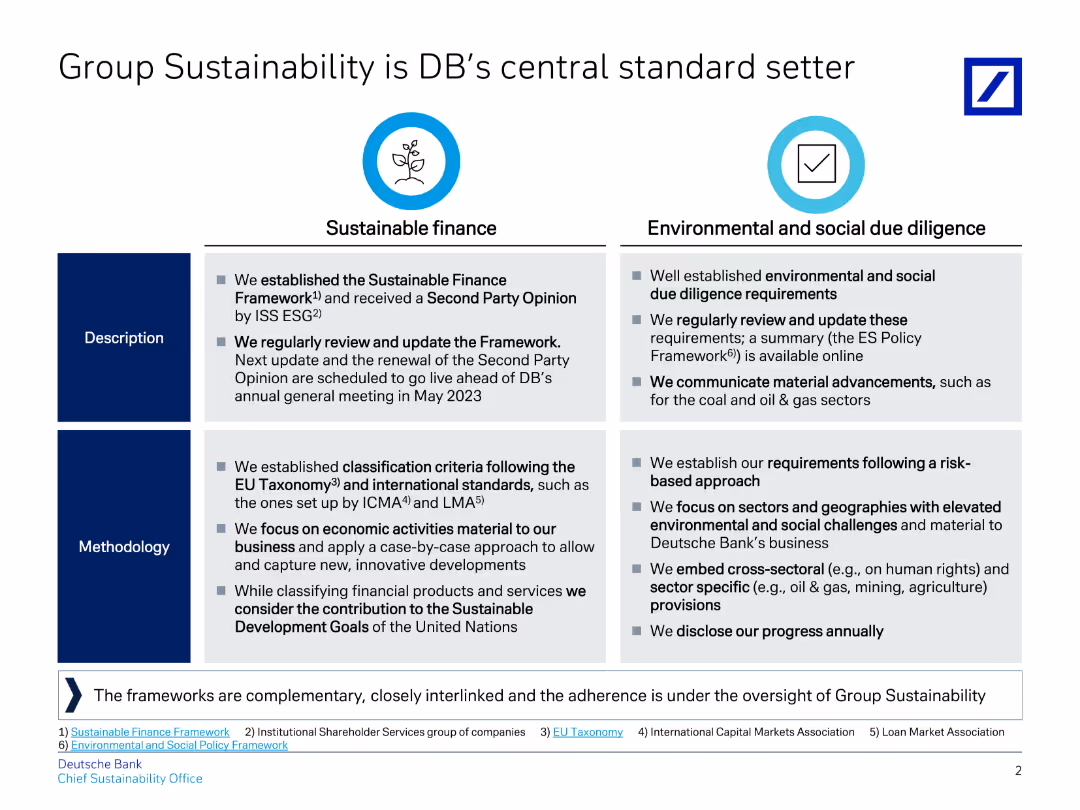
Contains two columns with descriptions and methodologies for Sustainable Finance and Environmental and Social Due Diligence, along with supporting text.
Regulatory and Compliance
Financial Services
The slide compares sustainable finance practices with environmental and social due diligence, highlighting Deutsche Bank's commitment to these standards and regular updates.
Sustainability, finance, due diligence, standards, methodology, banking, ESG, framework, compliance, regulation
Table
Deutsche Bank
Saved
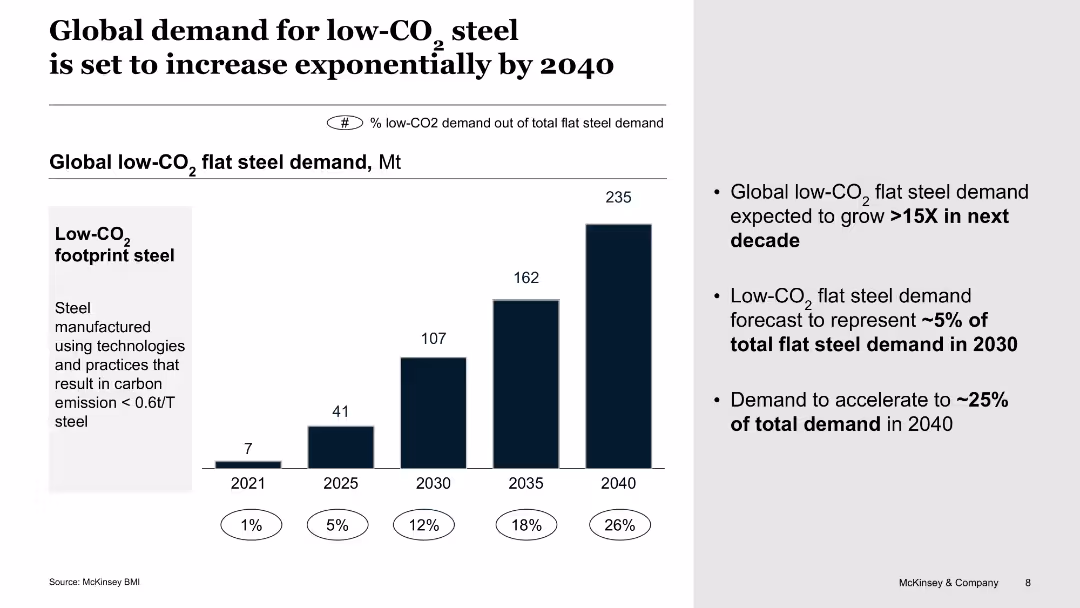
The slide features a column chart predicting global low-CO2 flat steel demand growth, with percentage labels for different years.
Market Analysis and Trends
Environmental Services & Sustainability
This slide forecasts a significant increase in global demand for low-CO2 flat steel by 2040, driven by sustainability efforts and carbon emission reduction technologies.
low-CO2 steel, demand growth, sustainability, carbon reduction, global market
Mixed Chart
McKinsey
Saved
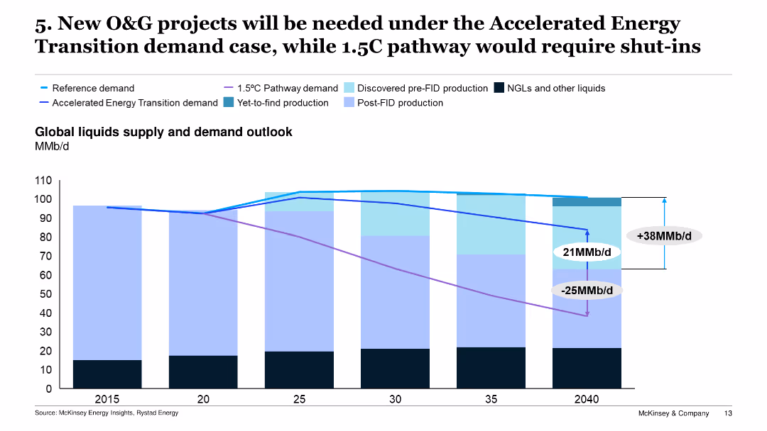
Displays a line chart projecting global liquids supply and demand outlooks under various scenarios, including the 1.5°C Pathway and Accelerated Energy Transition.
Risk Assessment and Management
Energy & Utilities
The slide examines the projected global supply and demand for oil and gas, stressing the need for new projects under the Accelerated Energy Transition scenario to meet future demands.
O&G projects, energy transition, demand, supply outlook, new projects
Single Chart
McKinsey
Saved
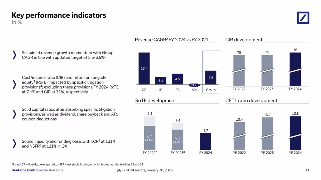
Split layout with bullet points on the left and four mini bar charts on the right. Each chart visualizes metrics like revenue CAGR, RoTE, CIR, and CET1. Dark blue for actual values and grey for comparatives.
Performance Metrics and KPIs
Financial Services
Highlights Deutsche Bank’s FY 2024 performance on key indicators including revenue CAGR, return on equity, cost/income ratio, and capital ratios. It provides both numerical insights and year-over-year development visually and textually.
KPIs, RoTE, CIR, CET1, revenue growth, banking performance
Multiple Chart
Deutsche Bank
Saved
The slide uses a dark background with a yellow text box for the quote. Below, there is a question and four circular charts with percentages reflecting future expectations.
Market Analysis and Trends
Healthcare & Pharmaceuticals
The slide provides insights into Canadian consumers' beliefs about the future of technology in healthcare, including AI, virtual presence, and digital monitoring.
Future of healthcare, technology, AI, virtual presence, Canada
Mixed Chart
EY
Saved
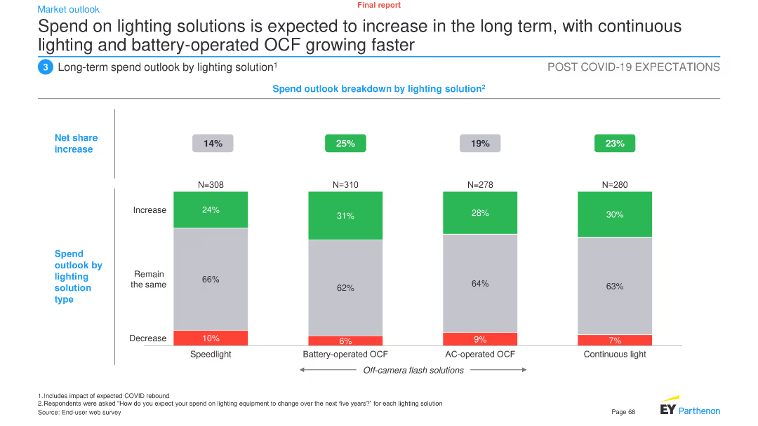
This slide features a column chart showing the net share increase in spend outlook by different lighting solutions: speedlight, battery-operated OCF, AC-operated OCF, and continuous light.
Market Analysis and Trends
Industrial & Manufacturing
The slide projects an increase in spending on lighting solutions, particularly battery-operated and continuous lighting, over the long term. It provides a breakdown of expected changes in spending across various lighting technologies.
Lighting solutions, spend outlook, long-term trends, battery-operated OCF, continuous light, speedlight, AC-operated OCF, market forecast
Single Chart
EY
Saved
This slide is text-heavy with a split layout. The left side displays a column chart titled 'Liquidity Ratio Components', and the right side features a column chart comparing 'Average Liquidity Coverage Ratio Trend' across different quarters. Text content explains the liquidity risk management strategy.
Risk Assessment and Management
Financial Services
Focuses on liquidity risk, showcasing components and trends in coverage ratios, and is ideal for financial managers or analysts looking at liquidity risk preparedness and regulatory compliance.
liquidity risk, risk management, bar chart, financial stability, coverage ratio, regulatory compliance, risk assessment, asset management, stress scenario, financial oversight
Multiple Chart
Goldman Sachs
Saved
Previous
Next
If nothing, comes up, please save your slides first
Create a FREE account to continue browsing
Receive Instant Access to 1,000+ slides from companies like McKinsey, Google, and Goldman Sachs
First Name
Last Name
Email
Password
I agree to all
Terms & Privacy Policy
Thank you! Your submission has been received!
Oops! Something went wrong while submitting the form.
Have an account?
Sign in
Column Chart
Heatmap
Chevron
Org Chart
Infographic
Callouts
Timeline
List
Graphic
Picture
Process Flow
Diagram
Paragraph
Map
Table
Framework
Subtitle
Takeaway Box
Icon
Other Chart
Radar Chart
Waterfall Chart
Mekko Chart
Pie Chart
Scatter Plot
Line Chart
Bar chart
Bullet points