My Account
My Slides
Search by Category
Companies
Slide Type
Use Case
Industry
Pricing
Templates
View All Templates
Download Template Slides
✦ AI
AI Prompt Library
AI Search
Feedback
Login
Logout
Get Started
Browse all Slides
Browse all Slides
Create a FREE Account
Instant access to 1,000+ real slides from top companies like McKinsey, BCG, Goldman Sachs, Google and many more!
First Name
Last Name
Email
Password
I agree to all
Terms & Privacy Policy
Thank you! Your submission has been received!
Oops! Something went wrong while submitting the form.
Have an account?
Sign in
Saved Slides
The slide features column chart for revenue and net income, with lines illustrating return on equity (ROE) trends for different sectors. The columns are deep blue, while the lines are in purple and green, set against a white background. A red circle highlights a specific point of interest.
Financial Performance
Financial Services
The slide highlights JPMorgan's strong financial performance in 2019, showing increased revenue and net income. It details the company's return on equity (ROE) for different sectors with bar charts and line graphs, emphasizing their market position and successful business strategy in the financial sector.
JPMorgan, Financial Results, Revenue, Net Income, ROE, Bar Chart, Line Graph, Market Position, Business Strategy
Single Chart
JP Morgan
Saved
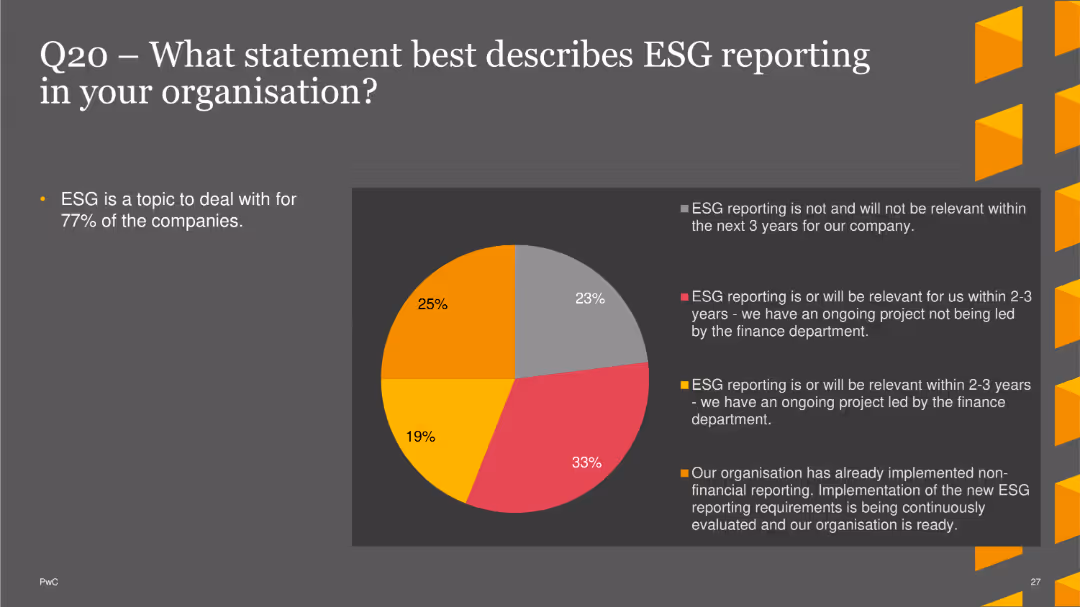
The slide displays a pie chart depicting the relevance of ESG reporting in organizations. Statements include whether ESG reporting is or will be relevant within the next 2-3 years, whether there is an ongoing project, and whether non-financial reporting has already been implemented. The chart uses various colors to represent different responses. A brief text section summarizes the importance of ESG for most companies.
Regulatory and Compliance
Financial Services
This slide presents survey data on the relevance and implementation of ESG reporting in organizations, indicating that a significant number of companies find ESG reporting important or have ongoing projects in this area. It provides insights into current compliance trends and future directions.
ESG reporting, compliance, finance, regulatory, trends
Single Chart
PwC/Strategy&
Saved
Displays characteristics of blockchain like decentralization and encryption, using icons and short text blocks arranged around a central circular graphic that symbolically represents a blockchain network.
Technology and Digital Transformation
Technology & Software
Highlights the essential attributes of blockchain technology, including security, flexibility, and its decentralized nature. Suitable for discussions on how blockchain can be integrated into various business or technology solutions.
blockchain, decentralization, encryption, data security, flexibility
Diagram
McKinsey
Saved
Featuring column charts and bar charts, the slide displays the likelihood of purchasing crypto assets within the next 12 months, comparing data from 2023 and 2022, and showing demographics of responses.
Market Analysis and Trends
Financial Services
The slide analyzes the purchase intent of Canadians regarding crypto assets over the next year, with a focus on how likelihood has changed from 2022 to 2023, including demographic insights.
purchase intent, crypto assets, next 12 months, demographics, comparison
Mixed Chart
IPSOS
Saved
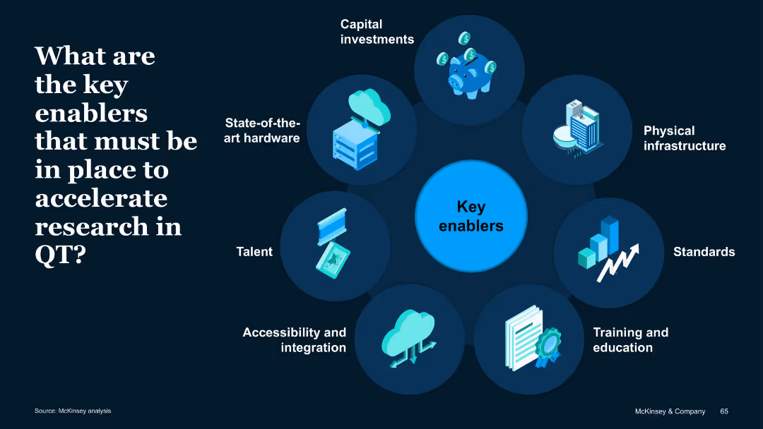
Circular radial diagram with icons around a central "Key enablers" node; dark background with high-contrast text and images.
Operational Efficiency
Artificial Intelligence
Outlines essential enablers for quantum technology advancement: capital, hardware, infrastructure, standards, talent, integration, and education. Each component supports acceleration of research and commercialization.
Enablers, hardware, talent, investment, integration, infrastructure
Uncategorized
McKinsey
Saved
A column chart showing market share by region from 2000 to 2030. Uses color-coded segments to represent different regions. Includes a dashed line for future projections. Clear, structured layout with a legend and source information at the bottom.
Market Analysis and Trends
Technology & Software
Slide analyzes the projected decline in market share for U.S. companies in the semiconductor industry by 2030, suggesting a need for strategic actions to maintain competitiveness in a global context.
semiconductor, market share, projections, U.S., decline
Single Chart
BCG
Saved
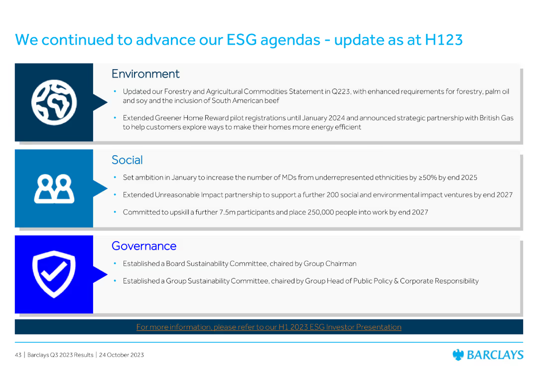
Divided into three sections: Environment, Social, and Governance, each with bullet points summarizing recent initiatives and achievements.
Market Analysis and Trends
Financial Services
Summarizes Barclays' progress on its ESG (Environmental, Social, and Governance) agendas as of H123, detailing initiatives in each area to enhance sustainability and social impact.
ESG, sustainability, environment, social, governance, Barclays, initiatives, H123, progress
Header Vertical
Barclays
Saved
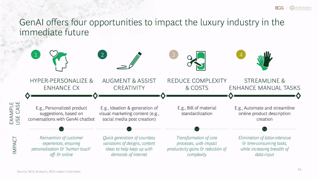
Four-column horizontal layout with icons, labels, examples, and impact text beneath each opportunity
Technology and Digital Transformation
Artificial Intelligence
GenAI can reshape luxury through: 1) hyper-personalized customer experience, 2) creativity augmentation, 3) process simplification, and 4) manual task automation. Use cases range from product recommendations to marketing content and e-commerce automation.
GenAI, luxury industry, personalization, automation, creativity, process improvement
Pillar
BCG
Saved
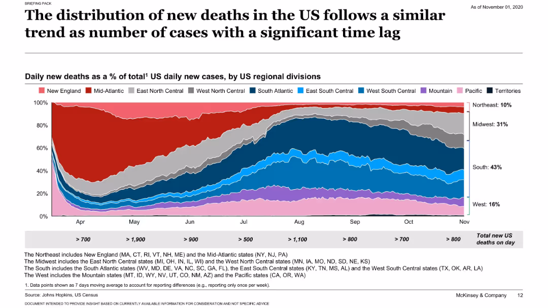
Similar stacked area chart as slide 17401, but for daily new deaths instead of cases.
Market Analysis and Trends
Healthcare & Pharmaceuticals
Displays a delayed but similar regional shift in new COVID-19 deaths across the US, suggesting a lagging correlation with the rise in cases seen in earlier months.
COVID-19, deaths, regional analysis, time lag, US trends
Single Chart
McKinsey
Saved
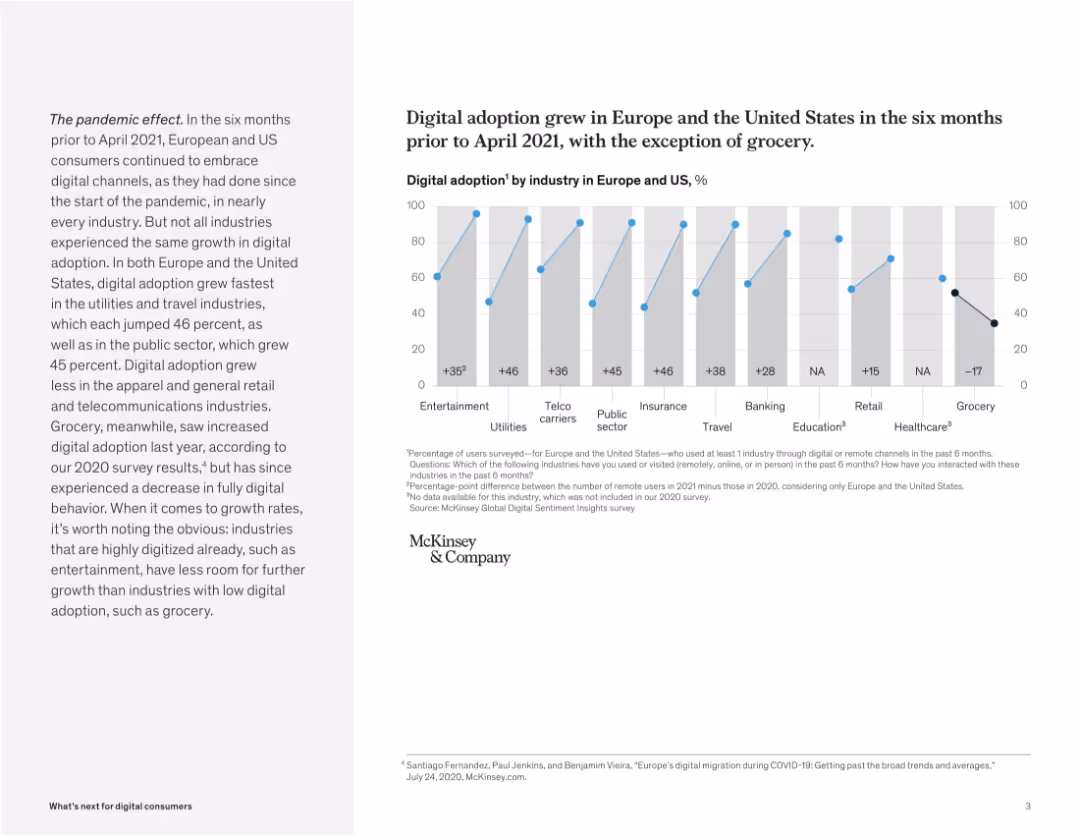
Bar chart comparing digital adoption by industry with growth metrics. Paragraph on the left gives context.
Market Analysis and Trends
Retail & E-commerce
This slide presents digital adoption rates by industry across Europe and the US. While most sectors saw growth in digital usage, the grocery sector notably declined, indicating a consumer shift back to physical channels.
digital growth, industry analysis, pandemic impact, retail trends, McKinsey, user behavior, grocery, Europe, US
Mixed Chart
McKinsey
Saved
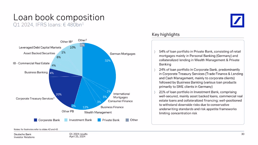
This slide includes a pie chart showing the composition of Deutsche Bank's loan book by type (German Mortgages, Corporate Treasury Services, etc.) as of Q1 2024.
Financial Performance
Financial Services
The slide details the composition of Deutsche Bank's loan book as of Q1 2024, breaking down the types of loans (German Mortgages, Corporate Treasury Services, etc.) and providing key highlights of the portfolio distribution.
loan book, composition, types, portfolio, German Mortgages, Corporate Treasury Services, Deutsche Bank, Q1 2024
Mixed Chart
Deutsche Bank
Saved
The slide features a column chart showing the total size of disclosed education deals by region in Africa from 2014-2018. It includes annotations and highlights of capital deployment, with specific details about investments in Southern, Northern, Eastern, and Western Africa.
Investment Analysis
Education & Training
This slide provides a regional breakdown of investment activity in the African education sector, detailing the total disclosed capital and the number of deals from 2014-2018. It highlights significant investments in Southern and Northern Africa, underscoring regional differences in investment levels.
investment, education, Africa, regional, capital
Mixed Chart
LEK
Saved
Features a comparative diagram illustrating the shift in luxury brands' roles from producers to broadcasters, pre and post-COVID-19. Highlights include traditional and evolved roles around a central product image.
Strategic Planning
Consumer Goods
This slide analyzes the strategic transformation of luxury brands due to COVID-19, transitioning from a product-centric to a consumer interaction focus. It visually compares the old and new roles of brands in engaging consumers, indicating a significant shift towards digital and media-driven interaction.
luxury brands, COVID-19, digital transformation, consumer engagement, strategic shift
Framework
Bain
Saved
Line chart showing U.S. Treasury yield curves and a table comparing yields and performance of various Treasury securities over different periods.
Investment Analysis
Financial Services
Presents U.S. Treasury yield curves and performance metrics for various Treasury securities, providing insights into interest rate trends and investment returns.
Treasury yields, investment, performance
Mixed Chart
Morgan Stanley
Saved
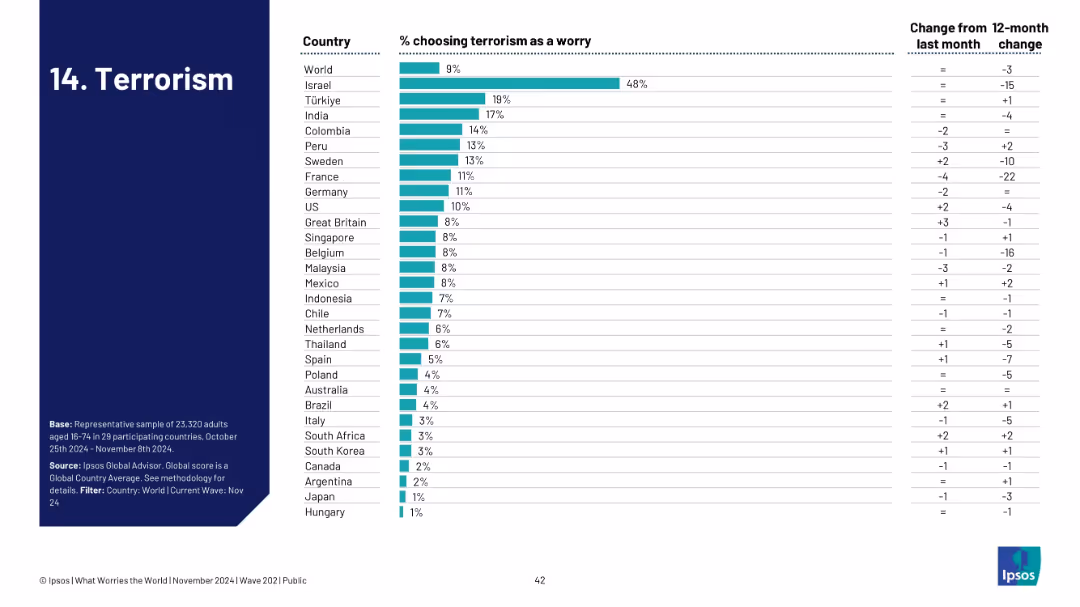
Ranked bar chart by country for terrorism concern; change columns provided.
Risk Assessment and Management
Government & Public Sector
Visualizes how terrorism ranks among public concerns across nations. Israel is highest at 48%, with most countries under 10%. The trend data indicates a general decline in worry, potentially reflecting a shift in geopolitical focus or threat levels.
terrorism, national security, global concern, Ipsos, survey, public safety, threat perception, geopolitical risk
Single Chart
IPSOS
Saved
Column charts showing group funding by year and quarter, with percentage breakdowns of shareholders equity, debt, and deposits.
Financial Performance
Financial Services
Overview of UBS group funding from 2020 to 3Q23, highlighting changes in shareholder equity, debt, and customer deposits.
Funding, equity, debt, deposits, trends
Multiple Chart
UBS
Saved
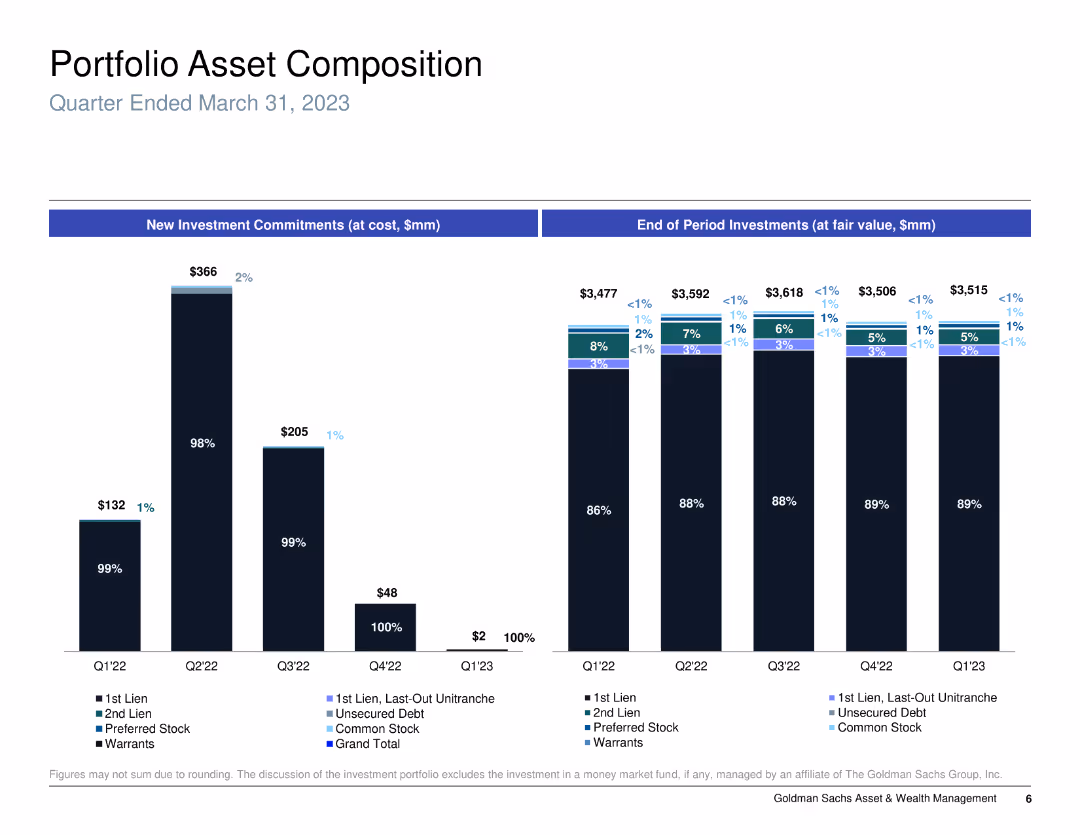
Column chart showing new investment commitments and end of period investments, categorized by type of asset.
Investment Analysis
Financial Services
Analyzes the portfolio asset composition for a specific period, detailing types of investments and their changes over time.
portfolio, assets, investment, commitments
Multiple Chart
Goldman Sachs
Saved
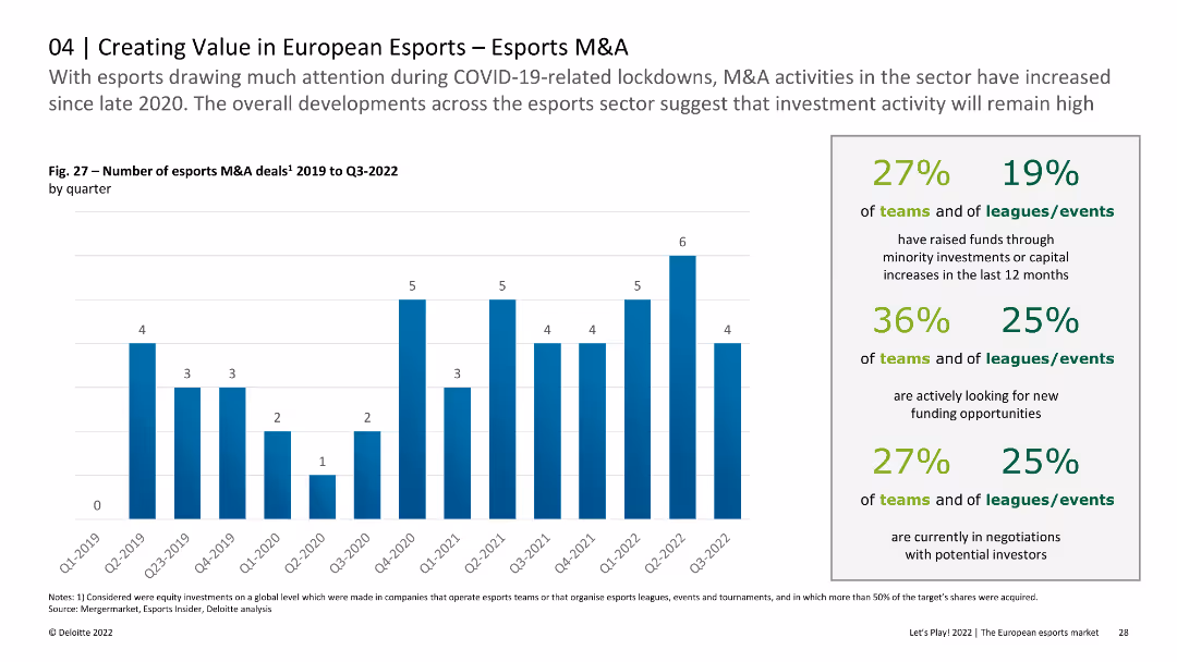
The slide includes a column chart showing the number of esports M&A deals by quarter from 2019 to Q3 2022. Text provides insights into investment activities and trends within the esports sector during this period.
Mergers and Acquisitions
Media & Entertainment
This slide analyzes the quarterly number of M&A deals in the esports sector from 2019 to Q3 2022, discussing how COVID-19 and other factors influenced investment activities and the overall market dynamics.
esports, M&A, quarterly deals, investment, trends
Mixed Chart
Deloitte
Saved
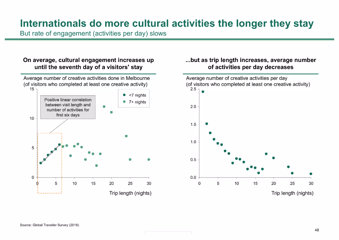
Two scatter plots: one shows a positive correlation between visit length and number of activities in Melbourne; the other shows the average number of activities per day decreases as stay lengthens.
Market Analysis and Trends
Hospitality & Tourism
Analyzes how international visitors' engagement with cultural activities in Melbourne increases with longer stays, though the rate of daily activities decreases over time.
cultural activities, visitor engagement, Melbourne, stay length, tourism
Multiple Chart
BCG
Saved
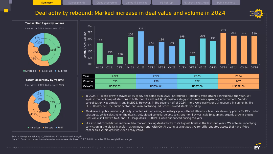
Dark background, multiple charts and tables (bar chart, donut charts, data table); yellow and turquoise highlights; visually dense with transactional and volume data.
Mergers and Acquisitions
Technology & Software
This slide details the resurgence in IT deal activity in 2024, with increases in volume and value. It attributes growth to digital transformation, GenAI-driven differentiation, and private equity-led consolidation. It presents data by deal type, geography, and monthly trends, highlighting strategic investor behavior.
M&A, deal volume, private equity, GenAI, digital transformation, IT services
Multiple Chart
EY
Saved
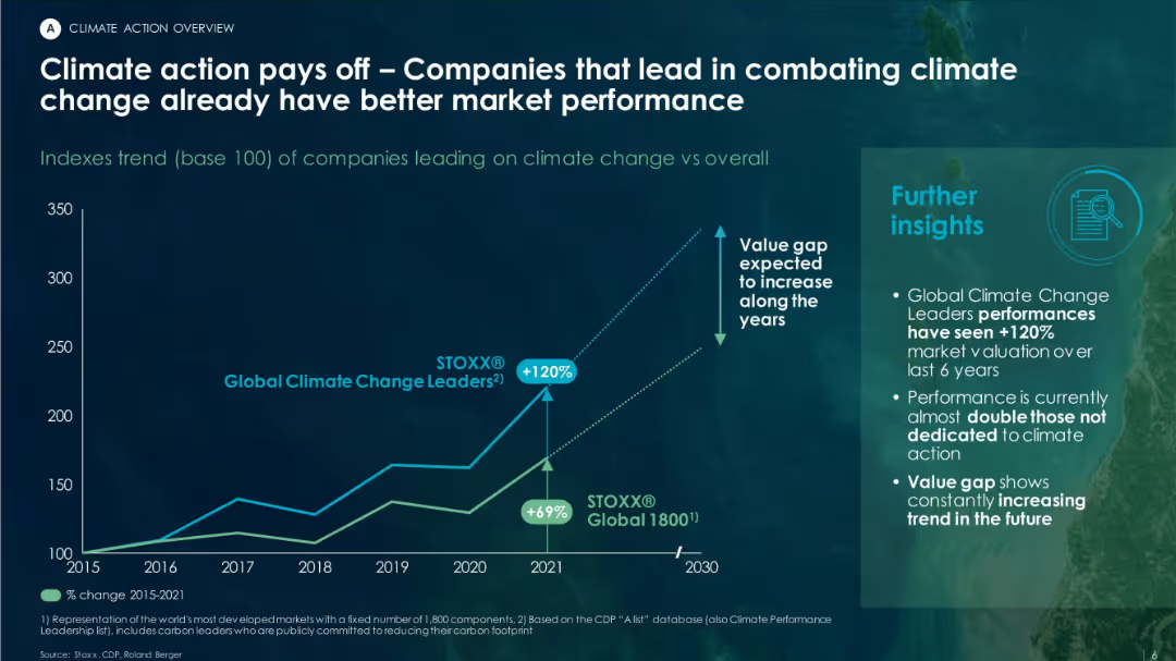
Contains a line chart showing performance trends of climate-leading companies vs. overall market. Includes insights box and minimalistic dark theme.
Investment Analysis
Environmental Services & Sustainability
The slide presents data showing that companies taking climate action outperform the market, with “Global Climate Change Leaders” showing a +120% valuation increase vs +69% for general market indexes between 2015–2021.
climate leaders, valuation, ESG, STOXX index, performance trend, investment returns
Mixed Chart
Roland Berger
Saved
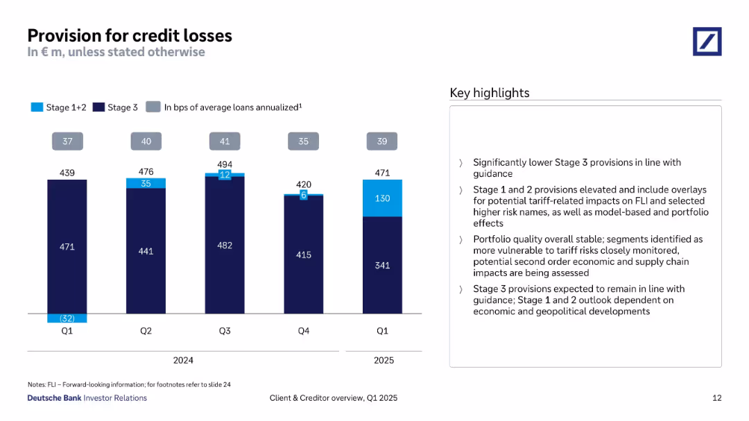
Bar chart tracking provision breakdown (Stage 1+2 vs Stage 3) from Q1 2024 to Q1 2025; bullet points on right.
Risk Assessment and Management
Financial Services
The slide tracks provisions for credit losses over five quarters, indicating a shift toward Stage 1+2 provisions driven by tariff and geopolitical risks. It notes stable portfolio quality and stresses on monitoring vulnerable segments.
credit losses, provisions, Stage 1+2, Stage 3, tariff risk, portfolio quality, Q1 2025, risk overlays
Mixed Chart
Deutsche Bank
Saved
Features an image of a creatively colored cow, alongside mobile interfaces and a strategic model diagram.
Market Analysis and Trends
Financial Services
The slide humorously uses a cow image to represent "growing our audience," linked to a new credit access program, highlighting strategic partnerships and market segment targeting, which are crucial for expanding consumer access and data acquisition.
audience growth, strategic partnerships, marketing, credit access, innovation
Mixed Chart
Barclays
Saved
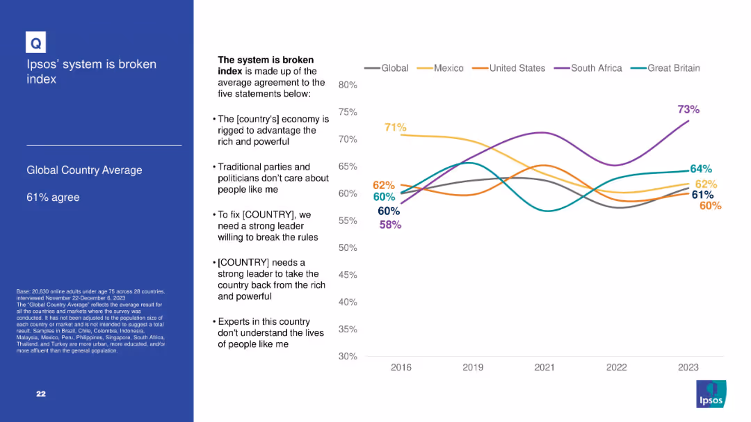
Line graph with average agreement to five statements comprising a “broken system” index; countries compared over time; text box lists index components.
Market Analysis and Trends
Government & Public Sector
Summarizes the Ipsos "broken system" index based on multiple political distrust indicators. South Africa shows highest agreement; trend data is shown for key countries from 2016–2023.
broken system, Ipsos index, trust, governance, political perception, dissatisfaction, public sentiment
Mixed Chart
IPSOS
Saved
Consists of a world map, key facts list, and a pie chart showing sales distribution. The slide is visually dense with a high level of detail.
Operational Efficiency
Technology & Software
Provides an overview of Clarion's global presence, focusing on sales by region and the distribution of its manufacturing and development centers, emphasizing the company's operational scope.
Clarion, global, sales, manufacturing, development, automotive
Mixed Chart
Deutsche Bank
Saved
Previous
Next
If nothing, comes up, please save your slides first
Create a FREE account to continue browsing
Receive Instant Access to 1,000+ slides from companies like McKinsey, Google, and Goldman Sachs
First Name
Last Name
Email
Password
I agree to all
Terms & Privacy Policy
Thank you! Your submission has been received!
Oops! Something went wrong while submitting the form.
Have an account?
Sign in
Column Chart
Heatmap
Chevron
Org Chart
Infographic
Callouts
Timeline
List
Graphic
Picture
Process Flow
Diagram
Paragraph
Map
Table
Framework
Subtitle
Takeaway Box
Icon
Other Chart
Radar Chart
Waterfall Chart
Mekko Chart
Pie Chart
Scatter Plot
Line Chart
Bar chart
Bullet points