Create a FREE Account
Instant access to 1,000+ real slides from top companies like McKinsey, BCG, Goldman Sachs, Google and many more!
First Name
Last Name
Email
Password
I agree to all
Terms & Privacy Policy
Thank you! Your submission has been received!
Oops! Something went wrong while submitting the form.
Have an account?
Sign in
Library
Templates
Courses
Pricing
My Account
My Slides
My Templates
✦ AI
AI Prompt Library
AI Search
Sign in
Start Here
Logout
My Saved Slides
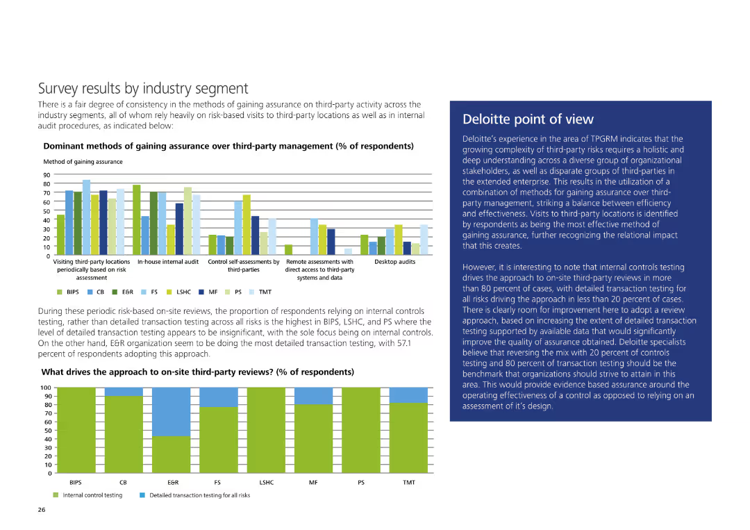
Column charts displaying dominant methods of gaining assurance and what drives the approach to on-site third-party reviews. Detailed analysis by industry segment.
Market Analysis and Trends
Financial Services
The slide presents survey results indicating dominant methods of gaining assurance over third-party management and drivers for on-site third-party reviews, segmented by industry.
survey, industry segment, third-party, assurance, analysis, column chart
Multiple Chart
Deloitte
Saved
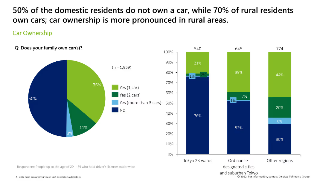
Features a pie chart on the left and three column charts on the right, displaying car ownership statistics across various regions.
Market Analysis and Trends
Consumer Goods
The slide details car ownership statistics, showing the percentage of domestic residents who own cars, with a focus on rural vs. urban areas.
car ownership, statistics, rural, urban, survey
Multiple Chart
Deloitte
Saved
Features a pie chart showing the 2020 market share of brake and fuel lines, with TI Fluid Systems highlighted as the market leader. Accompanying text provides additional context on market positioning and relationships with OEMs.
Market Analysis and Trends
Industrial & Manufacturing
This slide analyzes the market share for brake and fuel lines, showcasing TI Fluid Systems' leading position and their sustained dominance over a decade, attributed to strong global OEM relationships.
market share, OEM, automotive, 2020, pie chart
Mixed Chart
Deutsche Bank
Saved
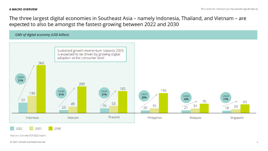
Column chart comparing GMV of digital economies in Indonesia, Vietnam, Thailand, Philippines, Malaysia, and Singapore for 2022, 2025, and 2030.
Market Analysis and Trends
Technology & Software
This slide compares the digital economies of Southeast Asian countries, projecting growth in GMV. It highlights the fastest-growing digital markets, providing valuable insights for investors and businesses.
digital economies, Southeast Asia, growth, projections
Single Chart
Deloitte
Saved
Column charts comparing the share of deals involving strategic vs. financial investors in the T&L sector.
Investment Analysis
Transportation & Logistics
Analyzes the role of strategic and financial investors in shaping the transportation and logistics market.
Investors, Strategic, Financial, Transportation, Logistics, Deals, Market, Analysis
Mixed Chart
PwC/Strategy&
Saved
Column chart showing a slight increase from 5.1 to 5.2 between August 2021 and September 2022 in marketing leaders' effectiveness at demonstrating marketing's bottom-line impact to other C-suite members.
Customer and Market Segmentation
Professional Services
Discusses the effectiveness of marketing leaders in communicating the value of marketing strategies to other executives, showing a positive trend in their ability to link marketing efforts to company financials.
Marketing, Leadership, C-Suite, Communication, Bar Chart, Bottom-Line Impact, 2021-2022
Mixed Chart
Deloitte
Saved
Features icons and bullet points detailing specific AI investment areas and their impacts.
Strategic Planning
Technology & Software
Outlines how AI has been strategically utilized across various industries to optimize operations and enhance customer interactions.
AI Investment, Industry Optimization, Strategic Utilization, Customer Interaction, Operational Efficiency, AI Benefits
Table
BCG
Saved
Line and bar charts illustrating US nominal and real retail sales indexes and y/y percentage change in real personal consumer expenditures.
Market Analysis and Trends
Consumer Goods
Analyzes how consumer spending slowed at the start of the year due to cost fatigue and softer employment trends, projecting future moderation.
consumer spending, retail sales, personal expenditures, cost fatigue, employment trends, line chart, bar chart, US economy
Multiple Chart
EY
Saved
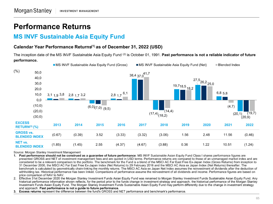
Column chart illustrating calendar year performance returns of the MS INVF Sustainable Asia Equity Fund.
Financial Performance
Financial Services
Highlights annual performance returns, comparing the fund's gross and net returns to a blended index from 2013 to 2022.
Annual, performance, returns, fund, equity
Mixed Chart
Morgan Stanley
Saved
Abstract blue design with pie charts showing statistics about leveraging worker data and readiness in the Nordics for various workforce strategies.
Organizational Structure and Change
Professional Services
Covers readiness to use worker data for mutual benefits and the readiness of organizations in the Nordics to address workforce ecosystems and worker agency.
Nordics, workforce, worker data, mutual benefits, organizational readiness, relationship
Multiple Chart
Deloitte
Saved
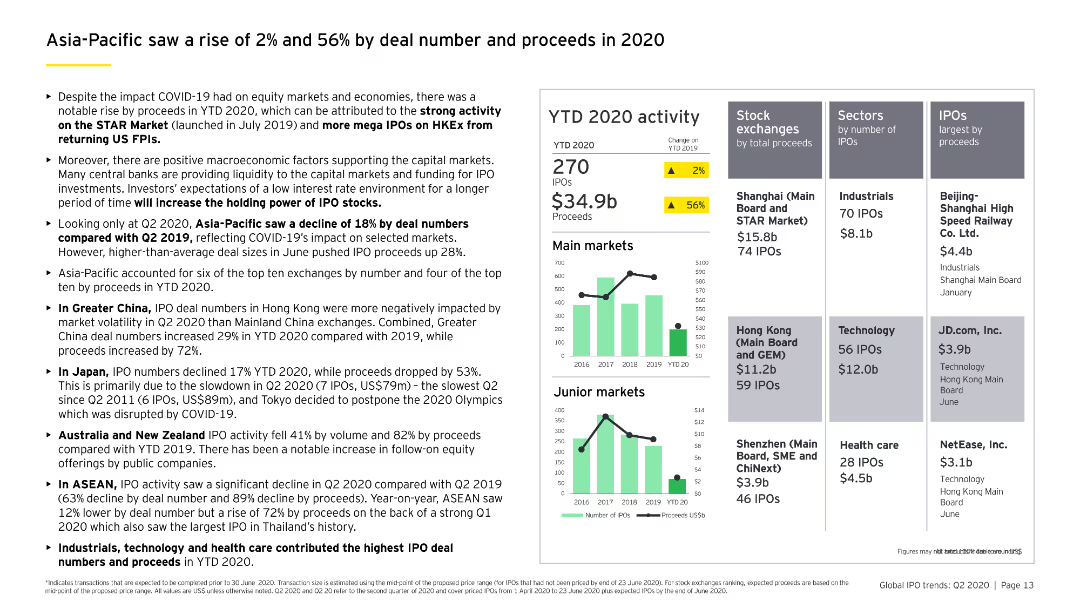
The slide features column charts comparing main and junior market IPO activities, highlighting the performance in Greater China, Japan, Australia, New Zealand, and ASEAN.
Market Analysis and Trends
Financial Services
Analyzes the Asia-Pacific IPO market's performance in 2020, noting increases in both deal numbers and proceeds, with detailed regional breakdowns.
Asia-Pacific, IPO growth, regional analysis, main market, junior market
Multiple Chart
EY
Saved
This slide features two pie charts illustrating different asset allocation strategies and a set of bar charts depicting their correlation with stocks and bonds.
Strategic Planning
Financial Services
Showcases alternative asset allocation models that balance performance with risk, pivotal for formulating a resilient investment strategy.
asset allocation, alternative investments, performance, risk management, pie charts, correlation analysis, strategy development
Multiple Chart
Morgan Stanley
Saved
This slide includes a comparative table chart analyzing credit card and auto loan risk metrics across various issuers. Metrics like 'Sub-Prime Mix' and '30+ DQs' are assessed. The use of a clean table layout with color highlights for Chase bank allows easy comparison of the data. There are also percentage points provided for quick insight into performance.
Risk Assessment and Management
Financial Services
Highlighting risk performance metrics in lending, this slide is key for financial analysts and investors, providing insight into credit risk and the bank's standing relative to industry peers. It serves as a base for discussions on risk management strategies, portfolio quality, and the health of the lending market, crucial for operational reviews and risk assessment meetings.
Credit Risk, Financial Analysis, Risk Management, Lending, Performance Metrics, Portfolio Quality, Market Health
Table
JP Morgan
Saved
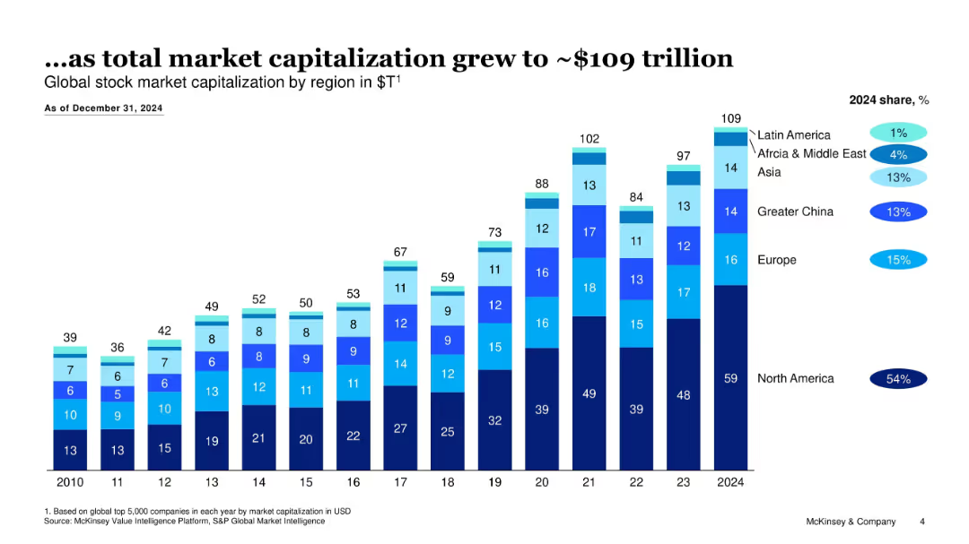
Stacked bar chart showing regional market cap in $T from 2010–2024 with share percentages
Market Analysis and Trends
Financial Services
Tracks growth in global stock market capitalization to $109T by 2024, with North America holding the majority share; visualizes regional contributions over time.
market cap, global stocks, regional share, financial growth, stock markets, valuation
Single Chart
McKinsey
Saved
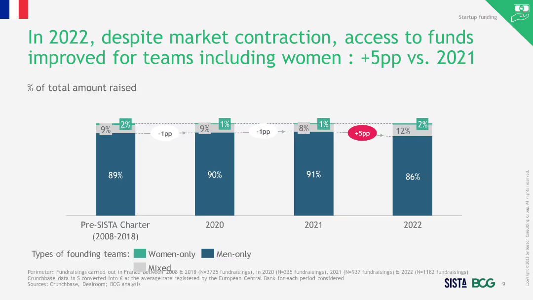
Column chart showing average amount of funds raised by different types of founding teams from 2008 to 2022, highlighting the funding gap for women.
Investment Analysis
Financial Services
The slide reveals that women-only teams received significantly less funding than men-only teams, with the gap increasing over the years.
funding gap, women-only teams, average funding, startups
Single Chart
BCG
Saved
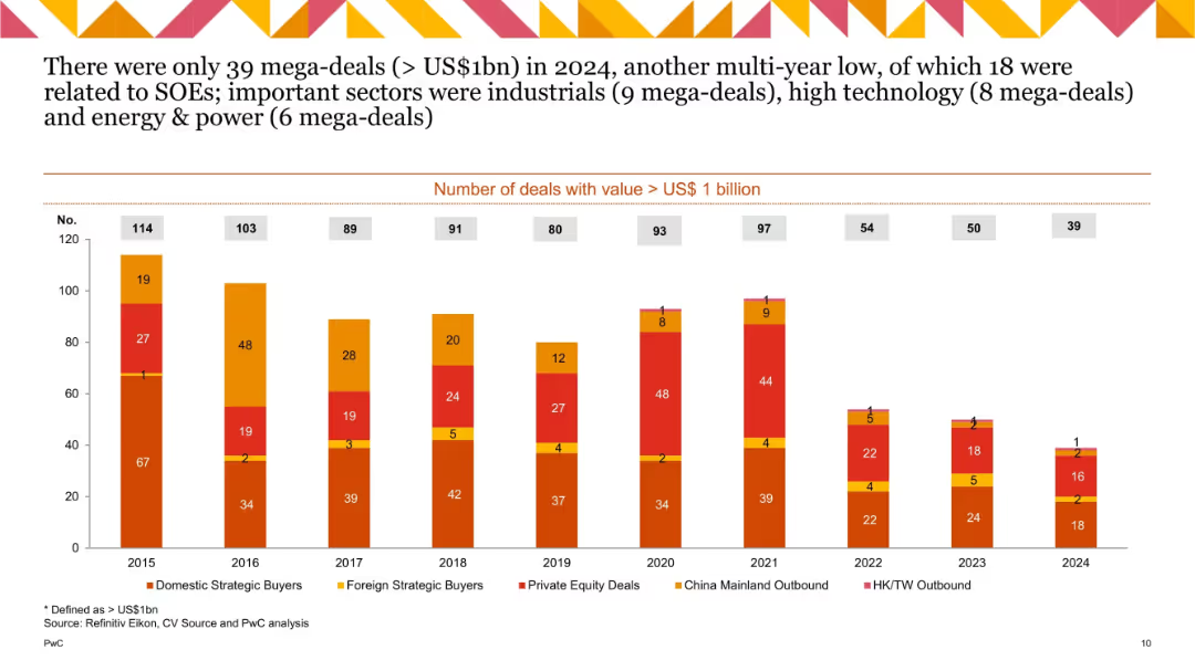
Stacked bar chart tracking number of mega-deals (> US$1bn) from 2015 to 2024 by buyer type; declining trend visible; segment colors match categories.
Performance Metrics and KPIs
Financial Services
Tracks annual number of mega-deals by type. 2024 saw only 39, the lowest in a decade. Industrial, technology, and energy sectors dominated. Many were state-owned enterprise-driven, reflecting weak private mega-deal activity.
mega-deals, US$1bn, deal count, strategic buyers, SOEs, sectors
Single Chart
PwC/Strategy&
Saved
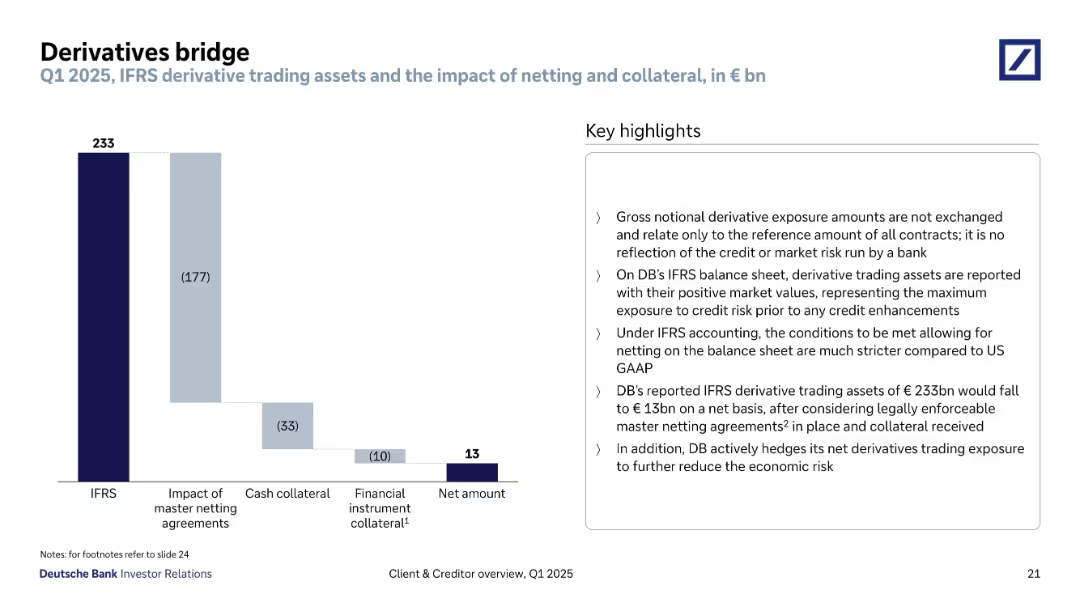
Waterfall chart showing IFRS gross to net amount reconciliation with right-aligned key highlights box. Clean layout with descending bars and annotations.
Risk Assessment and Management
Financial Services
Outlines Deutsche Bank’s derivative trading exposure under IFRS accounting rules. Highlights the effects of netting agreements and collateral on reducing the gross €233bn exposure to €13bn net, emphasizing reduced economic and credit risk.
derivatives, IFRS, netting, exposure, collateral, risk mitigation
Mixed Chart
Deutsche Bank
Saved
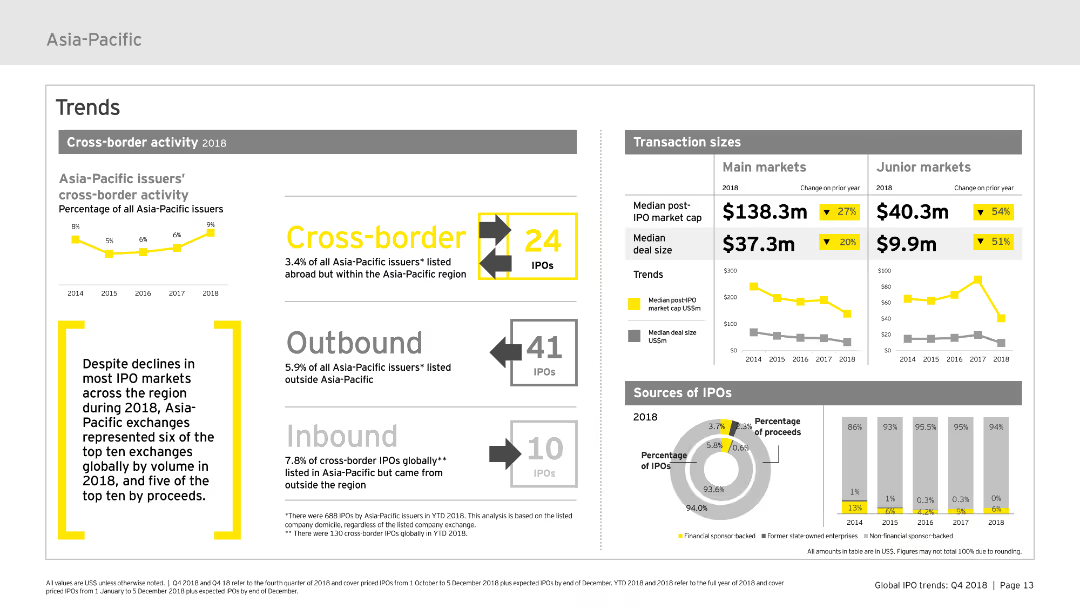
Features various charts and infographics focusing on cross-border activity within the Asia-Pacific IPO market. It uses bar charts to illustrate transaction sizes and sources of IPOs, along with textual highlights to provide context. The layout is clear, designed to show trends effectively.
Market Analysis and Trends
Financial Services
Analyzes the cross-border IPO activities in the Asia-Pacific region for 2018, detailing transaction sizes and the origins and destinations of IPOs. It highlights key trends and changes over the year.
cross-border, IPO, transaction sizes, trends, Asia-Pacific
Multiple Chart
EY
Saved
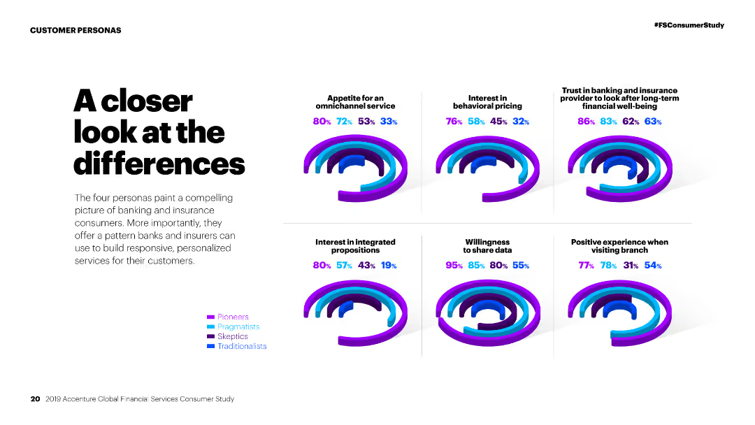
Column charts comparing personas on various factors like omnichannel service, behavioral pricing, and willingness to share data.
Competitive Landscape
Financial Services
Comparison of different customer personas in financial services, analyzing their preferences and behaviors towards various service aspects.
Personas, financial services, comparison, omnichannel service, behavioral pricing, data sharing, customer preferences, market study, segmentation
Multiple Chart
Accenture
Saved
This slide features a bar chart with horizontal bars showing the percentage of Millennials and Gen Z who agree with various statements about the pandemic's impact on their sense of responsibility. It includes text analysis on the left side.
Market Analysis and Trends
Environmental Services & Sustainability
The slide discusses how the pandemic has increased Millennials' and Gen Z's empathy and eagerness to positively impact their communities. The bar chart visualizes the survey responses, showing high levels of agreement on increased individual responsibility and community-focused actions post-pandemic.
Responsibility, Pandemic, Community, Empathy, Survey
Mixed Chart
Deloitte
Saved
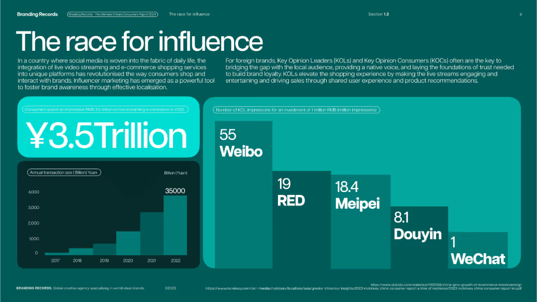
Teal-green layout with bar and stacked charts; large figure in center with visual emphasis.
Strategic Planning
Media & Entertainment
Illustrates the rise of influencer marketing and live-streaming commerce in China, with ¥3.5 trillion spent in 2022. Charts include annual transaction volume growth and KOL impressions by platform.
influencer marketing, KOLs, live-streaming, Weibo, RED, Meipei, Douyin, social commerce
Multiple Chart
McKinsey
Saved
Consists of a column chart showing job satisfaction levels (dissatisfied, neutral, satisfied) in France compared to a general view, using shades of green and grey.
Market Analysis and Trends
Professional Services
Discusses job satisfaction trends among deskless workers in France relative to other countries, useful for comparative market analysis in HR.
job satisfaction, France, comparison, deskless workers, column chart
Multiple Chart
BCG
Saved
The slide features a column chart with bold red background with multiple circular and linear elements indicating various stages and changes in the personal luxury goods market from 1996 to 2017. Various periods are marked such as "Sortie du Temple," "Democratization," "Crisis," "Chinese Bulimia," and "Reboot."
Market Analysis and Trends
Consumer Goods
This slide presents the growth trajectory and critical transformations in the personal luxury goods market, emphasizing shifts during different economic periods and their impact on market values, especially highlighting the "Reboot" phase starting in 2015 leading to a new normal in 2017.
luxury goods, market analysis, growth, crisis, Chinese market
Single Chart
Bain
Saved
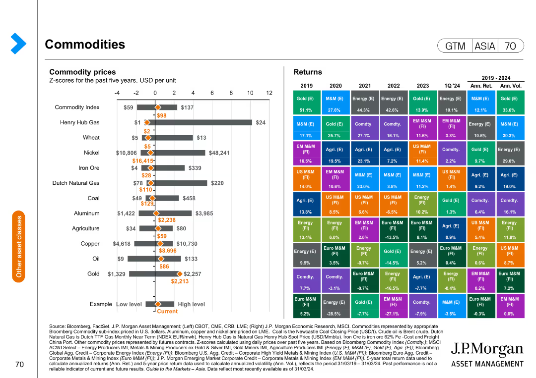
The slide contains a mixed chart with a horizontal bar chart on the left showing commodity prices and a matrix on the right displaying annual returns by commodity type from 2019 to 2024.
Market Analysis and Trends
Energy & Utilities
This slide compares commodity prices and historical returns, providing insights into market trends and performance across different commodity types.
commodity prices, market trends, historical returns, performance analysis, energy
Mixed Chart
JP Morgan
Saved
Includes column charts comparing Barclays' service distribution with major US banks and showcasing investment in high-growth sectors.
Strategic Planning
Financial Services
Strategically planning to rebalance service offerings towards Equity Capital Markets (ECM) and Advisory services, targeting high-growth areas like technology.
ECM, advisory, strategic planning, investment, high-growth
Multiple Chart
Barclays
Saved
Previous
Next
If nothing, comes up, please save your slides first
Create a FREE account to continue browsing
Receive Instant Access to 1,000+ slides from companies like McKinsey, Google, and Goldman Sachs
First Name
Last Name
Email
Password
I agree to all
Terms & Privacy Policy
Thank you! Your submission has been received!
Oops! Something went wrong while submitting the form.
Have an account?
Sign in
Column Chart
Heatmap
Chevron
Org Chart
Infographic
Callouts
Timeline
List
Graphic
Picture
Process Flow
Diagram
Paragraph
Map
Table
Framework
Subtitle
Takeaway Box
Icon
Other Chart
Radar Chart
Waterfall Chart
Mekko Chart
Pie Chart
Scatter Plot
Line Chart
Bar chart
Bullet points