Create a FREE Account
Instant access to 1,000+ real slides from top companies like McKinsey, BCG, Goldman Sachs, Google and many more!
First Name
Last Name
Email
Password
I agree to all
Terms & Privacy Policy
Thank you! Your submission has been received!
Oops! Something went wrong while submitting the form.
Have an account?
Sign in
Library
Templates
Courses
Pricing
My Account
My Slides
My Templates
✦ AI
AI Prompt Library
AI Search
Sign in
Start Here
Logout
My Saved Slides
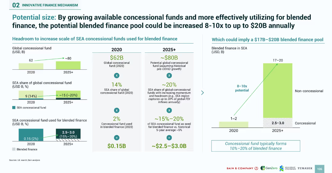
Infographic with bar charts and equations showing potential scale-up of concessional funds in SEA. Highlights 8–10x increase opportunity for blended finance.
Investment Analysis
Financial Services
Illustrates the opportunity to scale SEA concessional funds for blended finance from $0.15B in 2020 to potentially $2.5–$3B post-2025, implying a $17B–$20B blended finance pool. Uses projections based on increased SEA share of global concessional funds. Shows visual relationships between concessional and non-concessional finance pools.
concessional funds, blended finance, SEA, investment scale, projections, financial mechanisms, global fund share
Multiple Chart
Bain
Saved
Column charts comparing growth in brand building and CRM spending over several time points.
Strategic Planning
Professional Services
Discusses the trends in brand and CRM spending, noting a return to pre-Covid spending levels with a focus on brand investment over CRM. Useful for marketing strategy adjustments and budget allocation.
brand, CRM, spending, covid, trends, marketing, strategy, budget
Single Chart
Deloitte
Saved
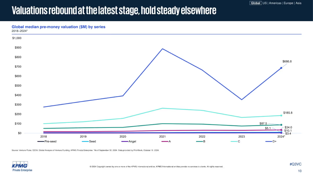
Line chart similar in style to previous, plotting median pre-money valuations across funding series; D+ shows significant increase in 2024; uses same visual and color scheme.
Investment Analysis
Financial Services
The slide displays median pre-money valuations across venture funding series from 2018 to 2024, showing that while early and mid-stage valuations are flat, late-stage valuations (Series D+) have seen a strong recovery. It emphasizes how later-stage optimism is rebounding first.
startup valuation, venture capital, pre-money, funding stages, D+ recovery, series B, investment climate, 2024, KPMG, VC metrics
Single Chart
KPMG
Saved
The slide features two column charts categorized by business line and account size, utilizing purple and yellow color schemes.
Technology and Digital Transformation
Financial Services
It assesses the utilization of automation and robotics across different business lines and account sizes for underwriting tasks.
automation, robotics, business lines, account size, chart
Mixed Chart
Accenture
Saved
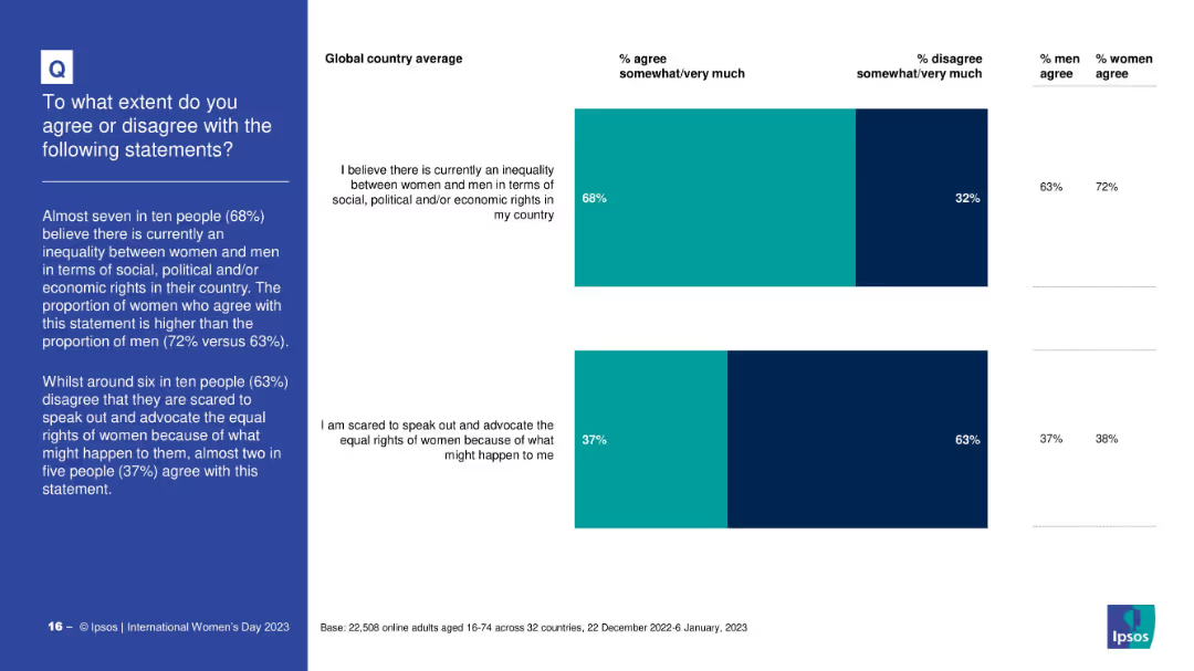
Two stacked bar graphs with global averages; bold sidebar text; compares agreement/disagreement on inequality and fear of advocating for women’s rights
Market Analysis and Trends
Professional Services
The slide features two questions: belief in current gender inequality, and fear of advocating women's rights. It shows global agreement and disagreement rates, along with gender differences in perceptions.
gender inequality, advocacy, fear, rights, global average, survey, social justice, Ipsos
Mixed Chart
IPSOS
Saved
Line charts illustrating AAA muni-to-treasury yield ratios and credit quality spreads vs. AAA over time.
Market Analysis and Trends
Financial Services
Provides updates on municipal bond market, focusing on yield ratios and credit quality spreads for different time frames.
Municipal Bonds, Yield Ratios, Credit Quality, Market Update, Financial Analysis
Multiple Chart
Morgan Stanley
Saved
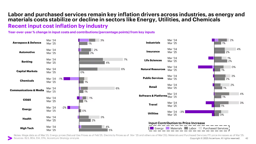
Horizontal bar chart segmented by industry and key cost drivers (Energy, Materials, Labor, Services); two bars per industry (Mar ‘24/’25)
Operational Efficiency
Industrial & Manufacturing
The slide details year-over-year changes in input costs for different industries as of March 2024 and March 2025. Key inflation drivers such as labor and purchased services remain dominant, while energy and materials costs have declined in sectors like Utilities, Chemicals, and Energy.
input costs, inflation, labor, services, industries, 2025, chemicals, utilities, manufacturing
Single Chart
Accenture
Saved
The slide contains pie charts showing the distribution of assets within the firm across different channels, using shades of blue and text annotations.
Operational Efficiency
Financial Services
Meant to illustrate how a firm manages and distributes its assets, highlighting the operational structure of asset management and wealth management.
Asset Distribution, Operational Structure, Asset Management, Wealth Management, Fee-Earning, Total Assets
Multiple Chart
Goldman Sachs
Saved
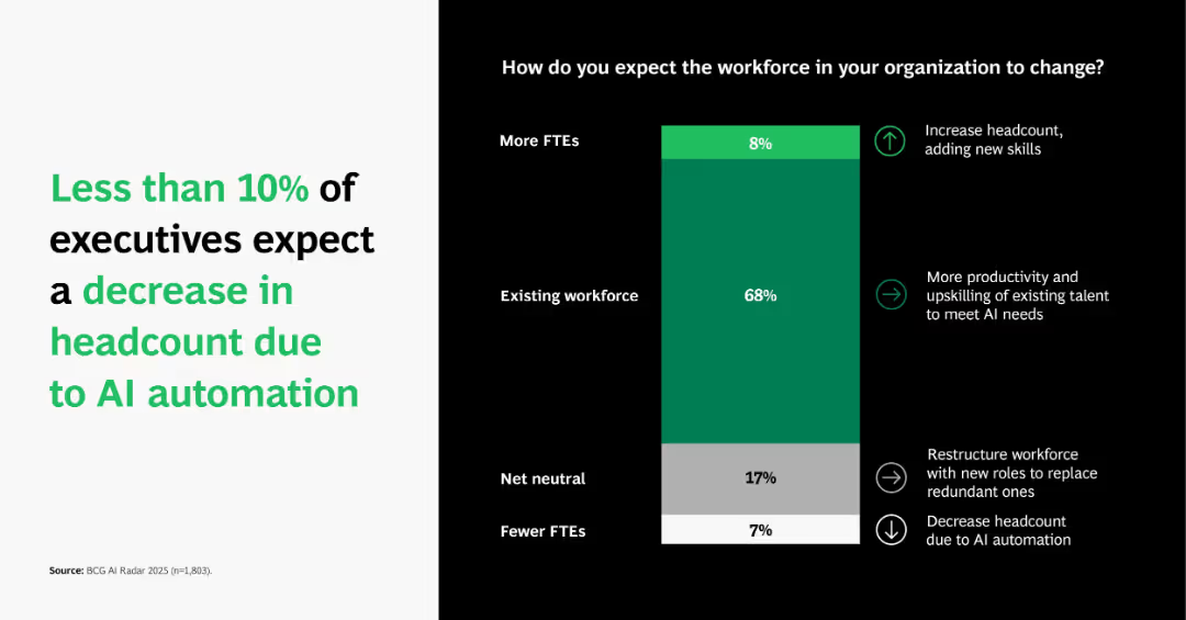
Vertical stacked bar showing workforce impact expectations (more, same, fewer FTEs) and reasons (e.g., upskilling, restructuring).
Human Resources and Talent Management
Artificial Intelligence
Depicts that most executives anticipate productivity gains and upskilling from AI rather than job losses. Only 7% foresee reduced headcount, indicating confidence in AI’s augmentative role in workforce transformation.
workforce change, AI impact, employment trends, upskilling, FTE
Single Chart
BCG
Saved
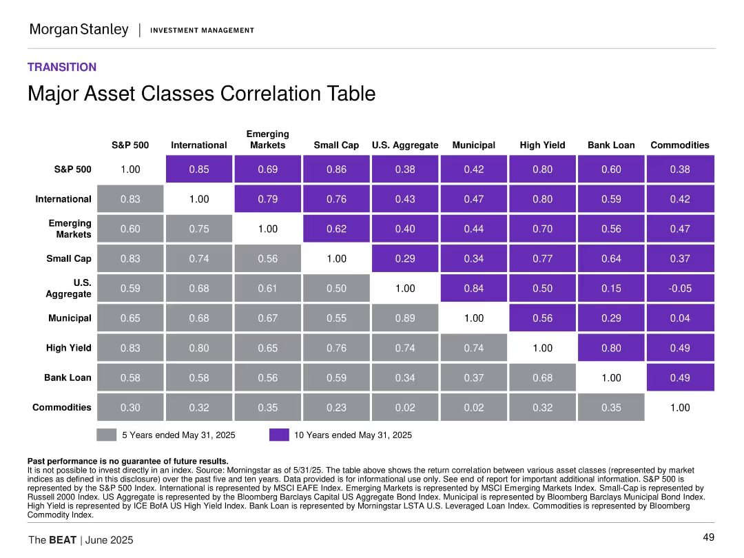
Matrix-style table of 5-year and 10-year correlations among asset classes with color-coding for correlation strength.
Investment Analysis
Financial Services
This slide presents a correlation matrix across major asset classes, revealing diversification benefits and co-movement trends. It shows strong correlations among equities and weaker ties to commodities, helping to inform portfolio construction and risk mitigation.
asset class correlation, portfolio construction, diversification, equities, fixed income, commodities
Table
Morgan Stanley
Saved
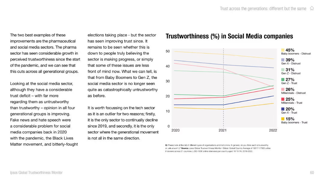
Text-heavy left side with analysis; right side contains a line chart showing trust/distrust by generation.
Market Analysis and Trends
Media & Entertainment
The slide outlines how public trust in social media companies has improved post-2020 across all generations, although overall levels of trust remain low, especially among older groups.
social media, trust trends, fake news, generational views, Ipsos, Baby Boomers, Gen Z, misinformation, public opinion, sector trends
Mixed Chart
IPSOS
Saved
The slide features a mix of text and bar charts with segmented pie charts displaying data on respondents' functions and industries.
Operational Efficiency
Industrial & Manufacturing
The slide presents an overview of the Operations Efficiency Radar study, focusing on manufacturing and service providers, targeting functional heads.
Operations Efficiency, CFO, Manufacturing, Survey, Trends
Multiple Chart
Roland Berger
Saved
The slide contains multiple horizontal bar charts comparing the performance of various talent management aspects within an organization. It uses color gradients to represent different performance ratings from superior to deficient, labeled for easy interpretation.
Human Resources and Talent Management
Financial Services
Examines the performance of different talent management practices like recruitment, training, and succession planning in underwriting. Highlights areas needing improvement and those performing well, essential for HR strategy development in financial services.
talent management, underwriting, performance, HR, recruitment, training, succession planning
Single Chart
Accenture
Saved
This slide presents information with a mix of text and images. It focuses on forest conservation and built environment opportunities, noting government support and carbon services ecosystem.
Market Analysis and Trends
Real Estate & Construction
Explains why the built environment sector is appealing in Singapore, discussing strong government support, high population density, and the importance of green building technologies and carbon trading.
built environment, Singapore, carbon trading, green buildings
Header Horizontal
Bain
Saved
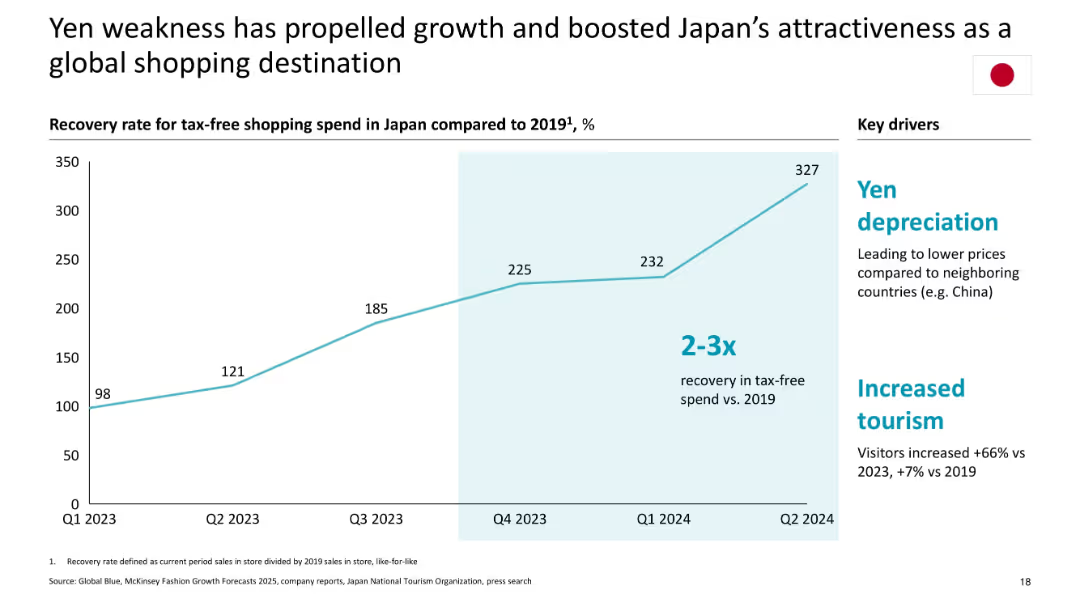
Single line graph tracking recovery in shopping spend; highlights drivers in a sidebar
Market Analysis and Trends
Consumer Goods
Illustrates Japan's rise in tax-free luxury shopping due to yen depreciation and increased tourism, showing a 2–3x recovery vs. 2019; growth backed by competitive pricing and travel surge.
Japan, yen depreciation, tax-free shopping, recovery, tourism, 2024 data, luxury retail
Mixed Chart
McKinsey
Saved
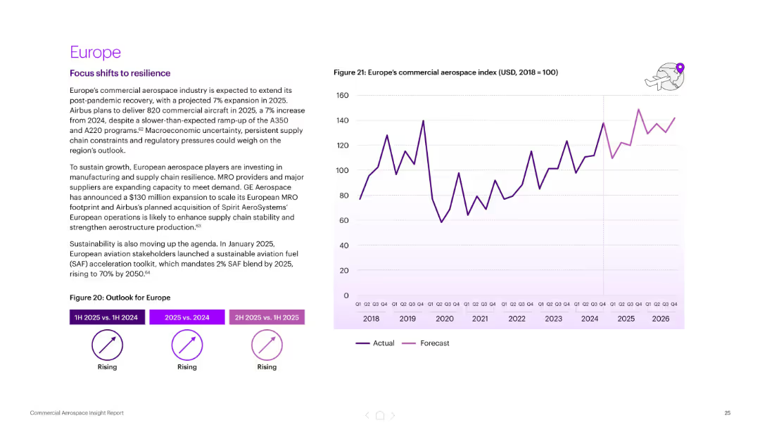
Text section on the left with growth summary; right side graph shows Europe’s aerospace index (2018–2026). Consistent with other regional slides.
Market Analysis and Trends
Industrial & Manufacturing
Forecasts a 7% growth in Europe’s aerospace sector for 2025. Highlights Airbus production targets, supply chain resilience investments, and the introduction of sustainability regulations (SAF blend targets).
Europe, aerospace growth, Airbus, supply chain resilience, sustainability, SAF, forecast, commercial aviation
Mixed Chart
Accenture
Saved
The slide features a detailed case study on biogas upgrading in China, covering the process description, key metrics, feedstock characteristics, and environmental performance. It includes a column chart showing biogas production by feedstock type in China for 2018.
Client Case Studies
Energy & Utilities
This slide examines the biogas upgrading process in China, detailing the conversion process, key metrics, feedstock characteristics, and environmental impacts associated with biogas production, highlighting its performance and deployment.
biogas upgrading, China, case study, process description, key metrics, feedstock characteristics, environmental performance
Multiple Chart
Kearney
Saved
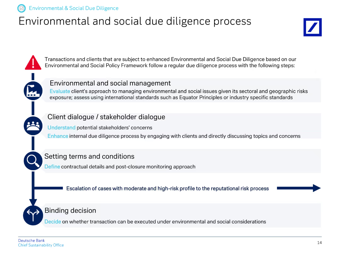
The slide presents a vertical flow chart outlining the steps in the environmental and social due diligence process.
Regulatory and Compliance
Financial Services
This slide explains the process for environmental and social due diligence, detailing steps from management to stakeholder dialogue, setting terms, and making binding decisions.
due diligence, environmental process, social process, stakeholder dialogue, terms and conditions, decision-making
Vertical Flow
Deutsche Bank
Saved
Pie chart showing the share of blockchain startups by country and a column chart projecting blockchain business value for different use cases from 2021 to 2030.
Technology and Digital Transformation
Technology & Software
The slide highlights the diverse applications of blockchain technology beyond cryptocurrencies, showcasing its use in various sectors. It includes data on the distribution of blockchain startups globally and projects the significant increase in business value derived from blockchain by 2030.
Blockchain, Startups, Business Value, Use Cases
Multiple Chart
Roland Berger
Saved
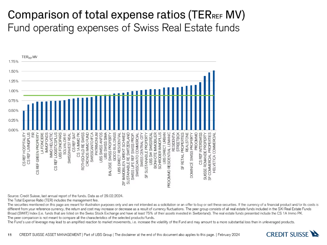
This slide features a column chart displaying the total expense ratios of various Swiss Real Estate funds. The chart uses vertical bars to represent each fund's TER_REF.
Financial Performance
Financial Services
The slide compares the operating expenses of different Swiss Real Estate funds, illustrating their total expense ratios. It helps in analyzing and comparing fund expenses.
expense ratios, Swiss Real Estate, funds, TER_REF, operating expenses
Single Chart
Credit Suisse
Saved
Contains multiple line graphs comparing the carbon intensity and emissions per capita for several countries, with projections for 2050 under current policies and ideal targets for a 2°C warming scenario. Each country's trajectory is marked distinctly.
Regulatory and Compliance
Environmental Services & Sustainability
Compares the carbon intensity and emissions per capita of key countries, projecting their future paths and comparing them to the required levels for meeting the 2°C warming limit. Highlights disparities in emissions intensity and the challenges different countries face in achieving climate goals.
Carbon intensity, Emissions, GDP, 2050, Country comparison
Single Chart
BCG
Saved
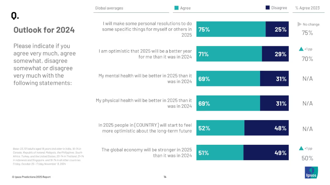
Stacked bar chart showing agreement vs disagreement with six future-focused statements about 2025, paired with 2023 % change.
Strategic Planning
Professional Services
This slide shows global agreement levels with positive expectations for 2025. Three-quarters plan personal resolutions, while 71% are optimistic about 2025 being better. Mental and physical health, economic strength, and long-term optimism are also assessed.
future planning, optimism, health outlook, economic forecast, mental health, public attitudes
Mixed Chart
IPSOS
Saved
Includes maps and column charts detailing school connectivity and population distribution across Indonesian regions. Color gradations indicate connectivity levels and population densities, with annotations providing regional data and trends.
Market Analysis and Trends
Education & Training
Details the disparity in school connectivity across Indonesia, with a focus on Sumatra's lag in internet access despite high connectivity in more populated regions like Java. Discusses the implications for educational equity and digital access.
school connectivity, internet access, regional disparity, Sumatra, Java
Multiple Chart
BCG
Saved
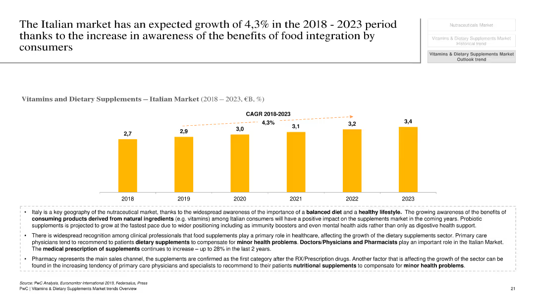
This slide features a column chart showing the growth of the Italian vitamins and dietary supplements market from 2018 to 2023, with a projected CAGR of 4.3%. Text boxes below the chart provide additional context and factors driving this growth.
Market Analysis and Trends
Healthcare & Pharmaceuticals
The slide presents the growth forecast for the Italian market for vitamins and dietary supplements, highlighting the projected CAGR and key factors contributing to this growth. It emphasizes the impact of increased consumer awareness and the role of healthcare professionals in recommending supplements.
Italian market, vitamins, dietary supplements, growth forecast, consumer awareness
Mixed Chart
PwC/Strategy&
Saved
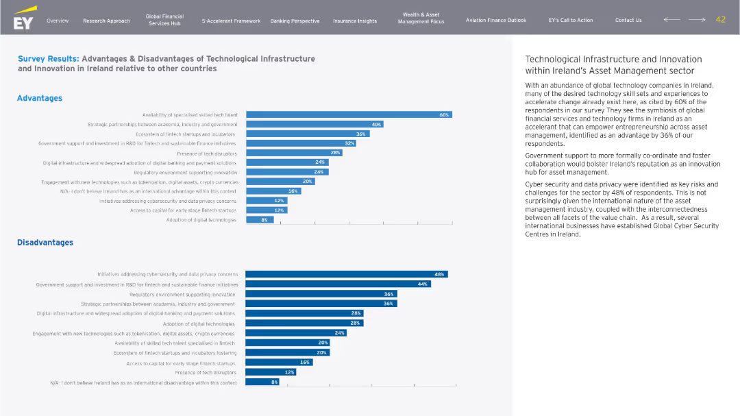
Two horizontal bar charts (Advantages and Disadvantages) on left, descriptive text on right. Blue and grey tones, structured data layout, EY branding.
Market Analysis and Trends
Financial Services
The slide compares perceived advantages and disadvantages of Ireland’s technological infrastructure for asset management, highlighting strengths like skilled talent and innovation, and weaknesses in cybersecurity and data privacy.
Ireland, tech infrastructure, asset management, advantages, disadvantages, innovation
Multiple Chart
EY
Saved
Previous
Next
If nothing, comes up, please save your slides first
Create a FREE account to continue browsing
Receive Instant Access to 1,000+ slides from companies like McKinsey, Google, and Goldman Sachs
First Name
Last Name
Email
Password
I agree to all
Terms & Privacy Policy
Thank you! Your submission has been received!
Oops! Something went wrong while submitting the form.
Have an account?
Sign in
Column Chart
Heatmap
Chevron
Org Chart
Infographic
Callouts
Timeline
List
Graphic
Picture
Process Flow
Diagram
Paragraph
Map
Table
Framework
Subtitle
Takeaway Box
Icon
Other Chart
Radar Chart
Waterfall Chart
Mekko Chart
Pie Chart
Scatter Plot
Line Chart
Bar chart
Bullet points