Create a FREE Account
Instant access to 1,000+ real slides from top companies like McKinsey, BCG, Goldman Sachs, Google and many more!
First Name
Last Name
Email
Password
I agree to all
Terms & Privacy Policy
Thank you! Your submission has been received!
Oops! Something went wrong while submitting the form.
Have an account?
Sign in
Library
Templates
Courses
Pricing
My Account
My Slides
My Templates
✦ AI
AI Prompt Library
AI Search
Sign in
Start Here
Logout
My Saved Slides
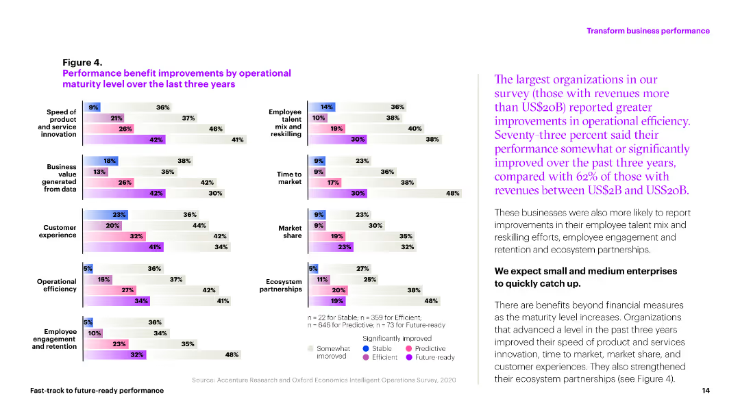
The slide includes multiple column charts showing performance improvements in various operational metrics over three years. Colors differentiate levels of improvement across categories like market share and efficiency.
Operational Efficiency
Professional Services
This slide illustrates the operational improvements achieved by organizations in areas like customer experience, market share, and operational efficiency over the past three years.
performance, improvements, metrics, efficiency, market share
Multiple Chart
Accenture
Saved
This slide has a column chart with vertical bars comparing percentages across countries for two years. It includes text blocks explaining context and survey data.
Market Analysis and Trends
Financial Services
The slide displays CEO growth ambitions outside their home markets, showing a trend of declining certainty. It illustrates the markets considered for expansion, hinting at strategic business development and market analysis.
CEOs, Growth, Expansion, Market, Survey, Ambitions, Uncertainty, Investment, Comparison
Mixed Chart
PwC/Strategy&
Saved
The slide features three vertical column charts comparing net new money, deposits in wealth management, and deposits in Swiss businesses.
Financial Performance
Financial Services
This slide presents data on client confidence, showcasing net new money and deposits across various sectors in Q3 2023.
client confidence, net new money, wealth management, Swiss businesses, deposits
Multiple Chart
UBS
Saved
A graphical timeline illustrating significant ESG milestones from pre-2020 to 2024, marked with icons and brief descriptions of each achievement.
Strategic Planning
Financial Services
Outlines Barclays' progression in ESG initiatives over several years, demonstrating commitments like joining the Paris Pledge and setting new financing restrictions.
ESG, sustainability, strategic milestones, climate action, corporate responsibility, green financing
Linear Flow
Barclays
Saved
The slide contains vertical column charts in green shades, depicting the different sources from which students seek advice for college choice, comparing first-gen and others.
Human Resources and Talent Management
Education & Training
Analyzes the sources from which different types of students seek advice when choosing a college, highlighting reliance on external organizations by first-gen students.
advice, college choice, first-gen, networks, support
Multiple Chart
BCG
Saved
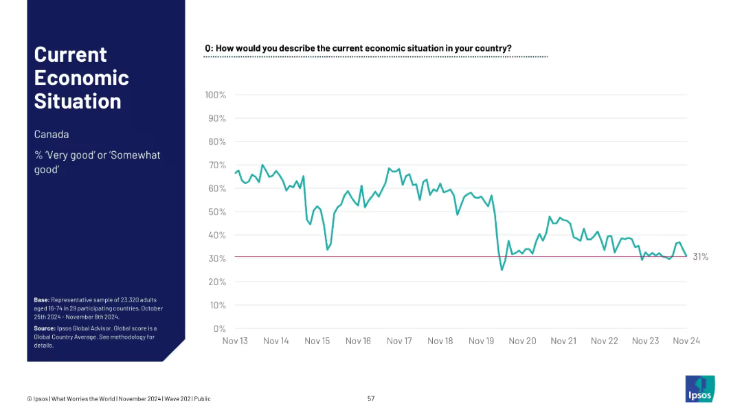
Single-country (Canada) line chart tracking positive economic sentiment since 2013; ends at 31%.
Financial Performance
Financial Services
Tracks Canadian public sentiment on the economy from 2013–2024. After high early optimism, sentiment declines and stabilizes below 40%, reflecting shifting economic realities such as inflation, housing, and employment factors.
Canada, economic trend, financial sentiment, Ipsos, time series, public opinion, macroeconomy, national outlook
Single Chart
IPSOS
Saved
Includes bar charts and comparative data blocks across various wellbeing categories, using contrasting colors to highlight differences between regional and national impacts.
Market Analysis and Trends
Telecommunications
Compares the wellbeing impacts of the nbn network on users in regional and remote areas to the national average, showing broadly similar benefits across key life aspects.
nbn, Wellbeing, Regional, Remote, Comparison
Multiple Chart
Accenture
Saved
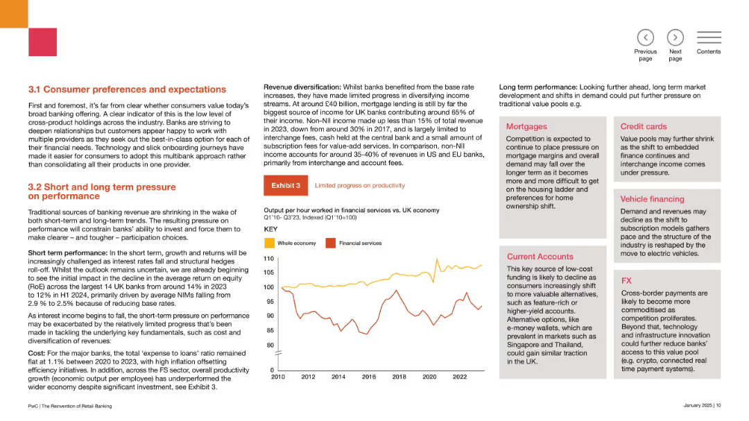
Two-column layout with bold orange headers, a line chart labeled “Exhibit 3” in the center right.
Market Analysis and Trends
Financial Services
This slide discusses changing consumer behaviors in banking, including preference for multi-bank relationships, lower product bundling, and impacts on revenue diversification. It highlights short- and long-term pressures on banks, especially around profitability.
banking trends, consumer behavior, revenue diversification, expectations, fintech, non-interest income, margins, RoE, productivity, participation
Mixed Chart
PwC/Strategy&
Saved
Divided into three columns: Technological evolution, Operating model re-invention, Macro-transformation, each with bullet points and associated icons.
Market Analysis and Trends
Technology & Software
Examines how evolving customer needs and macro shifts are driving technological advances and changes in operating models in the high-tech industry.
technology, customer needs, macro shifts, high-tech, innovation, operating models
Table
Accenture
Saved
Lists financial metrics and performance highlights for different regions.
Financial Performance
Financial Services
Summarizes regional performance in wealth management, noting high client engagement and income growth.
regional performance, client engagement, income growth, wealth management, financial metrics
Multiple Chart
UBS
Saved
Features a prominent blue graph illustrating the distribution of cash buffer days for small businesses, set against a white and light gray background.
Financial Performance
Government & Public Sector
This slide visually presents data on cash reserves in small businesses, indicating a generally low margin for error against financial shocks.
small businesses, cash reserves, financial analysis, cash buffer, economic shock
Single Chart
McKinsey
Saved
Features a series of column chart representing provisions for credit losses over several quarters. Each bar is annotated with figures for quick comparison, and key points are summarized on the side.
Risk Assessment and Management
Financial Services
This slide focuses on the quarterly provisions for credit losses, offering a detailed view of financial health and risk management strategies. It highlights trends and provides insights into the effectiveness of risk management practices within the financial sector.
credit losses, financial, risk management, trends, quarterly
Mixed Chart
Deutsche Bank
Saved
Two-column layout with textual content on the left and a table comparing FY20 and FY21 guidance on the right. Shades of gray and blue are used for text and table elements respectively.
Financial Performance
Financial Services
Details fiscal updates, affirms segment profit guidance, and indicates an increase in NPAT guidance. It's a deep dive into financial adjustments, explaining changes in projections with a focus on integration and transition costs.
NPAT, Segment Profit, Guidance, ETR, ROIC
Mixed Chart
Goldman Sachs
Saved
This slide has pie charts showing radio usage at home versus away from home, along with bar graphs indicating locations of out-of-home listening.
Market Analysis and Trends
Media & Entertainment
The slide depicts consumer radio usage patterns, highlighting the significant amount of radio listening that occurs away from home, especially in cars, supported by relevant statistics.
radio usage, out-of-home, pie charts, bar graphs, listening locations
Multiple Chart
Nielsen
Saved
The slide features a dark theme and includes a multi-layered area chart showing transaction volumes across several years, along with key financial statistics.
Market Analysis and Trends
Financial Services
This slide analyzes the merchant point-of-sale lending market, focusing on home improvement franchises, and visualizes transaction volume trends.
point-of-sale lending, home improvement, merchant network, transaction volume, financial statistics, FICO score, portfolio
Mixed Chart
Goldman Sachs
Saved
The slide contains several horizontal bar graphs displaying percentage ratings of different underwriting solutions. Color gradients from purple to pink are used.
Operational Efficiency
Financial Services
This slide evaluates various underwriting solutions used today in organizations to improve process efficiency.
underwriting, automation, efficiency, bar graph, solutions
Single Chart
Accenture
Saved
A bar graph with a horizontal layout shows the percentage of investors' change in risk preference due to increased inflation. It includes a sidebar with notable changes in investing practices. The visual elements are detailed, utilizing contrasting colors to highlight changes over time.
Market Analysis and Trends
Financial Services
Illustrates a shift in investors' risk preferences in response to inflation, highlighting an increase in risk aversion and changes in investment practices. Can be used to discuss investment strategies and market behavior.
Investor Behavior, Risk Aversion, Inflation Impact, Investment Strategies, Market Trends, Risk Management, Cash Holdings, Asset Classes, Portfolio Management, Value Investing
Multiple Chart
BCG
Saved
The slide contains multiple column charts comparing podcast ad revenue percentage shares by industry from 2020 to 2021, with a detailed list of industries and their contributions.
Market Analysis and Trends
Media & Entertainment
Analyzes the distribution of podcast ad revenues across different industries, noting a significant increase in the 'Other' category over two years.
Podcast, Advertising, Revenue, Trends, Industries
Single Chart
PwC/Strategy&
Saved
This slide displays a combination of column charts and line graphs in a blue and white color palette, projecting the growth of the Philippines' digital economy, specifically highlighting e-commerce, transport & food, online travel, and online media sectors. Each sector's growth trajectory from 2021 to 2030 is clearly shown, with annotations for compounded annual growth rates (CAGR).
Market Analysis and Trends
Retail & E-commerce
This slide analyzes the anticipated growth of the digital economy in the Philippines, with a projection of reaching approximately $35 billion by 2025, driven by e-commerce. It serves as an analytical tool for market researchers, strategists, and business development professionals to identify trends and investment opportunities within the digital marketplace of the Philippines.
Philippines, Digital Economy, E-commerce, Growth, Projection, CAGR, Online Travel, Media, Transport
Multiple Chart
Bain
Saved
Features a line graph charting the projected recovery of global luxury markets from 2010 to 2025, focusing on personal and experience-based goods. The slide includes future predictions with visual markers for expected recovery timelines.
Market Analysis and Trends
Consumer Goods
This slide forecasts the recovery trajectory of global luxury markets post-COVID-19, with a specific focus on the rebound of personal and experience-based luxury goods. It uses historical data to project future market recovery, providing a timeline and visual depiction of when various sectors might return to pre-pandemic levels.
recovery forecast, luxury markets, post-COVID, market projection, experience-based goods
Mixed Chart
Bain
Saved
A column graph with annotations displays the shift in venture deal mix by investment round, highlighting the movement away from early-stage funding.
Investment Analysis
Technology & Software
This slide analyzes changes in the investment round mix within the technology sector, pointing out a significant shift from early-stage Angel and Seed funding towards later-stage investments. It discusses the volatility and the strategic adjustments in venture capital allocations in response to market conditions and the startup ecosystem's evolution.
funding shift, Angel funding, Seed funding, investment rounds, venture capital
Single Chart
Oliver Wyman
Saved
This slide includes a column chart on the left showing contributions to global oil production by country and a line chart on the right showing U.S. crude oil inventories and rig count.
Market Analysis and Trends
Energy & Utilities
It presents data on global oil supply and U.S. crude oil inventories, useful for understanding supply dynamics and market trends in the oil industry.
oil supply, global production, crude oil, inventories, rig count
Multiple Chart
JP Morgan
Saved
Dual panel layout with a large image on the left and a series of bar charts on the right detailing dissatisfaction metrics by generation.
Market Analysis and Trends
Healthcare & Pharmaceuticals
Highlights younger consumers' dissatisfaction with traditional healthcare aspects, including treatment effectiveness and appointment convenience. Used for market analysis.
consumers, dissatisfaction, healthcare, trends, generations
Multiple Chart
Accenture
Saved
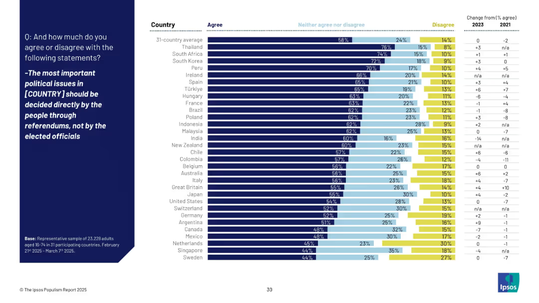
Bar chart ranked by agreement with the statement advocating for referendums over elected officials’ decisions; changes from 2021 are included.
Market Analysis and Trends
Government & Public Sector
This visual shows support for direct democracy (referendums) across countries. Thailand, South Africa, and South Korea have high support, while Sweden and Singapore are lower. Japan sits at 55% agreement.
direct democracy, referendums, political issues, public opinion, Ipsos, governance, 2025, participation, elite
Mixed Chart
IPSOS
Saved
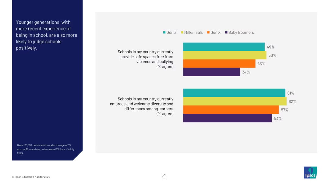
Two horizontal bar charts comparing Gen Z, Millennials, Gen X, and Boomers on school safety and diversity perceptions; color-coded by generation.
Market Analysis and Trends
Education & Training
This visual reveals generational differences in perceptions of school environments. Younger generations, especially Gen Z and Millennials, rate schools more positively than Gen X and Baby Boomers.
generational analysis, schools, diversity, education, safety, perceptions, Gen Z, Millennials, comparison
Mixed Chart
IPSOS
Saved
Previous
Next
If nothing, comes up, please save your slides first
Create a FREE account to continue browsing
Receive Instant Access to 1,000+ slides from companies like McKinsey, Google, and Goldman Sachs
First Name
Last Name
Email
Password
I agree to all
Terms & Privacy Policy
Thank you! Your submission has been received!
Oops! Something went wrong while submitting the form.
Have an account?
Sign in
Column Chart
Heatmap
Chevron
Org Chart
Infographic
Callouts
Timeline
List
Graphic
Picture
Process Flow
Diagram
Paragraph
Map
Table
Framework
Subtitle
Takeaway Box
Icon
Other Chart
Radar Chart
Waterfall Chart
Mekko Chart
Pie Chart
Scatter Plot
Line Chart
Bar chart
Bullet points