My Account
My Slides
Search by Category
Companies
Slide Type
Use Case
Industry
Pricing
Templates
View All Templates
Download Template Slides
✦ AI
AI Prompt Library
AI Search
Feedback
Login
Logout
Get Started
Browse all Slides
Browse all Slides
Create a FREE Account
Instant access to 1,000+ real slides from top companies like McKinsey, BCG, Goldman Sachs, Google and many more!
First Name
Last Name
Email
Password
I agree to all
Terms & Privacy Policy
Thank you! Your submission has been received!
Oops! Something went wrong while submitting the form.
Have an account?
Sign in
Saved Slides
The slide features a circular arrow diagram with three sections around a central rectangle labeled 'Goldman Sachs'. The sections are titled 'Culture of Risk Management', 'Process and Structural Oversight', and 'Continuous Improvement'.
Risk Assessment and Management
Financial Services
This slide presents the risk management strategy at Goldman Sachs, focusing on the continuous cycle of culture, process oversight, and improvement. It's suitable for discussions on corporate risk policies and institutional culture of risk.
Goldman Sachs, Risk Management, Culture, Process Oversight, Continuous Improvement
Linear Flow
Goldman Sachs
Saved
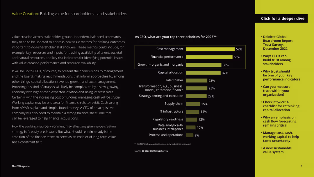
The layout includes a detailed paragraph on the left and a vertical column chart on the right. The text discusses priorities for CFOs in 2023, while the chart visualizes the top priorities.
Strategic Planning
Professional Services
The slide discusses the priorities of CFOs for the year 2023, focusing on cost management, financial performance, and growth, emphasizing the evolving role of CFOs in strategic decision-making.
priorities, CFOs, cost management, financial performance, growth, strategic planning, value creation, stakeholders, 2023
Mixed Chart
Deloitte
Saved
The slide shows a color-coded map of Europe highlighting various insurance companies' presence in multiple countries, accompanied by a list of company names per region.
Market Analysis and Trends
Financial Services
Provides a visual representation of insurance market presence across Europe, identifying key players in various countries to analyze market expansion and strategic positioning.
insurance market, Europe, company distribution, strategic analysis
Graphic
PwC/Strategy&
Saved
Column chart representing the dry powder of SEA funds over years with two key point bullets on the right. The background is white, and the text is predominantly blue and black.
Investment Analysis
Financial Services
Illustrates venture capital funds' remaining investment in the SEA region with $15B, emphasizing a continued but cautious approach amidst economic downturns.
venture capital, SEA, investment, economic downturn, dry powder, cautious approach, funding, startups
Mixed Chart
Bain
Saved
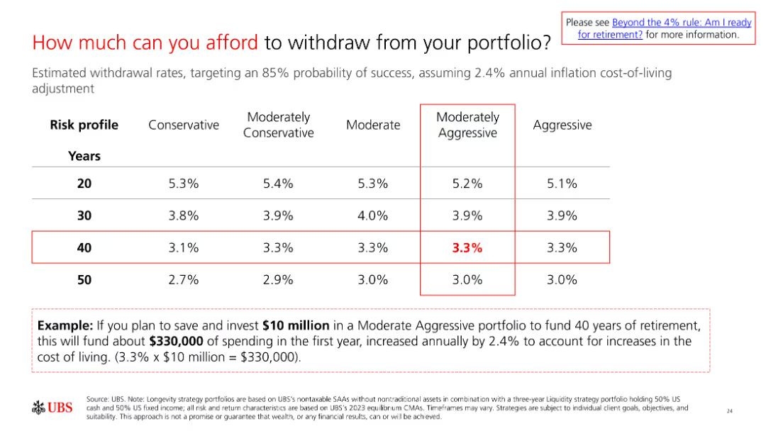
A slide with a table showing withdrawal rates for different risk profiles and time horizons. The example at the bottom illustrates how to apply the rates to determine affordable withdrawals.
Financial Performance
Financial Services
The slide explains how much individuals can afford to withdraw from their portfolios based on their risk profile and time horizon, with an example for clarity.
withdrawal rates, portfolio management, retirement planning, financial strategy, risk management
Table
UBS
Saved
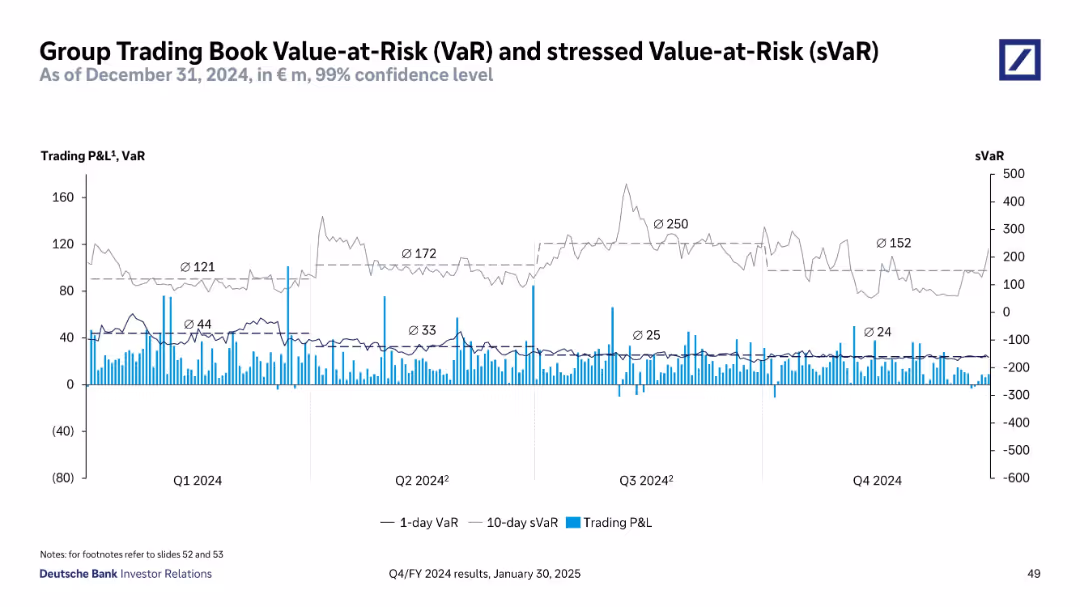
Line and bar chart with dual y-axes; light gray and dark gray lines for 1-day VaR and 10-day sVaR; blue bars for Trading P&L; four quarterly periods labeled
Risk Assessment and Management
Financial Services
This slide shows Deutsche Bank’s VaR and sVaR trends for 2024, illustrating daily risk metrics and profit/loss volatility. Quarterly averages highlight changes in risk exposure and stress scenarios.
VaR, sVaR, Trading P&L, risk metrics, 2024, volatility, confidence level, Deutsche Bank, quarterly trends, market risk
Single Chart
Deutsche Bank
Saved
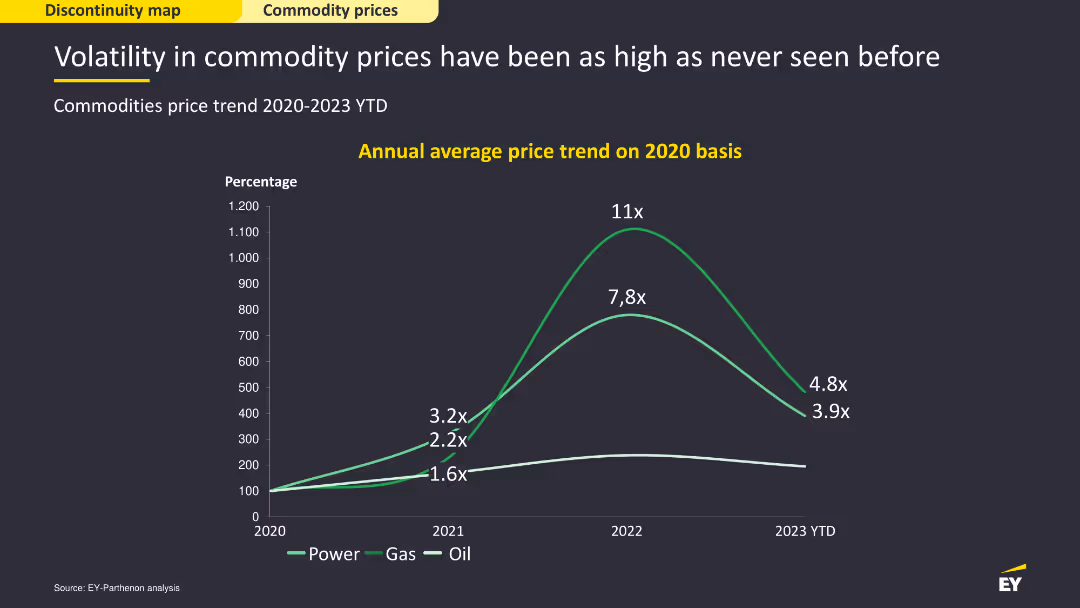
Line chart showing annual average price trends for power, gas, and oil on a 2020 basis from 2020-2023 YTD. Moderate complexity, effectively visualizing commodity price volatility over the years.
Market Analysis and Trends
Financial Services
This slide analyzes the volatility in commodity prices, particularly in power, gas, and oil. It discusses the trends in average prices from 2020 to 2023 YTD, highlighting the significant fluctuations in commodity markets.
Commodity prices, power, gas, oil, volatility
Single Chart
EY
Saved
Table with projects for delivery years and their values, client names. Column chart for net order book by segments. List of projects under execution. Company logo.
Operational Efficiency
Energy & Utilities
Details robust order book valued at ~$18B, upcoming project deliveries, and the segmentation of net order book. Used for showcasing financial strength and operational capacity.
order book, projects, net value, clients, execution, rigs, floaters, financial strength
Mixed Chart
Morgan Stanley
Saved
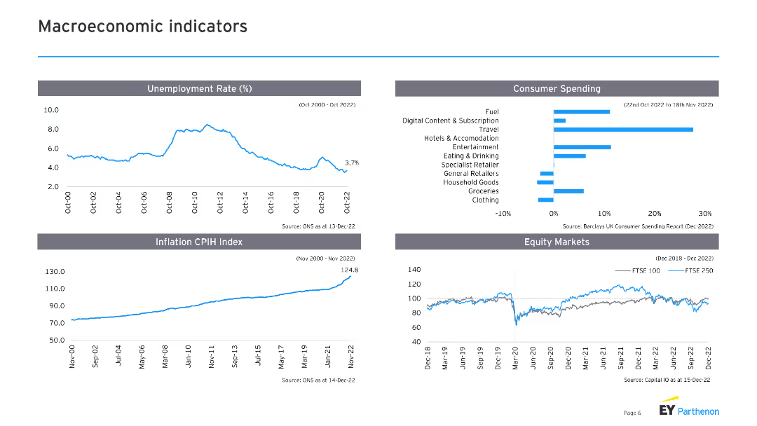
The slide includes four sections with line charts and column charts: unemployment rate, consumer spending, inflation CPIH index, and equity markets. Each chart has supporting text explaining the trends and data sources.
Market Analysis and Trends
Financial Services
This slide covers key macroeconomic indicators, including unemployment rates, consumer spending patterns, inflation trends, and equity market performance. It provides a comprehensive overview of the current economic landscape.
Macroeconomic indicators, unemployment, consumer spending, inflation, equity markets
Multiple Chart
EY
Saved
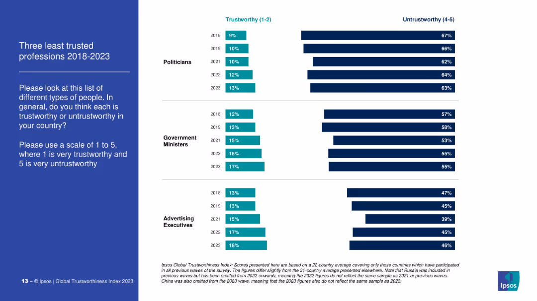
Dual bar chart comparing % of people who consider three professions (politicians, gov’t ministers, ad execs) trustworthy vs. untrustworthy from 2018 to 2023.
Market Analysis and Trends
Government & Public Sector
This slide examines public perception of the least trusted professions, contrasting the proportion of people rating them as trustworthy (1–2) and untrustworthy (4–5). Politicians are consistently ranked the lowest across all years.
distrust, politicians, government, advertising, perception, Ipsos, trust ranking, public opinion
Mixed Chart
IPSOS
Saved
Contains bar charts showing disparities between gender in workplace satisfaction and promotion rates.
Human Resources and Talent Management
Professional Services
Examines gender disparities in workplace outcomes, crucial for developing diversity and inclusion policies.
Gender Disparity, Workplace Equality, HR Practices, Diversity Policies, Inclusion Strategies
Single Chart
PwC/Strategy&
Saved
The slide presents a table with percentages showing alternative sites of care hospitals will invest in, such as diagnostic imaging centers and rural health clinics, across various countries.
Strategic Planning
Healthcare & Pharmaceuticals
The slide discusses the shift in hospital investment priorities post-COVID-19, with a focus on diagnostic imaging centers, rural health clinics, and skilled nursing facilities across different countries, reflecting changing healthcare dynamics.
COVID-19, hospital priorities, investment, care sites, global
Table
LEK
Saved
Features a line chart on battery price outlook and images of various battery types.
Financial Performance
Energy & Utilities
Details the expected decline in EV battery costs and market predictions up to 2030.
EV, battery cost, market forecast, lithium-ion, price decline
Mixed Chart
PwC/Strategy&
Saved
This slide displays column charts and world maps indicating improvements in market share across different regions and financial results from 2017 to 2021.
Market Analysis and Trends
Financial Services
This slide details JP Morgan's market share growth and financial outcomes across all business sectors and global regions from 2017 to 2021. It emphasizes their sustained expense management and operational leverage, contributing to their solid financial positioning in various markets.
market share, global, growth, financial
Multiple Chart
JP Morgan
Saved
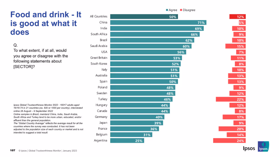
Similar bar chart design but covering the food and drink sector. Rankings by country on competence perception.
Product and Service Analysis
Consumer Goods
Surveys consumer confidence in the competence of the food and drink sector. China, India, and Brazil show high agreement that this sector performs well. Trust in product quality is central to the insights provided.
food industry, competence, trust, consumer perception, Ipsos, services
Mixed Chart
IPSOS
Saved
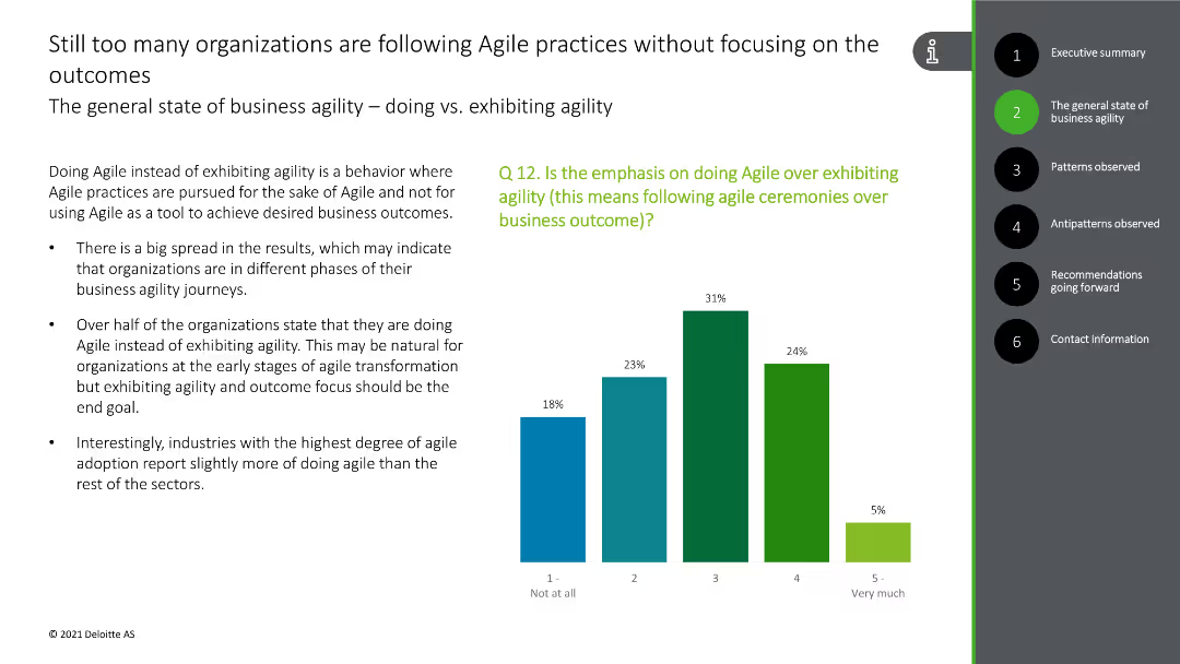
This slide contains a column chart showing the emphasis on following Agile ceremonies over outcomes, with green and blue bars.
Strategic Planning
Technology & Software
The slide discusses the focus on Agile practices rather than outcomes in many organizations, with survey data supporting this observation.
Agile practices, outcomes, focus, survey data, organizational behavior
Mixed Chart
Deloitte
Saved
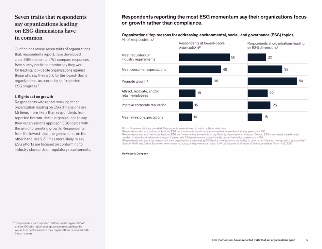
Two-column layout with narrative on the left and bar chart on the right comparing ESG motivations between top- and bottom-performing organizations.
Organizational Structure and Change
Professional Services
The slide reveals that organizations with strong ESG performance prioritize growth, unlike weaker performers who focus on compliance. A comparison chart illustrates differences in motivations—such as promoting growth, attracting talent, and improving reputation—between top and bottom ESG performers.
ESG leadership, strategic traits, growth vs. compliance, stakeholder engagement, sustainability traits, organizational performance
Mixed Chart
McKinsey
Saved
Features a stacked area chart for variant frequencies and a scatter plot comparing the antibody resistance of COVID-19 variants.
Regulatory and Compliance
Healthcare & Pharmaceuticals
Details the prevalence of COVID-19 variants and their implications on vaccine efficacy, stressing the need for continued vigilance.
COVID-19 variants, vaccine efficacy, public health, antibody resistance, variant tracking, health policy
Multiple Chart
BCG
Saved
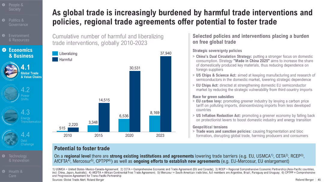
Bar chart tracking harmful vs liberalizing trade policies from 2010–2023; right sidebar with policy examples and regional efforts
Regulatory and Compliance
Financial Services
The slide examines the rise in harmful trade policies over time, far outpacing liberalizing measures. It attributes this to strategic sovereignty policies, green subsidies, and geopolitical tensions while suggesting that regional trade agreements could counteract these burdens.
trade policy, interventions, tariffs, liberalization, trade barriers, sovereignty, WTO
Mixed Chart
Roland Berger
Saved
This slide has two main sections. The left section features a column chart tracking deposit growth over two periods with arrows indicating changes. The right section contains two pie charts showing the composition of funding mix at two different points in time, illustrating a shift towards an even split between deposits and wholesale unsecured funding.
Market Analysis and Trends
Financial Services
It illustrates the growth trajectory of deposits and the evolving mix of unsecured funding, which can be instrumental for financial analysts or business strategists evaluating market trends and deposit strategies.
deposit growth, funding mix, bar chart, pie chart, market trend, financial analysis, strategic planning, unsecured funding, banking sector, resource allocation
Multiple Chart
Goldman Sachs
Saved
Bar chart showing growth projections across various media segments globally towards 2023 with red bars of varying heights.
Market Analysis and Trends
Media & Entertainment
Examines growth projections for various media segments like virtual reality and OTT video, highlighting their leadership towards 2023.
Media Segments, Growth, Virtual Reality, OTT Video, 2023, Global
Single Chart
PwC/Strategy&
Saved
Column charts showing invested assets and transaction-based income growth across business segments
Market Analysis and Trends
Financial Services
Displays growth in invested assets and transaction-based income, showing client momentum
franchise, client, momentum, growth
Multiple Chart
UBS
Saved
A structured slide with headers and a linear array of hexagons indicating financial services such as "Risk" and "Payments", with arrows pointing downwards, signifying the translation into a platform service with the assistance of "VOICE and APIs".
Technology and Digital Transformation
Financial Services
Transitioning Goldman Sachs' financial services into a more accessible platform, integrating technology like APIs to streamline services such as risk management, data analytics, and payments for better client engagement and operational efficiency.
platform, APIs, financial services, transformation, efficiency
Diagram
Goldman Sachs
Saved
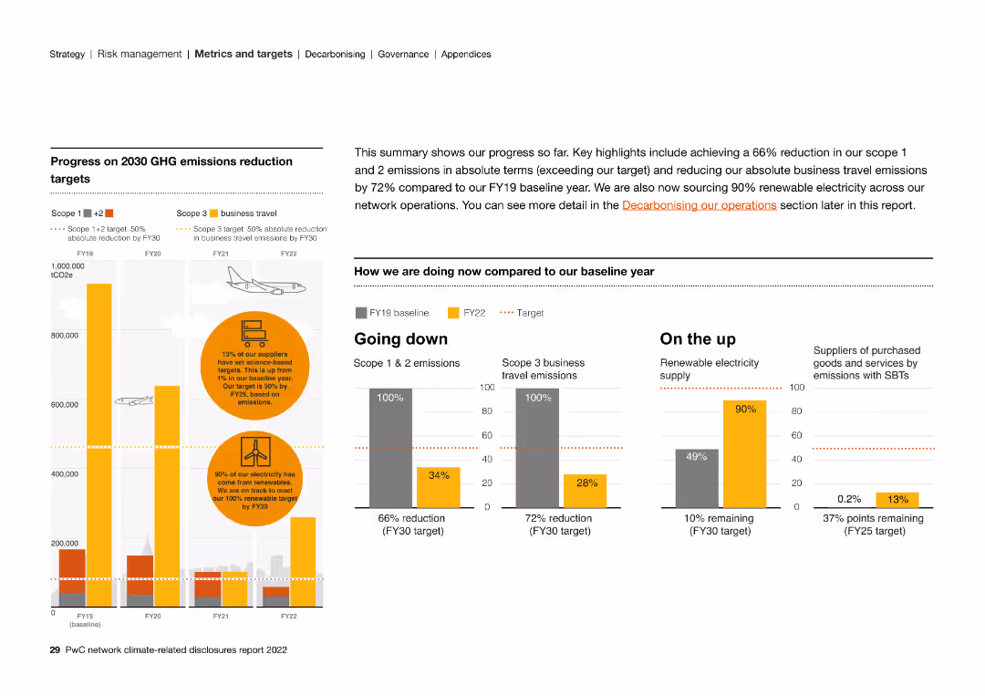
The slide includes column charts, text, and circular graphs detailing the progress of 2030 GHG emissions reduction targets, including business travel.
Strategic Planning
Energy & Utilities
The slide highlights key progress metrics in reducing GHG emissions by 2030. It showcases a 66% reduction in Scope 1 & 2 emissions and renewable energy efforts.
emissions, targets, renewable, electricity, suppliers, GHG, reduction, business travel
Multiple Chart
PwC/Strategy&
Saved
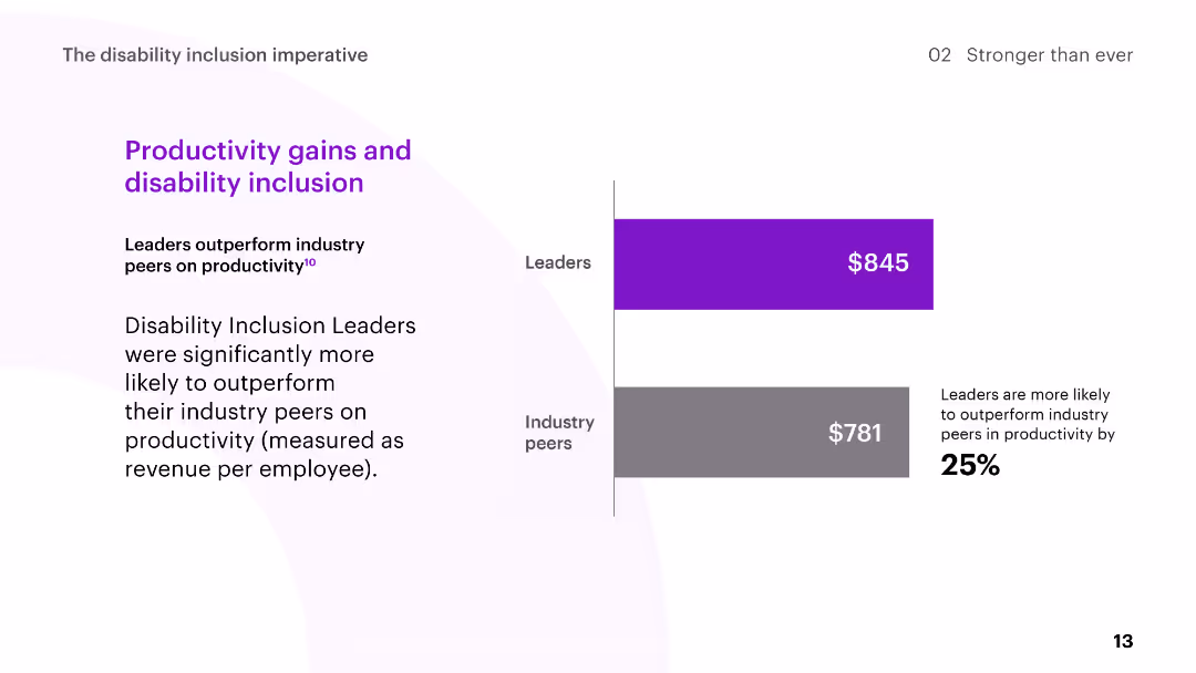
The slide includes a bar chart comparing the productivity of Disability Inclusion Leaders to industry peers, measured as revenue per employee.
Human Resources and Talent Management
Professional Services
The slide highlights the productivity gains of Disability Inclusion Leaders, showing they outperform industry peers in terms of revenue per employee.
disability inclusion, productivity, revenue per employee, leaders, industry peers
Mixed Chart
Accenture
Saved
Previous
Next
If nothing, comes up, please save your slides first
Create a FREE account to continue browsing
Receive Instant Access to 1,000+ slides from companies like McKinsey, Google, and Goldman Sachs
First Name
Last Name
Email
Password
I agree to all
Terms & Privacy Policy
Thank you! Your submission has been received!
Oops! Something went wrong while submitting the form.
Have an account?
Sign in
Column Chart
Heatmap
Chevron
Org Chart
Infographic
Callouts
Timeline
List
Graphic
Picture
Process Flow
Diagram
Paragraph
Map
Table
Framework
Subtitle
Takeaway Box
Icon
Other Chart
Radar Chart
Waterfall Chart
Mekko Chart
Pie Chart
Scatter Plot
Line Chart
Bar chart
Bullet points