My Account
My Slides
Search by Category
Companies
Slide Type
Use Case
Industry
Pricing
Templates
View All Templates
Download Template Slides
✦ AI
AI Prompt Library
AI Search
Feedback
Login
Logout
Get Started
Browse all Slides
Browse all Slides
Create a FREE Account
Instant access to 1,000+ real slides from top companies like McKinsey, BCG, Goldman Sachs, Google and many more!
First Name
Last Name
Email
Password
I agree to all
Terms & Privacy Policy
Thank you! Your submission has been received!
Oops! Something went wrong while submitting the form.
Have an account?
Sign in
Saved Slides
A column chart and a table showing global distribution of skilled workforce and top countries by skilled workforce.
Human Resources and Talent Management
Education & Training
Highlights global distribution and forecast of skilled workers, focusing on growth in Asia Pacific, Africa, and Latin America.
Skilled workforce, global distribution, Asia Pacific, Africa, Latin America, workforce forecast
Mixed Chart
Accenture
Saved
Features a strategy map outlining executive priorities.
Strategic Planning
Financial Services
Outlines the strategic priorities of C-suite executives heading into 2024, focusing on cost management, growth through price management, and expansion.
strategic priorities, cost management, growth, C-suite, expansion
Vertical Flow
BCG
Saved
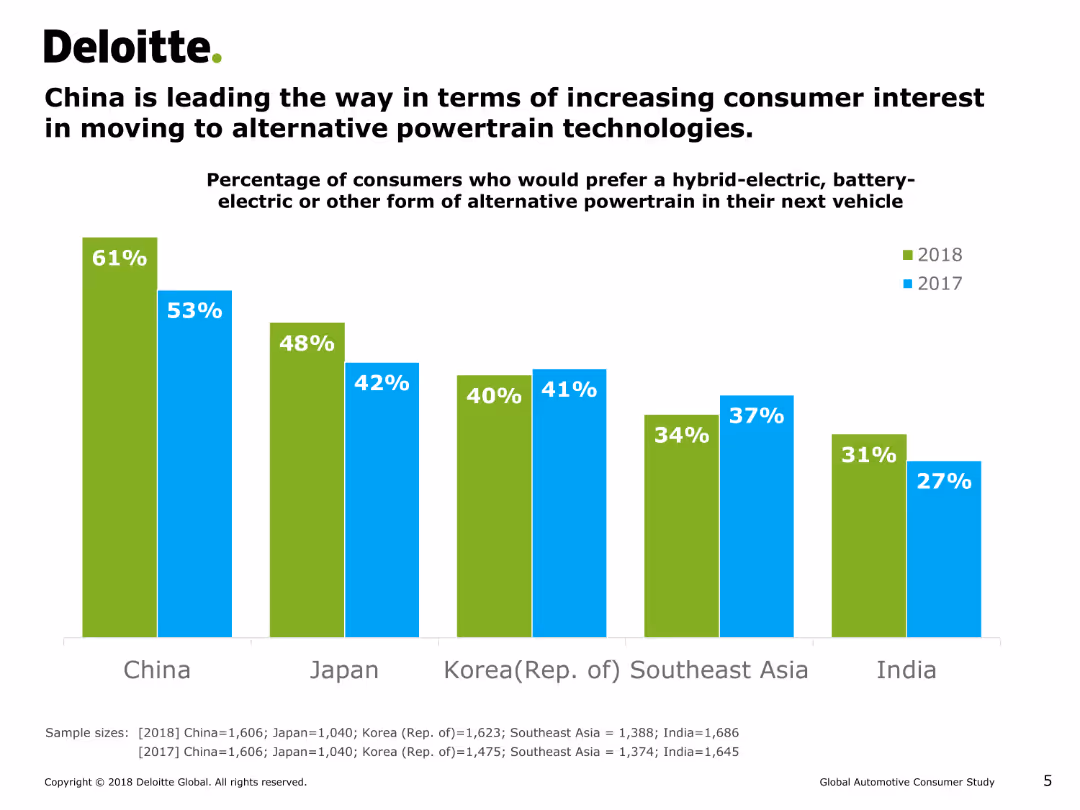
This slide features a vertical bar chart (column chart) comparing the percentage of consumers in different countries who prefer hybrid-electric, battery-electric, or other alternative powertrains in their next vehicle for the years 2017 and 2018.
Market Analysis and Trends
Energy & Utilities
The slide shows that China has the highest percentage of consumers interested in alternative powertrains, followed by Japan, Korea, Southeast Asia, and India. It highlights the growth in interest from 2017 to 2018.
consumer interest, alternative powertrain, hybrid-electric, battery-electric, column chart, market trends, energy, consumer preferences
Single Chart
Deloitte
Saved
Contains three charts: a line chart of LatAm y/y real GDP (2019 Q4 = 100) from 2015-2025F, a column chart of 2024F y/y real GDP, and a line chart of LatAm employment.
Market Analysis and Trends
Financial Services
Examines Latin America's economic performance in 2023 and provides forecasts for 2024, highlighting GDP, employment trends, and economic challenges.
Latin America, GDP, Employment, 2024, Trends
Multiple Chart
EY
Saved
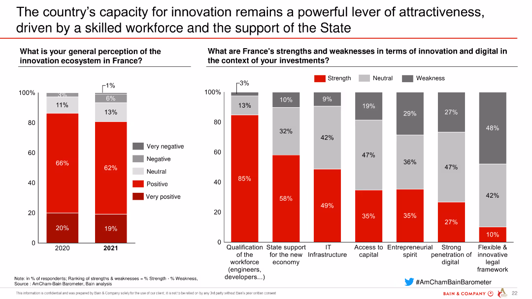
This slide has column charts comparing perceptions of the innovation ecosystem in France and analyzing strengths and weaknesses in innovation and digital terms for investments.
Market Analysis and Trends
Technology & Software
The slide evaluates perceptions of the innovation ecosystem in France and highlights strengths and weaknesses in terms of innovation and digital factors affecting investments.
innovation, ecosystem, France, strengths, weaknesses, digital, investments, technology, software
Multiple Chart
Bain
Saved
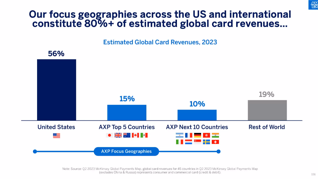
Bar chart illustrating revenue concentration in the U.S., top 5 countries, next 10 countries, and rest of world based on 2023 data.
Customer and Market Segmentation
Financial Services
This slide shows that more than 80% of global card revenues come from a focused set of geographies, with the U.S. contributing 56%, and top 15 countries adding another 25%. It implies strategic prioritization of these regions for business concentration and growth.
global revenue, market segmentation, geography focus, international markets, card revenues, US market, revenue distribution
Single Chart
McKinsey
Saved
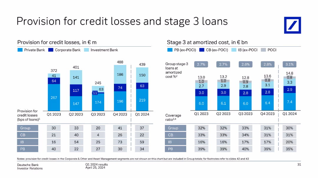
This slide features column charts detailing provisions for credit losses and stage 3 loans across different business divisions (Private Bank, Corporate Bank, Investment Bank) for Q1 2023 to Q1 2024.
Risk Assessment and Management
Financial Services
The slide discusses Deutsche Bank's provisions for credit losses and the status of stage 3 loans from Q1 2023 to Q1 2024, highlighting changes across Private Bank, Corporate Bank, and Investment Bank.
credit losses, stage 3 loans, provisions, business divisions, Deutsche Bank, Q1 2024
Multiple Chart
Deutsche Bank
Saved
A two-column slide, the left side shows column charts with market share and industry wallet, while the right side lists key focus areas for discussion with check marks.
Market Analysis and Trends
Financial Services
Discussing the ranking in investment banking fees, the slide covers historical data, market share, regional performance, and focus areas for in-depth discussion regarding future strategy and client relationships.
Banking, Fees, Market Share, Strategy
Mixed Chart
JP Morgan
Saved
Slide includes a mekko chart showcasing investment distribution by sector in Malaysia, focusing on solar and sustainable industries. Visuals are clean and professionally presented.
Investment Analysis
Energy & Utilities
Reviews the investment landscape in Malaysia, particularly in the renewable energy sector, highlighting potential growth areas and key investors.
Malaysia, investment, green energy, solar, sustainable development
Single Chart
Bain
Saved
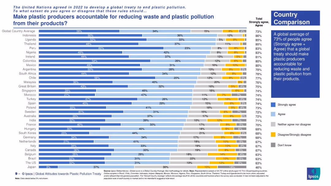
Horizontal bar chart displaying country-level agreement. Right-side text box provides global average and summary.
Regulatory and Compliance
Environmental Services & Sustainability
The slide reveals global public support for holding plastic producers accountable for pollution. It compares countries’ responses, highlighting strong agreement in Peru, Uganda, and Colombia. Global support is at 73%.
producer accountability, waste reduction, plastic treaty, environmental policy, Ipsos global survey, public opinion, sustainability, corporate responsibility
Mixed Chart
IPSOS
Saved
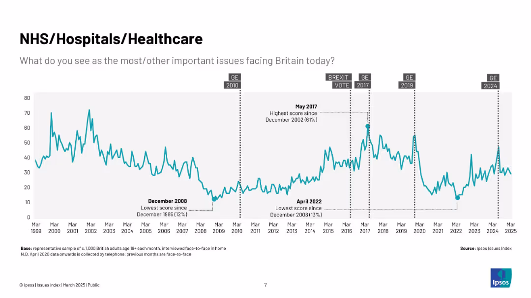
Teal line chart (1999–2025) showing public concern about NHS; includes peaks like 2017 and COVID era, with historic low in April 2022.
Market Analysis and Trends
Healthcare & Pharmaceuticals
Traces healthcare-related public concern trends, particularly focused on NHS performance and accessibility. Peaks are associated with systemic crises and political discourse.
NHS, healthcare, Ipsos, public concern, UK, pandemic, hospitals, medical
Single Chart
IPSOS
Saved
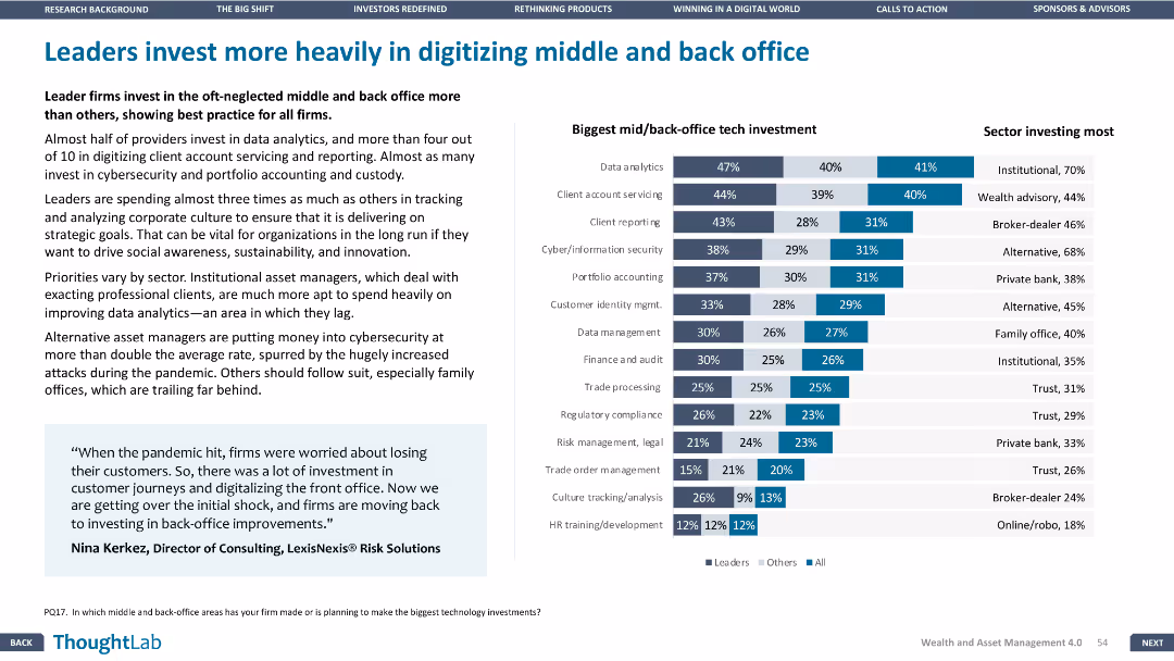
This slide has a bar chart and a detailed table. The layout is moderately dense, focusing on tech investments in middle and back office areas.
Operational Efficiency
Financial Services
The slide highlights the significant investments made by leader firms in digitizing middle and back-office functions, with data on the biggest tech investments and sectors investing the most in these areas.
Middle office, back office, tech investments, digitization, operational efficiency
Mixed Chart
Deloitte
Saved
Slide displays a column chart with the number of deals and deal value in the internet sector of the Philippines from 2016 to H1 2020, with a clear title, and legends for the chart.
Investment Analysis
Technology & Software
This slide evaluates investments in the Philippines' internet sector, showing deal counts and values, intended for stakeholders analyzing investment trends and opportunities.
Investment, Internet, Philippines, Deals, Value
Single Chart
Bain
Saved
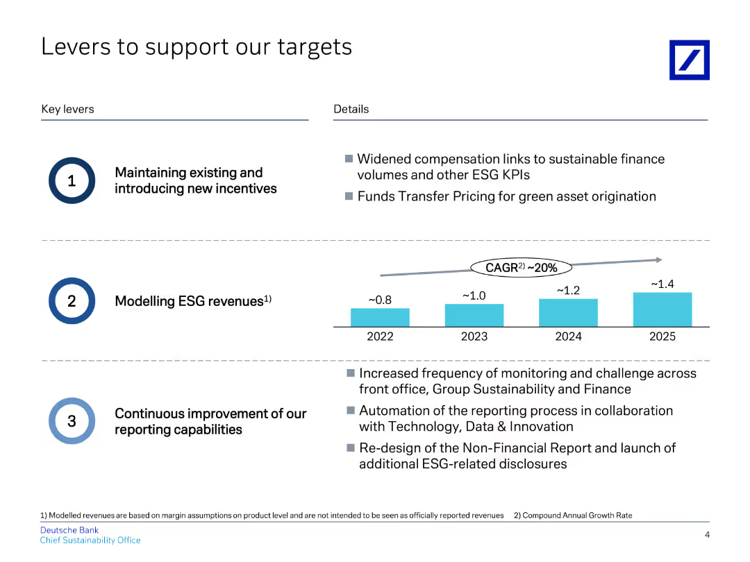
The slide features a title at the top, followed by two sections of key levers with brief descriptions and a column chart in the middle.
Strategic Planning
Financial Services
Describes key levers to support targets, focusing on incentives, ESG revenue modeling, and reporting improvements.
targets, incentives, ESG, revenue, reporting
Mixed Chart
Deutsche Bank
Saved
Bar graphs detailing anticipated levels of product personalization by industry for 2026, with a summary callout highlighting personalization goals.
Market Analysis and Trends
Professional Services
Forecasts the degree of personalization that companies aim to achieve within the next few years, signifying a strategic shift towards tailored consumer experiences.
Product Personalization, Future Trends, Strategic Shift, Bar Graph, Industry Forecast
Multiple Chart
Kearney
Saved
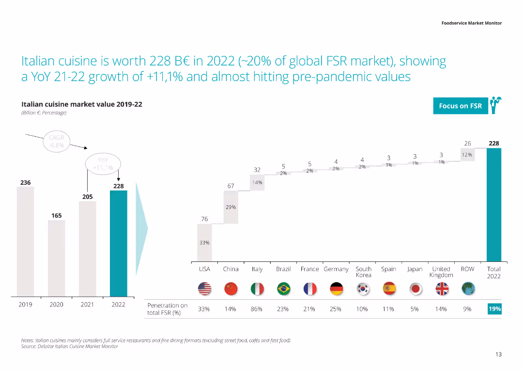
The slide displays a column chart showing the market value of Italian cuisine from 2019 to 2022, with a percentage breakdown of its penetration in the total FSR market across various countries.
Market Analysis and Trends
Hospitality & Tourism
This slide discusses the growth of the Italian cuisine market, highlighting its worth in 2022 and its significant year-over-year growth. It also shows its penetration in the full-service restaurant market globally.
Italian cuisine, market value, growth, full service restaurants, 2022
Multiple Chart
Deloitte
Saved
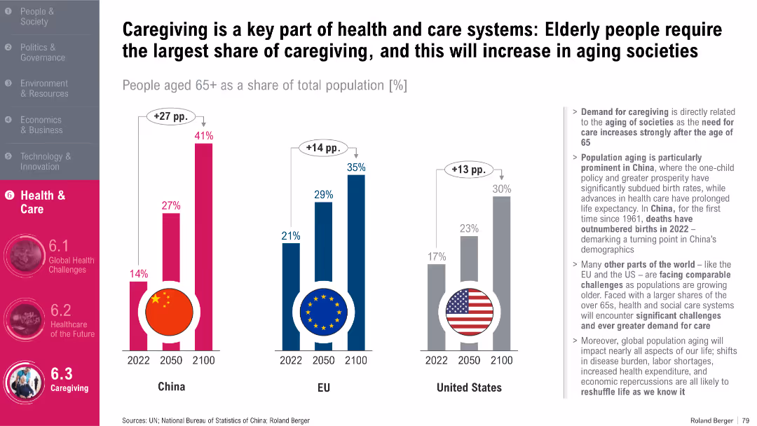
Three side-by-side bar graphs showing aging population projections; flag icons; summary text block
Human Resources and Talent Management
Healthcare & Pharmaceuticals
This slide visualizes the growing proportion of people aged 65+ in China, the EU, and the US through 2100. It explains that an aging population increases demand for caregiving services and highlights demographic trends that influence health system planning and workforce needs in elderly care.
Aging, Caregiving, Elderly, Demographics, Health Workforce
Multiple Chart
Roland Berger
Saved
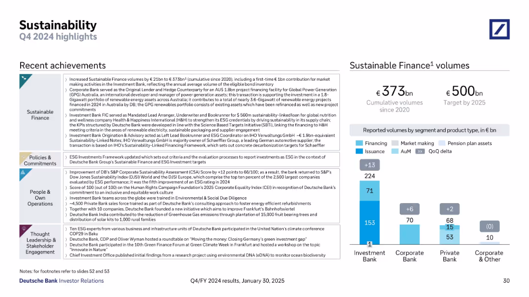
Multi-section text layout on the left; bar chart on the right showing sustainable finance volumes
Financial Performance
Financial Services
The slide summarizes Deutsche Bank’s sustainability initiatives, including €373bn in cumulative sustainable finance volumes, ESG framework enhancements, and environmental & social contributions. The right-hand chart shows volume contributions by business segment.
Sustainability, ESG, Finance Volumes, Climate, Renewable Energy
Mixed Chart
Deutsche Bank
Saved
Slide shows a dark background with five sets of dual vertical column charts comparing "Leading innovator" vs "Lagging innovator" percentages for five fundamental adoption metrics, labeled from 1 to 5.
Strategic Planning
Professional Services
This slide visually compares the adoption of five fundamental principles between leading and lagging innovators, providing a clear measure of innovation culture within organizations.
innovation, adoption, comparison, culture, principles
Multiple Chart
McKinsey
Saved
Visualizes NYC construction permit changes with a column chart and future recovery projections with a dotted line chart, showing both immediate impacts and recovery outlook.
Market Analysis and Trends
Real Estate & Construction
Evaluates the impact of the pandemic on the construction industry, showing immediate declines in activity and projections for recovery, emphasizing the slower than average rebound.
construction, pandemic, NYC, permits, recovery projections, bar chart, line chart
Multiple Chart
BCG
Saved
It uses line charts to depict CEO expectations on economic growth, with a key and explanatory notes.
Market Analysis and Trends
Professional Services
Illustrates CEO perspectives on global economic growth, with a focus on the changes in optimism and confidence over recent years.
CEO, Economic Growth, Survey, Trends
Single Chart
PwC/Strategy&
Saved
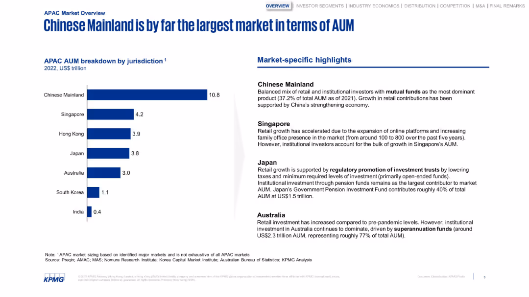
Bar chart with jurisdictional AUM and a column of highlights. Structured and minimalistic with strong blue tones.
Market Analysis and Trends
Financial Services
Breaks down APAC AUM by country, highlighting China’s dominance. The sidebar notes market-specific factors like regulatory frameworks, pension fund dominance, and online platform growth in Singapore and Japan.
AUM, China, Japan, Singapore, investment, retail growth, pensions
Mixed Chart
KPMG
Saved
A dark background slide with white and yellow text, and a series of column charts depicting reasons for virtual consultations.
Technology and Digital Transformation
Healthcare & Pharmaceuticals
It highlights consumer preferences for virtual consultations for minor medical matters, test results, and time-saving.
virtual care, consultations, convenience, survey, England
Mixed Chart
EY
Saved
Features a column chart depicting management and other fee growth, with future targets, and breakdowns of fee sources.
Financial Performance
Financial Services
Targets financial professionals, displaying fee-based revenue trends and projections, emphasizing the firm’s strategy to increase earnings through diverse fee sources as they navigate market cycles.
revenue growth, fee-based, targets, financial strategy, market cycles
Single Chart
Goldman Sachs
Saved
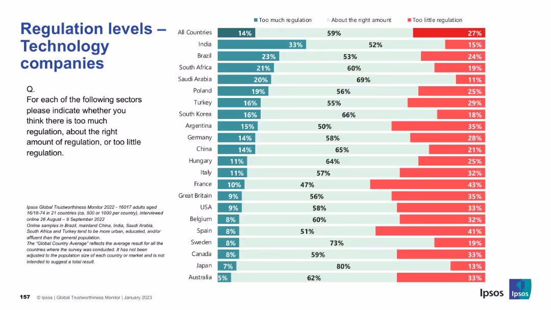
Consistent layout; country ranking by views; colors indicate opinions on regulation sufficiency.
Regulatory and Compliance
Technology & Software
This slide captures opinions on whether technology companies are properly regulated. The majority believe regulation levels are appropriate, but countries like Argentina and France indicate concerns about underregulation, while India and Brazil lean toward thinking there’s too much.
tech industry, regulation, public opinion, Ipsos, governance, compliance, digital policy, international, oversight, perception
Mixed Chart
IPSOS
Saved
Previous
Next
If nothing, comes up, please save your slides first
Create a FREE account to continue browsing
Receive Instant Access to 1,000+ slides from companies like McKinsey, Google, and Goldman Sachs
First Name
Last Name
Email
Password
I agree to all
Terms & Privacy Policy
Thank you! Your submission has been received!
Oops! Something went wrong while submitting the form.
Have an account?
Sign in
Column Chart
Heatmap
Chevron
Org Chart
Infographic
Callouts
Timeline
List
Graphic
Picture
Process Flow
Diagram
Paragraph
Map
Table
Framework
Subtitle
Takeaway Box
Icon
Other Chart
Radar Chart
Waterfall Chart
Mekko Chart
Pie Chart
Scatter Plot
Line Chart
Bar chart
Bullet points