My Account
My Slides
Search by Category
Companies
Slide Type
Use Case
Industry
Pricing
Templates
View All Templates
Download Template Slides
✦ AI
AI Prompt Library
AI Search
Feedback
Login
Logout
Get Started
Browse all Slides
Browse all Slides
Create a FREE Account
Instant access to 1,000+ real slides from top companies like McKinsey, BCG, Goldman Sachs, Google and many more!
First Name
Last Name
Email
Password
I agree to all
Terms & Privacy Policy
Thank you! Your submission has been received!
Oops! Something went wrong while submitting the form.
Have an account?
Sign in
Saved Slides
Similar layout to previous slide; stress bar chart on left, analysis and three suggested actions on right, expert quote at bottom
Market Analysis and Trends
Healthcare & Pharmaceuticals
Addresses the Healthcare industry’s financial stress from low Medicare indexation, rising costs, and operational inefficiencies. Recommendations include identifying revenue levers, optimizing cash, and improving patient flow. The chart shows most expect moderate to high stress in the next 12 months.
healthcare, cost inflation, patient flow, Medicare, stress levels, operational efficiency, financial pressure, regulation, workforce
Mixed Chart
Alvarez & Marsal
Saved
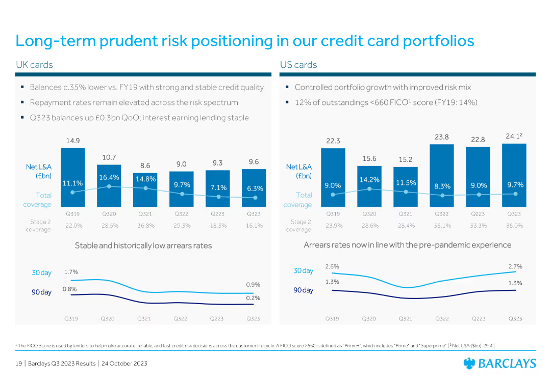
The slide includes two vertical column charts comparing UK and US credit card portfolios with coverage ratios and arrears rates. The design is clear and visually appealing.
Risk Assessment and Management
Financial Services
It describes the risk positioning in UK and US credit card portfolios, highlighting stable and low arrears rates, along with coverage ratios for different stages of credit.
risk, credit cards, arrears, coverage ratios, UK, US, prudent, portfolios, comparison
Multiple Chart
Barclays
Saved
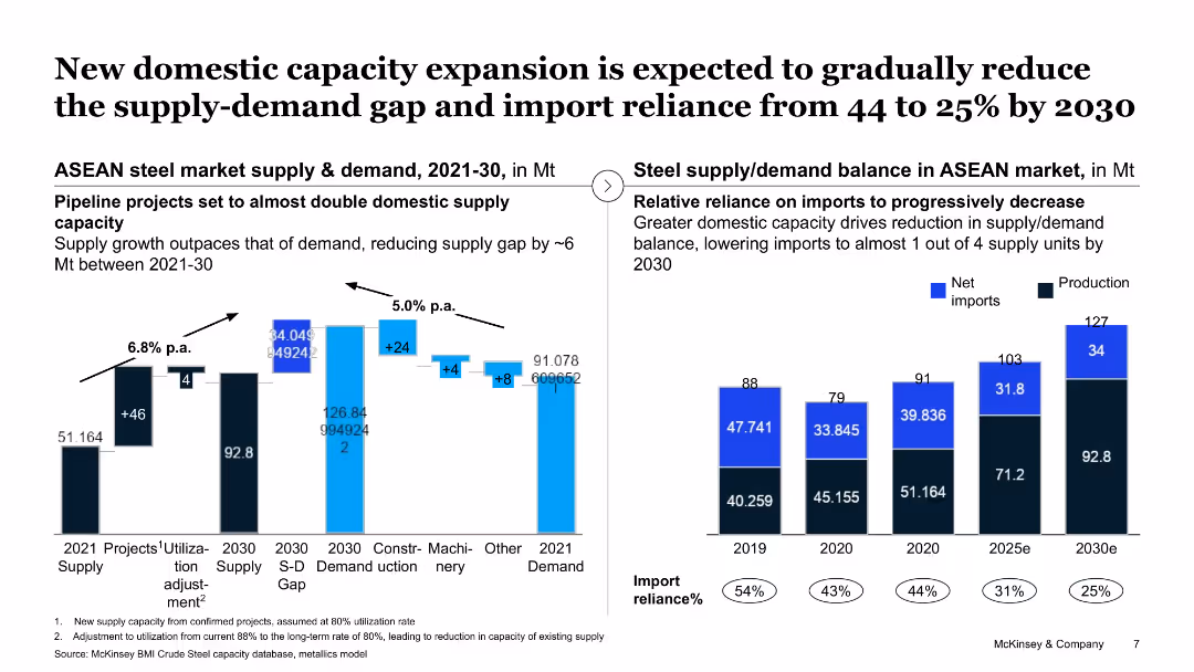
The slide shows a column chart and a line chart displaying supply and demand balance in the ASEAN market, highlighting domestic capacity expansion projects.
Strategic Planning
Industrial & Manufacturing
This slide projects a reduction in the supply-demand gap in the ASEAN steel market by 2030 through new domestic capacity expansions, aimed at reducing import reliance.
domestic capacity, supply-demand gap, ASEAN market, steel, import reliance
Multiple Chart
McKinsey
Saved
The slide features a balance sheet summary on the left with a simple table layout, and credit metrics on the right with numerical highlights and explanatory texts. The design includes shaded boxes and clear separation of content areas.
Financial Performance
Financial Services
This slide compares a company's balance sheet and credit profile, with a focus on cash, debt, and capital structure, as well as credit metrics like EBITDA and leverage ratio. It’s tailored for financial analysts or investors looking at company stability, creditworthiness, and financial health.
Balance Sheet, Credit Profile, EBITDA, Net Leverage, Capital, Financial Health
Boxed
Goldman Sachs
Saved
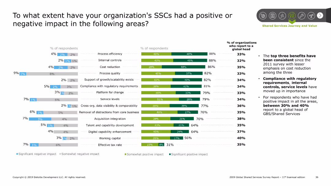
The slide includes a combination of column charts and bar charts. It shows the percentage of respondents reporting various impacts, and the significance of these impacts.
Performance Metrics and KPIs
Professional Services
This slide evaluates the positive and negative impacts of Shared Services Centers (SSCs) on different operational areas, as reported by respondents.
SSC impact, performance, evaluation, metrics, KPIs
Multiple Chart
Deloitte
Saved
The slide features bar charts and tables showcasing the function by ethnicity, and the gender breakdown for Hispanic employees across different years.
Human Resources and Talent Management
Professional Services
The slide analyzes the ethnic diversity of employees, with a focus on Hispanic employees and their roles in investment, finance, and other functions.
ethnic diversity, Hispanic employees, gender diversity, employee functions, investment firms
Mixed Chart
Deloitte
Saved
An informative slide summarizes key investment opportunities in the crop industry, featuring four key themes illustrated with circular icons and brief descriptions. The design is clean and corporate, with a mix of graphics and text.
Industry Overview
Agriculture & Food Production
Aimed at investors, this slide summarizes the attractive characteristics of the crop market, emphasizing the long-term fundamentals, market downturns, technological innovations, and M&A opportunities. It serves as an agenda slide, highlighting key themes that will be discussed in detail throughout the presentation.
Crop Industry, Investment, Opportunities, Value Chain, Themes, Fundamentals, Technology, M&A
Pillar
EY
Saved
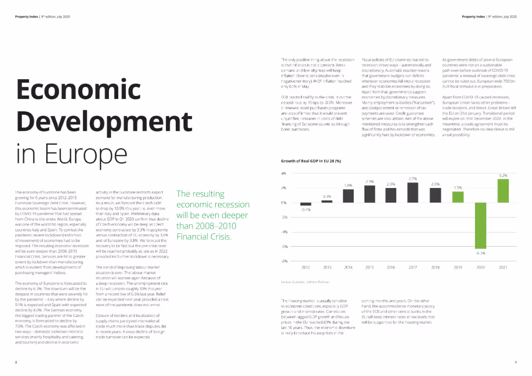
The slide features text detailing economic conditions in Europe, supported by a column chart showing GDP growth rates from 2012 to 2021. The layout is clean with ample white space, suitable for general audiences. Visual complexity is basic.
Market Analysis and Trends
Real Estate & Construction
Provides an overview of economic development in Europe, discussing the impact of the COVID-19 pandemic on GDP growth and the expected economic recession. Useful for understanding broader economic trends and their implications on various sectors.
Economic development, Europe, GDP, recession, COVID-19
Mixed Chart
Deloitte
Saved
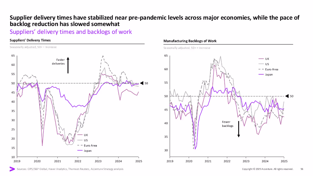
Dual line charts (delivery times left, backlogs right) by region with consistent styling, labeled axis and arrows.
Operational Efficiency
Industrial & Manufacturing
The slide shows that supplier delivery times have returned to near pre-pandemic levels across regions while backlog reduction has slowed. It emphasizes operational recovery with regional disparities post-COVID.
Delivery times, manufacturing, UK, US, Euro Area, Japan, backlog, stabilization
Multiple Chart
Accenture
Saved
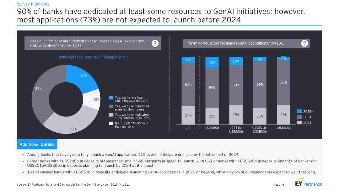
Left: pie chart on resource dedication to GenAI. Right: column chart on expected launch timelines for GenAI applications.
Strategic Planning
Financial Services
Shows that 90% of banks have dedicated resources to GenAI, with most applications not expected to launch before 2024.
resources, GenAI, deployment, launch, timeline
Multiple Chart
EY
Saved
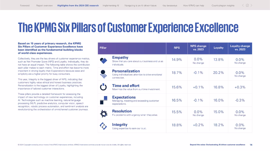
Table format listing six pillars with corresponding metrics (NPS, loyalty) and year-over-year changes.
Performance Metrics and KPIs
Professional Services
Summarizes KPMG's customer experience framework: Empathy, Personalization, Time and Effort, Expectations, Resolution, and Integrity. Shows data impact on NPS and loyalty metrics, emphasizing value alignment.
customer experience, KPIs, NPS, loyalty, empathy, personalization, integrity, KPMG framework, performance
Table
KPMG
Saved
Visually segmented grid layout with four numbered blocks on a digital-tech style background.
Organizational Structure and Change
Healthcare & Pharmaceuticals
Lists four main sections of a report related to metabolic health and strategic planning. Each box provides section title and page range. Provides a clear overview for navigating the document.
table of contents, strategy, healthcare, metabolic health, report
Agenda
McKinsey
Saved
The slide displays a donut chart and a gauge chart showing survey responses about staff turnover. The donut chart uses multiple colors to differentiate responses, and the gauge chart indicates a percentage.
Human Resources and Talent Management
Professional Services
This slide presents survey data regarding staff turnover, indicating a majority opinion with visual aids. It is useful for HR presentations to discuss staff retention strategies.
staff turnover, HR, survey, donut chart, gauge
Multiple Chart
PwC/Strategy&
Saved
This slide displays three sets of column charts showing job search status, job satisfaction, and burnout levels among various age groups of deskless workers.
Human Resources and Talent Management
Professional Services
Analyzes job satisfaction and burnout rates among different age groups of deskless workers, highlighting trends and challenges in workforce management.
deskless workers, age groups, job satisfaction, burnout, column charts
Multiple Chart
BCG
Saved
The slide features a complex line chart tracking the EBITDA multiples over time for different industry sectors. There are four lines representing the medians for Food & Beverage, Industrials, Utilities, and Diversified sectors. Tables with key statistics are positioned at the top right.
Market Analysis and Trends
Technology & Software
This slide presents market performance data for process automation companies, indicating trading ranges of EBITDA multiples and comparing sectors. Useful for financial and market trend analysis.
EBITDA, Market Performance, Process Automation, Financial Analysis, Industry Comparison, Trading Ranges, Sector Median, Utilities, Industrials
Single Chart
LEK
Saved
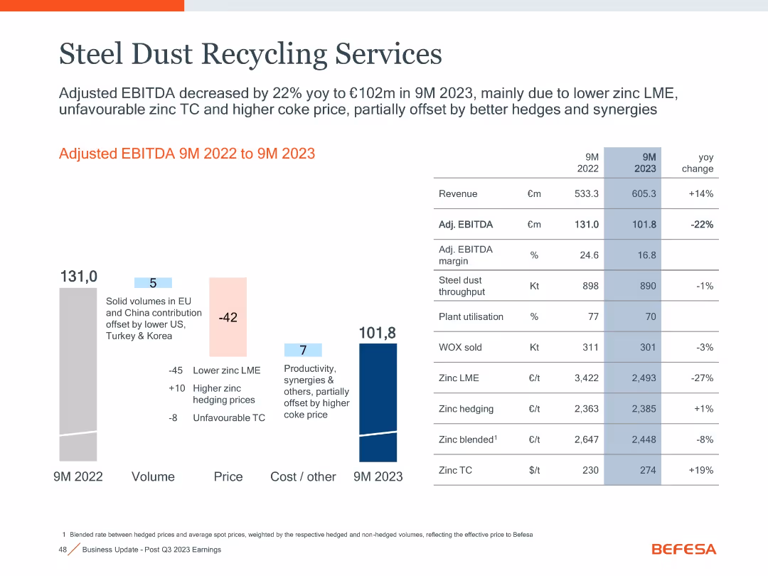
Waterfall chart of EBITDA changes with volume/price/cost blocks, table on right comparing 9M 2022 vs 9M 2023 metrics.
Performance Metrics and KPIs
Industrial & Manufacturing
Details 22% YoY drop in adjusted EBITDA for Steel Dust Recycling to €101.8m, impacted by zinc LME price drop, higher treatment charges, and offsetting synergies. Volume, price, and cost drivers are itemized.
steel dust, EBITDA, zinc LME, throughput, synergies, KPIs
Mixed Chart
Goldman Sachs
Saved
This slide displays two stacked column charts comparing the age of SSCs in various countries over different periods.
Strategic Planning
Professional Services
Evaluates the age distribution of shared service centers (SSCs) across different countries, showing trends over time which indicate shifts in global business service strategies.
SSCs, trends, geographic, business
Mixed Chart
Deloitte
Saved
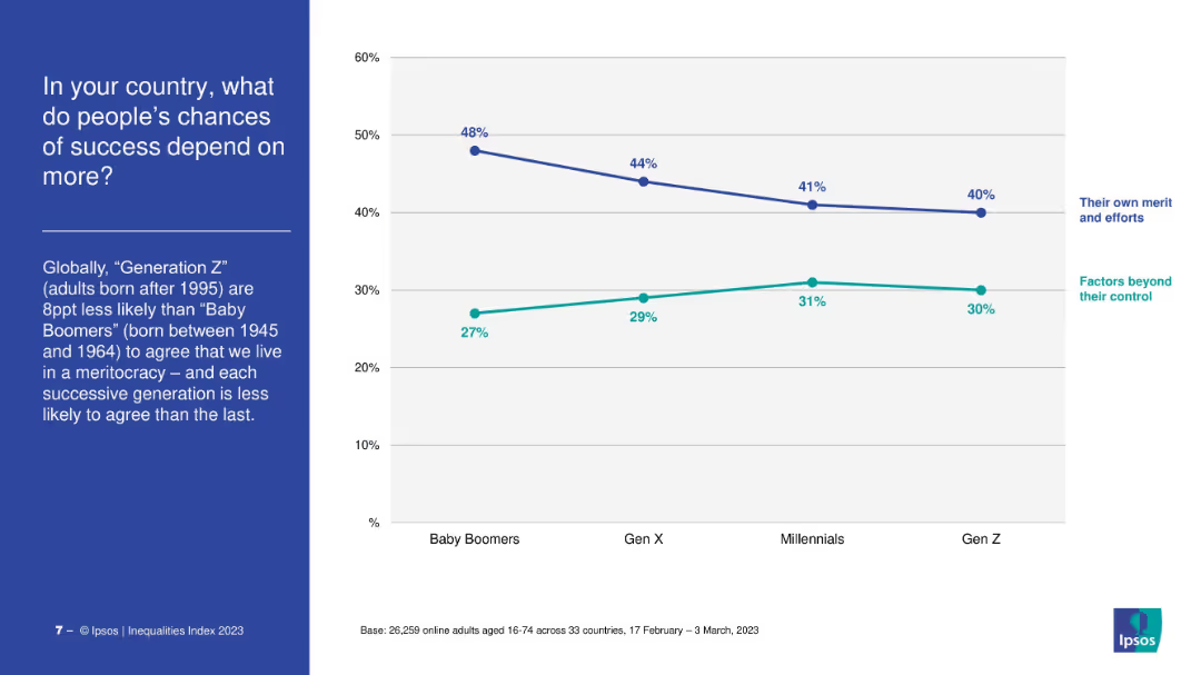
Dual-line chart comparing “merit/effort” vs. “factors beyond control” across generations. Title and text on the left.
Market Analysis and Trends
Government & Public Sector
The slide compares generational views on what influences success, revealing a decline in belief in meritocracy from Baby Boomers to Gen Z, who increasingly cite uncontrollable factors as more influential.
meritocracy, social mobility, Gen Z, inequality, generational comparison
Mixed Chart
IPSOS
Saved
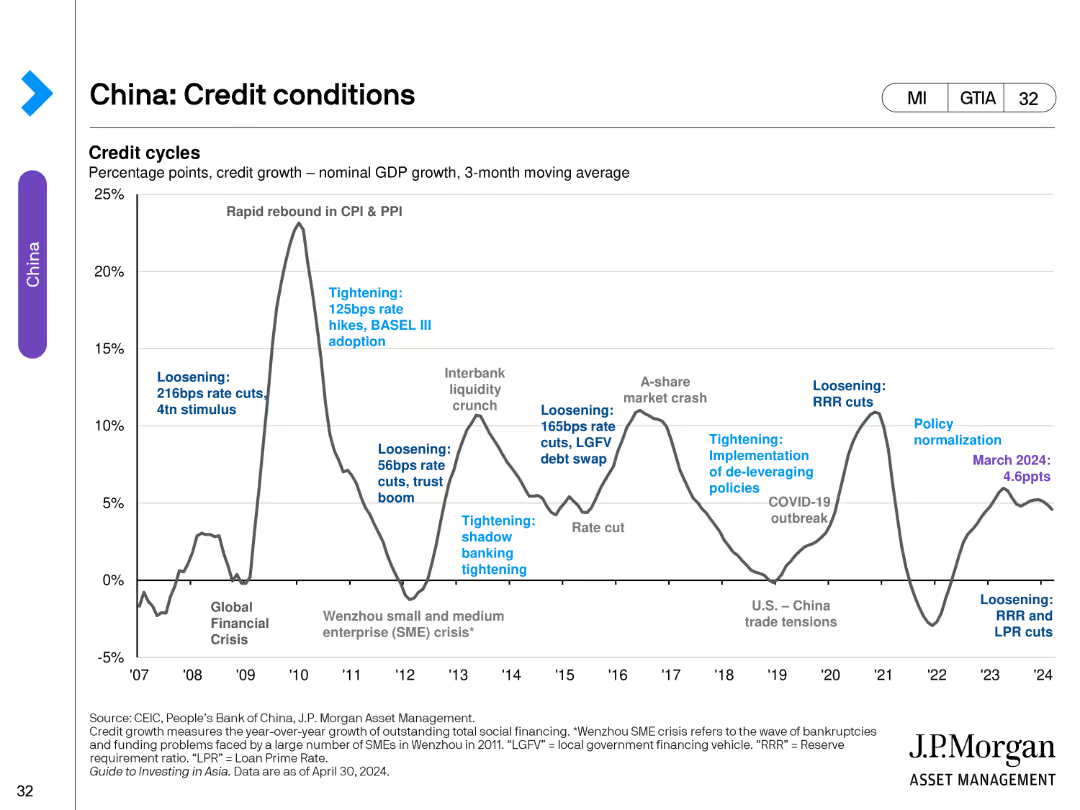
The slide contains a single line chart tracking credit cycles, percentage points, and GDP growth with notable economic events and policy changes annotated.
Market Analysis and Trends
Financial Services
This slide provides an overview of China's credit conditions, detailing changes in credit growth and notable economic and policy events.
Credit, Conditions, China, GDP, Policy
Single Chart
JP Morgan
Saved
Contains multiple gears representing different economic indicators like unemployment rate, inflation, and GDP growth, alongside a map highlighting Namibia's geographical context.
Market Analysis and Trends
Government & Public Sector
Offers a comprehensive overview of Namibia's key economic indicators as of January 2018, useful for understanding the broader economic climate and its potential impacts on policy and investment decisions.
Economic, Statistics, GDP, Inflation, Map
Graphic
PwC/Strategy&
Saved
Column chart showing likelihood ratios of being in the top 25% spenders on innovation related to network modernization efforts.
Investment Analysis
Telecommunications
Demonstrates the correlation between increased network modernization spending and higher innovation spending ratios among industry peers.
innovation spending, network modernization, industry ranking, competitive advantage, investment impact
Mixed Chart
Accenture
Saved
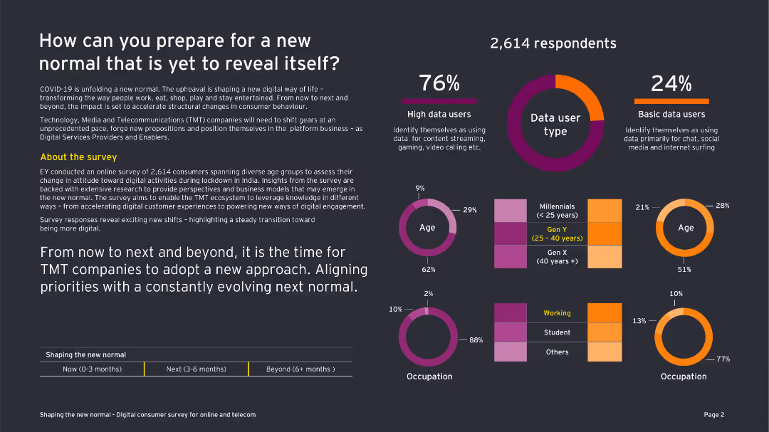
This slide features a combination of text and various charts including a column chart, pie chart, and doughnut chart. The design is moderately dense.
Market Analysis and Trends
Telecommunications
The slide discusses the impact of COVID-19 on consumer behavior in the telecommunications sector, using survey data from 2,614 respondents.
COVID-19, consumer behavior, telecommunications, survey, data usage, TMT companies, new normal, digital engagement, technology
Multiple Chart
EY
Saved
Contains column charts and numerical data representing the evolution of external costs related to CO2, VOC emissions, and water withdrawals, with comparisons to past years and future ambitions.
Financial Performance
Industrial & Manufacturing
Highlights Michelin's achievements in reducing emissions and water withdrawals, exceeding its 2023 ambitions, with an emphasis on the economic aspects of environmental costs.
CO2 Emissions, Environmental Costs, VOC Emissions, Water Withdrawal, Michelin, Reduction Targets, Sustainability, Compliance, 2023 Ambitions, Financial Impact
Single Chart
Morgan Stanley
Saved
The slide has column charts showing RWA and leverage exposure outlook in USD bn from 4Q15 to 2019 targets, with color coding for risk types.
Strategic Planning
Financial Services
The slide forecasts the reduction of RWA and leverage exposure by approximately 80% by end-2019, detailing credit and market risk components.
RWA, leverage exposure, outlook, risk reduction, strategic planning
Multiple Chart
Credit Suisse
Saved
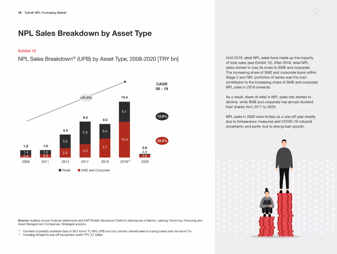
Column chart illustrating NPL sales breakdown by asset type from 2008-2020. Text discusses the shift in asset types.
Market Analysis and Trends
Financial Services
The slide categorizes NPL sales by asset type, showing trends from 2008-2020 and explaining shifts in retail and corporate loans.
NPL sales, asset types, retail loans, corporate loans, financial analysis, Turkey
Mixed Chart
PwC/Strategy&
Saved
Previous
Next
If nothing, comes up, please save your slides first
Create a FREE account to continue browsing
Receive Instant Access to 1,000+ slides from companies like McKinsey, Google, and Goldman Sachs
First Name
Last Name
Email
Password
I agree to all
Terms & Privacy Policy
Thank you! Your submission has been received!
Oops! Something went wrong while submitting the form.
Have an account?
Sign in
Column Chart
Heatmap
Chevron
Org Chart
Infographic
Callouts
Timeline
List
Graphic
Picture
Process Flow
Diagram
Paragraph
Map
Table
Framework
Subtitle
Takeaway Box
Icon
Other Chart
Radar Chart
Waterfall Chart
Mekko Chart
Pie Chart
Scatter Plot
Line Chart
Bar chart
Bullet points