My Account
My Slides
Search by Category
Companies
Slide Type
Use Case
Industry
Pricing
Templates
View All Templates
Download Template Slides
✦ AI
AI Prompt Library
AI Search
Feedback
Login
Logout
Get Started
Browse all Slides
Browse all Slides
Create a FREE Account
Instant access to 1,000+ real slides from top companies like McKinsey, BCG, Goldman Sachs, Google and many more!
First Name
Last Name
Email
Password
I agree to all
Terms & Privacy Policy
Thank you! Your submission has been received!
Oops! Something went wrong while submitting the form.
Have an account?
Sign in
Saved Slides
Contains a simple layout with icons and text describing various treasury capabilities offered, focusing on client-centered solutions.
Operational Efficiency
Financial Services
Describes JPMorgan Chase & Co.'s range of treasury capabilities, emphasizing client value and service efficiency.
Treasury, banking solutions, client value, JPMorgan Chase, financial services, liquidity management, payment processing, fraud protection
Pillar
JP Morgan
Saved
Slide includes column charts of revenue and balance sheet metrics across periods, and a line graph illustrating profitability trends.
Financial Performance
Financial Services
Provides a financial overview showcasing growth in revenue and assets, aimed at stakeholders interested in corporate financial health and performance metrics.
financial, performance, revenue, growth, assets
Multiple Chart
Barclays
Saved
Contains line charts and column charts comparing sovereign bond yields and credit default swap spreads for various countries and regions.
Financial Performance
Financial Services
Displays sovereign bond yields for a 10-year maturity period and credit default swap spreads across different countries and regions.
sovereign bonds, yields, spreads, countries
Multiple Chart
JP Morgan
Saved
A comparative analysis with three line charts showing different market scenarios for BEV shares by region from 2025 to 2040. Color-coded to distinguish scenarios.
Market Analysis and Trends
Transportation & Logistics
Examines three potential growth scenarios for battery electric vehicles depending on regional adjustments like government policies and infrastructure expansion.
BEV, scenarios, growth, policy, infrastructure
Multiple Chart
BCG
Saved
Slide with a casual image on the left and a focused, bulleted list on the right, detailing factors that can convert detractors into promoters in the food delivery industry, providing a balance of visual appeal and informative content.
Customer and Market Segmentation
Retail & E-commerce
Offers strategic insights into consumer preferences in food delivery, highlighting key factors that affect customer satisfaction and loyalty, and suggesting ways to improve service quality to increase promoter numbers.
food delivery, customer satisfaction, service improvement, detractors, promoters, Net Promoter Score, loyalty strategies
Agenda
Bain
Saved
The slide includes multiple data visualization formats: a column chart depicting crypto market cap growth, a table on stablecoin circulation, a line chart on DeFi TVL, and a sparkline graph on bitcoin mining stocks. Utilizes a dark background with blue accents.
Market Analysis and Trends
Financial Services
Showcases the rapid expansion of digital assets from 2019 to 2022 with specific focus on cryptocurrency market cap, stablecoin values, DeFi TVL, and stock prices of bitcoin mining companies. Intended for financial and market trend analysis.
cryptocurrency, DeFi, stablecoins, mining stocks, growth
Multiple Chart
McKinsey
Saved
Features a detailed column chart split into multiple segments representing different funding areas under the IIJA and IRA, accompanied by a list of key incentives such as tax credits for clean energy and transportation.
Regulatory and Compliance
Government & Public Sector
Provides a detailed overview of the financial specifics under the IIJA and IRA, highlighting key investment areas and incentives for promoting clean energy and infrastructure projects.
government spending, clean energy, infrastructure, tax incentives, IIJA, IRA
Mixed Chart
BCG
Saved
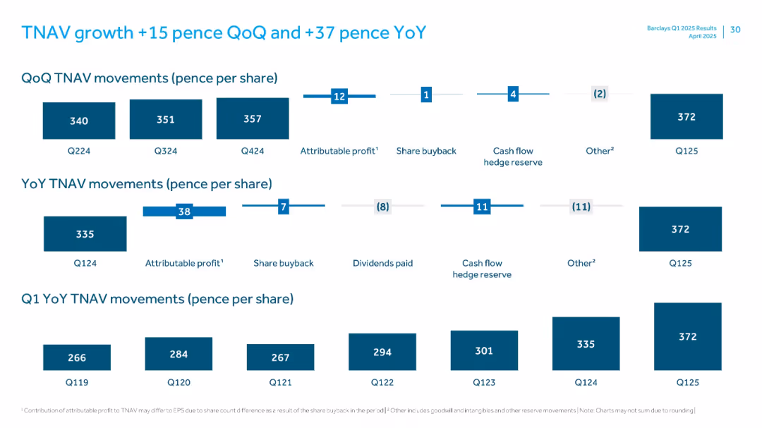
Multi-panel layout with bar charts showing TNAV changes quarterly and yearly per share
Financial Performance
Financial Services
Analyzes tangible net asset value (TNAV) per share movement quarter-over-quarter and year-over-year, attributing changes to profit, buybacks, hedge reserves, and other factors, ending at 372p in Q125.
TNAV, profit, share buyback, hedge reserve, earnings
Multiple Chart
Barclays
Saved
Features multiple pie charts and lists detailing the composition and risk assessment of commercial real estate loans.
Risk Assessment and Management
Real Estate & Construction
Dedicated to commercial real estate (CRE) loan analysis, this slide provides detailed insights into loan values, risk categories, and geographic distribution. It is tailored for real estate investors, financial analysts, and risk managers, focusing on assessing the risk profile, market trends, and financial health of the CRE portfolio. It also includes data on non-recourse loans and exposure under stress test conditions.
CRE, Risk Assessment, Real Estate Investment, Loan Analysis, Stress Testing
Multiple Chart
Deutsche Bank
Saved
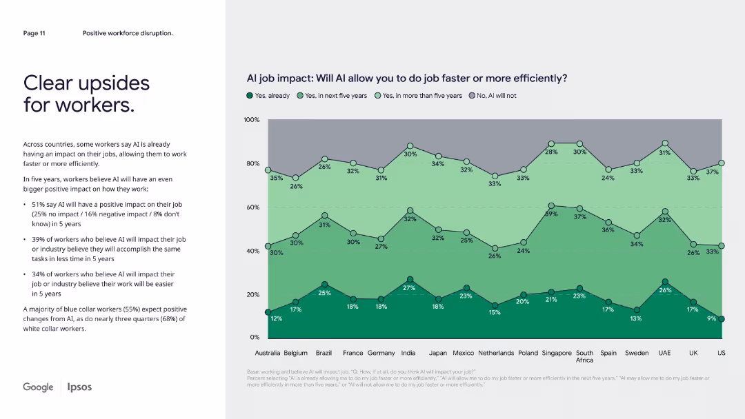
Left-aligned paragraph text with a multi-line area chart showing AI job impact predictions by country.
Operational Efficiency
Artificial Intelligence
Focused on workforce expectations, this slide shows that a majority of workers anticipate AI helping them work faster or more efficiently, particularly in the next five years. Regional breakdowns show varied levels of optimism about AI’s job impact.
workforce AI, productivity, job impact, regional trends, efficiency, optimism
Mixed Chart
IPSOS
Saved
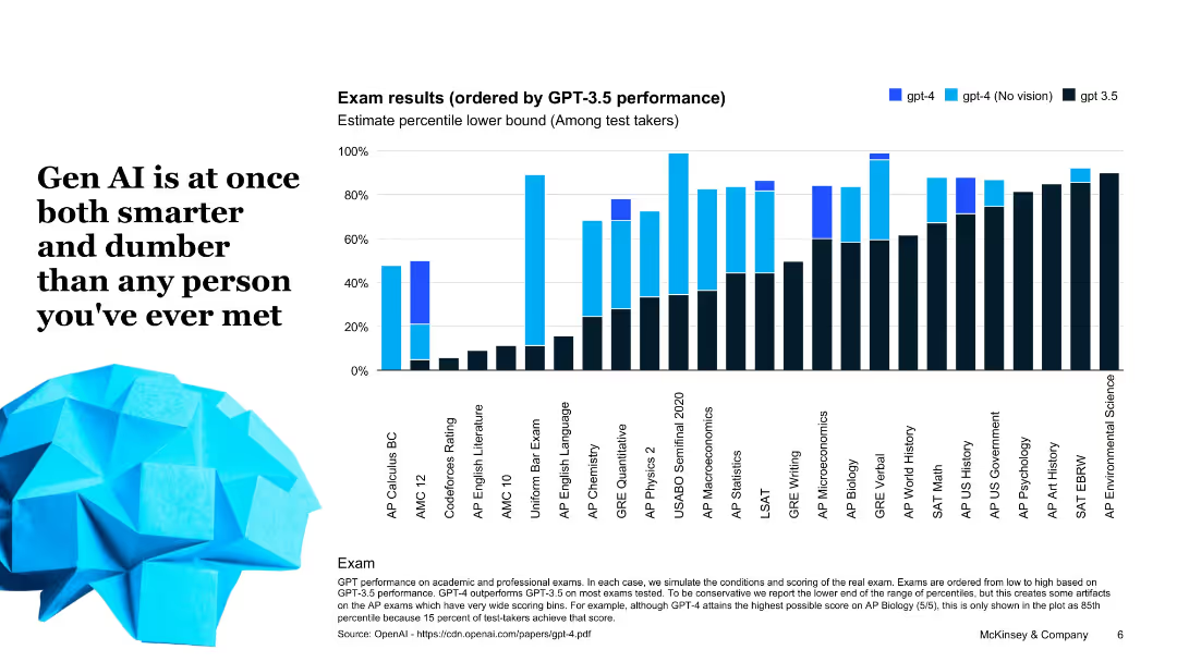
Bar chart comparing GPT-4 and GPT-3.5 performance across standardized tests; bold headline and image of a polygonal human face.
Performance Metrics and KPIs
Artificial Intelligence
This slide presents AI exam performance data, highlighting that GPT-4 outperforms GPT-3.5 in many academic benchmarks, but with varying results depending on subject, showcasing its uneven intelligence profile.
GPT-4, GPT-3.5, AI performance, standardized tests, exam results, metrics, benchmark
Single Chart
McKinsey
Saved
Displays a comparative table of hydrogen use cases across different countries, including industrial feedstock, FCEV manufacturing, electricity generation, and heating.
Strategic Planning
Energy & Utilities
Compares how different countries are developing hydrogen use cases across various sectors, focusing on strategic planning and implementation.
Hydrogen, use cases, strategy, comparative, countries, industrial feedstock, manufacturing, electricity generation
Table
Kearney
Saved
This slide presents pie charts and a global map to illustrate the market capitalization and global presence of surveyed companies. The design is clean with color-coded pie charts for easy interpretation and a grey world map highlighting operational regions.
Regulatory and Compliance
Healthcare & Pharmaceuticals
Provides an overview of industry practices in healthcare professional engagement by showing the market size and global operation scale of responding companies. It discusses the sector's distribution and geographic reach, aiming to give insights into global healthcare market dynamics.
healthcare, global presence, market capitalization, industry practices, survey results
Multiple Chart
Deloitte
Saved
A column chart shows the trend of rail ridership over the years, highlighting specific years with significant changes, providing a clear visual of ridership trends.
Industry Overview
Transportation & Logistics
Focuses on the significant decline in rail ridership over several years, offering insights into potential causes and implications for the transportation industry.
rail ridership, decline, transportation industry, trend analysis
Single Chart
BCG
Saved
Includes a mix of text and two sets of pie charts. The text emphasizes the importance of empowering employees and the positive impact on job loyalty. The pie charts compare responses of Gen Zs and millennials on empowerment and loyalty.
Human Resources and Talent Management
Professional Services
The slide discusses the significance of empowering employees in fostering a sense of belonging and loyalty within organizations. It presents data on how empowerment affects job retention and satisfaction, with supporting pie charts showing comparative data between empowered and non-empowered employees.
Empowerment, job loyalty, belonging, Gen Z, millennials
Mixed Chart
Deloitte
Saved
Features a bar chart ranking the top outcomes automotive companies target through digital transformation, like anomaly detection and improved supply chain efficiencies.
Risk Assessment and Management
Transportation & Logistics
Highlights specific outcomes automotive companies aim to achieve by scaling digital proofs of concept, emphasizing improvements in operations and management efficiencies.
automotive, digital transformation, anomaly detection, supply chain, operational efficiency
Single Chart
Accenture
Saved
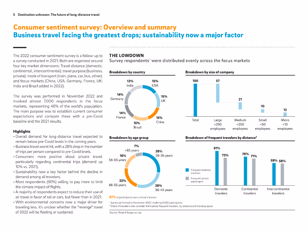
Pie charts and bar graphs with supportive text. Visual breakdowns by geography, company size, age group, and distance of travel.
Market Analysis and Trends
Transportation & Logistics
This slide summarizes consumer sentiment on long-distance travel from a global survey. It highlights generational and geographic insights, emphasizing declines in business travel and growth in private travel intentions. Sustainability and virtual communication emerge as key factors.
Consumer sentiment, long-distance travel, sustainability, virtual communication, business travel, demographics, survey
Multiple Chart
Roland Berger
Saved
The slide contains a column chart detailing various reasons for returns, such as incorrect size and fit, unmet quality expectations, and misleading product display.
Market Analysis and Trends
Retail & E-commerce
Presents survey data on the top reasons for returns in the fashion industry, highlighting size and fit issues, quality expectations, and other key factors influencing returns.
Reasons for returns, Size & fit, Quality expectations, Survey data, Fashion industry
Mixed Chart
Roland Berger
Saved
Features a line graph charting the projected recovery of global luxury markets from 2010 to 2025, focusing on personal and experience-based goods. The slide includes future predictions with visual markers for expected recovery timelines.
Market Analysis and Trends
Consumer Goods
This slide forecasts the recovery trajectory of global luxury markets post-COVID-19, with a specific focus on the rebound of personal and experience-based luxury goods. It uses historical data to project future market recovery, providing a timeline and visual depiction of when various sectors might return to pre-pandemic levels.
recovery forecast, luxury markets, post-COVID, market projection, experience-based goods
Mixed Chart
Bain
Saved
Features title, multiple bar charts showing potential impacts of digital initiatives in Denmark with values for "Total Value at Stake" and "Trapped Value".
Investment Analysis
Technology & Software
Highlights specific digital initiatives in Denmark and their economic impact, focusing on sectors like e-commerce, connected travel, and assisted driving.
Denmark, digital initiatives, economic impact, e-commerce, connected travel
Mixed Chart
Accenture
Saved
This slide displays a bar graph showing the percentage composition of different tax sources including customs & excise, VAT, individual income tax, and corporate income tax. Each category is represented by a different color and clearly labeled, making it straightforward to interpret.
Financial Performance
Government & Public Sector
This slide provides a breakdown of various sources of tax revenue in Namibia, highlighting the significant contributions of each type. It is commonly used in financial or economic presentations to illustrate how different taxes contribute to the national budget.
tax revenue, fiscal analysis, revenue sources, Namibia
Single Chart
PwC/Strategy&
Saved
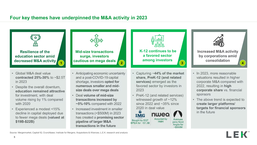
Four comparative boxes each detailing a key theme influencing M&A activity in 2023, such as resilience of the education sector, mid-size transaction surge, etc.
Strategic Planning
Financial Services
This slide outlines four major themes that influenced M&A activities in 2023, including sector resilience, the surge in mid-size transactions, and investor caution on mega deals.
M&A, Themes, 2023, Education, Mid-size Transactions, Strategic Planning
Pillar
LEK
Saved
The slide contains a column chart illustrating retail NPL sales volumes from 2010 to 2023. Different colors represent optimistic, base, and conservative growth projections.
Market Analysis and Trends
Financial Services
This slide provides projections for retail NPL sales volumes in Turkey from 2010 to 2023, with different scenarios reflecting optimistic, base, and conservative growth rates.
retail NPL, growth, Turkey, projections, scenarios
Mixed Chart
PwC/Strategy&
Saved
This slide features a two-column layout. The left side lists key takeaways in bullet points. The right side contains a column chart detailing economic impacts.
Regulatory and Compliance
Government & Public Sector
Covers the use of Earth Observation for security purposes, benefits of satellite data in surveillance, and economic impacts of such technology in Europe.
Earth Observation, surveillance, satellite data, economic impact, security applications
Mixed Chart
PwC/Strategy&
Saved
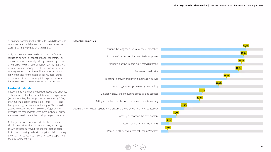
Horizontal bar chart listing leadership priorities with corresponding percentages, with detailed text on the left explaining each priority's importance.
Human Resources and Talent Management
Education & Training
This slide outlines key priorities for leaders, emphasizing long-term organizational goals, employee growth, and positive societal impact.
leadership priorities, organizational goals, employee growth, societal impact, long-term
Mixed Chart
Deloitte
Saved
Previous
Next
If nothing, comes up, please save your slides first
Create a FREE account to continue browsing
Receive Instant Access to 1,000+ slides from companies like McKinsey, Google, and Goldman Sachs
First Name
Last Name
Email
Password
I agree to all
Terms & Privacy Policy
Thank you! Your submission has been received!
Oops! Something went wrong while submitting the form.
Have an account?
Sign in
Column Chart
Heatmap
Chevron
Org Chart
Infographic
Callouts
Timeline
List
Graphic
Picture
Process Flow
Diagram
Paragraph
Map
Table
Framework
Subtitle
Takeaway Box
Icon
Other Chart
Radar Chart
Waterfall Chart
Mekko Chart
Pie Chart
Scatter Plot
Line Chart
Bar chart
Bullet points


![Exhibit 23 Retail NPL Sales Volume Expected Growth [TRY bn, 2010-23]](https://cdn.prod.website-files.com/654e70fb59937215cac87b19/6877e2161751f53f0c622983_BBai_k5b7CnS4pR6UgLlakGIJy5wz9d3QWqKrQsthSg.avif)