My Account
My Slides
Search by Category
Companies
Slide Type
Use Case
Industry
Pricing
Templates
View All Templates
Download Template Slides
✦ AI
AI Prompt Library
AI Search
Feedback
Login
Logout
Get Started
Browse all Slides
Browse all Slides
Create a FREE Account
Instant access to 1,000+ real slides from top companies like McKinsey, BCG, Goldman Sachs, Google and many more!
First Name
Last Name
Email
Password
I agree to all
Terms & Privacy Policy
Thank you! Your submission has been received!
Oops! Something went wrong while submitting the form.
Have an account?
Sign in
Saved Slides
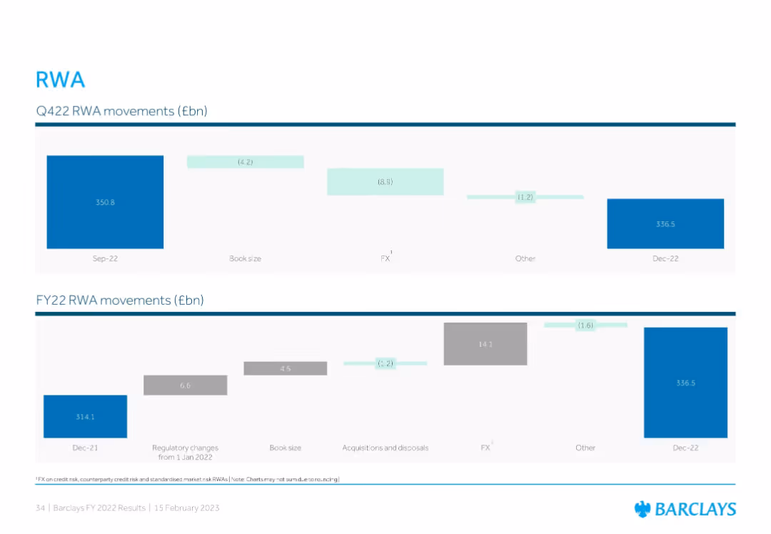
Two waterfall charts: one showing quarterly RWA movements for Q4'22 and another showing full-year RWA movement for FY22, with color-coded segments and value annotations.
Corporate Finance and Valuation
Financial Services
The slide analyzes Barclays’ risk-weighted asset (RWA) changes for Q4 2022 and FY22. It details how book size, FX, and other factors impacted RWA from September to December 2022 and over the full fiscal year. The bank ended 2022 with RWAs at £336.5bn.
RWA, risk exposure, FX impact, Barclays, capital ratio
Multiple Chart
Barclays
Saved
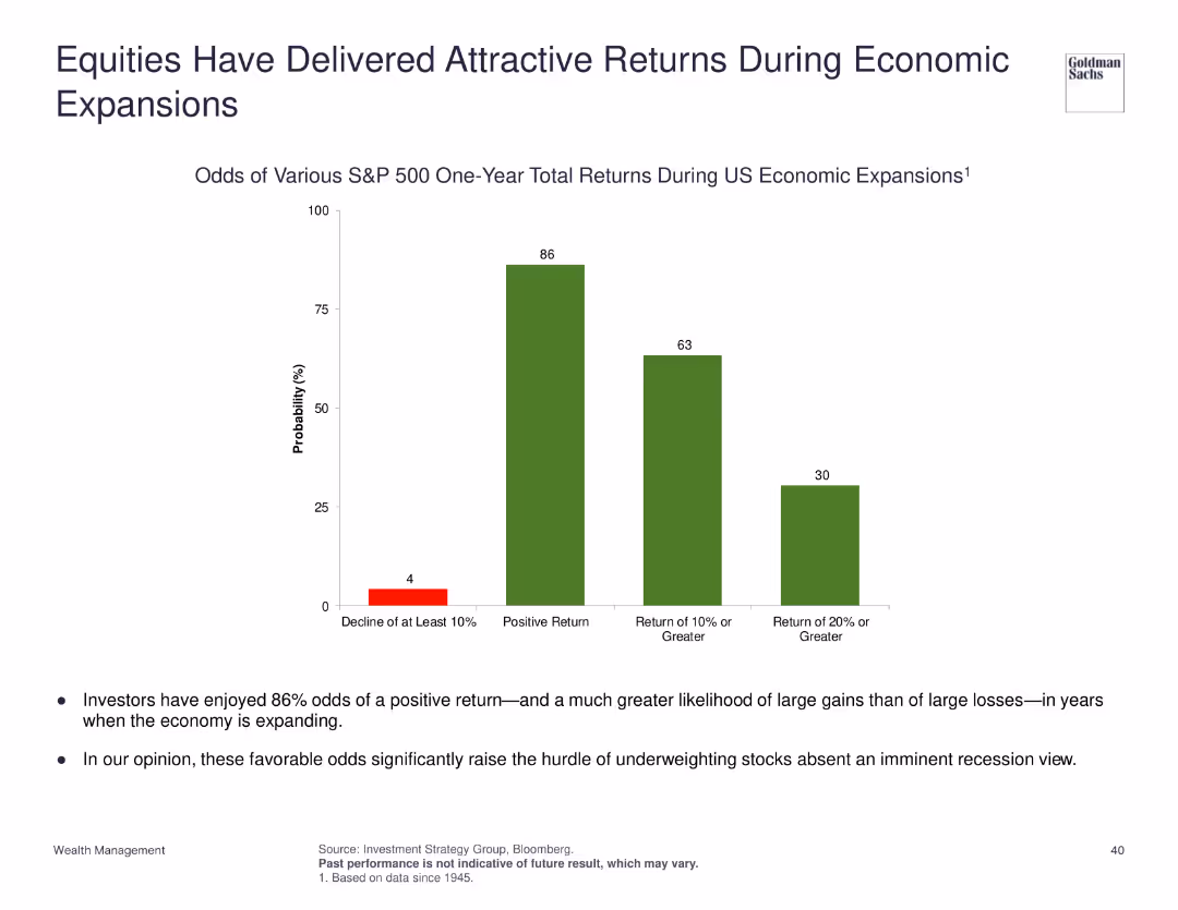
Column chart showing odds of various S&P 500 one-year total returns during US economic expansions.
Investment Analysis
Financial Services
Highlights the odds of positive returns for S&P 500 during economic expansions, suggesting high odds of gains over losses.
equities, economic expansion, S&P 500, returns, investment
Mixed Chart
Goldman Sachs
Saved
Includes a map displaying state-wise social return on investment and family impact numbers from the NCHP.
Strategic Planning
Government & Public Sector
Evaluates the regional impact of the National Community Hubs Program, showing differences in social returns and outreach by state.
NCHP, regional impact, social return, state comparison, family outreach
Graphic
Deloitte
Saved
This slide contrasts two pie charts, illustrating the percentage of consumers using video for product discovery and evaluation. A text box provides a relevant quote to emphasize the importance of video content in social media and OTT platforms. The visual elements are well-balanced, with clear labels and legible text, set against a neutral background to enhance readability.
Market Analysis and Trends
Media & Entertainment
The slide provides insights into how consumers use video in the product journey, particularly in product discovery and evaluation. It underscores the influence of video content on consumer decisions, making it suitable for presentations that analyze consumer engagement strategies and the role of video in marketing.
Consumer Engagement, Video Content, Product Discovery, Product Evaluation, Marketing Strategy, Social Media, OTT Platforms, Media Consumption, Audience Insights, Engagement Tactics
Multiple Chart
Bain
Saved
This slide features two line charts illustrating UK CPI inflation rates over several years, comparing the traditional core inflation with core excluding COVID-impacted sectors. The orange dashed line represents the traditional core, while the blue line shows the core excluding COVID-impacted sectors.
Market Analysis and Trends
Financial Services
This slide dissects the recent rise in UK inflation by differentiating between traditional core inflation and core inflation excluding sectors impacted by COVID-19. It can be used to discuss the nuances of inflation measurement and the pandemic's specific effects on economic indicators.
UK, Inflation, CPI, COVID-19 Impact, Economic Analysis, Sector Comparison, Line Chart
Single Chart
JP Morgan
Saved
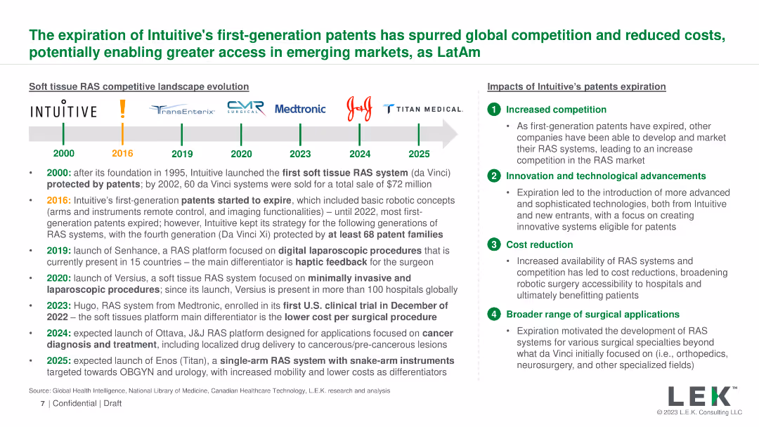
A timeline with logos of companies and key events, accompanied by bullet points and a side section with impacts
Competitive Landscape
Healthcare & Pharmaceuticals
Discusses the impact of the expiration of Intuitive's patents on global competition, technological advancements, and cost reduction
patents, competition, innovation, cost, healthcare
Header Horizontal
LEK
Saved
This slide presents a series of line charts depicting household savings dynamics in the US, EU, and UK, along with commentary. Each chart shows the actual savings rate, model-predicted trend savings rate, and cumulative excess savings.
Risk Assessment and Management
Financial Services
The slide discusses household savings dynamics, indicating that US consumers are depleting excess savings accrued during the pandemic. It forecasts savings trends and highlights differences between US and European savings behaviors, suggesting cautious consumer spending in the future.
household savings, US, EU, UK, dynamics, forecast
Multiple Chart
Accenture
Saved
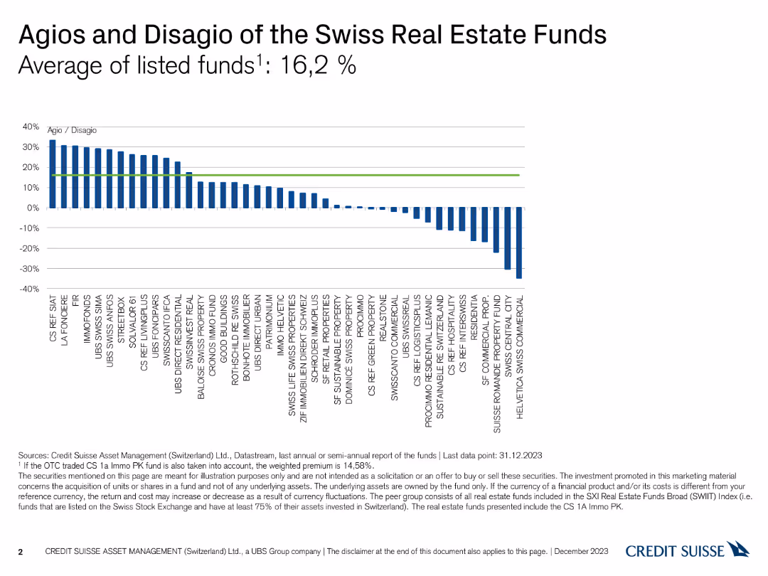
A column chart showing the Agio and Disagio percentages of various Swiss real estate funds, with bars extending above and below a zero line.
Financial Performance
Financial Services
This slide illustrates the Agio (premium) and Disagio (discount) of different Swiss real estate funds as of December 31, 2023, highlighting an average of 16.2%.
Agio, Disagio, Real Estate Funds, Premium, Discount
Single Chart
Credit Suisse
Saved
Slide with bar graphs displaying digital payment market shares and a section describing penetration strategies of different payment platforms.
Competitive Landscape
Financial Services
This slide presents the competitive landscape of digital payment platforms in 2019, showing market shares and penetration strategies. It's useful for analyzing market dominance and strategic linkages in the payment sector, highlighting how major players are leveraging partnerships to enhance their market position.
Market Share, Digital Payments, Penetration Strategy, Competition, Strategic Alliances
Mixed Chart
Kearney
Saved
The slide showcases two line graphs comparing the common equity growth over time for different entities and projected growth due to Basel 3 reforms. It's a complex visual presentation meant for expert audiences.
Regulatory and Compliance
Financial Services
Provides an analysis of the firm's equity growth, anticipating the impact of Basel 3 regulatory reforms. Ideal for discussions on regulatory impact and financial forecasting in a professional or regulatory context.
Basel 3 Reforms, Equity Growth, Regulatory Impact, Financial Forecasting, Capital Adequacy
Multiple Chart
Goldman Sachs
Saved
The slide includes three line charts depicting US y/y real GDP (2005-25F), US unemployment rate (2005-25F), and US y/y CPI (2005-25F). The design is moderately complex with clear labels and projections marked with dashed lines. Text at the bottom explains key economic factors.
Market Analysis and Trends
Financial Services
The slide forecasts US economic activity in 2024, highlighting slower private sector activity, easing inflation, and a modest rise in unemployment. It discusses factors influencing these trends and implications for business leaders and consumers.
economic activity, GDP, unemployment, CPI, forecast
Multiple Chart
EY
Saved
The slide includes two charts: a line chart on growth and value forward P/E ratios, and a bar chart showing equity sector correlation changes in bond yields.
Investment Analysis
Financial Services
Examines global equity trends, comparing growth vs. value P/E ratios and sector performance relative to bond yields, useful for investment decision-making.
equities, growth, value, P/E ratios, bond yields
Multiple Chart
JP Morgan
Saved
Features a column chart displaying growth over time, complemented by side panels with text and additional small images, creating a data-rich yet organized presentation.
Financial Performance
Financial Services
The slide demonstrates the financial growth of a company and its strategic investments. It would be effective in financial analysis presentations or shareholder meetings to display performance metrics.
Financial Growth, Investment, Performance, Success, Strategy
Mixed Chart
JP Morgan
Saved
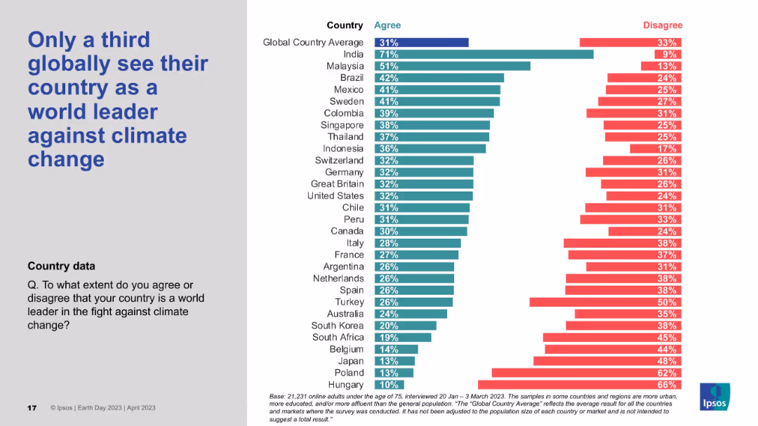
Bar chart visualizing countries’ agreement that their nation is a climate leader; large title left, data-heavy right side.
Strategic Planning
Government & Public Sector
The slide indicates low global confidence in national leadership on climate issues. Only a third of global respondents view their country as a world leader, with India topping the list. Many developed nations like Japan, Poland, and Hungary score very low in agreement.
Climate leadership, National pride, Public perception, Ipsos survey, Global ranking
Mixed Chart
IPSOS
Saved
Showcases a pie chart depicting the distribution of media spend in the auto industry, with emphasis on different channels including TV, social, and search.
Industry Overview
Transportation & Logistics
Details the media spend distribution within the auto industry, focusing on the sufficient data available for LFVC ad spending analysis.
auto industry, media spend, LFVC, industry analysis, ad spending distribution
Single Chart
Accenture
Saved
Two-column layout with line charts showing Nasdaq bank stock indexes and US lending conditions for businesses from 2021-2024 and 2008-2024.
Risk Assessment and Management
Financial Services
Analyzes the pressures on regional banks due to CRE-related vulnerabilities and the limited risk of broader financial contagion.
regional banks, CRE, financial vulnerabilities, banking system, risk assessment
Multiple Chart
EY
Saved
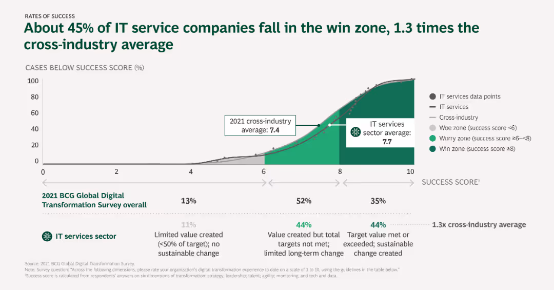
Column chart displaying success rates of IT service companies compared to cross-industry averages, with different zones indicating levels of success.
Performance Metrics and KPIs
Telecommunications
The slide examines the success rates of IT service companies in digital transformation, comparing them to cross-industry averages and categorizing success into different zones.
Success rates, IT services, Cross-industry comparison, Performance metrics, Digital transformation
Mixed Chart
BCG
Saved
Features stacked column charts for pre-tax income, line graphs for the macroeconomic environment, and quantitative data points.
Financial Performance
Financial Services
Describes the growth of pre-tax income across various business units and macroeconomic conditions.
Pre-tax income, economic growth, GDP growth, federal funds rate, business units
Multiple Chart
JP Morgan
Saved
Contains text descriptions and bullet points with a sidebar example of an Indian alcohol beverage manufacturer, a QR code, and percentage growth figures.
Market Analysis and Trends
Professional Services
Describes strategies for leveraging customer insights to develop and prioritize demand spaces, illustrated by a case study with positive growth outcomes.
Customer Insights, Demographics, Market Segmentation, Demand Spaces, Growth Strategy
Text Only
BCG
Saved
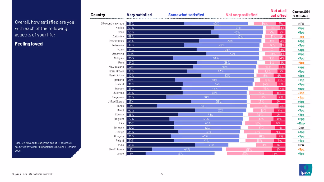
Dark blue left header; right side bar chart shows satisfaction levels by country in four response bands and change from 2024.
Human Resources and Talent Management
Professional Services
This slide visualizes how satisfied people are with feeling loved across 30 countries. It categorizes satisfaction levels and shows year-over-year change. Mexico and Colombia rank highest, while Japan and South Korea rank lowest. The chart includes detailed breakdowns per country.
feeling loved, satisfaction, emotional health, cross-country comparison, Ipsos, personal well-being, survey, 2025
Mixed Chart
IPSOS
Saved
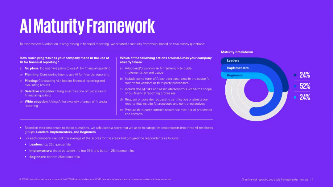
Purple background with side-by-side matrices and a donut chart breakdown of maturity levels: Leaders, Implementers, Beginners.
Technology and Digital Transformation
Financial Services
Defines an AI maturity model based on usage and actions taken. Categorizes companies into three groups based on their AI implementation readiness. Provides criteria and scoring method for classification.
AI maturity, financial reporting, implementation stages, digital transformation, assessment
Mixed Chart
KPMG
Saved
Column charts illustrating foreign investment projects in various sectors across the top three European economies.
Market Analysis and Trends
Financial Services
This slide highlights the strategic sector leadership of France, UK, and Germany in foreign investment projects.
strategic sectors, economies, investment, Europe, R&D
Multiple Chart
EY
Saved
This slide includes a table, column charts, and a photo. The left side features a table of survey respondents by country, while the right has column charts for industries and demographics.
Market Analysis and Trends
Professional Services
Presents survey demographics, showing respondents by country, industry representation, and age group. Highlights key statistics about the survey sample.
demographics, survey, industries, age groups, countries
Multiple Chart
EY
Saved
Data visualization slide showing the population of Southeast Asian countries, with a simple map and corresponding data points.
Market Analysis and Trends
Technology & Software
Presents demographic data relevant to the e-Conomy SEA report, such as the population figures of countries in Southeast Asia.
e-Conomy SEA, demographics, Southeast Asia, population, country data, market analysis
Uncategorized
Bain
Saved
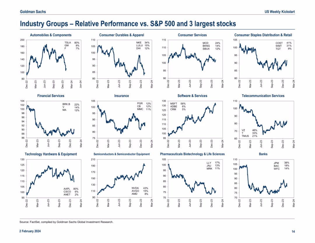
16-panel grid of line charts showing relative performance of specific industry groups versus the S&P 500. Each chart includes annotations for top 3 performing stocks in that group with respective YTD returns.
Competitive Landscape
Financial Services
The slide breaks down relative performance of key industry groups such as Automobiles, Software, and Banks against the S&P 500, highlighting leaders like TSLA, MSFT, and JPM. Performance trends since Dec 2022 are visualized with specific stock contributions, helping investors pinpoint which stocks are driving sector trends. This view is helpful for benchmarking and identifying outperformers within industries.
industry performance, S&P 500, TSLA, MSFT, JPM, stock returns, benchmarking, sector leaders, relative trends, outperformers
Multiple Chart
Goldman Sachs
Saved
Previous
Next
If nothing, comes up, please save your slides first
Create a FREE account to continue browsing
Receive Instant Access to 1,000+ slides from companies like McKinsey, Google, and Goldman Sachs
First Name
Last Name
Email
Password
I agree to all
Terms & Privacy Policy
Thank you! Your submission has been received!
Oops! Something went wrong while submitting the form.
Have an account?
Sign in
Column Chart
Heatmap
Chevron
Org Chart
Infographic
Callouts
Timeline
List
Graphic
Picture
Process Flow
Diagram
Paragraph
Map
Table
Framework
Subtitle
Takeaway Box
Icon
Other Chart
Radar Chart
Waterfall Chart
Mekko Chart
Pie Chart
Scatter Plot
Line Chart
Bar chart
Bullet points